User assistance occurs within an action context—the user doing something with an application—and should appear in close proximity to the focus of that action—that is, the application it supports. The optimal placement of user assistance, space permitting, is in the user interface itself. We typically call that kind of user assistance instructional text. But when placing user assistance within an application as instructional text, we must modify conventional principles of good information design to accommodate certain forces within an interactive user interface. This column, User Assistance, talks about how the rules for effective instruction change when creating instructional text for display within the context of a user interface.
User Behaviors and Their Implications for Instructional Text
When designing user assistance—particularly instructional text within the context of an application—we should keep the following typical user behaviors in mind:
When users are processing information on a computer screen, their flow of focus is the same as when they process information on a printed page. For example, in English, readers scan from the upper left to the lower right and read from left to right and top to bottom; in Arabic, people read from right to left and top to bottom.
When using an application, users are motivated to take action, and their focus is easily drawn to action objects such as menus, buttons, and text fields.
Once an action object or other visual element on a page has drawn a user’s focus downstream in the focus flow, it is difficult to redirect it back upstream. In other words, if something initially draws a user’s attention to the middle of a page, it is far more likely that the user will continue across and down as opposed to going back up the page. This is especially true if there are additional action objects downstream.
Champion Advertisement
Continue Reading…
While we intuitively expect such behaviors on the part of users, I have, in fact, observed them time and time again in usability testing. However, these user behaviors lead to some implications for user assistance design that might seem counterintuitive, as follows:
Do not introduce required conceptual information before a user engages in activities that require those concepts.
Do not explain business rules or constraints before the user encounters their constraining effects.
The key word in both statements above is before. Although both implications seem to fly in the face of good instructional design, they accommodate the reality of user behavior within an interactive medium. Given a choice between reading and doing, users prefer to be doing. There is another principle at work here as well. Let me tell you a story to illustrate it. As an instructor for a software application that had some annoying gotchas, I found that, as much as I tried to warn students about problem areas before they encountered them in lab exercises, the students still made the very mistakes I had warned them against. When I helped them back out of their mistakes, they would slap their foreheads and say, “Oh yeah, you told us about that!” The principle at work here: Until someone experiences or recognizes a problem, that person has no way of processing information pertaining to that problem. Yet much of what we do in instructional design has to do with giving answers to people who don’t yet have a problem—in the well-meaning, but wrong belief that “forewarned is forearmed.” Instructional text in user interfaces often exhibits this problem.
User Assistance in Context: An Example
Let’s consider a simple Log In form comprising a text field, two radio buttons, and an action button. For this example of user assistance, let’s make the following assumptions:
This form’s designer could have better accommodated some unusual application constraints with a different form design or even an improved application design—for example, a database that would allow more valid entries than just Member or Non-member.
However, as is often the case for technical communicators, we have no control over the design and instead must solve the problem by telling users what the rules are.
The example itself is simplistic, but the scenario it represents is authentic.
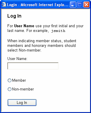
If you have a background in instructional design or information mapping, your instinct might be to provide instructions regarding the entry of information and selection of options before requiring a user to take action. In other words, you might be inclined to put the instructional text before the text field and radio buttons, as shown in Figure 1.
Figure 1—Logical, but ineffective placement of instructional text on a Log In page
However, if you consider the three user behaviors I described earlier, you’ll probably understand that the following scenario is what typically would happen when a user filled out this form:
The user’s focus would be pulled almost immediately to the User Name field, because the user is motivated to act.
Jumping immediately to that field would cause the user to leapfrog over the instructional text.
Once downstream of the instructional text, the user would not likely go back and read it, even if unsure of what the requirements are. Instead, the user would make a best guess and move on—attracted by the radio buttons downstream.
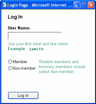
In Figure 2, we see the same login requirements and instructions presented in a way that accommodates users’ natural tendency to leap to an actionable object and the natural flow of focus that follows.
Figure 2—Instructional text immediately downstream of point of need
Some might object to this layout, saying that the user might provide an invalid name in the User Name field, then have to go back and correct it once he sees the instructions. My point is that they will probably do the same thing anyway if the instructions are upstream of the text field, because their focus is immediately drawn to the field, so they will never see the instructions. With the layout shown in Figure 2, users have the opportunity to catch and correct their mistakes before clicking Log In, preventing them from getting an error message.
Some Guidelines for Instructional Text
When placing instructional text within a user interface, apply the following guidelines:
Divide dense instructions up for individual action objects.
Put the appropriate instructions in close proximity to their respective action objects.
Place the instructional text next to the corresponding action object—preferably, in the downstream direction, to the right or just below it.
If the instructional text is too long and its recommended placement would disrupt the layout of the action objects—for example, disrupting the grouping of a set of radio buttons—instead provide a link that dynamically displays a pop-up or pane when a user clicks it. These kinds of links can be very effective when phrased like questions in FAQs.
Conclusion
The dynamics of how users interact with interactive elements within a user interface change how we must approach instruction that we deliver within user interfaces. Users skip static elements, such as instructional text, because they focus immediately on downstream actionable objects. Effective user assistance design accommodates users’ natural workflows by providing instruction immediately beside or following interactive elements that constitute points of need for more information.
This placement style will also be beneficial to those users who are already familiar with the form, since they don’t have to trudge past the instructional text every time. It might help to think of these text snips as “footnotes”, as opposed to “instructions”.
Brilliant article, and so true. I used to be the kind of person that puts carefully written instructional text at the top of a page, and then couldn’t understand why people still did stuff wrong on a page. Now my mantra is either make the page so clear it doesn’t require instructional text, or place it inline with the action. I’m also a big fan of ToolTips close to the relevant interactive elements.
This is a very good article. This issue is a big part of our work with the ELMER guildelines.
As of October 1. 2006, the ELMER guidelines were approved as the official user interface guidelines for Norwegian public forms on the Internet. The Norwegian Ministry of Trade has stated that all public forms on the Internet directed toward Norwegian enterprises shall follow these guidelines by the end of 2008.
As representatives of Norwegian enterprise, we are of course interested in making these guidelines as good as possible for our members—and all others. We have been involved in their development from the start, but are first to recognize that, while they are a very good start, they do not constitute the final answer. To encourage further development and getting even more views on the subject, we took an initiative to have the guidelines translated into English. Together with the Ministry of Trade, we released the English translation on January 31. 2007. The guidelines can be found here.
I hope this is of interest and can contribute to a discussion about this subject. Any suggestions on improvements or changes are most welcome.
Great article and something we have been encountering on an Internet application I have been working on. People were regularly getting some of the more complex screens wrong, and we could not work out why.
Providing contextual information via floating message boxes resolved the issues almost immediately. The removal of the instructional text also improved the users’ perception of the interface and it’s usability. Only issue was making sure this methodology worked for disabled users as well.
Thanks as always for the great work and information.
The ultimate execution of this is what we call internally dynamic tips, where the instructional text only appears as you interact with the action object. As you click the next action object, the previous instructional text disappears, to be replaced with copy pertaining to your current focus. This approach is good when there is a lot of instructional text and displaying it all at once appears overwhelming or cluttered. It tends to get users’ attention, and there is a strong connection between the copy and the task they’re doing. It can be distracting though and is not useful if you need to refer to multiple tips at once. We have classified some instructional text as “everyone needs this to get started,” which remains static, and other text as “only applies to some users,“ which can be dynamic, to find a happy medium.
Fascinating article! On first reading it, I was skeptical, but then while looking at the example image, I found myself indeed skipping over the instructional text and going straight to the text field.
It’s becoming more common to see instructional text directly below a form field, often in a very small font size, and in grey or another color that sets it apart from the surrounding text. However, if every form field needs explanation, this can make for a very cluttered page.
One solution I’ve used is CSS ToolTips to the left of each form field—a mouseover on a ? icon reveals a sentence next to the field. I wonder if you would consider the ToolTip placement on the left to violate the “never before” rule? I initially placed them to the right of each form field but the layout was too jagged. (Example)
Mechanically, I think your ToolTip to the left is okay, because it is in such close proximity and is not a dense text block. I have not seen good results in usability testing with the question mark being used much, however. If every field needs explanation and you are worried about clutter, you could also consider Mia’s dynamic tips technique described in the comment above yours. It requires less action on the user’s part and avoids the clutter of all the little question marks strewn around.
Thanks for the great article. My first move is always to advocate for a change to the UI and backend database—adding a third radio button in your example. But when forced, I will add a tip to the right of a form field—ours are green too. Though I feel like I am perpetuating the problem. Often, when we want to make improvements to the UI, our IT people come back with, “Well, can’t you just put a tip on it?” Sorry to admit that the right-hand column on several of our screens is now basically a continuous blur of green-text tips.
Great article on this. One thing I did notice was there was not a way for a user to create a user account, if the user did not have an account.
I also did not see a way for users to request
a copy of their login details.
I noticed there is no password box. I am assuming that, if a user logs in as a non-member and does not have an account in the database, the user would be logged in as a guest user? But, there is no indication of a guest user.
All the observations about how to make the basic user experience better are spot on. I never know how realistic to make an example. I generally only go far enough to illustrate the point I am trying to make. In this case, the example was about the placement of user interface text, not designing a good login workflow; hence the many shortcomings and the disclaimer: “The example itself is simplistic.” I also deliberately constructed a bad design to create a need for on-screen Help. But to all who have suggested that the best solution is an improved design: Right on!
One nice solution, when possible, is putting the instructions inside the actionable object. For example, putting the text Your first initial and last name as the default value in the user name text box. When a user clicks the box to type, the default value clears. This also saves screen real estate. booya.
It doesn’t really fly in the face of more modern instructional design—that is, constructivist, cognitive-based instructional design such as problem-based learning, using simulations or games.
You let people bump into constraints or explore in a messy and uncertain environment first, then give them directions or instructions afterward or as needed. Otherwise, if you lecture them first or give them a bunch of text to read beforehand, they’ll tune out and skip it.
One nice solution, when possible, is putting the instructions inside the actionable object. For example, putting the text Your first initial and last name
Though this will most likely lead them to submitting the form with that as the default value and having to fill it out again. Article on this site about that. Seen it in our own testing so far.
In his role as User Experience Architect for IBM Security, Mike’s professional focus is on designing usable user interfaces that accommodate the user as learner. Previously, as User Assistance Architect at IBM, Mike identified tools, methods, and standards for integrating the content and delivery of user assistance, including documentation, Help, elearning, and training. He was formerly Lead UX Designer for CheckFree Corporation, where he instituted their User Experience Research and Design Center. Mike has a PhD in Instructional Technology from the University of Georgia and a Masters in Technical and Professional Communication from Southern Polytechnic State University. He is a Fellow with the Society for Technical Communication and a Certified Performance Technologist through the International Society for Performance Improvement. Read More