Top

Conference Review: CHI 2007

July 10, 2007
Organization 3 stars
Content 3 stars
Presenters 3 stars
Proceedings 5 stars
Venue 4 stars
Hospitality 5 stars
Community 5 stars

This year, SIGCHI celebrated its 25th annual Computer/Human Interaction (CHI) conference. CHI 2007 took place at the Convention Center in San Jose, California, USA, on April 28 through May 3, 2007. Its theme: Reach Beyond. The organizers asked us to “reach beyond …our comfortable methods and praxis; beyond our exciting and innovative technology; beyond our established scientific frameworks and reputations; beyond the common ground of professional and national cultures; and beyond our far-flung social networks.” To what?

Opening the conference, Mary Beth Rosson, Conference Chair, said, “HCI folks are in the middle of everything now, and we’ve earned that.”

While Design Community Co-Chairs John Kolko and Bill Lucas brought us Bill Moggridge’s remarkable opening plenary, “Reaching for the Intuitive,” and the exceptional interactive session “Who Killed Design?” I still found the overall amount of design content at CHI 2007 lacking. This was particularly disappointing, because the conference convened in the heart of Silicon Valley—world center of the technology industry and home to many UX professionals. If ever there were a CHI that should have been centered more on practice than academia, this was it.

Champion Advertisement
Continue Reading…

Plus, many Design Community sessions were relegated to rooms that were too small to accommodate their audiences. Not only were design-centered courses full, there were long waiting lists of people hoping to get into them, while sessions for other communities, in larger rooms, were sometimes sparsely attended. I spoke with several attendees who were as frustrated by the limited options for designers as I was. Not only were designers unable to get into the courses of their choice, because their registrations were full, they couldn’t switch courses if they weren’t enjoying a course they were in.

I attended the Design Community SIG, on Wednesday, May 2, during which Elizabeth Dykstra-Erickson told me that design-focused content will be even more limited next year at CHI 2008, in Florence (Firenze), Italy. Elizabeth and Jonathan Arnowitz are the Design Community Co-Chairs for CHI 2008, but the Conference Committee dictates the number of Design Community sessions. The SIGCHI leadership also enforces the same paper-selection process that, while appropriate for academics, is not an effective means of selecting content for the Design Community. It’s discouraging that such passionate advocates for the Design Community as John Kolko, Bill Lucas, Elizabeth Dykstra-Erickson, and Jonathan Arnowitz have met with such limited success in bringing design content to CHI.

CHI 2007 did a better job of serving the UX Management Community, which focuses on “the business and organizational aspects of HCI.” (Though HCI is the wrong term. Nobody outside of academia or research uses that term.) Perhaps the Management Community was better served because it is the source of much of the funding for the conference.

The conference also did a good job of serving user research and usability professionals through its Usability Community. I can’t help wondering whether the establishment of the Usability Professionals’ Association and its popular conference brought home to CHI the need to better serve this community. Will it be necessary to establish an association for UX design professionals and a conference that successfully competes with the CHI conference to awaken CHI to the need to adequately serve the design community?

The organizers of CHI 2007 invited us to: “Join us as we reflect on our amazing accomplishments over the past 25 years while we look forward to those we haven’t yet tried to imagine.” Perhaps it’s difficult to reach beyond and look back at the same time. Still the conference had some high points, which I’ll share with you when I describe its content and presenters.

Organization

In many respects, CHI 2007 was a well-organized conference. With 25 years of experience putting on conferences, CHI knows how to make a conference run smoothly. Audio, video, and lighting were superb. CHI also provided a lot of services to make attendees’ days at the conference easier, including wireless high-speed Internet access and a press room. Friendly volunteers were always available to help.

Two days of workshops, on Saturday, April 27, and Sunday, April 28, preceded the main conference. However, “only those who have had position papers accepted can attend workshops.” I did not choose to attend any workshops.

Over the four full days of the conference, CHI offered fourteen tracks of sessions, running in parallel. Admittedly, that’s a lot of sessions to manage, especially with this year’s unusually high attendance. However, the allocation of rooms to sessions was poorly thought out. As I described earlier, there were overflow crowds for some sessions, while attendance for others was sparse—at least in relation to the size of the rooms in which they took place. For some sessions, overflow crowds were able to watch on monitors that were placed in the hallways. (Unfortunately, this sometimes made the hallways impassable.) However, no monitors were provided for the sessions I regretted missing.

During registration for future conferences, I suggest that the organizers of CHI poll attendees about their needs and preferences. For example, they might ask:

  • Are you an academic, student, or UX professional?
  • What is your area of specialty? (Provide check boxes appropriate to the category an attendee selected in the previous question.)
  • In what communities of interest are you likely to attend sessions? Design? Education? Engineering? Management? Research? Usability?
  • What kinds of sessions are you likely to attend? Courses? Experience reports? SIGs? Interactive sessions? ALT.CHI sessions? Papers? Competitions?
  • Of all the sessions in the conference program, which are you most likely to attend? (Initially, provide check boxes for sessions in each category an attendee selected in the previous question, but let attendees choose sessions in other categories, too.)

Gathering this information in advance would give the organizers some idea about the demand for space in particular sessions and ensure that people wouldn’t be shut out of the sessions they wanted to attend.

Content & Presenters

The majority of the worthy content for UX professionals comprises courses. Attending CHI on a press pass, I wasn’t permitted to sign up for courses in advance. Therefore, I was unable to get into the courses I’d planned to attend. I can’t review what I didn’t experience, so this part of my review will be relatively brief. Last year in Montréal, I had spent most of my time in courses. The rooms there were larger, so I was able to get into whatever courses I wanted to attend.

The upshot of my CHI 2007 experience is that, unless the CHI organizers permit members of the press to sign up for courses in advance or otherwise ensure access to them, I doubt I’ll review CHI again. It was bad enough to find myself in San Jose with nothing to do at the conference, but if I had incurred the expense of a flight and hotel accommodation in some remote place rather than simply driven in from my home in the Santa Cruz mountains, I would have been seriously displeased. Without knowing I’d have access to content that would be of interest to UXmatters readers, investing in a trip to another city or country isn’t a risk I’d undertake. Of course, I do hope CHI finds a solution to this problem.

In most cases, I’ll review only what were for me the highlights of the conference. Unfortunately, there were many hours when there just weren’t any really interesting sessions other than courses.

Day 1: An Evening of Courses

Unusually, the conference began on a Sunday evening, April 28, with four courses:

  • Human-Computer Interaction: Introduction and Overview
  • An Introduction to Computer-Supported Cooperative Work (CSCW)
  • HCI History: Trajectories into the Future
  • Drawing Ideas: Visualization and Design Sketching

Day 2: Opening Plenary: Reaching for the Intuitive

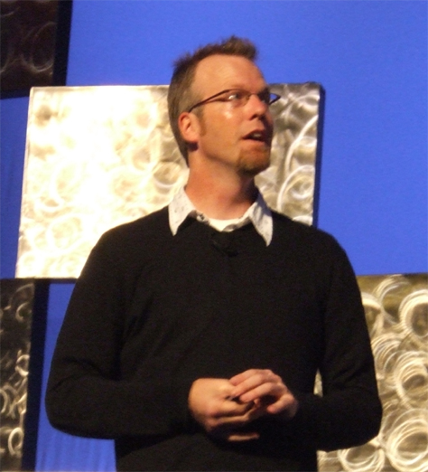
Presenter: Bill Moggridge

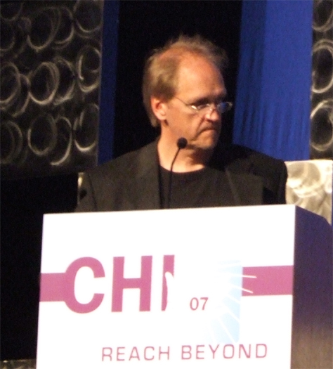
Day 2 of the conference began strongly with Bill Moggridge’s opening plenary, “Reaching for the Intuitive.” Shown in Figure 1, Moggridge is a renowned industrial designer, co-founder of IDEO, and author of Designing Interactions. In a time when most organizations are emphasizing user-centered design methodologies over intuitive design and incremental improvement over innovation—despite all the talk one hears about innovation these days—I think the design community needed to hear what he had to say. I really enjoyed his presentation.

Figure 1—Bill Moggridge
Bill Moggridge

Moggridge opened his talk by saying, “After 25 years, we should all be ready to congratulate ourselves for the progress we’ve made. Perhaps it’s time to embrace the more qualitative, intuitive aspects of design—to harness the subconscious aspects of design. Why intuitive design?

  1. “The problems are getting more complex.
  2. “Technology is part of our everyday lives—not just work. It’s now in every part of our lives.

“Now, we have to design interactivity.” Moggridge gave the example of the NTT DoCoMo i-mode mobile Internet service in Japan, which he told us has 32 million subscribers. He said, “The user interface of the phones should be easy enough for everybody. The hierarchy of complexity, in terms of the design problem, requires making decisions quickly, without having to justify them—experimentation.” Moggridge showed us a woman struggling to order a drink from a vending machine using i-mode. It took her 35 minutes to successfully order her drink, because of a variety of usability problems she encountered. People from different parts of the world use mobile phones differently. “The way people use phones is diametrically opposite.” For example, in Japan, people send text messages, because they consider it rude to talk on mobile phones in public places. In the USA, people spend a lot of time driving and prefer to use their phones to talk with one another.

Moggridge told us, “Designing something that’s aesthetically satisfying becomes more important as time moves on.” He spoke about venture capitalist David Liddle’s “three stages of adoption” for new technology products. First, enthusiasts adopt a new technology. Such people appreciate a technology for what it is and don’t care about ease of use or cost. “The fact that it may be difficult to use actually adds to the fun,” said Moggridge. Next, business users adopt the technology. During this stage, people realize they can use the technology to help them accomplish their work. Ease of use becomes more important, because business users care about the productivity they can achieve using the technology. Finally, as the technology’s volume of sales becomes big enough, it reaches a price point that is affordable for consumers. At the consumer stage, “style and intuitive design” become paramount. “These stages have profound implications for interaction design, as the design process changes with each phase to meet the increasingly practical needs of each new set of users.”

“How can we harness intuition? By understanding design and design thinking and developing design skills,” said Moggridge. Charles Eames once defined design as “a plan for arranging elements in such a way as to best accomplish a particular purpose.”

Moggridge used the analogy of an iceberg to show the relationship between the conscious mind and the subconscious. The conscious mind is like the tip of an iceberg that is visible above the water, while the subconscious mind is like the larger mass of the iceberg that lies submerged and hidden beneath the surface of the water.

According to Moggridge, “Design thinking harnesses design skills

  1. to frame or reframe a problem and objectively figure out what the brief is really
  2. to envision and create alternatives
  3. to select from among the alternatives, however they’re generated, knowing intuitively how to choose the best approach”
  4. “to visualize and prototype the intended solution in order to see what works quickly, in each iteration
  5. “to synthesize a solution from all of the relevant constraints, understanding everything that will make a difference to the result.

Throughout his talk, Moggridge cited examples of design innovation from his book, Designing Interactions. Intuitive design is the hallmark of that work:

  • Jeff Hawkins’s design for the PalmPilot—He had four design criteria—size, price, synchronization, and speed. It had to be fast.
  • Tim Mott’s desktop metaphor—He developed the metaphor for the Xerox PARC On Line Office System.
  • Larry Tesler and Bill Atkinson’s design for the Apple Lisa operating system—They developed a prototype every day, by brainstorming user interface design ideas, then each of them coding 12 hours a day. Larry was the day shift; Bill, the night shift. Larry’s goal was no modes, so he wanted to avoid the kind of hierarchical menu-driven interface in which users couldn’t see all levels in the hierarchy at once, making people keep track of the hierarchies in their heads. So, in one night, Bill came up with the design for drop-down menus, which were easily scanned, used highlighting to show selection, and provided keyboard shortcuts. “He thought of all that in one night,” said Moggridge.
  • Mat Hunter’s interaction architecture for digital photography—To help Kodak make the transition from film to digital photography, he created this architecture and developed a UX prototype that let users capture, review, share, and delete images.
  • Paul Mercer’s toolkit for the iPod—He did not design the iPod, but provided the building blocks for it.

“We now need people with a subjective, empathic approach to design. Intuition is an important moment of crystallization, but based on all the work that’s gone before,” said Moggridge. “Like most things in life, you can do design well or poorly. It’s about having the knowledge and understanding which alternative is best. Education is learning by doing—trying things—allowing the subconscious mind to inform intuitions that guide actions. You do just trust your doing of it. Design has now reached a stage at which Ph.D’s, who understand how design works, differentiate between designing user interfaces or objects and services, which have a social aspect. Both industry and designers have failed at making these things as simple as they can be. Perhaps we’ll see more development for specific purposes. General-purpose tools are the enemy of simplicity. Designers must know the state of the art—best practices—if they’re designing a product that isn’t unique, but when designing with no precedent, they must use intuition. Design is spreading its influence—through business as well.”

CHI madness followed the opening plenary. For attendees who are interested in papers sessions, there’s no better way of getting their flavor. Since I’m generally not interested in seeing papers presented, I wish CHI would include other types of sessions in the CHI madness as well.

Day 2: Bill Moggridge Interview

The organizers of CHI 2007 arranged some special events for members of the press, including an opportunity to interview Bill Moggridge. Here are some of the thoughts he expressed during the interview:

  • The trend is to move the person into the environment—with PDAs, wearable computers—into buildings, the architecture, the car.
  • Well-designed interfaces don’t get in the way. You can learn a lot from games.
  • People dont give due respect to the part of the iceberg thats submerged.
  • It’s difficult to justify or quantify intuitive design.
  • A designer gets a great idea; prototypes and tests it. When doing iterative design, inform each attempt with intuition.
  • People think of research as understanding ideas.
  • You build an innovation process, developing tacit knowledge, but if you dont think, you get stuck in the process. You must be able to adapt to change. You must understand how design works.
  • Cars are a very mature interface. Thirty percent of its computer science. Theres an enormous amount of computer intelligence in the car. It gives you computation when you need it.
  • Heads-up displays are dangerously distracting for drivers. Anything thats a tiny bit distracting takes away from the ability to focus on driving and is very dangerous.

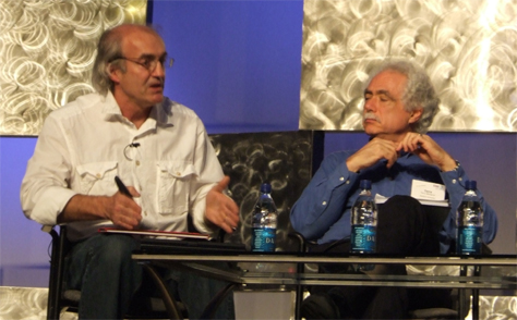
Day 2: Who Killed Design? Addressing Design Through an Interdisciplinary Investigation

Moderators: Scott Pobiner and Anijo Mathew

Panelists: Bill Moggridge, Bill Buxton, Terry Winograd, and Meg Armstrong

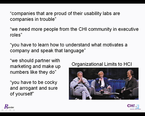
The interactive session “Who Killed Design?” took an interdisciplinary look at design, encompassing viewpoints from both industry and academia. Heres the lineup of panelists (shown in Figures 2 and 3):

  • Bill Moggridge—An award-winning industrial designer who designed the first laptop computer—the GRiD Compass—and co-founder of IDEO—a company whose name is synonymous with innovation—Moggridge pioneered interaction design as a discipline. Formerly, Visiting Professor in Interaction Design at the Royal College of Art in London, he is currently an Associate Professor in the design program at Stanford University. The MIT Press recently published his book Designing Interactions.
  • Bill Buxton—Currently Principal Researcher at Microsoft, Buxton has balanced design with pure and applied research throughout his career. He is now an Associate Professor in the Department of Computer Science at the University of Toronto. Buxton has served as editor for numerous HCI books. His new book on sketching and interaction design, Sketching User Interfaces: Getting the Design Right and the Right Design, launched at CHI 2007.
  • Terry Winograd—Professor of Computer Science, Director of the Human Computer Interaction Program, and co-founder of the d.school, or Institute of Design, at Stanford University, Winograd is the author of several books, including Understanding Computers and Cognition, with Fernando Flores, Usability: Turning Technologies into Tools, with Paul Adler, and Bringing Design to Software. In collaboration with David Kelley, Winograd teaches Interdisciplinary Interaction Design at Stanford.
  • Meg Armstrong—Currently, Associate Professor and Chair, Department of Design and Management, at Parsons, the New School for Design, Armstrong specializes in cultural theory and the application of qualitative design research to product development and innovation. She was formerly Director of User Experience Research for Sapient.
Figure 2—Bill Buxton and Terry Winograd
Bill Buxton and Terry Winograd

Unfortunately, I was detained in the press room, so missed the first part of this session, but here’s some of the dialogue on “who killed design”:

  • Bill Moggridge—“It’s not close to death. It’s been around long enough to do some interesting things, but it’s not really grown up yet. We have a lot of learning to do before we grow up. … Prima donna designers are giving way to multidisciplinary teams. … Adobe buys innovation rather than growing it internally. … Designers commit suicide when they say, ‘I’ve got this great idea. Just trust me.’ … You build your reputation. Until we start to understand and respect that….”
  • Bill Buxton—“I want the world’s best industrial designers in C-level and all other roles. The renaissance man is over, but long live the renaissance team. How do we get the renaissance team? … Business schools don’t teach collaboration. It’s cheating. They’re maintaining the silos. … It’s not about the world of design. It’s about the design of the world.”
  • Meg Armstrong—“Practice-based learning [is important]. Even identifying a problem is hard for a lot of people—problem setting instead of problem solving.”
  • Bill Moggridge—“At IDEO, we’ve been practicing this interdisciplinary approach. … The people who are most successful are T-shaped people, who have one deep specialty and broad knowledge. What you need for team success is this collection of T-shaped people. Just respect each other. It’s always interesting to compare the need for creative leadership with the need for collaboration. Set a strong direction and stick to it.”
  • Terry Winograd—“Engineers love to fix things. What can I connect that to?”
  • Bill Moggridge—“What happens with open source design? That’s much more confusing.”
  • Bill Buxton—“Let’s stop talking about open source like it’s religion.”
  • Bill Moggridge—“There’s a huge difference between design and innovation. One of the biggest differences is trying to invent some new possibility. For innovation, if you really have no idea what it’s going to be, you have to use different methods.”
  • Bill Buxton—“Design isn’t art. In Europe, engineering is called product design.
  • Terry Winograd—“Design is about trade-offs. Sometimes giving design less time helps, because designers don’t overthink it.”
  • Meg Armstrong—“Time constrains innovation.”
  • Bill Buxton—“One of the myths perpetrated about design is the flash of genius. You don’t expect every design to be Wayne Geary. What I want is good journeyman designers who can crank it out every day.”
Figure 3—Meg Armstrong and Bill Moggridge
Meg Armstrong and Bill Moggridge

For more dialogue on this interesting topic, visit the Who Killed Design? Web site.

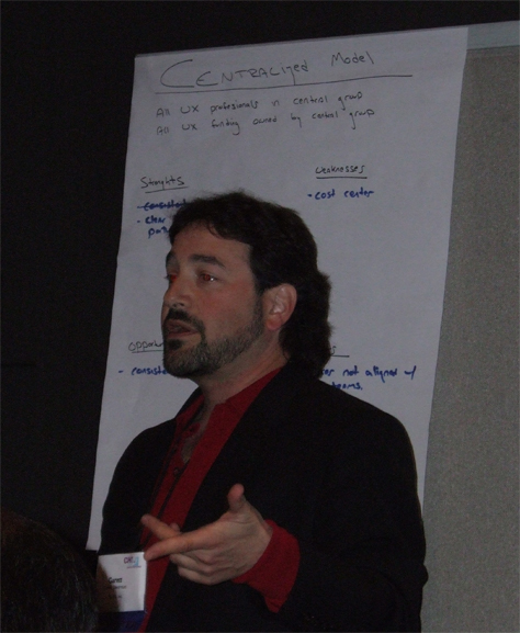
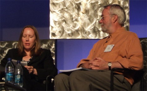
Day 3: “Get Real!” What’s Wrong With HCI Prototyping and How Can We Fix It?

Moderator: William Jones

Panelists: Victoria Bellotti, Mary Czerwinski, Jonathan Grudin, Tom Rodden, and Jared Spool

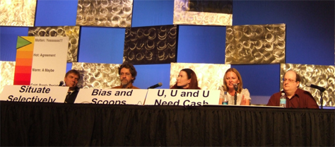
I really like the format of the interactive sessions at CHI, because they are truly interactive discussions—often on controversial topics. However, this interactive session didn’t live up to its description in the conference program, which promised a discussion of prototyping. “A prototype—as a means to evaluate and communicate a good idea—is often an essential step toward useful, shipping products and also toward a deeper understanding of what people really need.” Initially, I thought I might have landed in the wrong session. It was an uneasy amalgam of discussion about paper submission—I never did figure out what that had to do with prototyping—and user evaluation—not the creation—of prototypes. But there were some good people on the panel (shown in Figure 4), so I decided to slog through the very dull paper-submission detours in the hope of finding something interesting and was rewarded with some very lively discussion. I’ll report only the interesting bits. Figure 4 shows the panel.

The first nugget came from Jonathan Grudin of Microsoft who told us, “Overwhelmingly, prototype evaluations are done by friends of the prototype builders. They like the builders, so they want to say nice things. Later, you realize the product never made it into the marketplace. We never see a paper on why it failed. You see reports in the literature that are very promising and lead others down the same path. … Another problem I see today, there’s such a proliferation of products coming out.” Prototype builders suggest, “‘You evaluate my prototype, and I’ll evaluate yours.’ We shouldn’t evaluate our own prototypes.”

Victoria Bellotti of PARC asked, “What do we build prototypes for? Understandability, intuitiveness, usability, accessibility, efficiency, safety, usefulness. They improve some aspect of life.”

Mary Czerwinski, also of Microsoft, lamented, “In the visual information space, there are very few prototyping tools. So it’s a very costly enterprise. These prototypes require a lot of interesting transitions, which are costly things to prototype. You can’t really prototype these things very well—dynamic animations, transparency, rotations, translations, zooming, and so on. Users have to buy into your prototypes, so they’re willing to drop their daily tools. I don’t see a really good way around this—except some toolkits for information visualization.”

Figure 4—Panelists in the interactive session on prototyping
Panelists on prototyping

Not unexpectedly, the real gem came from Jared Spool, who began, “I want to take a different tack and talk about the importance of failure. So, I want to talk about me.” Jared proceeded to tell us the history of his early career before UIE, which constituted a litany of failure. He was fired from his first two jobs, then experienced problems working for some companies that failed. “And I learned from that” was Jared’s refrain. He worked for a company that went bankrupt. He got laid off. He was fired for a dress-code violation. “I learned from my own experience and started my own company, because I couldn’t hold a day job. So, failure turns out to be a really important thing that we learn from all the time. Apple has had a tremendous number of failures—the Lisa, the Newton.” There have been a lot of failures in the technology industry—Altavista, tablet PCs, Friendster. It’s important we talk about failure, so I want to talk about morbidity and mortality.” Jared’s monologue was one of the highlights of CHI for me. As always, he made me smile. Later, he said, “My position is comic relief.” Yes, indeed, and much more.

Then, Tom Rodden got on the failure bandwagon, saying, “We don’t celebrate failure enough.” He was absolutely right, of course, because without taking risks, there is no innovation, but when you take risks, you sometimes will fail. Tom brought the discussion back to prototypes by saying, “A prototype is the road to a product. Prototypes should support research.”

Victoria asked, “How many people think text-editing tools don’t need improvement? Software is simply appalling. Why aren’t people trying to improve things?” I heartily concur.

About prototyping, Jared said, “We don’t have platforms that let us prototype just one feature within an existing system.” To which Tom replied, “Open source. People are putting their toolkits out there.”

Jared told us, “We have clients that bring us multiple prototypes—three variants based on the same misconceptions. We dissect the failures and go from there.” Tom replied, “Instead of using words like success and failure, you should use other words like learning.” Jared came right back with, “I don’t think you learn anything from success. It’s when you fail that you can pinpoint problems, and that’s where learning comes from.” Victoria admitted, “I’ve never built a prototype that was entirely successful.” Then, Jonathan said, “But we aren’t getting reports on failures. It’s something we have to deal with.” Mary replied, “Sometimes the experimenter is very biased. You have to be aware of that and allow for it.” Tom asked, “If you haven’t had enough failure, have you been risking enough?”

Jared mentioned Apollo and frameworks and APIs that “let us build on top of other things. This kind of thinking is now prevalent.” Victoria replied, “It’s extremely difficult to build add-ons to existing software.”

Tom stated, “It isn’t that easy to identify success and failure.” Jared quipped, “In theory, theory and practice are the same, but in practice, they almost never are. Having a way to go back and look at what has and hasn’t worked is very useful.”

Mary said, “With the introduction of toolkits and programmability in software, I’m optimistic that prototyping will improve.” Victoria told us, “I’m very worried that people will become invested in their skills of using software. I’m very concerned that things being designed in a non-ideal way will continue.”

Jonathan concluded, “Now, there are better tools for prototyping, and the difference between prototypes and products is going away. You can put a beta up and get feedback very easily. The necessity for innovation is going away. There’s a greater need to evaluate what people are doing with what’s out there.”

Day 3: Moving UX into a Position of Corporate Influence: Whose Advice Really Works?

Moderator: Richard Anderson

Panelists: Jeremy Ashley, Shauna Sampson Eves, Justin Miller, Jim Nieters, Manfred Tscheligi, and Secil Tabli Watson

There is no more skilled panel moderator than Richard Anderson (shown in Figure 5), so I was eager to attend this interactive session. I was not disappointed. This session was a follow-on to a series of on-stage interviews Richard did back at CHI 1999, during which he discussed the various factors that limit the success of HCI within organizations with people such as Jakob Nielsen and Don Norman. Richard opened the session with a recap of the issues they had discussed, including

  • methodological limits
  • human limits
  • Web and Web design limits
  • organizational limits
Figure 5—Richard Anderson moderating
Richard Anderson

Figure 6 shows some organizational limits to HCI that were discussed at CHI 1999.

Figure 6—Organizational limits
Organizational limits

Figure 7 shows some impediments to moving user experience into a position of corporate influence this panel discussed. As Richard raised each issue, he asked each panelist to indicate whether he or she agreed or disagreed with a particular position by sitting on the left or right, respectively. So, each time he asked a question, a game of musical chairs ensued. This made the session a lot of fun. In some cases, panelists chose to sit in the middle to indicate they were neutral on an issue. Figure 8 shows the panelists in the interactive session.

Figure 7—Impediments to the corporate influence of UX
Impediments to the corporate influence of UX
Figure 8—Panelists in the interactive session
Panelists

Here are some highlights from the discussion:

  • Jim Nieters—“At Cisco, we don’t get involved in a project unless we own the UX. We need to be great team players.”
  • Secil Watson—“A lot of cross-disciplinary work goes into UX. Our group [at Wells Fargo] does own standards and guidelines. Our group owns the voice of the customer process. We lead through a vision of expertise. We need to make smarter solutions.”
  • Manfred Tscheligi—“It’s too much to be owned by one group.”
  • Jeremy Ashley—“UX is about quality. Everybody needs to be totally committed to quality. We’re part of a much larger structure. We have to figure out how to fit in that structure.”
  • Jim Nieters—“If we have a senior sponsor to support us, that’s what’s important. Having their advocacy is more important than anything else.”
  • Jeremy Ashley—“The challenge is positioning UX maximally within an organization.”
  • Shauna Eves—“It’s a shame we need executive sponsorship, but that seems to be true. Because what the team is doing is so important, you need to be working with executives who understand the value of UX.”
  • Secil Watson—“It’s important that you have a corporate sponsor that brings you to the forefront of key issues. It’s important to speak in the forum where strategic decisions are being made. If you can influence decision makers, that’s where you get leverage and credibility.”
  • Shauna Eves—“That should be the CEO who’s responsible for customer experience.”
  • Justin Miller—“At that level, you need to have everybody concerned about customer experience.”
  • Jim Nieters—“At Cisco, there’s a C-level manager for almost every function. Why not a Chief Experience Officer?”
  • Justin Miller—“Where I think we generally get stuck at eBay is we think about the user experience of the site. We need to think about the complete user experience—all aspects, customer support. A C-level person can look across the customer experience to create a holistic customer experience that expresses the brand value.”
  • Richard Anderson—“At eBay, estimating ROI (Return on Investment) was part of every project.”
  • Shauna Eves—“Calculating ROI is not a challenge for our organization.”
  • Jeremy Ashley—“If your company asks for ROI, your company doesn’t value UX. Better go to another company. When I present ROI arguments, I think we’re starting at the beginning. Executives hear voodoo economics. ROI is kind of like opening a fairly tale book.”
  • Justin Miller—“At eBay, as a company, we had much more demand than supply, so we estimated ROI for everything. Looking at ROI on a project-by-project basis is not the right approach. Now, we’re focused on initiatives like conversion rates. Are we able to move those metrics? We focus less on tactics, more on the big picture.”
  • Secil Watson—“Our challenge was prioritization. We had a lot of customer feedback. We created a hierarchical consumer task model, according to the frequency and importance of activities. We weren’t looking at ROI for a project or initiative, but customer tasks. How important is this to the company? Clearly, we could botch this. We understood where the natural tensions were between customers and business cases.”
  • Manfred Tscheligi—“At Mobilcom, ROI was based on several factors—internal performance measurements.”
  • Secil Watson—“At Wells Fargo, we’ve been doing ethnographic research for about four years. The results are phenomenal for us to impact product road maps and design. It’s allowed us to talk about customers—what the customer is saying—and show it to a group of executives—more than theoretical tools like personas.”
  • Justin Miller—“This has been a huge lever for us. It’s moved the organization from a situation of tactical optimization to a strategic approach. We do a lot of ethnographic studies every year, looking for cultural differences internationally. We ask executives to ride along, take notes, videotape. It provides a common understanding, and it’s provided a huge benefit.”
  • Jim Nieters—“We couldn’t do any of the work we do without ethnographic research. We don’t talk about ethnographic research as a separate practice. Executives appreciate the tangible results it delivers.”
  • Jeremy Ashley—“At Oracle, ethnographic research is part of our process. It helps inform our requirements and establishes positive relationships with customers.”
  • Shauna Eves—“Once you do the research, you need to go back and do it again. There’s nothing you can assume year to year.”
  • Jeremy Ashley—“We only justify ourselves with the product of our labors. The proof is in the pudding—what we deliver.”
  • Justin Miller—“You have to know how to influence your own organization—how to change.”
  • Jim Nieters—“You have to make an impact. Deliver value. Talk less. You have to have a leader who understands strategic flexibility. Find the right leader.”
  • Shauna Eves—“You have to hire the right people, trust them, give them the tools they need. Make sure your team is enabled.”
  • Secil Watson—“Think of yourselves as change agents. Start with people who are most sympathetic to your cause. If you really want to impact customer experience, know what will impact it the most.”

Day 3: Agile UCD

Moderators: Lynn Miller and Desirée Sy

Lynn Miller (Figure 9) and Desirée Sy (Figure 10) led an excellent SIG (Special Interest Group) on agile UCD (user-centered design). First, they described the agile UCD approach they use at Autodesk. They have two parallel tracks—a development track for the production of code and an interaction design track that also involves customer contact.

Figure 9—Lynn Miller
Lynn Miller
Figure 10—Desirée Sy
Desirée Sy

During Cycle 0, which is short—only two weeks—the team establishes a common vision and understanding of what they’re trying to build. They prioritize features according to user needs, business goals, and development effort—ranking everything as either must have or nice to have. Then, they plan the development iterations in two-to-four-week cycles. They don’t create any detailed requirements or design documentation. The UX team gathers customer feedback and does usability testing.

During Cycle 1, the development track focuses on the architecture and some critical features that don’t require a lot of design work, but do need a lot of engineering. That gets the developers working on something and gives the designers time to design. They’re always one cycle ahead of development. The UX team does contextual inquiries and usability testing. The developers understand the process they’re going through. They have daily scrum meetings, followed by discussions with the developers. They document usability test findings on issues cards—one major issue per card—then note changes on the back. When walking through the test results, they put the cards on bulletin boards—like feature cards. They do paper or whiteboard prototyping. They do walkthroughs during design and when testing prototypes. If they add a new feature, another feature comes out of the release.

Common problems designers encounter on agile projects include the following:

  • The cycles are too short for UX.
  • There is no Cycle 0.
  • UX is not on the agile team full time.
  • Members of the UX team are unhappy, frustrated, or demoralized by a drop in UX quality.
  • The UX team is overworked, because there isn’t enough time to design.
  • There’s no cycle planning or UX is not included in the planning.
  • Designs are implemented incorrectly.
  • Communication is poor.
  • There’s not enough user feedback.
  • Customer involvement is weak or non-existent.

Velocity engineering has worked really well for Autodesk, because it completely eliminated their estimating process. For white feature cards that represent well-understood features, they estimate effort, but not for pink cards, for which no design yet exists. The engineers break their designs down into white cards. They determine whether a feature is complete according to the usability criteria they’ve added on the back of each card. They’re honest about not knowing how long something is going to take. They use fudge factor cards to reserve unallocated design time. They test their documentation deliverables at the same time as their design. The UX team uses usability acceptance criteria to determine whether a design works the way it’s intended to work. Developers determine that there are no bugs. Quality assurance determines that their test suite passes.

The UX team needs to be involved in planning. They schedule longer cycles for hard design problems. At Autodesk, they’re using a mixture of XP, adaptive, and scrum.

Someone described field days at Yahoo! They take coders along on customer interviews. Designers also sit with coders while they’re coding. This helps build a common purpose.

At Autodesk, they coach, using oral storytelling to demonstrate customer needs and bring customers alive to the team. They show customer data to the team. Engineering and quality assurance love customer data.

When asked about their deliverables, the moderators said they solved poor communication by dropping almost all of their documentation. Instead, they use the issue cards. They do demos on whiteboards or create lo-fi prototypes. During a light version of Cycle 0, they create personas that represent customers and scenarios, including data files. Their product specifications are very light. They create a reverse chronology of all requirements. They use Breeze—open source online meeting software—chat, VoIP, and document sharing if they can’t do a live demo. They also do a daily walk to touch base with everyone on the team.

What’s the solution if UX resources are not assigned to an agile team full time? Each UX person should be on one scrum team. You can say no. Refuse to work on all products. Choose your scrum teams wisely. Get on customer-facing products that are important to the company. Work with teams who are doing agile better. If designers are on different projects, have a weekly design meeting to maintain consistency. Show one another what you're working on.

One participant suggested that a respected connector get buy-in. Otherwise, there is risk that a project will fail.

Day 4: Web 2.0 and the Enterprise: The Business Impact of Modern Technological Approaches to Web Application Design

Moderator: Jon Kolko

Panelists: Jeff Veen and Jonathan Grubb

This interactive session focused on designing Web 2.0 applications for the enterprise. Here are a few highlights:

  • Jonathan Grubb—“Please never say enterprise software again. I don’t really like enterprise software. Pretend you’re making consumer software. The process for designing them should be the same. Make software for people, not for customers. Make software for people in big companies. Start small and grow big. Most of the best companies constantly iterate, and if something doesn’t work, they try something else. Instead of going through steps and approvals, people just do their jobs. One great thing about Web 2.0 is that you can make money on much smaller products. Externalize as much as you can. Make it look nice. If you can make stuff that looks good, people will trust it more and use it more. The main point is, you’re making software for people. They’re just working for one company.”
  • Jeff Veen—“Business is selling attention.”
  • Jonathan Grubb—“If you’re going to be antisocial, you don’t get to socialize. Most people that start flame wars over the Internet aren’t like that face to face. How can you create a system that uses the same kinds of social pressures, so people aren’t rude and don’t lie or cheat?”
  • Jeff Veen—“The thing I like about tagging is that it’s insanely easy to use, and we’ve gotten rid of the controlled vocabulary.”
  • Jonathan Grubb—“Private versus public tagging is really different. Privately, you use tagging to remember something. Publicly, tagging is useful for both the person who’s tagging and opens it up for others.”
  • Jeff Veen—“I’ve dedicated my career to lowering the bar for participation—blogging, social networking, podcasting.”
Figure 11—Jeff Veen
Jeff Veen

Day 5: Comparing UXD Business Models

Moderators: Garett Dworman and Jim Nieters

Garett Dworman and Jim Nieters led a fascinating SIG on UXD business models, during which they analyzed various organizational models for UX groups. This SIG generated a lot of enthusiastic participation from the many UX managers in the audience. I won’t go into any detail about the content of the SIG here, because Garett and Jim have compiled the data they gathered during the SIG and written an article for this issue of UXmatters, “Comparing UXD Business Models.”

Figure 12—Garett Dworman moderating the SIG
Garett Dworman

Day 5: Closing Plenary: The Mobile as a Post-Industrial Platform for Socio-Economic Development

Presenter: Niti Bhan

Before introducing Niti Bhan, Dennis Wixon and Mary Beth Rosson reported on the attendance at CHI this year. Dennis said, “This was the most successful CHI in five years,” with 2,622 attendees from 45 different countries. To commemorate the 25 years of CHI, Mary Beth asked attendees to stand when she called out the year in which they first attended CHI, starting with the first CHI in 1982. My first CHI was in 1992, at Monterey. Of course, by the time she made it through the entire succession of years, everyone was standing. It really was a celebratory moment.

Niti Bhan’s closing plenary began with an extended slide show of images depicting technology products and scenes of life in India. Initially, the crowd was very still. You could have heard a pin drop, as people tried to identify a theme behind the images. But as the slide show went interminably on and on and people were unable to make rhyme or reason of the images, the crowd began to buzz. Finally, people stopped paying attention to the slide show and began talking among themselves. The increasing disquiet of the crowd culminated with the people across the back of the room doing the wave, as shown in the video in Figure 13.

Figure 13—The wave

After the slide show, the audience wasn’t in a very receptive mood. Unfortunately, Niti Bhan’s closing plenary lacked substance. One fellow conference attendee likened it to a sandwich with no filling. Her introduction was prolonged and seemed to segue directly into her conclusion. Figure 14 shows Niti Bhan giving the closing plenary. Here’s my favorite quotation from her talk:

“We all work to understand the user, but nobody is working to understand what happens to the village.”—Niti Bhan

Figure 14—Niti Bhan
Niti Bhan

I wanted to like Niti Bhan’s talk. She has a mellifluous voice, a pleasant demeanor, and is obviously comfortable speaking before large audiences. I fault the conference organizers’ timing, in asking her to speak about research she’s not yet begun.

Following the closing plenary, the Conference Co-Chairs for CHI 2008, Mary Czerwinski and Arnie Lund, announced its location at the Fortezza da Basso Convention Center in Florence, Italy. The theme of CHI 2008 will be Art • Science • Balance. Ben Schneiderman came onstage, masquerading as Leonardo da Vinci, and said, “If Leonardo was alive today, he’d be working on his paper for CHI 2008.” All the volunteers working on CHI 2008 then came up onstage and lobbed miniature soccer balls at the audience.

Proceedings and Other Things

At CHI 2007, each attendee received a nice, gray canvas bag, with zippered compartments, pockets, and pen holders, and both handles and a shoulder strap. Attendees received both a printed Conference Program and a Conference Proceedings and Extended Abstracts DVD. The Conference Program provided detailed information on every session and event. No conference provides a better designed or more usable Conference Program than CHI, which truly sets the standard for excellence. The program was sturdy enough to stand up to heavy use, with thick, coated covers and a Wire-O® binding. Tabbed sections made it easy to find general conference information, the programs for each day of the conference, posters and exhibits, and the index. The Conference Program included the following well-designed features:

  • “2007 Conference at a Glance”—which provided an easy-to-use overview of the entire conference on two facing pages inside the front cover
  • both a table of contents and a presenters index
  • descriptions of the different types of sessions the technical program comprises
  • information about special events
  • overviews of each day’s events—I wish they’d included the names of presenters.
  • detailed descriptions of sessions and courses—They still aren’t tagged by community of practice though.
  • a Commons Map at the front of the section on posters and exhibits
  • maps of both levels of the San Jose Convention Center, adjacent hotels, and downtown San Jose

I was glad to see a message to presenters on the CHI 2007 home page, encouraging them to post their slides on SlideShare, but very few have done so. This community isn’t quite as progressive as the IA Summit community. There are a few videos on YouTube, but no podcasts.

Each attendee also received a baseball cap commemorating the 25th anniversary of CHI.

Venue

It was great having CHI 2007 here in the Silicon Valley, which made attending the conference easy for the many UX professionals who work in its technology companies. Unfortunately, the conference organizers did not reserve the entire San Jose Convention Center for CHI 2007. They should have. If they had, they would have avoided the overcrowding problems I described earlier. There were also sessions in the Civic Center, which was an ideal room for the plenary sessions, and the San Jose Hilton. Fortunately, the signage at the conference was great—and necessary with sessions and hospitality events scattered across so many different buildings.

The driving force behind the planning of CHI is the need for academics to publish papers. The number of papers CHI accepts dictates the number of papers sessions and, consequently, the number of rooms CHI must dedicate to them. The large number rooms CHI carved out for papers sessions in combination with the unusually high attendance at CHI this year made finding adequate space for other types of sessions difficult and, in some cases, even impossible.

During the part of the “‘Get Real!’ What’s Wrong With HCI Prototyping and How Can We Fix It?” interactive session that focused on paper submissions, William Jones said, “Submission rates are so high compared to the available space,” making apparent the source of the problem.

Hospitality and Special Events

On Sunday, April 28, the first night of the conference, I met up with friends at the Networking Gathering on the Concourse, where refreshments were served. Later, I went to the Sponsors’ Reception, which is always a pleasant gathering that’s great for networking. There was some very nice, live acoustic music at the reception.

While CHI doesn’t serve lunch to its attendees, they do offer refreshments at morning and afternoon coffee breaks. Plus, with receptions and company-sponsored hospitality events every night during the conference, CHI 2007 gets high marks for hospitality.

On Monday, CHI served an excellent luncheon for Interactions editorial board members. This is the last year of Elizabeth Dykstra-Erickson (Figure 15) and Jonathan Arnowitz’s (Figure 16) tenure as Co-Editors in Chief of Interactions, so we celebrated their many successes. Monday night, the Conference Reception and Exhibits Grand Opening took place in the Commons. They served exotic foods from various locales. Though there was a Chinese dragon parade, the entertainment this year was notable mostly for impeding conversation, because of the volume of the Taiko drums. Combining socializing, entertainment, food, and 46 exhibits in one room was really too much, and the glaring lights of the exhibit hall didn’t lend the appropriate festive atmosphere to the reception. At least, this year, the Posters were on the Concourse rather than in the exhibit hall. All 156 of them.

Figure 15—Elizabeth Dykstra-Erickson
Elizabeth Dykstra-Erickson
Figure 16—Jonathan Arnowitz
Jonathan Arnowitz

The Job Fair took place in the Commons early Tuesday evening. Recruiters from 26 companies were present. Many Silicon Valley and other technology companies were actively recruiting throughout the conference. Tuesday night, I missed the eBay hospitality event at the Tech Museum. Since the eBay event wasn’t announced in advance, Mike Van Riper and I had arranged the BayDUX/UXnet dinner that night, at Il Fornaio, an excellent Italian restaurant just across the street from the Convention Center.

Wednesday was the big night for hospitality events. I made it to the Microsoft and Cooper events at the Marriott, missed the Intuit event at the Fairmont Hotel, went to the Google event at the Tech Museum, where I ate an excellent vegetarian curry, and finished off the night at the premium Morgan Kaufmann event at Paolo’s Restaurant, where they served wonderful food.

After the conference closed on Thursday, CHI held its Anniversary Party, celebrating 25 years of CHI with an ice cream social. Then, a bunch of us went to the IxDA F2F at The Loft. From there, we went to the CHI Volunteers’ Party, where there was a DJ and dancing, and afterward tried to find somewhere else to dance, but ended up hanging out in the lobby of the Fairmont, talking till the wee hours.

CHI can be a lot of fun!

Community

One of the most wonderful things about CHI is the diversity of its audience. The CHI community is both truly international and includes UX professionals in every specialty. For many of my designer friends, CHI is an annual pilgrimage. They make the trek to CHI year after year to renew connections with their friends and peers from around the world.

Unfortunately, there really are two communities at CHI: the academic community, which CHI serves very well—perhaps even exists to serve—and the practitioner community, which CHI serves less well. Despite the schism that exists between these communities, each community strongly participates in CHI.

The vibrant practitioner community is what attracts design professionals to this conference, despite the failings of CHI that I described earlier. If you want to gather with UX professionals in all specialties, who work on all kinds of products and platforms—from applications and operating systems for computers, the Web, mobile phones, and other digital devices—this is the conference. No other conference put on by a professional association serves such a broad audience.

The social aspect of CHI is what I enjoy most, so I made the most of this opportunity to renew friendships and make new friends among my peers whenever I found myself with nothing else to do at the conference.

Conclusion

I had a wonderful time at CHI despite the limited amount of content for designers and my being unable to get into the courses I’d wanted to attend. I particularly regret missing Kim Goodwins course, “Where Usability Meets Desirability: Visual Design with Personas and Goals.” I heard it was great. To enable CHI to reach its full potential in coming years, I hope its organizers take an iterative approach to designing the conference and solve the problems that exist. 

Photos by Pabini Gabriel-Petit

Principal Consultant at Strategic UX

Founder, Publisher, and Editor in Chief of UXmatters

Silicon Valley, California, USA

Pabini Gabriel-PetitWith more than 20 years working in User Experience at companies such as Google, Cisco, WebEx, Apple, and many startups, Pabini now provides UX strategy and design consulting services through her Silicon Valley company, Strategic UX. Her past UX leadership roles include Head of UX for Sales & Marketing IT at Intel, Senior Director of UX and Design at Apttus, Principal UX Architect at BMC Software, VP of User Experience at scanR, and Manager of User Experience at WebEx. Pabini has led UX strategy, design, and user research for Web, mobile, and desktop applications for consumers, small businesses, and enterprises, in diverse product domains. Working collaboratively with business executives, multidisciplinary product teams, and UX teams, she has envisioned and realized holistic UX design solutions for innovative, award-winning products that delighted users, achieved success in the marketplace, and delivered business value. As a UX leader, she has facilitated conceptual modeling and ideation sessions; written user stories; prioritized product and usability requirements; established corporate design frameworks, standards, and guidelines; and integrated lean UX activities into agile development processes. Pabini is a strategic thinker, and the diversity of her experience enables her to synthesize innovative solutions for challenging strategy and design problems. She is passionate about creating great user experiences that meet users’ needs and get business results. A thought leader in the UX community, Pabini was a Founding Director of the Interaction Design Association (IxDA).  Read More

Other Columns by Pabini Gabriel-Petit

Other Articles on Conference Reviews

New on UXmatters