Top

Home Page Design

August 6, 2007

It is time to review a company home page design. There are a number of stakeholders involved in home page design, and each of them wants a piece of the home page real estate. Are there questions you can ask before approaching home page design that can move it beyond the influence of specific stakeholders in the company toward a common vision? Are there tips to consider when designing a home page? This article will help you better understand how to approach home page design.

The Front Door Value

What is the value of the front door of a business? For some businesses, it’s their face to the world. Looking at the front door shown in Figure 1:

  • What is your impression when you see this?
  • What type of business do you think this is?
  • What do you think you can do when you go through the gates?

Champion Advertisement
Continue Reading…
Figure 1—Luna Park, an amusement park in Melbourne, Australia
Luna Park

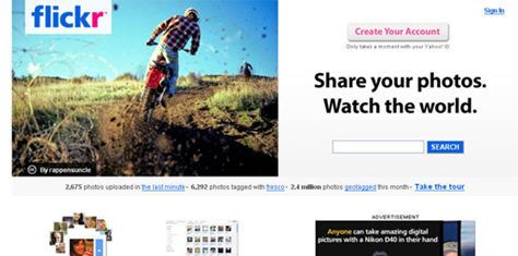
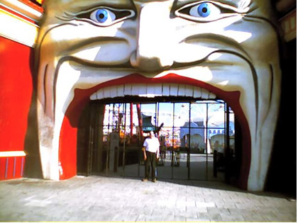
For other businesses it’s a logo like that shown in Figure 2:

  • What type of business is this?
  • Is there any content missing from this signage?
  • What impression do you get when you look at the logo?
Figure 2—J.J Express, a take-away restaurant in Melbourne, Australia
J.J Express

The Most Important Page—Or Is It?

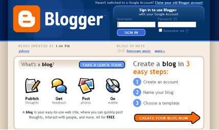
Often, both customers and the business itself see the home page as one of the most important pages on the Web site. It’s a place to present key information about products, services, and special offers; contact information; and calls to action—giving customers direct access to what they need quickly. So customers can serve themselves through the home page.

“Home pages are the most valuable real estate in the world. … A home page’s impact on a company’s bottom line is far greater than simple measures of e-commerce revenues. The home page is your company’s face to the world. … The home page is the most important page on most Web sites and gets more page views than any other page.”—Jakob Nielsen

For many users, the home page is a place where, if they get lost, they can start their journey again. Users often want to return to a site’s home page to reorient themselves. We often see this happen during usability testing. For a business, the home page offers an opportunity to communicate their value to the world—particularly as it relates to their products and services. Therefore, ideally, a home page should reflect and balance business objectives and user needs.

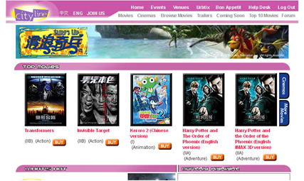
Other Landing Pages, Too?

In his article “Is Home Page Design Relevant Anymore?” Jared Spool of UIE pointed out that many users are bypassing the home page, going directly to whatever page satisfies their content need. So, it’s important for all your key landing pages to perform a similar role to the home page. According to Spool:

“A growing number of sites… see a lot of traffic that bypasses their site’s home page, going directly to content pages. As a result, these landing pages—the first page on your site the user encounters—have to perform the same functions as your home page, for these users. That turns out to be a lot easier than many designers think, mostly because they usually don’t really understand the true functions of a home page.

“In studying users visiting sites, we learned a long time ago that there are only two important functions for a home page:

  • The home page delivers the content to [users] that they are seeking—such as the top story on CNN—or
  • The home page provides strong scent to those pages that contain the content the user seeks.

“Those are the only two things users care about on a home page. (Lots of designers try to make the home page serve other functions, such as [telling] the user about things the organization cares about, but the user doesn’t—such as financial news about the business or what new products are on sale—but users blow right past this content and pay no attention to it. We’ve found it’s all a waste of valuable design resources.) When designers focus on just these two things on the home page, users tell us the site is substantially more usable.”

Fighting for Real Estate

The main issue we have seen on projects that involve the design or redesign of home pages is departments fighting for a higher profile and better positioning on the home page. Everyone wants a prime piece of real estate on the home page to get customers’ attention. Often, whoever in the company shouts the loudest or has critical company announcements or fancy marketing campaigns drives the outcome of the battle for home-page real estate.

What Do Customers Want?

When customers visit your home page, their attention span is limited. They are busy and want to find answers quickly. They don’t want unnecessary distractions and will immediately leave and go to another site if they cannot find what they want on your home page. They do not want to wade through marketing messages.

When customers arrive at your home page, they expect to find what they want quickly. After all, the promise of the Web is to provide an efficient, alternative channel that complements other channels like bricks-and-mortar shops and corporate customer support.

When customers visit a home page—whether for the first time or as repeat visitors—they might want to

  • satisfy an information need quickly
  • look for contact information like a phone number or email address
  • autonomously complete a task, without needing customer support
  • solve a problem
  • buy a product

What Does the Business Want?

The business also has needs it wants to satisfy:

  • selling products
  • increasing the number of successful transactions
  • saving money—by moving transactions from other channels to the Web
  • publishing company news and financial results

Sometimes, business needs and customer needs do not match.

Content Priorities

The challenge is: What content should a company give highest priority on its home page? Often, certain stakeholders within an organization want to push their content onto the home page to demonstrate their value, without any real regard for business needs, user benefits, or returns on investment (ROI) via the Web channel.

When defining content and design strategies for your company’s home page, consider the following questions:

  • Who are your customers?
  • How do customers currently use your home page?
  • What tasks do customers want to complete when they visit your home page?
  • What content are customers looking for via your home page?
  • How can you help customers find the information they need via your home page?
  • What are the strategic goals for your home page?
  • What are you trying to sell via your home page?
  • What are your business objectives?
  • How do your business objectives map to your home page goals?
  • How does the business measure the success of the home page?
  • What are you saying on your home page now?
  • What are your competitors doing, and how can you innovate?
  • How does the home-page design communicate to customers now?
  • Where are users going from your home page?
  • What search terms are customers using?

A Five-Second Test for Your Home Page

In her article “5-Second Tests: Measuring Your Site’s Content Pages,” UIE’s Christine Perfetti wrote:

“As the name suggests, the 5-Second Test involves showing users a single content page for a quick 5 seconds to gather their initial impressions. Five seconds may not seem like a lot of time, but users make important judgments in the first moments they visit a page. This technique unveils how those judgments turn out, giving the team insight into some essential information about the page. …

“As we often do in other types of usability tests, we start by giving users a focused task … Next, before we show the user our page, we tell them we'll only display it for 5 seconds. We ask them to try to remember everything they see in this short period. Once the user views the entire page for 5 seconds, we remove it by either covering it up or switching to another window. Then, we ask them to write down everything they remember about the page. When they finish jotting down their recollections, we ask… questions to assess whether users accomplished the task.”

When we’ve applied the idea of a five-second test to home pages, we’ve asked subjects the following questions:

  • What is the company’s core business?—The answers let you know whether the design framework supports the company’s business direction. For example, does it convey the intended business image—whether serious, fun, consultative, helpful, or so on?
  • What captures your attention? Are there elements on the home page that draw your attention immediately?—The answers tell you whether these are the elements to which you want to draw customers’ attention. Do the attention-getting elements help move customers into paths that will benefit the business?
  • What do you think you can do on the home page?—The answers can help ensure you optimally support the tasks on which most customers are focusing.

We might test a number of different home pages to see whether users can recognize design patterns, asking: Are there any common elements you’ve seen on the home pages we’ve shown you? Once a user has had some time to look at the various designs, we’ve documented issues that we can translate into design and business improvements.

Usability Walkthroughs

Usability walkthroughs can help you understand home-page designs. Let’s walk through several example home pages, thinking about answering the following questions;

  • What is the company’s core business?
  • What captures your attention?
  • What do you think you can do?

You can complete such walkthroughs quickly, but it’s important to make sure you have the right stakeholders involved.

Note—In my observations about each design example, I have indicated which of the design choices are good for users, for the business, or for both. Many are good for both. That’s a good thing!

Flickr

Here are my observations about the Flickr home page, which appears in Figure 3:

  • The photo on the left has prominence, indicating this might be a site having to do with photos. (Good for users; good for business.)
  • There is a clear statement of what is core to the Flickr service: Share your photos. (Good for users; good for business.)
  • The standard placement for Sign In, in the upper-right corner, is useful for returning users. (Good for users; good for business.)
  • The Create Your Account button provides a clear call to action. (Good for business.)
  • Repeat users can search for photos. (Good for users; good for business.)
  • Following an emerging pattern, the corporate logo is in the standard location in the upper-left corner. (Good for business.)
Figure 3—Flickr home page
Flickr home page

Blogger

From my usability walkthrough of the Blogger home page, shown in Figure 4, I made the following observations:

  • The Create Your Blog Now widget provides a clear call to action. (Good for business.)
  • There is a description of what a blog is for those who do not know. (Good for users.)
  • The standard placement for Sign In, in the upper-right corner, is useful for returning users. (Good for users; good for business.)
  • Following an emerging pattern, the corporate logo is in the standard location in the upper-left corner. (Good for business.)
Figure 4—Blogger home page
Blogger home page

Cityline

Here are my observations on the Cityline home page, which is shown in Figure 5:

  • In the primary navigation bar at the top of the page, users can find films under either Movies or Cinemas. (Good for users; good for business.)
  • The Buy buttons provide a clear call to action. (Good for business.)
  • Following an emerging pattern, the corporate logo is in the standard location in the upper-left corner. (Good for business.)
Figure 5—Cityline home page
Cityline home page

Do Your Own Usability Walkthrough

Try doing a usability walkthrough on your own now, on a home page or key landing page of your choice. How does the home page help users get to what they need quickly, and how does it help the business meet their objectives?

Million-Dollar Home Pages

As Christine Perfetti wrote on the UIE Brain Sparks Blog, “The Million Dollar Homepage is an innovative site created by college student Alex Tew to help raise money for his college education. Alex’s business model involved selling the one million pixels displayed on the home page for $1 per pixel. The business experiment turned out to be a huge success—Alex sold all of the ad space.” Figure 6 shows The Million Dollar Homepage.

Figure 6The Million Dollar Homepage
Million Dollar Homepage

Not every business can have a million-dollar home page, but starting with these three simple questions can help you get more clarity and better insights about what your home page should be—now and in the future.

  • What is the primary goal for the home page?
  • How will the content on the home page and the tasks it supports benefit customers?
  • How will this content and these features benefit the business, in turn?

Your home page should provide self-service access to information, so users need not rely on other information channels to answer their basic questions. In my experience, home pages often provide customers with no other choice but to call a company directly to get the answers they need.

Design Tips for Home Pages

To create successful home-page designs:

  • Find out what users’ high-priority tasks are.
  • Provide good visibility for these high-priority tasks.
  • Use user-centric language, not internal, company language.
  • On the primary navigation bar, present items of interest to customers first, then place links to information about the company toward the end of the navigation bar.
  • Provide a clear path back to the home page on the primary navigation bar, using the label Home.
  • Critical content should be above the fold on the home page.
  • Clearly differentiate widgets from content—for example, key sections, buttons, and so on.
  • Do not use pop-up windows.
  • Do not display Flash splash pages before allowing users to get to the home page.
  • Show the date and time when the home page content was last updated. 

Bibliography

Barker, Iain. “Full Site Redesign? Start by Addressing the Home Page.” CM Briefing, May 4, 2006. Retrieved July 20, 2007.

Gaffney, Gerry, and Daniel Szuc. The Usability Kit. Collingwood, Australia: SitePoint, 2006.

Nielsen, Jakob. “Top Ten Guidelines for Homepage Usability.” Alertbox, May 12, 2002. Retrieved July 31, 2007.

Perfetti, Christine. “5-Second Tests: Measuring Your Site’s Content Pages.” User Interface Engineering, June 9, 2005. Retrieved July 20, 2007.

—— “Branding and the Million Dollar Homepage.” UIE Brain Sparks Blog, January 25, 2007. Retrieved July 20, 2007.

Rogowski, Ron. “What Do Consumers Expect From Corporate Home Pages? Forrester, March 3, 2007. Retrieved July 31, 2007.

Spool, Jared. “Is Home Page Design Relevant Anymore? UIE Brain Sparks Blog, September 29, 2005. Retrieved July 20, 2007.

Straub, Kath. “Where Are You When I Need You??? (Or… Ending the Search for Search).” Human Factors International, “UI Design Newsletter,” February 2006. Retrieved July 20, 2007.

Szuc, Daniel. “Walking Through Your Product Design With Stakeholders.” UXmatters, June 4, 2007. Retrieved July 20, 2007.

—— “Why Do Big Companies Keep on Getting It Wrong? Apogee, January 24, 2002. Retrieved July 20, 2007.

The Million Dollar Homepage. Retrieved July 31, 2007.

van Welie, Martijn. “Homepage.” Patterns in Interaction Design. Retrieved July 31, 2007.

Principal Design Researcher at Apogee Asia Ltd.

Hong Kong

Daniel SzucOriginally from Australia, Dan has been based in Hong Kong for over 20 years. He is a co-founder of both Make Meaningful Work and UX Hong Kong. Dan has been involved in the field of User Experience for more than 20 years. He has lectured on user-centered design globally and is the co-author of two books: Global UX, with Whitney Quesenbery, and Usability Kit, with Gerry Gaffney. He is a founding member and Past President of the UPA China Hong Kong Branch and was a co-founder of the UPA China User Friendly conferences. Dan holds a BS in Information Management from Melbourne University Australia.  Read More

Other Columns by Daniel Szuc

Other Articles on Content Strategy

New on UXmatters