Top

Procedures: The Sacred Cow Blocking the Road

User Assistance

Putting Help in context

A column by Mike Hughes
November 19, 2007

If this column’s title sounds familiar to you, the bad news is you’re getting old, but the good news is your memory hasn’t gone yet. It was the title of a presentation I gave at the STC conference in Anaheim ten years ago. However, many of the points I made in that talk are still relevant to user assistance today, so I would like to update some of them and offer some new thoughts as well.

When product teams ask technical writers to document software products, writers usually start their projects by analyzing the tasks users will perform when working with them. A task analysis generates a list of procedures—plus the supporting information users need to follow them—and eventually results in a document in which sequentially numbered instructions are the dominant type of information—neatly organized under user-centered task headings and preceded by enabling knowledge. It sounds ideal, classical even. The problem? Users don’t read procedures.

Champion Advertisement
Continue Reading…

In spite of the respect and attention we give to the sequential, numbered steps that tell users how to achieve a given task, that form of information delivery just doesn’t match the typical user’s information-seeking behavior.
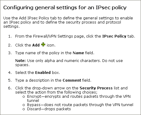
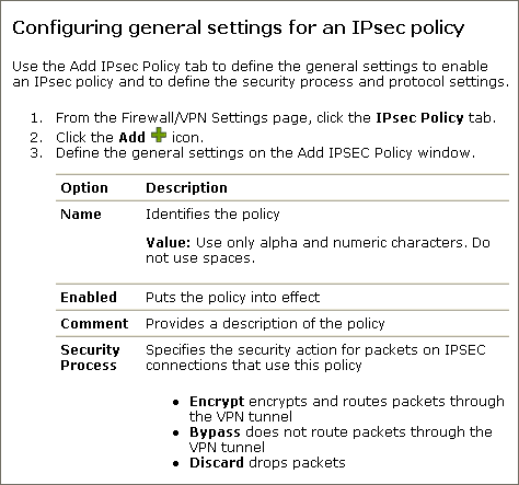
User Behavior

Two principles best describe how people use Help:

  1. People don’t go to Help unless they feel stuck.
  2. People stay in Help only until they feel unstuck.

It takes a surprisingly short amount of time for a user to feel unstuck. When I was a usability consultant, I used to advise clients to put the critical information in the first three words of a sentence. Here’s an example that demonstrates why this is important: The message “Create a directory for your XYZ product or click OK to use the default directory” often resulted in users unnecessarily creating a new directory and complaining about having to do so. The alternative, “Click OK to use XYZ product’s default directory, or if you want, create a new directory” was much more effective. Users often clicked OK without reading the whole message and suffered no harm—in fact, they did what the software developer preferred.

The three-word rule might seem restrictive, but it reflects the fact that good technical writers start instructions with a command verb that is closely followed by its direct object. Therefore, readers often have enough information to take action within three words. Unfortunately, that does not mean they have enough information to take the correct action.

A striking illustration of this fact came from a usability test I did, during which users installed a modem in a notebook computer. In one case, it was essential that a user load an installation diskette before inserting the modem into the computer’s card slot. Step 1 on the Quick Installation card was explicit about this requirement:

  1. Install the Modem Installation diskette before doing anything else.

One user read this as “Install the modem,” immediately quit reading further, and inserted the modem card into the card slot. To solve this problem, the writer reworded the instruction to say “Insert the diskette labeled…” This demonstrates how quickly users shift from reading documentation to doing something with a product. If they are this willing to abandon reading an instruction in mid-sentence, what hope is there that they will read an entire procedure?

Users’ Behavior Versus Procedures

There are some some basic mismatches between users’ behavior and the characteristics of procedures, as Table 1 shows.

Table 1—Mismatches between users’ behavior and procedure characteristics
Users… Procedures…

often have already begun a procedure, then get stuck and finally need to go to Help

start at step 1, requiring users to read—or at least skim—information that has no value to them in solving their current problem (See The MapQuest Phenomenon later in this column.)

might need to know only an important principle or rule to successfully complete a task

embed principles and rules within specific steps that require them, so users might miss them if they skip that step

are often in the wrong place in a program to perform a task when they refer to the documentation

often assume users are in the correct place to perform a task, so users might try to follow a procedure from where they are with undesirable results

might already have done something wrong that precludes the possibility of their successfully completing the procedure by following the instructions

often assume the right conditions for performing a task are in place, with the result that the instructions seem wrong to users and frustrate them

want information in the smallest chunks possible

deliver information about an entire task at once

Note—The last characteristic summarizes the basic mismatch between users’ needs and procedural characteristics: Users don’t want to know the whole answer; they just want to know the small part that has them stuck.

Some Practical Implications for Help

Wait, don’t stop writing procedures! Let’s just think differently about how we write them and how we present them. The discussions that follow provide some tips for mitigating some of the mismatches between user behavior and procedure characteristics.

The Choice Table

My wife thinks the Nobel Prize committee should give awards to people who really contribute to society, such as the inventor of the zip-lock bag. Thinking along similar lines, I would give a prize to whoever invented multi-level undo and the choice table.

A choice table is a simple, yet elegant device for displaying useful information in a procedure in such a way that frenzied, time-constrained users can easily scan it. Additionally, choice tables can eliminate the preponderance of verbiage that describes obvious interactions with a user interface. Consider the procedure that Figure 1 shows.

Figure 1—A step-by-step procedure
Step-by-step procedure

Now, let’s look at how that same procedure can benefit from using a choice table, as shown in Figure 2.

Figure 2—A procedure with a choice table
Procedure with a choice table

A couple of things to note:

  • A user can easily scan the references to specific fields in a user interface in the second example’s choice table. In the first example, the fields are buried within the instructions.
  • Using a choice table helps writers avoid specifying obvious actions such as type and click and stay focused on value-added content.

The MapQuest Phenomenon

Have you ever noticed that, when you get directions from a Web map application like MapQuest, the first half of the page tells you how to get out of your own neighborhood? In all likelihood, you already know how to do that. A similar situation can occur in online Help with context-sensitive links. If a user is already viewing the relevant topic when she clicks Help, navigation instructions are a waste of time. On the other hand, if a user gets to a topic through the Help table of contents, index, or search, she’ll need those navigation instructions. This is not a big problem if the navigation involves just a single step. However, for some multi-console systems, navigation instructions can be quite complex, because a user can navigate in a number of different ways, depending on which console she might be working from.

The example in Figure 3 shows how you can pull such steps out of the procedure for a task by creating a special topic for navigation, then making it a prerequisite for the procedure. Now users who are already in the right place to perform a task are not confronted by a bunch of unnecessary instructions—in effect, the directions for how to get out of their own neighborhoods.

Figure 3—Prerequisites for a procedure
Prerequisites for a procedure

This technique is not limited to just navigation. You can use it in any situation in which you want to keep a procedure focused on a clearly defined user and a specific task and deal with exceptional cases through linked information.

Non-sequential Task Information

Writers tend to favor procedures, because they know users are task oriented. However, not all tasks are sequentially constrained. And sometimes users just need a quick overview of what they can do or some critical tips for using an application. (See my column “Anatomy of a Help File” for a fuller discussion of task support clusters and keystone concepts.) Figure 4 shows a context-sensitive link’s target topic, which gives a lot of task-oriented information, but does not offer a step-by-step procedure.

Figure 4—Target topic
Target topic

Conclusion

Users do not remain in online Help for long periods of time. So, not only must Help topics be modular and self-contained, elements within topics must be directly accessible and self-contained as well. Procedural information must accommodate a reader, for example, who has already figured out how to complete steps 1 through 4 before ever going to Help and would be discouraged from continuing to read the Help if she felt she must wade though instructions on how to do stuff she has already done or information she already knows.

Using choice tables and tailoring information for primary users won’t keep users in the Help for longer periods of time, but it does ensure they’ll get to the information they need in the brief period of time they are willing to be there at all. 

UX Designer at TSYS

Atlanta, Georgia, USA

Mike HughesIn his role as User Experience Architect for IBM Security, Mike’s professional focus is on designing usable user interfaces that accommodate the user as learner. Previously, as User Assistance Architect at IBM, Mike identified tools, methods, and standards for integrating the content and delivery of user assistance, including documentation, Help, elearning, and training. He was formerly Lead UX Designer for CheckFree Corporation, where he instituted their User Experience Research and Design Center. Mike has a PhD in Instructional Technology from the University of Georgia and a Masters in Technical and Professional Communication from Southern Polytechnic State University. He is a Fellow with the Society for Technical Communication and a Certified Performance Technologist through the International Society for Performance Improvement.  Read More

Other Columns by Mike Hughes

Other Articles on User Assistance Design

New on UXmatters