Top

Starting from Zero: Winning Strategies for No Search Results Pages

Search Matters

Creating the ultimate finding experience

A column by Greg Nudelman
February 9, 2009

Search results pages are some of the most visited pages on typical ecommerce sites—to say nothing of a search engine like Google. Many articles appear each year about optimal search algorithms, database performance, and the like. In contrast, very few publications focus on improving the search experience from the customer’s perspective. My new column Search Matters aims to fill this gap by focusing on:

  • best practices of search user interface (UI) design
  • design patterns and strategies for improved search user interfaces
  • common search UI pitfalls
  • how to use search to provide maximum value to customers and your business
  • practical search UI matters that have strategic impact on your customers’ Web site experience

Champion Advertisement
Continue Reading…

During my career, I have designed diverse search user interfaces—for loan matching, large ecommerce, and social networking sites. With the goal of discovering innovative search strategies, I have led participatory design sessions for search user interfaces involving the home page, gallery pages, catalogs, and many others. Most importantly, I have watched over 100 people use various search interfaces as part of my field and lab studies. My design work in the search domain has led me to become intimately familiar with winning strategies for search user interfaces that involve diverse inventories and complex products. As you can see, the topic of search UI design has been the focus of much of my work. Based on this work, I have previously published two articles on search UI design and search caching strategies in the magazine JavaWorld.

Since this is the first installment of my column, it makes sense to begin from zero, with the no search results page. “Starting from zero, got nothing to lose,” as the Tracy Chapman song goes—so we can hardly do worse.

Starting from Zero

The typical product team has no coherent strategy for cases when there are no search results. Most teams spend the bulk of their design phase working on the search results pages for a successful search. Then, at the last minute, the engineers hurriedly slap something together for the no search results page and launch. Such an approach is detrimental to the success of a search experience. Search, more than any other activity on your Web site, is a living, evolving process of discovery, a conversation between a customer and your system. Unfortunately, misunderstandings in this conversation are all too common, and the effectiveness of the page that appears when there are no search results is critical to keeping the customer engaged.

In my experience, the effort and ingenuity a team invests in the no search results page is indicative of its overall dedication to customer success. Ignoring such a search results page virtually guarantees failure and obscurity. On the other hand, focusing on the needs of the customer, who holds the wallet, and thinking creatively about the case when there are no search results can turn a temporary snag in communication into an opportunity for deeper connection and a source of tremendous competitive advantage.

No Search Results Page: Your Key to Competitive Search Advantage

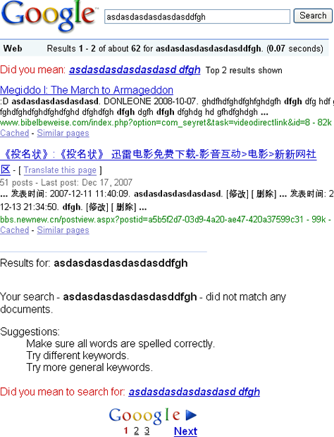
To see how original thinking about the no search results page can revolutionize an entire industry, consider the history of Google. A relative latecomer to an already saturated search market, in which it no longer seemed possible to invent anything new, Google blew away all competition through their unapologetic dedication to customer success. One critical innovation was the Google Did you mean… feature, which gave the process of discovery a safety net and made exploration more fun. This feature was the deliberate result of original thinking about how to help correct the misspellings that were a common cause for the appearance of the no search results page. Controlled vocabulary substitution redefined the way Google does search, and today, the Did you mean… feature shown in Figure 1 is considered a virtual necessity for a successful search implementation.

Figure 1—The Google Did you mean… feature
Google Did you mean feature

If you want to create a killer search app, I recommend you begin with the no search results page. Starting from zero forces your team to address the most difficult design questions up front and honestly assess your engineering budget and capabilities. More importantly, your team can define the entire search UI design problem more precisely—in a compelling and possibly even original way.

No Search Results Strategy: Not a Zero-Sum Game

There is no set of rules that guarantees a successful no search results implementation. However, by studying various search UI implementations, I’ve come up with three useful design directions:

  1. Don’t be afraid to say I did not understand. Clearly indicate there are no search results, so the customer can recover.
  2. Focus on providing a way out. Make sure every control on the page does something productive to help resolve the no search results condition.
  3. Focus on the customer’s goal. Provide the most relevant recovery content first, while staying as close as possible to the customer’s original intent.

Let’s look at some examples of how we can combine these design directions creatively to develop compelling experiences and business opportunities.

Don’t Be Afraid to Say I Did Not Understand

Clear communication of system state forms the foundation of all human-computer interaction. In his “Ten Usability Heuristics,” Jacob Nielsen put “Visibility of system status” at #1. If customers can’t understand that the system did not find what they asked for, they can’t take the appropriate corrective action. Yet many search applications do not display the no search results condition clearly and accurately. Figure 2 shows an example of a search results page from a leading financial information site, Morningstar.com. Can you tell whether the system found what the customer searched for?

Figure 2—Morningstar.com
Morningstar.com

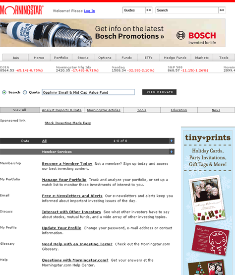
On the Morningstar search results page, there is no explicit message that states No results found. The only zero on the page appears in the black bar in the form of 1-0 of 0, which does not make much sense.

Compare the Morningstar page with the Google page shown in Figure 1, which indicates Your search for asdasdasdasdasdasddfgh did not match any documents. The status message on the Google search results page is clear and straightforward, making it obvious that the problem occurred and providing ways to correct it.

Note that, while Google clearly indicates the no search results condition, this status message appears after the recommendation the Did you mean… feature provides. This demonstrates another key principle: The best design for your application is the one that works with your business model and your particular audience. There are no hard and fast rules for implementing any of the strategies for handling the case when there are no search results.

To be successful, your team must conduct frequent quantitative A/B testing of multiple search results page variants to ensure the pages you’ve designed meet business and customer goals. Qualitative lab and field testing is also highly recommended to help you make sense of your A/B testing results and provide ideas for future improvements.

Focus on Providing a Way Out

On the Morningstar page in Figure 2, the most prominent controls on the page are the links on the gray bar, including Analyst Reports & Data, Morningstar Articles, and Tools. At first glance, these links seem a fine choice for customers to click to browse relevant content. Unfortunately, the links are actually filtering controls that serve only to further constrain the search that already has no results. Instead of providing a way out, filter links on a no search results page suck the customer deeper into the quagmire of no search results, now requiring multiple clicks of the Back button to get back to some useful content.

Morningstar is not the only site guilty of providing unproductive and confusing links that do not give customers a way out. Can you spot some useless filtering controls on the Endless.com no search results page shown in Figure 3?

Figure 3—Endless.com no search results page
Endless.com

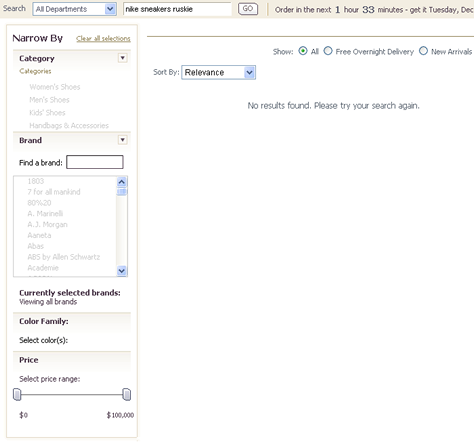
If you answered The entire page except the search box, you are correct. Further constraining already nonexistent search results to those with Free Overnight Delivery, changing the sort order, narrowing by category, or using a fancy price slider would all yield an endless stream of no results. Such system behavior is very confusing to customers who are already frustrated by getting no search results.

Instead of providing controls to further constrain a customer’s query on your no search results page, make sure every control gives the customer a productive way out. Compare these endless nonproductive results to the page in Figure 4, which shows the result of the same query on Amazon.com.

Figure 4—Amazon shows a way out to find Nike sneakers
Amazon.com

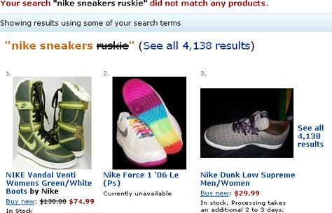
Amazon’s no search results page succeeds in a big way, because of its very prominent and useful links and content that helps customers find their way to Nike sneakers and get away from the no search results page.

Focus on the Customer’s Goal

The Amazon page in Figure 4 is also a great example of a very effective content strategy: removing some of a user’s original keywords, or making partial matches. For most ecommerce sites, this strategy deserves special consideration, because many of the people I’ve observed over the years have leaned toward overconstraining their queries by typing too many search keywords.

Overconstraining searches is especially prevalent when people are searching for an item of particular interest to them, so you will not always see this behavior in a usability test with predefined search tasks and made-up items for which participants are to search. Often, overconstraining searches also involves a customer’s picking the wrong category in a filter set, so your ecommerce site’s no search results recovery strategy must include, at the very minimum, a basic keyword-only search of All Categories with no other constraints.

Another reason to take a look at the strategy of removing some keywords is the fact that adding more search terms to explain what we mean is also a very common human response to the perceived misunderstanding a no search results page signals.

For example, in my experience, it is not uncommon for someone to attempt to recover from a no search results condition that resulted from mistakenly searching for the book Harry Potter and the Sleepy Hollows, by adding misspelled keywords such as J.K. Rawlin, thus inadvertently multiplying the confusion. After coming up empty after several such search attempts, the customer would invariably conclude that the site must not carry any Harry Potter books and move on to another site to make their purchase there. Thus, an effective no search results strategy is critical. Even after figuring out that they got the query wrong, not a single person I’ve watched ever came back to the original site.

Removing some of a user’s original keywords is just one in long list of effective content strategies. Here are some useful ideas for content strategies, in order of their relevance to the user’s original query:

  1. substituting a user’s original keywords with different keywords from a controlled vocabulary
  2. removing some of a user’s original keywords, or making partial matches
  3. matching categories or aspects
  4. top searches, featured results, or most popular results
  5. third-party resources and ads

We’ve already looked at a good example of controlled vocabulary keyword substitution: the Google Did you mean… feature shown in Figure 1. To provide relevant content that offers a way out, Google draws upon the enormous list of indexed keywords for which people have searched that forms its controlled vocabulary to suggest the nearest available keyword.

Successful content strategies for handling cases when there are no search results need not be limited to the five I’ve mentioned. Google’s brilliant auto-suggest feature, which is shown in Figure 5, is an excellent example of a successful marriage of a partially matching keywords strategy and controlled vocabulary keyword substitution.

Figure 5—Auto-suggest prevents a no search results condition before it happens
Auto-suggest

When automatically suggesting search keywords, Google chooses the top search keywords from a controlled vocabulary of popular search keywords. By matching the beginning of the string a customer types with the most popular search keywords, Google ensures a successful search result, forestalling the no search results condition. In doing so, Google has devised a tremendously useful and industry-changing search tool. The point is: Don’t stick with just one specific type of search assistance, but instead combine such features creatively to meet the goals of your partner in conversation on the other side of the human-computer interface.

In Closing

Let’s take a look at the abundant business opportunities we can find wherever no search results conditions occur. I’ll describe a scenario in which I am trying to look up Luke Wroblewski’s email address by searching for any email messages I’ve recently sent or received from him. Inadvertently, I’ve misspelled Luke’s last name, so my search query is Luke Wroblwski. This situation is, unfortunately, all too common. I personally experience it almost daily with people’s creative spellings of my own last name. Indeed, it is likely that millions of people experience the Hotmail no search results page pictured in Figure 6 on a daily basis.

Figure 6—Hotmail commits all three deadly sins on their search results page
Hotmail sins

The Hotmail page completely misses the mark, violating all of the design principles I’ve discussed so far, as follows:

  1. There is no indication of the no search results condition. Instead, the central message seems to be No message is selected, which is technically true, but hardly useful in this situation, because there are no messages to select. This brings to mind a famous joke involving a lost helicopter and a bunch of Microsoft programmers.
  2. Instead of focusing on providing a way out, the page presents several completely useless and confusing controls—like the Sort by checkbox with no options and the Change Your Reading Pane Settings link.
  3. There is no content that helps me reach my goal. The Return to inbox link and the various filter links on the left do nothing to help me connect with Luke.

What could we do to improve this page? Obviously, removing some of the confusing controls and improving the no results messaging would help. Further, we could think about the search problem creatively and try applying a social network model to email. For example, if Luke and I have ever corresponded in the past, we remain connected in the system, which remembers Luke’s email address automatically. If we’ve never connected, the system helpfully offers to introduce me to Luke for a fee. Of course, we also need robust controlled vocabulary matching, so the system always finds my existing connections first, no matter how badly I’ve misspelled their names. In Figure 7, my simple wireframe shows how a redesigned Hotmail page might look. It employs the three design principles I described earlier and uses sample content I’ve borrowed from LinkedIn.com.

Figure 7—Using three design principles to improve the Hotmail search results page
Improved Hotmail

By not giving their no search results page the attention it deserves, Hotmail possibly lost a massive opportunity to launch a social network revolution. Their loss resulted in a huge opportunity for LinkedIn, to the tune of millions of dollars.

Ultimately, no search results pages should be about having a useful, productive conversation with a customer. Ignore no search results conditions at your peril. They provide an opportunity to create legions of loyal followers and blow away your competition, if only you pay attention to what your customers are trying to do and address their problems with the care and creativity they deserve. 

Bibliography

Gill, Judith. “Effective Internet Search: Search Help.” SearchHelpCenter, March 2004. Retrieved January 31, 2009.

Mondosoft.Web Site Usability Metrics: Search Behavior—Search Trends.”PDF May 2004. Retrieved January 31, 2009.

Nielsen, Jakob. “Eyetracking Research.” Alertbox, April 17, 2006. Retrieved January 31, 2009.

—— “Search: Visible and Simple.” Alertbox, May 13, 2001. Retrieved January 31, 2009.

Nudelman, Greg. “Improve the Usability of Search-Results Pages.” JavaWorld, January 23, 2006. Retrieved January 31, 2009.

—— “Timestamp-Based Caching Framework.” JavaWorld, January 3, 2005. Retrieved January 31, 2009.

Spool, Jared M. “Producing Great Search Results: Harder than It Looks.” UIE, July 09, 2008. Retrieved January 31, 2009.

Head of UX Research / Senior Director of User Experience

Principal at DesignCaffeine Inc.

Pleasanton, California, USA

Greg NudelmanFounder of the San Francisco Bay Area UX design consultancy DesignCaffeine, Greg is widely recognized as an experience design and user research expert, specializing in search, social networking, business dashboards, and process redesign for mobile and Web platforms. Greg has published over 30 articles and speaks regularly to audiences around the world about how to design intuitive and elegant systems that improve the quality of people’s lives while creating abundant ROI. He has led design projects for Fortune 500 companies and creative startups.  Read More

Other Columns by Greg Nudelman

Other Articles on Search Experiences

New on UXmatters