Top

Searching Help: Don’t Even Go There

Search Matters

Creating the ultimate finding experience

A column by Greg Nudelman and Tricia Clement
April 13, 2009

Web site user assistance that consistently exceeds customer’s expectations can catapult your company to legendary status and create brand equity you can measure in billions of dollars. However, making Help a strategic asset for your company is an arduous task. To shed light on this important topic, I have teamed up with Tricia Clement, a renowned cognitive psychologist and Web site user assistance expert. In this month’s Search Matters column, we’ll deliver actionable insights about Web site user assistance.

We can broadly classify Web site user assistance content or components as either

  • aspirin—solutions that address an acute problem for people who need assistance right now
  • vitamins—solutions for process optimization and longer-term learning and training

Champion Advertisement
Continue Reading…

Aspirin Help should immediately alleviate the, hopefully, short-term pain of an acute problem. Problems in need of Aspirin Help represent clear diversions from customers’ desired tasks and usually arise when customers are completely stuck and looking for an immediate fix to their problems.

A customer’s mindset when looking for such content is that of fear—for example, a fear of losing money, losing time, or feeling stupid. The natural response to such fear is usually anger and frustration, a highly emotional state, and Aspirin Help solutions need to take the customer’s complex emotional state into account. Aspirin Help content must present a straightforward and simple way to address the customer’s immediate problem, as shown in Figure 1.

Figure 1—Aspirin Super Saver Shipping Help on Amazon.com
Amazon Help

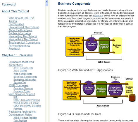
Unlike Aspirin Help solutions that offer immediate fixes, Vitamin Help solutions maximize user effectiveness on a Web site. Vitamins are preventative in nature. You need to take them in advance. So customers need to read Vitamin Help before performing tasks and interactions for it to be effective. Generally, Vitamin Help comes in the form of tutorials and articles that you expect customers to review with a calmer mindset, when seeking opportunities for gradual learning with the goal of obtaining beneficial long-term knowledge and skills. As Figure 2 shows, Vitamin Help solutions can be much more sophisticated, taking the form of interactive multipage tutorials or video presentations.

Figure 2—Vitamin Help—A J2EE tutorial on Sun.com
J2EE tutorial

Given these different and distinct uses for Help content, it is beneficial to classify Help content using the following three attributes:

  1. immediacy—Aspirin Help versus Vitamin Help
  2. depth of knowledgehow versus the why of how
  3. touch—static content versus a phone call

Each axis in Figure 3 represents one of the attributes we can use to evaluate each component of a Help system to determine whether it is appropriate to the task, the existing level of customer knowledge, the task’s level of complexity, and the sensitivity of the issue.

Figure 3—Three attributes of Web site user assistance
User assistance attributes

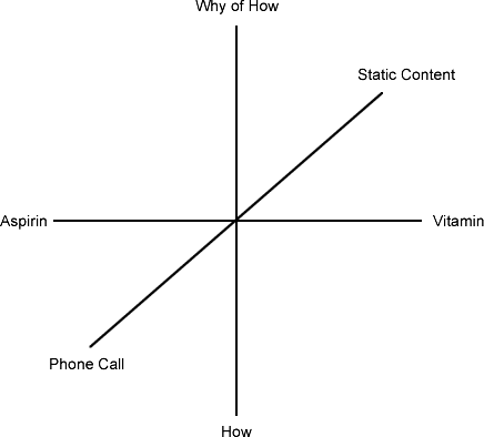
When evaluating the appropriateness of Help content to each specific use case, it is important to consider where your content falls along each of these attribute axes.

Stick to Established Best Practices

People expect to find Help even faster and easier than they can find your merchandise or content, so in most cases, it is safest to stick with the established mental models and design practices for Web site user assistance. People often have a strong mental model for how Help systems should work. Deviating from that mental model and forcing people to think harder when they are already confused is likely to lead to anger and frustration. Most examples of good Web site user assistance follow a similar design, often including the following components:

  • proactive inline Help
  • a single Help landing page
  • navigation that is optimized for browsing rather than keyword search
  • complete Help solutions through multiple landing pages

On the best Web sites, these components work together to provide effective user assistance.

Proactive Inline Help

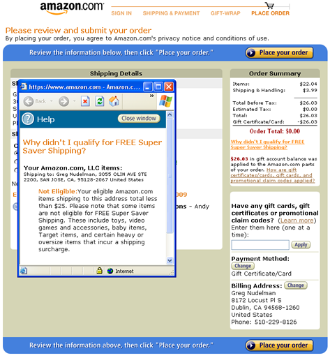
Inline Help provides the first line of defense against customer frustration by proactively offering both Aspirin and Vitamin Help content where you know your customers are most likely to need it. Inline Help is part of the site’s integral functionality. Where necessary, it is more extensive, but may be absent entirely where functionality is familiar or easy to understand. Figure 4 shows the excellent inline Help Netflix provides to help customers put an account on hold. There is enough information embedded on the page to enable confident on-the-spot decision making. There’s no need to navigate anywhere else for more information. It even explains how to reactivate the account later on.

Figure 4—Excellent inline Help on Netflix.com
Netflix Help

Good inline Help is preferable to all other types of Help, because customer expectations for inline Help are low. Inline Help often delights customers, because of the care and attention a company has invested in placing the right Help where customers need it most. People usually perceive inline Help as easy to follow and, in most cases, it can painlessly take care of 90% of customers’ need for assistance.

A Single Help Landing Page

For reasons of neglect or internal politics, many sites end up requiring customers to seek the information they need on many different pages—for example, Help, Top Questions, FAQ, Troubleshooting, Learning Center, or University. Offering dispersed collections of content without a single, well-integrated Help landing page often confuses customers about what kinds of Help are available and which content might actually support the need at hand. The best Web sites provide a single Help landing page where customers can obtain Help of all kinds:

  • Help search
  • common questions
  • a Help index
  • contact information, including email addresses, phone numbers, and chat and community links

One of the best examples of a single Help landing page is that for TurboTax, shown in Figure 5.

Figure 5—An excellent Help landing page for TurboTax
TurboTax Help

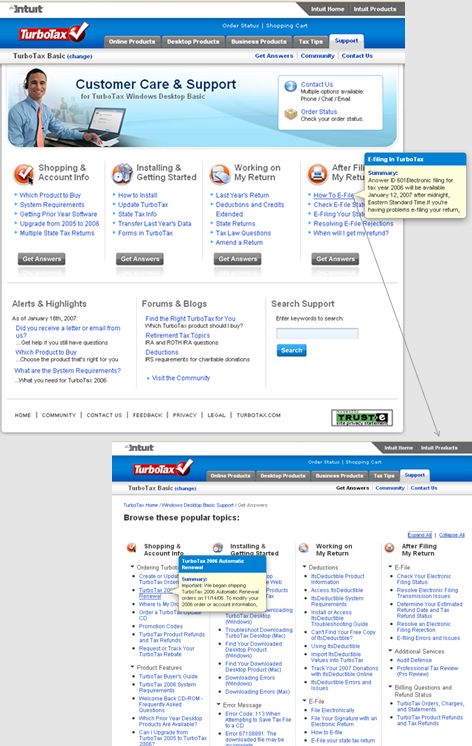
This page presents a clear process customers can easily follow to resolve their problems. Most options are clearly organized. However, customers must click a link to see a complete index of Help topics.

Amazon also provides an excellent Help landing page, shown in Figure 6. Note their relatively recent addition of a prominent Contact Us button. This is an improvement over their former Help page, which required customers to choose a category before seeing the Contact Us button.

Figure 6—Improved Help landing page on Amazon
Amazon Help landing page

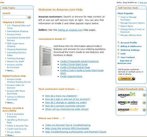
Note that the Amazon Help landing page devotes a great deal of critical real estate to selling Kindle. While it may seem like a good idea to market the new device, the Help landing page is not the best place for promoting products. First, too much information about Kindle on the Help may naturally raise some questions about how many problems someone could expect when using the device. Second, people with real problems to solve might be annoyed by seeing so much distracting promotional content.

Navigation That Is Optimized for Browsing Rather Than Keyword Search

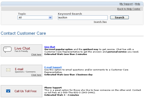
So where does search come into Help best practices? The truth is that simple keyword search is by far the weakest link in the Web site user assistance experience. Ray Bradbury famously wrote: “You need to know part of the answer in order to ask the right question.” In other words, a person seeking Help has to know the right terms to type into the search box, and often, they do not. Therefore, keyword search is often a customer’s last resort before contacting customer support.

The good news is that, precisely because people are not familiar with a topic for which they are seeking Help, they are more likely to type in very general terms. Thus, designers should optimize the finding experience for general keywords and offer additional links to encourage exploration, making the experience far closer to browsing than to traditional keyword search. Even the simple search powerhouse Google opted for a friendlier browsable interface for their Help page, as shown in Figure 7.

Figure 7—Browsable Help page on Google
Google Help

A specialized use case for searching Help is that of searching for the exact text of an error message when troubleshooting a problem. Advanced technical knowledge systems like Oracle MetaLink and the Microsoft Developer Network (MSDN) are optimized for this type of search. However, even for this use case, the user interface is closer to that for browsing than it is to traditional search. Notice that the MSDN Help search results in Figure 8 look very different from the kinds of search results we’ve examined previously in this column—the results that appear when customers search for specific items or content.

Figure 8—MSDN Support Search Results
MSDN search results

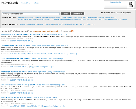
Gone are the prominent refinement controls, sort controls, and classification aspects from each row in the search results. Instead, each search result is considerably more prominent, with a text summary and multiple links to related items to encourage lateral exploration. Depending on the sophistication of an audience, such a page might also include some very general refinement controls for topic or content type. However, in the best systems, these filters are seldom prominent. The designer’s ultimate focus should be on providing a complete solution, including lots of links that let customers navigate laterally or even widen their search instead of constraining it further.

Complete Help Solutions Through Multiple Landing Pages

The best Help systems strive to provide a complete solution. On the HP Help site shown in Figure 9, the LaserJet Printer page is a landing page that provides all of the available Aspirin Help and Vitamin Help links for that printer, including user manuals, printer drivers, and setup guides. If just learning how to do something does not satisfy a customer, there are also lots of links to more sophisticated information that communicates the why of how, including links to support forums, upgrades, and parts.

Figure 9—HP LaserJet Help landing page—a complete solution
HP LaserJet Help

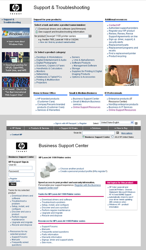
Even though, in this case, a customer arrived at the HP LaserJet Help landing page by searching for Help, the user experience is much more that of a browsing user interface that gently guides customers to a complete Help solution for a product, offering links for further investigation.

Creating a Comprehensive User Assistance Strategy

To put all of your Web site user assistance content into action, you need a comprehensive experience strategy. A good user assistance strategy has four goals, as follows:

  1. Manage expectations.
  2. Show that you care.
  3. Strive for an easy Help experience.
  4. Finish on a positive note.

Next, let’s discuss the four goals of a user assistance strategy in more detail.

Manage Expectations

B.J. Fogg popularized the notion that computers can change people’s thoughts and behaviors in predictable ways. One of the critical functions of a user assistance system is managing the strong emotions that arise when customers have unfulfilled expectations after interacting with an application. That’s why, when designing Help content, managing expectations should be a top concern. Expectations affect user emotions such as delight or frustration, and strong emotions translate directly into brand perception and brand equity. Unfulfilled expectations cause strong negative emotions and damage customer perception of your brand—often in ways that you cannot rectify later, because customers are unwilling to give you another chance. The good news is that Help is exactly the feature in which small delights can quickly add up to a very positive overall experience.

As shown in Figure 10, Overstock expertly manages expectations on their Contact Us page. The page clearly communicates that the waiting time for live chat is less than 2 minutes; for email support, less than 1 business day; and phone hold time is only 1–2 minutes.

Figure 10—Overstock expertly manages expectations for waiting time
Overstock manages expectations

A general strategy for managing expectations is as follows:

  1. Set low expectations for a process, in terms of its cost/benefit ratio.
  2. Work hard to exceed expectations and delight your customers.
  3. Cry just once. If you must disappoint your customers, do it in one big blow, then move on.
  4. Delight customers often, in many small ways.
  5. Delight customers in ways that never get old—for example, through your competence.

As for the zero search results pages I described in my first Search Matters column, it is important to treat Help not as a fatal breakdown in communication between your site and your users, but as an opportunity to exceed expectations and delight your customers.

Show That You Care

Human beings are social animals who want to feel someone cares about them. In the context of providing Help, caring means:

  • providing the right assistance in the right place at the right time
  • using the level of explanation that is appropriate to the task
  • never forcing customers to learn, but instead providing straight-forward, clear answers with lots of options to learn more
  • providing information that is appropriate to the knowledge level of a customer
  • never making people feel stupid by giving them the wrong answer, providing circuitous navigation, or offering unclear explanations.

If people feel that you care, they automatically trust that a Help system is suggesting what’s best for them and don’t scrutinize its content as much. In other words, the feeling that someone cares reduces people’s need to think about the quality of an answer. People generally prefer to trust information rather than having to think, because thinking can be hard work and takes energy.

Sometimes a company’s biggest problem can be the perception that it has grown so large that it no longer cares about individual customers. This perception can incite furious responses to even the smallest of infractions. Some big companies go to great lengths to show they do in fact care, but few manage to come across as sincere. Figure 11 shows the Travelocity Bill of Rights along with its signature gnome character.

Figure 11—Travelocity shows it cares
Travelocity Bill of Rights

Because Travelocity has made caring for customers an integral part of their brand, customers generally perceive its Bill of Rights as a sign of genuine caring, so it gets a positive response from most customers.

Strive for an Easy Help Experience

When customers say That was easy after using Help, their evaluation encompasses both their expectations and their satisfaction with the Help system’s performance. We suspect that’s why Staples has made this phrase their slogan. To ensure customers feel getting help was easy, you have to do both of the following:

  • Set the right expectations at the start—never overpromise!
  • Ensure customers feel like they’re making progress toward a solution with each thing they do.

The path to resolve a problem can take hours and still seem easy, as long as people expect the path to be long and don’t ever feel confused or stuck along the way. Part of making a long process feel easy has to do with the feeling of flow Mihaly Csikszentmihalyi popularized. The Travelocity user assistance, shown in Figure 12, does a good job of maintaining a sense of flow by providing both Related Answers and Previously Viewed Answers.

Figure 12—Travelocity offers useful links
Travelocity

A Help system can maintain good task flow by providing a clear path for a customer to follow, as well as lots of relevant links, ensuring the delivery of a complete solution to the customer’s issue.

Finish on a Positive Note

In user assistance, designers should do everything possible to provide a positive finish, even if it means taking a phone call—Horrors!—or offering a free gift. Finishing on a positive note is especially important for user assistance experiences that started with a strongly negative event like a stolen credit card, a broken item, or delayed shipping. Strong negative emotions directly affect customers’ brand perception. However, a weak negative finish has no effect on your brand perception, unless it happens again and again.

One of the ways you can finish on a positive note is to let customers provide feedback once the Help system presents an answer. In addition to showing a company cares, feedback lets the Help system dynamically choose what content to show next and shows where you need to expand your content to benefit your other customers.

Unfortunately, few companies ask customers for feedback effectively. Figure 13 shows a particularly cumbersome example of a feedback form for the Sun J2EE tutorial.

Figure 13—A cumbersome, non-contextual feedback form
Sun's feedback form

How many busy people would navigate to another page and take the time to fill out this long form? The form asks users to select a chapter. Do users have to fill out this form multiple times to provide feedback on different chapters? Who would know better what version of the tutorial a user is reviewing—the company or the customer? While this form feels like a typical, long form for contacting customer support, it includes this disclaimer: “We do not respond to everyone.” This kind of long form is not a good way to ask your customers for some quick feedback, and it does not, therefore, provide a positive finish.

In contrast to the Sun tutorial, the most effective user assistance feedback is

  • contextual—It provides the ability for a customer to give feedback on every chapter and every solution page when viewing it and does not require them to navigate to another page to give feedback.
  • immediate—It does not ask customers for their name or email address or require them to sign in. If you force customers to register, most people will provide fake or disposable credentials to avoid receiving spam. Often, a Help system can readily capture a customer’s identity from a cookie, so there is no need for customers to identify themselves.
  • simple—One simple, but effective method of providing feedback is tagging, which is sadly underutilized in Help systems. Tagging is both powerful and versatile. Tags can describe quality (“good”), topic (“tutorial”), keywords (“J2EE”), and much more. You can aggregate tags in tag clouds or lists and use them to enhance keyword search for your Help system.

Putting It All Together

User assistance that consistently exceeds customers’ expectations can catapult your company to the status of industry leader and greatly increase your brand equity. However, designing a great Help system is no easy task.

To design an optimal user assistance experience, it is important to think holistically about all of the touchpoints along the way. To serve the right Help at the right time, it helps to classify Help content along three separate attributes: immediacy, depth of knowledge, and touch. Web site user assistance involves a multipronged approach that includes inline Help, a single Help landing page, and browsable navigation, while keeping a clear focus on providing a complete solution for your customers.

To orchestrate a compelling user experience, think about how delivering user assistance is like a creating story, a film, or a motivational talk. A Help system needs to manage expectations, maintain task flow, and demonstrate that a company genuinely cares about its customers. It helps to think of a user assistance experience as an emotional journey—delighting people in small ways as the journey progresses and finishing on a strong positive note. Understanding and using the power of emotions to create a compelling, positive brand experience should be the primary goal behind a Help system. 

Bibliography

Csikszentmihalyi, Mihaly. Flow: The Psychology of Happiness. London: HarperCollins, 1992.

Goleman, Daniel. Emotional Intelligence. New York: Bantam Books, 1995.

Fogg, B.J. Persuasive Technology: Using Computers to Change What We Think and Do. San Francisco, CA: Morgan Kaufmann, 2003.

Friedman, Batya. Human Values and the Design of Computer Technology. New York: Cambridge University Press, 1997.

Miller, Christopher A., Editor. “Human-Computer Etiquette: Managing Expectations with Intentional Agents.” Communications of the ACM, 47(4), 31-61, 2004.

Norman, Donald A. Emotional Design: Why We Love (or Hate) Everyday Things. New York: Basic Books, 2004.

Nudelman, Greg. “Starting from Zero: Winning Strategies for No Search Results Pages.” UXmatters, February 9, 2009. Retrieved March 25, 2009.

Picard, Rosalind W. Affective Computing. Cambridge, MA: MIT Press, 1997.

Smith, Gene. Tagging: People-Powered Metadata for the Social Web. Berkeley: Peachpit Press, 2008.

Wroblewski, Luke. Web Form Design: Filling In the Blanks. New York: Rosenfeld Media, 2008.

Head of UX Research / Senior Director of User Experience

Principal at DesignCaffeine Inc.

Pleasanton, California, USA

Greg NudelmanFounder of the San Francisco Bay Area UX design consultancy DesignCaffeine, Greg is widely recognized as an experience design and user research expert, specializing in search, social networking, business dashboards, and process redesign for mobile and Web platforms. Greg has published over 30 articles and speaks regularly to audiences around the world about how to design intuitive and elegant systems that improve the quality of people’s lives while creating abundant ROI. He has led design projects for Fortune 500 companies and creative startups.  Read More

Founder at jUXtworks Inc.

San Francisco Bay Area, California, USA

Tricia ClementTricia specializes in translating consumer needs and cultural differences into delightful online experiences. Capturing data through various qualitative and quantitative research methods and combining it with advanced behavioral modeling techniques, she creates a holistic visualization of a consumer’s mental model, cognitive process, and behavioral patterns. Her insights and visualizations help companies align their corporate priorities, develop their product strategies, and align their organizational structures with those of their customers. Prior to entering industry, Tricia was a National Research Service Award (NRSA) Neuroscience Postdoctoral fellow at Stanford University, examining social regulation of the brain. She has extensively studied and written about the commonalities and differences in learning and memory strategies between humans and other animals, focusing on social learning, concept learning, memory strategies, and symbolic representation. For her work in the area of cognition, she has received awards and competitive grants from the National Science Foundation (NSF), National Institute of Mental Health (NIMH), and Howard Hughes. Tricia has published over 30 journal articles and book chapters. American Scientist and The Economist covered her innovative research demonstrating work ethic in pigeons, which challenged human-centered theories explaining the phenomenon. Her latest page turner, “Steering Clear of Trouble: Fish Can Infer Social Rank by Observation Alone,” garnered the cover of Nature.  Read More

Other Columns by Greg Nudelman

Other Articles on User Assistance Design

New on UXmatters