When designing the data and layout for search results pages, the design strategy boils down to a single key principle: show the greatest number of results possible, without increasing pogosticking. In other words, the challenge is finding the right balance between
providing enough information in individual search results, so customers can make informed decisions about whether to view product detail pages—that is, click product links
providing enough relevant search results on each page of results to warrant further exploration of the site
On the one hand, if your search results do not provide enough summary product information, you’ll force your customers to jump to individual product detail pages, then repeatedly back and forth between product detail and search results pages, like a child bouncing on a pogo stick. On the other hand, if you do not provide enough search results on each page of results, customers may not find relevant results, so may leave your site. As we will see presently, the tension between these two opposing design forces is what makes the problem of creating search user interfaces so interesting.
Champion Advertisement
Continue Reading…
Pogosticking Is No Fun
While pogosticking may sound like a fun activity, it is usually counterproductive to your customers’ finding the content and products they need. As Jared Spool discovered in his many studies of search results gallery pages:
“In our studies of ecommerce sites, for example, 66% of all purchases happened without any pogosticking at all—the users purchased the first selection they chose from the gallery two-thirds of the time. And when users did pogostick, the more they did so, the less they purchased. We’ve found this extends to non-ecommerce sites as well: Our studies show that users who don’t pogostick find their target content 55% of the time, where as those who do pogostick end up only succeeding 11% of the time.”—Jared Spool
We can define pogosticking as the average number of product detail pages viewed on your site, divided by the number of unique search queries—that is:
Pogosticking Score = (# of product detail page views - # of product page views direct from search engines) / # of unique search queries
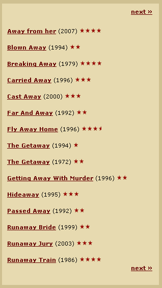
Let’s look at a real-life example to see how damaging pogosticking can be. A customer is looking for Roger Ebert’s review of a particular Japanese film. Searching by director’s last name, Miyazaki, yields no results. (See my recent UXmatters column, “Starting from Zero: Winning Strategies for No Search Results Pages.”) Fortunately, he remembers that the film’s title has the word away in it. Figure 1 shows the search results for the word away on RogerEbert.com.
Figure 1—Can you tell which film is Miyazaki’s masterpiece?
While the customer decides “Getting Away With Murder” is probably not the film he’s looking for, “Carried Away,” “Far And Away,” “Fly Away Home,” “Hideaway,” and about ten other links all present possibilities. One choice looks as good as another, because this page provides only three bits of data: title, Ebert’s rating, and the year a film was released. Certainly, this is not enough information to make an informed decision. Then, he notices the next » links and realizes very quickly that there are potentially many similarly structured results pages to browse. The next » links actually prove very helpful in making his decision: He is now absolutely sure searching on this site will be a total waste of his time. So, he heads over to Netflix, shown in Figure 2, to search instead.
Figure 2—Netflix, good summary information in search results
On Netflix, the customer can effortlessly pick out the right film in the search results, because it includes a beautiful picture in animé style. Notice, however, that even if the search results had no pictures, he would still have been able to find the right result. He can find all of the information he needs to correctly identify the particular movie for which he is looking by quickly scanning the film’s short description—which includes keywords like Japanese and director Hayao Miyazaki, as well as its PG rating. Thus, he’s spared from having to pogostick between search results pages and multiple product detail pages.
Overly Rich Search Results Can Be Unhealthy for Your Site
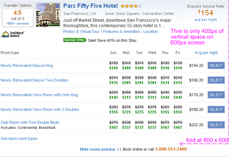
There are no general guidelines about what summary information your customers might actually need in search results or how much information is healthy for your particular application. More summary information in each result is generally better, because this decreases pogosticking. However, it’s possible to include too much information. It’s a balancing act. Take a look at the Expedia hotel search results in Figure 3.
Figure 3—Expedia—Welcome to the Parc Fifty Five Hotel!
At an 800 x 600-pixel screen resolution, Expedia customers can see is only a part of one magnificent search result for the Parc Fifty Five Hotel. That’s right! Some customers will have to scroll just to see one entire search result! This is a pretty extreme case of overly rich information in search results.
In general, displaying a smaller number of search results on each results page impacts your site’s user experience in two critical ways:
Fewer products on each page of results exposes less of your site’s inventory to customers, at a given resolution.
Results pages that show fewer products are less likely to be relevant to customers.
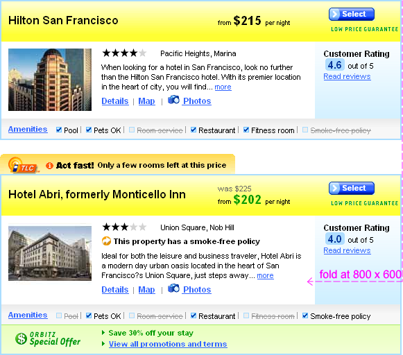
To understand this issue better, let’s contrast the Expedia search result with the Orbitz search results shown in Figure 4.
Figure 4—Orbitz, putting search results on a diet
Placing more products on each search results page requires using less real estate for each result. On 800 x 600-pixel resolution screens, Orbitz shows almost two full search results, whereas on Expedia customers can barely see even a single result. This means the Orbitz showroom floor has about 200% the capacity of that on Expedia.
The number of search results on a page is also significant from the standpoint of the overall page relevancy. Often, business people and designers alike forget that their site is not the only site on the Web, and consumers have many choices. If your site does not provide the right information scent, your customers can be gone, just like that. (Fingers snap.) But wait a minute, you say, “What about scrolling? Can’t users just scroll down to what’s relevant?”
It is true that they can. Research shows people actually have no problem scrolling. However, users will scroll only if they feel they have a hope of finding something that is relevant to them lower on the page. In a post-Google world, this hope quickly diminishes if what customers see on the page above the fold is not relevant. There is a very strong mental model at work here: The most relevant stuff is at the top, and the further down I go, the less relevant the content is likely to be.
For example, if a customer is looking for a historic, boutique bed-and-breakfast in San Francisco, she is not likely to find an Expedia page that the Parc Fifty Five Hotel dominates particularly relevant. In contrast, Orbitz shows two results, so that doubles the chances one of those results might be the historic boutique jewel the customer is looking for. No search engine is perfect at understanding customers’ desires, which they often express in vague and over-generalized terms. But, by exposing a greater number of search results on a page, you maximize the chances for your customers to quickly find something of relevance and either make a purchase right away or continue scrolling. Conversely, if you show only a few results and force your customers to scroll to find something relevant, you are risking their giving up after a quick glance and going somewhere else.
In Closing: Optimize Results for Your Business and Your Customers
For individual search results, the basic design tension is between two opposing forces:
How much summary information would let your customers make the right decision without pogosticking?
How many search results can you show on a single page to capture the interest of your customers?
Include too little summary information, and you get pogosticking. Include too much summary information, and customers get too few results—and perhaps no relevant results at all.
Most often, the best solution lies somewhere in the middle between these two extremes. However, it’s possible practical factors that are unique to your Web site may complicate the matter still further. For instance, the absence of pogosticking is not the only determinant of successful search results. Your search results may get an excellent, very low pogosticking score, but you still might not sell anything, because customers don’t find your search results relevant. What’s even more incredible is that some Web applications succeed despite having high pogosticking scores. As long as people become emotionally engaged with your search results and product detail pages load reasonably quickly, they don’t mind picking up and trying on individual items.
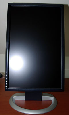
On the other hand, very detailed summary results, like those from Expedia.com, seem cumbersome on 800 x 600 screens. But what if I told you that all Expedia customers care deeply about the price per room per diem—perhaps because of some inexplicable corporate travel policies? Do those Expedia results still seem too rich? What if I also told you that all Expedia customers use 1920 x 1200-pixel resolution screens like that shown in Figure 5? Suddenly, the design of the search results pages on Expedia begins to make a lot of sense.
Figure 5—A big monitor with 1920 pixels of vertical space
Now, I don’t actually claim to know anything about Expedia customers. The point I am trying to make is that only your customers can tell you what level of summary information is appropriate for your search results. You have to think through all of the use cases, then experiment with including or excluding various pieces of information in the search results to see how the changes impact your completion metrics, click-through behavior, and pogosticking score. To help you make better sense of your Web site metrics and understand your customers’ pain points, as well as new business opportunities, there is simply no substitute for frequent field research.
People working for large corporate design teams or rich startups are often well insulated from customers who browse the Web on 12-inch notebook monitors, with 800 x 600-pixel resolutions, and their font size turned way up. Try always to be mindful of your customers’ hardware requirements and how many of your search results might actually show up on their screens. When deciding what summary information to include, keep in mind this key design principle: Show the greatest number of search results possible, without increasing pogosticking. Always take the time to optimize your search results pages for your business and your customers’ unique goals and needs. Your customers will make it well worth your time and effort.
Founder of the San Francisco Bay Area UX design consultancy DesignCaffeine, Greg is widely recognized as an experience design and user research expert, specializing in search, social networking, business dashboards, and process redesign for mobile and Web platforms. Greg has published over 30 articles and speaks regularly to audiences around the world about how to design intuitive and elegant systems that improve the quality of people’s lives while creating abundant ROI. He has led design projects for Fortune 500 companies and creative startups. Read More