Ask UXmatters answers our readers’ questions about user experience matters. To read our experts’ responses to your question in an upcoming edition of Ask UXmatters, please send your question to: [email protected].
Champion Advertisement
Continue Reading…
Label Alignment in Long Forms
Q: I am producing a very long data-entry form that is at least 3000 pixels in height. It does not require users to complete all fields. However, it is likely that users would complete all fields. I cannot choose to place the labels above the input fields, because this would double the height of each field. Therefore, I need to use a layout with labels on the left. However, if I chose to make the labels right aligned, it would be very hard to scan down the form—both because of the size of the form and the number of fields it has. As a result, I am choosing a left-aligned approach. Do you think this is appropriate, or do you believe, regardless of the form size and number of fields, that I should align the labels on the right if they are to the left of the input fields?—Paul Wallas
The following experts have contributed answers to this question:
Pabini Gabriel-Petit—Publisher and Editor in Chief, UXmatters; Principal User Experience Architect at Spirit Softworks; Founding Director, Interaction Design Association (IxDA); and UXmatters columnist
Michael Griffith—User Experience Director at Hewlett-Packard
Caroline Jarrett—Owner and Director at Effortmark Limited
Tobias Komischke—Director of User Experience at Infragistics
Whitney Quesenbery—Principal Consultant at Whitney Interactive Design; Past-President, Usability Professionals’ Association (UPA); Fellow, Society for Technical Communications (STC); and UXmatters columnist
Jim Ross—Principal of Design Research at Electronic Ink and UXmatters columnist
Paul Sherman—Principal at Sherman Group User Experience; Vice President of Usability Professionals’ Association; and UXmatters Columnist
Caroline Jarrett, who is co-author with Gerry Gaffney of Forms that Work: Designing Web Forms for Usability, answers: “I know one of the most popular articles on UXmatters is Matteo Penzo’s article ‘Label Placement in Forms,’ in which he advised placing labels above fields. However, he focused on the time it took for users’ eyes to jump about as they read a form. While this can be important for very short, trivial forms such as the ones he described in his article, it is not particularly important for any other type of form. The sheer length of a form—both visually and in terms of the effort completing it requires—is really important. Your idea of using left-aligned labels would, as you point out, make it easier to scan the labels—a task that is unnecessary for a short, trivial form, but is often very important for a long form. It would also reduce the visual length of the form and probably make it seem a bit less daunting.”
Pabini relates how Matteo’s article came about and shares her thoughts about its conclusions: “I asked Matteo to undertake his eyetracking study and write the article ‘Label Placement in Forms’ for UXmatters, because the UX Design team with which I was then working as a consultant was embroiled in an endless debate on the topic of label alignment in forms. Over many years, this has been a recurring debate at many companies, as well as in online discussions, so I wanted to see some definitive data.
“When I first read Matteo’s article, I made a similar observation to Caroline’s: His conclusions emphasized the rapid completion of forms, which is really important for short forms comprising familiar data—such as forms for signing in or providing personal contact information. However, I don’t believe our sole goal in designing most forms is their rapid completion. This is often an important goal, but in some cases, you might actually want users to take a moment to consider some of the information they’re providing in a form. For all forms—especially long forms—easy comprehension by users, layouts users can easily scan, and ensuring users are willing to complete a form are also key design goals. (More on this later.)”
“I don’t think the length of a form really makes that much difference,” counters Whitney, “as long as all of the questions in a form ask for information users are likely to expect to—and be willing to—fill out.”
Some General Guidelines for Labels in Forms
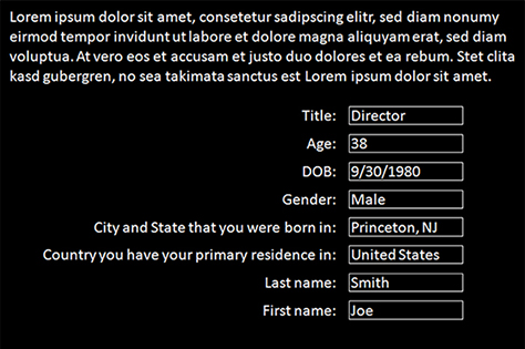
“What you should always try to avoid is having very different label lengths in the same form,” states Tobias. “For example, if one label is a whole sentence, but another is only one word, that results in an unattractive visual layout, as the example in Figure 1 shows. This is especially true when short labels are at the beginning of a form, requiring some effort on the part of users to locate the first indented field.”
Figure 1—An example form with very different label lengths
“Make every effort to use labels of approximately the same length,” agrees Pabini. “If you’re able to use labels having similar lengths, the decision regarding whether to place a label above or to the left of a field, using left alignment or right alignment, diminishes in importance. Regardless of the labels’ placement, they’ll consistently be more closely coupled with their field visually.
“Also, avoid labels for text boxes or drop-down lists that wrap onto multiple lines. To prevent labels’ wrapping, try shortening them—conciseness is a virtue. But be sure to allot sufficient width for them. If your labels are long, examine whether you are trying to accomplish too much with them. Rather than using a long label, you could provide interactive user assistance to the right of fields. Your layout of labels in relation to their fields should be consistent—though there’s one exception: scrolling text boxes require greater width, so their labels are usually above them.
“Tobias’s example of how not to design a form, shown in Figure 1, presents an interesting problem, begging for a solution. I’d revise his example form as follows, creating labels of relatively uniform length:
Move Last name and First name to the top of the form and invert their order—or better, provide a single Name text box.
Change the cryptic label DOB to Birth date.
Move Gender above Age, so all fields relating to a person’s birth would appear together.
Add a Birthplace group label above separate City and State text boxes—thus, limiting the length of their labels without losing clarity. Or better, have a single Birthplace text box, with interactive user assistance to the right of the field that presents the following tip: City and state—for example, Princeton, NJ.
Change Country you have your primary residence in, which isn’t even good English, to Country, with the following interactive user assistance to the right of the field: Location of your primary residence. However, putting Country in close proximity to Birthplace gives me pause, because users might assume the field is related to Birthplace. (I have a hard time believing this particular combination of form fields would occur in real life.) An alternative would be to use the label Residence or Primary residence—which is clearer, but overly long in comparison to the other labels—with Country or Country in which you reside in interactive user assistance to the right of the field. This label would be a bit obscure, but the field’s overall structure would be parallel with that of the previous field.
Add more vertical space between the fields.”
Label Alignment
Now, let’s get to the crux of the matter. Where should you place the labels for fields?
to the left of fields AND
left aligned OR
right aligned
above fields and left-aligned
Left-Aligned Labels to the Left: Pros and Cons
Caroline recommends left alignment for field labels to the left: “Your form is long, so the chances are that some of its questions are relatively complicated, some of the users’ answers might require more research, or you might need to justify some questions and explain how your organization intends to use their answers. In any of these situations, you’ll usually need longer questions—and those don’t look good and are hard to read when they are right aligned.”
Pabini disagrees with Caroline’s conclusion: “While Caroline’s reasoning about the instances in which a form needs to provide more information to users is cogent, I don’t agree that these situations justify using longer labels. In my mind, very little would. Instead, I see these as justifications for providing interactive user assistance to the right of form fields.
“Even assuming a designer absolutely cannot bring label lengths into relative conformity, there are still a few circumstances in which left-aligned labels for fields might be appropriate—particularly where users’ need to scan a form is paramount. For example, in a long, familiar form for a data-entry professional who usually needs to fill out only a few fields or in an edit view of a long form in which a user would likely be modifying only a few fields, scanning becomes very important.
“Left-aligned labels can be very hard to read, especially when their length varies, because users’ eyes can accidentally jump to the wrong row in a form when moving between labels and fields. This is most likely to occur when fields have insufficient space between them. However, I think the need to visually couple labels with their distant fields is the primary reason for the typically long duration of saccades with left-aligned labels—approximately 500ms (milliseconds)—that Matteo noted in his article. In general, I’d recommend that you not use left-aligned labels, except where users typically need to scan forms. However, if you do, make sure the labels are of a uniform length and relatively short.
“You haven’t mentioned the audience for your form, but for a consumer application,” Pabini continues, “I wouldn’t use left-aligned labels in a long, unfamiliar input form, requesting data that may be difficult to provide, because users must read—or at least skim—the entire form to know what to fill out and what they can skip over. Right-aligned labels are usually preferable for consumer applications.”
Right-Aligned Labels to the Left: Pros and Cons
“You should use right-aligned labels,” asserts Jim. “People do not scan down a form in the same way they scan a regular list of items. When filling out a form, people usually tab from one field to the next, focusing on one field at a time. This is especially true when they are going to fill out all or most of the fields in the form.
“Eyetracking studies of form-label placement—see Matteo Penzo’s ‘Label Placement in Forms’—have shown that right-aligned labels require shorter eye movements than left-aligned labels. Users first focus their attention on a form field, then their eyes travel to the left to read its label. Right-aligned labels require the eyes to travel shorter distances to view both the form field and the label.”
“With right-aligned labels, each label and its field are always in close proximity to one another,” adds Pabini, “so if labels are very short, users’ eyes can sometimes take in both a label and its field in one fixation. Plus, users’ eyes are not likely to jump to the wrong row in a form, as can happen with distant left-aligned labels when fields have insufficient vertical space between them.
“When I looked at Matteo’s data, I noted that there was not a great difference between the time it took to complete a form with labels above fields—with 50ms saccades—versus a form with right-aligned labels to the left of form fields—with 170ms saccades. His data and analysis validated to me that my standard practice of using right-aligned labels for longer forms is, indeed, correct.
“Aligning labels to the right is popular for short, trivial forms where all the questions are simple, the answers are easily available in users’ heads, and there are no concerns about how an organization might use their answers,” says Caroline.
Choosing Between Left- or Right-Aligned Labels
“Label placement is an epic topic, and there are good reasons for both right-aligned and left-aligned labels,” affirms Tobias. “Let’s assume, for now, that a form’s fields are left-aligned. Eyetracking studies on menus have shown that users can scan items faster if they’re left aligned, because their eyes can follow a straight path from top to bottom. But with data-entry forms, there are not only items below other items, but also the fields that are associated with labels. That makes things somewhat more complicated. We’re talking about a 2-column grid structure, consisting of an unspecified number of rows.
“So, it comes down to this question: What is more important?
To be able to quickly scan the list of labels? This would call for left-aligned labels.
To be able to quickly grasp what field belongs to a label? This would call for right-aligned labels.
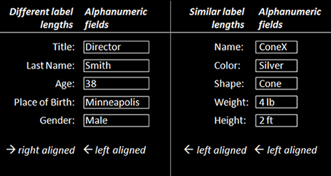
“There is an ISO (International Organization for Standardization) standard just for data-entry forms: ISO 9241-17:1998, ‘Ergonomic requirements for office work with visual display terminals (VDTs)—Part 17: Form filling dialogues.’ This standard says that, as a rule, labels should be right aligned. It also says that, in case the labels have similar lengths, you can left align them. See Figure 2 for an example.
Figure 2—An example comparing left and right alignment in the same form
“Their overall goal seems to be to move labels and fields closer together, so they’d answer the above question by choosing the second option. That does make sense to me, because bringing labels and fields close to each other makes it easier to connect both. Plus, since the gaps between them have pretty much the same width throughout the form, the negative space between labels and fields creates its own gestalt, making it easier to visually understand the 2-column structure of the form and to anticipate the location of its elements.
“I would even argue—and this goes a little bit against the premise of the first answer to the question I posed earlier—that the ragged-left border resulting from right-aligned labels helps users to understand and anticipate the items they need to fill in, similar to the way a pattern of ascenders—bdf—and descenders—gjp—creates the typical shape for a specific word.”
“I suggest mocking up both versions in simple HTML, doing some hallway tests, using your design sense, and picking whichever solution both looks better and performs better,” advises Paul. “All design guidelines are made to be broken. That’s how design advances and evolves.”
Whitney agrees with Caroline and recommends “aligning labels on the left, so they are easy to scan.” But she concedes that “this topic has been debated many times. The conclusion seems to be that it does not make as much difference as the energy we expend upon it. We have to base part of our decision on the overall layout of the form and the length of the labels. However, the other consideration is whether the people using the form are likely to need to read all of the labels, so they can find the fields they want to complete. If so, laying out the form for easy scanning makes the most sense.”
“As with so many design decisions, the answer to the question of label alignment is: It depends. Though even after analyzing the same data,” Pabini observes, “not all experts come to the same conclusion. So, the debate rages on!”
Labels Above and Left Aligned: Pros and Cons
“Matteo’s eyetracking study proved conclusively that placing labels above form fields is optimal in short forms, because they are very closely coupled visually with their fields and users can take in both with a single fixation,” acknowledged Pabini. “I often place labels above fields in dialog boxes and other short forms, especially when asking users to provide familiar data. Plus, when localizing a user interface is necessary, placing labels above fields eliminates the layout problems that can occur when translations result in much longer labels. However, I don’t think placing labels above fields is optimal for long forms. In such a form, there are likely to be group labels above closely related fields. In such an information hierarchy, placing form fields to the left provides a clearer distinction between the two levels of labels.”
“I don’t think you should rule out placing the labels above the form fields,” recommends Jim. “Even though this would increase the length of the page, it is easier for people to complete a form with labels above the fields. Eyetracking studies show that labels above fields require the least amount of eye movement. Often, people can see a form field and read its label with only one fixation, thus completing the form is less time.”
Other Factors in the Usability of Long Forms
Pabini explores some other factors in the design of forms: “As I mentioned earlier, there are some other factors that are key to the usability of forms—especially for long forms—including the following:
easy comprehension by users
layouts users can easily scan
ensuring users are willing to complete a form”
Easy Comprehension by Users
“To help users better comprehend form fields,” explains Pabini, “do the following:
Provide clear, concise labels that use plain language.
Use terminology that is familiar to your users.
Use consistent styling for labels—for example, sentence capitalization and bold text.
Where appropriate, use text box sizes that indicate the length of the data a user should provide.
Clearly indicate whether fields are optional or required.
Provide interactive, inline user assistance, including
tips
validation”
Layouts Users Can Easily Scan
“When users don’t need to complete all of the fields in a long form, they must be able to easily scan the form to determine what fields they should complete,” continues Pabini. “To make it easy to scan a long form, do the following:
Use labels of a fairly consistent length.
Place required fields near the beginning of a form.
Ensure all required fields are visible.
Effectively chunk form fields into groups.
Provide clear group labels.”
Ensuring Users Are Willing to Complete a Form
“As Caroline mentioned earlier, it’s important to make long forms seem less daunting,” concludes Pabini. “Achieving this goes a long way toward ensuring users are willing to complete your forms. However, label placement plays a only small part in achieving this goal. Some more important things you can do to help people successfully complete long forms include the following:
Ask for only essential information. Doing so may let you shorten a long form and engenders trust. Avoid asking users for information they’ve already provided elsewhere, but if you do, at least prefill those fields with users’ data.
Organize a form’s fields into groups. Providing this kind of structure to forms helps users get an overview of a form.
Use progressive disclosure. Place related fields that are not required and may not always be relevant in groups that expand only once a user selects an option—indicating that they are relevant.
Provide helpful user assistance. When requesting information users might have to look up, ensure they know in advance what information they’ll need. Provide interactive user assistance to focus users’ attention on the information they’ll need to successfully complete the current field.
Prevent errors.
Provide default values. Providing helpful default values both reduces the effort of completing a form and is an effective means of preventing errors.
Provide inline validation. As users complete a form, let them know whether they have successfully filled out each field. Doing so nips errors in the bud.”
Motivating Form Completion Over Time
Michael observes, “Your statement that your form ‘does not require users to complete all fields. However, it is likely that users would complete all fields’ is curious! I have yet to meet users who enjoy filling out optional form fields. If your Web site or application is one that people will visit often, consider collecting any optional information across multiple visits. Later on—perhaps after their fourth visit—when users sign in, present them with a message that asks in a polite way whether they would be willing to provide more information, so you can provide better service to them. Give users a short explanation of how you’ll use the additional information to improve their experience. If they decline, do not ask again. The most important thing to remember is that, once you have gained users’ trust, they will be more willing to share information, and the information they share will be of higher quality. LinkedIn.com uses a similar technique, motivating users with a goal: Your profile is 80% complete, add education to reach 85%.”
References on Designing Web Forms
Our experts recommend the following resources on Web form design:
—— Web Form Design: Filling in the Blanks. Brooklyn, New York: Rosenfeld Media, 2008.
Paper Prototyping for Engineers
Q: I am a classically trained engineer and am now getting ready to use paper prototyping for the first time. My company usually focuses on the technical parts of our products and thinks of usability only toward the end of a project timeline, if at all. Paper prototyping can us give an inexpensive way to improve our products and, hopefully, will instill a sense of the importance of involving user experience early on future projects. The product we’re currently developing is for users who are highly trained, technically oriented employees in the network-support domain. Do you have any tips for me?—from a UXmatters reader
The following experts have contributed answers to this question:
Pabini Gabriel-Petit—Publisher and Editor in Chief, UXmatters; Principal User Experience Architect at Spirit Softworks; Founding Director, Interaction Design Association (IxDA); and UXmatters columnist
Mike Hughes—User Assistance Architect at IBM Internet Security Systems and UXmatters columnist
Caroline Jarrett—Owner and Director at Effortmark Limited
Whitney Quesenbery—Principal Consultant at Whitney Interactive Design; Past-President, Usability Professionals’ Association (UPA); Fellow, Society for Technical Communications (STC); and UXmatters columnist
Jim Ross—Principal of Design Research at Electronic Ink and UXmatters columnist
Paul Sherman—Principal at Sherman Group User Experience; Vice President of Usability Professionals’ Association; and UXmatters Columnist
Janet Six—Principal at Lone Star Interaction Design; UXmatters Managing Editor and columnist
Our UXmatters experts have offered both encouragement and some very useful tips on doing paper prototyping. I say good for you for wanting to involve User Experience earlier in your project timelines. The benefits of integrating usability test results into design are greater then. When they are applied at the end of a project, it’s like putting a Band-Aid on a broken arm.
“Hurrah for you,” exclaims Whitney. “I’ll bet your networking applications are complicated—not the sorts of tools you can fix as you go. So, hurrah for getting users involved with the design early. Not only will this let you design a better user experience, you may even find that the users have good design ideas. I assume you have read Carolyn Snyder’s excellent book, Paper Prototyping—or some of the many articles on the subject on the Web.” “There are many fine resources for learning more about paper prototyping,” says Paul, “and I’m sure a quick search on the Web will provide you with the top resources.” Caroline suggests, “Definitely run, don’t walk, to your nearest bookshop or preferred online book vendor and get Carolyn Snyder’s excellent book.”
Jim also recommends Paper Prototyping: “It’s the best book for practical tips on how to conduct your usability testing with paper prototypes. It also covers the basic principles of usability testing. You can create your paper prototypes at various levels of fidelity—from hand drawings to images you’ve created in a graphics program, then printed out. In addition to creating screens, you can create menus and other user interface elements, then cut them out and place them on top of a page to simulate changes that occur on a screen. For example, you can simulate opening a menu in response to a participant’s click.”
“Our experts all agree that Paper Prototyping is the definitive reference on conducting usability testing with paper prototypes,” says Pabini. “We’ve published some excellent content about paper prototyping on UXmatters, including the following:
‘Book Review: Paper Prototyping’—Read my very detailed review of Carolyn Snyder’s book, which provides a synopsis of the book’s main points. My book review covers creating a paper prototype, planning a usability study with a paper prototype, designing tasks for a usability study, preparing and refining a paper prototype, facilitating a usability test, conducting a usability study with a paper prototype, and deciding whether to use a paper prototype. As I said in my review, the companion Web site for Paper Prototyping ‘provides a rich trove of resources for paper prototypers, including PDF versions of templates, forms, checklists, handouts, and procedures from the book; links to Web sites where you can obtain the supplies you need to create paper prototypes; and an extensive list of references, including articles, papers, and books.’
‘Conference Review: UIE Web App Summit 2007: Part III’—As a developer, you might find Sean Kane’s comments on paper prototyping interesting. My review of his talk, ‘Building a Great User Interface, the Netflix Way,’ includes a diagram that shows where paper prototyping fits in the development lifecycle. At the time he gave this talk, Sean was Director of User Interface Engineering at Netflix.
“Other books that provide useful information about paper prototyping include Effective Prototyping for Software Makers, by Jonathan Arnowitz, Michael Arent, and Nevin Berger, and Todd Warfel’s new book Prototyping: A Practitioner’s Guide. Both books include a chapter on paper prototyping.”
Some Tips for Conducting Usability Tests with Paper Prototypes
“My advice is more attuned to the social, organizational, and political context,” explains Paul. “I strongly recommend having your stakeholders observe usability testing if possible. If you have the equipment, it would be great to push live video of the test sessions to them, either via a Webcam or a camcorder attached to a TV or monitor in the next room. The reason I recommend this is because watching users interact with the prototype helps your team achieve alignment and a shared vision about how to improve the design. It’s all too easy to dismiss or discount the findings from usability testing when you haven’t watched the test sessions. But once your team watches them, they become actively engaged in the process. The magic of usability testing isn’t in the testing, it’s actually in the watching.”
“It may be that your company perceives usability as being user friendly or some other soft attribute,” suggests Caroline. “Try to focus on hard numbers. Your target audience is very technical and, therefore, expensive to employ. If you can save them time, you’ll have a winning product. Look for numbers such as time on task, time to learn an unfamiliar task, and error rates. You can measure all of these for a paper prototype in the same way you would measure them for an interactive prototype.”
“Identify the most critical use cases and plan several quick testing iterations around those,” advises Mike Hughes. “Arrange for users to come in the morning for three days in a row. During the first morning, test your prototype with two or three users, then make any necessary changes to the prototype in the afternoon. The next morning, test your revised prototype with new users. At the end, wrap up your findings and do a walkthrough of the paper prototype on video—that can be your design specification.”
“Conduct tests with an assistant who plays the part of the computer,” suggests Jim. “Have this person represent the computer by simulating the actions of a user interface in response to the participants’ actions. For example, the person playing the role of the computer might overlay paper drop-down menus or change to new screens in response to a participant’s clicks.
“Playing the role of the computer can be very difficult, because it requires knowing exactly which part of the paper user interface to lay down in response to each participant action. Keeping track of all the paper pieces during a session can be very demanding. So don’t try to do that yourself. It is difficult enough to facilitate the session, observe, and take notes without also trying to play the role of the computer. Be sure to run through a few practice sessions so you and the ‘computer’ can become familiar with the process.”
Jim also offered this recommendation for working with paper itself: “To ensure that your prototype lasts over several testing sessions, you may want to create your prototype on card stock and have it laminated. Paper can get bent, ripped, and smudged over the course of several sessions. More durable prototypes are easier to handle and keep fresh.”
Working with Engineers
Since you are working with highly technical developers and users, it is important to frame your use of paper prototyping in technical terms. If the use of personas is not too uncomfortable for your development team, use them. Some of your colleagues might expect that a usable product is one with a cute interface. They should know that well-documented studies have shown that good design for both a product’s front end and back end can significantly improve performance, reduce maintenance, and even reduce the time it takes to develop a product. I, too, am a classically trained computer scientist. I do the following when introducing the concepts of user experience to a group of technical professionals:
I start with a quick story of a UX nightmare—like the story of the dishwasher in “Multiple Mistakes Drown Interface.” This helps connect the developers to their personal bad experiences with products and always compels them to share their own UX nightmares. Often, I have to stop the string of stories so we can get on to the technicalities of improving user experience. Right away, I am able to make a connection with the developers that motivates them to integrate better UX design into their projects.
Then, I immediately show how the designers might have improved the UX design in the case of my nightmare story. I specifically point out how minor changes could have made huge improvements. This is important, because many engineers have no training in user experience and might expect all good UX design to be beyond the capability of their domain. Some engineers might even need what I call untraining, to overcome what they’ve learned from certain collegiate engineering programs that actually mock the importance of good user experience. Be sure you know the right solution to the nightmare design. Since you are new to UX design, don’t try to come up with this solution on the fly. Of course, I expect you already know that your colleagues will grill you with questions. You need to know the answers and be confident of your facts.
Next, I show some data. Engineers always love to see numbers. I often briefly introduce the Goals, Operators, Methods, and Selection Rules (GOMS) model to them, then explain how to derive a number showing how good the improved design is in comparison to the nightmare design. It is crucial that you provide data that demonstrates why UX design and usability are important to your company. Otherwise, you may lose the support of part of your product team. Of course, you might lose some of their support anyway, because UX design and usability are foreign to many of them.
At this point, you can create a paper prototype of your design. Be sure that you follow good design principals, and avoid the temptation to just move the paper around without any specific justification. Act with purpose and tie your changes back to your data. I recommend Ben Shneiderman’s Designing the User Interface as a good place for classically trained engineers or computer scientists to learn the basic principles of good UX design—particularly, his ‘Eight Golden Rules of Interface Design.’ You do not have to make complicated changes at this early stage in your adoption of paper prototyping. You can make huge impacts with some very focused changes.
As an engineer, you have the distinct advantages of being able to speak to other developers in their own language and understanding the specific obstacles they face in their work. Good luck with your paper prototyping!
Shneiderman, Ben, and Catherine Plaisant. Designing the User Interface: Strategies for Effective Human-Computer Interaction. 5th Edition. Reading, MA: Addison-Wesley, 2009.
Snyder, Carolyn. Paper Prototyping: The Fast and Easy Way to Design and Refine User Interfaces. San Francisco: Morgan Kaufmann, 2003.
Thanks for doing a sterling job of trying to represent all of our differing views on label placement in forms.
I think I’m correct in calling my talk on this topic “Label placement in forms—and other time-consuming forms controversies.”
What I’m convinced about is this: users don’t care very much about the placement of labels.
What users do care about is whether the questions are easy to answer, whether they want to reveal the information on your form, and whether the validations prevent them from entering the answers of their choice.
So my current advice really is: Pick any convenient arrangement that looks harmonious to you, then test your form with your users and change it according to whatever they tell you.
I can see the validity of all of the arguments given by each expert, and I covered many of them in an article I wrote on this “hot” subject matter. (See my alignment article on the Formulate Web site.) It seems to me that the trouble comes when we try to prioritize the different pros and cons.
In doing so, I would argue that how the form looks, visually and aesthetically, is, relatively, far less important than how the form functions when the filler interacts with it. For this reason, I think aiming for labels of the same length—and short; with all the mandatory questions grouped together to boot—is missing the forest for the trees.
I would argue that the ability of the user to accurately comprehend and interpret each question, as they encounter it, is far more important to the user’s experience—and the usability of the resulting data—than whether things were neat or not. I would also argue that, in most cases, forms of any length are filled in sequentially rather than scanned, so we should be designing primarily for that use.
As to the suggestion of putting part of a long question into field Help, even my own research has shown that such tips may often not be seen. This is because form fillers satisfice—that is, read only as much as they feel they need to read in order to answer. My rule of thumb is to not have anything in accompanying tips that the user needs to provide an appropriate answer.
So, my advice to form designers—if I may be so bold as to give some!—is: don’t be too concerned about how the form looks when you stand back and peruse it, but rather focus on whether it actually functions the way you need it to.
Jessica—Your comments seem to be directed at some statements I made, so I’ll respond to them. We’re in agreement on your primary point. While the first part of this column focuses mainly on our reader’s questions about label alignment—after all, that’s the point of this column—I wanted to ensure we didn’t overemphasize the importance of label alignment, so added a rather long section toward the end of that part of the column, covering what I think are higher-priority–form-design goals for both usability and engagement—in brief:
easy comprehension by users
layouts users can easily scan
ensuring users are willing to complete a form
Easy comprehension by users is of the highest priority. Clear labeling is essential. However, I rarely see long labels that are well written and, therefore, clear. Long labels more typically result from poor writing, as in the example, or unnecessary repetition. In the proper context, with good group labels, short labels are often clearest. It’s usually possible to be both succinct and clear. Plus, short labels also facilitate quicker form completion, both because they require users to do less reading—which, as you mentioned, most readers try to minimize doing anyway—and because of the fewer and briefer fixations they require. Of course, there are occasionally times when it’s just not possible to achieve clarity with a short label. My point was that, in such cases, left alignment of labels in a poor choice, because there’s too great a gap between some labels and their fields.
Of course, a field’s label should clearly communicate the information a user needs to provide. I would not recommend relying on user assistance to clarify an unclear label. But user assistance can provide clarifying information like the proper format for a response. In my experience, users find interactive user assistance and inline validation engaging. I rarely use static Help tips anymore, because they’re too easy to ignore.
Nobody recommended grouping all required fields together. The overall structuring of a form into groups dictates where fields relating to a specific topic should appear.
I agree with you that scanning is not the most typical use case for forms. That’s why I generally prefer right-aligned labels in long forms.
You’ve provided links to two documents about survey design in making your case for longer questions in forms. But form design and survey design are two very different things. What would be good design for one would not necessarily be good for the other.
The aspects of form design that we’re discussing are not mutually exclusive goals. While we, of course, need to prioritize these goals, and there are sometimes tradeoffs, it’s usually not necessary to sacrifice neatness and aesthetics for clarity. In fact, quite the opposite is true. Visual simplicity is essential for good readability—and adding unnecessary visual elements can appreciably slow down form completion and even engender confusion. We should strive for clarity of communication in every way.
Thank you for your thoughtful response, to which I was saying “here, here” repeatedly in my head! In particular, I agree that:
comprehension is key
aesthetics don’t necessarily need to be compromised to achieve comprehension—and often aren’t—and
right-aligned labels are an apt default approach
When I referred to mandatory questions placed all together, I was responding to the bullet point in the article: “Place required fields near the beginning of a form.” As a general principle, I think this is okay, but there are often other considerations—that is, context effects and grouping questions on the same topic—that mean it is often not the way to go.
Yes, the links were to survey design references, not form design ones. I agree that there are differences between the two fields. However, I would also argue that there are many similarities as well. Moreover, the research referred to in those references has been designed in such a way that the findings can be extended to form design. For example, they look at how memory does—and often doesn’t—work. It’s a rare—and probably very short—form that doesn’t rely on memory at some point.
From what I can tell, there is a paucity of solid research into form design; witness how eagerly we designers responded to Matteo Penzo’s work! As such, I think it’s imperative that we also draw on related fields such as cognitive psychology and survey methodology. That way, we can at least minimize re-invention of the wheel and make the most with what we have.
My recommendation to “Place required fields near the beginning of a form” would definitely benefit from some elaboration. :-) As a general rule, it’s best to elevate the most important fields in a form—the required fields. The motivation for this guideline is visibility—ensuring users don’t overlook required fields. However, this simple guideline applies more to relatively short forms rather than very long forms with a mix of required and optional fields in various groups. When the fields in a long form are broken down into logical groupings, a designer might consider applying this guideline within each group. However, the primary organizing principle for the fields in a particular form or group should arise from any logical relationships that exist between the fields. For example, in an Address group, there might be both required and optional fields, but the order of the fields should reflect conventions for postal addresses. I did allude to the importance of logical groupings in my last comment. Whether such groupings determine the overall structure of a form or the sequence of fields within a group, such considerations of context supersede the simpler goal of mere visibility. So, we’re in complete agreement about this, too.
I didn’t mean to discount the possible applicability of some survey guidelines to forms. There is definitely some crossover between the two fields—particularly in relation to the cognitive aspects of interacting with forms and surveys, as you mentioned. But I think one has to be very careful in determining what guidelines from survey design might or might not apply to form design. An inexperienced designer, lacking the context for making such judgments, could easily be led astray, so I wanted to inject a note of caution.
There unfortunately is a paucity of publicly available data about form design. Most of the data that exists belongs to companies or other organizations who aren’t willing to share it. I’d like to see what more we can do on UXmatters to remedy that lack.
I think a factor that isn’t discussed here, but greatly reduces the risk of failure when labels are left aligned is deliberate variable presentation of the fields themselves.
A good example here is the Age field, which, if shortened significantly relative to the cells around it, helps the user connect the field to the appropriate label—whether it’s separated by a significant amount of whitespace.
Likewise, if the gender field is replaced with radio buttons in HTML or check marks in paper forms, its label is made obvious—which, therefore, also makes keeping track of the next few labels simpler.
The real danger is a form that all appears uniform and without variation. I’m sure we’ve all filled out a computerized test of some kind and realized too late that all our answers were for the wrong questions, because every field appeared identical on the page.
Another interesting point is the mandatory asterisk or other similar indicator—probably best to defer to Jessica’s research on this. For designers who insist on placing an asterisk after a field label, but before the field itself, the inclusion of the asterisk in the label’s text often breaks the visual flow of right-aligned labels relative to optional fields. I’ve seen designers use this as justification for left-aligned fields. Likewise, I’ve seen designers put the asterisk after the label explicitly because it allows the labels to be attractively left aligned.
Re: Label Alignment: Quesenbery is right that this is tired debate, and yet, despite Matteo’s study, adequate data is lacking and the debate continues. It seems to me you can have both vertically scannable labels and good label-field association by using left-aligned labels with a graphic connection to the field, such as with leader dots or zebra striping. (See “Zebra Striping: More Data for the Case.”) Until someone does a study including these options tested on the gamut of form-use tasks, I guess this basic design question will keep us debating in circles.
First, I am very glad to see our good discussion of label placement in forms.
Kitgrose, you make an excellent point about the length of the fields themselves. It is important that the length of fields is appropriate for and also can give subtle clues about the expected data—for example, the Age field should not be as long as the Address field. And it certainly is frustrating when we are not given enough space to enter the information we’re asked for. However, a form can get unwieldy if we allow the form labels and fields to be too different. As we’ve discussed, it is a great idea to do a reasonable form design, then do some usability tests to determine whether the design is performing as we expect.
Michael, I agree that the use of zebra striping is very useful, especially in long forms. The use of dots is a little more tricky though, because users’ minds start to see unexpected patterns if we use too many dots in a form. Visually, it is more difficult to follow a straight line of dots rather than a box of a different background color. But, of course, dots would be more appropriate in a shorter form. And I certainly agree that I would like to see more research on form design, but I do not expect the results will prevent us from debating in circles. I expect that this subject will bring hours of debate, regardless of the available studies.
Dr. Janet M. Six helps companies design easier-to-use products within their financial, time, and technical constraints. For her research in information visualization, Janet was awarded the University of Texas at Dallas Jonsson School of Engineering Computer Science Dissertation of the Year Award. She was also awarded the prestigious IEEE Dallas Section 2003 Outstanding Young Engineer Award. Her work has appeared in the Journal of Graph Algorithms and Applications and the Kluwer International Series in Engineering and Computer Science. The proceedings of conferences on Graph Drawing, Information Visualization, and Algorithm Engineering and Experiments have also included the results of her research. Read More