In my lastcolumn on UXmatters, “First, Do No Harm,” I discussed some basic design principles whose violation either interferes with users’ work or actually harms their work, causing frustration for users. Those design principles are not new. They’ve been widely known for decades. So, why do so many software products still violate them? And why do so many applications provide a poor user experience as a result of their not behaving properly? I can think of several possible reasons why some applications don’t behave as they should:
ignorance of interaction design principles—This could be the result of either there being no interaction designer or UX designer on a project and/or a developer’s or designer’s inadequate education regarding the principles of good interaction design. Perhaps a Web application designer has never designed desktop applications, so hasn’t learned the UX design guidelines for Windows, Mac OS X, or Java, which established the standard behaviors users have come to expect in the applications they use. This problem is relatively easy to solve: Study the books and Web sites that document UX principles, guidelines, and patterns. (See suggested reading.) Read publications like UXmatters, Boxes and Arrows,Johnny Holland,interactions, and User Experience Magazine.
Champion Advertisement
Continue Reading…
developers’ failing to implement products as designed—Why a company would invest in good interaction design, then squander their investment by allowing developers to ignore design specifications is inexplicable. However, this happens all too frequently in Engineering-driven organizations. Powerful engineers may override UX Design—sometimes even at the expense of sacrificing business goals or doing what would be best for a company’s well-being and continued existence. Overcoming this challenging problem requires evangelizing the value of user experience to business leaders, organizational change management, persuading developers to implement our designs, and educating our peers in other disciplines about good design principles and guidelines.
designers’ inadequately specifying behavior—It sometimes happens that excessive time pressures prevent designers from modeling, designing, and specifying behavior adequately. However, we can overcome this problem by helping our product teams manage the scope and schedules for projects. Unfortunately, inadequate behavior specifications too often result from poor design documentation standards and practices or designers’ inability to clearly communicate behavior. Solving these problems is solely the responsibility of UX Design and is the focus of the remainder of this column.
Making Time for Specifying Behavior
To ensure time pressures don’t prevent designers from specifying behavior adequately, try doing the following:
Encourage your development team to adopt an agile development process, which minimizes shifting requirements and the unpleasant consequences they can have for designers’ schedules. (Of course, the challenge an agile process poses for designers is the need to envision a holistic design solution, while designing only small parts of a product during a given development cycle.)
Ensure designers have adequate time during each development cycle to produce high-quality interaction design documentation by balancing the scope of requirements and the duration of each cycle.
Create resources that make the production of design specifications more efficient, including templates for interaction design specifications, design patterns, design guidelines, style guidelines for specifications, image resources for standard icons and controls, and boilerplate text—both for specifications and for user interface elements like interactive user assistance and error messages.
Taking Responsibility for Designing and Specifying Behavior
Some deficiencies in the quality of interaction design documentation today could be attributable to the fact that, before the Web, few designers got the opportunity to design elements of operating systems’ user interfaces. The designers who specified those user interfaces were responsible for the majority of all interaction design, and their companies produced the detailed UX guidelines that documented the standard interface elements, interactions, and behaviors everyone else used in their user interface designs. Designing an application’s interactions using standard interface elements did not require very detailed interaction design specifications, because their behaviors were standard, well known, and often implemented in existing code. Of course, designers also needed to design some unique interactive elements for most applications, and their designers were responsible for providing detailed interaction design specifications for those elements.
Then, along came the Web, with its limited capabilities for interactivity. Web designers’ simplistic notions of interaction design consisted mostly of navigation design and basic Web form design. Annotated wireframes became the standard way of communicating interaction design for the Web, which was okay for documenting the design of such simple applications. For many designers who began their careers designing Web applications, wireframes were the only kind of design documentation with which they were familiar. That’s all there was to interaction design for the Web—till Ajax (asynchronous JavaScript and XML) burst upon us.
Ajax was a game changer. Initially, there weren’t standards for any Ajax interactions—though many emulated operating system standards. The innovative interaction models Ajax enabled and the complex rich Internet applications (RIAs) that used them needed very detailed interaction design specifications. It soon became apparent that annotated wireframes were inadequate for documenting such complex interactions. But the use of wireframes for Web application design has persisted. Often wireframes omit many essential details of complex Ajax interactions and behaviors. When interaction design documentation fails to specify the behaviors of applications adequately, designers abdicate detailed interaction design to the developers. It’s time to take back responsibility for detailed interaction design!
Even though many JavaScript frameworks have now emerged, implementing standard interactions for their adopters and making it unnecessary to provide such detailed interaction design specifications for those interactions, their adoption is not universal. More important, RIAs remain a rich field for innovation. Designers are still coming up with new interaction models that do require detailed interaction design specifications. So, we need a better way of documenting Ajax interactions and behaviors for RIAs.
Interaction Design Deliverables
In my experience, there are only three types of interaction design deliverables that adequately express behavior for implementation by engineers:
high-fidelity prototypes—For a designer who has the JavaScript or Flex programming chops to deliver a prototype that represents a user interface’s desired behavior with complete fidelity, prototyping can be a great way to communicate behavior. Some designers use video creatively to achieve high-fidelity prototypes. When you produce high-fidelity, interactive prototypes, developers can view and interact with them online, there is less chance of misinterpretation by developers, and during usability testing, users can actually experience interacting with the application you’re designing. However, most designers don’t have that level of programming skill. Producing high-fidelity prototypes can be very time consuming and, therefore, expensive. And since prototypes are rarely fully self-explanatory, it’s usually necessary to provide some supplementary documentation along with them—that is, to show and tell.
storyboards—Whether a designer produces a series of high-fidelity screen images or wireframes, storyboards should show every state for an application user interface in sequence. To describe interactions and behaviors adequately, storyboards must be heavily annotated. However, if the annotations for each screen or wireframe are limited to a single page, the space constraints pages impose can make it difficult to include sufficiently detailed documentation or, if you use oversized pages to make room for all the necessary information, the storyboards can be hard to print or, for remote teams, to view online. Plus, it’s difficult to express animations and transitions in words.
interaction design specifications—For a designer with strong writing skills, detailed interaction design specifications can be a very effective and efficient way of expressing interactions and behaviors, even for agile development teams. Design specifications are easy to publish, print, and view online. While they share storyboards’ difficulty of expressing animations and transitions in words, designers can overcome this limitation by referring their developers to online demos of the behaviors that various JavaScript frameworks implement. Writing design specifications is my own preferred method of documenting interactions and behaviors. Though I usually incorporate one or more series of high-fidelity screen images in my specifications to show a user interface’s states, which are similar to those in storyboards. When there is no language barrier, interaction design specifications are well-suited for remote development teams, who need design documentation that is both complete and precise. When documenting interaction design for offshore team members where a language barrier does exist, visual communication is paramount, so including storyboard-like images becomes essential.
An Example of What Could Go Wrong with Inadequate Specifications
In my column “First, Do No Harm,” I discussed what happens when applications violate design principles such as the following:
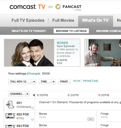
Remember users’ settings. Violating this principle destroys users’ work, so provides one of the more egregious examples of doing harm to users. In that column, I used Comcast’s Fancast Browse TV Listings page, shown in Figure 1, as an example of an application that violates this principle in several ways. This Fancast page does a poor job of saving users’ settings both within and across sessions. In fact, users may have to reset some settings repeatedly during a single session. Among other problems, for example:
If a user is looking at TV listings for a particular date and time, then has to restart his or her browser, the application does not retain the user’s previous settings for date and time across the sessions.
Problems with the Date and Time drop-down menus on the Fancast Browse TV Listings page that I’ve described under the next design principle are also examples of failing to remember users’ settings. While these menu settings are usually fairly easy to reset, having to reset them repeatedly becomes annoying.
Give users a sense of being in control. The Fancast Browse TV Listings page also provides an example of violating users’ sense of control. The order in which the page lets users perform specific interactions is very constrained—and unnecessarily so. For example:
If a user chooses a time on the Time menu, then chooses a different day on the unlabeled Date menu, the time reverts to the current time—at least it did when I starting writing this column. Now, inexplicably, it’s reverting to primetime, or 8PM.
If a user chooses a date on the Date menu, then clicks the PRIMETIME link, the date reverts to the current date.
Figure 1—Date and Time menu buttons
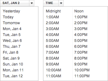
Figure 2 shows the Date and Time menus on the Fancast Browse TV Listings page. These menus exhibit some other basic interaction design problems, as follows:
The Date menu has no label, but displays the selected date, which is inconsistent with the behavior of the Time menu.
The Time menu displays its label rather than the selected time, which is inconsistent with the behavior of the Date menu.
The Date menu is an odd cross between a drop-down menu and a drop-down list, with the selected value appearing on it.
When a user clicks a date on the Date menu, the date changes, but the menu does not close as it should, so a user must click outside the menu to close it, sometimes repeatedly.
When a user clicks a time on the Time menu, the time changes, but the menu does not close as it should, so a user must click outside the menu to close it, sometimes repeatedly.
Figure 2—Date and Time menus
For consistency, both of these menus should have labels rather than displaying a user’s current selection. The current date should appear elsewhere on the page.
I have no idea why the Date and Time menus on the Fancast Browse TV Listings page have these usability problems. While it’s possible there were no designers who were responsible for interaction design on this project, I really doubt it—both because Comcast is a large company and because the visual design is quite good, with the exception of a few elements that don’t align properly in a grid. It’s also possible that this page did not get built as designed. However, it seems more likely that a designer either specified incorrect behavior for the menu interactions or simply failed to specify their behavior at all. Whatever the cause, the Browse TV Listings page provides an illustrative example of how behavior can go wrong. Now, let’s see how we might remedy these interaction design problems.
Redesigning the Date and Time Menus
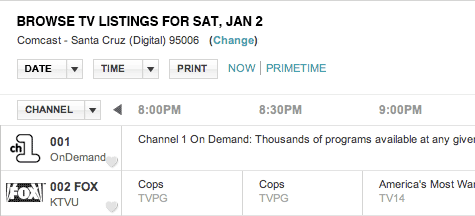
To provide an example menu behavior specification, I’ve redesigned the Date and Time menus and a few other features of the Fancast Browse TV Listings page that are closely interrelated with those menus, as shown in Figure 3.
Figure 3—Redesigned Fancast Browse TV Listings page
As you can see in Figure 3, I’ve changed the following elements on the Fancast Browse TV Listings page:
There was originally no title on the page and, since I’ve removed the display of the selected date from the Date menu, I needed to display the selected date in a new location, so I created a page title that serves both purposes, as follows: BROWSE TV LISTING FOR [DAY], [MON #].
I changed the following text and moved it to a new location: Your settings (Change): [ZIP code]
Or, when a user is signed in, this text: Your settings (Change): Comcast - [City] (Digital) [ZIP code]
This is the revised text: Your settings: Comcast - [City] (Digital) [ZIP code] (Change)
(Note—Change is a link that displays an overlaid dialog box, in which a user can provide a different ZIP code and select a Comcast service.)
I provided a static label for the Date menu and reduced the width of the DATE menu button, making it the same width as the TIME menu button.
I adjusted the vertical spacing between the elements, so it’s consistent and a bit tighter. Thus, the new design provides more information without taking up any additional vertical space.
I adjusted the vertical alignment of all the elements on the same line with the DATE and TIME menu buttons, so they have the same baseline.
I adjusted the vertical alignment of the label for the CHANNEL menu button, so it has the same baseline as the times heading the columns of TV listings.
I adjusted the alignment of the times in the grid, so they align with the columns of TV listings.
Note—Some text strings include variable text, which is conditional, so differs depending on state, and appears within brackets. For example, [DAY], [MON #] might be MON, JAN 4, [City] might be San Francisco, and [ZIP code] might be 94123.
Interaction Design Specification for the Date and Time Menus
This interaction design specification defines the behaviors for the redesigned Date and Time menus and related functionality on the Fancast Browse TV Listings page.
Note—Variable text on a Web page is conditional, so differs depending on state. Within this specification, variable text appears within brackets. For example, the text [Day], [Mon #], represents a variable comprising a 3-letter abbreviation for a day of the week and another variable comprising a 3-letter abbreviation for a month and a one- or two-digit date.
The Basis for Dates and Times
Both the default date and time and any dates and/or times a user specifies should display Comcast TV listings as follows:
If a user has specified a ZIP code, during either a previous session or the current session, display TV listings for the ZIP code the user specified.
If a user has not specified a ZIP code, but is signed in, display TV listings for the ZIP code on the user’s account.
Otherwise, display TV listings for the user’s current location.
Important—Always retain a user’s current ZIP code setting across sessions.
Note—Dates do not have leading zeros.
Default Settings for Date and Time
By default, display TV listings for the current date and time. Once a user has chosen a date and/or time, retain the user’s settings both during the current session and across sessions, until the date and/or time the user had chosen have passed. If the selected time has passed, display the current time. If the selected date has passed, display the current date.
The DATE and TIME Menus
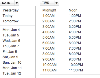
Figure 4 shows the redesigned DATE menu button; Figure 5, the DATE menu button when highlighted, because a user is pointing to it; Figure 6, the redesigned DATE menu and the TIME menu, which remains unchanged; Figure 6, the DATE menu, with an item to which the user is currently pointing highlighted.
Figure 4—Revised DATE menu button Figure 5—Highlighted DATE menu button, with a darker gray border Figure 6—Revised DATE menu and the unchanged TIME menu
As Figure 6 shows, the DATE menu button is now the same width as the TIME menu button and has a static label rather than displaying the current selection. There is also a separator bar between the relative and absolute dates.
Figure 7—A highlighted item on the DATE menu
Common Behaviors of the DATE and TIME Menus
Both the DATE and TIME drop-down menus have the following behaviors:
The clickable region of a menu button encompasses the entire button, including the drop-down arrow.
On hover, when a user points to a menu button, the button’s border appears highlighted—that is, it changes to a darker gray (#B8B8B8).
When a user clicks a menu button, the menu appears.
As a user drags the pointer over the items on a menu, each menu item appears highlighted in turn—that is, its background color changes to #FFE4DF—but the link for the item does not appear underlined. (No action occurs until the user releases the mouse button with the pointer over a menu item.)
Thus, to choose an item on a menu, a user can do either of the following:
Click a menu button to open the menu, move the pointer to the item on the menu, then click the item to choose it.
Move the pointer to the item on a menu that is already open, then click the item to choose it.
If a menu is already open and a user clicks another menu button, the menu that was already open closes and the other menu appears.
Once a menu appears, it remains open until the user either clicks an item on the menu to choose it, clicks the menu button again to close the menu, clicks another menu button, or clicks outside the menu to close the menu. Moving the pointer outside the menu does not close the menu.
Clicking an item on a menu to choose it closes the menu.
Clicking the menu button for an open menu closes the menu without choosing an item.
Clicking outside a menu closes the menu without choosing an item.
Important—The date and time settings a user changes by clicking items on the DATE and TIME menus should be independent of one another—that is, changing the time should have no affect on the date and vice versa. Nor should clicking the PRIMETIME link have any affect on the date. It should merely reset the time to 8:00PM, as it now does. However, clicking the NOW link should affect both the date and time settings, resetting them to the current date and time, as it already does.
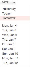
The DATE Menu
The DATE menu has the static label DATE and comprises the following options:
The following relative dates:
Yesterday—Clicking Yesterday displays TV listings for the previous day.
Today—Clicking Today displays TV listings for the current day.
Tomorrow—Clicking Tomorrowdisplays TV listings for the next day.
Separator bar
Below the separator bar, the menu lists nine absolute dates, starting with the current date, in the following format: [Day], [Mon #], where [Day] is a capitalized, 3-letter abbreviation for a day of the week—that is, Mon, Tue, Wed, Thu, Fri, Sat, or Sun—and [Mon #] is a capitalized, 3-letter abbreviation for a month—that is, Jan, Feb, Mar, Apr, May, Jun, Jul, Aug, Sep, Oct, Nov, or Dec—plus a one- or two-digit date—that is, a date with no leading zero, or more specifically, a number from 1 to 31.
Clicking a date on the DATE menu displays TV listings for that date, at the currently selected time, and changes the variables that are in the page title to the selected date, as shown in Figure 3. In the page title BROWSE TV LISTING FOR [DAY], [MON #], [DAY] is a 3-letter abbreviation for a day of the week, in all caps, and [MON #] is a 3-letter abbreviation for a month, in all caps, plus a one- or two-digit date. For example, the page title might be BROWSE TV LISTING FOR MON, JAN 4.
The Time Menu
The Time menu is unchanged and comprises the following options:
Midnight
1:00AM
2:00AM
3:00AM
4:00AM
5:00AM
6:00AM
7:00AM
8:00AM
9:00AM
10:00AM
11:00AM
Noon
1:00PM
2:00PM
3:00PM
4:00PM
5:00PM
6:00PM
7:00PM
8:00PM
9:00PM
10:00PM
11:00PM
Clicking a time on the TIME menu displays TV listings starting at that time, on the currently selected date, and displays that time above the first column of TV listings, as shown in Figure 3.
Important—Choosing a different time on the TIME menu should have no affect on the selected date.
Creating Interaction Design Specifications
Designers can create interaction design specifications using many different applications. When the goal is producing and disseminating beautiful, elegant printed documentation to impress business leaders or clients or for display on a wall, Adobe InDesign is frequently a designer’s tool of choice. Some organizations create templates that let designers more easily produce specifications using InDesign, which is not easy to use.
Other designers produce serviceable printed design documentation using Microsoft Word or another word processor. For many years, I used the Macintosh version of Microsoft Word for creating specifications, because it was easy to use and offered superb styling capabilities. I had created an elaborate set of styles that let me efficiently format my specifications. Later, when using Word for Windows, I found that styles did not work so well; and I encountered problems with its dumping all of my text style formatting, which is a serious problem when creating specifications, with their heavy use of bold type for labels. For these reasons, I stopped using Word for creating specifications quite a few years back. I switched back to the Mac a couple of years ago, so I don’t know whether Word for Windows still exhibits these problems. Word for Mac OS X does not have any of these problems, so is probably the better choice for creating printed specifications. However, I don’t recommend using Word if your goal is to publish HTML specifications on the Web.
Instead of using Word, I now usually create HTML/CSS specifications, which offer great flexibility and let me easily publish my specifications online, incorporating resource images for developers to use. Since I often work with remote development teams, publishing specifications and resource images on the Web has been very beneficial. To make producing my specifications more efficient, I’ve created HTML specification templates for various types of specifications, using CSS styles for both page layout and styling the content. I’ve created these templates and specifications using Dreamweaver, because of its WYSIWYG and table-creation capabilities, but do much of my HTML coding and all of my CSS coding by hand. My specifications also include Photoshop or HTML/CSS mockups that I’ve embedded in the specifications or to which I’ve provided links. Of course, there are many other excellent tools in which you can create mockups.
You can create PDFs of specifications you’ve produced using any of these applications, then publish them on the Web, where team members can download them, then, if they choose, print them. To create PDFs of HTML/CSS specifications, I use Paparazzi!
I don’t recommend creating specifications using wikis such as Google Sites, because of their weak support for both uploading images and embedding them within pages.
Components of an Interaction Design Specification
My interaction design specifications include the following elements and sections:
title page—In addition to the specification’s title, this page includes branding, the software release to which the specification applies, the publication date of the current version of the specification, the name of the specification’s author, and a confidentiality statement.
Revision History—This is a table comprising the following columns: Date, Author, Contributors, and Description. In the table, there in a row for each revision. Including the names of contributors, who are often peers in other disciplines, is very important to establishing shared ownership of a specification, which ultimately describes what a product team has agreed to build. Under Description, I provide links to all the sections of the specification that have changed and indicate what figures have changed, briefly describing the changes.
Table of Contents—The Table of Contents provides links to all numbered sections and subsections of the specification.
1.0 Overview—This standard section provides a brief overview of what the specification covers.
2.0 Definitions of Terms—This standard section defines specific terms I’ll use in the specification—such as terms for on-screen elements and interactions. Including this section helps prevent your specifications from becoming overly repetitive, lets you tuck the definitions for terms most readers already know out of the way, and for new terms, provides a place where readers can easily find them.
The remainder of the specification comprises numbered sections and subsections covering my designs for specific windows, pages, or features.
Communicating Behavior Clearly
When writing interaction design specifications, it is essential to communicate behavior clearly to prevent misinterpretation of your specifications by developers. Here are some tips for communicating clearly:
Use standard terminology.Always use the standard terms for on-screen elements and interactions. These are some of the best sources for the correct terminology to use in your specifications:
Define new terms. Clearly define new application-specific terminology at the point of its first use within a specification, but also within the “Definitions of Terms” section in a specification, to ensure readers can easily find definitions.
Provide scenarios. Use scenarios to provide overviews of users’ workflows and context for the detailed interactions that follow in your specifications.
Make your specification’s structure reflect users’ workflows. Presenting specifications for windows or Web pages in the same sequence users would typically encounter them in an application’s user interface helps clarify the application’s structure.
Include storyboards that show sequences of events. The step-by-step illustrations of behaviors that storyboards provide offer much greater clarity than words alone can, but they still require clear descriptions.
Communicate conditional logic.Always be sure to specify every possible sequence of events an application must handle as a result of user interactions, including all error cases. Get your development team to help you by having them let you know whenever they discover a new error case—developers are very good at this—then quickly provide the error message text to them and add it to your specification.
Provide examples to demonstrate complex behaviors. When describing transitions or other animations, it’s always a good idea to provide an example that shows the desired behavior. That could be a functional prototype, but you can instead refer developers to a JavaScript framework’s online demo of the behavior. Here are some links to demos of popular JavaScript frameworks:
jQuery—jQuery User Interface: Demos & Documentation—jQuery is a very popular JavaScript framework and provides an excellent and well-organized collection of demos of many interactions, widgets, and effects.
Mootools—Demos—This site offers numerous high-quality demos of behaviors for widgets, as well as effects.
Script.acul.us—There are many simple demos of effects and widgets on the gitHub Social Coding site.
Google Web Toolkit—Smart GWT Showcase—This excellent site presents many elaborate, highly interactive demos.
YUI 2—Index of Library Examples—Under YUI Components in the navigation bar on the left, you’ll find links to many different types of components. On the pages for individual components, under Quick Links, look for a link to Examples.
YUI 3—Yahoo! User Interface Library—YUI 3 is still in beta and, so far, the number of examples for YUI 3 widgets is limited to those for an overlay and a slider. Plus, there are examples of animation and drag and drop.
Be specific. Clear behavior specifications are detailed and very specific. For example, if an element should appear on hover, specify a 500-millisecond or longer delay before it appears. Don’t leave these kinds of details to developers.
Assume no knowledge. If you assume your developers have the same understanding of requirements, workflows, interactions, or behaviors that you do, you’ll often find your assumption was wrong. In an iterative requirements definition and design process, many things change. Developers might not have the latest iteration in mind. So, forestall misunderstandings by providing complete and clear specifications that assume no prior knowledge.
Revising Specifications
Because design is iterative and specifications should document what a product team has agreed to build, it’s very important to keep them completely up to date throughout a product development cycle. Whenever I receive feedback that requires me to revise my designs, I update my specifications—indicating what changes I’ve made in the Revision History, highlighting any text that has changed, and adding Revised to the section headings, table captions, and figure captions for sections, tables, and images that have changed—then republish them on the Web. Doing this ensures that the specifications are useful to the entire product team. My specifications document the product team’s current understanding of the goals and requirements for a project and the design that Development is actually building, so both Quality Assurance and Documentation can rely on the specifications to get a headstart on their work.
In Conclusion
While I’ve chosen to document my redesign of the Date and Time menus in an interaction design specification, the type of interaction design deliverables we choose to create isn’t of primary importance. What is key is expressing behavior adequately for implementation by developers. For these menus, this requires communicating all of the information I’ve provided in my specification through one means or another.
Please bear in mind that this specification is a first draft. If it were an actual specification that would really get implemented, it would go through a rigorous review by the entire product team. The feedback my team members gave me would allow me to improve both the quality of my design and the clarity of my specifications.
When you successfully engage the members of your product team in the process of designing interactions and behaviors and reviewing your interaction design specifications, the designs you create get built as designed. Creating detailed interaction design specifications that clearly communicate your design intent makes it possible for developers to make your design a reality.
Founder, Publisher, and Editor in Chief of UXmatters
Silicon Valley, California, USA
With more than 20 years working in User Experience at companies such as Google, Cisco, WebEx, Apple, and many startups, Pabini now provides UX strategy and design consulting services through her Silicon Valley company, Strategic UX. Her past UX leadership roles include Head of UX for Sales & Marketing IT at Intel, Senior Director of UX and Design at Apttus, Principal UX Architect at BMC Software, VP of User Experience at scanR, and Manager of User Experience at WebEx. Pabini has led UX strategy, design, and user research for Web, mobile, and desktop applications for consumers, small businesses, and enterprises, in diverse product domains. Working collaboratively with business executives, multidisciplinary product teams, and UX teams, she has envisioned and realized holistic UX design solutions for innovative, award-winning products that delighted users, achieved success in the marketplace, and delivered business value. As a UX leader, she has facilitated conceptual modeling and ideation sessions; written user stories; prioritized product and usability requirements; established corporate design frameworks, standards, and guidelines; and integrated lean UX activities into agile development processes. Pabini is a strategic thinker, and the diversity of her experience enables her to synthesize innovative solutions for challenging strategy and design problems. She is passionate about creating great user experiences that meet users’ needs and get business results. A thought leader in the UX community, Pabini was a Founding Director of the Interaction Design Association (IxDA). Read More

