Thinking of porting your Web finding experience to iPhone, Android, or Windows Mobile? Just forget about the fact that these devices are basically full-featured computers with tiny screens. Having gone through this design exercise a few times, I have realized that designing a great mobile finding experience requires a way of thinking that is quite different from our typical approach to designing search for Web or desktop applications. To put it simply, designing a mobile finding experience requires thinking in terms of turning limitations into opportunities. In this column, I’ll discuss some of the limitations of mobile platforms, as well as the opportunities they afford, and share a few design ideas that might come in handy for your own projects.
Champion Advertisement
Continue Reading…
Understanding Mobile Platforms
One of the challenges of mobile application design is understanding both the capabilities and limitations of each platform. Let’s use the iPhone finding experience as an example. On the plus side, the iPhone has a high-resolution screen, Multi-Touch controls, accelerometer, persistent data storage, cool video transitions, push content delivery, GPS, and a device ID. The benefits of these features have been pretty much beaten to death in advertisements, so I will not discuss them here. On the other hand, the problem constraints and limitations of mobile devices are much more interesting. I have found few sources that discuss these in detail, so in this column, I’ll attempt to describe the most important challenges of designing for the new generation of smartphones—at least as they pertain to finding:
the difficulty of typing
the small amount of screen real estate
awkward touch controls
the so-called fat-finger problem
The Difficulty of Typing
Searching requires users to type a search string, and typing on a mobile phone is difficult—partly because of the size of the device. In a July 2009 blog post on Alertbox, Jakob Nielsen called the mobile experience “miserable” and reported, “Text entry is particularly slow and littered with typos, even on devices with dedicated mini-keyboards.”
For many users, touch devices like the iPhone exacerbate this problem. Their screens display a virtual keyboard and other buttons. One issue with touch devices is poor visibility, because a user’s fingers must, by necessity, cover buttons on the screen when a user is pushing them. Thus, when pushing a button on a virtual keyboard, a user’s hand obscures his view of the keyboard.
The lack of tactile response on touch devices presents a particular problem when a user is multitasking—whether riding in taxi, using public transportation, or walking down a city street. On any mobile device, it’s very difficult to type when a person is crammed into a bus or subway car and being jostled around. A user’s desire to avoid typing becomes a necessity when using a mobile device while driving.
Another challenge users encounter when searching on smartphones is that they’re likely to lose anything they’ve laboriously typed into a search box if a device receives an incoming phone call, because mobile applications cannot block phone functions. Nor should an application, however useful, be able to prevent a user from receiving incoming calls.
The Small Amount of Screen Real Estate
Mobile screens are, by necessity, small, because a mobile device has to fit into a person’s pocket or purse. The small size of mobile screens limits the number of controls and the amount of content that can appear on them. In that Alertbox post I mentioned earlier, Jakob Nielsen reported, “Unsurprisingly, the bigger the screen, the better the user experience.” According to Nielsen, users’ success rates with touch phones like the iPhone are about double their success rates with feature phones.
Awkward Touch Controls
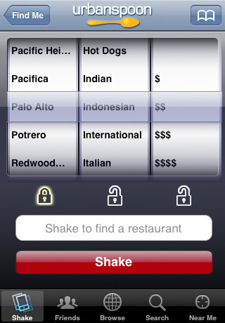
One of the consequences of mobile devices’ having smaller screens and controls that users must manipulate through touch interfaces is that some controls no longer look like their Web and desktop counterparts. For example, rather than the usual drop-down list or set of option buttons, the selection control on an iPhone is instead a spinning control called a picker, shown in Figure 1.
Figure 1—Three pickers in the Urban Spoon iPhone app
A picker that a user can quickly manipulate with a finger eats up precious real estate, so it’s not possible to show users much outside the picker. Large pickers also place limitations on how users can filter search results on mobile devices. Similar size restrictions exist for all of an application’s touch controls.
The Fat-Finger Problem
The high-resolution screens on better mobile devices—like the iPhone, Android, and Palm Pre—can accommodate fairly high information density. Unfortunately, at the same time, touchscreens limit the on-screen density of controls that users can accurately manipulate with a finger. Thus, placing multiple controls close together on a touchscreen mobile device presents difficulties. This challenge is known as the fat-finger problem.
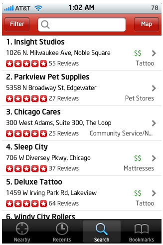
Typically, an iPhone touchscreen can comfortably support a maximum of only three to five clickable buttons or tabs across a screen. More than this leads to frequent frustrations due to users’ inadvertently pressing the wrong control. While five controls across a screen is the absolute limit for relatively frustration-free mobile computing for people with relatively small fingers, I highly recommend a limit of four or fewer controls. Of course, if one control is bigger than the others, you’ll have to reduce the overall number of controls accordingly. For example, Figure 2 shows the Yelp mobile application, which has only three controls across the navigation bar at top of the screen, but four controls across tab bar at the bottom.
Figure 2—Yelp iPhone app
Because Yelp’s search box takes up a large part of the navigation bar, the designers had to reduce the overall number of controls to three to ensure users’ wouldn’t press the wrong controls with their fingers too often.
Understanding User Experience within a Mobile Context of Use
The challenge in designing mobile applications is the need to accommodate the design constraints and usability challenges mobile devices impose, while focusing on users’ goals within a mobile context of use. Simply duplicating the functionality of a Web application—while trying to work around the mobile design challenges I’ve described—always results in a subpar mobile application. It’s not enough to think: How can I duplicate our Web application’s user experience within the limitations of the mobile platform? Instead, it’s better to start from scratch, focusing on What experience would work best for mobile users? Putting users’ goals first allows a design team to concentrate on the new opportunities a mobile application presents rather than seeing the challenges of mobile simply as barriers to implementing a Web application’s existing functionality.
Next, I’ll present some ideas about how to approach the design of finding experiences for mobile devices in a way that lends itself to taking full advantage of their capabilities within a mobile context of use. These ideas by no means represent an exhaustive catalog of all possibilities. I merely want to provide a few examples that may inspire further exploration as part of your own finding projects.
Preloading Pertinent Search Results
As I discussed earlier, typing on mobile devices is difficult. Plus, a phone call, a text message, or an opportunity to take a picture is likely to interrupt a user’s finding experience at least once. Saving a user’s previous searches is an obvious and simple way of re-engaging users in a finding task and provides useful context when an application first opens.
Unlike Web applications, native mobile applications are persistent, so it’s easy to cache their search results. Cached results load quickly, users’ re-engagement is immediate, and there is little to compete for a user’s attention—that is, at least until another phone call comes in. Some mobile device APIs even enable native applications to detect whether a phone call interrupted a user’s previous session or the user exited an application normally and determine how much time has elapsed since a user last opened the application. These capabilities present interesting possibilities for fine-tuning an application’s welcome-back screen to re-immerse users in their previous tasks or offer pertinent new content and present new possibilities for interaction.
Providing Local Results
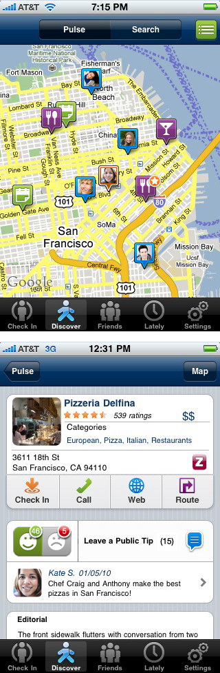
On mobile devices that support GPS, Wi-Fi, or other location-tracking mechanisms, you can determine the current location of another person who is using a mobile device, allowing applications to offer location-aware services. Mobile applications with search capabilities can serve highly relevant, fresh results that perfectly match a user’s current mobile context. For example, Loopt is just one of a whole cadre of social networking mobile applications that allow users to track the locations of their friends who are currently nearby and exchange messages with them, get coupons from local merchants, and discover neighborhood happenings, as Figure 3 shows.
Figure 3—Local search results in the Loopt iPhone app
Offering a Value-Added Interpretation of the Real World
Using mobile devices for sense-making in the real world offers one of the most intriguing possibilities for mobile applications. Luke Wroblewski described some interesting possibilities, including augmented reality applications, in his Smashing Magazine article “Enhancing User Interaction with First Person User Interface.”
When it comes to finding, however, the Amazon Mobile iPhone app offers the Amazon Remembers feature, which is a forerunner of many exciting things to come. Amazon Mobile lets customers take pictures of any real world items and add them to their lists of things to remember. Once a user uploads a photo, Amazon figures out what the item is and, if there is a corresponding item available for sale on Amazon, displays that item and sends the customer an email alert, encouraging her to purchase the item. Customers often get a response in a matter of minutes, but the search can take up to 24 hours. This application lays a solid foundation for the idea of a mobile Internet of objects that I described in one of my previous columns, “Brave New World of Visual Browsing.”
Providing Various Sorting Options
As I previously mentioned in my column “The Mystery of Filtering by Sorting,” sorting options are an excellent way of opening up an ecommerce site’s inventory for browsing. One of the best ways of doing this is to provide two or more buttons on a search results screen that allow multiple ways of dissecting an inventory, without ever failing to serve some results. By using sorting options together with geolocation, customers can even avoid having to type in any query at all. As Figure 4 shows, the ThirstyPocket iPhone app lets customers simply press the Search Nearest or Search Newest button to see a sample of local results without having to type anything in the search box.
Figure 4—ThirstyPocket iPhone app
Of course, a customer can always type keywords in a search box to narrow down the results. As I explained in my presentation at the Net Squared Conference in May 2009, using this design pattern lets customers engage with an inventory of items or content immediately, then invest the effort of typing in keywords once they have caught the scent of something that interests them or to refine the search results further. Of course, given the fat-finger problem and a mobile device’s limited screen real estate, we can’t provide more than three to five sort options on the screen at one time. However, as the ThirstyPocket example shows, even a couple of sort options is often enough for customers to begin exploring.
Considering Custom Controls
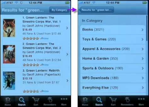
One consequence of mobile devices’ having a smaller screen is not having the space to create a navigation bar of filters, facets, or categories on the left, providing a key to the properties by which a user can effectively narrow down a result set. Consider, for example, the all-important category filter. If an application were to use the standard iPhone picker, shown in Figure 1, it would obscure most of the search results on the screen. Various applications deal with this challenge in different ways. Some mobile applications have created custom category-filter controls—like those in Amazon Mobile, shown in Figure 5.
Figure 5—Custom category-filter controls in Amazon Mobile
Clicking By Category takes a customer to a different, full-sized screen on which he can select a category. The ThirstyPocket application, shown in Figure 4, uses the same principle for its custom category selector, with an added twist: the visual design of the category selector is reminiscent of the familiar drop-down list, taking full advantage of customers’ existing mental model and helping them understand what behavior to expect.
Changing Search Paradigms
Because of the unique mix of constraints and opportunities that mobile application design presents, this design space is rich with possibilities for changing the existing paradigms for search and finding. Consider speech recognition, for example. While, on the desktop, speech recognition does not yet enjoy widespread popularity and use, mobile represents an entirely different context—where speech recognition can offer an ideal solution. Not interpreting a spoken word correctly on a mobile device might not be quite as big a deal as it is on the desktop, because the accuracy of speech recognition may actually approach, if not exceed, that of typing on a mobile phone’s awkward mini-keyboard. Combine speech recognition with the use of an accelerometer and magnetometer, allowing gestural input, and you have the Google Mobile search application for the iPhone, shown in Figures 6 and 7.
Figure 6—Google Mobile iPhone app Figure 7—Google Mobile Voice Search on the iPhone
The iPhone application Google Mobile recognizes the gesture of a person’s swinging the phone up to his ear to know when to record a search command. When the user speaks, the search engine accepts and interprets his voice commands, then serves up search results. This user interface implements what is literally a game-changing design paradigm, because its designers have taken the time to truly consider the mobile context of use and map natural interactions like speech and gestures to mobile device functions. As Peter Morville said in his book Search Patterns, “We simply raise our phones to our ears and speak our search, relying on Google Mobile to derive what we want from who we are, where we stand, and what we say…. Like placing your hands under a tap to turn on the water, this is the type of smart design that ‘dissolves in behavior’.”
When it comes to designing for a mobile context, we are just starting to scratch the surface. As Tom Chi of OK/Cancel famously quipped in his interview with Luke Wroblewski, “A well defined-and exciting problem (and its associated constraints) is the catalyst that makes design go.” When we stop thinking about the limitations of mobile platforms and, instead, truly focus on the user goals we are working to support, we might just find those limitations turning into opportunities for redefining how people find, remember, and discover things in their world.
Excellent article, like the other Search Matters columns!
I agree that apps like Google Mobile will be an important part of the solution, but before that happens, a lot of work needs to be done. First, on making voice search available in more languages and dialects. And second, on making it a lot easier to select those other languages.
Great article; really sets the stage for thinking through design of mobile search. I’ve been noodling this problem, too. We need to have good answers for our Enterprise Search customers asking about mobile experiences. On the Web, I’m a huge fan of faceted search, but as you point out, in mobile it doesn’t fit on the left anymore. I came up with a riff on Goggle Suggest, or auto-complete, and applied it to faceted search. I’m interested in feedback from others.
Founder of the San Francisco Bay Area UX design consultancy DesignCaffeine, Greg is widely recognized as an experience design and user research expert, specializing in search, social networking, business dashboards, and process redesign for mobile and Web platforms. Greg has published over 30 articles and speaks regularly to audiences around the world about how to design intuitive and elegant systems that improve the quality of people’s lives while creating abundant ROI. He has led design projects for Fortune 500 companies and creative startups. Read More

