Top

Designing with the Mind in Mind

April 5, 2010

This is a sample chapter from Jeff Johnson’s forthcoming book, Designing with the Mind in Mind: Simple Guide to Understanding User Interface Design Rules. 2010 Morgan Kaufmann.

Chapter 3: We Seek and Use Visual Structure

Chapter 2 used the Gestalt principles of visual perception to show how our visual system is optimized to perceive structure. Perceiving structure in our environment helps us make sense of objects and events quickly. Chapter 2 also mentioned that when people are navigating through software or Web sites, they don’t scrutinize screens carefully and read every word. They scan quickly for relevant information. This chapter presents examples to show that when information is presented in a terse, structured way, it is easier for people to scan and understand.

Consider two presentations of the same information about an airline flight reservation. The first presentation is unstructured prose text; the second is structured text in outline form (see Figure 3.1). The structured presentation of the reservation can be scanned and understood much more quickly than the prose presentation.

Champion Advertisement
Continue Reading…
Figure 3.1— Structured presentation of airline reservation information is easier to scan and understand.
Structured presentation of airline reservation information is easier to scan and understand.

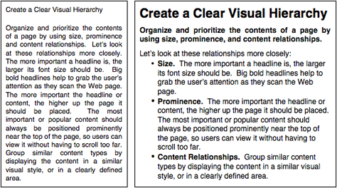
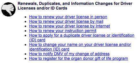
The more structured and terse the presentation of information, the more quickly and easily people can scan and comprehend it. Look at the Contents page from the California Department of Motor Vehicles (see Figure 3.2). The wordy, repetitive links slow users down and “bury” the important words they need to see.

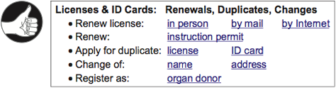
Compare that with a terser, more structured hypothetical design that factors out needless repetition and marks as links only the words that represent options (see Figure 3.3). All options presented in the actual Contents page are available in the revision, yet it consumes less screen space and is easier to scan.

Figure 3.2— Contents page at the California Department of Motor Vehicles (DMV) Web site buries the important information in repetitive prose.
Contents page at the California Department of Motor Vehicles (DMV) Web site buries the important information in repetitive prose.
Figure 3.3—“ The California DMV Web site.” Contents page with repetition eliminated and better visual structure.
The California DMV Web site.” Contents page with repetition eliminated and better visual structure.

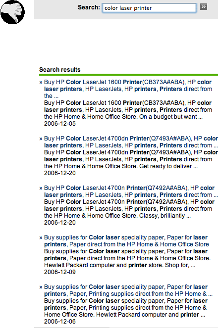
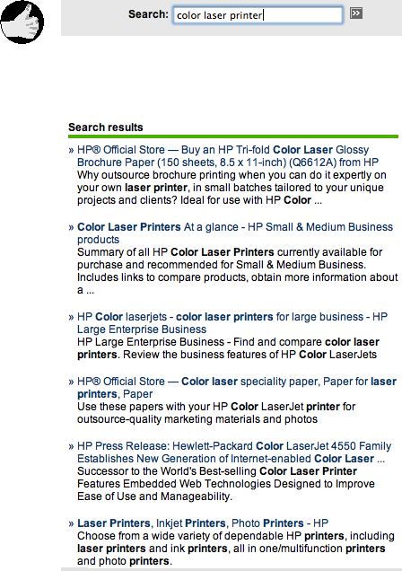
Displaying search results is another situation in which structuring the data and avoiding repetitive “noise” can improve people’s ability to scan quickly and find what they seek. In 2006, search results at HP.com included so much repeated navigation data and metadata for each retrieved item that they were useless. By 2009 HP had eliminated the repetition and structured the results, making them easier to scan and more useful (see Figure 3.4).

Figure 3.4— In 2006, HP.com’s site search produced repetitious, noisy results (top) but by 2009 was improved (bottom).
HP.com search results in 2006


Improved HP.com search results in 2009

Of course, for information displays to be easy to scan, it is not enough merely to make them terse, structured, and non-repetitious. They must also conform to the rules of graphic design, some of which were presented in Chapter 2.

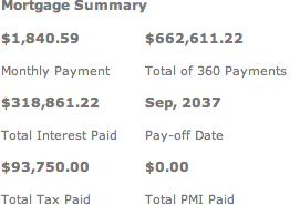
For example, a prerelease version of a mortgage calculator on a real estate Web site presented its results in a table that violated at least two important rules of graphic design (see Figure 3.5, top). People usually read (on- or offline) from top to bottom, but the labels for calculated amounts were below their corresponding values. Second, the labels were just as close to the value below as to their own value, so proximity (see Chapter 2) could not be used to perceive that labels were grouped with their values. To understand this mortgage results table, users had to scrutinize it carefully and slowly figure out which labels went with which numbers.

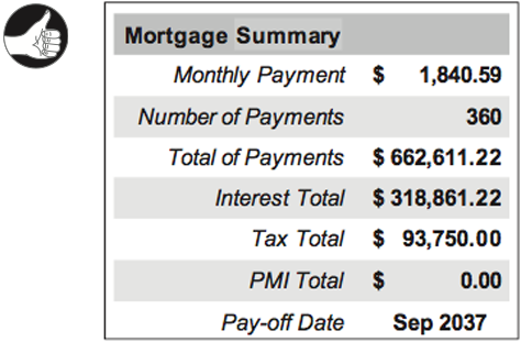
The revised design, in contrast, allows users to perceive the correspondence between labels and values without conscious thought (see Figure 3.5, bottom).

Figure 3.5— Top: Mortgage summary presented by a software mortgage calculator. Bottom: Improved design.
Poorly designed mortgage summary


Improved mortgage summary

Structure Enhances People’s Ability to Scan Long Numbers

Even small amounts of information can be made easier to scan if they are structured. Two examples are telephone numbers and credit card numbers (see Figure 3.6 and Figure 3.7). Traditionally, such numbers were broken into parts to make them easier to scan and remember.

A long number can be broken up in two ways: either the user interface breaks it up explicitly by providing a separate field for each part of the number, or the interface provides a single number field, but lets users break the number into parts with spaces or punctuation (see Figure 3.8A). However, many of today’s computer presentations of phone and credit card numbers do not segment the numbers and do not allow users to do it with spaces (see Figure 3.8B). This limitation makes it harder for people to scan a number or verify that they typed it correctly.

Figure 3.6— Telephone and credit card numbers are easier to scan and understand when segmented.
Telephone and credit card numbers are easier to scan and understand when segmented.
Figure 3.7— (A) At Democrats.org, credit card numbers can include spaces. (B) At StuffIt.com, they cannot, making them harder to scan and verify.
Democrats.org includes spaces


Stuffit.com doesn't include spaces

Segmenting data fields can provide useful visual structure even when the data to be entered is not, strictly speaking, a number. Dates are an example of a case in which segmented fields can improve readability and help prevent data entry errors, as shown by a date field at Bank of America’s Web site (see Figure 3.8).

Figure 3.8— BankOfAmerica.com: Segmented data fields provide useful structure.
BankOfAmerica.com: Segmented data fields provide useful structure.

Data-Specific Controls Provide Even More Structure

A step up in structure from segmented data fields are data-specific controls. Instead of using simple text fields—whether segmented or not—designers can use controls that are designed specifically to display (and accept as input) a value of a specific type. For example, dates can be presented (and accepted) in the form of menus
combined with pop-up calendar controls (see Figure 3.9).

Figure 3.9— NWA.com: Dates are displayed and entered using a control that is specifically designed for dates.
NWA.com: Dates are displayed and entered using a control that is specifically designed for dates.

It is also possible to provide visual structure by mixing segmented text fields with data-specific controls, as demonstrated by an email address field at Southwest Airlines’ Web site (see Figure 3.10).

Figure 3.10Southwest Airlines Web site: Email addresses are displayed and entered using a control that is specifically designed for them.
Southwest Airlines Web site: Email addresses are displayed and entered using a control that is specifically designed for them.

Visual Hierarchy Lets People Focus on the Relevant Information

One of the most important goals in structuring information presentations is to provide a visual hierarchy—an arrangement of the information that:

  • Breaks the information into distinct sections, and breaks large sections into subsections
    Labels each section and subsection prominently and in such a way as to clearly identify its content
    Presents the sections and subsections as a hierarchy, with higher level sections presented more strongly than lower level ones

A visual hierarchy allows people, when scanning information, to separate what is relevant to their goals from what is irrelevant instantly, and to focus their attention on the relevant information. They find what they are looking for more quickly because they can easily skip everything else.

Try it for yourself. Look at the two information displays in Figure 3.11 and find the information about prominence. How much longer does it take you to find it in the nonhierarchical presentation?

Figure 3.11— Find the advice about prominence in each of these displays. Prose text format (left) makes people read everything. Visual hierarchy (right) lets people ignore information irrelevant to their goals.
Find the advice about prominence in each of these displays. Prose text format (left) makes people read everything. Visual hierarchy (right) lets people ignore information irrelevant to their goals.

The examples in Figure 3.11 show the value of visual hierarchy in a textual, read only information display. Visual hierarchy is equally important in interactive control panels and forms—perhaps even more so. Compare dialog boxes from two different music software products (see Figure 3.12). The Re-harmonize dialog box of Band-in-a-Box has poor visual hierarchy, making it hard for users to find things quickly. In contrast, GarageBand’s Audio/MIDI control panel has good visual hierarchy, so users can quickly find the settings they are interested in.

Figure 3.12— Visual hierarchy in interactive control panels and forms lets users find settings quickly. (A) Band in a Box (bad), (B) GarageBand (good).
Band in a Box lacks visual hierarchy


Garage Band has good visual hierarchy

Print VersionDownload a PDF version of “Chapter 3: We Seek and Use Visual Structure.”

Discount for UXmatters Readers—Throughout 2010, buy Designing with the Mind in Mind from Morgan Kaufman, using the discount code UXMATTERS, and save 20% off its retail price. 

Principal Consultant at Wiser Usability, Inc.

Assistant Professor, Computer Science Department, at University of San Francisco

San Francisco, California, USA

Jeff JohnsonAt Wiser Usability, Jeff focuses on usability for older users. He has previously worked as a user-interface designer, implementer, manager, usability tester, and researcher at Cromemco, Xerox, US West, Hewlett-Packard, and Sun Microsystems. In addition to Jeff’s current position as Assistant Professor of Computer Science at the University of San Francisco, he has also taught in the Computer Science Departments at Stanford University, Mills College, and the University of Canterbury, in Christchurch, New Zealand. After graduating from Yale University with a BA in Experimental Psychology, Jeff earned his PhD in Developmental and Experimental Psychology at Stanford University. He is a member of the ACM SIGCHI Academy and a recipient of SIGCHI’s Lifetime Achievement in Practice Award. Jeff has authored numerous articles on a variety of human-computer interaction topics, as well as the books Designing User Interfaces for an Aging Population, with Kate Finn (2017); Designing with the Mind in Mind: Simple Guide to Understanding User Interface Design Rules (1st edition, 2010; 2nd edition, 2014); Conceptual Models: Core to Good Design, with Austin Henderson (2011); GUI Bloopers 2.0: Common User Interface Design Don’ts and Dos (2007), Web Bloopers: 60 Common Design Mistakes and How to Avoid Them (2003), and GUI Bloopers: Don’ts and Dos for Software Developers and Web Designers (2000).  Read More

Other Articles on Sample Chapters

New on UXmatters