In this Ask UXmatters column—which is the second in a special, two-part series focusing on Web form design and evaluation—our experts discuss the following topics:
In this column every month, our Ask UXmatters experts answer our readers’ questions about user experience matters. To get answers to your questions about UX strategy, design, or research in an upcoming edition of Ask UXmatters, just send your questions to us at: [email protected].
Champion Advertisement
Continue Reading…
The following experts have contributed answers to this column:
Jessica Enders—Principal at Formulate Information Design
Pabini Gabriel-Petit—Publisher and Editor in Chief, UXmatters; Principal User Experience Architect at Spirit Softworks; Founding Director of Interaction Design Association (IxDA); UXmatters columnist
Gerry Gaffney—Founder and Lead Consultant at Information & Design; Coauthor of Forms that Work: Designing Web Forms for Usability
Joel Grossman—SVP, Technology & Operations at Leapfrog Online
Peter Hornsby—Senior Information Architect at Friends Provident; UXmatters columnist
Mike Hughes—User Assistance Architect at IBM Internet Security Systems; UXmatters columnist
Caroline Jarrett—Owner and Director at Effortmark Limited; Coauthor of Forms that Work: Designing Web Forms for Usability; UXmatters columnist
Cone Johnson—Interaction Designer and Co-founder of JSTAR Studio
Jim Ross—Principal of Design Research at Electronic Ink; UXmatters columnist
Putting a Paper Form Online
Q: My organization has a paper form that we want to put online. How should we go about doing that? Also, how do you decide what format to use—for example, HTML, Flash, PDF, or proprietary software?—from a UXmatters reader
Does the Paper Form Work Well?
“The very first step is to get a thorough understanding of the paper form,” advises Gerry. “Is it working well? Who fills it in and what assistance or resources do they use? What errors occur? How are you identifying and rectifying those errors—if indeed you are? How and when do you enter the data or transfer it to an internal system? Who uses the data? Is any data redundant? Are there ancillary or associated forms, and should they be subsumed within the new online version of the form?
“Don’t rely on hearsay for any of this information; it’s absolutely critical to observe all of these processes at first hand. For example, I worked with a telco that wanted to put data networking requests online, so customers could fill them in using a Web browser, but on investigation, it transpired that customers were unable to complete the existing paper forms and were relying on the telco’s own technical personnel to complete them. Putting them online would have been counterproductive—to say the least.”
Evaluating and Understanding the Need for Web Forms
“Most important, take the time to evaluate and, if necessary, redesign the form,” suggests Peter. “Are you asking the right questions of the right people? Who are you aiming the form at, and what is the context in which they will be completing the form? Understanding the context will help you to word the questions—and answers—in the most appropriate way for your users, as well as to determine in what format you should make a form available.
“For instance, your users may be completing the form on behalf of someone else, away from their computer, and, therefore, need to upload it later. In this case, making the form available in a printable, hardcopy version with a corresponding Web version may be the best solution. Test the form with real users to ensure the wording you are using makes sense to them and that the flow of the form is appropriate. Electronic forms give you a great opportunity to show people only what they need to see by using the dynamic aspects of Web applications to manage the perceived length of a form.” Peter highly recommends that you check out Luke Wroblewski’s book Web Form Design: Filling in the Blanks and his other writings and presentations about form design on his Web site.
Gerry recommends that you do “typical user-centered activities—understand the users’ motivations, expectations, and tasks; become familiar with their terminology and their requirements and design accordingly. My colleague Caroline Jarrett wrote in 2000 that: ‘Organisations have sometimes been surprised and disappointed when they re-engineer a forms-based data capture process, but fail to achieve their anticipated savings.’ Read Caroline’s paper, ‘Understanding the Costs of Data Capture’.”PDF
What Format Should You Use?
“Web forms that are implemented using Ajax provide rich interactions that can greatly assist people in successfully completing forms online,” advises Pabini. “For example, to ensure users don’t need to bother with parts of a form that aren’t applicable in their case, you can use progressive disclosure. Once a user has given a particular answer to a question in a form, you can reveal later parts of the form whose relevance depends on a user’s having that answer. Employing progressive disclosure draws users’ attention to fields they need to complete and prevents their being overwhelmed by an unnecessarily long form.
“Interactive user assistance can offer tips that help users provide information in the proper format and let them know whether they’ve completed a field correctly. Such tips appear only once a user has selected a field, so prevent a form from becoming cluttered with text. Plus, tips and error messages appear at their point of need—in terms of both space and time—making them convenient for users to read and act on.”
“Stick with the conventional and create your form in HTML,” replies Jim. “Flash, PDF, and other proprietary software only make your form more difficult for users. One great advantage of HTML forms is that they work with AutoFill features like those that come with the Google Toolbar and other similar toolbars. With one click, users can fill in most conventional form fields with their information. However, that works only if you’ve coded a form correctly. Be sure to code and test your form fields to be sure they work correctly with AutoFill features. This will make it much easier on your users, potentially increasing the accuracy of the information you get and increasing the completion rate. The disadvantage of Flash, PDF, and other formats for form is that they do not use AutoFill.”
“The simplest mechanism is often the best,” says Cone, “I find that most people these days are very comfortable receiving a PDF as an attachment to an email message. So, if a paper form is something that can easily fit on one page, creating a digital form that people can easily fill out and return by email is a quick way of getting a good response. To get a digital form, you can create a PDF in Acrobat and gather input just as you would with any online form.
“If there are anonymity concerns, I’d suggest creating a Web page in HTML, where, again, you can easily gather the data into a database. Providing a link to a page where users can quickly fill out a form and submit it may prove to be most effective for some audiences.”
“I can’t really comment on what format—that is, what delivery tool—to use, other than to say that a key criterion for choosing it would be whether users would have access to it,” answers Gerry. “For example, proprietary software may be fine for an in-house or intranet form, but would be likely to cause problems for a wider community.”
Avoiding Web Form Dropouts and False Information
Q: We’re getting a lot of dropouts on our two-page registration form. My boss says, if we put the whole form on one page, it will fix the problem. But I think we’re asking too many marketing questions that we’ve made mandatory. How can we resolve our difference of opinion? Also, our database is full of dummy names—like Mickey Mouse and some that are downright rude. What can we do about that?—from a UXmatters reader
Agreeing on the Right Solution
“Many factors can influence dropouts,” replies Gerry. “It’s possible that, if you put the whole form on one page, the dropout rate would improve. It’s also likely that reducing the number of questions you ask would be beneficial. It’s often worth asking why you’re collecting information. Sometimes people ask for information they don’t actually use, so culling those questions can be a big help.”
“You and your boss may both be right,” suggests Jim. “Moving to a shorter, one-page form and removing the marketing questions or making them optional are two things that would likely increase your completion rates.
“Testing is a great way to resolve differences of opinion. Create and test several different versions of the form: the current form, a one-page form—your boss’s idea—a two-page form in which the marketing questions are optional, and a one-page form in which you’ve either made the marketing questions optional or removed them.
“You can conduct either usability testing or A/B testing. Usability testing gives you qualitative information about which parts of the form people object to filling out, but A/B testing may demonstrate more realistic behavior. With A/B testing, you put all four versions of the form online. When users on your Web site click the link to the registration form, the site randomly displays one of the four versions of the form. After a few weeks, you can look at the data to compare the completion rates for the four forms. If you see that one is performing much better than the others, you’ve got the kind of data that resolves disagreements. If you still need more information about why one form works better than the others, you can also conduct some usability testing to get those kinds of answers.”
“I’ve got a really simple answer for you,” says Joel “Run an A/B test. Put up a control version of the form—the 2-pager—and another version that is a one-page form. For a thorough explanation of how to construct a statistically valid test, see ‘Practical Guide to Controlled Experiments on the Web: Listen to Your Customers, Not to the HiPPO.’ Depending on the programming language or framework your Web site uses, there are many free and Open Source toolkits like A/Bingo for Ruby on Rails, django-lean for Python/Django, and Genetify for JavaScript. These are pretty easy to implement. Don’t get into an unnecessary argument about differing opinions—let the facts speak for themselves.”
“To resolve your difference of opinion, you need to talk!” exclaims Peter. “Where in the broader process does registration occur? At the point of registering, do users have a compelling reason to complete the form, or are you requiring them to complete the form before they can do anything on your site? For instance, it is frustrating for users to have to register on a site before they can start shopping.
“Come to an agreement with your boss, and any other core stakeholders, about what the core purpose of the registration form is—both for your business and for your users—then look at each element of the registration form in light of its core purpose. Get some users to work through the form, speaking aloud as they go and describing their thoughts and feelings, so your boss can see their reactions. If some marketing questions are mandatory, can you preselect answers, so users can be aware of them without needing to spend time answering them?”
A Matter of Trust
“The fact that people complete your registration form with dummy names indicates that they do want to complete their registration—perhaps to get some benefit of registering,” explains Jim. “Otherwise, they would just drop out rather than finish filling out the form. But the fact that they provide dummy names indicates they don’t want to provide their personal information. They may not want your company to contact them, or perhaps they don’t trust your company with their information. The mandatory marketing questions may contribute to this lack of trust. Removing or making the marketing questions optional may help solve this problem. You may also want to provide assurances about how you’ll use users’ information or options for how or whether you’ll contact users. Provide information about your privacy policy and let users know whether you intend to share their information with other companies. Doing all of this will help improve your impression of trustworthiness.”
“If your database is full of junk names, it’s probable that people don’t trust you or feel that you’re asking for inappropriate information,” agrees Gerry. “Making questions mandatory can be necessary, but always runs the risk that people are just going to give you any old answer just to get through a form. Sometimes, explaining why you’re asking can help—for example, if you need an address for credit-card verification.”
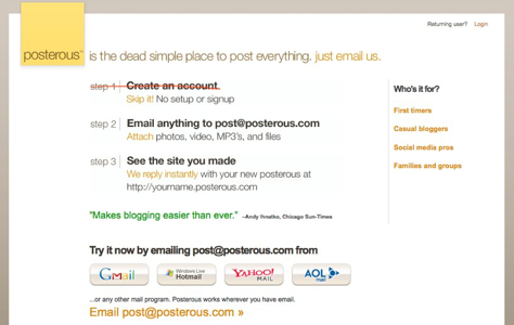
“Sometimes it’s not the length of a registration form that’s the problem as much as it is people’s unwillingness to share information,” points out Cone. “Suggest to your marketing folks that your form may be hindering signups, then streamline the form and find another way to gather that information once a visitor opts in to become a customer. Try a shorter, less invasive registration form to see whether that eliminates the fake names and dropouts. One interesting idea would be to implement an extremely simple registration form that’s a 3-step process. Provide visuals so users can clearly see where they are in the process—for example, a progress meter. Or go even more lightweight like posterous, shown in Figure 1. Only 2 steps! What could be simpler? And a great way to entice registrations!”
Figure 1—Signup page on posterous
Applying Aesthetic Styles to Web Forms
Q: How can I apply our company’s aesthetic style to a form without negatively impacting its ability to communicate and collect information?—from a UXmatters reader
Should You Put Visual Design or Usability First?
“Aesthetics don’t need to compromise usability and, indeed, the best visual design can really enhance a form’s ability to communicate and collect information,” answers Jessica. “For example, having form fields vertically aligned not only looks neater, it means faster completion and fewer errors.”
“In most cases, you can readily accommodate your company’s aesthetic style,” agrees Gerry. “In fact, you do want to ensure that your form does look like it’s associated with your organization, so people don’t feel they’re being passed on to a third party. Just maintaining the same color scheme and displaying your company’s logo is usually adequate.
“Users’ form-filling behavior actually helps. Once people are engaged in completing a form, they tend to ignore anything on the periphery. My colleague Caroline Jarrett uses the term page furniture to describe the stuff that’s around the edges of a form—things like logos, contact details, and ‘office use’ identifiers. Most people ignore them unless they run into trouble—in which case, they’ll generally start looking outside the core area of a form.”
“Impossible to say specifically without looking at the particular style,” says Caroline. “Broadly, try to keep the fancier elements away from the labels and boxes that create the main flow through the form.”
“Comply with your company’s rules for color and font,” recommends Mike. “But give the form elements the appropriate affordances—such as making writeable fields look writeable and buttons big enough for users to easily click them. People know there’s a difference between style for articles versus style for forms. They will accept functionally different styles where it makes sense, as long as the other branding elements are consistent.”
“One common problem I’ve observed in the application of corporate color schemes to Web forms is a failure to consider the legibility of text,” explains Pabini. “Adequate value contrast between labels or other text in a form and a page’s background color is key to good legibility. So, when you apply your corporate colors to the elements in a form—whether you’re using dark text on a light ground or light text on a dark ground—be sure the value contrast between them is sufficient.
“In judging contrast, consider older users and others with poor eyesight. What’s legible to a typical 25-year-old’s eyes may not be legible to everyone. To achieve good legibility, you may need to either darken or lighten certain colors in your company’s color scheme, while staying true to its aesthetic style. You may also want to use gradations of colors to communicate hierarchy or provide emphasis within a form. In Web forms, color does much more than just communicate branding—it also helps you communicate more effectively with users.”
The Corporate View of Web Forms
“In my experience, most company style guides do not cater to forms,” responds Jessica. “Brochures, posters, letterhead, business cards, annual reports—the list goes on and on, but no form guidelines! This is an unfortunate state of affairs, to say the least, because forms are—as you have suggested—a key medium of communication. They can also have very different visual requirements compared to other materials. For example, a style guide that insists all text be flush left doesn’t marry well with a form where labels would work best flush right. For more information, see the January 2010 Ask UXmatters column, ‘Label Alignment in Long Forms.’
“I suggest applying a company’s aesthetic style to a form, but in instances where it may clash with usability, ask for an exception—given that a form is a very different medium to other artifacts that only provide information rather than collecting it. If you’ve used the logo, corporate colors, the corporate typeface, and some key heading styles, the form should certainly look like part of the brand family, perhaps giving you some leeway when it comes to other visual design elements.”
“You may need to make the case that forms are not like other Web pages, and that they need a template of their own that excludes extraneous elements,” recommends Gerry. “For example, having company announcements, advertising, or similar material in the margins has the potential to distract users from completing a form—presumably a nondesirable outcome.”
“Web forms present unique visual design challenges,” observes Pabini. “If your company doesn’t already have form design guidelines, create them—hopefully, deriving them from your existing forms’ best practices. Web form design guidelines can help ensure best practices propagate across all of your Web forms—offering the advantages of consistency in their presentation and efficiency in their design and implementation.”
Exemplary Web Forms
“There are lots of form collections on the Web—for example, ‘100 Outstanding Login Forms’,” offers Caroline. “You will see that, for straightforward forms with just a couple of fields—for example, registration forms, blog comment forms, or contact us forms—you can apply practically any aesthetic style and the form will probably survive it. That particular collection includes all sorts of bizarre usability errors such as
illegible text
buttons that do not look like buttons
labels inside the fields
labels presented as icons instead of text
“But somehow or other, these forms were successful enough to make it into a list of ‘outstanding forms’.
“You will also observe that most forms in the collection do keep to a simple, straightforward layout for the actual labels and boxes—even though they appear in quite an amazing range of different aesthetic styles. Do this much—make sure your users can read the text and associate each label with the correct box—and you’ll probably be fine. But make sure you test with your users.”
Thanks for sharing—great article. What I real like is that it gives a very good overview and also quite a lot of detailed information. You managed to straddle the extremes of detail and generality very well. Thanks!
Dr. Janet M. Six helps companies design easier-to-use products within their financial, time, and technical constraints. For her research in information visualization, Janet was awarded the University of Texas at Dallas Jonsson School of Engineering Computer Science Dissertation of the Year Award. She was also awarded the prestigious IEEE Dallas Section 2003 Outstanding Young Engineer Award. Her work has appeared in the Journal of Graph Algorithms and Applications and the Kluwer International Series in Engineering and Computer Science. The proceedings of conferences on Graph Drawing, Information Visualization, and Algorithm Engineering and Experiments have also included the results of her research. Read More