User researchers frequently use card sorting to understand how users perceive the structure of a Web site and the ideal way for them to navigate through the site. Usually card sorting starts with doing an inventory of a Web site’s content, then creating a card for each stand-alone piece of content. Researchers recruit participants for a card sort from a Web site’s target audience, then ask them to group the cards into categories that make sense to them.
There are two methods of card sorting: open card sorting and closed card sorting. In an open card sort, participants are free to group the cards into any category they feel is appropriate, then label the groups using their own descriptors. In a closed card sort, participants group the cards into predefined groups with predefined category labels. Depending on whether you’re validating or creating a sitemap, you can give participants either a closed card-sorting task or an open card-sorting task. You can do card sorts in person, using real cards, or online, using virtual cards. Doing card sorts with real cards gives participants a more tangible sense of actually sorting cards and offers them a more flexible way of organizing cards. Alternatively, online card sorts provide a good way of gaining access to a larger number of participants.
Champion Advertisement
Continue Reading…
Challenges of Card Sorting
Generally, user researchers claim card sorting is an easy method of research. However, in practice, I have found that, while card sorting is easy to conduct, it presents several challenges that likely prevent researchers from using this method more. The UXmatters article, “Card Sorting: Mistakes Made and Lessons Learned” by Sam Ng also discusses this concern. One particular challenge is analyzing the data from a card sort, then presenting the results to clients. A question usability professionals often ask is: How can we efficiently analyze the results of a card sort and present them in a meaningful way that conveys the method’s value?
In an ideal world, participants would go through the cards, make sense of the information on each of the cards, then gather the cards into meaningful groups. Once a researcher analyzed the results of the card sort, a perfect Web site structure would appear. The real world is considerably messier. In reality, it’s unlikely that hundreds of participants would be in complete agreement, so we usually see a wide range of different categorizations arising from a card-sorting exercise. Analyzing card-sorting data sometimes means going through results from a couple hundred participants and trying to recognize meaningful patterns in the data. It usually involves a tedious data-cleansing process and a time-consuming data-analysis process. Cluster analysis and dendrograms are the methods of analysis researchers most frequently use, but they seem to present a high bar for many usability professionals to overcome.
The next step is the most challenging: presenting and explaining the results to clients. Clients seem to have difficulty understanding a cluster analysis and all that’s going on with dendrograms. So, basically, we need a quick-and-dirty way of analyzing and presenting card-sort data that conveys the value of the card-sorting method.
A Recent Experience
My colleagues at Business Online and I recently had a wonderful experience using card sorting—although it was a bit intimidating at the beginning. We had a sitemap we wanted to validate, so we conducted an online card-sorting exercise. Around 400 people participated in our card sort. Each participant sorted 50 cards into 10 predefined categories. Once we cleaned up the data, we found that we had around 350 sets of good responses. We tried several different ways of analyzing and visualizing the data. After a couple of different trials, we discovered an effective, yet simple way of presenting our card-sort data that demonstrated the value of the card-sorting method—both within our UX team and externally to clients.
A Quick-and-Dirty Method of Analyzing and Explaining Card-Sorting Results
You can analyze card-sorting results effectively and present them visually by following these steps.
Step 1: Identify the Common Categories
For a closed card sort, you’ve already predetermined the categories. If you’ve done an open card sort, you need to identify the most commonly suggested categories among all of the responses.
Step 2: Create a Matrix
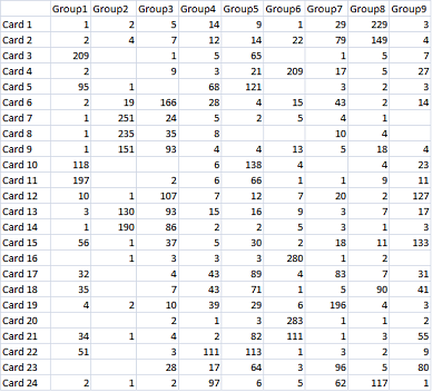
Create a spreadsheet, listing the cards in the rows and the categories in the columns. From your card sort’s results, determine how participants grouped the cards into the categories, then add the raw counts to your spreadsheet, as shown in Figure 1.
Figure 1—Raw counts of card-sorting results in a matrix
Step 3: Calculate the Percentages
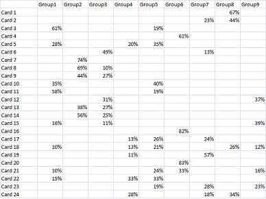
Replace the raw counts with percentages. Each percentage is the number of participants who sorted certain cards into a particular group divided by the total number of participants. Once you’ve calculated the percentages, keep only the percentages that are substantial enough to take into serious consideration. To quickly determine the meaningful results and gain insights from our recent card sort, we used a 10-percent threshold, deleting all lower percentages from the spreadsheet. This threshold can vary based on the scale of your card sort and the goals of your study. Now the spreadsheet should look as shown in Figure 2.
Figure 2—The percentages in the matrix
Step 4: Group the Cards
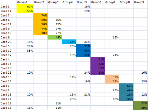
Starting with Group 1, reorder the cards according to which cards have the highest percentages among all of the groups. For example, for Cards 3 and 11, the highest percentages fall under Group 1; for Cards 7, 8, 14, 9, and 13, under Group 2; and so forth. Once you’ve determined which cards have their highest percentages under each group, rearrange the cards so all of the cards with the highest percentages are together in the matrix under each group. Continuing our example, move Cards 3 and 11 to the top of the spreadsheet; gather Cards 7, 8, 14, 9, and 13 under Group 2; and so on. Then use different colors to highlight the clusters of cards under each of the groups.
Figure 3—Cards grouped by percentages
Step 5: Analyze the Distribution of Percentages, Group by Group
Analyze the distribution of percentages across the groups. For each group, go through each card under the group and compare their percentages, then consider why participants made their judgments.
Step 6: Make Your Decisions
Based on your comparison of the percentages, decide where to place the corresponding content, where to crosslink between content, and where to duplicate content. Sometimes you might need to change labels for categories as well.
Special Considerations When Doing Card Sorting
Through my research, I have found there are some ways to increase the effectiveness of the card-sorting method. You can create pre- and post-card–sort questionnaires to collect more information from participants before and after a card sort. Participants may offer good insights that help you overcome the limitations of online card sorts. This can be especially useful with closed card sorts. I have seen better group-labeling options come from participants’ open-ended comments.
In some cases, asking participants to group cards based only on a simple category label is not sufficient. They may need better descriptions or more examples of content to make better judgments about the categories to which certain content should belong. You should pay special attention to the wording of your cards’ labels to avoid situations in which participants group cards together simply because they contain the same words.
In general, card sorting allows participants to group cards at only one level rather than grouping them hierarchically. In practice, I have found that this is not always sufficient. Sometimes participants feel it’s necessary to group cards into multiple levels of hierarchy. When participants are sorting real cards, they can easily do this if you allow them to arrange cards in different ways of their choosing. However, in online settings, this is more difficult, because few online card-sorting tools allow it. If future card-sorting tools let participants resize cards—making them larger or smaller to represent a higher or lower level in a hierarchy—respectively, these tools would be much more flexible and effective.
Summary
Card sorting is a great method of understanding users’ interpretations of a Web site’s structure. Through my experiences using card sorting, I have recognized that there are several challenges with using the method—in particular with data analysis and the presentation of results. To address these challenges, my colleagues and I have employed spreadsheets to visually represent card-sorting data and present the results of studies to clients, and we have received positive feedback from them. My experiences have also demonstrated that gathering additional insights from card-sort participants through questionnaires and providing more context for participants add value to the method. User research practitioners should consider enriching the results of their card sorts by taking the approaches I’ve described.
Thank you very much for writing this article. Dealing with information overload after extensive UX exercises is always a major hurdle, and any help is much appreciated!
I’ve just had a big lunch, so I might be a little slower in my understanding than usual, but there seems to be a mistake in your graph. I have now read 4 times through the paragraph, but I always come to the same conclusion:
For card 24 and card 5, I believe that you coloured the wrong group. The value in the coloured block is lower than the maximum - wouldn’t this mean that these cards should be in different groups? Card 24 should be in group 8, and card 5 should be in group 5.
Evan here from Optimal Workshop—makers of OptimalSort, our card sorting tool.
We really liked your article and were particularly inspired by the matrix that you’ve designed for presenting card-sorting results.
In response, we have just added a new Popular Placements Matrix to OptimalSort for closed card sorts. (We have recently enhanced our downloadable Analysis Spreadsheet for open card sorts, too.) So, as it’s brand new—we’ll call it beta for now, and if you have any feedback we’d love to hear it!
I have a quick question: we deal with a lot of overlapping cards. How would you arrange the matrix to deal with the idea that cards 3 and 11 were distributed between two groups who used them unevenly? Meaning that group 1 used cards three and 11 the most, but group 2 used them about half as much, so there would be overlaps in the card arrangement. Card three would be in the first row, but also in the fifth row. Would you suggest creating two different matrices, or is there some way to distinguish the overlapping data on the same sheet of reference data for clients? I am trying to avoid scope creep here. Thank you for the great article.
Thanks for your comment, John. If you are describing a situation as card 22 in Figure 3, where the percentage is distributed evenly between group 4 and group 5, my experience is that it requires deeper analysis of the data to find out why this happens. Possible reasons could be labeling confusion, content repetition, or others. Based on your understanding, you may then decide where to place the corresponding content, where to crosslink between content, and where to duplicate content. Sometimes you might need to change labels for categories as well.
How would you recommend collecting data from a client where we want them to be able to select more than one category for a piece of content to appear in if necessary? With dynamic content we will have a single place where it lives, but it can show up in other areas of the site. Are you aware of a tool that can do this?
Shanshan has extensive research experience in understanding how human beings organize and find information on the Web and in their own personal computing environment. Her expertise includes designing and conducting user research, handheld device and Web site usability, and user experience consulting. Shanshan received her PhD degree in the area of Human-Computer Interaction from Drexel University. Read More