Top

10 Ways Mobile Sites Are Different from Desktop Web Sites

Mobility

User experience on the move

A column by Shanshan Ma
March 21, 2011

Web site design principles and best practices are becoming well known these days. For example: In a process funnel, progress status should be readily visible across its pages. We should prevent errors from happening, but when errors do occur, provide adequate guidance to help users resolve them.

Many believe the basic principles and guidelines that are applicable in the design of Web sites should still apply when designing for mobile platforms. After all, Web design has evolved from basic, text-based HTML pages into today’s Web standards. So, we might expect that mobile sites that follow the same guidelines could easily reach the same level of success with users that desktop Web sites have achieved.

Champion Advertisement
Continue Reading…

However, the design of mobile sites is still in its infancy. As Jakob Nielsen’s 2009 study on mobile usability pointed out, users’ success rates when using mobile devices to access mobile sites averaged only 64%, which is quite low in comparison to the 80% average success rate for users who access Web sites on a computer. The form-factor difference seems to have a dramatic impact on the success rates of users’ interactions, and therefore, should impact how we design mobile sites as well.

New principles and best practices will inevitably arise as mobile site design continues to evolve. As a first step toward achieving this evolution, I’ve looked at how some successful mobile sites already differ from desktop Web sites. Based on my analysis of several verticals, including airlines, ecommerce, social networking and entertainment, and travel sites, I have identified 10 ways in which mobile sites should be different from desktop Web sites.

1.  Content Prioritization

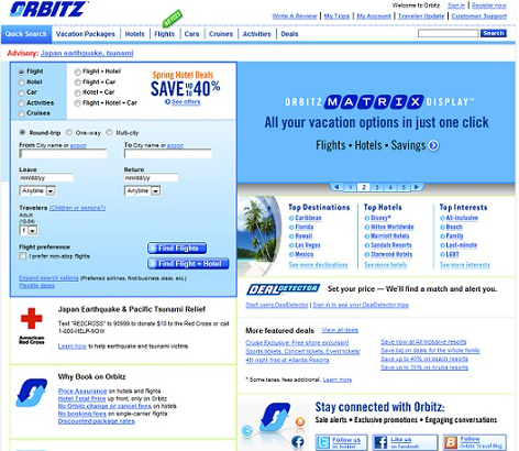
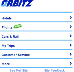
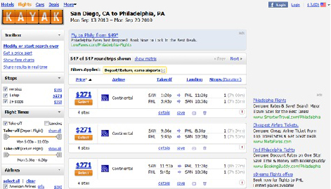
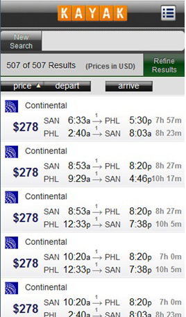
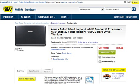
In comparison to the design of Web sites for desktop computers—typically, for a 1024 x 768 screen resolution—the biggest challenge in designing a Web site for a smartphone with a 320 x 480 screen resolution is how to cope with this dramatic difference in screen size without sacrificing the user experience. While desktop Web sites often contain a wide range of content, mobile sites usually include only the most crucial functions and features—particularly those that leverage time and location, as the example Orbitz desktop and mobile Web pages in Figures 1 and 2 show. Mobile site designs should give priority to the features and content users are most likely to need when viewing a site using a mobile device. Having insights into your customers’ needs dictates a lot from a content-development standpoint, as well as a site’s architecture and screen layouts.

Figure 1—Features on the Orbitz desktop Web site
Features on the Orbitz desktop Web site
Figure 2—Features on the Orbitz mobile site
Features on the Orbitz mobile site

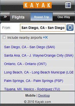
2.  Vertical Instead of Horizontal Navigation

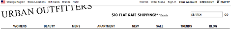
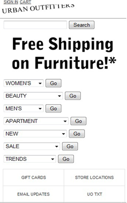
Horizontal navigation, like that on the Urban Outfitters site shown in Figure 3, is a widely accepted means of structuring and presenting content on desktop Web sites. Users scan a navigation bar from left to right, then click a link to go to a different section of a site. A UIE blog post titled “The Challenge of Moving to Horizontal Navigation,” by Joshua Porter, talked about the benefits of using a horizontal navigation bar at the top instead of placing navigation on the side of a page. When a navigation bar is at the top of a page, users can typically more easily focus on page content rather than their being visually attracted to the navigation bar on the side. However, vertical navigation has replaced horizontal navigation on more than 90% of the mobile sites I analyzed, including the Urban Outfitters mobile site shown in Figure 4.

Figure 3—Horizontal navigation bar on the Urban Outfitters desktop Web site
Horizontal navigation bar on the Urban Outfitters desktop Web site
Figure 4—Vertical navigation on the Urban Outfitters mobile site
Vertical navigation on the Urban Outfitters mobile site

3.  Bars, Tabs, and Hypertext

Hypertext is the signature component of the Internet and the Web, as Figure 5 shows. However, we see much less hypertext on mobile pages. It’s not that pages are no longer linked, but that links instead appear in the form of bars, tabs, and buttons, as shown in Figure 6. The reason for this is the optimization of mobile design for users’ operation of mobile devices with their fingers.

Hypertext is ideal when users click links using a mouse on a computer, but tapping links using your fingers on a touchscreen mobile device is not easy. Users can too easily activate a link they did not intend to tap and accidentally land on an undesired page. This can lead to a bad user experience. Fitts’s law tells us that the time required to acquire a target area is a function of the distance to and the size of the target. Bigger objects such as bars, tabs, or buttons allow users to tap with more precision. It is essential to make the actionable objects on mobile sites big and easily noticeable.

Figure 5—Kayak Web page with links
Kayak Web page with links
Figure 6—Kayak mobile page with no links
Kayak mobile page with no links

4.  Text and Graphics

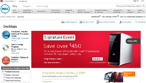
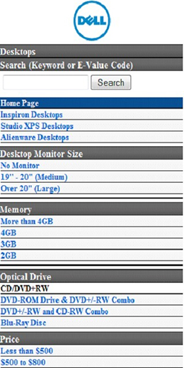
On Web pages, we can use graphics for many different purposes such as promoting, marketing, or navigating, as on the Dell Web site shown in Figure 7. However, designers often remove promotional or marketing graphics from the designs of mobile sites, as shown in Figure 8. The company logo remains for navigational purposes. Users can tap it to go to the home page. There are several reasons for this transition from many to few graphics. One reason is that some mobile devices do not support the software we traditionally use for desktop Web site design. Other reasons include the small screen sizes of mobile devices and the limited available screen real estate in which to display content, as well as the slow download speeds on mobile devices.

Figure 7—Dell Web page with graphics
Dell Web page with graphics
Figure 8—Dell mobile page with minimal graphics
Dell mobile page with minimal graphics

5.  Contextual and Global Navigation

Desktop Web sites typically use various forms of navigation, as on the Best Buy site shown in Figure 9. Some of them are global and remain consistent across a site, while others are contextual and change depending on where users are on a site. However, while global navigation is common on mobile sites, contextual navigation is not. The Best Buy mobile site shown in Figure 10 provides an example of typical mobile site navigation.

The main reason for the reduction of global and contextual navigation on mobile sites is the limited screen real estate on mobile devices. However, a lack of global and contextual navigation may cause users to find themselves in the middle of nowhere, not knowing where they are. Therefore, it’s essential to reduce hierarchy when organizing the content on mobile sites, so users don’t have to dig too deeply to get things done. They should be able to achieve what they want to accomplish before becoming lost.

Figure 9—Multiple types of contextual navigation on the Best Buy Web site
Multiple types of contextual navigation on the Best Buy Web site
Figure 10—No contextual navigation on the Best Buy mobile site
No contextual navigation on the Best Buy mobile site

6.  Footers

There are two types of footers that are in common use on desktop Web sites. One type of footer provides links to content that users might expect to see on a site’s home page, but has a lower priority than the primary content on the home page—for example, Careers or Sitemap. Another type of footer provides quick links to content users typically need to view most often. As shown in Figure 11, these quick links are often grouped in lists in a footer, so users have access to them across a site. Mobile sites employ footers that provide access to content users often look for on a home page, keeping its links to a minimum, as shown in Figure 12, but they do not use footers containing quick links.

Figure 11—Footer on the Dell Web site
Footer on the Dell Web site
Figure 12—Minimal footer on the Dell mobile site
Minimal footer on the Dell mobile site

7.  Breadcrumbs

On desktop Web sites, breadcrumbs are an effective way of reassuring users they are on the right page and allow them to backtrack on their navigational path like those shown in Figure 13. They make sense for large, hierarchical Web sites with lots of different content at multiple levels in a hierarchy. However, breadcrumbs rarely appear on mobiles sites, and there is usually no necessity for them. Limited space is one reason breadcrumbs are uncommon on mobile sites. But the main factor is that the design of mobile sites prevents users from having to go too deep into a hierarchy to find what they are looking for. Again, users should be able to achieve what they want to accomplish on a site before they start feeling lost.

Figure 13—Breadcrumbs on Amazon Web site
Breadcrumbs on Amazon Web site

8.  Progress Indicator

On desktop Web sites, when users must progress through multiple steps to complete a process—whether they are making a purchase, as in Figure 14, or filling out a long registration form—there is often a progress indicator at the top of the page to guide users through the process. Such progress indicators do not appear on mobile sites. Again, limited space is the main reason.

Use alternative approaches to make users aware of their progress without a progress indicator. For example, instead of using buttons with implicit actions such as Next or Continue, use buttons with explicit labels that inform users exactly what the next step is—for example, Proceed to Checkout or Specify Shipping & Payment. Users still receive information about where they are in a process and what to expect at the next step.

Figure 14—Progress indicator on Amazon Web site
Progress indicator on Amazon Web site

9.  Integration with Phone Functions

Smartphones are communications devices, so making phone calls is their most basic function. While mobile platforms place many limitations on design and content, they also open up new opportunities that traditional Web sites cannot provide. For example, there is better integration with phone functions such as direct calling and text messaging, which lets mobile sites facilitate ordering products by phone—as shown in Figure 15—or send promotional text messages. Usually mobile sites let users select a phone number, then call or text that number—without having to type the number.

Figure 15—Shop by phone on the Best Buy mobile site
Shop by phone on the Best Buy mobile site

10.  Localized & Personalized Search

Another area of opportunity that is unique to mobile sites is the use of geolocation services or support. While this technology has been available for some time, only in the last five years has it gained traction in the consumer marketplace. Now, it is commonplace for mobile applications and Web sites to take advantage of this functionality by integrating it into value-adding services such as mobile search.

Many mobile devices can automatically detect where users are and give them local search results, as exemplified by the store location search on Best Buy, restaurant search on Yelp, and airport suggestions on Kayak, shown in Figure 16. This capability offers powerful opportunities for businesses to promote their products or services based on a person’s proximity to their place of business and their immediate intent.

Figure 16—Autodetection of geographical location to suggest an airport on Kayak
Autodetection of geographical location to suggest an airport on Kayak

In Summary

Based on my company’s research, which looked at a number of mobile sites from various industries, I’ve discovered 10 ways in which mobile sites differ from desktop Web sites:

  1. In comparison to desktop Web sites, which usually contain a wide range of content and information, mobile sites usually include only the most crucial and time- and location-specific functions and features.
  2. On desktop Web sites, horizontal navigation at the top of a page is a widely accepted way of structuring and presenting a site’s content. However, vertical navigation replaces horizontal navigation on more than 90% of the mobile sites we analyzed.
  3. Hypertext is the signature component of the Internet and the Web. However, on mobile sites, there are few or no hypertexts on pages.
  4. On desktop Web sites, designers use graphics for many different purposes, including promoting, marketing, and navigating. Mobile sites avoid using promotional and marketing graphics and use minimal graphics for navigation.
  5. Various types of navigation are available on desktop Web sites. Some are global, so are consistent across a site, while others are contextual and change depending on where users are on a site. In contrast, while most mobile sites have global navigation, contextual navigation is rare on mobile sites.
  6. On desktop Web sites, footers typically provide either links to content users might expect to see on a site’s home page or quick links that are available across a site to provide access to content users often need. Mobile sites employ a minimal form of the first type of footer, but they do not use footers containing quick links.
  7. On desktop Web sites, breadcrumbs reassure users that they are on the right page and let them backtrack on their navigational path. Breadcrumbs are rare on mobiles sites and really aren’t necessary, because of the relatively flat structure of mobile sites.
  8. Process funnels on desktop Web sites frequently use a progress indicator at the top of each page to guide users through the process. Such progress indicators do not appear on mobile sites.
  9. Mobile sites offer better integration with phone functions—and present marketing opportunities such as facilitating direct orders by phone or sending promotional text messages.
  10. Mobile sites can take advantage of technology that automatically detects where users are to present local search results. When users set up their preferences or profile, personalized search results become even more relevant and valuable to them. 

Principal User Experience Designer at BD

San Diego, California, USA

Shanshan MaShanshan has extensive research experience in understanding how human beings organize and find information on the Web and in their own personal computing environment. Her expertise includes designing and conducting user research, handheld device and Web site usability, and user experience consulting. Shanshan received her PhD degree in the area of Human-Computer Interaction from Drexel University.  Read More

Other Columns by Shanshan Ma

Other Articles on Mobile UX Design

New on UXmatters