In previous columns, I’ve talked about how the number of options in a choice set can influence decision outcomes, and I advised that it’s often best to limit the number of options to reduce a decision’s level of complexity. I also said that, when a decision is too complex, people adopt simplifying strategies to make the decision easier.
Champion Advertisement
Continue Reading…
Compromise Choices
Sometimes, people’s strategies for simplifying decisions are very predictable. For example, if you present two options at different price points, people will generally choose the cheaper of the two. But if you present three options, they’ll generally choose the mid-priced option. Such compromise choices, in which people avoid the extremes and choose the middle option, enable people to more easily justify their decisions.
For example, if I’m choosing a winter coat from a large selection, it’s harder to justify buying the most expensive coat. It’s also hard to justify buying the cheapest one—especially if I assume price reflects quality, which is what many people do. Choosing a coat from the middle of a price range is easier to justify, because I’ve compromised on both price and quality, and my decision seems more balanced.
A research study involving microwave ovens examined how the number of options available and the prices of those options affect decision outcomes. For the study, participants were split into two groups. The researchers offered the first group a choice between two microwaves: an Emerson at $110 and a Panasonic at $180. Results of the study showed that, given these two options, 57% of the participants preferred the Emerson; 43%, the Panasonic.
The researchers offered the second group of participants a choice between three microwaves: the same two options they had offered the first group, plus a different Panasonic at $200. Table 1 shows a summary of the results of the entire study.
Table 1—Study results
First Group of Participants
Second Group of Participants
Options
Price
Popularity
Options
Price
Popularity
Emerson
$110
57%
Emerson
$110
27%
Panasonic
$180
43%
Panasonic
$180
60%
—
—
—
Panasonic
$200
13%
The results of the study showed that, when only two options were available, more people preferred the cheaper of the two: the Emerson at $110. When there were three options, most people preferred the mid-priced option: the Panasonic at $180. [1]
Typically, the highest-priced item in a choice set is not the one that is most popular. However, it still serves an important purpose in that it drives traffic to the next most expensive option. Businesses sometimes make the mistake of eliminating their top-of-the-line offering, simply because it doesn’t sell as well as they hoped. By doing so, however, they run the risk of driving their overall revenue down, because they lose the anchoring effect of the most expensive item.
Implications for UX Design
The strategy of making compromise choices plays itself out in many scenarios in which a user interface presents people with a list of items from which to choose. As a UX designer, you’ve probably had to make decisions about how to display items—for example, whether they should appear in a drop-down list or scrolling list box or directly on a page.
And maybe that’s as far as your involvement went. Perhaps you didn’t get into the details of how to order items within the list. That decision might either have been made by someone on the business team, or the team might even have left the ordering to chance.
In my last column, I talked about why the ordering of the available options is such an important aspect of decision architecture and how it influences decision outcomes. To illustrate, let’s consider a study where researchers were interested in finding out how participants would respond to three different ways of presenting a choice set consisting of investment options. The object was to determine to what extent the ordering of items within each type of choice set would influence decision outcomes.
The researchers tested three menus, whose options are represented in Table 2, where each letter represents a different type of investment option. The investment options varied incrementally along a spectrum of increasing risk such that A was the lowest risk, and D was the highest risk. [2]
Table 2—Three menus
Menu 1
Menu 2
Menu 3
A
B
C
B
C
B
C
D
Specifically, researchers were interested in finding out how many people would choose options B and C, which were common to all three menus, but appeared in a different position in each menu. In which menu do you think participants chose option C most often?
Here are the results of the study:
29% preferred C over B in the first menu
39% preferred C over B in the second menu
54% preferred C over B in the third menu
Do you see what’s happening? Most participants simply chose the middle option—or in Menu 2, the first option. Think about the implications for how people invest their money! People didn’t know how to decide, so they used a simplifying strategy: pick the middle option.
Many UX designers and business professionals tend to believe that people approach the making of important, personal investment decisions in a logical way—by carefully considering the pros and cons of each available option. Sometimes people do carefully consider their options. But often, they use a simplifying strategy that totally bypasses careful, analytical thought.
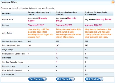
Using the strategy of picking the middle option occurs in a multitude of situations where people don’t have strong preferences about what they should choose or don’t know enough about a domain to know what to choose. Choosing the middle option enables people to easily justify their decisions and to feel as though they’re reducing their risk of making a wrong choice. For example, it’s likely that people select the middle business package shown in Figure 1 more frequently than the other two, especially if they aren’t sure which package is right for them.
Figure 1—Comparing business packages
The 1/N Strategy
An essential component of decision architecture is understanding the common decision strategies people use. We’ve already seen how numbers of options and their order affect decision making. Another shortcut strategy decision makers often use when they don’t have strong preferences or don’t know how to decide is to select equal portions of each option available: the 1/n strategy, where n = the number of options available.
To illustrate, let’s consider a study that examined how three different groups of people would distribute their investment contributions across two investment fund options. For each group, the two funds comprised of a different mix of investments, as shown in Table 3.
Table 3—Groups’ mix of investments in two funds
Fund A
Fund B
1st Group
100% stocks
100% bonds
2nd Group
100% stocks
50% stocks; 50% bonds
3rd Group
50% stocks; 50% bonds
100% bonds
Although people could distribute their money across the funds as desired—by contributing part of their money to both funds or all of their money to only one fund—researchers found that a large segment of the participants in each group chose to distribute their money evenly across both funds, regardless of what each fund comprised. [3] Consider how different their portfolios would look in each of these scenarios!
When people make important decisions that seriously affect their long-term well-being, the design of the decision context plays a critical role in the outcome of those decisions.
Defaults
We’ve already looked at two common decision strategies people use to simplify the decision process: compromise choices and the 1/n strategy. Another common decision strategy is to simply opt for the default value. Default values appear in many Web forms and play a significant role in people’s decisions.
Default values are influential because people sometimes assume that a default value is either the recommended option or that it represents the most popular option. They often choose the default value based on this assumption, especially when they’re not sure which option to choose. People also end up with the default when they opt not to decide.
In previous columns, I’ve discussed a variety of reasons why people opt not to decide. For example, perhaps they become overwhelmed by too many options or the complexity of a decision. People also avoid making a decision when the nature of the decision itself is unpleasant or stressful.
Staying with the default value is a comfortable choice because it often represents the existing state, or status quo, while making a change involves tradeoffs and the potential for loss. Because people are sensitive to losses and the amount of work decision making involves, they often find it easiest to simply accept a default value, making what is essentially an effortless decision.
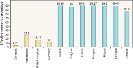
Let’s take, as an example, a decision about whether to become an organ donor. Deciding to be an organ donor is a difficult decision—and not a very pleasant one. Because of this, many people don’t want to make the decision at all.
Figure 2 shows data on organ donation rates from various countries. The yellow bars show countries where the default choice for organ donation was not to be a donor. In these countries, people needed to indicate explicitly that they wanted to be a donor. The blue bars show countries where the default choice was to be a donor. In these countries, people needed to indicate explicitly that they did not want to be a donor. Note the drastic difference in response between the yellow bars and the blue bars!
Figure 2—Organ donor data, by country
Defaults can play a powerful role in decision making, and this is why they’re such an important aspect of decision architecture. UX designers need to think carefully about which values they should designate as defaults and how these defaults will impact decision outcomes.
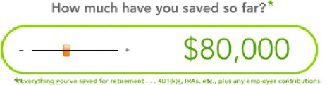
Defaults affect people not only when they’re not sure how to decide, but also when we provide defaults as a starting point. The $80,000 default shown in Figure 3 affects people despite the site’s asking them a very straightforward question: How much have you saved so far?
Research shows that people use an anchor-and-adjust strategy, where they start with the anchor value, in this case $80,000, and adjust from there. So regardless of how much people have really saved, their answer will reflect an adjustment from $80,000.
Figure 3—A slider with a default value
If a design instead simply asked the question and provided a text box, with no default value, as shown in Figure 4, people’s answers would be much more realistic.
Figure 4—An approach that results in more realistic data
The Importance of Decision Architecture
It’s easy to assume people make well-informed decisions that they’ve carefully thought out, but realizing how they really make decisions is quite eye opening. Remember, people are incredibly sensitive to the amount of work that decision making involves. Their objective is to make the best possible decision with the least amount of effort. Simplifying strategies reduce the amount of effort decision making requires and let people easily justify their decisions.
As UX designers, we can help people make better decisions when we understand their decision-making process—for example, the strategies and shortcuts they’re using. This is especially important when their decisions have serious implications for their long-term well-being. A key aspect of effective decision architecture is designing with people’s common decision strategies in mind.
Notes
[1] Shafir, Eldar, Itamar Simonson, and Amos Tversky. “Reason-Based Choice.”PDFCognition, Vol. 49, 1993. Retrieved March 17, 2011.
Colleen is a skilled writer and an experienced UX researcher who has spent hours watching people use Web sites and other digital tools. She has a deep understanding of what works—and what doesn’t—from a design and content perspective. Whether it’s an online user interface or the written word, she collaborates with her clients and partners to craft solutions that communicate clearly and succinctly. Colleen always welcomes opportunities to use her writing and UX design and research skills. Read More