Top

UX Dimensions of Conflict

User Assistance

Putting Help in context

A column by Mike Hughes
December 19, 2011

A project management instructor told me that, if there were unlimited resources and no deadlines, there would be no need for project managers. This general principle applies to many aspects of human endeavor: If there is no tricky path for you to navigate between a rock and a hard place, anybody can do it. So, why do we need you?

Fortunately, UX professionals often find themselves having to negotiate conflicting goals, looking for that sweet spot that optimizes the end result. However, working in software development, I have found two dimensions of conflict that are particularly challenging from a UX perspective:

  1. convention versus innovation
  2. control versus freedom

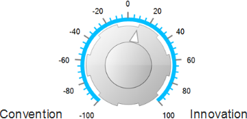
I like to think of these as knobs, like the bass and treble knobs on my radio. You can’t move in one direction without going away from the other, and you generally want to find some point in between the two extremes.

Champion Advertisement
Continue Reading…
Figure 1—Convention versus innovation
Convention versus innovation
Figure 2—Control versus freedom
Control versus freedom

The first knob, convention versus innovation, has to do primarily with design decisions. The second knob, control versus freedom, deals with how an organization chooses to manage the development process itself. In this column, I’ll describe these conflicts and suggest some considerations for UX professionals who are trying to navigate the appropriate course.

Start with a Value-Neutral Approach

Part of the problem in managing these conflicts is that most individuals and organizations have predetermined values assigned to these concepts. We talk about innovation with a lilt in our voice and a glow on our cheeks. On the other hand, describing someone’s thinking as conventional is almost pejorative. There is probably an even greater imbalance between freedom and control. After all, nobody wants to be labeled controlling. For starters, let’s dispel these myths. If only one end of either of these dimensions of conflict were good—and the other were bad—we would be in the situation my project management instructor described: There’s no conflict. We just need to do what’s obviously the right thing to do.

During my doctoral research, in which I studied how development teams learn collectively during usability tests, I came across a field called Action Science, which analyzes dysfunctional communication with a focus on resolving contradictions between stated beliefs and theories in use. In cliched terms: A lot goes wrong when there is a disconnect between our talk and our walk. When confronted with such disconnects, most of us tend to blame our walk for failing to meet the standards of our talk—and we vow to do better. But Action Science also challenges the validity of the talk. Many times, it provides a surprisingly simple answer: Stop saying what you obviously do not believe. You’re just confusing people.

So we need to deal realistically with these tensions by accepting that there is nothing wrong with a highly controlled development process that results in conventional designs that are financially successful. And if we choose to be free-wheeling and innovative, there must be good reasons for our decision that go beyond any innate belief that there is an inherent goodness in either.

Convention Versus Innovation

As a UX Architect, the dimension of convention versus innovation is where I find myself in conflict with many designers. I often take this position: If nobody has ever done this in this way before, users won’t expect it to work that way. Very often at the start of a design project, I’ll look at how others have solved similar user interface design problems. For example, if I’m building a customizable security dashboard, I’ll look at how MyYahoo! and iGoogle let users customize their home page. Or, if I’m designing a Web page that lets users schedule recurring online bill payments, I’ll look at how Outlook and Lotus Notes let users schedule repeating meetings. But when I report my findings during early design sessions, I’m sometimes confronted by comments like “We should be leading, not following.” In truth, I’m just trying to understand how users already expect these kinds of transactions to work, because, if we meet users’ expectations, we stand a good chance of having a predictable user interface.

But even though I think my bias for convention serves users well in many cases, I have to accept the fact that, in a field that advances as rapidly as software does, we continually have opportunities to do things in ways that are better for users. Doing so provides the dual opportunities of improving the user experience and differentiating ourselves in the marketplace. But when we’re pursuing innovation, we must make a commitment to ensure that an innovation is intuitive or helps users get through the learning curve as easily as possible. Since we tend to overestimate the intuitiveness of our own user interface designs, I suggest that you always devise a strategy to help users understand your innovation.

To illustrate how this might work, let’s consider a case where we are trying to make a financial dashboard more visual. Data visualization guru Edward Tufte makes an interesting point that we shouldn’t discount the value of a graphic just because users don’t understand it right away. His standard is: how informative and how efficient to use is a graphic once users know how to read it? For example, look at the bullet graph in Figure 3. If you had never seen one before, it might be a little confusing.

Figure 3—Bullet graph—from Wikipedia
Bullet graph—from Wikipedia

But once you understand how to read such a graph, you’ll find it to be a powerful way to understand a lot of data quickly and see it in context. See the annotated version in Figure 4.

Figure 4—Annotated bullet graph—from Wikipedia
Annotated bullet graph—from Wikipedia

In my dashboard design that introduced this innovation, I would have to include some kind of education strategy such as an illustration with callouts or annotations in a ToolTip.

In our zeal for innovation, we need to remember that novelty carries usability baggage and evaluate whether the added benefit justifies users’ added risk or burden. If the answer is yes, we must have a user instruction or education strategy—or do some usability testing to make sure the innovation is truly intuitive and valuable.

Additionally, UX conservatives like me need to remember that sticking with the familiar, although attractive in the short run, can leave our companies trailing the pack and dull their competitive edge.

Control Versus Freedom

Let’s take a quick, one question survey:

If you put something on a wiki, how would you like people to interact with things they disagree with?

  1. Send you an email.
  2. Add a comment to the wiki’s comment tab.
  3. Add an inline comment to the wiki page itself.
  4. Just make the change.

The above example helps illustrate a couple of points: First, we must measure our attitude about control versus freedom by how much freedom we are willing to grant others—not by how much freedom we want for ourselves. In general, we’re all in favor of a free environment when describing how we want others to treat us. But the real measure is how willing we are to tolerate the freedom of others. Second, your answer to the wiki question is probably conditional—depending on the following:

  • What kind of change is necessary to resolve a disagreement? For example, do you need to correct typos or make substantive changes to the content?
  • How important is the document? For example, is it an internal wiki for reserving the department’s projector or a customer-facing product page?

To better understand this particular dimension of conflict, let’s look at two contrasting organizations: Organization A, which is highly controlled, and Organization B, which emphasizes individual freedom and decision making.

Organization A

Organization A takes a waterfall approach to product development. Product Management issues a detailed Product Requirements Document (PRD), which was months in the writing. Engineering spends weeks analyzing the product requirements, then provides estimates and suggests changes. The two groups negotiate back and forth until they agree on the final PRD. At this point, Organization A implements its change-control protocol, and any revisions to the PRD must go through a change-control board for approval. The UX design team produces a functional specification based on the requirements, including detailed wireframes, then gives the functional specification to the developers for implementation. As the developers discover technical problems with the proposed solution, the designers revise the specifications and wireframes, and submit their revisions to the change-control board. QA tests the final product against test plans they’ve based on the functional specification.

Organization B

Organization B uses Scrum as its development protocol. Product Management submits a list of requirements for a new product offering to the team as a loosely structured Word document—often just a compilation of individual requests that they’ve collected over a period of time. Based on these sketchy requirements, a UX designer produces a few low-fidelity wireframes to communicate some design concepts. Then, the Engineering team organizes the requirements into user stories and begins working through the backlog. As technical problems come up, developers make the appropriate modifications. They generally ignore the wireframes once UI coding begins, because code is the ultimate documentation, and the wireframes are meant to be only guidelines.

You would not have to be a very creative writer to produce either happy endings or horror stories for either of the examples I’ve just described. I have worked in both types of environments, and either of these approaches can produce good products that are financially successful. Either can produce pigs as well.

As in the case of convention versus innovation, where I had an inherent bias toward convention, I have a bias here as well. I prefer the control-versus-freedom knob to be turned a bit more toward freedom than control. Although I produce fairly detailed wireframes, I use a low-fidelity tool, keeping a drawing-on-a-napkin look that says: Build something like this. I want the UI developers to feel free to apply their creativity as well. However, I have found that, if the process is too free-wheeling, we may end up either producing features that users don’t need—but are oh so cool—or missing critical requirements.

My current group tends to look like Organization B. So we have looked for ways to apply controls that do not stifle the freedom that nurtures creativity. We have found that we get the best results when we focus on two things:

  1. communicating the problem the design needs to solve
  2. providing clear guidelines that establish the boundaries within which a solution must work

We do the first by writing scenarios and the second through descriptions that we call strategic visions.

Scenarios

We use scenarios to capture and communicate requirements. A scenario is essentially a two-act play, in which Act I describes the problem and Act II describes the solution. A scenario’s main purpose is to communicate the requirements within the context of an end-to-end user experience. The engineers then break the scenarios down into agile user stories, which become the focal points of planning and tracking. Here is a typical scenario:

Custom Dashboard

Problem—Tom is the Security Analyst for ABC. He is mainly responsible for coordinating with the Security Operations Center of their managed security services vendor, regarding security issues and the change requests they’ve opened. Mary is the Security Manager for ABC. She is more interested in keeping up to date on ABC’s general security posture, including the overall vulnerability of her network and the health of her devices. Jeff is the Chief Security Officer. He is interested in a lot of the same things as Tom and Mary, but also likes to stay abreast of what’s happening in general in the computer security industry.

As Tom, Mary, and Jeff work individually with the existing dashboards on the vendor-supplied customer portal, they find some existing dashboards and portlets that they don’t care about distracting. They have to click back and forth between various dashboards, then look for the portlet that they want to see. Often, they can’t remember where a particular portlet is, so they have to hunt for it.

SolutionUsing a new release of the software, Tom logs into the portal and finds a new dashboard that has specific subsections for business roles such as Operations and Management. He looks at the subsection for Security Analysts, then quickly looks at the others and gets a feel for what portlets are available and how they’re laid out. He likes what he sees in general, but notes that ABC is unique in some ways and says, “No one of these is exactly right for me, but I could see a mashup that would work for me.”

Tom creates a new dashboard and starts to populate it with some of the individual portlets that are available. Some of these portlets allow custom configuration—for example, around timeframe. For one of the portlets, Tom would like to see both a 24-hour and a 48-hour view. So he creates two versions of the portlet—one named One Day; the other, Two Day. He deletes the other dashboards he does not need and now has a single, concise dashboard that meets his specific needs.

Mary and Jeff create custom dashboards for themselves, too. In fact, Jeff decides to create two separate dashboards. One includes vulnerability and operations information; the other, a collection of security news information.

These custom dashboards give Mary, Tom, and Jeff exactly what each of them needed—a high-level view that they’ve tailored specifically to their differing needs.

Strategic Visions

We use strategic visions to define a broad understanding of a problem space, including the general direction we want to take and the constraints we need to accommodate. A strategic vision should help developers make decisions that, over time, result in consistent solutions across multiple teams. Our visions have three distinct sections:

  1. a direct statement of the principle at the heart of the vision
  2. examples of how to apply that vision in practice
  3. examples of wrong practices—that is, those that do not apply the principle

Here is an example of a strategic vision for a product’s user assistance:

User Assistance

User assistance should be accessible from the point and at the time of need and require the least amount of intervention by Engineering to create and keep the information updated.

Practical Application

  1. Provide a chat link that offers a direct, real-time link to the Support Center.
  2. Create a document repository in which to store formal documents and instructional media.
  3. Provide page-level links to documents that are stored in the document repository wherever there is a targeted need that a specific document can meet. [1]
  4. Provide page-level links to knowledge-base articles that provide focused information and can contain attachments, including training media and more in-depth articles from public sources or the document repository. [1]

[1] Engineering’s responsibility is to provide the appropriate links. If SMEs outside of Engineering own these documents, those SMEs should not have to rely on Engineering to make updated content available.

Common Mistakes

Solutions that would require significant engineering interventions to create or update the content or its delivery—such as:

  1. an embedded Help panel that requires portal code to render its content

  2. Help systems that require a high degree of integration with a product or technical writers who are skilled in these tools
  3. content owners who do not have access to delivery channels such as the document repository or the knowledge base

Conclusion

Even though there is no single answer to the question of how innovative or conventional a team should be and no clear gauge for how free or controlled a development process should be, you can make thoughtful decisions about what the right settings for those knobs are within your own organization. In doing so, make sure you take a value-neutral approach and understand your own biases going in. Then, choose the appropriate balance for your team, and select whatever tools and processes make the most sense for where you’ve set those knobs. 

UX Designer at TSYS

Atlanta, Georgia, USA

Mike HughesIn his role as User Experience Architect for IBM Security, Mike’s professional focus is on designing usable user interfaces that accommodate the user as learner. Previously, as User Assistance Architect at IBM, Mike identified tools, methods, and standards for integrating the content and delivery of user assistance, including documentation, Help, elearning, and training. He was formerly Lead UX Designer for CheckFree Corporation, where he instituted their User Experience Research and Design Center. Mike has a PhD in Instructional Technology from the University of Georgia and a Masters in Technical and Professional Communication from Southern Polytechnic State University. He is a Fellow with the Society for Technical Communication and a Certified Performance Technologist through the International Society for Performance Improvement.  Read More

Other Columns by Mike Hughes

Other Articles on UX Strategy

New on UXmatters