Top

Communicating User Research Findings

Practical Usability

Moving toward a more usable world

A column by Jim Ross
February 6, 2012

“No one reads reports!”
“PowerPoint must die!”

We’ve all read monotonous reports and struggled to remain awake during boring presentations, but must all deliverables be interminably dull? Conveying user research findings so people can understand them, believe them, and know how to act on your recommendations can be challenging. And providing enough detail without boring your audience is a difficult balance. But there are some best practices in communicating user research findings that can make them more effective—and even entertaining.

Champion Advertisement
Continue Reading…

Why Provide Any Deliverable At All?

First, you might question whether your project needs a formal deliverable. Some project teams are tempted to simply translate their research findings into a product’s design without producing any documentation of their research findings. This saves time in the short term, but the danger is that, without some kind of description of the findings, the research knowledge remains in the brain of the researcher. When that person moves on to another project or another employer, you’ll lose that knowledge. I experienced this problem recently when I took over a project from a researcher who had left our company. It was extremely difficult to understand the previous research, because there were only raw notes and no deliverables.

Choosing a Deliverable Format

When choosing the type of deliverable that would best communicate your findings, two important things to consider are:

  • Who is the audience?
  • How soon do they need the findings?

Who Is the Audience?

Ideally, you should tailor your deliverables to the needs and interests of your audience, but a common difficulty is that you often have to serve a variety of audiences. High-level executives typically want only a brief overview. But the people who have to implement your recommendations—the application’s owner, designers, and developers—need to understand the details. So you may need to create several versions of your deliverables, each with varying amounts of detail. For example, once you’ve created a detailed version, you could strip it down to the essentials to create an executive summary version.

Your audience also determines the formality of your deliverables. If you are presenting findings to a client, your deliverable needs to be more formal than if you were doing research for your own, internal project team.

How Soon Do They Need the Findings?

Obviously, how quickly your audience needs the results of your research determines the detail and formality of your deliverables. For example, if you’re conducting iterative usability testing in the middle of a project, your goal is to quickly evaluate and make changes to the design, then test again. In this situation, you may prepare no deliverable at all and, instead, just have an informal discussion of your findings and the design changes your team needs to make.

On the other hand, if you’re conducting more exploratory user research, you may not have a distinct deadline, so it would make sense to take the time to do detailed analysis and present your results. Unless there is an important deadline you need to meet, it’s always best to give researchers time—within reason—to produce quality results. I’m always dismayed when a client spends a great deal of time and money conducting research, yet wants to rush through to the presentation of findings.

Types of Research Deliverables

There are various types of deliverables—from no deliverable at all to a full report. You should choose the deliverable that best allows you to communicate your findings and recommendations, in the time available, and considers the needs of your audience.

No Deliverable

It’s rare that you can get away with providing no deliverable, but if the right people are involved throughout the research, you can just discuss the findings afterward and make changes to the design, without spending any time creating a deliverable. However, remember that there will be no record of your findings for later use.

Quick Findings

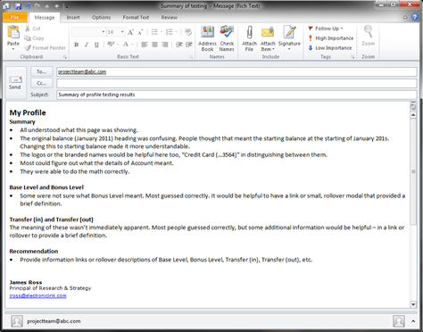
If time is a consideration, the quickest deliverable format is an email message or informal Word document with bullet points describing your overall findings and proposed design changes, as shown in Figure 1.

Figure 1—An informal, summary email message including your findings
An informal, summary email message including your findings

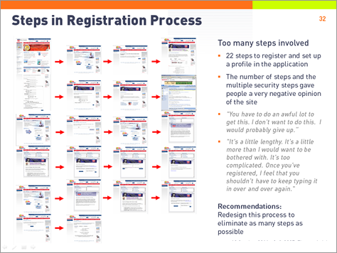
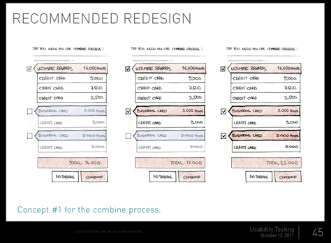
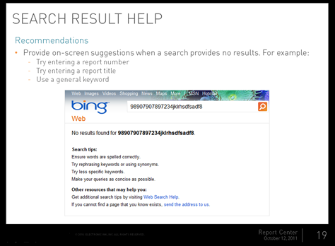
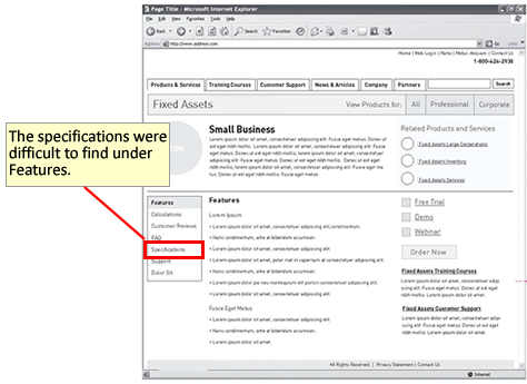
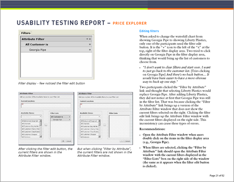
Another good option is to annotate the designs, pointing to the problem areas and describing your recommended changes, as shown in Figure 2. It’s usually quicker and easier to annotate designs than it is to describe problems only in text. It’s also easier for people to understand problems when seeing them in the context of a design.

Figure 2—A wireframe with annotated user research findings
A wireframe with annotated user research findings

When you have to document your findings quickly, you usually won’t have much time to go through your notes. Instead, you must rely on your memory of the main issues that you observed. An effective way to document these is to go through your testing protocol, question-by-question, and write down your overall conclusions about each task or topic. You’ll be surprised how much you can remember from the research off the top of your head. When doing this, you’ll naturally document your overall conclusions based on what you’ve observed rather than the details, which is exactly what you want to document in quick findings.

Detailed Reports

A report gives you the freedom to describe your findings and recommendations comprehensively and in as much detail as needed. However, it’s also easy to become verbose. In the past, I’ve written 100-page heuristic evaluations and usability test reports. But did anyone have time to read them? No wonder people have said that no one reads reports.

Figure 3—A usability testing report
A usability testing report

Though many people don’t read reports, they are valuable to the people who have to understand the problems and implement the changes. Web site and application owners are responsible for understanding any issues and prioritizing which recommendations to implement. Designers and developers need to understand user needs and the problems they face to design effective solutions for them. Even if each person reads only the parts of your report that apply to the aspects of a design for which they’re responsible, a report serves its purpose.

Reports are also valuable as a detailed archive of your research information. Once a project ends, even those who were involved in the research will gradually forget much of the information. Reports usually contain enough detail and context that someone new can read them later on and understand the findings.??

Lastly, reports have value as proof of the value of the research. If a client has just spent a lot of money and time doing extensive user research, they expect to see some substantial documentation from it. A high-level PowerPoint or a brief summary of findings usually doesn’t cut it. The hearty thwack that comes from slapping down a thick report on a conference room table is impressive, even if no one reads it. To some people, a hefty and detailed report says, “Here’s some impressive, comprehensive research. We got our money’s worth on this one.”

Presentations

The problem with a report is that there’s no way to easily present it. You certainly can’t just read it to your audience, and you usually can’t just tell people to read it themselves. You need to present something. So you have to create two deliverables—the report and the presentation.

Figure 4—A presentation of usability testing results
A presentation of usability testing results

As with reports, presentations can provide either a summary or the full details. If you have a detailed report, you can create a summary presentation and tell people to refer to the report if they want the full details. The problem is that many people see only the presentation and won’t read the report, so you often find that you have to convey most of the information in your presentation anyway.

To save time and money and avoid the duplication of effort involved in creating both a detailed report and a presentation, some people skip the report and, instead, create only a detailed presentation. However, it’s difficult to convey voluminous user research findings in the format of a presentation. And it’s unreasonable to expect an audience to stare at dense slides or absorb the kinds of data that are characteristic of robust findings.

When your only deliverable is a presentation, you’ll run into the two competing goals of a presentation: You need to optimize it for effective delivery, but because it’s your only deliverable, it also needs to be understandable on its own by those who view it later, without the explanations you initially give during your presentation.

The extra explanatory text that makes a presentation understandable on its own doesn’t necessarily make a presentation a compelling experience when you deliver it to an audience. One solution is to record an audio track, so those who view your presentation later can hear your explanation of the slides. However, not everyone wants to take the time to sit through such a presentation.

You’ll walk a fine line between providing enough explanatory text and overwhelming your audience with too many bullet points. One solution is to provide an appendix of additional material that you don’t present during a meeting, but that others can read later for more details.

Findings and Recommendations Matrix

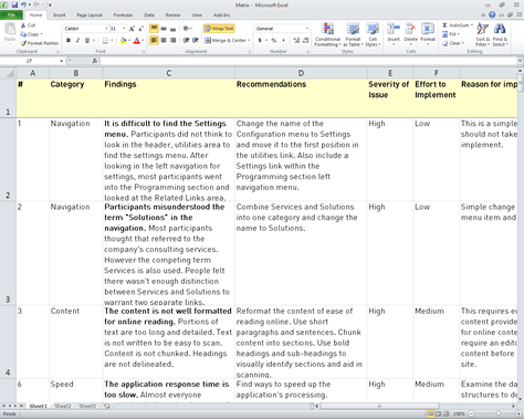
Reports and presentations provide a lot of context and examples, so people can understand your findings and recommendations, but once your audience has this initial understanding and a project team simply want to view and discuss your recommendations, all that extra content gets in the way. A findings and recommendations matrix is an additional deliverable that gathers all recommendations together in a simple table format—usually in Word or Excel—with a brief summary of the findings that led to each recommendation and, often, a severity rating for each issue. This matrix provides an easy format that lets a project team review the recommendations, prioritize them, and refer to them throughout the rest of a project.

Figure 5—A findings and recommendations matrix
A findings and recommendations matrix

Other Deliverables

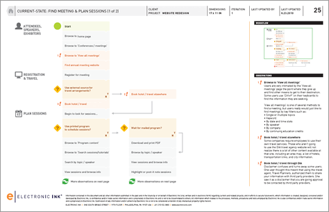
Other ways of describing and visualizing user research findings include scenarios, personas, workflow diagrams—like that shown in Figure 6—task analysis diagrams, customer journey maps, and experience maps. These forms of documentation are often better at conveying the information and bringing your research findings to life. For example, people who might otherwise be turned off by the thought of reading a long report often take the time to look at a deliverable that takes a more novel and visual approach—such as a set of personas.

Figure 6—A workflow diagram
A workflow diagram

Elements of Effective Research Deliverables

Regardless of the type of deliverables you provide, the following elements can make your findings and recommendations more understandable, more interesting, and more relatable.

Effective Writing

It’s important to clearly and succinctly describe your findings and accurately convey your recommendations. Your audience needs to understand what you’re talking about without their becoming bored by your providing too much information. Get feedback from someone on your project team to make sure your content is understandable. Get a content review from a writer or editor to make sure you have a well-balanced, persuasive piece of work. A good editor can point out where you get lost in evidence or don’t make your analysis or recommendations clear. Also, be sure that you or someone with a sharp eye proofreads your documentation to find and fix any errors.

Screenshots, Illustrations, Diagrams, and Charts

It’s difficult to convey research findings through text alone. Use annotated screenshots, illustrations, diagrams, charts, and other visualizations to show what you’re referring to in the text. In addition to clarifying the information, these types of visualizations break up the density of the text, making the deliverable appear more interesting and approachable. For example, Figure 7 shows a slide from a presentation that used small screenshots to show each of the 22 steps involved in what should have been a simple registration process. Showing that many screens on one slide was far more impactful than simply stating that the registration process involved too many steps.

Figure 7—Illustrating how many steps a process involves
Illustrating how many steps a process involves

Mockups and Examples

When it’s appropriate, illustrate your recommendations with examples. Create mockups that show the changes you’re recommending, as shown in Figure 8, or examples from other user interfaces that do what you’re recommending, as shown in Figure 9.

Figure 8—Illustrating your recommendations with an informal sketch
Illustrating your recommendations with an informal sketch
Figure 9—Illustrating recommendations by showing examples of other designs that take a similar approach
Illustrating recommendations by showing examples of other designs that take a similar approach

Photos

Photos are a great way of displaying the environment, documents, tools, signage, and other physical aspects of users’ context that you encountered during your research. For example, Figure 10 shows photos from a contextual inquiry that convey how much employees still rely on a paper-based process rather than online applications.

Figure 10—Photos in a presentation that depict a paper-based process
Photos in a presentation that depict a paper-based process

Photos are also a good way of showing your process to an unfamiliar audience. For example, you could display your usability lab setup, as shown in Figure 11, your eyetracker, a card-sorting session, or participants in a design session.

Figure 11—Using photos to demonstrate the research process
Using photos to demonstrate the research process

Quotations

Participant quotations are much more colorful and impactful than simply having a researcher describe a problem or general user opinions. For example, you could either say, Employees are frustrated with the new application, or you could use participant quotations like the following:

“It’s awful. It’s horrible. It’s the worst system I’ve ever used. At one point I thought, this is such a magnificent failure, there’s no way we’ll continue using it, but here we are.”—Employee

“It doesn’t assist me in anything. It’s just a record keeper. It would be nice if it were a more dynamic tool that helped me get my job done. Because it’s really a barrier to getting my job done.”—Employee

Of course, you should always ensure that the quotations you use are representative of what you heard from participants. You wouldn’t want to use these two negative quotations if most participants loved the application and found it useful, unless you balanced them with some positive quotations.

Sometimes you get so many great quotations that you’re tempted to include as many as possible, but if you gather too many quotations together, your audience won’t read all of them, and they’ll lose their impact. Choose the best quotations and don’t overdo it. With limited space on the slides of a presentation, it’s difficult to put quotations into a presentation. If you use too many quotations or they are too long, your audience will spend time reading them rather than paying attention to you.

Audio and Video Clips

Even more effective than reading the text of a quotation is hearing or seeing participants making comments themselves. While audio clips of participant quotations are useful, video clips allow your audience to see for themselves what participants actually did. With video clips, you can show how people perform tasks, what problems they encounter, the environments in which they work, and much more, as shown in Figure 12.

Figure 12—A video clip of a participant performing a task during usability testing
A video clip of a participant performing a task during usability testing

Video and audio clips are a powerful way of backing up controversial findings or recommendations. You can edit clips to show a series of different participants experiencing the same problem or expressing the same opinions. It’s difficult for your audience to argue with a finding after seeing a video clip showing several people encountering the same problem and what a negative impact it had on their experience.

Use video-editing software to create a number of short audio or video clips and provide links to them at various points in your presentation. Ideally, the clips should be just a minute or two long to ensure they hold your audience’s attention. Three minutes is about the maximum, but if you have very good quotations or examples, showing them may be worthwhile. You can always stop playing the clips after showing a few of them, letting those who want to see more of the clips view them later on. If you have a lot of video clips in a presentation, you usually won’t want to show all of them. You can leave in the extra video clips for reference, and those who want to watch them later can get more detail on a particular issue.

Don’t Forget the Obvious

As UX professionals, it’s easy to forget that our audience doesn’t know everything we know about our methods, the purpose of our research, and how to use our findings and recommendations.

Explain Your Methods

Give a brief summary of the goals of your research and the methods you used. Even if you’ve explained that before, it’s good to explain it again in your deliverables. Your audience may include people who have forgotten what you’ve already explained, people who never understood it in the first place, and people who weren’t involved earlier during a project. Your deliverables may live on long after a project ends, so they need to make sense at a later point when people have forgotten a project’s activities.

Note the Positive Aspects

Because our goal is to improve the user experience, user research tends to focus much more on the negative. Since our focus is on finding and fixing problems, we tend to take the positive aspects of a design for granted. For our audience, however, it can be depressing to hear an endless litany of problems and complaints about their application.

So be sure to balance the negative with some positive aspects of an application, if there are any. It’s a good idea to mention the positives at the beginning and end of your deliverable. It also helps to explain why user research often focuses on the negative.

Guide Your Audience on What to Do Next

Some audiences become overwhelmed by seeing a long list of problems and recommendations. They may wonder, Where do we start first? What do we do next? Sometimes the reason usability problems don’t get fixed is because no one knows how to proceed or no one gets assigned to fix them. Give your audience a plan for how to address the issues you’ve found. This usually involves meeting to discuss the problems, prioritizing which issues to fix first, and assigning people to work on the changes.

Size Doesn’t Matter

Length is a terrible way of measuring deliverables. The number of pages in a report or the number of slides in a presentation are irrelevant. Of course, deliverables should not be any longer than necessary, but saying deliverables should be no longer than X number of pages or slides is ridiculous.

Density of information is a better measurement. You can create a very short report or presentation if you include only text, while visualizations, photos, screenshots, and mockups can take up a lot of space. For example, an 80-page report with many illustrative screenshots and explanatory visualizations may be much more informative and much easier and more enjoyable to read than a 20-page report of wall-to-wall text. Similarly, a 150-slide presentation full of examples and screenshots may be more informative and interesting than a dense 30-slide presentation comprising only bullet points. Be clear and succinct, and judge the interest of your audience when determining the appropriate length.

In Summary

Summarizing these guidelines for creating valuable user research deliverables:

  • Choose the right deliverable format based on your audience and how soon they need your findings.
  • Ensure that your deliverables are well written and ask an editor to review them.
  • Supplement the text of a deliverable with screenshots, illustrations, diagrams, charts, and other visualizations that more clearly show your findings.
  • When possible, illustrate your recommendations with mockups and examples of similar designs from other user interfaces.
  • Use photos, audio clips, and video clips to show users experiencing problems and allow your audience to hear their comments with their own ears.
  • Don’t forget to explain your methods, mention the positive aspects of a user interface, and make sure your audience knows what to do next with your findings and recommendations.
  • Don’t make your deliverables any longer than they need to be, but don’t be overly concerned about their length.

Even the best research can lose much of its value when presented in a poorly executed deliverable that doesn’t clearly communicate research findings and recommendations. Following these guidelines can help you to deliver useful findings and recommendations without putting everyone to sleep. 

Principal UX Researcher at AnswerLab

Philadelphia, Pennsylvania, USA

Jim RossJim has spent most of the 21st Century researching and designing intuitive and satisfying user experiences. As a UX consultant, he has worked on Web sites, mobile apps, intranets, Web applications, software, and business applications for financial, pharmaceutical, medical, entertainment, retail, technology, and government clients. He has a Masters of Science degree in Human-Computer Interaction from DePaul University.  Read More

Other Columns by Jim Ross

Other Articles on Deliverables

New on UXmatters