People also visualize objects differently. If we show a drawing of a rectangle to a group of people, some will interpret it as just a rectangle, but others will see it as a brick. None of these interpretations is wrong. But if we show an actual brick to the same group of people, everyone will understand that it is a brick. The way we present even the simplest visuals affects people’s understanding.
Consequently, it is not right to expect our clients to understand a concept that we’ve outlined purely with boxes and arrows or words and objects.
Why Visuals Are Important
Our perception of the world is primarily visual. In fact, according to the article “Seeing Clearly: The Story of the Human Eye,”![]() by Bradford G. Schleifer, we receive 80 percent of the information that enters our brain through our eyes. Thus, it is no surprise that visual communication lets people perceive concepts and ideas most easily. As UX professionals, we present concepts and ideas to our clients or other stakeholders every day. The deliverables through which we communicate these concepts and ideas should be well designed. Designers know that great visuals not only help people understand concepts, but also create empathy in their audience. If we fail to create empathy in our clients and stakeholders, we’ve lost the essence of our work.
by Bradford G. Schleifer, we receive 80 percent of the information that enters our brain through our eyes. Thus, it is no surprise that visual communication lets people perceive concepts and ideas most easily. As UX professionals, we present concepts and ideas to our clients or other stakeholders every day. The deliverables through which we communicate these concepts and ideas should be well designed. Designers know that great visuals not only help people understand concepts, but also create empathy in their audience. If we fail to create empathy in our clients and stakeholders, we’ve lost the essence of our work.
A More Visual Approach to Communicating UX Concepts
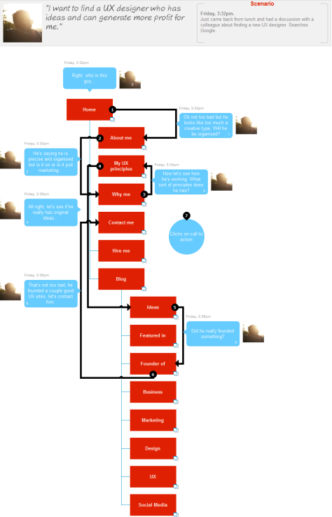
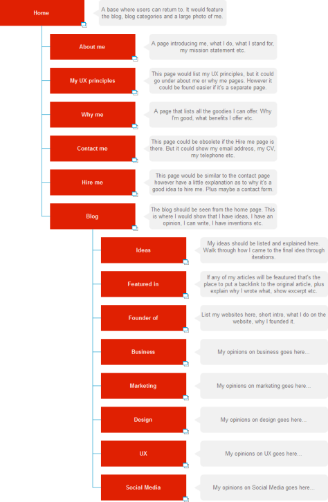
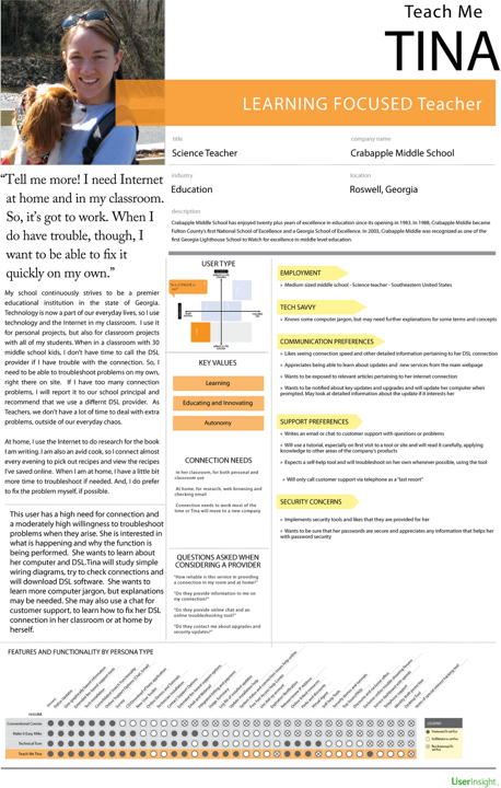
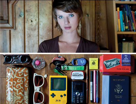
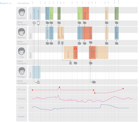
I come from a creative design background, and it has always been frustrating to me to see UX deliverables that are not well designed. This is why I started to look for better ways of presenting UX deliverables. In my search for better ways of communicating concepts visually, I have come across some great ideas for presenting UX concepts from others—like the personas UserInsight and Jason Travis created, shown in Figures 1 and 2, respectively, and the user flow Hochschule Luzern created, shown in Figure 3.
While I was fascinated by all of these UX deliverables, some of them seemed to be too cluttered, while others lacked words. I wanted to create something new, better, and even more usable. Next, I’ll outline my ideas for presenting personas, sitemaps, user flows, and wireframes more visually. The aim of these UX deliverables is to help clients and stakeholders understand our work better. In fact, they may even help us to design better user experiences.
A Complex Speech-Bubble Persona
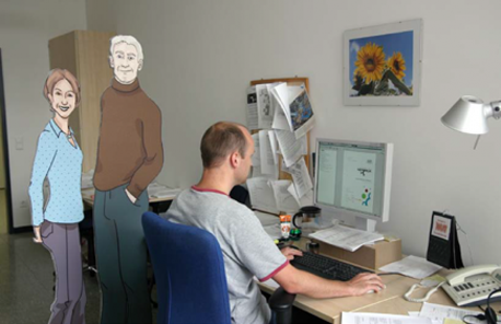
The idea for the speech-bubble persona shown in Figure 4 was to give Lucas more personality and, thus, create more empathy for him in stakeholders. I used speech bubbles to enable my persona to speak for itself. This persona reveals important information about Lucas, including his world view, what he is and isn’t looking for, his most recent and next experiences, what motivates and demotivates him.
Conversations give us good insights into the lives of people, so I created a conversation between my persona and a colleague. The work of Jason Travis compelled me take into account the fact that the items people possess reveal much information about them. So I added some things that Lucas possesses or would like to own or experience—for example, record albums, a house, a dog, a dream holiday. I also added some questions he might ask, because these can also reveal a lot about his personality. On my Web site, you can see a full-size image of this persona![]() and read my article “Complex Speech Bubble Persona,”
and read my article “Complex Speech Bubble Persona,”![]() which describes in greater detail how I came up with this idea.
which describes in greater detail how I came up with this idea.