Top

Demystifying UX Design: Common False Beliefs and Remedies: Part 2

Eliciting Desired Behavior

Designing for business success

A column by Frank Guo
December 10, 2012

In Part 1 of my series Demystifying UX Design, I wrote about two design issues that people commonly and falsely believe to be problematic: long pages and the number of clicks it takes for users to get to information. In Part 2, I’ll discuss another common false belief relating to high information density and provide design recommendations for addressing this issue.

High Information Density Is Not Always Bad

Through my interactions with UX designers and Web product managers, I’ve found that many hold a firm belief that high information density is something to avoid at all costs. Granted, cramming too much information into a limited space in a disorganized manner makes it difficult for users to scan, read, and absorb the information. Besides, it seems to go against the popular usability heuristic of aesthetic and minimalist design.

Champion Advertisement
Continue Reading…

However, if a page is well designed, high information density does not compromise either the reading experience or usability. If anything, a very compact screen design could enhance reading. Not only that, it might help in achieving greater user engagement.

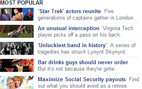
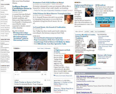
Let’s take a look at the home page of cnn.com, a page that obviously has relatively high information density. The text links on the left side of the page are all tightly spaced. There are many thumbnail images. The global navigation bar at the top seems to have too many items on it. However, many still find the page easy to read and fairly engaging. Why is that?

Figure 1—CNN home page has high information density, but is still easy and fun to read
CNN home page has high information density, but is still easy and fun to read

Taking a closer look, it’s easy to see that the page is very well organized. Key screen elements like the global navigation, the three-column page layout, the promotional areas highlighting top news stories, and the thumbnails in the middle of the page are all part of a well-organized design. Similar elements align with one another. For example, all of the hyperlinks at the left are left aligned, and there is no comingling of links with other types of content; images break up the text, helping users to scan the content. The horizontal layout of the global navigation bar and the three-column layout for the content follow common design patterns that are well understood by users. The visual design scheme features good contrast—red, black, and dark blue—across different types of content. The list goes on…

The message here is that—despite its high information density—this home page is easy to read and scan because it employs a few well-applied design guidelines. Before discussing these design guidelines, let’s look at some potential benefits of high information density.

Benefits of High Information Density

Placing more information within the available screen real estate has a few noteworthy benefits:

  • leveraging limited screen real estate—An obvious benefit, of course, is that you can better leverage a Web page’s limited screen real estate. When you can fit more information on one page, users don’t need to scroll as much or click to go to another page as often.
  • giving an experience of abundance—High information density can give the impression of abundance. When visiting ecommerce or news sites, users like to see lots of articles, images, and items for sale—just like when they’re browsing a newsstand or shopping at a mall. Making a page just a little bit crowded, while ensuring that it’s still well organized, makes visiting the site more engaging. During many usability sessions, I’ve observed that younger, more tech-savvy users are more likely to find pages that have high information density fun to read; while older, less tech-savvy users are more likely to become frustrated by this kind of information design.
  • making it easier to find information—When looking for information on a Web page, many savvy users perform an intrapage search—typically, by pressing Ctrl + F—using their browser’s find capability to find keywords on the page. Having more information on the same page better supports this finding behavior. The more information there is on one page, the more likely that a user can find content using intrapage search.
  • enhancing content discoverability—We all know that “out of sight, out of mind” is true for Web browsing. If a user doesn’t see certain content on a Web site’s home page, there’s great chance that user won’t explore the rest of the site to unearth that content. By placing all key information prominently on the home page—using excerpts, thumbnail images, and headlines—rather than hiding it within the layers of a site’s navigation system, you can help users to discover what a site has to offer and enable them to better appreciate the full breadth of the site’s content.

How to Design for High Information Density

High information density can deliver numerous benefits, but it’s success depends on how well designers execute on this design approach. Here are some guidelines for making a page with high information density both readable and engaging for users:

  • Use a page layout that is easy to understand and scan. When you employ a common, well-understood page layout, you enable users to rely on their past experiences to understand a page’s basic information buckets. One example is using a horizontal area at the top of a page for a site’s primary, or global, navigation; a column at the left of a page for secondary, or local navigation. In contrast, if you get too creative—for example, placing the global navigation in a sidebar on the right—users will become confused and frustrated.
  • Align similar content to enhance its scanability. By using alignment effectively, you can help users to scan large amounts of information with minimal effort. However, if content is not well aligned, the mental effort of reading that content increases dramatically. In Figure 2, a thumbnail image of equal size precedes every headline, without exception. This sets up a consistent expectation, making it very easy for users to glance over many headlines at once.
Figure 2—Example of good alignment of similar elements
Example of good alignment of similar elements

In Figure 3, on the other hand, the content is poorly aligned. Different types of visual elements and content containers are juxtaposed with one another all over the place. Perhaps the designer of this page intended to use variety as a means of creating user engagement, but users get lost when screen elements are not well aligned. You can make things look interesting without messing up the alignment and organization of the content on a page. The content of lots of highly engaging user interfaces—including those of Amazon.com, Netflix.com, and iPad and iPhone native apps—is both well aligned and engaging.

Figure 3—Example of poor alignment
Example of poor alignment
  • Leverage whitespace effectively. With high information density, there is not a lot of whitespace at your disposal, which makes it even more critical for you to leverage whitespace effectively. Employ whitespace to break down a page’s content into chunks. For example, when there is abundant whitespace between paragraphs, this helps users to scan the text.
  • Use graphics to break up long passages of text. Text-heavy pages are more difficult to process, and we all know that, in a Web context, users often do not read every detail in content. By using graphic elements such as pictures and font variations to break up text-heavy Web pages, you can make it easier for users to get through them.
  • Use color coding to help users group information. When reading a text-heavy Web page, it is difficult for users to identify groups of information without expending lots of mental effort. By using color coding—applying the same color to all instances of the same type of content—you make it easy for users to mentally organize information into meaningful chunks and thereby reduce the amount of mental effort that information processing involves.
  • Adjust information density based on users’ information needs. It should go without saying that you must make all design decisions that relate to information density according to the type of page that you’re designing. On a news site, really high information density is fine, because users expect to quickly absorb lots of information on such a site. On a corporation’s Web site, however, users usually look for key navigational elements such as Products, Support, or Jobs, then drill down from there. Having lots of information on the home page doesn’t support their use cases.

When Shouldn’t You Present Dense Information?

When designing Web pages, you should adjust their information density based on their context. While I’ve described many benefits of high information density in this column, high information density is not appropriate in certain situations, as follows:

  • when accessibility is a key concern—High information density makes it very difficult for people with poor eyesight to read a Web page, regardless of how well designed the page otherwise is. Therefore, when designing Web sites for older populations—for example, a Web site for a mutual-fund company—you need to be very cognizant of this risk.
  • when designing for mobile sites and apps—A screen with high information density would make it very difficult for users to tap a link or a button or even to read content on mobile devices—on smartphones in particular. Because of the space constraints that are unique to mobile devices, you should place less information on a screen.
  • when a site has a heavy marketing or branding focus—On a site that focuses on branding, marketing, and visual appeal rather than delivering information, high information density would make it challenging to highlight the key marketing messages or create an elegant visual presentation. For instance, high information density simply does not suit Apple.com, a site that markets simplicity as a key brand attribute for the company. Figure 4 shows a case where low information density is appropriate: the home page of a financial company’s Web site.
Figure 4—Home page with a focus on branding and marketing and low information density
Home page with a focus on branding and marketing and low information density

In the cases I’ve just outlined, low information density better meets a Web site’s design objectives.

In Part 3 of this series, I’ll explore some other UX design myths. 

Reference

Nielsen, Jakob. Designing Web Usability. Indianapolis: New Riders Publishing, 1999.

Founder of UX Strategized

San Bruno, California, USA

Frank GuoA well-respected UX strategist and architect, Frank has co-authored a book chapter and published more than a dozen professional papers, covering such topics as advertising, Web promotion, eyetracking, persona development, product strategy, and search results. He has also developed a large body of user-research techniques and UI-design guidelines and trained many in applying them. Recently, at the Human-Computer Interaction International conference, Frank received a best-paper award for a paper that he co-authored. Frank is currently providing UX strategy and design consulting services through his firm, UX Strategized.He set up and led user research practice for Barclays’s iShares business and established foundational digital client insights for the firm. His work had a deep impact on iShares’s digital strategies and shaped the award-winning UI designs of iShares’s Web tools and iPhone app. Previously, Frank established eyetracking as a key research method at eBay. He led advertising research there and published a professional paper on best practices for online advertising. He also led design guidelines research that influenced eBay’s UI design best practices and full-cycle user research for the shipping and seller tools, influencing the tools’ overall redesigns. Prior to joining eBay, Frank conducted design-strategy research at Oracle, influencing the UI architecture of its enterprise software suite. Frank obtained a PhD in cognitive psychology from UCLA, where he conducted extensive scientific research on consumer psychology and taught advanced statistics.  Read More

Other Columns by Frank Guo

Other Articles on UX Design

New on UXmatters