Top

Designing for Users and Their Devices

Mobile Matters

Designing for every screen

A column by Steven Hoober
December 10, 2012

The iPad Mini presents an interesting case study of differences in the use of particular types of mobile devices. People use smaller tablets and eReaders in somewhat different ways: Their usage rates are different. Their use outside the home is more prevalent. And their users hold them differently. [1] For the most part, UX designers and developers are trying to build user experiences that are appropriate to the ways in which people will use an iPad of a smaller size.

Last month, in my UXmatters column “Mobile Input Methods,” I talked about how there are many types of input devices other than just touchscreens. And there are even customizations and variations among touch input methods that designers need to be aware of so they can create the best possible user experiences.

Champion Advertisement
Continue Reading…

This month, I'd like to talk about why we should care about designing for users and their devices. As designers, how can we use information about device hardware and the ways users choose to employ it to make our designs better and to make our users, clients, and customers happier and more productive.

While users interact with their mobile devices in many ways, I’d like to focus on some of the areas where I see the greatest misunderstandings and the most problems and provide some simple guidelines to help UX designers get to a more complete understanding of device hardware.

Respect Orientation Choices

I often travel and work away from home. But I don’t like to miss my TV shows, so I get around the current limitations of digital distribution by watching shows that I’ve recorded at home via the DISH network using the DISH Remote Access app. Getting data from my personal video recorder (PVR) at home onto the network involves a little hardware setup, but this requires only simple, consumer-grade technology experience. Thus, when I am away from home, I can just open the DISH Remote Access app on my mobile phone or tablet, select a show, and watch it.

Unfortunately, most of the DISH Remote Access app works only in portrait mode, while the video player works only in landscape mode, forcing me to view the selection and viewer screens using a device in different orientations. So my choices are either to pick up the device and rotate it a lot, as shown in Figure 1, or simply to leave it on its stand and turn my head sideways from time to time.

Figure 1—Orienting an Android tablet to view the DISH Remote Access app
Orienting an Android tablet to view the DISH Remote Access app

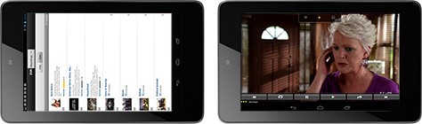
You can certainly encourage the use of specific orientations for certain tasks such as watching video. But you should almost never force anyone to use a specific device orientation. Respect a user’s personal preference, and provide the most complete functionality possible however they choose to use a device.

You may recall from last month’s column that perhaps half of Android phones have a hardware keyboard. A lot of these keyboards slide out from beneath the screen, making a phone a landscape-orientation device whenever the keyboard is in use. That means, when the keyboard is out, an app should almost always ignore orientation sensors and assume a user wants to enter content, with the phone oriented in the correct way for keyboard use.

Design for All Orientations

While you can use responsive design principles to make sure content stretches to fit the available space on a screen, you will be much better off and have more satisfied users if you customize an app’s user experience for each orientation.

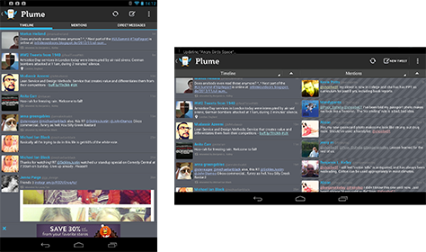
For example, if your product has a useful hierarchy of lists or displays multiple types or categories of useful information, one simple approach is to display either one or two columns of data depending on orientation, as in the Plume app for Android shown in Figure 2. There are other ways in which you can take advantage of additional space or, depending on the orientation of a device, cleanly use less space. For instance, your lists can provide varying amounts of information per line, by either adding columns or simply expanding the area for longer descriptions and not truncating content as much.

Figure 2—Column layout in different orientations in the Plume app on Android
Column layout in different orientations in Plume app on Android

Never just pad out extra space with unrelated items or more advertising. Users will recognize that you’ve put a small screen interface on their tablet. And never leave extra whitespace. While you might be able to persuade yourself that a user interface is clean and open, users will want to use all of the available space to view more information. They may even perceive that extra space as something being broken.

Also make sure all functions work correctly across orientations. Make sure a user interface doesn’t change, forget selection states, clear user-entered data, or scroll to a different place on a page during orientation changes. In just the last few weeks, I’ve seen all of these misbehaviors, so make no assumptions about development teams being on the same page as you regarding the proper implementation of an app for different device orientations. Specify behaviors clearly, then test them carefully.

Understand Focus

Looking at a classic scroll-and-select user interface—on a desktop computer, mobile phone, or even a game console or TV—is the best way to understand how focus works. When navigating a list, a user uses a directional pad to scroll through the items in the list. It’s easy to tell which item has focus because it is highlighted or otherwise clearly indicated. This is the in-focus item. [2]

When designing user interfaces and interactions, I find it helpful to declare when something is in focus. One key reason I push for this is that there are a lot of devices with hardware keyboards and 5-way directional pads. Even iOS supports add-on keyboards. Design and build apps properly, so users can scroll through the items in a list using the arrow keys on their keyboards.

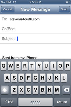
Focus conditions are still critically relevant for pure touch interfaces. Think of the many times you’ve tapped an item only to find that it’s not a link or button, but a field, as shown in Figure 3. There are many conditions like this where it’s necessary to select an item just to indicate focus. Form fields are a simple case, but you’ve probably designed many conditions that on a desktop Web site would be a hover state. For example, a user might tap an item to reveal a bit more information or display a menu over the rest of the page.

Figure 3—The focus indicator in iOS forms is just a blinking insertion point
The focus indicator in iOS forms is just a blinking insertion point

Still, you might ask, why does this matter for touch? If an operating system already supports this behavior, you might think all you need to do is provide form fields. Well, have you considered what granting focus can or should do? Seesmic, a Twitter client for Android, demonstrates both of these cases, as illustrated in Figure 4.

Figure 4—When displaying a screen, Seesmic grants focus to certain fields
When displaying a screen, Seesmic grants focus to only certain fields

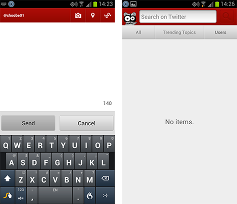
In this user interface, tapping the Compose button displays a full-page text area, in which a user can type whatever he wants. Most usefully, the text area is in focus by default; so on all touch devices, the keyboard immediately appears on the screen, and a user can get right to typing. On the other hand, tapping the Search button usually displays an autocomplete list of favorite searches—though, the first time, it is empty—and a search box. Nothing is apparently in focus, and the user must deliberately tap the search box to start typing a new search string.

This user interface is almost a copy of the classic scroll-and-select address book layout on a phone, in which lists appear with search boxes. But the search box should always have focus by default. On feature phones, a user can scroll or type with equal facility and, using this Twitter client, could just as easily tap words to search or select an old search string, if available. This behavior would both expose the function more quickly and prevent a user from having to tap something that is both far up the screen and near many other functions.

Forms and Entry

While I try to avoid discussions of the limitations of mobile devices, they are indeed small. But much more important than the size of a mobile device’s screen is the fact that text entry and selection are more difficult, error prone, and are sometimes tasks users want to avoid. [3] Whenever possible, don’t make users enter information. Instead, design an app to use sensors and stored data whenever you can. And carefully consider just how much users really need any information.

However, when you do require explicit user input, be sure to employ the correct input methods and support the user’s choice of methods. You should always set a field to its proper entry type, so the most useful and relevant keyboard loads. These can get pretty detailed. For example, numeric entry is different from telephone-number entry even though both involve numbers, as shown in Figure 5.

Figure 5—Autofill ZIP code entry on iPhone; proper use of keypad layout for phone number entry in Path on Android
Autofill ZIP code entry on iPhone; proper use of keypad layout for phone number entry in Path on Android

Support input methods other than typing whenever you can—especially wherever they are common and expected functions. If a form calls for selecting a date from a small set of dates, a typical selection list might be confusing. Forcing users to type in a specific format is just asking for disaster. Use a device OS’s standard date selector because users are accustomed to the interaction and immediately understand the need, as well as the constraints.

When you design for a desktop computer, it’s hard to remember that, these days, you may be designing for touchscreens. Don’t just reduce the range of input methods, but use those that are touch and gesture friendly. If a user must make a selection from a list of values comprising regular increments, perhaps a sliding control like a volume fader would provide a better interaction than a drop-down list. It could be smaller and easier to interact with, as well as more engaging for users, as in the examples shown in Figure 6.

Figure 6—Kayak’s iPhone app uses sliding controls for some inputs like the number of travelers and the maximum price
Kayak’s iPhone app uses sliding controls for some inputs like the number of travelers and the maximum price

Before you get too excited about being able to do this, note that some of the more useful input methods are not fully and equally supported on all platforms. Thumbwheel-like date-and-time pickers are available on all of the major mobile operating systems, but it’s not always possible to customize them, so you may not be able to use this widget for other types of values. Many HTML5 input types are not yet well supported. The email-specific keyboard is a great example that is almost entirely unsupported on Android. Although browsers usually at least fall back on displaying their default entry method.

Sensors Make Mobile Better

The most exciting part of mobile UX design to me is not the challenge of the small screen, the ubiquity, or the connectivity, but the sensors. Smartphones and tablets now usually incorporate a

  • camera
  • microphone
  • touchscreen
  • light-level sensor
  • accelerometer—often multi-axis
  • proximity sensors
  • Global Navigation Satellite System (GNSS) receiver such as a Global Positioning System (GPS), Assisted GPS (A-GPS), or the Russian GLONASS
  • magnetometer, or compass

Many devices boast multiple cameras, multiple proximity sensors to detect gestures above or near the device, and some now even have environmental sensors to detect temperature, altitude, and barometric pressure.

But it’s not just that devices have a lot of sensors. It’s the way they are integrated into a platform. Many notebook computers now have many or most of the same sensors, but I dare you to try to get access to them. For some years, I’ve owned a Tablet PC on which I can barely make the very high-precision integrated GPS work at all; and my Tablet PC never makes its GPS available when a Web page asks for location information. Designing for the desktop is the wrong way to start. You must address each platform’s capabilities. And it should now be clear that mobile devices are often much more capable than our bigger, seemingly easier-to-use desktop computers.

For example, think about providing a technical support form. On the Web, you’d probably ask for a product’s model number, other product specifics, how it’s installed, for what purpose, maybe its serial number, and, finally, ask for a description of what is wrong.

However, on a mobile device, there is a camera with which a user can take a photo of the sticker on a hardware product that provides all of the essential data about that product. If you need all of that data, tell users where to find that sticker, and ask them to take a photo of it instead of writing it on a scrap of paper, then typing it into a support form. Once you’ve recognized that users have a mobile device, you can send them photos or other graphics that are sized to fit their screen, so they can solve the problem working directly on their device.

By the time you get that working, we should be ready for augmented reality (AR). You’ll be able to ask users to download an app that walks them through a repair or replacement procedure. Users could point their phone at a product, and your AR system could overlay instructions on the screen display, using the phone’s cameras and direction sensors. This is just possible today and will get easier in the near future.

Testing and Validating

Just the other day, I was handed a set of devices on which to test our new mobile product. The small mobile phone I got was supposed to be a G1, which has a keyboard. But instead, I got an HTC Explorer. The hardware specification to which we were testing was screen size, so in that respect, they were equivalent devices. However, as a result, we didn’t do testing on any devices with hardware keyboards. Keyboard bindings are different from virtual keyboards, so I expect bugs to emerge. At least we tested for both orientations, and the product actually has to work in both.

I have already mentioned this in passing—and in previous articles—but it bears repeating: Testing to make sure a product works correctly before it gets to users is critical. Whenever possible, you should be involved in this testing, but at least try to help everyone understand the range of device capabilities that your users actually have, so you cover all the bases.

You cannot just spot check on your favorite phones, but must test on an appropriate range of devices. And not just devices with different screen sizes, but different platforms and input types as well. Create a test plan, and make sure that you are checking your app in both orientations, both using sensors and avoiding the use of sensors—deny automatic location and see what happens—and using various input methods. Some devices use different types of connections, so you’ll need to check connectivity on mobile networks and Wi-Fi, which can give different results.

Which devices, methods, and networks do you need to test on? Check your analytics carefully, and recheck them regularly to stay up to date on the key types of devices for your app.

It’s Not Always Easy

As I mentioned earlier, not everything that is optimal is easy to do on every platform. Getting back to the iPad Mini, while you can easily design apps for different screen sizes, Apple has specifically hidden the features that allow targeting of the Mini—as a device that is different from the larger iPad—at least for the Web. [4, 5]

This is apparently to reduce the perception that Apple iOS platforms are becoming as fragmented as Android. The iPad Mini scales down designs for the original 9.7" iPad to its 7.9" screen. However, the iPad Mini is a different device, so application experiences for the Mini should account for its different scale and the different ways in which people might use this new device.

Developers almost immediately noticed the issue of targeting the iPad Mini, so, hopefully, Apple will fix this soon. We can also expect Android browsers to get full support for HTML5 input methods. Users want to use their devices however they want and with the most native experience possible. [6] There is increasing evidence that higher usage rates correspond directly to building an app or site correctly for a device. [7]

Demands from UX designers, developers, and clients to be able to build what users want is already growing. If you don’t build what they want, someone else soon will. 

Endnotes

  1. Hardawar, Devindra. “Small tablets = Big Engagement: 20% More Pageviews, More Time on Site for e-Readers.” VentureBeat, October 19, 2012. Retrieved November 11, 2012.
  2. Hoober, Steven, and Eric Berkman. Designing Mobile Interfaces. Sebastopol, California: O’Reilly Media, 2011. The pattern Focus & Cursors on the 4ourth Mobile Patterns Wiki and in the book I coauthored explains this in more detail.
  3. “Participants reported that typing on the tablet was a major pain point, which they found frustrating, and it often limited the amount of data entry they were willing to do before moving to another device such as a laptop or desktop computer.” From Müller, Hendrik, Jennifer Gove, and John Webb. “Understanding Tablet Use: A Multi-method Exploration.” Proceedings of the 14th International Conference on Human-Computer Interaction with Mobile Devices and Services, 2012. Retrieved November 11, 2012.
  4. Weverbergh, Raf. “iPad Mini: Dear Browsers, Can We Please Agree That 10 cm Is Actually Ten Centimeters? Whiteboard. Retrieved November 11, 2012.
  5. Firtman, Maximiliano. “Mission: Impossible - iPad Mini Detection for HTML5.” Breaking the Mobile Web, November 5, 2012. Retrieved November 11, 2012.
  6. Brooks, Ben. “Tablets Are Empowering Users.” The Brooks Review, September 8, 2011. Retrieved November 11, 2012.
  7. Olanoff, Drew. “Mark Zuckerberg: Our Biggest Mistake Was Betting Too Much on HTML5.” TechCrunch, September 11, 2012. Retrieved November 12, 2012.

President of 4ourth Mobile

Mission, Kansas, USA

Steven HooberFor his entire 15-year design career, Steven has been documenting design process. He started designing for mobile full time in 2007 when he joined Little Springs Design. Steven’s publications include Designing by Drawing: A Practical Guide to Creating Usable Interactive Design, the O’Reilly book Designing Mobile Interfaces, and an extensive Web site providing mobile design resources to support his book. Steven has led projects on security, account management, content distribution, and communications services for numerous products, in domains ranging from construction supplies to hospital record-keeping. His mobile work has included the design of browsers, ereaders, search, Near Field Communication (NFC), mobile banking, data communications, location services, and operating system overlays. Steven spent eight years with the US mobile operator Sprint and has also worked with AT&T, Qualcomm, Samsung, Skyfire, Bitstream, VivoTech, The Weather Channel, Bank Midwest, IGLTA, Lowe’s, and Hallmark Cards. He runs his own interactive design studio at 4ourth Mobile.  Read More

Other Columns by Steven Hoober

Other Articles on Mobile UX Design

New on UXmatters