Top

The Spectrum of Visual User Interface Design

August 5, 2013

A debate between designers who prefer highly detailed and textured designs that emulate things in the physical world and those who favor more abstract, flat, and iconic designs has polarized the visual design community. In the early days of the Macintosh computer, with only black-and-white, bitmapped pixels to work with, creative talent such as Susan Kare did great work within rigid hardware constraints. Her iconic abstractions of metaphors—for example, a trash can for a delete action and a floppy disk for saving a file—served as terrific storytelling devices, educating new users about a new method of interacting with computers.

Today’s touchscreen mobile devices have far greater graphics-rendering power than the original graphic user interfaces of Macs and PCs, and the multitouch screen user interface has now matured and become a widespread, commonly understood technology. The intent of the fully rendered details of skeuomorphic designs was to encourage an audience that was new to multitouch interfaces to tap, pinch, and zoom. However, as the mobile device market has become increasingly more competitive, manufacturers are looking to software as a way to differentiate their offerings, and UX and visual designers are publicly challenging one another’s positions on the value of each style along the spectrum from skeuomorphic to flat design. This debate reminds me of Scott McCloud’s evaluation of a visual vocabulary of cartoon illustration, ranging from realism to abstraction.

Champion Advertisement
Continue Reading…

A number of factors are driving the trend away from the detailed skeuomorphic rendering of user interfaces toward iconic abstraction:

  • a combination of a device’s primary mode of interacting and its graphics-rendering capabilities
  • fashion
  • market differentiation and prioritization of features

Device Interactions and Graphic-Rendering Capabilities

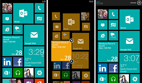
App designers are embracing change and inviting people to interact in new ways with touchscreen devices. So, instead of focusing on tapping, pinching, zooming, and panning, they’re adopting more fluid, gesture-based input methods. They’re also encouraging users to interact through animations and transitions—highlighting another benefit of the touchscreen interface: movement. In marketing iOS 7, Apple is focusing on movement and animation. Microsoft Windows 8 features a number of gesture-based user interactions and animated Live Tiles with app content updates. Figure 1 shows the flat, minimal user interface of Windows Phone.

Figure 1—Windows Phone 8 Live Tiles show app content on the home screen
Windows Phone 8 Live Tiles show app content on the home screen

Gesture-based keyboards are very popular on Android devices because of the increased typing speed that users can achieve once they’ve grown accustomed to this means of interacting. For example, the Blackberry Z10 keyboard predicts the word you’re typing, so you can swipe up to select it instead of continuing to type.

Historically, new UI design aesthetics have emerged when designers have worked toward a design solution that blends artistic expression and usability requirements, while staying within the constraints of a system’s software and hardware capabilities. Mobile-device technology has changed rapidly since the iPhone first presented static graphic images that drew consumers into learning how to interact with its new touchscreen. As processing power on small devices has increased and higher resolutions have made digital screens almost as sharp as print, designers have begun to embrace movement and animation in exploring how much information a screen can display and prompting people to play with a user interface. That playfulness is part of the value of modern user interface design on touchscreen devices, especially when it triggers an emotional response similar to those of video games.

Movement may encourage user interaction and can feel more engaging in comparison to presenting a set of detailed static graphics for users to tap. It remains to be seen whether gesture-based interactions benefit intuitiveness, because they require memorization of movements, but designers are betting that most users have become accustomed to touchscreens and are willing to experiment with gestural interactions in lieu of buttons. As the mobile-technology industry expands into wearable devices, we should expect fewer physical buttons with which to interact and the use of movement to convey complex actions.

Fashion

Aesthetic trends in design often result when designers, who are in a position to lead taste in their industry, share their appreciation for a new design direction and encourage the market to follow their lead. Some designers want to make others aware of a style that they prefer, while others feel that design should be reductive and serve content and data to users with minimal interference. User interface design shares the goal of storytelling that is characteristic of other media.

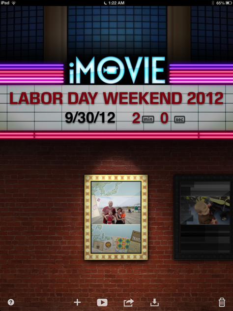
Most film directors use storyboards that look like comic strips to help them work through their vision for a script. Some film directors have an unmistakable style in which they tell their stories, which serves as a trademark that they want their audience to recognize. Tim Burton, Quentin Tarantino, and Sam Raimi come to mind as stylish storytellers who evoke a specific mood in each scene and film. Other directors, like David Fincher or Jon Favreau, have a more subtle style that primarily serves to tell a story. iMovie for iOS, shown in Figure 2, is a creative app whose user interface employs rich graphic detail to evoke a mood when a user launches the app and sees the exterior of a movie theater.

Figure 2—The rich detail of the UI design for iMovie on iOS
The rich detail of the UI design for iMovie on iOS

Aesthetic trends may also be a response to sociological effects that are similar to fashion trends, which swing back and forth like a pendulum over generations.

It won’t be long before high-resolution displays become common on notebook computers, leading to a shrinking desktop-computer market. No one really paid much attention to the slight resolution increase from the old standard of 72 points per inch (ppi)  to 96 ppi. Today 320 ppi or greater resolutions are common on best-selling mobile devices. This may lead to more stylish apps with crisp, sharp lines and elements and enhanced typography, which would improve legibility.

Market Differentiation and Prioritization of Features

Another reason for iOS competitors’ pushing for flat user interface design is as a possible means of market differentiation. Google focuses on data collection and presentation, so the modern version of Android—especially with Google Now features—is a real-time, location-based data dashboard. Simple rendering of the user interface places the focus on data-driven visuals and gesture-based interaction design.

A simple graphic user interface reduces the time and cost of working through rapid design iterations. It takes significantly more time to create rich, graphic details for a class of devices with a wide variety of screen sizes and resolutions, from hardware manufacturers who are seeking market differentiation. As the crowded mobile-device market has matured and manufacturers have explored hardware features other than screen size and resolution to deliver a unique element that captures consumers’ attention, the rapid iteration of software has become a necessity.

For example, initially, the priority for Android was to serve many different device sizes and hardware configurations and provide a framework within which manufacturers could create their own graphic user interfaces. The rendering of detailed graphic user interface designs to mimic analog metaphors might have been too difficult to scale properly with such great variance in device size and screen resolution. However, from the Honeycomb release of Android to the present, the stock version of the Android OS received a more distinctive style and a better-defined identity. Microsoft Windows’s modern user interface differentiates itself with simple, colorful shapes; information display that uses movement, and a typography-driven user interface that results in a clear information hierarchy.

Design Is About Solving Problems

Sophisticated design taste doesn’t have to be boring. Tapbots apps have a sleek, futuristic, fun user interface that makes these apps seem playful, as shown in Figure 3. Apple’s cover flow user interface gave those who are nostalgic for a bygone era the ability to flip through album covers to find the right record for their mood—just as they would with a jukebox. But, while cover flow is fun, it’s usefulness is probably lower for iOS users who prefer to find music quickly, using more efficient, modern methods such as alphabetical ordering, music organized by genre, keyboard search, predefined playlists, random selection, or telling Siri what to play.

Figure 3—Convertbot from Tapbots has a tactile, futuristic design aesthetic that enhances the user experience
Convertbot from Tapbots has a tactile, futuristic design aesthetic that enhances the user experience

As Figure 4 shows, a user interface that depicts the pages in an ebook without representing how much content remains for a user to read is not helpful.

Figure 4—An unhelpful graphic treatment showing pages in a book without indicating how many pages remain
An unhelpful graphic treatment showing pages in a book without indicating how many pages remain

A less highly rendered or textured user interface design may work well in many software contexts, but this is not a design aesthetic that is appropriate for all software applications. For example, many software experiences in the video-game industry rely heavily on creating a virtual representation of reality to add value and enhance the gameplay experience, as Figures 5 and 6 illustrate. Without a game’s photorealistic detail and high production quality, a player would feel disconnected from the alternate reality that it presents and the game-playing experience would suffer greatly.

Figure 5—The detailed rendering of Fallout 3 enhances its experience
The detailed rendering of Fallout 3 enhances its experience
Figure 6—Modern Warfare 3 presents a photorealistic game experience
Modern Warfare 3 presents a photorealistic game experience

For many application experiences such as games or media experiences, where the value of evoking an emotional reaction is clear, designers should continue to employ a design aesthetic that uses detailed, photorealistic rendering. This design approach enhances the user experience through user interface elements and interaction design that set a mood.

Conclusion

It will be interesting to observe how designers explore the range of the spectrum between skeuomorphic and flat design, looking for niches within a polarized design community that aims either for super-rich detail or simple shapes and lines and fluidity of movement. As new devices appear in the consumer marketplace, new design opportunities will arise from their new capabilities, new contexts, and new use cases. This will be particularly true of products that solve new problems—for example, products that are wearable and have fewer hardware elements with which to interact, such as health monitoring wrist bands and eyewear. 

Senior UX Designer at SimpleTire

Bensalem, Pennsylvania, USA

Evan WienerAs a UX designer whose education is in psychology, visual design, and technology, Evan enjoys solving problems to address user needs and enhance their experience by creating engaging interactive elements that delight people. Evan serves as an advocate for the benefits of taking the time that is necessary to do good design and think through the usability and accessibility of native apps and Web applications. He has worked as a UI designer and interaction designer as part of UX teams at a variety of organizations such as The Vanguard Group, Project Management Institute, Deloitte, and Expensewatch.com. Starting his career in visual design, Evan worked as an independent UI design and UX design consultant. He also served as a research assistant in the early days of online personalization and marketing as a Psychology undergrad at the Smeal College of Business at Penn State University.  Read More

Other Articles on Visual Interface Design

New on UXmatters