Top

Design for Fingers and Thumbs Instead of Touch

Mobile Matters

Designing for every screen

A column by Steven Hoober
November 11, 2013

In previous columns, I have revealed guidelines for touchscreen design and research into how people really hold their phones, but in neither case did I get very far into how to really apply this information in your design work. Partly, this was because, at that time, designing for touch was still evolving rapidly. Until recently, Josh Clark’s charts of thumb-sweep ranges represented the state of the art in understanding touch interactions. In creating his charts, Josh surmised that elements at the top of the screen—and especially those on the opposite side from the thumb, or in the upper-left corner for right-handers—were hard to reach, and thus, designers should place only rare or dangerous actions in that location.

Since then, we’ve seen that people stretch and shift their grip to reach targets anywhere on the screen, without apparent complaint. The iPhone’s Back button doesn’t appear to present any particular hardship to users. So the assumption behind those charts seems to be wrong—at least in the theory behind it. But are there other critical constraints at work?

I am starting to think that it’s time for us to start designing for fingers and thumbs instead of for touch.

Champion Advertisement
Continue Reading…

New Findings from Research

As I’ve said before, when we’ve reached the boundaries of our knowledge, we should go back to the original research. So I’ve re-read some of the reports to which I have previously referred in my columns, looked up their references, and done some of my own analysis. As a consequence, I’ve found out two really interesting things:

  • Tapping targets at the edges of a screen is problematic.
  • Liftoff and reach make targets at the edges of a screen hard to hit.

The Edges Are the Problem

Certain parts of the screen are either harder to touch, take more time to achieve an adequately precise touch, or both. Since much of the screen offers the same level of precision, I had previously more or less averaged touches across the viewport for my guidelines.

This wasn’t crazy, because no other guidelines that I am aware of account for accuracy by screen position. But several research papers do, with enough precision and consistency that the results are quite believable. The results are simple: edges are hard to hit.

Well, not really hard to hit in the classic sense—causing people to avoid them—but are more difficult to hit accurately, take more time to hit accurately, and cause users to have reduced confidence in their ability to hit them accurately. It turns out that users actually realize they are bad at targeting the edges of the screen.

And I do mean edges. There are such small—and inconsistent—variations in accuracy and speed between left- and right-hand users that it is safe to say that both the left and right edges of a screen are equally hard to reach for all users. However, the top and bottom edges are much worse than the sides.

Why Are the Edges Hard to Hit? Liftoff and Reach

We often refer to a non-gestural touch as a tap on the screen. But that might lead you to miss noticing a key part of how users interact with an application through touch.

When users press the down arrow on their keyboard, the insertion point moves or the scrolling action occurs immediately, on key down. Holding the key down causes the key’s action to repeat. In contrast, if users click a link on a Web page with their mouse, the mouse down action does nothing. The click, like most mouse actions, occurs on mouse up, or when the user releases the mouse button.

Touchscreens inherited this same behavior long ago. Usually, this is a good thing because it gives users a chance to adjust where they’re pointing or change their mind and scoot off a link. Well, in principle that is. I have no evidence that users do this. But it also means that long click actions, or presses, are available, so this is probably the right way to do things in general.

However, it also means that users can accidentally move off their target—after they’ve begun clicking. Biomechanical analysis of these interactions gets pretty involved, so we’ll skip that. But in short, this appears to be a key mechanism of why edges are hard for users to hit. Once the angle between a person’s thumb and a device’s screen gets below a certain threshold, both parallax and deflection—that is, what users can reach and how they see targets—can cause lift-off errors, causing their clicks to occur in the wrong place.

Touch by Zones

When I reviewed the data, I had to re-analyze what the findings meant. And the first thing that became apparent was that they didn’t represent a linear progression. For over five years, within my various organizations, I have been establishing an understanding of touch interactions. Over time, we’ve tweaked recommended target sizes as new knowledge has come to light. Later on, it was easy to overlay our understanding that interference is a separate size, though part of the same system.

But now we know that accuracy is related to position on the screen. That’s a paradigm shift. So we can’t simply create designs, then uniformly account for target and interference sizes or avoid putting targets in certain areas of the screen. Instead, we can place any target anywhere, according to normal, hierarchical rules of information architecture and information design. We just have to allocate sufficient space for them. As Figure 1 shows, we can correlate touch accuracy across the screen to a few zones where we already commonly place elements.

Figure 1—Touch accuracy and the placement of elements in zones on the screen
Touch accuracy and the placement of elements in zones on the screen

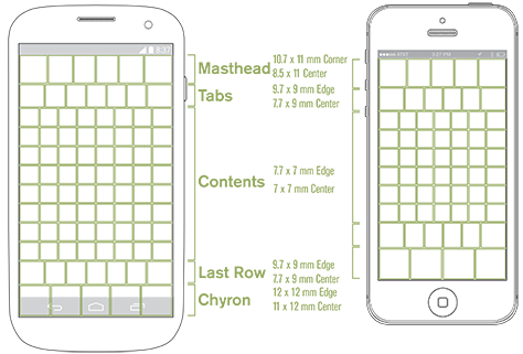
The diagram in Figure 1 summarizes the interference sizes that are necessary for targets in various parts of the viewport. There are no out-of-bounds areas, just a large area in the center that allows quite dense touch targets, left and right edges that require slightly larger interference zones, and significant areas along the top and bottom that require substantially more space between targets.

Since the whole viewport seems to be filled with a few large strips of content, it is possible to consider and discuss these as zones.

  • masthead—Notification and title bars often occupy the top of the viewport, or masthead. The tappable title bar usually comprises relatively few, large elements—such as the iOS Back button. This convention typically works well within the new guidelines.
  • tabs—Tab bars commonly reside below the masthead. We must keep that zone’s slightly lower targeting accuracy in mind when designing any elements in that position.
  • content—The entire middle of a page is similar in size and usually scrolls, so we can consider this area as a single large zone. Using simple lists, with full-width selection, eliminates worries about slightly poorer targeting at the sides.
  • last row—This zone doesn’t usually correspond to any specific element—like the others do—and for many designs, it does not matter. If there is a scrolling list comprising selectable items, users tend to scroll up to place items of interest comfortably within the middle of the viewport.
  • chyron—The word chyron is a term for bars that dock at the bottom of the viewport. The iOS menu bar works well in this location, but only if there are four or fewer elements on it.

In case you are suspicious of lab research and the application of theory in the real world, a few notes are in order. Some of the research I refer to is on a very large scale and involved real users in their actual environment. So, not all of the research occurred in a lab, despite its being academic research. While I haven’t taken the time to set up and perform my own tests of these theories, looking back at some raw data from my previous usability research does point to their being true. And as a last gut-check, when I did some anecdotal research by observing my children and coworkers using specific user interfaces, I got results that are consistent with this theory.

Cadence and Viewports

Please do not think the chart in Figure 1 is about cadence or extending a grid along those exact lines. The boxes represent touch targets in a general zone, but you can shift them to wherever you’ve placed your grid or elements on a page.

However, the chart does bring up issues that arise from the current overuse of the grid in digital design. I’ve always been leery of extending the typographic grid up to page scales, and my new understanding of how people prefer to tap elements on a screen, which this chart represents, counters the principle of absolutely regular, high-density grids such as the Apple iOS 44-pixel cadence.

Any grid you use should both follow principles based on human factors and support the template and structure that you are using. You must fully account for mastheads and chyrons with larger targets and greater spacing. This might not work if those parts of the screen inherit the dense grid of the middle of the viewport. And I do mean viewport, not page. For these physiological reasons alone, you must consider where elements should live on the screen to facilitate a user’s seeing and tapping them. So, once you account for scrolling and reflow, you may need to reconsider your page design.

There is some indication that people scroll to the point where they are comfortable. If you allow your user interface to scroll and provide sufficient space below the last item in a list, this seems to give users another way to self-correct some of their touch inaccuracies.

A Summary of Touch Guidelines

The following touch guidelines summarize these findings from research:

  • In the center of the screen, you can space targets as close as 7 mm, on center.
  • Along the left and right sides of the screen, elements are slightly harder for users to tap. Use list views whenever possible, and avoid things like small icons and checkboxes at either side of the screen.
  • At the top and bottom edges of the screen, you must make selectable items larger and space them farther apart. Depending on the area of the screen, spacing between elements in these zones should be 10–12 mm.
  • Account for scrolling. These guidelines are for the screen, or viewport, not the page.
  • Account for scaling. In Figure 1, you can see that five icons might fit on the example Android phone’s screen, while the iPhone screen accommodates only four icons. Be aware of what users are targeting, and make sure that what works on your phone doesn’t become unusable for those with smaller screens.
  • Don’t get confused about the differences between visual targets, touch targets, and interference. All of these guidelines are about interference. You don’t need giant icons and large words, just elements that have sufficient selectable size and spacing around them to prevent misses and selection errors.

We’re Doing Some Things Right Already

What really jumped out at me when I started mapping the results of the research was how much they corresponded to some of what we’re already doing. The basic layout principles that we have used for over a decade—for lists, mastheads, and chyrons—line up pretty well with these touch zones. To follow these new guidelines, you don’t have to totally shift or set aside everything you know about how to design according to iOS and Android standards and conventions.

The masthead and menu bar on iOS, for example, work pretty well. Target sizes and spacing on the Android title bar are close to good. However, dropping the amount of spacing between targets to fit all of them on smaller devices—as with a similar user interface on the iPhone—makes them too close together. In Figure 2, you can see that both the typical title bar for Android and the four elements on the iOS menu bar have appropriate spacing. Compare this to the much higher density that is available in the middle of the screen.

Figure 2—Comparison of target sizes and spacing on an Android phone and the iPhone
Comparison of target sizes and spacing on an Android phone and the iPhone

On the other hand, there is a lot of pressure to put more and more into smaller areas of the screen. Extending the Android-style action buttons to iPhones often places them too close together, as shown in Figure 3.

Figure 3—Examples showing targets that are too small and too close together for their location on the screen
Examples showing targets that are too small and too close together for their location on the screen

As the red boxes in Figure 3 show, the quest to fit more on the screen has affected the entire page, but far too often, especially the top and bottom of the screen, where we now know that touch accuracy presents special problems. Placing more than four menu items on an iPhone is starting to push it, and almost every tab bar that exists is too short. When these are too dense, the risk is that users will make accidental clicks.

Remember, designing to solve the interference problem doesn’t mean that you have to make the elements of a user interface large and chunky. For example, you can solve the tab bar–size problem just by not placing other tappable elements immediately adjacent to the tabs. In many designs that I have created lately, non-tappable labels and titles precede and follow tabs, or I’ve added some space so the tab bar is not right next to the title bar.

Notes on Designing for the Web

Touch guidelines for the mobile Web have traditionally been almost identical to those for mobile operating systems and native apps. However, there are some differences when you’re considering design for touch.

In some circumstances, the browser chrome—that is, the controls and labels that are part of the browser app that contains a Web page—is visible. But in almost all current smartphone browsers, the browser chrome disappears as soon as the user scrolls. You should assume that the masthead and footer elements on your mobile Web pages will appear at the edge of the viewport, just as in native apps. This is just another dimension of making sure that you check how everything works in all feasible contexts. Don’t just design for one mode, but instead be aware of all the possibilities.

There’s Still More to Do

As always, there’s more that we need to do. Even if further research validates the concepts that I’ve outlined in this column as correct and useful, there are still gaps in our knowledge. For example, we know much less about how people make gestures. With gestures, liftoff occurs far from the finger-down point, but what happens in between? There appear to be differences in how tracking and liftoff work for touchscreens, but research is just starting in these areas, so it is hard to tell how guidelines for gestures will develop in the future.

Similarly, there is insufficient insight into touch on tablet-scale devices. I assume that many of the same pressures exist as for mobile devices, so I would expect liftoff errors to be similar, but not identical as a result of scale. People hold tablets differently, so the low-accuracy areas may be in entirely different places. As research on touch for tablet devices comes to light, I hope to have the opportunity to evaluate that research and extend my design guidelines.

I feel that embodied cognition may significantly inform the way users interact with touchscreen devices. Establishing an understanding of users’ preferences, comfort, and behavior that is based on this model might be very, very interesting and help us to develop not just guidelines, but models that let us understand user behavior and interactions.

As I have explored all of this research, I have encountered many guidelines that we had previously codified as standards, but are now leaving by the wayside. These changes are not the consequence of bad early research, nor have these old standards become unimportant because people have changed. These changes are necessary because technology is evolving and the ways in which we interact with technology are changing. To take an extreme example, we cannot apply old guidelines for light-pen usage on computer terminals to hand-held, capacitive touch devices.

As our understanding of the ways in which people interact with mobile devices matures, our knowledge of appropriate guidelines and standards will grow. However, when we reach the next inflection point for technology, we must be careful not to make the same sorts of mistakes that we’ve made when moving to designing software for mobile devices and again beware of misapplying old standards to new technologies. We are starting to work on new user interfaces for devices such as smartwatches and with new methods of interaction like kinesthetic gestures. So we must be sure to analyze any assumptions about the ways in which such new technologies should work or how people should use them and develop guidelines and standards specifically for them. 

References

Hoober, Steven. “Common Misconceptions About Touch.” UXmatters, March 18, 2013. Retrieved October 23, 2013.

Hoober, Steven. “How Do Users Really Hold Mobile Devices?UXmatters, February 18, 2013. Retrieved October 23, 2013.

Clark, Josh. “Designing for Touch.” .net Magazine, February 1, 2012. Retrieved January 18, 2013.

Henze, Niels, Enrico Rukzio, and Susanne Boll. “100,000,000 Taps: Analysis and Improvement of Touch Performance in the Large.” Proceedings of the 13th International Conference on Human Computer Interaction with Mobile Devices and Services. New York: ACM, 2011—This study analyzed several million somewhat-qualified clicks from a game on Android. “They also indicated that targets near the center of the screen were easier to reach than those close to the screen edge. These results provide useful guidance for target design on mobile devices with touchscreens.”

Bérard, François. “Measuring the Linear and Rotational User Precision in Touch Pointing.” Proceedings of the 2012 ACM International Conference on Interactive Tabletops and Surfaces. New York: ACM, 2012—A detailed, well-designed exploration of separating physical pointing limits from other aspects of touch. It turns out that people can control their finger positions to an accuracy of around 0.1 mm. However, except in cases where a user interface provides enhancements—such as the edit magnifier in iOS—this is irrelevant, and we must consider all aspects of perception that result in pointing accuracy.

Parhi, Pekka, et al.  “Target Size Study for One-Handed Thumb Use on Small Touchscreen Devices.” Proceedings of MobileHCI 2006. New York: ACM, 2006—Clear research findings that interference sizes are smallest at the center of the screen and notably worse at the corners. If you have access to the paper, see Figure 6 for a simple explanation.

Park, Yong S., et al. “Touch Key Design for Target Selection on a Mobile Phone.” Proceedings of Mobile HCI 2008. New York: ACM, 2008—All users appear to have cradled the phone and used their thumb to tap, which is good to know. The authors made special note that the bottom of the screen was hard to tap accurately.

Perry, Keith B., and Juan P. Hourcade. “Evaluating One-Handed Thumb Tapping on Mobile Touchscreen Devices.” Proceedings of Graphics Interface 2008. New York: ACM, 2008—Evaluated users both walking and standing, and all held the device with one hand and tapped with the thumb.

Xu, Wenchang, et. al. “Digging Unintentional Displacement for One-handed Thumb Use on Touchscreen-Based Mobile Devices.” Proceedings of the 14th International Conference on Human-Computer Interaction with Mobile Devices and Services. New York: ACM, 2012—Detailed discussion of inaccuracies that liftoff induces on mobile handsets, with some exploration of the biomechanics that are involved and how those inaccuracies change according to the position on the screen. Interesting notes about changes in accuracy over time, which will inform any gesture standards that may eventually emerge.

Wikipedia. “Lower Third.” Wikipedia, undated. Retrieved October 25, 2013—In the US, the term for bars at the bottom of the TV screen that provide labeling and context for what is currently on the screen is the chyron, pronounced ky’ron. We sorely need a term for docked toolbars, which are in such common use for displaying different kinds of information and controls.

Bragdon, Andrew, et al. “Proceedings of the SIGCHI Conference on Human Factors in Computing Systems.” Proceedings of Graphics Interface 2008. New York: ACM, 2011—One of the few papers that I have found that very carefully explores gestures. The research is still foundational, so we can currently draw few conclusions that are applicable to design.

Wilson, Andrew D., and Sabrina Golonka. “Embodied Cognition Is Not What You Think It Is.” in Frontiers in Psychology, February 2013, Volume 4, Number 58. Retrieved October 25, 2013—This article is very long for an introduction, but very clearly explains how embodied cognition works, why it matters in the real world, and the multiple approaches to embodied cognition that you will run into as you read more research.

President of 4ourth Mobile

Mission, Kansas, USA

Steven HooberFor his entire 15-year design career, Steven has been documenting design process. He started designing for mobile full time in 2007 when he joined Little Springs Design. Steven’s publications include Designing by Drawing: A Practical Guide to Creating Usable Interactive Design, the O’Reilly book Designing Mobile Interfaces, and an extensive Web site providing mobile design resources to support his book. Steven has led projects on security, account management, content distribution, and communications services for numerous products, in domains ranging from construction supplies to hospital record-keeping. His mobile work has included the design of browsers, ereaders, search, Near Field Communication (NFC), mobile banking, data communications, location services, and operating system overlays. Steven spent eight years with the US mobile operator Sprint and has also worked with AT&T, Qualcomm, Samsung, Skyfire, Bitstream, VivoTech, The Weather Channel, Bank Midwest, IGLTA, Lowe’s, and Hallmark Cards. He runs his own interactive design studio at 4ourth Mobile.  Read More

Other Columns by Steven Hoober

Other Articles on Mobile UX Design

New on UXmatters