Top

Designing Solutions for Unpleasant Tasks

Practical Usability

Moving toward a more usable world

A column by Jim Ross
May 5, 2014

We all have to do things that we don’t like doing. For me, there’s one day of the month that I dread far more than any other: the day that I have to update our family finances in Quicken and pay bills. This involves downloading checking and credit-card transactions and matching up receipts to make sure that everything is accurate before I pay the bills. Besides the physical drudgery of entering receipts, paying bills brings up almost every kind of negative emotion—regret, irritation, anger, resentment, anxiety, fear, and depression. Unless it’s a particularly good month, I usually end up worrying about questions like these: Why did I spend money on that? Why did my wife spend money on that? Did we really need that? Are we saving enough for retirement? How are we going to pay for the kids’ college? Am I going to end up living in a refrigerator box in an alley?

While Quicken has some design and usability problems, its user interface isn’t really the problem. The task itself is extremely unpleasant, regardless of the technology I’m using to do it or even doing it manually. No matter what improvements Intuit makes to Quicken, paying bills will never be a pleasant experience. But the design of Quicken could at least make the task a little more bearable.

Champion Advertisement
Continue Reading…

Compare Quicken to TurboTax, also from Intuit. I wouldn’t say that using TurboTax makes doing your taxes fun, but it does ease a lot of the pain—and actually makes doing taxes an interesting and educational experience along the way. Plus, the experience often ends on a positive note when you get a refund back. But even when you end up owing money, TurboTax takes some of the sting out of doing your taxes by proactively offering suggestions to help you avoid owing money next year. So you end up feeling that you’ve learned something and are in control of the situation.

Design Strategies for Unpleasant Tasks

In addition to updating your finances, paying bills, and doing your taxes, life is full of unpleasant tasks such as checking credit reports, making a living will, learning about a negative medical condition, filling out a mortgage application, and many others. As designers, what can we do to ease the pain of these tasks or at least avoid adding to the unpleasantness? In this column, I’ll look at design strategies to help people get through life’s unpleasant tasks.

Accept That You Can’t Make Some Tasks Pleasant

Certain things in life are just naturally unpleasant. A positive user experience can help minimize the pain and avoids adding more unpleasantness, but it can’t completely take the pain away. That’s okay. A funeral director’s job provides a good analogy: Funeral directors must work with clients who are going through a terrible grieving process. They know that their job isn’t going to take that grief away, but they can fulfill their purpose of handling the funeral details so everything goes smoothly, and this takes at least a little of the burden off the grieving family members. In the same way, our job as UX designers is to help people get through their unpleasant tasks smoothly—and without adding any difficulties. Ease of use and efficiency are especially important in easing the way through unpleasant situations.

Stay Out of the Way

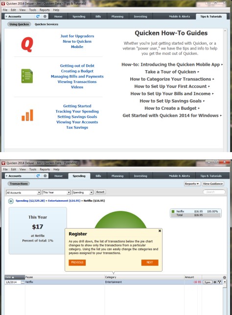
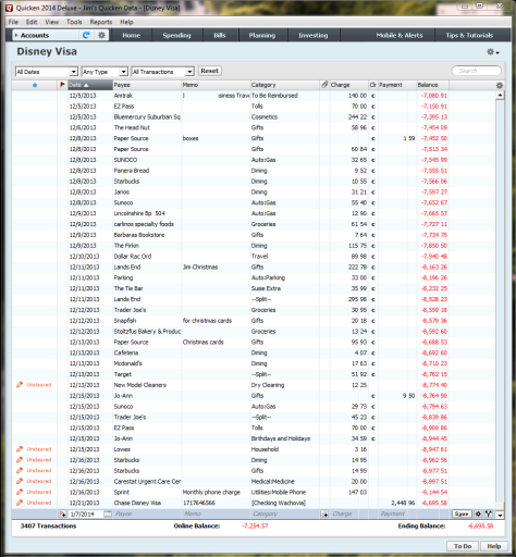
When someone is in a bad mood, you tread lightly. You don’t want to get in the way and cause more problems or have anger directed toward you. Ensure that the user interfaces that you design do the same. Remove unnecessary features, distractions, questions, and interruptions, so users can focus on their tasks. Over the years, the Quicken team has refined and optimized the product to give most of the screen real estate to the register of transactions, shown in Figure 1, and make it easy for experienced users to enter transactions quickly. It does a pretty good job of staying out of the way and allowing users to focus on their main tasks.

Figure 1—Quicken’s register of transactions
Quicken’s register of transactions

Be Careful What You Say

Just as you would be careful about what you say to a person who is upset, be careful with the tone of your content. For some Web sites, taking an informal, irreverent tone is the fashion these days. Yahoo! Mail, for example, displays messages like “You are my anti-spam hero!” which appears when you delete all of your spam. People might appreciate this light tone when they’re in a happy or neutral mood, but when in a bad mood or under stress, they might view it as patronizing or worse.

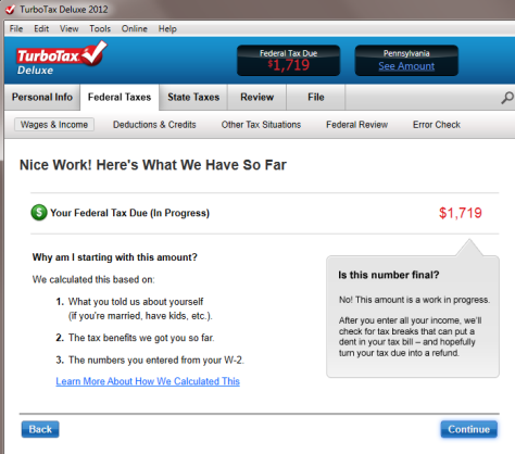
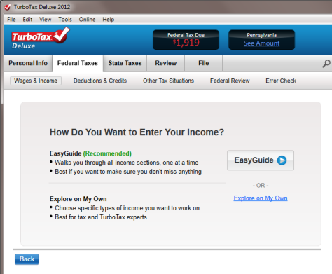
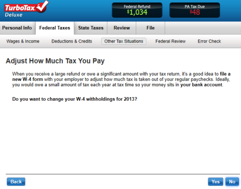
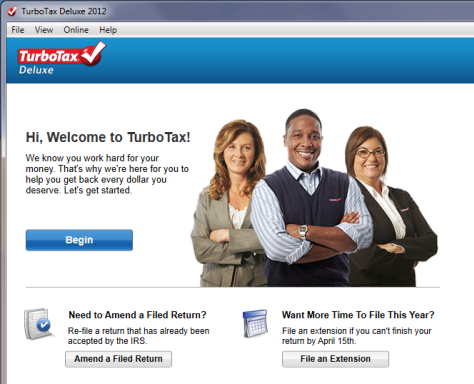
When writing messages and other text relating to unpleasant tasks, it’s best for the tone of the content to remain neutral or perhaps mildly encouraging at most. TurboTax uses language that always remains professional, yet is friendly and not too formal. It provides encouragement at the appropriate moments, too, as shown in Figure 2.

Figure 2—TurboTax’s encouraging tone avoids being patronizing
TurboTax’s encouraging tone avoids being patronizing

Avoid Overwhelming People

Too much information or too many options can easily overwhelm people who are already stressed and anxious. Use the following techniques to avoid overwhelming them.

Ease into Things

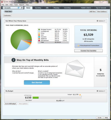
Dashboards present an overview that eases users into complex information by presenting a simplified view first before they dive into the details. Quicken does this well, opening on a simple Home screen, shown in Figure 3. This is a lot more pleasant than being immediately dumped into a complicated—and sometimes depressing—list of transactions like a credit-card or checking-account register.

Figure 3—Quicken’s simple Home screen
Quicken’s simple Home screen

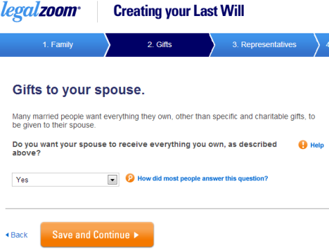
Show What’s Coming Up

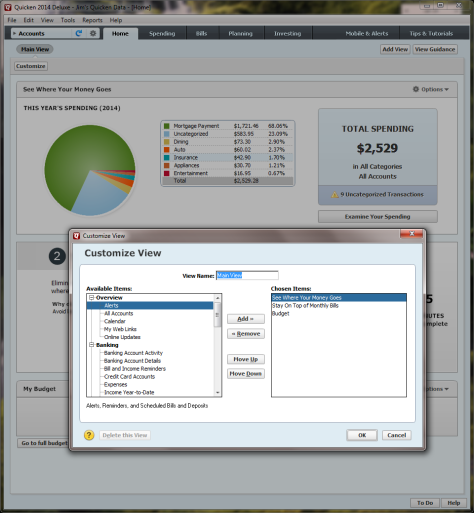
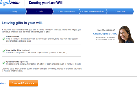
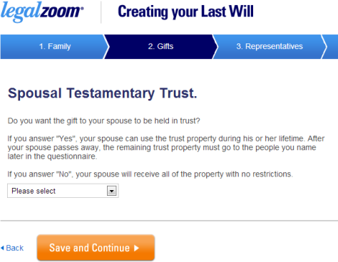
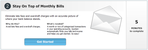
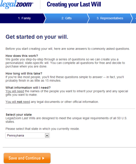
Another way of easing into a process is by telling users what to expect. People are more likely to begin and complete a process if you give them a reason to do it and show them what’s involved. Both TurboTax and Quicken are good at introducing new sections of the application by providing a simple overview that shows what’s next. For example, as Figure 4 shows, Quicken gives users an idea of why they should set up automatic payments for their monthly bills, what they’ll need to set them up, and how long it should take. Similarly, as shown in Figure 5, LegalZoom gives users an idea of what information they’ll need to create a will and how long it will take.

Figure 4—Quicken’s Stay on Top of Monthly Bills feature
Quicken’s Stay on Top of Monthly Bills feature
Figure 5—LegalZoom provides information about creating a will
LegalZoom provides information about creating a will

Focus on One Step at a Time

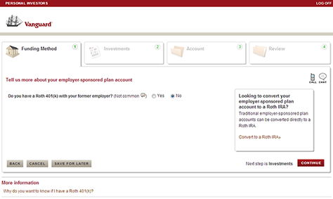
TurboTax does an excellent job of making a confusing or overwhelming task easier by taking users through a step-by-step interview process, focusing on just one topic at a time. What could seem overwhelming and intimidating seems doable when you break a task into small, manageable chunks. For example, on Vanguard’s Web site, explaining the complicated concept of rolling over a 401k to an IRA step by step makes it seem simpler, as shown in Figure 6.

Figure 6—A complex topic is easier to understand when it’s broken into manageable steps
A complex topic is easier to understand when it’s broken into manageable steps

Use Progressive Disclosure

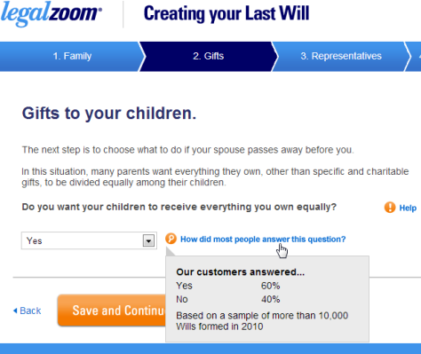
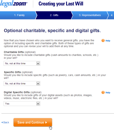
Provide only the information and options that users need to see now. Both TurboTax and LegalZoom do this well, asking questions and subsequently displaying only the content that is appropriate to users’ answers, as shown in Figure 7. This saves users time by letting them skip topics that apply to only a small number of people.

Figure 7—Users’ answers to questions determine which pages to present next
Users’ answers to questions determine which pages to present next

Hide Complexity

Don’t expose users to information that they don’t need to see. TurboTax hides the complexity of tax forms behind its interview process. While it provides access to tax forms for tax experts who want to see them, novices never have to see them until they print out their completed tax forms.

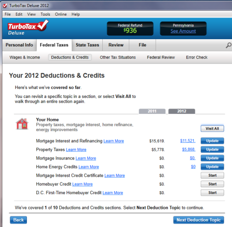
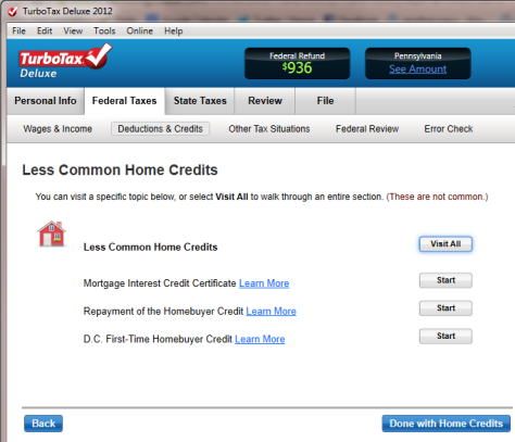
TurboTax also hides complexity by telling users if a particular tax situation is uncommon. For example, TurboTax must cover all home credits, but lets users know which of these are uncommon, as Figure 8 shows. By asking users questions before delving into such obscure topics and indicating that something is “less common,” TurboTax lets users avoid going through many unnecessary sections.

Figure 8—TurboTax indicates uncommon home credits
TurboTax indicates uncommon home credits

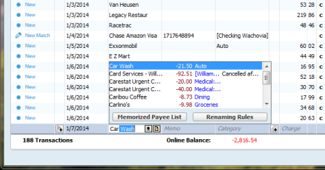
Minimize the Need to Read

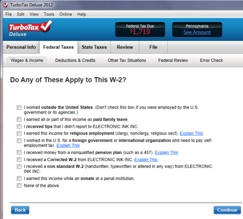
People don’t like to read online instructions. So, under normal circumstances, they’ll skim just the content that they need to get through tasks. When people are stressed, this is even more true. So keep your content concise and make it easily scannable by adding headings, using bullet points, and formatting text to emphasize important information. For example, TurboTax, makes certain words bold so users can quickly scan lists and easily skip over situations that don’t apply to them, as shown in Figure 9.
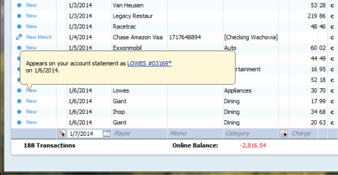
Figure 9—Users quickly scan words in bold instead of reading the entire list
Users quickly scan words in bold instead of reading the entire list

Automate Actions

Automate frequent and repetitive actions. Make it obvious that the system has completed an automated action so users can undo it, if necessary. For example, Quicken eliminates the need to enter many receipts manually by downloading credit-card and banking receipts, as shown in Figure 10. A dot to the left of items highlights those that were downloaded automatically, enabling users to review these transactions simply by clicking the dots.

Figure 10—Quicken downloads transactions to minimize manual entry
Quicken downloads transactions to minimize manual entry

Provide Common Defaults

Another way to save users time and effort is to provide good defaults, so users don’t have to type the values themselves. For example, when a user types a merchant’s name in Quicken, this automatically displays merchants, categories, and amounts from the user’s previous transactions, as shown in Figure 11. This saves users time when making frequent transactions.

Figure 11—Quicken lets users choose previous transactions
Quicken lets users choose previous transactions

You can also use defaults to prompt people to make the most common choice. As shown in Figure 12, LegalZoom prompts people to choose the most common answer, yes, by making it the default item in the drop-down list for the question, “Do you want your spouse to receive everything you own?”

Figure 12—Making the most common answer, yes, the default response
Making the most common answer, yes, the default response

Avoid Surprises

Anxious people don’t like surprises, especially negative surprises. Keeping users informed throughout a process prevents their encountering nasty surprises later on. As shown in Figure 13, TurboTax prominently displays a running tally of a user’s tax refund or the amount owed on every screen. This keeps the user informed and provides immediate feedback to show how certain choices affect taxes.

Figure 13—TurboTax shows the user’s tax due or refund at the top of each screen
TurboTax shows the user’s tax due or refund at the top of each screen

Give Users Control

Provide users with a sense of control by giving them options instead of constraining them to one path. For example, although TurboTax takes users through a step-by-step interview by default, it also provides the option to go straight to the tax forms. TurboTax also shows users where they are in the overall process and lets them skip forward or backward. At various points in the interview, the application asks users whether they want to go deep into a topic or skip it if it doesn’t seem to apply, as shown in Figure 14.

Figure 14—TurboTax employs a step-by-step interview, but also lets users jump to any step
TurboTax employs a step-by-step interview, but also lets users jump to any step

Provide Options for Different Audiences

As appropriate, provide options for novice and experienced users. TurboTax sometimes provides two paths through a tax topic: the Easy Guide version, which walks users through each step, and Explore on My Own, which lets users choose the topics they’re interested in. As shown in Figure 15, the Easy Guide option’s greater prominence steers most people toward using that version.

Figure 15—TurboTax has an Easy Guide and an option for expert users
TurboTax has an Easy Guide and an option for expert users

Quicken wisely presents a simple Home screen by default, but lets users add custom modules to the home screen, as shown in Figure 16.

Figure 16—Customized modules on the Quicken Home screen
Customized modules on the Quicken Home screen

Give a Sense of Progression to Encourage Users

The best part of an unpleasant task is the relief that you feel when it’s finished. So let users see how they’re progressing through a task to remind them that relief is in sight. Show what they’ve already completed, where they are in the overall process, and what is coming up next. This provides a sense of accomplishment and, by reminding users that there is light at the end of the tunnel, encourages them to power through to completion.

TurboTax periodically shows users a list of the sections that they’ve completed and the remaining sections that they must complete. Displaying a running total of the tax due or the amount of a tax refund gives users a sense of how their entries lead to the final total. As shown in Figure 17, LegalZoom shows users their location in the process with a progress bar at the top of the page.

Figure 17—LegalZoom shows users where they are in the will-creation process
LegalZoom shows users where they are in the will-creation process

Provide Various Levels of Help

Help can come in the form of instructional text on a page, ToolTips, contextual Help, interactive user assistance, detailed Help that appears in a separate panel or window, and assistance from a live person via chat, email, or a phone call. People often need help when performing infrequent tasks like preparing taxes or creating a will. So applications like TurboTax and LegalZoom provide Help right on the page, as shown in Figure 18—especially for unfamiliar topics. Applications that people use more frequently need to make Help available, but keep it out of the way in ToolTips, contextual Help, and Help sections, as shown in Figure 19.

Figure 18—LegalZoom’s explanation of a complex question right on the page
LegalZoom’s explanation of a complex question right on the page
Figure 19—Quicken keeps Help out of the way in ToolTips and a Tips & Tutorials section
Quicken keeps Help out of the way in ToolTips and a Tips & Tutorials section

Help Users Make Difficult Decisions

Provide information, suggestions, and recommendations to help users make difficult decisions. This is especially important when people need to make difficult decisions regarding unfamiliar and complex subjects such as taxes, investments, and health issues.

Many years ago, I gave up on making a living will because the software I was using, WillMaker, didn’t provide any assistance in answering extremely difficult questions such as whether I wanted to be resuscitated in various scary-to-contemplate scenarios. It wasn’t a pleasant topic to think about in the first place, and without help, the easiest decision seemed to be to make no decision.

LegalZoom, in contrast, helps users to make decisions by showing the choices that most people make, in a “How did most people answer this question” ToolTip, shown in Figure 20. Conduct user research to find out what decisions people need help making and what common questions they have.

Figure 20—When making difficult decisions, it’s helpful to know what other people do
When making difficult decisions, it’s helpful to know what other people do

Avoid Being Annoying

There’s a fine line between being helpful and annoying users with unwanted recommendations. Remember the infamous Clippy from early versions of Microsoft Word? Make suggestions and recommendations available for those who want them, but keep them out of the way so they don’t intrude on those who don’t need them. Usability testing can help you to gauge whether your recommendations are helpful or annoying.

Turn Mistakes into Learning Experiences

Often, the only consolation when people make a mistake is that they learn a valuable lesson and can avoid making the same mistake again. You can help turn a negative situation around by providing users with tools and information that help them to avoid making the same mistakes in the future. TurboTax does a great job of teaching users how their actions affect their taxes. It gives helpful suggestions about adjusting withholding and paying estimated taxes to help users avoid owing money on their taxes next year, as shown in Figure 21.

Figure 21—TurboTax provides a learning experience for handling next year’s taxes better
TurboTax provides a learning experience for handling next year’s taxes better

Conclusion

When a task is unpleasant, people just want to get it over with as quickly as possible. Even the best user experience can’t make an unpleasant task fun, but there are many ways in which you can make such experiences more bearable. By following the guidelines in this column, you can make inherently bad experiences a little better. 

Principal UX Researcher at AnswerLab

Philadelphia, Pennsylvania, USA

Jim RossJim has spent most of the 21st Century researching and designing intuitive and satisfying user experiences. As a UX consultant, he has worked on Web sites, mobile apps, intranets, Web applications, software, and business applications for financial, pharmaceutical, medical, entertainment, retail, technology, and government clients. He has a Masters of Science degree in Human-Computer Interaction from DePaul University.  Read More

Other Columns by Jim Ross

Other Articles on UX Design

New on UXmatters