Hardly any of us toil away in a mountain cabin or lonely basement. We all have to work with others to get our products built. Good collaboration is a critical feature of ensuring that your UX design solutions add value and are successful. Working collaboratively is more efficient, but most importantly, it helps to ensure that your designs meet the needs of both users and your clients.
As someone who has worked in the field of user experience for decades, received training on half a dozen development methodologies, and completed over 150 agile projects, one thing that I am quite confused about these days is the term waterfall. In pre-agile times, I never worked in any organization that claimed they were doing waterfall development. If I did hear terms like “toss it over the wall”—and they were as derisive back then as they are now. Product development—at least for products that anyone expects to be successful—has always been iterative, incremental, and collaborative.
Champion Advertisement
Continue Reading…
There Is No Waterfall
Traditional software-development methodologies are not step by step or siloed. In even the worst development process, people aren’t locked into separate rooms to do their work in isolation, then pass fully formed, unchanging documentation through a slot in the wall. As Phillip G. Armour wrote in his article “The Business of Software: Estimation Is Not Evil”:
“The waterfall model was never really a way of working. It was not so much a development model as a management model that allowed a simplified basis on which to track projects. Work was rarely if ever finished on an unambiguous date, while most requirements might have been defined up front others were identified in later phases, and necessary reworking occurred throughout the life cycle all of which contradict the naive model assumptions.”
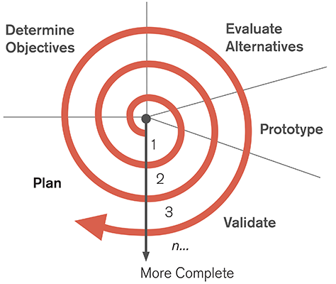
This is my experience also. Only bad teams failed to collaborate or work iteratively. Even if some clever manager overreached and tried to manage everyone into bad choices, the various disciplines would meet secretly and coordinate their activities. Everyone was iterating all the time. For example, spiral is just one older development methodology whose purpose is to improve products throughout the development lifecycle. Figure 1 illustrates how spiral development works.
Figure 1—Spiral development lifecycle
Other development processes tend to be similar. Even when there are distinct phases, everyone—including whoever will eventually maintain the system—is invited or even required to participate. Plus, many phases overlap or people continue working in a monitoring role because of the near impossibility of nailing down a design in isolation.
Which brings us to how to integrate User Experience into these processes. Easily and naturally, I think. When serious software developers or architects refer to design, they often mean software design, database design, or other technical design efforts. While teams often give such efforts short shrift today, they are crucial to building a reliable product that does anything like what is expected.
Quantifying User Needs
This confusion of terminology might be an issue. If we mean different things by design, how can we work together? Well, I don’t think we mean different things. UX design is about building systems, too. We just include users as part of the system and acknowledge that they have quantifiable needs and constraints.
It’s crucial to define the user as broadly as possible. Not just all the types of end users who will use your product, but internal users like administrators, content creators, and the people responsible for system maintenance. Whether you’re porting legacy systems to new platforms or creating all-new technologies from scratch, beyond the digital technology, there are business processes and objectives that you need to address as well.
When you look at User Experience in this way, suddenly everyone in the business—maybe even the Engineering team—will find that your role makes sense and is valuable. This is especially true if you, as the UX designer, also take the time to understand technical constraints and consider the client’s needs, as well as the user’s needs. If you do, your design work will naturally be in sync with the technical specifications. Because of the analytical nature of our work, UX professionals can become the most valuable members of their teams early on. And this is when it is easiest to do our work anyway.
User Experience and the Development Process
The only challenge, then, is the development process itself. Within the past week, I’ve seen agile experts come in who totally failed to understand what User Experience does. Even after I’d explained the role of User Experience a few times, their assumption that we’d do UI design after the stories were set persisted. They even thought we should just “clean up the UI” after the first round of development work on a feature was complete. Even worse, their view was that, if we insisted on doing some overall, holistic design up front, we’d be breaking their process and thus, committing the ultimate sin: not collaborating.
In an exchange on Twitter a while back, Brian Rieger responded to my tweet as follows:
“I find ‘agile design’ discussions most curious as I was never aware that design (as I was taught) could be anything but agile.”
Aside from a few managers, process coaches, and developers who were raised badly, most project teams will at least give you leeway to explain your role as a UX professional and what you will do to help a project. So, what can you do to overcome such biases?
These days, more often than not, I say that I am an ecosystem designer. My job is to discover, synthesize, and balance all needs and constraints, as shown in Table 1.
Table 1—Balancing needs and constraints
Needs
Constraints
User goals
Organizational time and budget
Organizational objectives and key results
Technical feasibility and environments
Legal, regulatory, or process requirements
The environment in which users operate
And how do we do that? If I had to nail this down by defining a few key guidelines, I’d say:
First, don’t draw.
Gather and understand.
Design ecosystems first.
Hold, look, tap, and connect.
Annotate, describe, and explain.
Evaluate and validate.
Before I get into discussing each of these, I want to emphasize that they really are not steps in a process. Instead, they are actions or behaviors that you employ repeatedly—or even continuously—throughout a project. These are things that you do iteratively. For example, you do the first of these whenever new information arises, not just when you first join a new project.
First, Don’t Draw
I came to understand these things about the role of User Experience in the development process not through philosophical introspection, but from failing, badly. By nature, I am of the “genius designer,” decision-making type and get pretty good results by relying on gut instinct and experience—though I hate some implications of this term. I actually used to interrupt client’s explanations of their needs and come up with pretty good solutions on the whiteboard in a few minutes. But, over 10 years ago, things came to a head when I was the UX designer for a complete redo of the Sprint Web site.
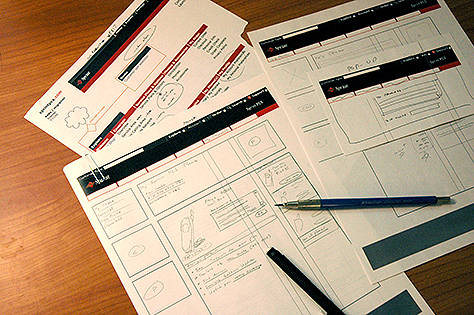
I created a very high-level sitemap—before the term information architecture (IA) had really made it to my brain—and a set of page templates that complied well with both branding and best practices. Then a very good project manager arranged for us to be in a room with each of the product owners in turn. For six months, sometimes for 16 hours a day, I worked with them, drawing each of the site’s hundreds of pages on the template printouts—working section by section and drawing in pencil, as shown in Figure 2.
Then I translated these drawings into Photoshop mockups. A few weeks into this part of the process, it was clear that this approach was insane, and as soon as I was finished, I began developing a better process. This all happened before the UCD chutes-and-ladders chart existed, so there was nothing that I could follow. Figure 2 shows my old approach, designing pieces in isolation, page by page.
Figure 2—My old approach to UX design
Recently, a project experience reconfirmed that page-by-page and feature-by-feature design is a terrible approach. I took over a project from someone else, with no time to start over. The previous agency was a Photoshop-centric, comps-only sort of organization. The client was sure that I could do a great job by picking up where they had left off, so insisted that we just keep going. So I did as they asked—though I did make some half-hearted attempts to diagram the process and enforce consistency. And the resulting design was pretty, fun enough to use, and moderately praised—at first. Then people began noticing issues—for example, that there are fully fifteen styles of modals, interstitials, and popups—that existed for no other reason than that we had designed everything on the fly, to meet specific needs that had arisen at the moment.
When I take some time to listen and think, I always come up with better solutions that are easier and cheaper to build and maintain. Always do this—and insist that your clients allow you to do this. It will make clients perceive you and your UX team as more friendly, and you will get more work when others come to you to improve their products.
Gather and Understand
So, how should you listen? Formally. There are lots of bad processes for gathering information. For example, the traditional brainstorming that we were taught in grade school is a terrible way to find out information. In brainstorming, we are always told that there are no bad ideas, but that’s not true. Aside from there being plenty of bad ideas, what is actually good are constraints. Anyway, we’re rarely asked to come up with solutions to a raw problem. Usually, we already have a bit of direction going in.
As early as User Experience typically engages with projects, usually someone else has already had an idea—in my experience at least. Often, it’s a variation, twist, or improvement on something that’s been around for years or even decades. So the first thing we do is get the whole team together. They have a lot of very relevant knowledge in their heads.
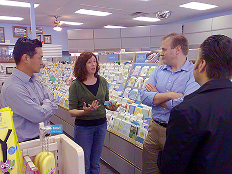
Annoyingly, it’s inside their heads. Be aware people are bad at analyzing and sharing what they know. You cannot just bring them into a room or sit down for lunch and get that information from them. However, there are some techniques that work well in extracting that kind of information, enabling you to find really interesting answers as a result. One way is to visit the people in their own environment. Ethnography is actually the science of observational research, but just bringing your team to a real environment like a home, repair shop, park, or store can encourage conversation and recollection. Figure 3 shows a team visiting a Hallmark store to explore with their clients why legacy products are arranged and labeled in particular ways.
Figure 3—Visiting a Hallmark store
Most of my information gathering is even more directed than this. Over the years, I have learned to ask these four core questions about any product:
What is the product?
What is its one main purpose?
What one problem does it solve?
Who will use the product?
You can gather this information in several ways. I have successfully gotten answers by simply asking the questions very carefully on phone calls or in email messages or online surveys. By far my favorite method of doing this is what, for years, I had simply called the Post-it method. Many people call this affinity diagramming. Recently, I found out that this method has got a formal name, the KJ method, and was named for its Japanese creator, Kawakita Jiro.
In this method, you gather the project team—and everyone else who has the knowledge that you need—in a room and ask them to write information on cards or Post-its, then organize them as a team. Just telling people to work together and giving them tips on collaboration goes only so far. This is one of those tricky methods that intrinsically makes people work together to come to a common understanding of an issue and agree on the answer.
Don’t Just Check Off This Step—Evolve Your Design
It is important that you conduct exercises like this differently from the way you would a team-building exercise. You don’t just meet, run through the steps of the exercise, then all high-five and move on. During design, apply the data that you obtain from these exercises. Your design should evolve seamlessly from one step to the next.
This sort of exercise results in a small number of fairly well-described features. For agile teams, epics and perhaps user stories could emerge from this exercise. You should do this exercise as early as you can—before embarking on any development process. This is about understanding the customer and the business goals.
Another key outcome should be a set of objectives and key results. This lets you formally quantify success so you can recognize it later on, as well as clearly define a business’s actual goals.
Know Your Audience
Creating personas is a great way to understand how people will really use your product. Personas can be indispensable later on, when you’re trying to understand why actual users are running into issues.
One of Diane Jacobsen’s clients once responded to her expressing the need to get this sort of data as follows: “Don’t do that early fooling around stuff; start with phase three!”
But I won’t lay the blame only on clients. The classic UCD processes are so time consuming that I know few designers who bother to create formal personas. This is not just a problem of perception either; I have worked with teams who spent over 6 months creating personas. The need to abbreviate this process is about more than meeting demands for greater speed; the world may change by the time your team gets those personas done.
You can shortcut this process by completing your user interviews and personas in only a few weeks. Even better, you can get a pretty good handle on your audience in a matter of days. Presumptive personas already exist in the minds of you and your team. You can use the same information-gathering exercises that I described earlier to extract information about personas from the team.
I like to spend some time searching the Internet to flesh out these personas further. For professional users, I look up things like resumés and job postings. But this doesn’t have to be the end of your process. It can be preliminary work to direct your interviews or ethnographic studies, so you’ll get much more accurate results, more quickly as you proceed with your project.
Design Ecosystems First
Being a UX professional has always been about designing ecosystems. Everything that we design is an ecosystem. Good UX designers have thought this way since long before the digital era. For example, publishers design newspapers and magazines not just to be readable, but to be appealing on the newsstand, allow room for mailing labels for subscribers, and be printed and bound, so every copy looks good when it gets into the reader’s hands—all while meeting a budget.
Consider the following three factors:
With new, connected devices, ecosystems are becoming more complex. It’s not just a choice between either the Web or mobile, but both at once, plus your Smart TV, thermostat, and car.
Systems are arbitrarily complex, so assuming a simple, linear process dooms you to failure. You must design for complexity and potential errors to meet all user and technical needs.
There are few truly full-stack ecosystem developers. In fact, I don’t really know any. You need to plan the entire experience before prototyping or development can occur on one or more platforms.
Designing ecosystems is about truly designing from the user’s point of view. Think about users, their real motivations and goals, and the broader environments that they inhabit. Think about what they’re already doing today. Are they indoors or outside? At a desk or walking around carrying the baby? Is it is raining? Are they driving? You can see how putting together at least a bit of a persona would be helpful in answering these questions.
There are many ways to draw an ecosystem, but make sure that you focus on behaviors instead of user interfaces or interactions. Focus on services, data, sensors, networks, and users, not screens, pages, and buttons.
This diagram doesn’t have to be pretty. You can start your diagram by just drawing boxes or literally by taking Post-its from your previous exercises off the wall.
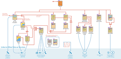
Any diagram that meets your needs can work. For example, storyboarding is another good way to model ecosystems. In the end, you’ll need something that is clear and unambiguous, so implementation teams can get their heads around it going into system design and estimation. Your diagram should evolve into boxes and arrows, including every node of the system with which the user interacts and all the resources that the system will use, such as storage and location. The ecosystem diagram in Figure 4 shows all customer and system touchpoints and the flow between them. I have segregated the parts of the system, external links, and other tools on the handset such as the phone or location services in a strip along the bottom.
Figure 4—An ecosystem diagram for a connected mobile app
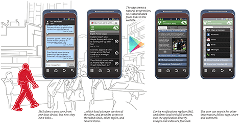
Remember to transition smoothly from one diagramming method to another, building on previous stages. You may need to create example user interfaces earlier than you’d prefer, so senior management understands that you are making progress. In this case, I like to expand on my user-centric diagrams. People are part of your ecosystem. When evolving from diagrams to user interfaces and interactions, explicitly try to keep people in your diagrams. For example, there are screens in Figure 5, but they’re grounded in a user’s walking down the street in Nairobi. The screens are all on his mobile phone, but spanning platforms, moving from SMS to the Web to an app.
Figure 5—People in ecosystem diagrams
Hold, Look, Tap, and Connect
Many of you know the story of Jeff Hawkins—even if you don’t recognize his name. He was the founder of Palm, so brought us the modern PDA and, therefore, the smartphone. Early in the development of the Palm, he carried around a block of wood, wrapped in tape, and paper printouts. To try out the concept, in context, he pretended to take notes on it throughout his day, in much the same way a real user would. He focused specifically on the form factor because he believed—correctly, as it turned out—that similar projects had previously failed largely because the devices were too big to put in a pocket.
I have created and seen similar prototypes. Whether you’re making wooden prototypes of devices that don’t yet exist or just passing around mockups of user-interface designs on a handset, be sure to have the prototype in the room whenever you’re discussing a service. Get away from relying on your computer, the whiteboard, and PowerPoint presentations.
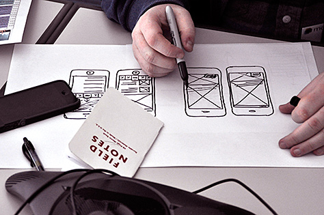
A simple way to make your designs more accurate and your process more efficient is to work at scale. Draw on printouts of devices at their actual size, as shown in Figure 6. Sketching at scale is an easy and cheap way to ensure that your designs make sense in context.
Figure 6—Sketching at scale
Once you’ve moved on to creating digital designs, export your user-interface designs often, so you can see them on the phone, tablet, or whatever device the user interface will appear. There are numerous products that help you to do this, but it’s not very hard to simply generate images having the proper aspect ratio, then email them to a mobile device and scroll through a slideshow. I have even done paper-prototype testing with such mockups, and it works surprisingly well.
Understand the Technology
Behind everything, there are wires, radio antennas, batteries, sensors, integrated circuits, resistors, films, adhesives, and more. If you think you are building for the real world, but don’t plan for when that world intrudes, you will fail.
Understand the technology, and check it out yourself. There are many technologies that you have to use in order to really understand them; and all of them are often misunderstood. You will probably never use GPS for your mobile app, but you may use location, which derives from many sources, including up to three different satellite networks.
Consider displays. We like to pretend that they are made of pixels—like those you see when you zoom in on a Photoshop image, each one a square of a different color—but it’s not true. There are several different types of displays, and which one you are using can matter—and not just to make things pretty, but to manage power so battery life lasts all day, instead of just an hour or two.
Radios are a favorite technology of mine. I hear lots of talk about how mobile networks are slow, but that’s not strictly true. They can be, but the best are generally as fast as your typical home network. However, they do have horrid latency—that is, the speed at which each connection is made. To optimize for mobile networks, total page size is not quite as important as reducing the number of items on the page. You can solve this problem by using inline JavaScript and CSS instead of referring to external files, and even use Base64 encoding to embed images directly in a Web page.
How Bad Can It Really Be?
Of course, the technology is part of the experience the user has with your product. In case you’re thinking all of this is on the implementation side, so you can worry about it later, that’s wrong. The software design, the interaction design, and even the information architecture and data concepts can induce failure if you are not careful.
Right now, I am working on a revision of a sort of Internet of Things (IoT) system that connects to remote equipment for diagnostic purposes. We built the product to read the remote system in real time. Much, much, much later, we found out that it cannot actually do that, but instead must get snapshots of data whenever the user enters the viewer or presses the Refresh button.
We tested this with real users, and even after making a few tweaks to explain this, it didn’t work. The concept of the app design didn’t make a bit of sense in fairly fundamental ways. We’ve had to go back and fairly heavily redesign the architecture and parts of the user interface to reflect the way the system actually works. These are non-trivial differences as it turns out. You can’t just add a button or an explanatory overlay. You have to build the interaction around the way the system really works in the user’s real environment.
Annotate, Describe, and Explain
So, keeping all of those issues in mind, I move from requirements to actually designing the details. This is where I move from the ecosystem to a single platform—mostly because individual teams, phases, or iterations address one or a few platforms, not the whole ecosystem.
I take the task flow and make it platform specific. To ensure that I keep the broader system in mind, I transition again—literally taking the task-flow drawing and, using a marker or just the Pen tool in InDesign, scribbling over the parts that don’t apply. I continue to branch the design, creating a series of diagrams covering each platform. All of these are children of the master-ecosystem task flow, but I expand on them individually, as needed.
This is where I tend to rant about not prototyping, but drawing and describing. As you move to arbitrary numbers of devices or even all-new devices, you can’t code up your designs. These devices might not exist at all until your team creates the new hardware. You have to be able to draw and specify things like the lights, the blink rate, or the way the user shakes or waves at the device.
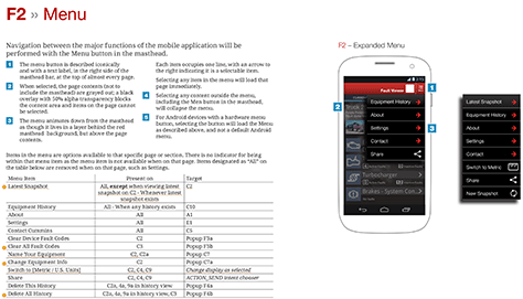
Figure 7 shows a good example of what I mean by describing. It would be insane to draw every version of the menu, so I showed only a few key examples, described the many matrixed states in a table, and detailed the user interface and interactions in a series of notes.
Figure 7—Annotating UI drawings to make them specifications
Descriptions, lists, and tables should accompany any drawings to specify the user interface in the same way as a functional specification. The specifications should be unambiguous and testable. Later, when it doesn’t get built right, you can remind everyone this is a specification and open bugs against it.
As we move on to other types of devices like wearables and smart thermostats, don’t get hung up by thinking that there’s no user interface. While the nascent No-UI movement is a clever way to think about things, it really means a user interface that is different from a screen that you touch or a keyboard.
Blinking and buzzing is output. User movement can be input. Wiring your thermostat or plugging in your wearable to charge it every night is absolutely an interaction. And don’t forget about internal processes like loading new content or technical systems that impact the user, such as data retrieval. Think of all of these, and design them as well.
Evaluate and Validate
Developers may be familiar with some variation of system-integration testing. It’s one of a couple of names for end-to-end, technical testing of an entire system. But, these days, claims of doing end-to-end testing are increasingly untrue. Are you testing on the actual hardware, on mobile networks other than at your corporate office? Outside? With noise and glare and distractions? Because all of these matter.
The system includes people, but in the past, we have tended to distinguish between system testing and usability testing. As I mentioned in my earlier example, this doesn’t always work. The app that we built and all of the APIs and servers worked technically, but not when we factored in the users and their environment.
Of course, you first need to make sure the system basically works. Check the hardware and make sure your fundamental assumptions are correct—in context, as much as possible. Bench tests in your office can go only so far, so you need to walk around and try things in the real world. Remember how I said mobile networks are different? Don’t be that guy who tests your mobile app only on a WiFi connection.
As soon as possible and regularly throughout the development process, test with real people in their own environment. Doing testing with real users and in their real environment is more important than testing a real piece of software. Take paper prototypes or a slideshow of mockups to your users as soon as you have them, so they can try out your design.
The photo shown in Figure 8 depicts a typical user’s work site, a maintenance shop. I had this user wear video-recording glasses, so I could review his work later on and get his actual point of view throughout the process. We captured everything the user saw and did, not just what he did with the app on the phone.
Figure 8—Testing with real people, in their real environment
For years, the usability lab was the ultimate in UX research, but increasingly, I find that field studies are better and, in many ways, make it easier and cheaper to conduct research. You have to know how to test—how not to mess up the results with your own opinions. But you go to the users, so they are easier to get hold of and act more naturally.
The User Experience Is Part of the Stack
Engineers often think of their project requirements and their processes in terms of the stack. They choose an OS, on which they layer a Web server, then a database, and so on. Lately, they have extended the stack to include everything on a project.
The full stack increasingly includes the user interface, marketing—every part of the system. Business and development are all but demanding well-designed, usable products as the baseline for what they need to be competitive in the marketplace.
There are continually increasing opportunities for UX professionals and teams to contribute to great products, but we need to be really proactive—maybe even aggressive—in interjecting ourselves into the process, demonstrating our value, and communicating our processes in ways in which Engineering teams are used to talking.
References
Armour, Phillip G. “The Business of Software: Estimation Is Not Evil.” Communications of the ACM, Vol. 57 No. 1. New York: ACM, 2014—The quote about waterfall is from this article.
Spool, Jared M. “5 Design Decision Styles. What’s Yours?”User Interface Engineering, January 21, 2009. Retrieved April 20, 2014—Being a genius designer is not really a good thing, despite the sound of the name. The designer or team rely on their experience to make gut decisions. There are better ways.
Usability Professionals’ Association. “Designing the User Experience.” Retrieved April 29, 2014—Commonly referred to as the “Chutes and Ladders poster,” this poster was part of every membership package in UPA, then UXPA, for many years. For a time, it seemed to be hung in every user-centered design (UCD) office. Because of its broad distribution, this poster hugely influenced how many UX professionals thought about and defined UCD.
Hoober, Steven. Designing by Drawing: A Practical Guide to Creating Usable Interactive Design. Lawrence, Kansas: Little Springs Design, 2009—Some of the process comes from this, which is an evolution of the design methods I created after realizing that screen-by-screen design was a flawed approach.
Lehrer, Jonah. “Groupthink: The Brainstorming Myth.”The New Yorker, January 30, 2012. Retrieved April 29, 2014—A well-reasoned and oft-referenced article on why brainstorming doesn’t work, referring to research studies and statements from the developers of the original idea. This has become controversial to defenders of brainstorming.
Berkun, Scott. “In Defense of Brainstorming.”Scottberkun.com, February 13, 2012. Retrieved April 20, 2014—This is essentially a rebuttal of Lehrer’s article—and, I think, misses the point by being too defensive. Berkun himself discusses the need to perform the brainstorming process correctly—hence, my qualifier “taught in grade school.” I still think there are better methods.
Spool, Jared M. “The KJ-Technique: A Group Process for Establishing Priorities.”User Interface Engineering, May 11, 2004. Retrieved April 20, 2014—The only article you’ll need to understand how to do K-J exercises. I have my own preferred tweaks to this technique, but they’re minor in comparison to how comprehensive this article is.
Wodtke, Christina. “An OKR Worksheet.”Eleganthack, April 27, 2014. Retrieved April 29, 2014—Objectives and Key Results is actually a fairly formal method of discovery. I like the term, and some of the constraints help you to get good results, but I am not sure that another worksheet helps. It may conflict with the KJ or other approaches—or simply be too much to do. However, you may like this approach, so check it out.
Savoia, Alberto. “My Favorite Pretotype Story.”Pretotyping, August 20, 2010. Retrieved April 29, 2014—This entire Web site that is devoted to the principle of building pre-prototypes, with a nice summary of the Palm case study.
Krishna, Golden. “The Best Interface Is No Interface.”Cooper Journal, August 29, 2012. Retrieved April 20, 2014—I attended a Cooper parlor, or open discussion and workshop, in September of 2012 and got to talk about this with Don Norman before the session.
The article “Design by Number: Quantifying the Subjective” is not far from what I am saying in this column as well, but I had somehow missed it.
The premise is good as well. Ideally, by working as a group like this, you remove a lot, though not all, of the opinion and subjectivity from the process.
Something else super interesting, which I once again missed despite its being two years old: “Loops and Arcs.”
Conceptual activities to make simple, high-level task maps. This is written from a game design point of view, but it is generally applicable. Pretend that I added that as a link in the “Design Ecosystems First” section. If you don’t get how to think about design of your system this broadly, try this as an exercise.
The book “Human-System Integration in the System Development Process: A New Look” shows how human factors can be integrated into the spiral model—albeit for bigger systems, but the ideas are applicable to most, if not all systems. You should be able download it free.
This is a really great and practical article, Stephen. Thank you. I was wondering, though… There are two references in your bibliography that aren’t easily accessible, and I was wondering if you have offline methods of purchasing or otherwise getting hold of them? Specifically the “chutes and ladders poster” and your own book/article, “Designing by Drawing: A Practical Guide to Creating Usable Interactive Design.”
Do people still produce such heavy, antiquated spec documents? Who really reads them and what value do they really bring? Why not just work collaboratively, as the article states, to understand the design and it’s specifications and go build it?
Really weird to create such huge documents in my opinion.
Tom Wellings: Both of those figures are for real products that I’m not really allowed to share. So, partly, the small and fuzzy bit is what makes me able to do an end run around that.
Gordon Baxter: Thanks for the link and remembering the past was not all stupid also!
I did skim this history part, but totally was developing my UX methodologies back in Rational, Spiral, and other eras. To rant a bit, it’s one reason I never figured out why I can’t integrate UX design and usability into agile. What’s the difference between one development process and another when my part is, if anything, more about business process and people, so never changes.
Daniel Hedrick, you should be able to contact UXPA to get the poster. Since they switched from UPA to UXPA, they don’t seem to send it out to each member anymore; and the store is broken, but I bet it’s available.
My old process book is available, expensively, from Lulu, but also has been available cheaper from iBooks and some other eBook places. If you still can’t find it, search me out on Twitter, find my contact form at 4ourth.com or something, and tell me about it. I’ll figure out a way to get it back out there.
Johnny: Assuming you mean the documents I showed off in my tiny, burry screenshots: not sure how to respond to “antiquated.”
But if open to my answer, we do work collaboratively: to design something. Design—even software design, database design, or process design—is a separate step from execution. Saying “and go build it” is not dissimilar to me asking why we need a backlog or burndown chart. I mean, if we all know what’s happening, why spend the time documenting it?
The reason is that we have terrible memories and biases and fill in gaps when things are vague. A whiteboard sketch and verbal understanding of a design will be built not just differently from what the designer and product owner thought was the agreement, but if more than one developer works on the product, the two will come up with different answers. It’s inefficient. Demonstrably so.
And, we need proof. Until every organization has a team with exactly the same understanding of what is important to the user, you need to be able to point to a document to say “this is a bug” or “No, we need to build this because the product owner said to do it exactly like this.” Also, the future. Lots of inefficiency when you get to v2 or v10, and no one knows what it is supposed to work like.
Also, it’s not an FRD or anything else old fashioned at all—just because it’s on paper. The format of the document is designed as much as any end-user product. It’s evolved, and it changes—often based on the way the team works. They are read very, very carefully by the implementation teams. Often, I find that UX documentation like this is so robust that other documents are eliminated from the development process.
This is a really great share. Thank you for this great share. All the excerpts on user interviews are really great. This is a well-written, insightful article. A wider perspective on product development than just agile software development methodologies.
For his entire 15-year design career, Steven has been documenting design process. He started designing for mobile full time in 2007 when he joined Little Springs Design. Steven’s publications include Designing by Drawing: A Practical Guide to Creating Usable Interactive Design, the O’Reilly book Designing Mobile Interfaces, and an extensive Web site providing mobile design resources to support his book. Steven has led projects on security, account management, content distribution, and communications services for numerous products, in domains ranging from construction supplies to hospital record-keeping. His mobile work has included the design of browsers, ereaders, search, Near Field Communication (NFC), mobile banking, data communications, location services, and operating system overlays. Steven spent eight years with the US mobile operator Sprint and has also worked with AT&T, Qualcomm, Samsung, Skyfire, Bitstream, VivoTech, The Weather Channel, Bank Midwest, IGLTA, Lowe’s, and Hallmark Cards. He runs his own interactive design studio at 4ourth Mobile. Read More