Touch mobile interfaces have become commonplace in our daily lives. While touch interfaces were previously in common use only for entertainment and social networking apps, many large software firms are now designing touch interfaces for mobile apps that provide extensions to enterprise software, giving customers access to functionality that had previously required them to be on a Web site or application. Because the functionality of these apps tends to be complex, having a practical, reliable usability evaluation method for touch mobile interfaces is vital.
Remote usability testing is often a corporate mainstay. Getting feedback from an international audience early in the development process reduces costs and ensures a universally usable product design. This is especially true of mobile app development because UX design guidelines are still evolving and the challenges of mobile interactions are not yet well understood.
Champion Advertisement
Continue Reading…
Unfortunately, remote testing of mobile applications is still impractical and in-person tests are expensive and time consuming. A possible alternative is to adapt accepted discount usability evaluation methods that were developed to evaluate software usability, such as heuristic evaluation. Although heuristic evaluation is a fast and effective method of identifying usability flaws, the widely used heuristics that Molich and Nielsen introduced were originally created for evaluating desktop software. Their language and examples are not always appropriate for other platforms such as mobile devices, because there are fundamental differences between touch interfaces and conventional desktop-computer interfaces.
Over the years, various UX researchers have evolved and expanded Molich and Nielsen’s original heuristics to meet their needs. While there have been many noteworthy efforts, nearly all of these heuristics were created before the advent of touch devices. In this article, we’ll discuss adapting Nielsen’s heuristic evaluation method to the evaluation of applications for touch devices by developing a set of heuristics for identifying usability problems that are specific to touch interactions. Our proposed heuristics augment existing guidelines to ensure that evaluation methods more thoroughly address the distinctive properties of mobile interactions.
Heuristic Evaluation
Heuristic evaluation is a widely accepted discount evaluation method for diagnosing potential usability problems in user interfaces, in which a small number of usability experts systematically inspect a user interface and judge its compliance with a set of heuristics. Heuristics are general rules that describe common properties of usable user interfaces. They help evaluators to focus their attention on specific aspects of user interfaces that are often sources of trouble, making the detection of usability problems easier. Nielsen’s heuristics are as follows:
visibility of system status
match between the system and the real world
user control and freedom
consistency and standards
error prevention
recognition rather than recall
flexibility and efficiency of use
aesthetic and minimalist design
help users recognize, diagnose, and recover from errors
Help and documentation
Heuristic evaluation is popular because of its low cost in time and resources. A usability expert can complete a heuristic evaluation in a relatively short amount of time—just a few hours—and this evaluation method does not involve users.
Because heuristics are well documented—for example, as in Greenberg and Roseman’s Using a Room Metaphor to Ease Transitions in Groupware—they are easy to learn and apply. Even people who are not usability experts can use them with some success. Heuristic evaluations have a low cost-to-benefit ratio: only 3 to 5 experienced evaluators can identify approximately 75 to 80% of all usability problems.
Heuristics for Evaluating Applications for Mobile Devices
Previous studies by the Nielsen/Norman Group have noted three common design issues for touchscreens.
Inconsistent interaction design, preventing users from transferring their skills from one interaction to the next. When this design flaw exists, users do not know what has happened or how to replicate a certain action to achieve the same result again. In the worst case, users may not know how to revert to the previous state because there is no consistent undo feature or Back button across applications.
Inaccurate selection, or fat fingers. Screens for touch devices are smaller than typical desktop monitors. Their small target areas create a problem in designing mobile applications. Although touching a screen is simpler, it is less precise than clicking with a mouse.
Lack of navigational aids such as a visible Home icon or a search box. A Home icon is an important landmark for users. Being easily able to go back to the home page gives a sense of predictability and control to users. Having a visible search box can dramatically improve the success of users looking for a specific piece of information. Unfortunately, designers often sacrifice these common desktop aids to save real estate on mobile interfaces.
Consideration of these design issues provides a foundation for evaluating touchscreen interactions. In addition, some of Nielsen’s general heuristics for evaluating desktop applications are still applicable, including error prevention, consistency, and standards. Some existing work that recognizes the differences in design requirements for mobile devices was based on MWBP and the iPhone Human Interface Guidelines. These design recommendations include using a hierarchical arrangement of elements in user interfaces, minimizing scrolling on navigation pages, and displaying basic navigation—a Home icon and Back button—at the top of every page.
In the next section, we’ll discuss our experimental approach to developing design heuristics through a lab test using iTouch devices, during which we re-evaluated the traditional usability heuristics that we discussed earlier and identified some new heuristics for touch interfaces.
Our Research Methodology
We initially designed this research to investigate whether there are differences between using real mobile devices and using a mobile-device emulator in detecting usability issues. In this study, we used two different test environments: in-person testing using iTouch and remote testing using an emulator. We reported the complete results of our quantitative analysis of number of errors, number of assists, time to complete each task, and task completion in our paper, “Testing Touch: Emulators vs. Devices.” In this article, we’ll focus on the process of defining design heuristics using a coding scheme.
Test System
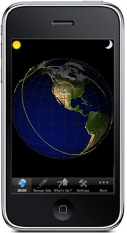
For our study, we chose a product that is currently available through the iTunes app store, but is sufficiently specialized and technical that the majority of test participants would not have seen it. The ProSat app, shown in Figure 1, lets users—primarily satellite watchers and ham-radio operators—track and predict the location of satellites in the sky. An enterprise software designer developed the app. This app was ideal for this experiment because it had some obvious usability issues that the designer had not had the chance to evaluate and correct. We evaluated the product using standard usability heuristics and chose tasks for the test that would highlight the known issues.
Figure 1—Home page of the ProSat app
Participants
All participants were employees of an international IT company who had normal or corrected-to-normal vision. We conducted tests with a total of 49 participants—24 remotely and 25 in person. For the in-person tests, all participants were located in either Colorado Springs, Colorado, or Plano, Texas. For remote tests, participants were located in numerous locations around North America.
Table 1 shows the demographic breakdown of participants by gender; Table 2, by age; Table 3, by their frequency of use of touch devices.
Table 1—Gender of participants
Gender
Male
Female
On emulator
18
6
On device
16
9
Table 2—Age of participants
Age
21–30
31–40
41–50
51–60
61 and Up
On emulator
0
6
15
2
1
On device
0
3
14
5
3
Table 3—Participants’ frequency of use of touch devices
Frequency of Use
Never
Once or Twice
Monthly
Weekly
Daily
On emulator
0
3
2
3
16
On device
2
7
0
0
16
Participant Preparation
When participants arrived, we briefly described to each of them the purpose of the study, the software and its uses, and the format of the test session. We gave them opportunities to ask questions both before and after the session.
In addition, before the test, remote participants received an email message providing instructions and the time and date of their session. We asked them to have the following items ready before the session started:
a phone with toll-free access and either a speaker or headset—Because the session required the use of a mouse and keyboard, we asked that participants have a way to communicate with us without using their hands.
a printed copy of the task list—We wanted participants to use the software in full-screen mode, which made it necessary for them to have a printed copy of the tasks.
Test Environment
We presented the same tasks to all participants, in the same order. We conducted in-person test sessions in a team room with standard office seating, a fixed-height table, and overhead fluorescent lights. We conducted remote test sessions at the locations of individual participants, which could vary significantly. Remote participants accessed the software using Microsoft LiveMeeting. The session then proceeded like a traditional usability test.
During test sessions, participants performed a total of eight tasks, covering the main features of the app. In addition, we asked participants to rate the usability of the user interface on a Likert scale, from 1 to 7, then asked open-ended questions about their experience with touch interfaces.
Measures and Analyses
We did a quantitative analysis of the number of assists participants required during the sessions. We based our analysis of assistance types on a coding scheme. We based the codes on prior literature on design heuristics. The categories reflect the different types of usability issues that we identified during the study. Table 4 shows our coding scheme, listing all codes and their definitions.
Table 4—Coding scheme for assistance types
Code Name
Definition
Persistence of screens
Participant became confused or got lost because the screen remained in a drill-down state after the participant had navigated away using the toolbar or another means.
Entry point
Participant could not find the entry point, or starting point, for a task. Participant may have accessed the appropriate screen, but did not recognize that it was the desired starting point.
Response time
Participant moved on to another screen or task prematurely because he did not wait for the system to respond.
Fat finger
Participant could not select an item because he was unable to be sufficiently accurate with his finger.
Inconsistent behavior
Participant could not figure out how to use a widget or screen because it behaved differently than expected, based on use of other similar apps or other screens within this app.
Back
Participant could not navigate back to the original page.
Confirmation
Participant did not know whether an action was successful because he did not receive confirmation or see a familiar completion button such as Done.
Visibility
Participant did not see a feature that was necessary to perform a task, even though on the correct page.
Help
Participant used Help to try to figure out to perform a task.
Coders’ Reliability
Three coders, from the same group in an IT company, completed all coding. All three coders had similar educational and professional backgrounds and had some experience coding the findings of actual research projects. One coder coded all of the transcripts for the emulator group; another two, the transcripts for the device group.
During the training stage, we randomly chose one video recording, including eight test tasks from a remote test session using an emulator. Each coder coded the transcript independently, then went through several iterations of discussion and recoding to come to agreement on the application of the codes, until they attained a satisfactory level of inter-rater reliability. The consistency of the three coders on the eight tasks was 100%, 67%, 67%, 80%, 50%, 80%, 100%, and 100%, respectively, with an average of 80.5%. The Cohen’s Kappa reliability statistic for all the task transcripts was .80, which is within the acceptable range.
Results
The coding analysis revealed the types of assistance that participants required while performing the test tasks. This, in turn, reflected the design issues that we identified. Table 4 lists the codes the coders used for analysis. Table 5 shows the frequency of each code across tasks in each test environment.
Table 5—Frequency of codes for each test environment
Code Name
Emulator (N=24)
Device (N=25)
Persistence of screens
6
5
Entry point
39
42
Response time
11
3
Fat finger
0
15
Inconsistent behavior
32
4
Back
2
1
Confirmation
0
1
Visibility
8
15
Help
0
4
We found significant differences between test environments for response time, fat finger, and inconsistent behavior.
The differences in response time confirmed our quantitative analysis of time spent performing tasks, in which we discovered that it took participants in the emulator group significantly more time to complete tasks. Participants in the emulator group often moved to another screen or task prematurely because they did not wait for the system to respond. The significantly poorer response time for the emulator through Microsoft LiveMeeting explains this behavior.
Only participants in the device group encountered the fat-finger issue. Participants had trouble accurately selecting items on the small screen with their fingers.
In the emulator group, participants requested more assistance in using a particular widget, because it behaved differently than expected based on their experience using touchscreen devices—for example, using a swipe behavior.
In the next step, we calculated the percentages of codes by dividing the frequency of each individual code by the sum of all codes. Table 6 lists the results of this calculation. It confirmed our analysis: participants in the emulator group had more issues with inconsistent behavior and response time; while participants in the device group had more issues with accuracy of selection, or fat finger.
In general, the results show that participants had a high percentage of entry point and visibility issues. This illustrates the main design issues for this particular application:
Participants had difficulty in discovering how to get started with particular tasks because of the lack of visual aids.
Participants did not discover features that they needed to perform tasks because they were hidden.
Participants misused icons and menu items with unclear names.
Table 6—Frequency of codes for the two test environments as percentages
Code Name
Emulator (N=24)
Device (N=25)
Persistence of screens
0.06
0.06
Entry point
0.40
0.48
Response time
0.11
0.03
Fat finger
0
0.17
Inconsistent behavior
0.33
0.05
Back
0.02
0.01
Confirmation
0
0.01
Visibility
0.08
0.17
Help
0
0.05
Results for Heuristics
In general, we verified that the existing heuristics from previous research efforts are still applicable to many aspects of good interaction design for touch devices, including consistency with standards—that is, persistence of screens and inconsistent behavior; visibility of application status—for example, confirmation; accuracy of selection, or fat finger; use of navigational aids such as a Back button; and Help and documentation.
Additional heuristics that we discovered include the following:
entry point
response time
visibility
Entry Point
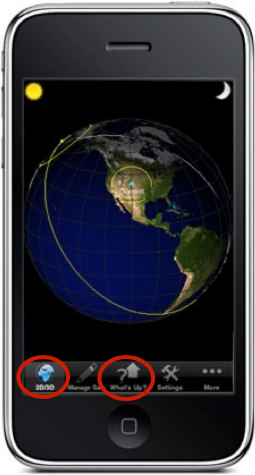
The results showed a high percentage of entry-point issues across both test environments. During tests, participants often complained that it was not clear where to start tasks, because of either the lack of visual aids in the user interface, misplaced features, or ambiguous icons. Figure 2 shows a screenshot of the application home page, with ambiguous icons. Most participants commented that the label 2D/3D did not represent a home page to them and many looked for a Home icon when starting a new task or after getting lost during navigation.
Figure 2—Homepage of ProSat app with ambiguous icons
Similarly, participants believed the What’s Up menu was the Help documentation and were surprised that it was instead a list of currently available satellites. When asked, participants commented that the menu name was ambiguous and the icon was misleading because it included a question mark, which typically indicates Help.
Response Time
Response time was another issue for many participants. Participants repeatedly expressed their frustration with the app’s slow response times. They sometimes moved to another screen or task prematurely because they did not wait for the system to respond. Consequently, they either requested Help or gave up on tasks when they were unable to find the desired screens. When using touch devices, participants often have high expectations for quick response from applications, which is part of what makes these experiences engaging.
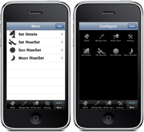
Visibility
Visibility issues were primarily the result of features being displayed in the wrong place or being hidden. Figure 2 shows an example of a visibility issue. In one task, we asked participants to make the Sun Rise/Set menu appear as the second icon on the toolbar at the bottom of the screen. Participants went first to the Settings menu. After becoming frustrated and often asking for Help, they navigated to the More menu screen, shown on the left in Figure 3. Unfortunately, most participants still did not discover how to get to the Configure screen shown on the right in Figure 3. When we told them that they needed to click the Edit button in the upper-right corner of the More menu screen to go to the Configure screen, participants were surprised and commented that the Edit button did not fit their mental model of an entry point to the Configure screen. Plus, the Edit button was not sufficiently visible in the user interface.
Figure 3—More and Configure screens
Our analysis of the code percentages showed a higher percentage of visibility issues for the device group. This indicates that elements’ lack of visibility on a physical device may not be obvious when developing applications on an emulator. Designers must pay greater attention to the arrangement of elements to use the limited space in a mobile user interface effectively.
Error Detection: Emulator Limitations
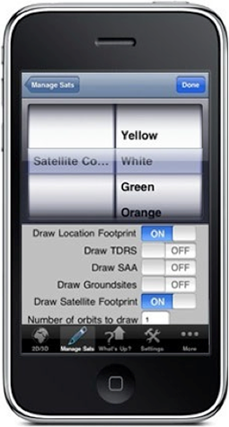
Of additional interest to designers, the results of this experiment showed that participants were more likely to detect errors on the device than on an emulator. Generally, we found that participants in the emulator group were more likely to overlook issues with the arrangement of interface elements, see Figure 4, and the visibility of features.
Figure 4—Satellite configuration screen
In Figure 4, the field Number of orbits to draw is slightly off the bottom of the screen by default. Participants in the device group frequently tried to tap this field to enter a number, but selected the Settings toolbar button by mistake. Participants in the emulator group did not encounter this accuracy issue because they were using a mouse and keyboard rather than their fingers.
Figure 4 also demonstrates the false positives that can occur when using an emulator. When asked to change the satellite color, participants in the device group easily accomplished the task by swiping the wheel and selecting different colors. However, when participants in the emulator group tried to drag and drop the desired color to simulate the swipe behavior, they failed to select a color because the emulator widget required them to click the colors to spin the wheel.
In another task, we asked participants to change the satellite rise time using a similar widget and the emulator used a drag-and-drop behavior. These inconsistencies in the design of the app’s screens caused more trouble and required more assistance in completing tasks for the emulator group, resulting in a higher percentage of inconsistent behaviors overall for the emulator group.
Conclusions and Future Work
In this article, we have described our empirical approach to verifying existing design heuristics and developing new heuristics for touchscreen devices. The marked differences between our findings and those of previous studies of desktop design heuristics suggests that we need to re-evaluate traditional heuristics when approaching the evaluation of touch interfaces.
Our next steps will be to validate the ways in which evaluators can use these heuristics to discover usability problems and to validate the use of our touch-device heuristics as a discount usability method. The number of usability problems that we discovered during our study is not indicative of what a typical usability specialist would find, because we’re intimately familiar with these design heuristics. We are planning to conduct a formal evaluation of a different iTouch application, with outside evaluators using the heuristics that we developed through our research.
Our objective is to assess the ability of usability specialists to learn and apply these touch heuristics by analyzing the number of problems each evaluator discovers. Ideally, each evaluator would discover a relatively large proportion of all problems that all evaluators have found, but even Nielsen found the average performance of individual evaluators to be modest. Thus, we hope to define the average proportion of usability problems that a usability specialist would find as a function of the number of evaluators performing a heuristic evaluation. As with a conventional heuristic evaluation, we hope that only a small number of evaluators—about three—would be able to find a reasonably high proportion of the usability problems. This would ensure that heuristic evaluation would remain a low-cost technique in terms of resources.
In addition, we want to find out whether we can extend these touch heuristics to other mobile devices such as Android and Blackberry. It would also be beneficial to conduct comparative studies across different mobile platforms running similar applications. Through these follow-up studies, we believe that we can improve the touch heuristics shown in Table 1 to make them easier to learn and apply and to provide better coverage of potential mobile design problems. As Nielsen’s heuristics have evolved over time, across different systems, we believe that our heuristics should and will follow the same path.
Acknowledgments
We would like to thank Craig Vosburgh, for providing the application for this study, and the employees from the authors’ company, who generously volunteered their time for this study.
References
Baker, Kevin, Saul Greenberg, and Carl Gutwin. “Empirical Development of a Heuristic Evaluation Methodology for Shared Workspace Groupware.” In CSCW ’02 Proceedings of the 2002 ACM Conference on Computer Supported Cooperative Work. New York: ACM Press, 2002.
—— “Heuristic Evaluation of Groupware Based on the Mechanics of Collaboration.” In EHCI 2001 Proceedings of the 8th IFIP Working Conference on Engineering for Human-Computer Interaction. London: Springer-Verlag, 2001.
Baker, Rebecca, Xiaoning Sun, and Bob Hendrich. “Testing Touch: Emulators vs. Devices.” In Proceedings of HCI International 2011. Berlin: Springer-Verlag, 2011.
Cohen, Jacob. Statistical Power Analysis for the Behavioral Sciences. Hillsdale, NJ: Erlbaum, 1988.
Greenberg, Saul, and Mark Roseman. Using a Room Metaphor to Ease Transitions in Groupware. Research report. Calgary, Canada: University of Calgary, Department of Computer Science, 1998.
Molich, Rolf, and Jakob Nielsen. “Improving a Human-Computer Dialogue: What Designers Know about Traditional Interface Design.” Communications of the ACM, Volume 33, Issue 3, March 1990.
Nielsen, Jakob. “Enhancing the Explanatory Power of Usability Heuristics.” CHI ’94 Proceedings of the SIGCHI Conference on Human Factors in Computing Systems. New York: ACM Press, 1994.
—— “Finding Usability Problems Through Heuristic Evaluation.” CHI ’92 Proceedings of the SIGCHI Conference on Human Factors in Computing Systems, New York: ACM Press, 1992.
Nielsen, Jakob, and Robert L. Mack, eds. Usability Inspection Methods. New York: John Wiley and Sons, 1994.
Nielsen, Jakob, and Rolf Molich. “Heuristic Evaluation of User Interfaces.” CHI ’90 Proceedings of the SIGCHI Conference on Human Factors in Computing Systems, New York: ACM Press, 1990.
Interesting test, but what’s the point of testing a phone app in an emulator with a mouse? You get false negatives—no fat fingers with mouse—and false positives—no touch gestures like swipe.
Exactly. Part of the reasoning behind the test was to point out the number of false positives and negatives that you get trying to use an emulator. We have had a number of development groups approach us to do testing on mobile, insisting on using the emulator because that’s how they developed for mobile.
Were you able to complete your next steps to “validate the ways in which evaluators can use these heuristics to discover usability problems and to validate the use of our touch-device heuristics”? If so, is there an article on this as well? Thanks.
A usability disciple, quixotic scientist, excellent listener, and author of mundane fantasies, Rebecca is a professional writer and speaker with more than 20 publications and 30 speaking engagements on topics ranging from information encapsulation to remote usability testing. Since acquiring a PhD in Information Sciences, she has specialized in enterprise-level user research, usability, and remote testing techniques and has personally conducted over 100 usability tests, interviews, and walkthroughs. With 20 years of enterprise software experience, she currently leads the central User Experience team at CA Technologies and dreams of feeding electric sheep in the metaverse. Read More
At CA Technologies, Xiaoning works in the central product design group, focusing on creating research and design standards and best practices. She holds a PhD in Human-Computer interaction from Drexel University. She has authored or co-authored many well-known publications in the field of human-computer interaction and has presented at SIGCHI and Interact. Read More