Top

Realistic or Flat Design? Be Style Agnostic

June 23, 2014

When creating a new visual design for a software user interface, don’t just adopt the popular style of the year. Instead, get to know your audience by conducting user research, then deliver a design that’s appropriate for that audience. In this article, I’ll offer some process tips that will help you to make your next visual design project a success.

That Is So 2014!

For the past 18 months, there has been a lot of discussion around design styles. Realism versus flat design has been the biggest point of debate. I follow many designers on Dribbble, a popular design-sharing site. If you peruse the user-interface mockups that appear on Dribbble—for example, those shown in Figure 1—you’ll notice that they all look very similar. Nothing really stands out. What is the common thread? It’s clear that flat design is the current flavor of choice. But will this still be the trend in three years? I doubt it.

Champion Advertisement
Continue Reading…
Figure 1—Search results for Interface on Dribbble, Spring 2014
Search results for Interface on Dribbble, Spring 2014

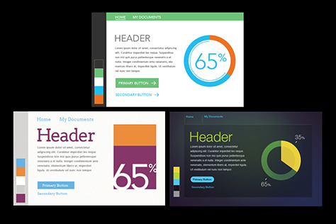
Interestingly, about three years ago, realism—in the form of skeuomorphic design—was everywhere. At that time, the now-hated, realistic leather stitching, wood grains, and metallic textures of skeuomorphic design made their appearance in nearly every mockup on this site.

But regardless of the time period, clients typically use the same words to describe what they’re looking for in a user interface: modern, clean, and sexy. I usually find myself asking what they really mean.

Clients often delay updating the visual designs for their software user interfaces. Therefore, as a visual designer, you face a challenge. How can you create design styles that people will perceive as being modern, yet will remain timeless? How can you avoid following trends and, instead, deliver something amazing?

It is imperative that you approach a project with a style-agnostic viewpoint. Here are some ways in which you can leverage user research and client collaboration to help drive your visual design decisions.

Do Some User Research and Experience the Culture

It’s always important to get to know your audience and their needs. Unfortunately, this part of the UX design process all too often gets left out, especially in the agency world. Formal, requirements-gathering visits with users provide information about their context of use and enable you to better understand your users and their needs.

For example, you can observe the environmental factors surrounding potential users. This will help you to decide how much visual contrast should exist in a layout. You may also take note of users’ font settings in their email client or Web browser. Such observations can provide insights into how you should treat font sizes and typography. It’s also important to note other applications running on a user’s screen, then to try to design a more holistic work experience that’s not limited to just the confines of the application you’re designing. These are just a few examples of things that impact your design decisions when you’re not merely trying to follow a predefined style.

An appropriate visual design language is the key to a successful project. While spending time with your users, you must try to soak up their culture as much as possible. Listen to the words and phrases that they use. Really get to know their culture. If you’re on site, take a look at the physical space in which they work and the way it’s designed. Observe the styles of clothing that people are wearing. Consider their geographic location. Letting all of this flavor your design style will definitely increase users’ satisfaction.

I recently designed an infographic for a group of users who wanted something modern. This group was located in a rural Philadelphia suburb. I noticed that they dressed in retro styles. After asking them to show me some examples of modern design, I decided to put a mid-century modern twist on the style of the infographic.

In another example, I worked on a project where most of the users commuted by train to their office. Consequently, I borrowed some visual design cues from a subway diagram when creating a workflow map. This enabled me to make the complex content more relatable for this group. I wasn’t trying to use trendy styles in either of these examples—and both projects were huge successes.

Navigating the Designer / Stakeholder / User Love Triangle

Client stakeholders are not users. In today’s world, users influence our interaction design decisions, but visual design typically gets left to the client stakeholders’ preferences. But, just as with interaction design, the designer should represent the user throughout the visual design process. 

Nevertheless, a client’s brand and style preferences must come through in your design. It’s important to work closely with stakeholders and let them participate in your design process and help set the design direction to ensure that their brand is well represented. However, throughout your collaboration with stakeholders, you must highlight stylistic decisions that you’ve based on users’ needs. You must always map the details of your design back to your user research. This will help client stakeholders to understand why particular parts of your design should look and feel a certain way.

Co-design

Our visual design instincts tell us that we must impress client stakeholders right from the start. A good visual designer lets these stakeholders participate actively in the design process from start to finish. Design workshops are a great way to get to get the ball rolling. For example, if stakeholders ask you for a modern design, you must understand what modern means to them.

In a workshop setting, show your stakeholders a set of popular examples of modern design. It’s important to have an in-depth conversation about each of these images. You must gain an understanding of what the stakeholder likes and dislikes about each of the examples. Stakeholders’ interpretation of modern design could differ drastically from what you had in mind. These conversations can mitigate potential communication issues with stakeholders.

Try Many Different Design Directions

Combine what you’ve learned during the co-design workshop with all of the knowledge about users that you’ve gathered in the field to create a set of various design directions. These samples should include a collage of common screen elements, not full-screen designs. A good visual designer shows versatility in these options. Perhaps one design direction is flat, while another includes some dimensionality and extra embellishments. It’s important to understand what the users and the stakeholders like and dislike about each sample. It is also important to understand the tradeoffs between them.

Figure 2—Sample visual design concepts
Sample visual design concepts

Since these samples should require minimal effort, this is the time to explore a blue-sky concept—assuming you’ve already mocked up a few safe samples. You don’t have to spend a lot of time on this, but it affords you the opportunity to show the client your design concept. You must map all design decisions back to either the initial research or findings from the design workshop—including design iterations from the workshop.

At Last, A Full Design That Works!

Because you’ve done some user research and collaborated with stakeholders throughout the design process, chances are that the outcome will be a success. And, once you’ve followed the steps that I’ve described in this article, the design of a full screen should require less work.

In the end, the aesthetic of your design may be flat, or it may have some touches of realism, or the aesthetic may be something completely different. The key thing is that you’ve designed something that your client likes, and you didn’t merely follow today’s popular style trend. Oh, and by the way, upload your design solution to Dribbble. It will probably stand out in the crowd. 

Interaction Designer at Google

Cranbury, New Jersey, USA

Kent EisenhuthKent has been working in the field of UX design for nearly ten years. During that time, he has led project teams in adopting user-centered design methods to solve complex business and consumer design problems. Kent specializes in user interface design, interaction design, and data visualization. His work has appeared in many publications, including Fast Company. He also has a ties to the academic community in Philadelphia. He currently teaches an interaction design class at the University of Pennsylvania. Kent has presented at international conferences such as IxDA’s Interaction and is a frequent guest lecturer at the universities in the greater Philadelphia area.  Read More

Other Articles on Visual Interface Design

New on UXmatters