Top

Information Displays That Change Driver Behavior

Practical Usability

Moving toward a more usable world

A column by Jim Ross
July 7, 2014

I recently bought a Toyota Prius and was surprised to notice my driving behavior change to a more economical style of driving. Doing some research, I learned that I wasn’t alone in this. Much has been written about “the Prius Effect”—how the Prius and other hybrid vehicles change driving behavior by providing feedback that shows drivers how their actions affect their gas mileage. Some people view this as a positive effect, while others, who are annoyed by slow Prius drivers, view it negatively.

What causes Prius drivers to change their behavior? I believe that it’s the feedback that the Prius’s Multi-Information Display provides to drivers. This display consists of several screens, showing the current gas mileage, average gas mileage over various periods of time, and whether the gas or electric motor is currently powering the car. In this column, I’ll discuss the Prius’s information displays, in terms of the effects they have on drivers, the usefulness of the information that they provide, and the effectiveness of their design.

Champion Advertisement
Continue Reading…

The Effects of the Prius Displays

The Prius’s Multi-Information Display, shown in Figure 1, subtly changes driving behavior by providing feedback and rewards for economical driving. It also reinforces customer satisfaction and loyalty by constantly reminding drivers of the value that they are getting from their purchase.

Figure 1—The Prius’s Multi-Information Display
The Prius’s Multi-Information Display

Changing Driving Behavior

The Prius’s displays change driving behavior through what is known in psychology as a feedback loop. A person takes an action, receives information about that action, reacts to the information, receives information in response to that reaction, and so on, in a loop. The driver’s actions are the speed and force of pressing the accelerator and brake. The driver sees the miles-per-gallon (MPG) information display, showing the consequences of his or her actions—the MPG goes up or down—then reacts by applying more or less force to the accelerator. This feedback encourages drivers to strive for better gas mileage through

  • slow acceleration
  • maintaining a steady speed
  • coasting
  • braking lightly, far ahead of time, which charges the electric battery
  • avoiding stops when possible
  • judiciously using the heating and air conditioning

In response to these behaviors, a driver sees feedback that the MPG is getting higher, which the driver perceives as gaining cost savings. Increasing MPG is the reward, further reinforcing those economical driving behaviors.

Feedback is key to changing behavior. Although most drivers have long known that sudden acceleration and stops use more gas, they haven’t been able to see the direct consequences of their actions. Being able to see how much gas they’re using in real time has a much greater impact on changing their behavior.

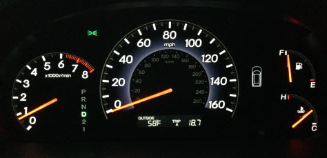
If you compare the Prius’s displays to the traditional dashboard display shown in Figure 2, you can see that the Honda Odyssey provides no feedback about gas mileage. The primary feedback is on speed, leading the driver to focus on going as fast as possible without going too far over the speed limit and risking getting a ticket.

Figure 2—The more traditional dashboard display of a Honda Odyssey
The more traditional dashboard display of a Honda Odyssey

Reinforcing Customer Satisfaction

The Prius’s information displays also play a large role in keeping customers satisfied with their purchase and strengthening their loyalty to the Prius brand. The gas mileage information constantly reminds Prius owners that they’re saving gas, saving money, and helping the environment—which are usually the reasons they bought the Prius in the first place. It provides a constant reminder that the car is delivering the value that they wanted and, thus, that they made a good purchase decision. This causes them to feel good about their purchase and themselves. It’s no wonder that the Prius often ranks extremely high in customer satisfaction and has extremely loyal customers.

The Design of the Displays

The Prius shows gas mileage and hybrid-engine status through several different displays. Some of these are more effective than others—both in affecting driving behavior and in their understandability, usefulness, and potential for distracting the driver.

Location

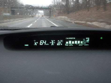
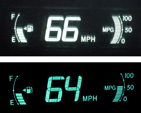
The Multi-Information Display is appropriately located at the top of the dashboard, to the right of the speedometer display, as shown in Figure 3, which keeps it close to the driver’s view of the road. It’s easy to glance at the display quickly, minimizing the time that the driver’s eyes are off the road. The driver can easily flip through the screens using a button on the steering wheel.

Figure 3—Placement of the Multi-Information Display near the driver’s view of the road
Placement of the Multi-Information Display near the driver’s view of the road

Current MPG (Miles per Gallon)

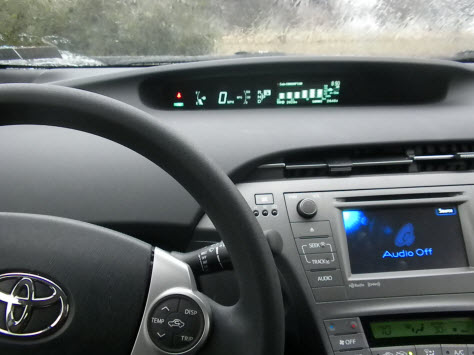
The feedback that is most effective in changing driver behavior is the current miles-per-gallon display, shown on the right in Figure 4. It immediately shows how the driver’s actions affect the current gas mileage. Jam on the accelerator and the MPG dramatically drops. Accelerate slowly and the MPG remains in the center of the range. Ease off on the accelerator and the MPG rises to the top of the range. Through this direct feedback, drivers learn, in real time, which actions increase and decrease gas mileage.

Figure 4—Current MPG display’s feedback on current gas mileage
Current MPG display’s feedback on current gas mileage

Placement

As the display that drivers look at most often, the current MPG display is well located next to the speedometer, making it easy to see both of them at a quick glance. Grouping these together also reinforces the relationship between speed and gas mileage.

Design

A bar whose height moves up and down against simple intervals of 0, 50, and 100, the current MPG display is easy to read at a quick glance. A bar chart is a good choice for this element because it’s easy for people to judge bar height quickly. The simplified scale is easy to read. Actual MPG numbers would be far too complicated and distracting. Instead, it’s necessary to see only whether the bar is over 50 (good) or below 50 (bad).

Why a curved bar? The curve of the bar makes it resemble an analog gauge—like a speedometer whose needle goes up and down in a curved arc. It also parallels the curved gas gauge to the left of the speedometer. Together, they symmetrically frame the speed display.
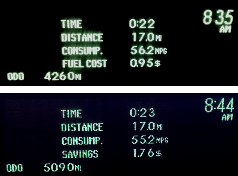
Consumption

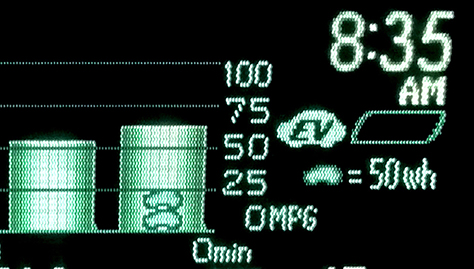
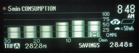
The 5-minute consumption display—or optionally, a 1-minute consumption display—indicates the average gas mileage for each five-minute period of the current trip, as shown in Figure 5. While the current MPG varies widely, going up and down rapidly, the 5-minute consumption provides a better depiction of the overall mileage that you’ve been getting for each segment of your drive. It’s more reliable, intermediate-term feedback that shows the driver how different parts of a trip—such as hills or heavy traffic—contribute to the overall gas mileage.

Figure 5—5-minute consumption display showing average gas mileage over five-minute periods
5-minute consumption display showing average gas mileage over five-minute periods

Design

The MPG for each five-minute segment appears in a bar chart, with 0, 25, 50, 75, and 100 MPG intervals. Bars show the trend in average MPG, in five-minute intervals over the last 30 minutes. A bar chart is a good choice for this display because it’s quick and easy to compare bar heights. The driver doesn’t need the actual MPG numbers, which would add too much complexity to the screen.

The Car Icon?

Some elements of this screen are not immediately intuitable. There is a small car icon that sometimes appears in the bars, as shown in Figure 6. A legend to the right of the chart says that the car icon equals “50wh.” Although I’ve read the manual, I still don’t understand the purpose of that icon, and I’m not the only one. A Google search reveals that there are many people who have similar questions. I think it has something to do with charging the electric battery, but I’m not sure.

Figure 6—Car icon equals “50wh”—Huh?
Car icon equals “50wh”—Huh?

Eco Savings Record

The Eco Savings Record, shown in Figure 7, can optionally show either how much the driver spent on gas per month or how much the driver saved on gas each month, over the last six months. If you enter the gas price with each fill-up, the Prius can calculate how much you actually spent on gas. You can enter a hypothetical gas mileage—for example, the mileage of your previous car—to see how much money you’ve saved each month with the Prius. This gives drivers long-term feedback about how the car and their economical driving habits have saved them money over time.

Figure 7—Eco Savings Record showing the cost savings of driving a Prius
Eco Savings Record showing the cost savings of driving a Prius

Energy Monitor

The Energy Monitor shows how the various parts of the hybrid system—the gas engine, the electric motor, and the hybrid battery—are currently working. It shows when the gas engine, the electric motor, or both are powering the car. It also shows when the hybrid battery is in use or is being recharged by coasting or braking. As shown in Figure 8, the Energy Monitor superimposes the gas engine, the electric motor, and the battery on an image of the car. Arrows point from one element to another to show which are currently in use.

Figure 8—Energy Monitor showing which parts of the hybrid system are currently in use
Energy Monitor showing which parts of the hybrid system are currently in use

Although some people choose the Energy Monitor as their primary display to make sure they’re using the electric motor as much as possible and the gas engine as little as possible, I find this screen to be far too complicated to monitor constantly. I think it’s better to use this display to learn how the car works and how to refine your driving to use the hybrid elements of the car optimally. 

Understanding the Energy Monitor

For a new hybrid owner, this display isn’t immediately intuitable. The battery icon is fairly understandable, but the gas and electric motor icons aren’t immediately recognizable. It takes some time—or reading the manual—to understand what the Energy Monitor is showing and how to get value from this display.

Hybrid System Indicator

The Hybrid System Indicator seems to be a complex combination of the current MPG display and the Energy Monitor. As shown in Figure 9, a horizontal bar fills up, from left to right, to show which aspect of the hybrid system is in use. When you brake or coast, the CHG area of the bar lights up, indicating that the hybrid battery is being recharged. As you accelerate, the horizontal bar grows from left to right. While to the left of the center line, the bar shows that the electric motor is primarily powering the car. When it gets to the center line, both the electric motor and gas engine are powering the car. As it moves to the right of the center line, the gas engine is mainly powering the car. When the horizontal line gets to the PWR area, the gas motor is in heavy use and in Power mode, giving extra power to the engine and giving terrible gas mileage.

Figure 9—The complex Hybrid System Indicator
The complex Hybrid System Indicator

Understanding the Hybrid System Indicator

The meaning of the Hybrid System Indicator and how you would use it is not immediately clear. It wasn’t until I started writing this column, months after I had bought the car, that I finally understood what it was showing. Googling “Prius Hybrid System Indicator” reveals that I’m not the only one who has had problems understanding this display.

How to Use the Hybrid System Indicator

Once you understand the complex, immediate feedback that the Hybrid System Indicator is providing, you can use this feedback to refine your economical driving habits. Slow acceleration and a steady speed keep the horizontal line to the left of the center point and maximize gas mileage. Some people like to use the Hybrid System Indicator as their primary display while driving, but I find the Hybrid System Indicator to be too complicated and distracting to use it regularly. I prefer the simplicity of the Current MPG display, shown in Figure 4. I do use the Hybrid System Indicator occasionally, for short periods, as an educational tool to see how I can refine my driving.

Trip Summary

The Trip Summary appears every time you turn off the car, as shown in Figure 10. For that specific trip, it shows how long you’ve been driving, how far you’ve driven, your average miles per gallon, and either how much you spent on gas or how much you saved on gas—by using the Prius versus a hypothetical car. For some people, like me, the average MPG becomes something like your total score in a video game. You’re always trying to beat your previous high score. My current high score is 64.5 MPG. This display works well in providing a reward and as a way of measuring your progress toward becoming a more economical driver.

Figure 10—The Trip Summary that appears at the end of each trip
The Trip Summary that appears at the end of each trip

Trip Odometer

In addition to the typical displays of total mileage and trip mileage, the Prius’s trip odometer shows your average gas mileage since you last reset the trip odometer, as shown in Figure 11. This allows longer-term tracking of gas mileage over multiple trips.

Figure 11—Trip Odometer
Trip Odometer

The trip odometer also displays your average speed to the right of your average gas mileage. At a quick glance, this display can be slightly confusing because these are similar numbers that both start with MP, and it’s easy to mistake MPG for MPH and vice versa. It takes a little extra examination and thought to distinguish between them.

The Prius Effect

Overall, I love my Prius. It’s a great car. I bought it because I wanted to get good gas mileage and save money. It also had great reviews, a reputation for quality, and is known for having extremely satisfied and devoted customers.

However, I hadn’t realized how much the Prius’s displays are responsible for its success. Although the Prius is engineered to get good gas mileage, the gas mileage that it actually gets depends on the way you drive it. The displays are the car’s feedback mechanism to teach drivers how to drive a hybrid economically. They remind drivers that they’re accomplishing the goals that they wanted to achieve by buying a Prius—getting good gas mileage, saving money, and helping the environment. The displays constantly remind Prius owners that they made a good buying decision and that their purchase is paying off. Perhaps that’s why the Prius gets such high customer-satisfaction ratings.

How has the Prius Effect affected me? I’m hooked on the gas-mileage game, my goals have changed from going places quickly to going places economically, and the Prius keeps telling me how much money I’m saving, what a good purchase I made, and what a great person I am. 

Principal UX Researcher at AnswerLab

Philadelphia, Pennsylvania, USA

Jim RossJim has spent most of the 21st Century researching and designing intuitive and satisfying user experiences. As a UX consultant, he has worked on Web sites, mobile apps, intranets, Web applications, software, and business applications for financial, pharmaceutical, medical, entertainment, retail, technology, and government clients. He has a Masters of Science degree in Human-Computer Interaction from DePaul University.  Read More

Other Columns by Jim Ross

Other Articles on Product Reviews

New on UXmatters