The UX strategy tribe gathered once again for the UX STRAT 2014 conference in picturesque Boulder, Colorado, at the foot of the magnificent Rocky Mountains. After a day of pre-conference workshops on September 7 at the beautiful Hotel Boulderado, the main conference convened for two days, on September 8 and 9, just one block away at the lovely Art Deco Boulder Theater.
In this review, I’ll provide an overview of the conference, covering the same dimensions as the star ratings to the rig<>ht, and Jim Nieters and I will review four of the workshops that took place on Sunday, September 7.
Organization
Organization
Content
Presenters
Proceedings
Venue
Hospitality
Community
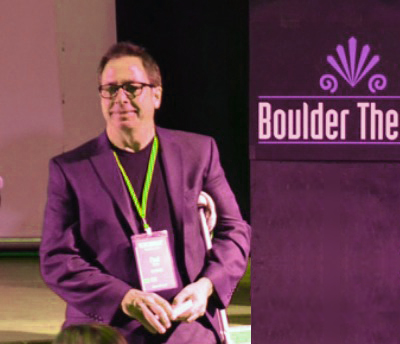
Paul Bryan, producer of UX STRAT 2014, who is shown in Figure 1, did a great job of organizing another excellent and enjoyable conference. I was really glad that UX STRAT 2014 was again a single-track conference, so all attendees could share a common experience. As Paul promised in his UX Strategy column on UXmatters, “UX STRAT 2014: Focusing on UX Strategy,” “Experienced UX strategy professionals will present their approaches to guiding UX projects, products, and programs.” This year, Paul decided to dispense with panels and vignettes, which allowed more speakers more time for in-depth explorations of their topics. In my view, these were good decisions.
Champion Advertisement
Continue Reading…
Figure 1—Paul Bryan, producer and host of UX STRAT 2014
Photo from UX STRAT
Acting as host throughout the conference, Paul began and ended each day with his brief remarks, introduced each speaker, and coordinated our activities throughout the day. A troupe of volunteers in orange UX STRAT T-shirts served the needs of attendees and kept things running smoothly. For the most part, things went off without a hitch.
Kudos to Paul for establishing the first international conference to focus on UX strategy, which has become a key competency for leading UX professionals.
Content & Presenters
In that same column I mentioned earlier, Paul wrote: “The theme of UX STRAT 2014 is Sharpen Your Axe. Abe Lincoln once said, ‘Give me six hours to chop down a tree, and I will spend the first four sharpening the axe.’” UX STRAT 2014 delivered content that helped all of those who attended to sharpen their UX strategy skills. UX strategy is an evolving practice and, for many UX professionals, a new aspect of their professional practice, so it’s truly vital that we share our learnings with one another.
UX STRAT 2014 brought together many great speakers who are thought leaders in the UX community and spoke on a broad spectrum of UX strategy topics. Each day, the conference opened and closed with a keynote address—all of which were excellent. In general, presenters spoke well and delivered presentations on interesting, relevant topics. Jim Nieters and I will be covering the content of the conference sessions in detail in Parts 2 and 3 of our UX STRAT 2014 series of reviews.
Proceedings
When we signed in at the registration desk, we received two small cards, each listing the schedule for a day of the main conference. These cards were similar to those that attendees received last year, which I found so convenient. But this year, the schedule cards were smaller, so they would fit into the plastic sheath containing our badge. This was a good idea, but poorly executed. Because the cards containing the schedules were smaller, they used a too-tiny font with inadequate leading, making the text hard to read—especially the session times, which were in light gray. Bad design. A very dimly lit venue exacerbated this problem.
The schedule cards could easily have been designed to allow the use of a larger, more legible font—the same size as last year—for example:
They could have printed the morning schedule on one side; the afternoon schedule on the other. Or
Instead of having, for example, TUESDAY on a black bar across the top, then Today’s Schedule below that with quite a bit of whitespace above and below, they could have combined both into TUESDAY’S SCHEDULE and placed that text on the black bar. And
They could have greatly reduced the size of the UX STRAT logo at the bottom of the card—or put it on the back of the card, along with their Web address, which may not have been necessary at all.
For a single-track conference, I didn’t feel that I needed a detailed program—whose main purpose would be to allow attendees to choose which sessions to attend. UX STRAT’s well designed Web site provided all of the information that I needed.
For the UX STRAT 2014 conference sessions, all presenters have posted their presentations on SlideShare, but I wasn’t able to find any of the workshop presentations there except that for Tim Loo’s workshop, “Experience Visioning and Roadmapping.” Thank you to the presenters who have posted their presentations!
Sadly, while the pages containing the information about UX STRAT 2014 are still on the UX STRAT site, they are no longer easy to find, and the information about UX STRAT 2013 appears to be gone altogether. It would have been great if this valuable historical information had been placed in 2013 and 2014 subdomains or archival sections.
Venue
The historic Hotel Boulderado was both the venue for the workshops and the conference hotel. Built early in the 20th century, the Boulderado combines features of the Italian Renaissance and Spanish Revival styles, as shown in Figure 2. The lobby and mezzanine of the original building feature a stunning, stained-glass canopy ceiling that was restored in 1977, shown in Figure 3, and the hotel’s massive, original cherrywood staircase, shown in Figure 4.
Figure 2—Hotel Boulderado
Photo from Hotel Boulderado
Figure 3—Leaded-glass, canopy ceiling from the lobby of the Hotel Boulderado Figure 4—Canopy ceiling, cherrywood staircase, and Welcome to UX STRAT 2014
Photo from UX STRAT
The hotel’s conference rooms comfortably accommodated workshops of various sizes. My hotel room in the new wing of the Boulderado was quite spacious, very comfortable, and furnished with Victorian reproductions. I enjoyed my stay there.
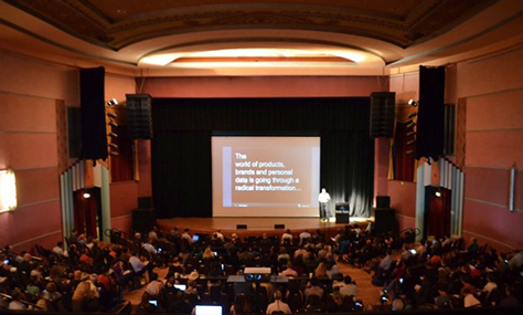
The Hotel Boulderado is in a prime downtown location just a couple of blocks from the popular Pearl Street Mall and in a neighborhood where there are lots of good restaurants, nightclubs, and street musicians. And it’s just a block from the main conference venue for UX STRAT 2014, the Boulder Theater, shown in Figure 5. While the Boulder Theater has a modest exterior, the interior of this Art Deco theater is beautiful, as shown in Figure 6 and 7.
Figure 5—Boulder Theater
Photo from UX STRAT
Figure 6—Proscenium arch of the Boulder Theater, with Theo Forbath on stage
Photo from UX STRAT
Figure 7—Interior of the Boulder Theater and the UX STRAT audience
Photo from UX STRAT
As a conference venue, the Boulder Theater had pros and cons. On the plus side, the theater is a small gem, with a lovely interior that any designer would appreciate and is in a very convenient location relative to the conference hotel—which made the conference’s early-morning start easier—and to surrounding restaurants. On the downside, the lighting was too dim—more appropriate for the rock venue that it usually is these days—and made it impossible to take photos with my iPhone camera. The lobby is tiny, so there wasn’t a common area in which the crowd could mingle freely during breaks. Exhibitors occupied most of the lobby space. There was no room in which to dine on site. The theater seating had been removed for general-admission concert audiences and replaced with uncomfortable, stackable chairs. Also, there were no power sources for people to recharge their devices.
Hospitality
Coffee was served at the beginning of each day and during mid-morning and mid-afternoon breaks. On the day the workshops took place and on Day 2 of the main conference, the organizers took a pretty innovative approach to providing lunch for all of us. Each of us received a debit card, giving us a budget with which to purchase our lunch at a restaurant. This should have worked perfectly, but through no fault of UX STRAT, some of the debit cards were defective.
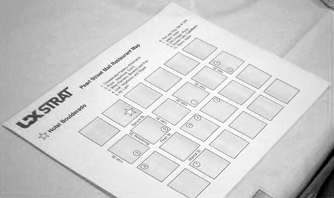
The organizers put together a selection of nearby restaurants that offered many different types of cuisine on a map, shown in Figure 8, and arranged for the restaurants to expect us for lunch. I was in heaven because one of the restaurants was the Leaf Vegetarian Restaurant, which offers gourmet-quality vegan food and is just a couple of blocks from the Boulder Theater. Fabulous food! On Day 2 of the conference, groups of people gathered and walked over to their chosen restaurant together.
Figure 8—Map of restaurants for conference-goers
Photo from UX STRAT
On Day 1 of the conference, the organizers brought in box lunches. Many people gathered in the park across the street to eat their lunch, as shown in Figure 9.
Figure 9—Lunch in the park
Photo from UX STRAT
At the end of Day 1 of the conference, from 5:30 to 7:30pm, the UX STRAT organizers hosted a Happy Hour in the bar that occupied the back of the Boulder Theater, giving each attendee a couple of drink tickets. The theater’s usual role as a rock music venue made it a very convenient place for the Happy Hour.
Figure 10—Happy Hour on Day 1
Photo from UX STRAT
After the conference ended, many UX STRAT attendees who weren’t leaving Boulder until the next day gathered at License No. 1, a bar in the basement of the Hotel Boulderado. It’s always hard to say goodbye to the special people I see only at UX STRAT.
Community
A vibrant and growing UX strategy community has coalesced around UX STRAT and the UX Strategy and Planning group that Paul Bryan founded on LinkedIn. It was great getting together with people who share like minds and common interests to renew friendships and form some new ones at UX STRAT. If UX strategy plays an important role in your work or your aspirations, I recommend that you attend the next UX STRAT conference and engage in the UX strategy community’s lively dialogue around a great variety of UX strategy issues.
There was quite a bit less opportunity to meet new people than at the first UX STRAT conference. There wasn’t a good place to hang out and talk in the theater—except in one’s seat, which limited possibilities for conversation to a very limited sphere—and there were too many physical barriers to mixing inside the theater. At lunch breaks, the crowd fragmented across many different restaurants. Informal gatherings in and around the Hotel Boulderado in the evening afforded the best opportunities for meeting people, and, at dinner, I enjoyed fine dining with new and old friends.
The Pre-conference Workshops
The pre-conference workshops that took place on Sunday, September 7, comprised one full-day workshops and seven half-day workshops.
Full-Day Workshops
“Customer Insight-Driven Design: Really Getting There”—with Dan Saltzman, Director of User Experience, and Beth Koloski, Lead Experience Architect, both of EffectiveUI
Half-Day Workshops
“Converting to Cross-Device: A Painless Journey from Desktop-only to Responsive”—Sophia Voychehovski, Founder of ReWired UX Studio
“Creating a Culture of Innovation”—Dr. Amaya Becvar Weddle, UX Research Manager at Immersion Corporation, and Curtis Lefrandt, Vice President of Product & Training at Innovator’s DNA
“Customer Journey Mapping”—Megan Grocki, Experience Design Director at Mad*Pow
“Deciding Together: Three Tools for Realizing an Effective Information Architecture Strategy”—Dan Klyn, Co-founder and Information Architect, and Bill Holsinger-Robinson, Vice President, both of The Understanding Group
“Decoding Data: UX Metrics”—Pamela Pavliscak, Founder of Change Sciences
“Mapping the User Experience: Locating Value with Alignment Diagrams”—Jim Kalbach, Principal User Experience Designer at Citrix
“UX Strategy Fundamentals: Experience Visioning and Roadmapping”—Tim Loo, Strategy Director at Foolproof
As you can see, there were many good workshop options, which made it hard to choose. To enable Jim and I to review as many workshops as possible, we decided to attend only half-day workshops. The UX STRAT site hadn’t indicated which were were morning workshops and which were afternoon workshops, so we couldn’t make our decisions about which workshops to attend in advance.
I’d participated in Megan Grocki’s and Tim Loo’s workshops at UX STRAT 2013. Both were great! (Check out my reviews of their 2013 workshops.) So, this year, I decided to try something completely new and participated in the following workshops:
Presenters: Amaya Becvar Weddle and Curtis Lefrandt
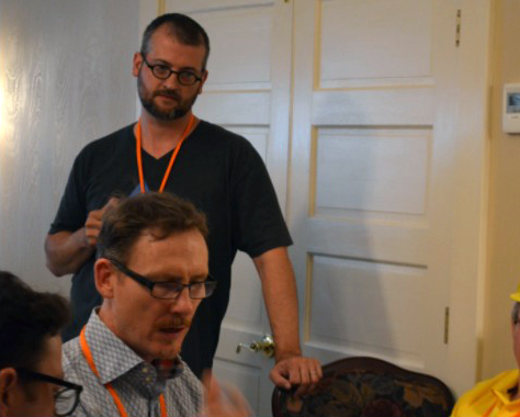
Innovation and cultural transformations are some of my favorite topics of study, so there was no question that this would be one of the workshops I’d choose. Plus, Amaya had written an article for UXmatters, “In Participants’ Own Voices: Using Quotations from User Research Ethically,” so it was great meeting her in person. When Amaya, shown in Figure 11, was UX Research Manager at Immersion, she co-led their innovation program. As CEO and Co-founder of Innovator’s DNA, Curtis, shown in Figure 12, has driven innovation change projects at AT&T, J&J, and Stanford, and his company has done significant primary research on innovation within “startups, mid-sized organizations, and Fortune 500 companies.” Plus, Curtis is a former venture capitalist.
Figure 11—Amaya Weddle overseeing a workshop exercise
Photo from UX STRAT
Figure 12—Curtis Lefrandt presenting
Photo from UX STRAT
As an icebreaker, Amaya and Curtis asked us to do a really fun exercise that they called “Innovation Baby,” for which we broke into teams of two people, each of whom had chosen a brand, product, or service that they love. The goal of each team was to create an “innovation baby” at the intersection of the brand, product, or service that each had chosen.
Overview
Amaya and Curtis presented this high-level overview of their workshop, to which I’ve added some answers and information that they provided later in their workshop:
“What is innovation? Why are innovation programs important?” “(Re) defining innovation”:
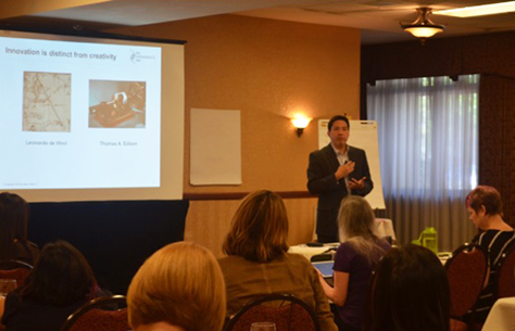
“Innovation is distinct from creativity.” They quoted Thomas Edison, who said: “Anything that won’t sell, I don’t want to invent. Its sale is proof of utility and utility is success.”
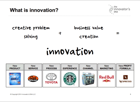
As Figure 13 shows: “creative problem solving + business value creation = innovation,” and there are many types of opportunities for innovation.
Curtis presented some of his company’s research on innovation and creativity, demonstrating that “the most innovative companies are characterized by a significant market premium in:
customer base
customer brand
capacity to attract and retain the best talent
stock value
product pricing
12-month sales growth of [the] top versus bottom 10 of the 100 most innovative companies: 3 times higher
5-year annualized total return of [the] top versus bottom 10 of the 100 most innovative companies: 2.5 times higher”
Curtis’s research also showed that companies that have achieved cultural transformation and significantly increased their innovation premium have reaped many billions of dollars of value in additional market capitalization.
Innovation is important because it allows you to “continuously provide value for your customer[s]” and cope with “market and technological uncertainty.” We’re living in a time that they characterized as the “Age of Uncertainty,” in which the life expectancy of Fortune 500 companies has decreased from 61 years in 1964 to just 18 years in 2014. High-uncertainty problems require new, entrepreneurial management principles, as this quotation from Scott Cook, Founder and Chairman of Intuit, illustrates: “As a successful scaled company, you cannot run the ship the way you used to. You’ll get run over by a swarm of startups.”
“Lean experimentation [lets you] address high-uncertainty problems and reduce the uncertainty ratio.” Lean companies “pivot and iterate [their way] to success, but three of four VC-backed companies fail.”
“How do the most innovative companies practice innovation?”
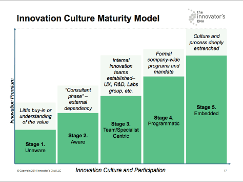
Amaya and Curtis presented an “Innovation Culture Maturity Model,” which correlates the value of a company’s innovation premium to the maturity of its innovation culture and comprises five stages: Unaware, Aware, Team/Specialist Centric, Programmatic, and Embedded. (See Figure 14 and read about the innovation maturity assessment activity that they conducted later in this review.)
The research that Curtis’s company conducted “found that the most innovative organizations all have something in common—they develop innovative best practices that span across three areas:
people—Innovative organizations have the right mix of talent to discover, develop, and deliver innovative, new ideas.
processes—Innovative organizations create processes that allow them to challenge the status quo and repeatedly innovate.
philosophies—Innovative organizations live by philosophies that inspire and empower their members to create value.”
Much more on this later…
“Innovation is everyone’s job.”
“Case studies: Big and small, mature and young”—Curtis and Amaya told stories about the innovation programs at Intuit and Immersion. Read about these case studies later in this review.
“Sketching out your own innovation program”—Read about the final exercise later in this review.
“What role does UX play in an innovation program?”—“UX is the key catalyst in bringing design thinking into a company,” said Curtis.
Figure 13—What is innovation?
Workshop Activity 2
For our second workshop activity, Amaya and Curtis asked us to do an innovation maturity assessment for our own organization, providing a worksheet that let us rate its innovativeness in relation to the following five statements, as yes, somewhat, or no:
“Innovation is seen as critical to the future of our organization. We are constantly looking forward to the next 5 or 10 years and actively seek ways to stay ahead of the curve.
“Leaders are prepared to guide the organization’s innovation efforts. They know where to go to learn about innovation and trends, and they know how to apply and encourage specific behaviors that lead to innovation.
“Individuals throughout the organization are motivated to contribute to innovation, and widely demonstrate behaviors that lead to innovative thinking.
“We apply a systematic approach to innovation, and our organizational programs and processes support innovation-related activities.
“Our company invests in a healthy mix of incremental, as well as disruptive innovation efforts.”
To help us assess our organization’s stage on the “innovation culture maturity scale,” shown in Figure 14, the worksheet posed the following questions:
“Whose job is innovation currently?
“What role does the UX team … play in innovation?
“What programs currently exist to support innovation? How would you assess their health?
“What sorts of initiatives might be important to move your organization up the maturity scale?
“How well does the innovation maturity model work overall? What does the model imply for companies at different stages of maturity?”
Figure 14—Innovation Culture Maturity Model
An Innovation Program Framework
Curtis and Amaya presented an innovation program framework that derives from the research that Curtis’s company, The Innovator’s DNA, has conducted on the best practices of innovative organizations. As mentioned earlier, these best practices comprehend three areas:
“people—All employees need to innovate.
“discovery skills”—Innovative people possess “five discovery skills” that foster innovation. “The innovator’s skills refer to the set of behaviors that contribute to one’s ability to generate novel insights that result in new products, processes, or business models.” These discovery skills include
“questioning”—A “passion and skill for inquiry … to find new insights, connections, possibilities, and directions.” You can measure this skill by the “frequency and types of questions” a person asks. Curtis quoted Peter Drucker, who in The Practice of Management said: “The important and difficult job is never to find the right answers, it is to find the right question.” “Questioning is [about] challenging the status quo, imposing or eliminating constraints, getting to the root cause of the issue at hand, and peeling back layers of complexity.”
“observing”—A “propensity to intensely observe … the world around you,” including “customers, products, services, and technologies,” to “gain insights and ideas about new ways of doing things.” According to a quotation from Tom Kelley, Co-founder of IDEO, “The anthropologist’s role is the single biggest source of innovation at our company.” “Observing [lets you] find surprises and understand the gap between expectations and reality,” said Curtis. “Taking the initiative to place ourselves in different environments and cultures, different industries and functions, [makes it] twice as likely [that we’ll] come up with new ideas—combinatorial plays.”
“networking”—An ability to find and test new ideas by talking to a network of people with diverse backgrounds, who “may offer a radically different perspective.” “We should pull in ideas from people who are as different from us as possible,” advised Curtis. “The best innovators develop an idea network. Lean Startup is closely tied to this idea. Failure is an opportunity to learn.” “Discovery-driven executives … [network to] “learn new things, … gain a new perspective, find and test ideas, … [and] target interesting people with different backgrounds and perspectives—[that is,] people who are not like them.”
“experimenting”—A tendency to frequently engage in experiments “to learn new things,” “test ideas,” “take things apart and put them back together again,” or to “explore with an experimental mindset, visiting new places, trying new things, [and] seeking new information.” You can “learn from new experiences, pilots, and prototypes.”
“associating”—An “ability to make connections across seemingly unrelated questions, problems, fields of study, or ideas … and put them together in new ways.” Curtis told us, “High-quality, novel ideas come from disparate inputs.” He quoted Steve Jobs, Founder and CEO of Apple, who said: “Creativity is connecting things. … Creative people connect experiences they’ve had and synthesize new things.”
“roles”—People at every tier in a company play a role in innovation.
“senior leadership”—Their role is to:
Act as “champions and sponsors” of innovation efforts.
“Provide guidance on strategic direction.
“Fund and support high-potential opportunities.
“Create a common language and framework.”
managers—The role of “high-potential management [and] innovation leaders and facilitators” is to act as “innovation catalysts” who:
“Oversee the development of a new idea or business.
“Facilitate innovation and key innovation initiatives.
“Influence and train others in the organization.”
“practitioners”—The role of the “broad employee base” of “doers and innovators” is to:
Let “10,000 flowers bloom.
“Generate enthusiasm and energy [toward] innovation initiatives.
Realize “culture change.”
“processes:
“Programming and managing … the four steps in the innovator’s method:
“1. Insight”—Through “questioning, observing, networking, and experimenting, … search broadly for insights about problems worth solving. Insights can come from surprises, clues, symptoms; can be external or internal; and can come from anyone, anywhere.
Key activity—Savor surprises
Tools—Five discovery skills [and an] insight capture system. Practice the discovery skills to come up with more and better ideas.
Tests—Vote test [and] proof test
Outcome—Opportunity insight”
“2. Problem—Discover the job to be done—a job you need to hire a product or service to perform. Rather than starting with solutions, start by exploring the customers’ needs, desires, pains, or problem[s]—the functional, social, and emotional job to be done—to be sure you’re going after a problem worth solving. Every job has a functional, social, and emotional element to it—[for example, it may be] social or image driven. How will this affect my image with my peers?
“3. Solution—Prototype the minimum awesome product. Design experiments to reduce uncertainty. Instead of developing full-scale products, leverage theoretical and virtual prototypes of multiple solution dimensions. Use rapid prototyping to move quickly. Iterate on each solution to develop a minimum viable prototype and, eventually, a minimum awesome product,” as Intuit does. “Decreasing your uncertainty ratio is your success metric. How much are we learning?
Key activity—Prototype minimum awesome product
Tools—Solution-storm [and] four prototypes:
theoretical prototype—Rough sketches [or] a conversation [for] high-level validation and exploration, [in] 5–15 minutes
virtual prototype—Physical or digital renditions or mockups—faking it—[for] idea validation and feature exploration, [in] 30 minutes–2 hours
minimum viable prototype—Rough, crude working version [for] product and feature validation [and] business exploration, [in] 1 day–1 month
minimum awesome prototype—Insanely great on the most important features, [but] still quick, cheap, and fast, [in] 1 week–3 months
Tests—Wow test, promoter test, [and] payment test
Outcome—Minimum awesome product”
“4. Business model—Validate the go-to-market strategy [to ensure you] deliver and capture value. Once you’ve nailed the solution, you’re ready to validate the other components of the business model, including the pricing strategy, the customer acquisition strategy, and the cost.
Key activity—Validate go-to-market strategy
Tools—Price-sensitivity meter, consumption chain, customer-influence pyramid, [and] a go-to-market strategy worksheet comprising sections for Key Partners, Key Activities, Key Resources, Value Propositions, Customer Relationships, Channels, Customer Segments, Cost Structure, and Revenue Streams
Tests—Love metrics [and] financial metrics
Outcome—Scalable business model”
“Innovation portfolio management and horizon planning:
“Horizon 1: Core (Reap)—Sustaining innovation, [using] 70% of resources, [in a] high-certainty, mature business, [leveraging the] current financial engine, focused on efficiency and optimization, [supporting] all current operations, [and investing] in future innovation efforts.
“Horizon 2: Growth (Nurture)—Adjacent innovation, [using] 20% of resources, [in a] medium-certainty, high-growth business, [leveraging the] current growth engine, focused on scale and high growth, self-sustainable, and profitable.
“Horizon 3: White Space (Plant)—Disruptive innovation, which might be completely different from what we’re doing today, [using] 10% of resources, [in a] high-uncertainty, nascent business, [relying on a] future growth engine, focused on learning and validation, Ramen profitable or unprofitable.”
“philosophies—Building and leading a culture of innovation:
”modern, innovative thinking”—as propounded in The Innovator’s Method: Bringing the Lean Startup into Your Organization, by Nathan Furr and Jeff Dyer. “Innovation School Management for High-Uncertainty Businesses:
enlightened trial and error
failing fast
rigorous testing
lightweight experiments
deep customer immersion
continuous doing
“frame of mind—No HiPPOs—Highest-Paid [Person’s] Opinions—or 3Ps—Politics, PowerPoints, Persuasion!” Curtis shared another quote from Scott Cook: “We fell victim far too often to the 3Ps and HiPPO syndrome in making our decisions. We decided that ‘politics, PowerPoint, and persuasion’ and the ‘Highest-Paid [Person’s] Opinions’ needed to stop guiding our innovation strategy, and instead it was time to rely on action and data.”
“creating a safe space for others to innovate—[Provide] easy access to customers, technology specialists, prototyping tools, and experimenting processes.
“small project teams—Keep teams small, with ownership of ideas. Two to four individuals is optimal.”
Case Studies
This team of presenters shared two case studies with us. They first spoke about Intuit, where senior leadership strongly supports innovation efforts and UX leaders Wendy Castleman and Kaaren Hansen have created a “best-in-class program for innovation facilitators.” They started with ten innovation catalysts with design thinking skills, trained the organization in design thinking, now have 250 innovation catalysts, and have validated the value of this effort. “UX was a key catalyst in bringing design thinking to the company,” said Curtis, to which Amaya responded, “But not just UX. It’s distributed throughout the company.” Someone in the audience, who was formerly at Intuit, mentioned that the effort was initially vertical within UX, then very quickly branched out, as they trained people across the organization. The entire company was exposed to the framework and language.
Amaya presented a case study on innovation at Immersion, where she was a co-leader of their Innovation Board, which “oversee[s] strategic initiative[s], program[s], gating, and evolution.” On the Innovation Board, she “worked with mid-level managers across the company on resource allocation” and other issues. An Innovation Champion ensures that the “company-wide program thrives [and provides] management oversight and tracking.”
The Innovation Board at Immersion created the Sparks program, “a designated team of trained innovation facilitators, tasked with sparking design-thinking practices throughout the company. Sparks facilitators [are responsible for facilitating and igniting] innovation across teams and the company by applying a toolbox of proven techniques. Their mission is to inspire innovation across the company.” About 10% of the company participates in the Sparks program, with innovation facilitators coming from cross-functional teams, including finance and other operational groups. Competent innovators and idea people draw out ideas from the larger group.
All Immersion employees have discretionary time, or Innov8 Days, and participate in Challenge Days and targeted innovation efforts. Immersion started with a customer-centric viewpoint, an understanding of the business, and the goal of getting everyone on cross-functional teams aligned. At Immersion, an idea review begins with an invention disclosure, which, if approved results in an innovation program project—either a discretionary-time proposal or intensive activity outputs—may require further refinement, and ultimately, results in projects outputs such as research or UX design.
Exercises 3 and 4
Another exercise followed these case studies: “Name Your People,” for which we were given a worksheet on which we were to identify, then discuss the “network of key innovation influencers who can drive a program to success” at each tier in our organization: senior leadership, management, and practitioners. Amaya and Curtis posed these questions for us to think about: “Who do you need to persuade? Who are—or who can become—your sponsors and champions? Who could be your on-the-ground leaders and facilitators? How will you capture the mindshare of the employees in the organization? Where is skepticism bubbling up for you? What is behind that?”
For the final exercise in this workshop, we broke into groups and created an “Action Plan for Leading Innovation,” listing our priorities and indicating the key activities, the owner and key stakeholders, and the timeline for each priority. Amaya and Curtis instructed us to: “Remember the future. Imagine it is a year from now, and you have been successful in spearheading several initiatives to lead up an innovation program or effort at your organization—or at a clients’. Take a few moments to jot down some thoughts, describing some of the following:
How the program is operating, highlighting a few key initiatives.
Who the major players are that have made the program successful thus far.
How you convinced senior leadership to sponsor and champion innovation.
How the program has impacted the organization and provided indirect or direct financial value.
Some of the biggest challenges you are now facing, one year into the program’s launch.
How you are leveraging the expertise of a network of practitioners met through UX STRAT or other events to help you overcome challenges.
A spokesperson for each group shared the group’s key insights, action items, and takeaways.
Reflection Questions
At intervals throughout the workshop, Amaya and Curtis presented some useful “reflection questions,” including the following:
“How would you define innovation?
“What is the difference between creativity and innovation? Are both important in the context of your team?
“Why do you think innovation is important to your organization?
“What are the greatest threats and challenges your organization faces?
“How much of a responsibility does UX currently play in innovation in your organization?
“How [are] my existing vision and strategy connected to innovation and growth? Is there an explicit link to innovation efforts, indicated by dedicated resource allocation?
“How am I communicating our growth and innovation story internally and externally? Is there a consistent definition, language, and framework for describing the process of innovation?
“How am I currently forming and enabling high-performance innovation teams?
“How can I remove barriers to creativity and build a culture and legacy of innovation?”
These are all important questions to ask if you’re launching an innovation effort.
Conclusion
Both Amaya and Curtis are polished presenters. Amaya was especially good at connecting with workshop participants as she facilitated the exercises. This was an excellent workshop on a very current and interesting topic.
Workshop: Decoding Data: UX Metrics
Reviewer: Pabini Gabriel-Petit
Presenter: Pamela Pavliscak
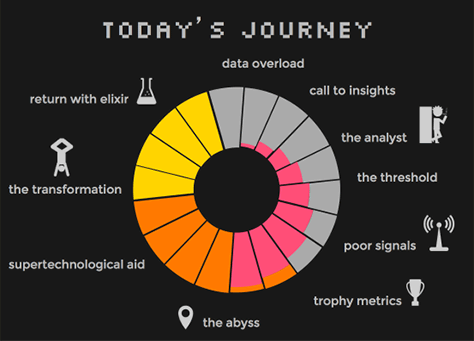
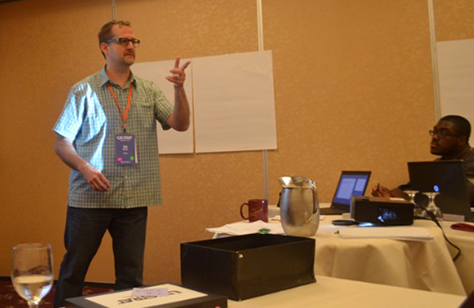
Pamela Pavliscak, Founder of Change Sciences, who is shown in Figure 15, writes a great UXmatters column on metrics, Data-Informed Design, so I was really looking forward to her workshop. I first met her at UX STRAT 2013. Pamela makes whatever she’s teaching fun, in part by injecting humor into her presentation, as exemplified in Figure 16—not at all the typical overview of a workshop—but also just because she’s a high-energy, joyous person.
Figure 15—Pamela reviewing the output of the first workshop activity
Photo from UX STRAT
Figure 16—Today’s Journey
But here’s “The Real Agenda:
UX + Data = < 3
Introductions
Group Brainstorm
Metrics How-To
Small Groups
Tools & Cheats”
1. Overview: UX + Data = < 3
Pamela began her presentation by saying, “There is too much data, not enough insights.” After showing examples of the massive numbers of interactions that have occurred online and the growing number of mobile phones in use, she informed us of the “2000% expected increase in global data by 2020.” Data is accruing at an incredibly rapid pace. Pamela shared a wonderful quotation from Dan Ariely:
“Big data is like teenage sex: everybody talks about it, nobody really knows how to do it, everyone thinks everyone else is doing it, so everyone claims they are doing it.”—Dan Ariely
Pamela told us that big data “frustrates CEO types” for lots of reasons, including the fact that it’s complicated, lacks customization, is inconsistent, isn’t actionable, is inaccessible without IT, is ambiguous, lives in silos, isn’t user friendly, is inaccurate, comes from disparate data sources, lacks real-time access, is hard to use effectively, takes too long to manage, and is dirty and disorganized. Plus, the sheer volume of data is overwhelming, and there’s a lack of buy-in regarding big data. “It has to be big to matter, but even when your data is small, you can get a lot out of it.”
There are lots of problems with data. “There is always a filter”—for big data, there’s signal bias; for small data, the Heisenberg Uncertainty Principle applies. “Research biases data. Just because it’s easy to track doesn’t mean it’s important. What are the right things to measure?”
“Friends don’t let friends measure page views, ever.—Avinash Kaushik.
“Time could mean anything”—that a user was stuck, enjoying something, or distracted. “Counts are often vanity metrics.”
“Not everything that can be counted counts, and not everything that counts can be counted.”—Albert Einstein
“Signals can be ambiguous. Analytics are the traces left behind by people—clues, but not answers. They came <something, something>. They left. You can’t single source your metrics. Data can be too granular.” As Pamela explained, “There are still so many questions:
What did they expect?
What was their goal?
How did that work out for them?
How did they feel about it?
What are they really thinking?
What exceeded expectations?
What disappointed them?
Why did they do what they did?
What are they going to do next?
What do they remember later?
“UX is really good at the <something, something>,” noted Pamela. “Data may not map to design. A/B tests are tactical, not strategic. Bounce rate and other metrics are too high level. Conversions going up could be a lot of different things. There are so many reasons that don’t tie back to design. UX metrics aim to connect the dots between data and design. Can data make user experience better?”
There’s an insight vacuum. “Narration can make data meaningful and drive high-level business goals. Discover something you don’t know.” Look for “patterns—just be careful. There’s a huge problem with correlation. Correlation does not equal causation. Prove something you should know. ROI loops back to experience design. How can we prove that we’ve done better? Improve something you can change. Track over time, by iteration, against competitors. It’s something that we’re just not doing in UX. We’re not tracking usability testing [and tying it] to design success. We need to track progress moving forward. That’s one of the things that data is really good for.
“There is no perfect data. For questions on a scale, open questions are harder, but we can still classify the data.”
2. Introductions: 3 x 3 x High 5
Pamela did something that greatly enhanced the workshop experience: She asked up to introduce ourselves to three people, discover three things that we had in common, and exchange nine high fives. This was such a fun mixer, and it really warmed up the room for the upcoming team exercises. As a result of this exercise, there was so much more fellow feeling among workshop participants, and it persisted throughout the entire workshop and even the conference beyond. I wish the UX STRAT organizations had taken a leaf from Pamela’s book and encouraged more diverse social interactions during the conference.
Pamela asked what we learned about data from this experience, then declared, “You did learn about data!
A small [number] of people can produce a lot of data.
If you don’t decide to collect data, you won’t get much that is useful.
If you aren’t consistent, you will get a mess of data.
But it can be easier to see patterns with more data.
Even with a mess, you can classify and interpret.”
3. Brainstorm All the Metrics
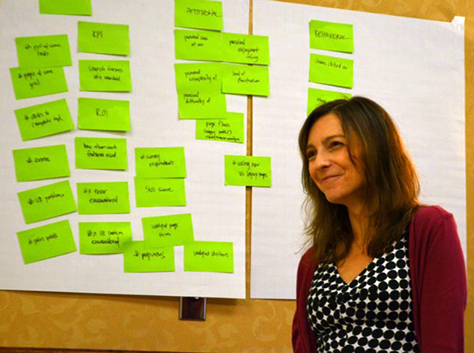
Pamela asked us to break into teams comprising several people and brainstorm as many different metrics as we could think of. You can see the results of one team’s efforts in Figure 17.
Figure 17—Brainstorming metrics
Photo from UX STRAT
“Lean toward ratios and percentage, not counts and averages—which are vanity metrics,” recommended Pamela. She gave an example of a useful metric: “The number of conversions divided by the number of visits equals the conversion rate. A metric must have a target, that’s a KPI (Key Performance Indicator)”—for example, a 2% increase in conversions. Put the number you’re measuring against over the total number of possibilities. You can do that with almost any of these metrics. A KPI is a target, or goal.”
4. Discussion: UX Metrics How-To
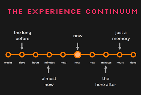
“Consider measurable moments,” suggested Pamela. “Expectations (before), moments (during), and memories (after)”—which together form “the experience continuum,” shown in Figure 18. “Many metrics are big picture things. All of the things on this continuum are things we want to have metrics for. Before and after, are not from analytics, but from other sources.”
Figure 18—The experience continuum
Consider tracking the following:
“behaviors—from analytics, paths, funnels
“interactions—which have links to behaviors, but are not always the same thing. What did people actually do on the site? Multi-signal interactions.
“feelings—ask people about their feelings or hook them up to fancy equipment and measure biometrics. Do diary studies.
“attitudes and biases—These kind of go together. What presuppositions are people bringing to a site.
“Balance subjective and objective metrics. The things we’re asking people to report on [include] time on task, attention time, how long [a person] interacted or scrolled. Combine quantitative and qualitative data. Most data starts off as quantitative data. There are things that are qualitative that we can quantify. Get the right mix of those moments.
“Start by formulating big questions. There will be an insight vacuum if nobody is stepping back and asking these questions:
Why do we exist?
Why would people want what we offer?
What is the main problem we solve?
Why do people take action—or not?
What other sites are they using?
What matters most to the experience?
What is costing the most?
How can design support business goals?
What does success look like?
What indicates success?”
“99.9% of the time, the main goal is to grow revenue. Get at the nuances.” “Business metrics are tied to the success or failure of the company [and include]:
total revenue
total expenses
net profit
lifetime value
profit margin
closed sales
billable/non-billable hours”
“You have to make money, not spend all your money, and make a profit. These metrics have high-level relevance to UX, but don’t give you data that ties back directly to UX. It’s loosely tied to UX.”
“Marketing metrics have more overlap with the experience [and include]:
attention minutes
share of searches
Net Promoter Score
growth of a channel
social media sentiment
satisfaction ratings
brand awareness
“They give some subjective indication of what people might do, … so there’s a little more intersection with UX.”
“UX metrics [include]:
ease of use ratings
attention time
task success
navigation use
engagement points
page depth—how far down they scroll
happiness ratings
“These drill down to the experience people are having. They touch the actual use of the site or application. Feelings don’t touch it, but it’s important to measure them at different points. It’s important to capture that information.”
“Tune in to the right signals. No data is perfect, but it gets you closer.
single signal—once source: analytics, surveys, a study, or a UX metric
multiple signal—several sources: often analytics plus a survey. Look at data with other data and combine them into one score or aggregate.
event stream—sequences of interactions. A lot of people are working on this in the content area.
analytics—Piwik, Clicky, and Google Analytics, which are free; Chartbeat, Crazy Egg, Mixpanel, and KISS metrics. Clicktale and Chartbeat let you track more than Google Analytics. I really like Chartbeat for content sites. Analytics are not metrics. Look at patterns. What do people on a page for a long time do next. Intercept them when they’re on the page or do a qualitative study. You do have to make some assumptions. We use engagement points a lot—things that people did and felt good about or wanted to do, but ran out of time during a study.
social media data—Topsy, Social Mention, Open Status, and Google Trends are free; Shoutlet, Reachli, and Tracker.
other data sources—Pull in other data sources as part of your signal:
A/B tests
Surveys
Heatmaps
Quantified qualitative studies
Biometrics and eyetracking
Sales data
CRM data
Call center logs
Billing systems
Business intelligence systems
“The top five are more relevant for UX; six plus are more abstract business metrics. Cinch it with a framework” such as the following:
Dave McClure’s AARRR (Pirate Metrics)—Acquisition, Activation, Retention, Referral, and Revenue. These metrics are for startups. They “follow the sales cycle. Its weakness is that it is very focused on the path to success—very much on the business level—but you could adapt it to UX.”
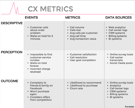
Forrester’s CX Metrics—Three big categories: Descriptive, what actually happened; Perception, how they actually felt about it; and Outcome, what they did about it. These apply to Events, Metrics, and Data Sources. “You have to bring these metrics together to get attention. Combine them in a score. Think about three levels: business, marketing, and UX.” These metrics are shown in detail in Figure 19.
Avinash Kaushik’s See-Think-Do (Adapted for UX)—“See—People become aware of something. I know who you are. Think—You’ve got me interested, maybe now I’ll do something on your site. Do—What did they actually do on the site? Convert? Abandon?” Map Audience, Content, Interactions, and Metrics to these.
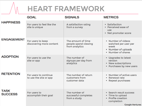
Google’s Heart Framework—Happiness, Engagement, Adoption, Retention, and Task Success in relation to Goals, Signals, and Metrics. “A lot of folks are using this set of metrics. It’s a little complex for me.” This framework was developed by the UX team at Google Ventures. These metrics are shown in detail in Figure 20.
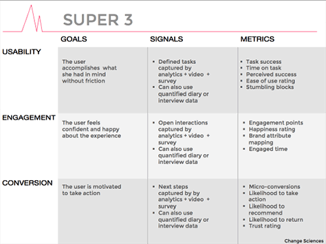
Change Science’s Super 3—Usability—“a lot of businesses don’t really care about this, but we do”—Engagement, and Conversion in relation to Goals, Signals, and Metrics. These metrics are shown in detail in Figure 21.
“You might need to fit your UX metrics into one of these dashboards to get them noticed.” Other possible metrics include accessibility, engagement points, conversions—combined with Net Promoter Score—or microconversions. “Which metrics to use is very context dependent.”
The workshop participants again broke into groups for this activity, which involved brainstorming possible metrics for an actual product or service. The group I belonged to decided to discuss metrics for Uber.
6. Cheats: Tools, Tips, Shortcuts
“Start plain. With less formatting [there’s] more cool stuff to try. Categorizing can still be plain. Do the math. Less math; standard scales, preferably tens. Try code. Visualize. Dashboards aren’t so easy”
Pamela shared a wealth of metrics resources with us, including
books—Data Smart: Using Data Science to Transform Information into Insight, by Nate Silver; How to Lie with Statistics, by Darrell Huff; Naked Statistics: Stripping Down the Dread from the Data, by Charles Whelen; all of Edward Tufte’s books
Web sites—Occam’s Razor, by Avinash Kaushik; Numberphile; KhanAcademy; The Analysis Factor; FlowingData; Drawing by Numbers
dashboards—Bittle, Tableau, Dashzen, Domo
other Web applications—infogr.am, Wordle,
Conclusion
A leading expert on UX metrics, Pamela got everyone excited about metrics. Her enthusiasm for her subject is contagious, and participants became avidly engaged in the workshop activities she’d planned for us. This was a great workshop, and I really enjoyed it. The topic of UX metrics is one that all UX professionals should learn more about, so if you haven’t already done so, check out her excellent column on UXmatters.
Workshop: Mapping the User Experience: Locating Value with Alignment Diagrams
Reviewer: Jim Nieters
Presenter: Jim Kalbach
In leading the workshop “Mapping the User Experience: Locating Value with Alignment Diagrams” at UX STRAT 2014, Jim Kalbach, who is shown in Figure 22, demonstrated why he is a leading expert on this topic in the UX community. I’ll be honest, though; when I considered attending this workshop, I couldn’t have answered what an “alignment diagram” is. But I quickly realized that perhaps one of the most common forms of alignment diagram is a customer journey map, which is a tool with which I am quite familiar.
Figure 22—Jim Kalbach
Photo from UX STRAT
A journey map can help align cross-functional teams around a customer’s complete end-to-end path through a system, with the goal of completing—as Jim Kalbach would say—a Job to Be Done (JTBD). In fact, in mid-2014, Forrester conducted research that indicated CEOs consider journey maps to be one of the most useful tools in transforming the total customer experience. CEOs value journey maps so much because they knock down silos that would otherwise result in a fragmented customer experience. They bring together teams from across the company—at different points in the user’s journey—to understand and create a cohesive user and customer experience. They are, as Jim suggests, an alignment diagram, but Jim helped me to recognize that there are many types of alignment diagrams and add several new tools to my team’s tool belt.
Alignment Diagrams Create Long-Term Value
The thing that really resonated with me during the workshop was that Jim continued to tie value back not only to the user, but to the business. That is, he showed how alignment diagrams can highlight the intersection between simplicity and delight on one hand and monetization and long-term value on the other. One of the largest challenges for UX teams with business teams is getting business teams to recognize that UX concepts also monetize. Alignment diagrams provide a tool that clearly shows the intersection between the experience and monetization.
Of equal importance, Jim told us that business teams in many companies focus on short-term value extraction at the expense of long-term value creation, citing articles in prestigious publications such as HBR, in which economists and industry leaders support this concept. I couldn’t agree more. Not only can alignment diagrams help align teams around creating long-term value for customers, they can also help integrate the thinking of UX and business teams and bring them into alignment.
As Jim stated, “The use of visual representations exposes new opportunities for improvement and growth. The term alignment diagrams describes the class of diagrams that visualize touchpoints in a business process. Ultimately, alignment techniques let UX strategists use their expertise to help solve business problems. More than that, they help move business forward in creating shared value.”
Workshop Flow
In Jim’s description of the workshop, he said, “Through hands-on exercises, this workshop will show you how to turn customer observations into actionable insight for the strategic design of products and services. We’ll review and discuss many examples of alignments, as well as create an experience map together in the class. Participants should leave with both theory and practical experience, as well as references….”
Walking Through An Alignment Diagramming Process
Jim was true to his word. At the beginning of the workshop, he walked us through the basic process of creating alignment diagrams, in the context of a couple of projects. He then had us to break into ten or so small teams, each comprising five to six participants, to create our own alignment diagram. He also provided a number of references that would help us to leverage such diagrams in our own work going forward. Jim broke the alignment diagramming process into four steps:
Understand users.
Map JTBD.
Identify opportunities.
Align efforts.
1. Understand Users
Jim highlighted several different methods that teams can use in understanding users, which is the foundational step in creating an alignment diagram. The most important of these are user observation and interviews. He showed one example where his team conducted 39 observations and interviews, collected 68 hours of audio, captured 1,488 pages of text—that is, 793,000 words—and they identified 1,716 discrete tasks.
2. Map Jobs to Be Done
The step Map Jobs to be Done comprises several steps. Jim emphasized the importance of identifying users’ mental models during this phase—that is, how users conceptualize the problem space. He cited Indi Young’s book Mental Models in talking about the importance of visualization in describing people’s mental models, pointing out that: “A mental model helps you visualize how your business strategy looks compared to the existing user experience. Thus, it is a diagram that can support your experience strategy.”
In an example that Jim showed us, he and a product team had created mental models for photography users. They noted that the JTBD across this journey cut across products, features, services, and support. In his maps, he also identified issues at three levels, from the highest, or most general to the lowest, or most specific, as follows:
goal space—for example, Find Photos
tower—for example, Find Photos on the Go or Find Photos on the Computer
tasks—for example, Get photos from social or cloud services or Dig through unorganized photos
After identifying current tasks, categories, and larger goals, his team mapped out future concepts.
3. Identify Opportunities
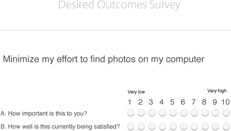
In this step, Jim identifies and ranks possible opportunities by defining several desired outcome statements, then calculating opportunity scores for each.
Desired outcome statements reflect user goals. For example, a desired outcome statement for users around the photography example I mentioned earlier might be: “Minimize my effort to find photos on my computer.” After defining a series of such statements, the team evaluates these outcome statements against two factors: importance and satisfaction. They then pose these questions to users, using a rating scale from 1 to 10, as in the example shown in Figure 23.
Figure 23—Survey of desired outcomes
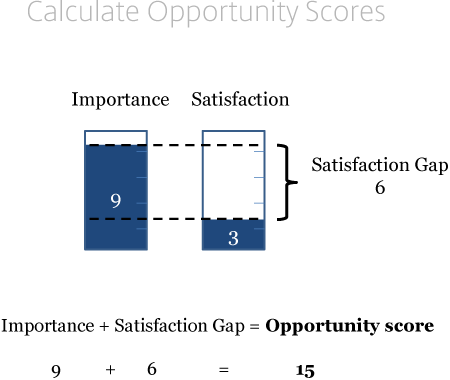
Once they have data on each of the desired outcomes statements, they calculate an opportunity score. Such a score sums importance and the satisfaction gap, as shown in Figure 24.
Figure 24—Calculating opportunity scores
In this case, the opportunity score is relatively high, because the importance is nine, and satisfaction is only three. Thus, the satisfaction gap—the difference between importance and satisfaction—is six. Adding an importance of nine and a satisfaction gap of six gives a total opportunity score of fifteen.
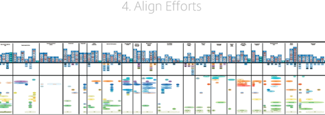
4. Align Efforts
During the alignment phase, the team maps issues and opportunities on a map. In Figure 25, items with the highest opportunity scores appear at the top—marked Do 1st, and items with lower opportunity scores appear at the bottom—marked Do last.
Figure 25—Aligning a team’s efforts
Workshop Exercise
Next, Jim presented a case study for which all workshop attendees created alignment diagrams. He provided a scenario where the Boulder Tourism Board wanted to attract more travelers. The objective for each team was to deliver a proposal to the Tourism Board, highlighting the largest opportunities for helping to attract more travelers. Using the concepts that Jim presented, each team crafted a different proposal. Of course, the goal was to practice creating alignment diagrams that would inform the recommendations that we would propose to the Tourism Board.
The proposals from various teams were extremely creative and included diagrams that differed significantly in how they visualized opportunities. Each team also presented its recommendations, which ranged from updating the Boulder Tourism Web site to creating new smartphone apps. The class voted for the best proposal.
Conclusion
I found the course to be very worthwhile, not just from a methodological perspective, but also from a strategy perspective. As Jim pointed out in his workshop, leveraging alignment diagrams that present data so powerfully and clearly helps place User Experience in a position of strategic relevance in relation to other functional organizations. In fact, Jim shared a quotation from one of his Product Management colleagues: “It’s great to have this data to help make informed decisions. I’m looking forward to incorporating it more and more.”
I’d created journey maps before, but honestly, I had never applied the level of rigor that Jim demonstrated in this workshop. Given Jim’s deep understanding of this topic and its relevance—not only to design, but to product strategy and the business overall—I would very much like to see him write a book on the topic of alignment diagrams.
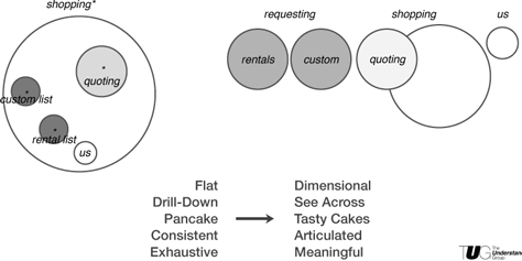
Workshop: Deciding Together: Three Tools for Realizing an Effective Information Architecture Strategy
Reviewer: Jim Nieters
Presenters: Dan Klyn and Bill Holsinger-Robinson
In this workshop, Dan Klyn, shown in Figure 26, and Bill Holsinger-Robinson, shown in Figure 27—both of whom are with The Understanding Group—presented three tools, or methods, for creating what they called “deep and durable agreement” on strategic issues:
intention mapping
tetrad analysis
dumb modeling
Figure 26—Dan Klyn
Photo from UX STRAT
Figure 27—Bill Holsinger-Robinson
Photo from UX STRAT
The key point of this workshop: when designing products, services, or systems, teams must first achieve alignment on their vision for the solution—one that aligns with the needs of users, but also with the surrounding ecosystem, their company’s capabilities and intent, and users’ context of use. Essentially, everything needs an architecture, whether it’s a building or a digital experience. Unfortunately, many Web sites and applications lack an underlying architecture that tells potential users what its purpose is. Dan and Bill used the photo of a building shown in Figure 28 as an example and asked, “What is this for?”
Figure 28—Inferring intent from architecture
However, when you learn that this structure is actually a Pizza Hut restaurant, as you can see in Figure 29, you recognize that the building does not convey any sense of what’s inside.
Figure 29—Mismatch between architecture and intent
Too many designers fail to consider the architecture for the thing they’re designing up front, in its context of use. As a result, people run into significant challenges in their daily usage of these products. Whether you’re designing a building, a piece of hardware, or a digital experience, why not define its architecture up front? Why not create a plan and a blueprint—an information architecture?
It is critically important that UX strategists define architectures that convey the intent of the thing they’re designing—whether for a building or a digital design.
Dan and Bill pointed out that the classic seduction for designers is to find a solution instead of a truth—attributing this concept Richard Saul Wurman, who co-founded the TED conference. The opportunity, then, is for designers to find a way to decide together what an architecture should be and leverage a core framework in doing so.
In my experience, their perspective applies to all forms of digital and hardware-software design. While Dan and Bill’s talk was about information architecture, their point applies more broadly than to just information. It applies equally to task-based systems. As they talked, I translated their information-architecture concepts into interaction design models that would support a user’s conceptual model within a software application. The same concepts apply: Are you applying the right affordances, so when users look at your product, they can intuit its use from its structure? For example, Microsoft Excel uses rows and columns in the same way as the ledger books that accountants have used for centuries. When people who work with numbers see the app, they can immediately intuit what do to with it—even though they still need to learn many of the specifics.
The challenge is: how can you align a large group of people within an organization around the right vision and plan?
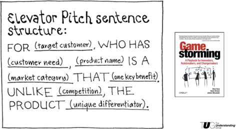
Before jumping into their planned exercises, Bill and Dan had us do a pre-activity, shown in Figure 30, in which we identified a new product or service by completing an elevator-pitch, sentence-structure exercise, which you can find in the book Gamestorming, by Dave Gray, Sunni Brown, and James Macanufo.
Figure 30—Elevator-pitch exercise
Participants broke into four teams, each of which identified a new product for a new customer with a particular need. Each team identified the benefits, the competition, and how their product would differentiate in the marketplace. We then took these products and applied the three methods I listed earlier to ensure alignment among the members of our teams.
Intention Mapping with Performance Continuums
The Understanding Group typically engages in a discovery phase for any project, during which they identify the intended use for a space or application. They end this phase with what they call an alignment session. Their objective in these sessions is to seek the truth within the organization rather than a quick solution. They hold up a mirror to the organization, in effect asking, “Is this the truth?” They borrowed the idea of performance continuums from Richard Saul Wurman’s work in the 1970s and ended up with a repeatable methodology that is now a formal part of their discovery process.
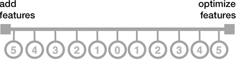
In creating a performance continuum, they identify factors that seem opposed to one another and place them at the extremes of the continuum, then ask stakeholders to rate each continuum. For example, they might place Engagement on one side of a continuum and Conversion on the other. Both are goals, and teams might consider them to be opposites, so ask, “Should we focus on engagement or conversion? Or, as shown in Figure 31, do we want to focus on adding new features, or optimizing existing features?
Figure 31—Performance continuum example
For Dan and Bill, a continuum represents a continuous sequence in which adjacent elements may not be perceptibly different from one another—even though the extremes are quite distinct.
Their definition of performance is a measure of how well the stuff we make responds to people’s needs, which provides the basis for a common vocabulary for communicating our needs.
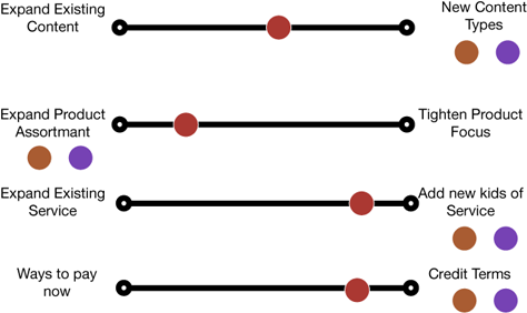
During the workshop, we reviewed the performance continuums shown in Figure 32.
Figure 32—Performance continuums
We then worked on establishing a set of performance continuums for the products that we had defined and identified where we, as a team, sat in our perception of the continuum. The ensuing discussion helped us to internalize the value of dialogue in driving alignment. Of course, there are many tools that you can use to drive alignment among team members, but the performance continuum lets a team evaluate and come to clarity regarding the various factors about which they might otherwise argue—or not even realize that they held different opinions.
Bill pointed out that, in the March 2015 issue of Harvard Business Review, Donald Sull explains in his article “Why Strategy Execution Unravels—and What to Do About It” that communication does not equate to understanding. Just because people communicate, even if they communicate frequently, that does not mean others understand what they’re saying. Therefore, using tools such as performance continuums is critical to ensuring teams think through the priorities for their products.
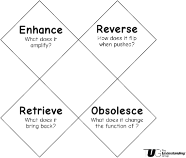
Tetrad Analysis
Tetrad analysis helps teams to control and clarify what they mean—and determine what the implications are for different types of decisions. This tool is a way of looking at any issue from multiple perspectives, to understand what might be good about any idea and what might be bad in different contexts.
Dan and Bill recognize the importance of understanding and envisioning the implications of any decision. Thus, they leverage insights from Marshall McLuhan, who “contends that all media—in and of themselves and regardless of the messages they communicate—exert a compelling influence on man and society.” Do we understand how our designs, whether physical or virtual, impact users or the environment in unseen ways?
In tetrad analysis, you look at your core idea relative to four factors, as shown in Figure 33.
Figure 33—Tetrad for analysis and comparison
For example, taking the example of a balcony, you might consider:
square footage
distance from the ground
a feeling of freedom
lines of sight, or the apparent edge of the horizon
peripheral vision
luxury
However, your conception of a balcony might well shift if you consider:
elitism
detachment
jumpers
a choir loft
Looking at a balcony from the perspective of its view, you might think of a
Viewmaster toy
mountaintop
theater—Romeo and Juliet
We can investigate a balcony from the context of what it makes obsolete:
the immediate foreground
visibility from ground level
sunlight on the ground
windows
When teams can take any topic and evaluate it within the context of a tetrad, they gain new perspectives on the idea and can better understand its potential drawbacks, as well as some possible metaphors for the concept.
After each of the subteams did a tetrad analysis, we learned about and practiced creating dumb models.
Dumb Models
This part of the workshop may have been the most humorous: the instructors showed a video clip from the movie Zoolander to demonstrate how a dumb model really acts.
The key point of this segment of the workshop was that teams should give structure to their concepts and visualize them. Models don’t need to be super detailed, but they do need to be understandable and bring a greater level of understanding among team members. A model might be a physical prototype of a building, as in the example shown in Figure 34.
Figure 34—Example of a dumb model for a building
Or a model could represent a navigational model for a digital product like that shown in Figure 35.
Figure 35—Dumb model comparing two navigational strategies
In my experience, UX strategists must be able to represent their models visually, to help teams understand the different options through different representations. The value of such a dumb model is clearly that you can change it rapidly. This is similar to rapid prototyping, but the concept here is that, before someone creates a prototype of the actual product, they can evaluate different interaction, navigation, or information models to ensure that their teams understand and can decide on the right model to solve the user’s problem.
Consider a map, for example. Dan and Bill quoted Korzybski, who said, “A map is not the territory it represents, but, if correct, it has a similar structure to the territory, which accounts for its usefulness.” A map is a model—a representation of the actual thing.
Conclusion
About their workshop, Dan and Bill said, “Participants will get hands-on with each tool and walk away a little woozy from the awesomeness—or perhaps the altitude—equipped with some powerful new approaches for deciding together.” We certainly learned about the importance of aligning teams, and we also came away with some new tools for driving this alignment in our toolboxes. Achieving alignment is hugely important to the success of a UX strategy.
Conclusion of Overview and Workshop Reviews
UX STRAT 2014 was an excellent conference and took place in a great location. UX strategy is at the cutting edge of UX practice, so it’s an important time for everyone to share their learnings—presenters and attendees alike. At UX STRAT 2014, attendees enjoyed great talks by many thought leaders in UX strategy, as well as fascinating conversations with other UX professionals who define UX strategy.
This was my first visit to Boulder, Colorado, and I loved this mountain community, which is part university town, part high-tech center, part vacation destination, and part hippie haven. I hope to visit Boulder again soon.
I heartily recommend your attending UX STRAT 2015 for both the community and the content—and this year, you’ll have two opportunities to experience UX STRAT:
UX STRAT Europe—The first European UX STRAT conference will take place in Amsterdam, The Netherlands, at the Tobacco Theater, on June 4–5, 2015.
UX STRAT USA—The next UX STRAT conference in the USA will be in Athens, Georgia, at The Classic Center, on September 8–10.
Look for our detailed reviews of the conference sessions in Part 2 and Part 3 of this three-part review of UX STRAT 2014, in upcoming editions of UXmatters.
Thank you, Pabini, for this outstanding, detailed review of UX STRAT 2014. I’m thrilled that you found the community and the level of presentations to be so worthwhile. These are areas with which I am preoccupied throughout the year, so to read your positive comments about these aspects of UX STRAT is encouraging.
Although we received high ratings in the feedback surveys on the Boulder Theater experience, there were definitely some tradeoffs for its character and charm. The Classic Center in Athens GA is a beautiful facility that is spacious, comfortable, and modern.
We received a flood of presentation proposals for UX STRAT USA, so I expect the content to be very tightly focused on experience design strategy. The town itself is very easy to get around in on foot and has some great restaurants that are walking distance, including the vegan favorite, The Grit.
Thanks again for serving the UX community with your detailed conference reviews!
Founder, Publisher, and Editor in Chief of UXmatters
Silicon Valley, California, USA
With more than 20 years working in User Experience at companies such as Google, Cisco, WebEx, Apple, and many startups, Pabini now provides UX strategy and design consulting services through her Silicon Valley company, Strategic UX. Her past UX leadership roles include Head of UX for Sales & Marketing IT at Intel, Senior Director of UX and Design at Apttus, Principal UX Architect at BMC Software, VP of User Experience at scanR, and Manager of User Experience at WebEx. Pabini has led UX strategy, design, and user research for Web, mobile, and desktop applications for consumers, small businesses, and enterprises, in diverse product domains. Working collaboratively with business executives, multidisciplinary product teams, and UX teams, she has envisioned and realized holistic UX design solutions for innovative, award-winning products that delighted users, achieved success in the marketplace, and delivered business value. As a UX leader, she has facilitated conceptual modeling and ideation sessions; written user stories; prioritized product and usability requirements; established corporate design frameworks, standards, and guidelines; and integrated lean UX activities into agile development processes. Pabini is a strategic thinker, and the diversity of her experience enables her to synthesize innovative solutions for challenging strategy and design problems. She is passionate about creating great user experiences that meet users’ needs and get business results. A thought leader in the UX community, Pabini was a Founding Director of the Interaction Design Association (IxDA). Read More
Chief User Experience Strategist at Experience Outcomes
Los Altos, California, USA
A design leader for 17 years, Jim loves every minute of helping companies create competitive advantage by designing experiences that differentiate. He has worked with a range of companies—from startups to Fortune-500 companies—most recently as Senior VP of Customer Engagement at Monaker Group. He previously led User Experience at HP, Yahoo, and Cisco and has advised numerous startups. Jim chooses to work with brilliant clients, helping them unlock their unbounded potential by envisioning and designing end-to-end experiences that disrupt markets and engaging users emotionally. He often works with UX leaders to help them work through organizational challenges and ensure User Experience has the visibility it deserves and can design experiences that make the team proud. Jim also conducts design-value assessments for his clients, identifying gaps in their ability to differentiate on the experience, then helping them close those gaps and become extraordinary. Read More