In Part 1 of my series on applied UX strategy, I defined a framework for assessing an organization’s UX maturity. In Part 2, I described the role of product designers. We need both to approach design systematically. Now, in Part 3, I’ll explore how these work.
Many designers still focus on deliverables—work products of their creative process. Following this approach, they do research on a market and users, define scenarios and information architectures, explore solutions through sketching and prototyping, create mockups and guidelines, then give all of their deliverables to the developers. Next, they review the implementation of their design, which usually requires a lot of corrections, until the team achieves the right product-market fit and a decent level of quality. While this works in general, this classic assembly-line approach burns a lot of time and effort on needless deliverables. Designers spend their time polishing supplementary documentation instead of focusing on the product itself. The purpose of most deliverables is simply to transfer knowledge about the product design to other team members, and they quickly become obsolete. This approach leads to high transactional costs. It’s definitely not an optimal approach!
Champion Advertisement
Continue Reading…
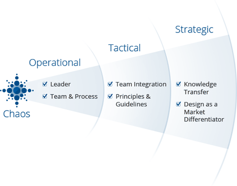
In this article, I’ll discuss moving from deliverables thinking to platform thinking. This approach requires that designers no longer consider their work narrowly, focusing on projects whose goal is to launch a new product or feature. Instead, they focus on bringing a holistic product platform to market, then evolving it. When designers take this approach, a product or product line grows systematically, and a company’s UX strategy works on all three levels: operational, tactical, and strategic, as shown in Figure 1.
Figure 1—A mature approach to user experience
A Systematic Approach to Designing Product User Experiences
Classic solutions for systematic product design are guidelines and pattern libraries. These define typical designs for a company’s product line. They help designers, managers, developers, and testers to maintain consistency across screens, products, and teams. They accelerate and reduce the cost of the design and development process—thanks to their providing ready-made solutions. Creating these is critical for large companies, but they’re also useful for mid-sized and small organizations with mature products. Users benefit from consistency and familiarity in the product user interfaces.
However, guidelines and patterns are yet more static artifacts that designers must create and support. Plus, creating them adds one more step to the design process. In a guidelines → design → front-end code → implementation workflow, a lot of design and product details get lost in every iteration. So this approach also generates a lot of bugs along the way. But there are other problems, too:
Designers often complain that developers don’t read the documentation. But, to be fair, designers themselves seldom refer to it when interacting with several people. They’re always too busy!
It’s impossible to implement a design with 100% accuracy, especially when your organization is launching several products at once. Moreover, specifications often require updates, new patterns emerge, and designers discover better solutions for old designs. So final implementations are always short of perfection, and the implementations of products within a product line are not quite identical, because design implementation and the creation of guidelines move on parallel tracks. So where’s the reference design—in the documentation or the implementation? We’re all familiar with refactoring, but it becomes expensive when you have to do it all the time for every product.
This approach requires massive effort, and keeping the design quality high takes a lot of time—thus, it’s expensive.
Problems multiply if design guidelines need significant updates—starting again from the very beginning, then ensuring the full realization of the new design in every product.
Design experiments are expensive, too. They require yet another stack of deliverables and increase entropy.
As you can see, there are a lot of problems! Plus, when doing responsive Web design, you can multiply these issues by the number of breakpoints you’re supporting. Many companies just hire more designers in this case. However, systems thinkers are trying to find a solution to this problem at the intersection of design and technology. Only by moving the reference design from static documentation to the design implementation can you shorten the production cycle to prototype = design mockup = HTML → implementation. Many troubles with design implementation, enhancement, and support then go away.
The Unification of Design and Technology
Many big companies are moving in this direction because it allows them to create and implement good designs faster and cheaper. What is the best way for you to do this? There are two possibilities:
A simpler approach, in which you create “a tiny Bootstrap” as Mark Otto and Dave Rupert would say—This could mean either creating extensions to a framework such as Bootstrap or creating your own framework.
A more complex approach, in which you construct a true component-based system
Of course, the first approach is faster and cheaper. You can quickly profit from inexpensive design experiments, fast prototyping, and simplified development support. You can use predefined HTML markup and CSS classes in the actual product. This framework approach has become highly popular recently, with the publication of some visionary articles from the likes of Mark Otto—see his presentation “Build Your Own Bootstrap” on Speaker Deck—and Dave Rupert. More and more companies are creating frameworks and living style guides.
The second, component-based approach requires much more effort. However, it guarantees the quality of the design implementation and offers the benefits of easy product updates. We chose this approach at Mail.Ru Group. There are five levels of maturity for this approach:
Design principles have been defined, then implemented in CSS.
All products use common user-interface components.
Living guidelines exist that describe design principles and common components. Example components and pages are implemented in code, not shown in screenshots.
Prototyping is possible using common components of code from the living guidelines—bypassing the need for Axure, Photoshop, Sketch, or other tools.
Design experiments employ common components, making it possible to compare different approaches.
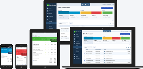
While the approach of developing common user-interface components is not yet in wide use, there are some fantastic case studies demonstrating this approach, including Intuit’s Harmony ecosystem, which is shown in Figure 2; the Lonely Planet Style Guide, which uses the Rizzo framework; and, of course, the Polymer Project from Google, which is based on its Material Design.
Figure 2—Intuit’s Harmony
Developing common components offers the following benefits:
A unified visual style and information architecture and common interaction-design principles benefit users by ensuring that an organization’s products are visually familiar and work in the same way. This is also great for the brand because it results in a holistic design for an entire product line.
This development process guarantees consistency for about 90% of a product’s user interface (UI) because all ready-made code blocks and elements come from the common code base. The other 10% is up to designers, who should choose design patterns with care when creating screens. You can build a monster even with a perfect toolkit.
Launching new products and redesigning existing ones is much easier. The framework provides all necessary user-interface controls, patterns, and components. It also helps you to build new designs really quickly.
It’s easier to manage many concurrent projects when all products are being built in the same way. Instead of closely monitoring many separate projects, designers can just manage a few core guidelines.
This modern design process means you are designing in code instead of following the classic prototype → design mockup → HTML → implementation approach for every screen and producing a lot of unnecessary artifacts.
Successful product decisions have a cumulative effect. For example, if your new design increases pageview metrics on your Sports Web site, you can quickly apply those enhancements to all of your other services.
You can move from doing large redesigns every couple of years to constantly updating designs. Large redesigns take a lot of time and effort, and a thousand little enhancements that you’ve made to a design throughout its lifetime typically get lost in the process.
Implementing products using common components would make it easy to capitalize on whatever the next design trend after flat design might be. Of course, running after trends is not a viable design strategy. However, in our fast-changing industry, there are sometimes radical transformations that seemingly happen overnight—as with iOS 7 last year. Companies need a way to react to such changes quickly.
At Mail.Ru Group, marrying design and technology is a critical part of our UX strategy. We had tried to unify design and implementation several times through specifications, UI Kits, and pattern libraries. But these were never viable solutions. Developers rarely requested these deliverables, which were internal to the design team. We all know how often designs are implemented incorrectly in the transition from mockups to production code. However, when you create, then reuse an accurate design implementation, you can be much more confident in the quality of the products you launch. This is why I believe that the best way to succeed in a product design-unification effort is to move design artifacts to the implementation level.
At MX2014, Bill Scott talked about having a similar experience when he moved from Netflix to PayPal. At PayPal, it took six weeks to change a simple block of text on the home page because of technical constraints. This slowed down the evolution of designs and made experiments impossible. At Netflix, he had made development-process simplification one of his team’s primary goals. They built a flexible HTML5 framework that supported a broad range of target devices.
The goal should be to use designers’ heads, not just their hands. Reducing the amount of routine, operational work that designers must do lets them move their focus to strategic tasks such as product definition and solving business problems.
The company also benefits from the use of common components and a systematic approach to product development. Once the company has incurred the initial costs of creating a platform and rebuilding its existing products on it, business benefits include reduced costs, efficiency improvements, faster time to market and revenues for new products and features, and guaranteed design unity. Our UX team’s ability to speak the language of business has helped us to convince management to invest in our framework.
How to Build Your Platform
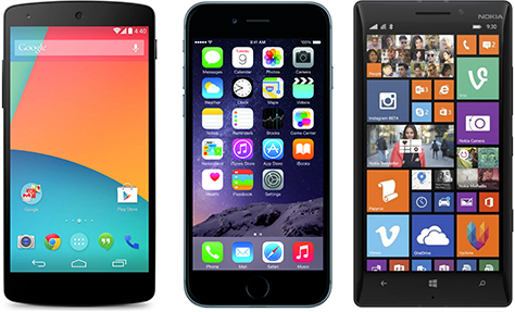
Stop thinking about designing and building pages or screens and, instead, view product design and development as platform development. For example, look at what Google, Apple, and Microsoft have done. They’ve made terrific progress by building platforms and ecosystems for Android, iOS, and Windows Phone, shown in Figure 3. Even if your company is smaller and has less ambitious goals, you can still learn from these giants. If you deconstruct these platforms’ key elements—general principles of visual and interaction design and a portfolio of products that includes their own apps, as well as a vast array of third-party apps—these have much in common with what any product company creates.
Figure 3—Android, iOS, Windows Phone
There are two ways to unify design—both of which have pros and cons:
You can first create guidelines, then build products based on them.
You can launch a successful product, then build guidelines based on it.
At Mail.Ru Group, we chose the second approach. We scaled the already tried-and-tested design that we’d optimized after doing user research and gathering analytics. Nearing product launch, then right after release, we conducted many experiments and tests that led to many design tweaks. This approach was rocky at the beginning, but now we’re refactoring the platform and building the system top down.
It’s necessary to abandon the long-held concept of final designs. Designers must be involved throughout the entire product development process, not just at the beginning.
Designers must create reusable front-end code or interactive prototypes instead of document-based deliverables or mockups.
While designing guidelines and products simultaneously may seem ideal, doing so would take an enormous amount of time. On a real project, the product would never get released because there would be seemingly endless iterations of the following process:
A new pattern is proposed.
The pattern is applied to several products.
Inconsistencies are found.
The whole team discusses and fixes the problems.
The revised pattern is applied to products.
Realizing Platform-Maturity Levels
Based on our experience at Mail.Ru Group, I’ll describe how we achieved the various platform-maturity levels.
Defining Design Principles
At the first platform-maturity level, an organization has defined design principles, then implemented them in CSS. We started our unification effort by defining the foundational principles for our platform. These basic principles simplified getting approval for our design decisions at every level and ensured that the platform grew systematically. The IBM Design Language provides a great reference.
Specific design principles apply to brand design, information architecture, interactions, and visual presentation. Design principles speak to values that influence specific design decisions, so should be defined at a high level of abstraction.
Brand Design Principles
We defined a set of about a dozen principles that help us to integrate brand image with specific product-design decisions. These principles functions as a high-level checklist that we use to validate our design patterns. For example, one principle for our international My.com brand is to combine a minimalistic white surface for all user-interface blocks with bold red accents to strengthen brand identity. However, other brand qualities include personality and emotion. To support these without breaking the first rule, we use colorful backgrounds wherever the main working surface lies on top of a semi-transparent white container.
You can set principles relating to different ideas that you believe are important for the brand. For example, MailChimp puts a lot of effort into voice and tone. Microsoft advised focusing on content rather than chrome for Metro design, and the role of animation is also foundational. Setting such principles leads to a consistent experience across all products and devices.
You should tie design principles to a company’s business strategy. For design principles, we do this primarily through branding, ensuring strong impact and value for managers and other team members. The purpose of brand design principles is to help you make design decisions. Principles should not overlap, and there should be a reasonably small number of them to ensure that they’re memorable. You can find inspiration in the great collection at Design Principles FTW.
Information Architecture Principles
Considering the specific target audience for a product, information architecture principles should guide the distribution of features and scenarios across pages or screens, so you can build a suitable hierarchy and navigation system. Within a product line, the information architectures for different products can vary significantly, so may require different approaches. Your principles should describe several different constructs for pages or screens: a one-pager, hierarchy, linear, network, hub and spoke, or a combination of these. You should define what each of these constructs is good for and how to map product features and scenarios to them. You can also cover labeling, metadata, and organizational schemes—such as alphabetical, geographical, temporal, topical, task based, audience based, or popularity based.
Interaction Design Principles
Specific navigation patterns correspond to information architecture principles. Navigation patterns include navigation bars in the header or footer; drop-down menus; contextual menus, which appear when a user right-clicks or presses; search bars; breadcrumbs; drop-down list controls for sorting, filtering, or grouping; contextual links; and notification systems and alerts. Illustrate these patterns, showing how they should appear on typical screens and annotate the illustrations with usage recommendations that are tied to business goals—for example, contextual links help improve pageview metrics.
Tie all interaction design patterns to device types—that is, patterns for Web applications on the desktop, tablets, and mobile devices, as well as patterns for operating systems that run on tablets, mobile devices, and wearable devices. Every device type has its own specific input methods such as mouse, touch, and voice; shortcuts, including keyboard shortcuts and gestures; and accessibility features.
Visual-Language Principles
In this section, I’ll describe key visual-language principles.
UI grid—The increments of a grid like that shown in Figure 4 allow you to align and measure the sizes and margins of all UI elements. Many products now use an 8-pixel grid, including Android and Google products. Windows 8 and Windows Phone use a 5-pixel grid, while iOS uses an 11-pixel grid. The 8-pixel increment is great because you can always divide it by 2—for example, to create 2-pixel rounded rectangles. At Mail.Ru, our UI grid limits sizes and margins to 4, 8, 16, 24, 32, 48, 96, or 128 pixels. This approach became an unexpected boon for us, greatly reducing the number of disputes and errors relating to every tiny screen detail. It’s better to measure a grid in density-independent pixels (dp) rather than in pixels.
Figure 4—A UI grid
Structural grid—This grid sets the number and size of the columns and gutters that define a UI layout. A 12-pixel grid is most prevalent now because the most popular frameworks use it. However, as shown in Figure 5, we chose to implement a rhythmic grid—a series of 40-pixel columns with 20-pixel gutters. This results in 16 columns for 1024-pixel viewports, 20 for 1280-pixel viewports, 24 for 1440-pixel viewports, and 26 for 1600-pixel viewports. This approach allowed us to unify different generations of our designs. The structural grid defines how responsiveness works for layouts on screens of various resolutions.
Figure 5—A structural grid
Layouts—Now, getting to the level of specific design solutions, what UI work areas are necessary, and how are they distributed on the structural grid? A page layout may consist of a single column, as is popular on landing pages, but most follow a classic two-column approach. However, specialized and professional layouts often have three columns. Alternatively, a layout may comprise an infinite flow of cards or tiles, as popularized by Pinterest. A layout may also define a vertical ratio, but that’s rare. Figure 6 shows a layout grid.
Figure 6—A layout grid
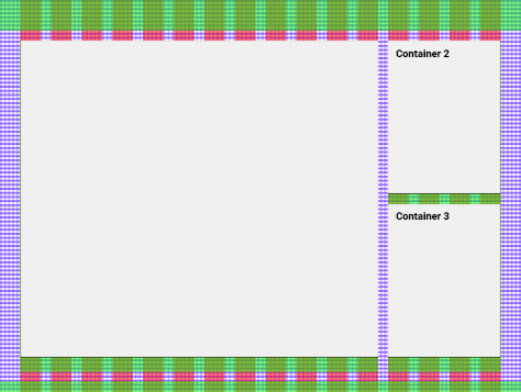
Containers—Every column in a layout holds containers that appear one after another in a stack. Figure 7 shows a container grid. You place content and controls within containers, which are useful in defining visual presentation—for example, using borders, backgrounds, shadows, and headers—and define interaction logic for the container itself. Containers make platform development easier and simplify adding new patterns or tweaking current patterns. If there are more elements than a container can display on a screen, overflow logic becomes necessary—for example, a Show More link that expands a list, page navigation, or infinite scrolling—whether vertical or horizontal. If you choose horizontal scrolling and want to change the style and position of arrows or add a swipe gesture for touch devices, you can do it at the container level instead of changing every instance. You can be also define overlays and tutorials.
Figure 7—Container grid
Typographic grid—Using the idea of base-text scaling will help you to build layouts. Gridlover is an online grid generator that brings most of these approaches together. The resulting type sizes should be based on the UI grid. For example, in our case, font parameters should be multiplied by four. This is easy to do for headings, but problems often arise with the body text. First, 16 pixels for the base text may be too large for a specific user interface. Second, Web-font rendering is unpredictable in Windows and often requires many hacks and tweaks. Nevertheless, if the line height fits into your UI grid well, it’s already good enough. Display and text fonts won’t break the grid.
Color palette—Add complementary values for your primary branding colors. First, define UI colors, including black and white and several shades of gray for base surfaces, borders, and supplementary text; colors for errors and other system messages—typically, red, green, and yellow; and colors for links. Second, define accent colors—for example, for content categories. These could use some variance algorithm—for example, to display states, they could be tinted or shaded. All of these additional colors should be harmonious with the primary brand colors. In addition to defining colors, define formulas for box shadows, setting standard parameters for transparency and blur.
UI controls kit—Once you’ve created UI and typographic grids and paired them with a color palette, you can create basic building blocks, including buttons—primary and secondary action buttons, option buttons, text and/or icon buttons for toolbars; links; generic and specific input boxes; drop-down lists such as combo boxes, date pickers, and country selectors for telephone codes; selectors such as check boxes, radio buttons, and switches; and UGC (User-Generated Content) loaders for photos, videos, and files. Each of these requires states such as focused, active, hover, and unavailable. Form elements should have field sets defined. Consider the placement of field labels, tip or descriptive text, validation rules, and error text.
UI icons—These should follow brand guidelines, so you can build a universal icon set for all products. Define their general style, stroke width, color palette, volume-representation principles, and their placement in user interfaces or promotional materials. Lay out small or mid-sized icons in a standardized grid.
Graphics and illustrations—You should define standards for photos, other content images, and user avatars, including their proportions, typical sizes, and alternate sizes for various screen resolutions. Try to fit them into the column grid. Define the general style of illustrations. Consider creating a mood board when making decisions about style. You can base large illustrative icons on the metaphors you’ve used in small UI icons, adding detail.
Infographics and data visualizations—These may include tables; common types of diagrams such a histograms, pie charts, and bar, line, and area graphs; specialty diagrams such as bubble, ring, radar, and span charts, Venn and Sankey diagrams, maps and cartograms, heatmaps, tag clouds, trees and tree maps, mindmaps, block charts, flow diagrams, timelines, and arc diagrams. You’d need all of these only for highly specialized products, but some of these are in wide use.
Animation model—In a perfect product, all transitions between states and screens should be based on a well-defined model. Animation should be consistent, making users more comfortable. For example, an overlay could slide down from the top of the screen, then slide back up when it’s closing. For a multi-step wizard, the next step could slide in from the right; the previous step, from the left. The best source of inspiration for animations are the three major mobile operating systems: Android, iOS—before and after iOS7—and Windows Phone, which introduced the modern approach to UI animation.
Ads—First, define an advertisement grid—within the limitations of the design grid—which typically determines the visual appearance of ads. To determine design-friendly ad formats, it’s critical that you communicate with sales as much as with developers. Set standards for your ad inventory. Define types and sizes of display and contextual ads, branding principles for pages and patterns, and limitations for full-screen banners and other aggressive advertising approaches. Set requirements for internal promotions as well. Second, define an advertising-layout grid, which determines where ads are placed in a layout.
Implementing Design Principles in Code
Once you’ve defined basic design principles, you can bake them into your CSS—thus, completing the first platform-maturity level. Designers should understand that they can build a truly future-proof platform. As I mentioned in Part 2 of this series, systems thinking and the continuous improvement of a design implementation throughout the product development cycle are key to delivering high-quality products. Modern CSS preprocessors like SASS and Less let you define variables, which is a great way of implementing design principles in code. Plus, icon fonts and SVG sprites simplify your usage of graphics.
If you keep your general design principles sufficiently abstract, you can define powerful UI standards that make visual divergences almost impossible. For example, to create a button:
Add the text Save in the base text size.
Add standard padding around the text.
Fill the space around the text with the standard background color for controls.
Draw a border using a standard color, stroke width, and corner radius.
Add a standard box shadow beneath the button.
As long as your design standards exist, those that you’ve defined will lead all designers and developers to consistently make the same design decisions, no matter where they are. Furthermore, once you’ve defined standards in code, you can easily update them globally, magically changing the design of your whole product line.
Also, code examples of typical page layouts, including a header, footer, content area, and columns will make your guidelines easier to use and understand.
Creating Common User-Interface Components
At the second platform-maturity level, all products use common user-interface components. Since your goal is to simplify your production cycle to guidelines = design = front-end code → implementation, your next step in building a platform is to create ready-made components on which you can base your product designs. A component is ready-made code that defines a UI element and applies the appropriate visual appearance and user-interaction logic to it. Components should be independent of their context, so you can put them anywhere, on any page, and they won’t break.
A component is a classic design pattern. Designers have always collected them in libraries and stencils for design tools and defined them in guidelines. The difference is that you’re no longer using deliverables to define them, control their implementation quality, or support them. Furthermore, if you want to update a pattern, you just have to change the code in the unified code base to update the component in all of the products based on your framework.
Semantics are important when you’re defining components. One basic principle is that the names for patterns should have semantic meaning and refer to types of elements rather than their style—for example, second-level heading or surface for cards rather than 24pt font or surface color #F0F0F0—or refer to their target usage—for example, main content, more information on a topic, or supplementary links. As long as you do this, the goal of making updates across your entire product line easy will work as intended.
Here are some examples of components:
navigation—These components could include tabs, alphabetical navigation, calendar navigation, search, filters, sorting controls, and a browsing history.
lists—These include drop-down lists, matrices, horizontal sliders, and asynchronous tile grids.
media—Components that display media might include videos, infographics, a photo gallery, and social-media embeds.
informers—These might be gadgets that display information about the weather, stocks and commodities, sport statistics, schedules, horoscopes, or world clocks.
social interactions—These include comments, surveys, ratings, feedback, and social sharing.
In addition to defining specific components, you should define typical page types based on them—for example, a news listing, article, search results, settings, user profile, sign in and sign up, blank pages, and server errors. Create newsletter templates as well. It’s best to standardize anything that you use more than once.
Some readers may think that having several products or services based on the same components might lead to boring user interfaces. However, your platform should let you stylize certain properties of components for specific products, without altering the main component’s essential design. For example, our team decided to use different accent colors for specific products. Each product has its own accent color to differentiate it from other products. You can also use different fonts, decorative elements, illustrations, and icons.
Creating Living Guidelines
At the third platform-maturity level, living guidelines exist, in which design principles and common components are implemented in code. Creating a great set of living guidelines in code is just another project based on your platform. Its first sections should describe general principles, which you’ve extracted from your actual CSS. Then include ready-made components that you’ve used in real products. You should describe each of these components, including where and why it should be used. Even if you’ve built a simplified system that is similar to Bootstrap, it will help you greatly in systematizing design.
The design solutions that you describe and show in guidelines should be 100% accurate. Having designers and developers use code and components that implement reference patterns radically simplifies quality control for a product line. You could go even further and set up an auto-healing system, in which a spider script occasionally goes through all products, comparing their CSS to reference values. Then, if there are inconsistencies, designers should get a list of the problems discovered.
Prototyping in Code
At the fourth platform-maturity level, you can build prototypes using components from your living guidelines. Once all key parts of a platform are up and running, you can simplify your production cycle even further and leave behind tools for deliverables creation entirely. When living guidelines show a component’s HTML code, it becomes easy to create a real page in an HTML editor using layout templates. And, once you’ve created the code for a page, it becomes even easier to fix it.
Many designers are no longer afraid to code. More designers must leave their fears behind. Coding in HTML and CSS are simple enough, and there are many simple tutorials and ready-made examples of code on the Web. Photoshop or Sketch are still great tools for design exploration. But, especially for responsive design, it’s getting harder to work productively without moving at least part of your design process into a browser.
If your company has the resources and your platform is mature enough, you could go further and build an online tool for visual prototyping. Designers could drag ready-made components onto a page to create an interactive prototype. The best example of this is the Polymer Project from Google, which lets you to create Material Design in a browser and is shown in Figure 8. Similar visual constructors exist for Bootstrap—for example, Jetstrap.
Figure 8—The Polymer Project’s Constructor
Going even further, a decent prototyping tool should be able to use real data. While good designers know not to use Lorem ipsum, it takes a bit of effort to create mock data. Showing different states of pages and patterns takes even more time, so making data easy to import into a prototype would help us to do this faster. Designers can already accomplish this in Sketch, adding both text and photos.
In addition to a functional prototype’s being cheap to create, it works much better as a communication tool. You can link pages and use all of the logic and scripts from the production version. Plus, pages are all properly responsive, so you don’t have to address same problems again and again.
Conducting Design Experiments
At the fifth platform-maturity level, you can conduct design experiments employing components. Design patterns don’t solve problems once and for all. You should always strive to find better solutions. You should experiment as much as possible and compare alternative approaches. You can get ideas for experiments from well-known or newly discovered problems, goals for product KPIs, fresh patterns that your competitors have implemented, or just the need to constantly fine-tune your designs. A great platform should afford the ability to do this systematically and inexpensively, making it simpler to do usability testing and run A/B tests.
First, you need the ability to create variants of components. For example, our platform at Mail.Ru Group lets us use alternative versions of components on different projects, if necessary. Although, we try to avoid doing this when we can. Second, you can save historical versions of patterns, including the details about and results of experiments. This helps you to learn why they worked or how they failed, so you can gain insights that you can apply when creating future enhancements. The main benefit of a platform is that every project uses an actual version of a component from the unified code base. So you can quickly distribute an optimized variant across the whole product line, and the company benefits from cumulative advances.
Implementing Algorithm-Based Design
We are seeing more and more examples of the algorithmic design of user interfaces. On algorithmic platforms, designers and developers define logic that considers content, context, and user data, then the platform compiles a design based on principles and patterns. In this way, it is possible to fine-tune the tiniest details of a user interface for specific usage scenarios, without your having to draw and code dozens of screen states.
For example, at Mail.Ru, we specified an automated magazine layout. The existing content had poor semantic structure, and it was too expensive to update by hand, so we wondered how we could achieve a modern design, considering that editors are not designers. A special script parsed an article and, depending on its content—for example, the number of paragraphs and words in each article, photos and their formats, and inserts for quotations and tables—the script chose the most suitable pattern in which to present parts of the article. This script also tried to mix patterns, so the final design would have variety. This saves time that editors would otherwise spend reworking old content, and designers just add new presentation modules. Flipboard launched a similar model last year.
Another great example is the infamous The Grid CMS, which chooses templates and content presentation styles and retouches and crops photos all by itself. Plus, the system runs A/B tests to choose the most suitable patterns. One more interesting example is parametric typography such as Robofont, which gives designers flexibility and presents new options. Algorithmic design is far from being an established approach—it’s rarely even discussed today. But, in the future, it could definitely help designers to achieve truly groundbreaking designs, even on more mature platforms.
Some Real Examples
The platform I’ve described may seem massive, but this approach is available to large and small companies alike. Bootstrap and Foundation already solve a lot the problems by implementing design principles in code, providing living guidelines, and supporting prototyping. Although these frameworks lack the benefits of a component-based system, they radically simplify updating a whole product line.
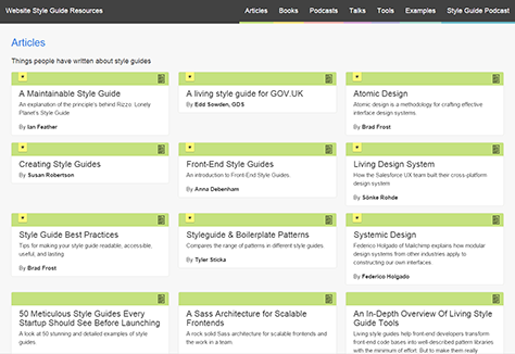
Anna Debenham was one of the pioneers in creating living style guides. On the Styleguides.io Web site, shown in Figure 9, she and Brad Frost collect examples of such systems, articles, presentations, and tools. This is a marvelous resource, and I strongly recommend that you check it out.
Figure 9—Styleguides.io
Brad Frost is the author of the Atomic Design ideology. He is currently writing a book on this subject, shown in Figure 10, and has already published some chapters from it on his Web site.
Figure 10—Atomic Design, a book by Brad Frost
Bundles for Mobile Apps
The component-based model that I’ve described is for the Web. However, at Mail.Ru Group, we’ve thought about applying this idea to mobile apps, using bundles instead of components. These are shared libraries to which we’ve applied a unified design. But for now, we’re focused on our Web platform.
Our Story at Mail.Ru
Mail.Ru is taking this platform approach, and we’ve already launched mobile Web and content-based projects. To get there, we’ve committed to the whole process of framework creation and implementation. We are now on the third and fourth steps of our framework-implementation process, which follows:
Create the reference design and the platform. We defined a suitable and scalable information architecture, interaction-design principles, visual styles, and a technical solution for implementing the framework.
Move all products to the platform. We’ve expanded our unified code base with new patterns and made the back-end for every product conform to framework requirements.
Refactor the design process. We’ve created design solutions for core product tasks and are fine-tuning the technical solution now, so we’ll be able to dispense with most design artifacts soon and create new screens out of ready-made blocks of code from our unified code base.
Refactor the design. We’ve released a dozen products and discovered a lot of problems after their launch, so refactoring their designs is taking a significant amount of time. Plus, design trends are changing, requiring further refactoring.
We’ve seen benefits from working with the platform from the very beginning, the evolution of our designs is becoming easy, and we’ve reduced unnecessary design-documentation work significantly. Nevertheless, looking back, I believe that we could have made the implementation process faster and shorter. I’ve told you about both our mistakes and our good decisions, so your job will be easier if you decide to follow our path. We have had our share of problems to be sure, but the overall result of this effort has been amazing for our products, our users, and our product teams.
When you’re implementing guidelines, they must be authoritative. To achieve systematic design, always use existing patterns and components whenever possible. However, if there’s a need to introduce something new, you should determine whether you’ll use it again in the future. If so, create a new pattern or component. This is the only way to keep your design framework up to date and your product portfolio consistent. It also ensures that your framework will be easy to support, enable you to create comfortable user interfaces, and be a positive for your brand.
We’re currently updating the visual design across our platform, so we’ll find out whether this is as easy as we intended. When rolling out a set of living guidelines, implementation takes a couple of years, so there is always the risk that new design trends may emerge. Even so, you should strictly follow your own standards. Sure, during the framework rollout, some of your products won’t have up-to-date visual designs. But once you’ve launched your platform, you’ll have the luxury of updating the designs for a dozen products at one time, in a matter of just a few weeks.
Conclusion
I’m absolutely confident that any modern UX strategy should employ such principles as those I’ve described in this article to ensure a good outcome for your products. If you want to build a solid, sustainable foundation for a product or an entire product line, you’ll have to forget about creating static guidelines and pattern libraries and instead take a platform approach. Guidelines and pattern libraries are just more interim design artifacts that add unnecessary costs to design projects. In contrast, platform thinking offers several benefits:
It becomes faster and cheaper to get new products and features to market.
It guarantees that you’ll achieve a unified design and sustain it in the future.
It lets you run more design experiments to find the best solutions.
It benefits your whole product line by scaling the enhancements you’ve made to individual products.
However, the main benefit of the platform approach is leaving behind the need to do massive redesigns every couple of years and, instead, being able to constantly update your designs. The platform approach lets you spend more time thinking about product design rather than design documentation and maintenance. Plus, you can stop creating mockups and move beyond Photoshop or other similar design tools.
Yury leads a team comprising UX and visual designers at one of the largest Russian Internet companies, Mail.Ru, which is part of the Mail.Ru Group. His team works on communications, content-centric, and mobile products, as well as cross-portal user experiences. Both Yury and his team are doing a lot to grow their professional community in Russia. Read More
