In Part 1 of our three-part review of UX Strategies Summit 2015, we provided an overview of the conference’s organization, content and presenters, proceedings, venue, hospitality, community, and workshops, as well as a detailed review of the workshop that Pabini attended, “Rapid Prototyping for Mobile Experience Design,” which was presented by Will Hacker. Now, in Part 2, we’ll review Day 1 of the General Summit, which took place on June 11, at the Marines’ Memorial Club & Hotel, in San Francisco, California.
Champion Advertisement
Continue Reading…
Highlights from Day 1 of the General Summit
The stronger day of the two-day General Summit, Day 1 began well, with all attendees together in the elegant Commandants room for two sessions:
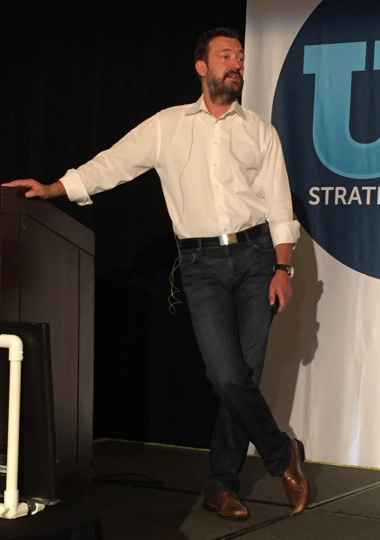
Klaus Kaasgaard, VP, Experience Design at Intuit, who is shown in Figure 1, talked about Intuit’s Project Harmony, which he has led over the past three years or so. Klaus told us, “[Project Harmony] is the most exciting and most successful design-driven project that I’ve been part of.” He was kind enough to share what he has learned from his experience leading Project Harmony.
Figure 1—Klaus Kaasgaard
Klaus began by sharing a telling quotation from John Legend, “The future started yesterday, and we’re already late.” Looking back to the early-to-mid-1990s, Intuit had won the desktop war with its small business products, including QuickBooks. However, winning on one platform doesn’t mean you’ll win on another. The world changes quickly, and Intuit recognized that there had been shifts in the market and user expectations, so they needed to introduce a new generation of products that could disrupt the market again.
Klaus pointed out that there had been four structural market shifts that had strategic implications for Intuit—shifts that Intuit had to address:
“being a great product and network-effects platform company”—For a platform company, users and third-party developers can contribute to products and their ecosystems, which increases value creation for both users and developers. “Open ecosystems and network effects win” in the competitive marketplace. Thus, Intuit had to deliver great products, become a platform company, and create network effects.
“accelerating growth through cloud-driven global services”—The cloud “redefines service relationships and expectations.” Users’ ability to access any application in the cloud creates “a world without borders” and “significantly expands addressable geographies.” Intuit needed to deliver global services in the cloud.
“re-imagining user experiences in a mobile-first world”—Today, “mobile experiences prevail.” Intuit needed its applications to work seamlessly across devices, creating product user experiences for a mobile-first world.
“capitalizing on data to create delight and drive growth”—Intuit needed to create secure, intelligent systems that take advantage of both user and system data to surprise and delight users and drive growth. They had toleverage new sources of competitive advantage based on these insights.
Core Capabilities and Goals
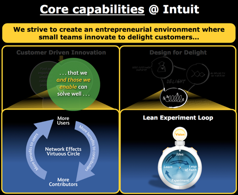
Klaus then turned the conversation to focus on Intuit’s goals and core capabilities, which are depicted in Figure 2: customer-driven innovation, design for delight, the Lean experiment loop, and network effects. These are key to Intuit’s success in the foreseeable future.
Figure 2—Core capabilities at Intuit
At Intuit, “we strive to create an entrepreneurial environment where small teams innovate to delight customers,” said Klaus, then he explored Intuit’s goals and core capabilities in depth:
customer-driven innovation—Intuit’s goal was to “find an important, unsolved customer problem that we and those we enable can solve well, and build durable competitive advantage.” Scott Cook, Intuit founder and early CEO, encouraged teams fall in love with the problem, not the solution. “The worst thing that can happen to a designer is to fall in love with their solution,” declared Klaus. Teams should explore multiple ideas, instead of getting stuck on the first possible solution that came to mind.
design for delight—The core tenets of design for delight are deep customer empathy, go broad to go narrow, and rapid experiments with customers. “The desired outcome: product experiences that connect with customers emotionally.” For example, at Intuit, teams engage in “follow-me-home” studies. Even Scott Cook followed customers home so he could watch them install Intuit’s products. This deep empathy is still alive and well in the Intuit mindset.
Lean experiment loop—Teams explore their way to an optimal market fit. Experimentation used to be about prototyping, but today, teams follow a lean experiment loop, which begins with identifying possible product ideas. The team then takes a leap of faith, which results in an experiment from which the team learns by prototyping and evaluating an idea. The team then either tackles the next leap of faith or pivots to a new idea. This lean experiment loop has become such a core part of Intuit’s business that it’s a pervasive mindset there today.
network effects—Intuit is focusing on creating network effects because this is the most durable competitive advantage a company can have today. Take Facebook for example, with their billions of users.
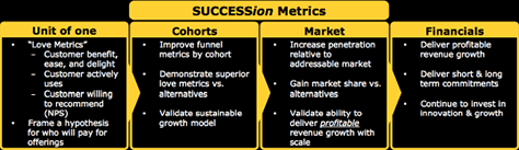
SUCCESSion Metrics
Every company leverages metrics to evaluate their success. At Intuit, they have developed what they call “SUCCESSion Metrics,” which are shown in Figure 3. These include unit of one, cohort, market, and financial metrics.
Figure 3—SUCCESSion Metrics
Klaus particularly likes the “Love Metrics,” which provide focus for Intuit. Their intent is to determine whether they’re providing real customer benefit. While Intuit, of course, cares about usability, even more importantly, they want to delight users in a surprising way. In a mobile world, delight is a fundamental requirement. Thus, Intuit’s Love Metrics assess customer benefit, ease, and delight; customers’ active usage; and customers’ willingness to recommend their products.
Re-envisioning Success for Intuit
Klaus pointed out that, even though Intuit had created a marketplace in which consumers expected easy-to-use budgeting and tax software, in around 2010, they had started to lose their way. They were still working in a linear fashion—defining requirements, designing solutions, then building them. They had a highly skilled UX team, but were producing poor designs. They delivered complex products that confused users—and worse, there were completely different interactions across their products and even within each product. With seven or eight products serving the same customer, each product’s tone, voice, visual design, and content were inconsistent with the others. At that time, there were only loose connections between the products. They had even begun to do what so many other companies do—they had revealed their organizational structure in their designs.
Intuit needed a turnaround. As Intuit’s new UX leader, Klaus had to create a consistent user experience across the Small Business group’s products. To achieve this goal, he launched the Harmony Ecosystem project. “Our vision is to create a cohesive, multi-device user experience that unites Intuit’s Small Business products,” Klaus told us. To succeed, Harmony had to accomplish three things:
“Develop a scalable UI framework and the underlying services and infrastructure that make up a modern technology platform.
“Unify its disparate interaction models and interfaces into one coherent ecosystem across the various products.
“Institute a completely new way of working for Intuit’s designers and developers that placed the needs of the company above the needs of the individual business unit. From now on, there will be one team with one goal, and it will be design-driven.”
While Intuit had perfected “the art of the standalone business unit” to succeed in the marketplace, these business units had worked in a siloed way and their products reflected that. This had resulted in disparities in their products’ user experiences. But users no longer worked only in individual products. Klaus recognized that, in addition to designing great individual products, they must create unified product lines. They needed systems thinking. “We were struggling to think as systems designers rather than app designers,” admitted Klaus. So the leaders of Intuit’s business units had to bridge the divides between them. Therefore, these leaders aligned behind a powerful new set of three decision criteria:
“Intuit’s core products will work together. Any product that acts as a customer’s first point of contact will introduce the customer to the entire ecosystem.
“When there are common jobs or tasks across products, Intuit will use common designs and components. If a problem has already been solved, we will use that component. It may not be the best for one, but it will be the best for all.
“We will share data across teams. If a product captures [data], that product needs to enable other products to use it.”
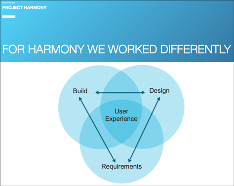
Thus, Project Harmony had to work somewhat differently from the way teams at Intuit had worked in the past: They decided to form a trifecta among Product Management, Design, and Engineering, making user experience central to their strategy, as shown in Figure 4.
Figure 4—Working differently to produce great user experiences
Updating Their Design Approach and Engagement Model
Intuit has taken a completely new approach to design:
breaking down applications into components
defining structure and layering logic
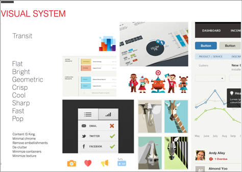
defining all elements of a visual system, including a color palette and information visualizations
As shown in Figure 5, the visual system is flat, bright, geometric, crisp, cool, sharp, fast, and pops. Klaus made this important point: “Users need to get access to the data itself, not the UI’s visual elements.” Thus, the goal of the visual system is to ensure that content is king, and users focus on the content, not the user interface (UI). The UI should not call too much attention to itself. Therefore, its designers minimized the applications’ chrome, removed embellishments and decluttered, and minimized containers and texture. “They defined an entire color palette that could be used across the products and for various components of the platform.”
Figure 5—Intuit’s new visual system
“With these elements in place, developers could create pages on their own,” said Klaus. Since all of the design components had already been defined and implemented in code, they could simply add components and hook them up to an application’s back-end. Plus, “designers had more time to focus on innovation and emotional design.” As a result, Intuit is now completely re-envisioning many of its products, which has involved significant trial and error.
To deliver delight, Intuit has focused on optimizing applications for first-time use. Thus, consumers feel more engaged by and even love the re-envisioned products. Because Intuit produces financial software, the applications must be clear, intuitive, and not too flippant. Their goal is to enable users to perform any transaction from anywhere in an application, so they’ve created a Global Create function.
The Outcome
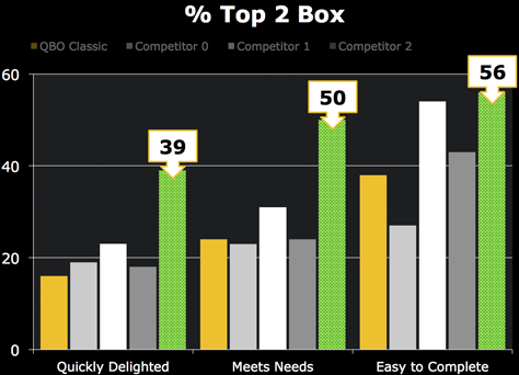
So, how is Intuit doing so far? Three years ago, their Love Metrics could be summed up as Meh or just okay. When Intuit launched Harmony two years ago, the Love Metrics quickly delighted, meets needs, and easy to complete increased significantly. In fact, metrics for QuickBooks indicated an almost two-times improvement over the old version and most of its competitors, as shown in Figure 6.
Figure 6—Intuit’s user experience measurements
Plus, the Harmony Ecosystem has received great press. The trade journal Intuitive Accountant said, “The new QuickBooks Online is almost artistic in appearance…. It’s the most visionary change I have seen out of Intuit in ages; heck it is almost Apple-like.’’
The reality is that very few companies are able to recognize the need to make a platform shift—or an overall market shift—and transform to successfully make these shifts. The innovator’s dilemma prevents their recognizing the need to change, so companies continue following the same recipe that made them successful many years back—often long after markets and consumer expectations have changes. The fact that Intuit recognized the need to change and took steps to disrupt itself says good things about the company.
Of course, the history of this change remains to be written, but for Klaus, creating the Harmony Ecosystem has been an exciting journey. This journey began with empowerment by executives, one of whom said, “I don’t want engineers to tell you what you can’t do, because of their monolithic code base. I want to start with designers.” Two or three months into Harmony, the designers brought in engineers and product managers to get their feedback and talk about how they could get their new vision implemented.
Some Lessons Learned from Harmony
Teams need to be decisive. Klaus exhorted us to: “Make bold design decisions based on gut and experience. Otherwise, you try to research your way out the situation. You move too slow. You need these types of decisive people in your organization. If you don’t, you end up spinning, and there’s nothing worse than spinning. … Give designers the power to make decisions.” If designers have seen a design pattern play out 100 times and know the outcome, leaders and engineers should trust them, not ask them to run yet another usability test or A/B test. Collaborating means trusting your partners.
Leaders have to change the mindset of people in the company to become design led. For example, the designer and product manager must take ownership for more than just individual products. They need to take ownership for an entire ecosystem, as well as for the user experience across that ecosystem.
One of the biggest challenges Klaus confronted during the Harmony project was the need to create intense focus on the top priorities. Klaus advised, “You can never do everything at once. You’ll fail at everything when you do too much. You need to be decisive when it comes to prioritization and do what matters most.” For Harmony, leadership needed to make decisions, then allow the UX team to stay focused on and execute the highest priorities. Leaders should not spread their teams thinly across multiple projects. Instead, they must make good decisions and give the right level of resourcing to each project, so teams can deliver maximal value by creating great user experiences. While a UX design project that has a low priority may not get any UX resources, empowering engineers by giving them the tools they need to build good, basic user interfaces ensures good outcomes. Delivering maximal value is not just about creating great application designs, but about designing great ecosystem experiences, which requires the support of executives.
Mapping Experience
Reviewer: Jim Nieters
Presenter: Tom Hobbs
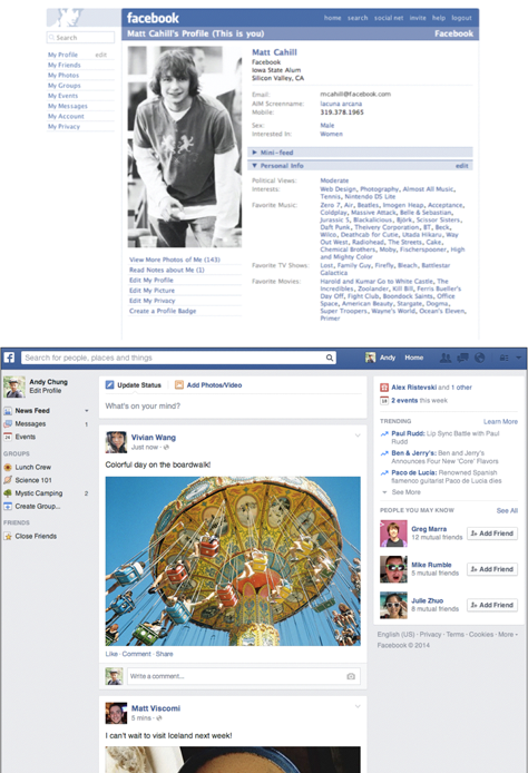
Tom Hobbs, shown in Figure 7, has a challenging job as Product Design Manager at Facebook, where he leads UX for their Advertising group. He began by showing how Facebook has evolved over the years to create greater engagement as the social-networking market and user expectations have changed. Figure 8 contrasts an early version of Facebook with Facebook now. Tom observed that “Facebook has changed quite a bit over the years. Most people now use Facebook on mobile. That was a huge shift. How could we have mapped that up front? We couldn’t. It was about figuring out what was good along the way.”
Figure 7—Tom Hobbs
If you look at how Facebook has evolved across the years, each individual change does not appear too significant. In the end though, these small changes have resulted in a powerful platform that makes the world more open and connected.
Figure 8—Early and current versions of Facebook
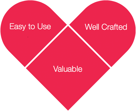
In evolving Facebook’s design, “a lot of this was figuring out what was good along the way,” acknowledged Tom. One of the tools they used to evaluate what is good is a pyramid, with value as the foundation, then ease of use, and craft at the top. Their aspiration is for people to love using Facebook, so they then turned these three qualities into a heart, as shown in Figure 9. Their goal is to ship love! What a great concept!
Figure 9—Shipping love
Does a Solution Provide Value?
Tom spoke about how, first and foremost, a site or product must provide value. How do you know whether it is providing value to its users? Answering this question requires getting answers to several other questions:
“Do you know who you are building for?
“Are you solving a real problem for this person?
“Is it valuable?
“Is it immediately and tangibly valuable?
“Is the product stable enough for this person to rely on it?”
The UX team did “ethnographic research to identify what is valuable,” noted Tom. They were “trying to address a lot of needs across a lot of different people.” Plus, they recognized that they had a lot of different sub-products within Facebook. Unfortunately, each product’s user experience was different. So they needed to create a common set of simplified formats that they could deploy across the platform in a consistent way.
Is It Easy to Use?
“If someone isn’t getting value, ease of use and craft don’t matter,” observed Tom. So, only once the UX team had answered the question “Is it valuable?” did they ask “Is it easy to use?” But they had to determine what easy to use means. Ease of use is contextual, depending on the users, their knowledge, and their goals:
“Are the things I do most the easiest to do?
“Are the less common features still discoverable?
“Is the interface fast and responsive to my touch?
“Is the content clear and easy to understand?”
Taking Facebook for Android as an example, it turned out that very few Facebook employees use Android products, so they needed to go to external Android users to learn about their experience of Facebook. They did studies that evaluated Facebook performance on Android devices, the number of crashes, and its perceived reliability. While UX researchers might typically look only at time on task, actual and perceived performance and reliability also impact the ease-of-use score. The UX team assessed ease of use based on the overall star ratings for Facebook for Android in the app store as well.
Bringing Craft and Humanity into the Product
The UX team questioned, “Is it well crafted?” Regarding craftsmanship, Tom said, “Designers think about this as fit and finish. Engineers talk about craft.” They assessed the level of craft by asking:
“Are the visuals beautiful and faithfully executed?
“Are there moments of delight and magic?
“Do we sound human and approachable?
“Do we handle failures and edge cases gracefully?
“But there are other things that go beyond fit and finish,” acknowledged Tom, so the UX team then asked:
“Are there factors beyond the fit and finish that matter to users?
“Can we bring humanity and approachability into the product?”
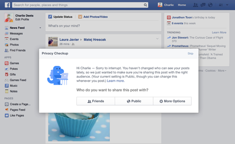
For Facebook, one implication of this was proactively making sure people weren’t over-sharing through a Privacy Checkup, shown in Figure 10.
Figure 10—Privacy Checkup
“So goodness is defined as making things valuable, easy to use,
and well crafted, but how much should you invest in each?” asked Tom. The Facebook team needed to determine how much they should invest in making changes or additions to the platform. “How do you decide if it’s worth investing in something new? All of us have to invest in our platform. The world is changing around you, and you have to change with it.” So they knew they needed to invest, but they had to decide what to invest in. Looking back to about 2004, Facebook was all about finding new things, but the Facebook team knows they haven’t always made it easy to find new content.
“At times, we’ve done new things that hurt our core user base,” admitted Tom. Do users always trust Facebook? How important is it that they do? This quotation from Mark Zuckerberg suggests that Facebook has learned a lot from their mistakes:
“About a month ago, we released a new feature called Beacon to try to help people share information with their friends about things they do on the Web. We’ve made a lot of mistakes building this feature, but we’ve made even more with how we’ve handled them. We simply did a bad job with this release, and I apologize for it.”—Mark Zuckerberg
Innovating at Facebook
Tom touched briefly on Facebook’s need to innovate to create sustainable differentiation. An underlying part of the Facebook culture is running hacks every six weeks. These hacks have been very successful in driving the evolution of the product.
But they also needed to think about how to evolve the product in a more creative and sustainable way, so they founded Facebook Creative Labs to incubate and drive new products. Tom assured us that it’s “not an ivory tower. There’s movement in and out of this group. It’s not about just ideas that come out of this group.”
Product Briefs: Creating Clarity Across the Company
Many product teams create complex MRDs (Marketing Requirements Documents) and PRDs (Product Requirements Documents) that very few people actually read. Tom explained that Facebook instead decided to create clarity about product direction by creating product briefs, which are simple, clear summaries of a product’s core capabilities and help clarify the value of a product for the entire company. “Product briefs are a very critical part of designing strategy and move things forward,” said Tom. Developing product briefs
“helps teams develop a better product strategy
“creates a clearer understanding of the goals
“builds a shared understanding early on” across the entire product team—“not just the design team, product managers, engineers, and everybody else”
“[makes it] easy to share [product strategy] with other folks across the company”
Product briefs ensure that a team’s goals are out in the open, and people across the company can see the value of the product strategy. What are the properties of a product brief? They provide
“value for people—Why should this product exist? Who is it for? How does it make that person’s life better? Different people have different stakes in the product.
“company impact—Why is doing this good for the company? Why should our company in particular do this? What value does it bring to the mission we’re trying to achieve overall. Many companies try to replicate the success of another company. You can’t. That’s theirs.
“metrics for success—How will we know if we’ve succeeded? You have to know what it means to succeed and measure that.
“inventory of work—What will or won’t you take on as part of this, and why? What are you going to do? Start on first? Think about [the product brief] as a top-down, prioritized list to get to what we’ve defined success to be in the shortest time.”
Tom shared a couple of examples of product briefs from projects, highlighting how teams defined these properties. For the first example, Tom showed us how they defined these properties for Groups:
“value for people—People who want to share in small, audience-aware clusters”—such as a family, an organization, or a sports team—“will have a familiar, safe place to do so.
“company impact—Giving people more tools to share with the right audience in the right forums is Facebook’s mission. Groups should lead to more engagement across the app.
“metrics for success—[The] number of daily active Groups [should be greater than] X within Y months. [The] participation rate of Facebookers using Groups [should be greater than] Z within Y months.
“inventory of work—Options in groups—open, closed, secret—groups page, notifications system, group chat.” What is the scope of work, and what will not get built?
Next, we looked at an example of a product brief for a product called Atlas:
“value for people—Improve advertiser ROI” (Return on Investment); “more efficient and effective methods for digital advertising; consumers see more relevant messages and [fewer] ads overall.
“company impact—Expand the value of Facebook advertising to the rest of digital advertising.
“metrics for success—[The] number of measurable impressions served.” Or, is there a measurable increase in clicks or conversions?
“inventory of work—Campaign setup and management, reporting and measurement systems, targeting and tagging systems.”
Tom advised, “Take the time to define value before embarking on a new product.”
Bringing Data into the Equation
“How do you know you are making those products successful?” asked Tom. “There are lots of examples of products that were not initially successful.”
Tom observed that teams across the industry, and certainly at Facebook, are talking a lot about metrics. He recommended finding ways of instrumenting sites, which lets you collect a huge mass of data. But the important thing is knowing that you’re measuring the right thing. “If you’re measuring the wrong things, it leads to wrong decisions,” warned Tom. “Choosing the right metrics is really challenging. You shouldn’t measure just to measure.” So you need to figure out what the important data points are and drill into the right issues, so you can figure out the path to success. Gathering and analyzing metrics
“Tells you how things are going
“Alerts you to problems and opportunities
“Lets you do A/B testing
“Lets you set clear, numerical goals”
Measurement is useful, but when teams see actual improvement, that excites them. When you see +5.5% growth over the last quarter, your team gets excited, and this can drive them to work harder and better. So, metrics provide value for a platform, but the right metrics can also help engage the team better.
Tom recommended some basic metrics of success that every business should track, including the following:
traffic
engagement
new users
people leaving or staying
where the trends are
where people are focusing
Looking to the Future
Tom posited that teams need to consider what the competitive landscape would look like in three years if their product succeeded. “You have to have some hypotheses of what it’s going to look like in three years,” advised Tom. “Five years is too long. A year is not long enough for it to be visionary. Three years is a pretty good place to look.” You should ask, “How will people use this product? What will the competitive landscape look like? Who else is going to bring products in?” Teams need to be forward thinking, because the competition is. “Think about what people could do, move it to your worst fear, and assume people are going to do that,” suggested Tom. While “a three-year vision is hard to pin down to a number,” you can put your vision into a mission statement that everyone can understand. Then, you can measure whether you were successful against that vision.
Once you’ve identified your three-year vision, your team needs to map out what needs to happen in year two, then year one, and finally, in the next six months for you to arrive at your three-year goal. At Facebook, this meant asking such questions as the following:
What’s the high-level strategy? Should we go to market by vertical segment? By demographic? By region or market?
What’s a realistic trajectory? While a team might want visitors and revenue to jump by 50% in one year, it’s not realistic to think that these metrics can grow by just 5% in one year, then by 50% in the next.
Where will you need to be relative to your competition?
What’s the specific plan for the next six months?
Of course, your team needs to re-evaluate your three-year plan every year, because the competitive landscape changes very rapidly, and you might not have been right about where things are headed. But teams that lack a three-year vision for their product can’t possibly evolve rapidly enough to keep up with changing market demands.
There’s Always More To Do
Even considering their site’s massive evolution from 2004 through 2015, Facebook still believes that they’ve done only 1% of what they ultimately need to do. There’s still a lot more to do. Their strategy gives them a framework for figuring out where they need to grow.
Also, as Tom pointed out, it’s not always possible to know ahead of time what changes the market will bring. Therefore, it is the responsibility of each of their teams to justify their decisions and understand how their work contributes to the next-level goals of the company as a whole.
Through Burnout and Back Again: UX Skills That Saved My Life
Reviewers: Jim Nieters and Pabini Gabriel-Petit
Presenter: Jaimee Newberry
Jaimee Newberry works as a corporate advisor and coach through her company SWINGSET and is shown in Figure 11. She shared the story of her personal journey and gave an inspiring talk. The central point of Jaimee’s talk was something she had learned from her dad, “Life is short. Love what you do. Don’t waste time. Make the most out of life.”
Figure 11—Jaimee Newberry
Jaimee realized, early in life, that life is too short to waste time doing things we don’t want to be doing. She needed to love what she does, so she decided to be a designer. Jaimee confided, “I made a heart choice to do design. My work was my salvation. I was a designer. I cared. I was invested. I loved what I did. Doors of opportunity opened.” She took pride in being a designer and poured everything into her design work. Jaimee brought her passion and dedication to her work with some amazing design agencies, where she was able to produce some great-quality results.
When her dad died, Jaimee learned that it is possible to “take something positive from a negative experience. My dad died doing something he loved. The odds of that happening were really high, because that’s how he lived. That was a pretty good lesson.”
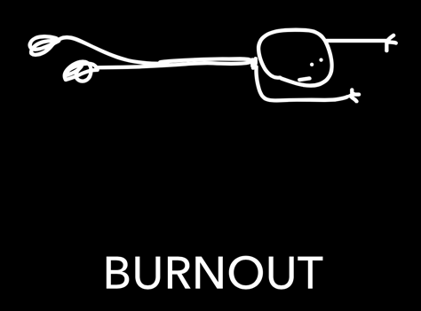
Even though Jaimee loved the people she worked with and loved her clients, she eventually reached a point where thinking about working on another project made her physically ill. Her work had been her life; it had been everything to her. But it was no longer possible for her to pour her life into her work. As shown in Figure 12, Jaimee was experiencing burnout, so she quit her job.
Figure 12—Jaimee experiencing burnout
“My expectation was that my work would rescue me as it had before, but that didn’t happen this time,” Jaimee admitted. “After fifteen years, I couldn’t connect with my work the way I had before. As responsible designers, we have to connect.”
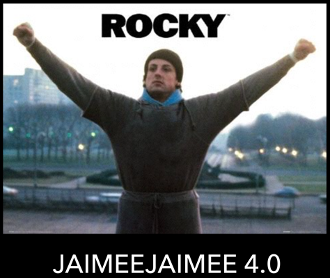
Jaimee first looked for insight in self-help solutions. She didn’t know how to proceed, but she knew she had to move forward. She told us, “I needed to get myself out of this funk. Giving up was not an option.” She had two children who were depending on her. Jaimee loves the movie Rocky, shown in Figure 13. Fighting to build herself back up, she took inspiration from this Rocky Balboa quotation: “All I want to do is go the distance.”
Figure 13—Jaimee’s inspiration, Rocky Balboa
Ultimately, Jaimee realized that she could draw on the tools she used as a designer to solve her problems and rethink her life. She could use the processes she knew for making products to design her life! She thought about the parallels between life and products.
Jaimee decided to reinvent her life by following the four steps in a user-centered design process:
understand—Jaimee realized that she needed to “ask the right questions.” This was something she could do. She aimed these questions at herself: “What problem am I trying to solve? What is the most important thing for me right now to get unburned out?” Jaimee had another realization: “Breakdown occurs when clarity of vision is lacking.” Getting clarity around what was important, she used that to solve her burnout problem.
discover—Next, Jaimee turned to the discovery process.
context—“Designers don’t just pick a target audience. They need to understand what’s going on around them every day,” observed Jaimee. With this in mind, she looked at the context of her life, including behaviors, environment, users, brand, existing patterns, data, and feasibility, as illustrated in Figure 14. She asked, “What things are happening that you have to be aware of? What in your environment impacts your ability to make a change?” Jaimee did stakeholder interviews with her children to figure out how she could be a better mom. She interviewed her kids’ teachers to better understand them as human beings. She looked at some existing patterns and considered where she could make changes in her life—just as a designer does with products, judging the feasibility of various changes.
brainstorming—Next, Jaimee brainstormed goals, tools, and solutions, thinking of them as a series of puzzle pieces. She noted, “We get so problem focused in our work that sometimes we forget to look at what’s good.” She tried to recognize and build on the aspects of her life that were already going well.
design—Jaimee looks at design as “solving puzzles—until you find the thing that fits.”
considering all situations—Jaimee told us about her personal experience with Disney’s Magic Band, which makes the already pretty great experience of going to a Disney park even better. She exclaimed, “It’s a miracle! They really looked at the context of the problem.” The Magic Band retains all the data that park-goers’ might need—your ID, your credit card information, fast passes that let you schedule rides ahead of time; and, if you’re staying at a Disney hotel, your room key—so you don’t need to carry a wallet. If you buy souvenirs using the Magic Band, Disney sends your purchases directly to your room, instead of your needing to carry them around the park all day.
designing behavior—“Design for life and behavior,” suggested Jaimee. From Charles Duhigg’s book The Power of Habit, she learned the concepts of Trigger, Action, and Reward, which were integral to her life-design experience. “We look at people’s behavior, get them to take an action, and reward them for taking that action.” For example, the inventor of toothpaste, created a trigger—Feel that gritty film over your teeth?—that prompted an action—Brush your teeth!—then rewarded people with better breath and reduced tooth decay.
creating tiny habits—After reading B.J. Fogg’s book Tiny Habits, Jaimee realized that she needed to create tiny habits—breaking her routines down to tiny actions that are so small she can’t help but do them. “We can make big changes by making small ones first,” acknowledged Jaimee. “Celebrate the little things. We can celebrate our little achievements by actually rewarding ourselves. Reward is a really big part of this. Some positive affirmation. Give yourself a pat on the back for what you did do.”
iterate—“Get something out there and get feedback on it, so you can iterate. … Fail or succeed, then try again. Test, tweak, revise,” advised Jaimee, emphasizing that the iterative design process is ongoing. Only by iterating and learning can we make things better.
Figure 14—Discovery through context
Once Jaimee had recovered from burnout by going through this process, she got really excited. She realized, “I could take everything that I knew about designing products and apply it to life. I started seeing positive change.”
Jaimee began to see a way to connect to her work again: she could actually use this approach to help people and businesses. So she shifted her focus and has since become a coach for individuals and teams, showing them that they already have the tools they need to solve real problems, whether for themselves or their companies. She helps UX teams that are struggling. She gets people to collaborate better. She helps CEOs and CTOs to fold UX into their business. She helps clients to focus on what’s important in their life and make changes.
Jaimee concluded by saying, “By understanding you have the tools already, you can prevent the burnout.” Jaimee’s process is amazing—both for individuals and teams.
Case Study: Bringing Sexy UX to Enterprise IT
Reviewer: Jim Nieters
Presenter: Alix Han
Alix Han, User Experience Lead at Qumulo, who is shown in Figure 15, found herself getting tired of working on consumer products after working for MSNBC, Zillow.com, the Seattle Seahawks, and others. So, currently, she is in her “Happy Zen” place at Qumulo, an enterprise technology company in the network-storage space. At one point, Alix quipped, “There are a lot of enterprise products that just suck so bad; so I decided to move into enterprise.”
Figure 15—Alix Han
During her talk, Alix made the point that making UX for the enterprise world sexy is crucial and presents many interesting challenges. She provided this definition: “Sexy UX is when you get a product or service that is so damn good that it is desired by users and noticed by competitors.” Alix defined user experience as the total experience that shapes the user’s behaviors, attitudes, and emotions about the company, its employees, products, and services.
Alix began her talk with a lengthy history of enterprise data–storage user experiences. If you look at the evolution of these user experiences since just 2000, you can see that it began with IBM offering sets of giant manuals that described how to use a command-line interface and cost $150,000. That’s right—just to use the product, the customer had to spend $150K to read hundreds of pages of technical manuals.
In the early 2000s, Web sites such as Facebook, and Flickr democratized and facilitated knowledge acquisition. In the mid- 2000s, we saw huge growth in Web-application user experiences. Then, Apple came out with the iPhone, which changed the game completely, making a type of product that had previously been enterprise technology into something consumers coveted. Experiences like these made people believe that using any product should be easy.
In about 2010, IBM got rid of its manuals, but instead began creating long YouTube videos that described how to use their storage systems. Sadly, even these were too complex and comprehending them required expert knowledge of data storage and Web development. Crazy, right?
To understand the challenge of network storage, consider this question: How much data is being generated on the Internet every minute of every day? Figure 16 shows an infographic that answers this question. The volume of data is truly massive, which means network storage has become critical.
Figure 16—“ Data Never Sleeps” infographic
In 2012, CEO Peter Godman formed Qumulo with a specific vision in mind:
“When we built Qumulo, we didn’t start off with a vision for a product. We started off with a vision of how to build a product that people cared about.”
Alix reported that 42% of startups fail expressly because they do not understand or solve a real market need. She enjoys her role at Qumulo because they trust the people who work for them. At Qumulo, their goal is to hire only people who are not assholes and develop a team of people who they feel lucky to know. Alix advised us to: “Trust the people you hire to do their jobs well until they eff up. Management is the removal of trust.” Qumulo lets their UX leader make all UX decisions. What a concept! How often do we hear UX leaders saying that they are trying to get a seat at the strategy table?
Alix told us that Qumulo believes only way to continue creating the right culture is to provide venues for teams to interact—because “teams that socialize, work better together. Different teams need to interact with one another.” The main thing that optimizes teamwork is creating shared successes. “Everybody participating should feel like they’re part of the win,” and everyone should get credit.
Alix pointed out the importance of agreeing to “say no to HiPPOs”—the Highest Paid Person’s Opinions. “HiPPOs quickly shoot down others’ ideas. They destroy trust in companies.” One way to get rid of HiPPOs is to share why you’re making a decision. Another way is to share data. When you use the scientific method, personal opinion doesn’t play a part in the process. When you don’t have trust, you’ll have to play the game of office politics. “Always tell people why you make decisions. Over time, they’ll become UX advocates.”
Once Qumulo established trust and got rid of HiPPOs, they conducted extensive external user research. “Our customers are our magnetic field. Everything we build is driven by their challenges and designed around their needs,” said Alix. So Qumulo gets super creative about how they conduct research, has created a Best Listener Award, and awards customers membership in Maximum Q, as shown in Figure 17.
Figure 17—Maximum Q
The ugly truth that the Qumulo team discovered is that there’s a gap between what enterprise data–storage admins want versus what data-storage companies want to produce. Enterprise data–storage admins want to buy less to save money, to be empowered, and to know how storage is being used. They also know that millions have already been spent, so they can’t easily use another storage solution. In contrast, data-storage companies want to sell more to make more money, to sell more support. They say, “Don’t worry, we’ll tell you how much more to buy, show that you still need more storage, and take advantage of the non-transferable nature of storage.”
Alix quoted Qumulo VP of Products, Jeff Cobb, “You have to be led by what delights the customers, not what minimally satisfies them.” Customers ask for something specific, but that doesn’t mean it’s the right solution for them. The point is that you shouldn’t build what people ask for, you should build what they really need. Qumulo realized that there was a new way to approach selling enterprise data storage, which is shown in Figure 18.
Figure 18—The old way versus Qumulo’s way
At Qumulo, they actually experimented with product team structures to determine what worked best for each of the core roles: product management, user experience, and development.
Alix suggested that other designers should consider enterprise UX, because there are significant problems to solve. She offered these key takeaways:
“Enterprise users are people, too.”
The voice of the customer and the voice of technology are equally strong.
“Trust is crucial.” Teams must trust the UX experts they work with.
Teams need to “listen for the real needs” of users, not just deliver what the business thinks they want.
Organizations need to “experiment with team structures” to get them right.
Alix and her team have had great results with the products they’ve designed. One product is so cool that some customers have said, “I love it! Wow! It’s really the best user interface I’ve ever seen for storage admin.” What a great result! I can see why Alix wanted to move to enterprise UX.
The Quest for Excellence in UX Leadership: Building Company and Team Environments That Foster Inspiration and Creativity
Reviewer: Pabini Gabriel-Petit
Presenter: Darren Hood
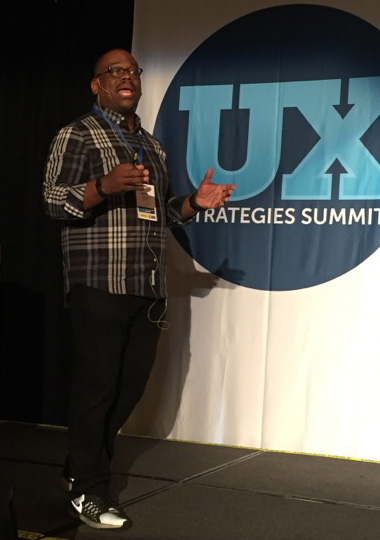
Darren Hood, Senior UX Consultant at Bosch and Adjunct Instructor at Kent State University, who is shown in Figure 19, gave a great talk on UX leadership. He began by asking and answering the question “What is leadership?
“Leadership operates on the front lines. Leaders are engaged.
“Leadership provides insights that help transform vision into reality.
“Leadership empowers others to fulfill the tasks at hand—to do their jobs.
“Leadership influences others to willingly ascend.
“Leadership is more of a function than a position.”
Figure 19—Darren Hood
Achieving Excellence in UX Leadership
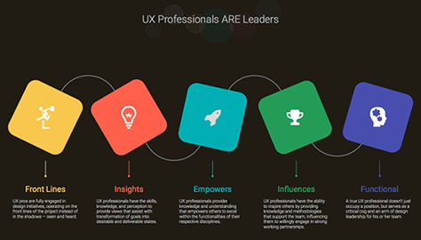
Darren acknowledged that “UX professionals are leaders by trade, but in reality, we mature into such roles.” Figure 20 shows the many ways in which UX professionals are leaders. Elaborating on the characteristics of UX leaders, Darren told us:
“front lines—UX professionals are fully engaged in design initiatives, operating on the front lines of a project instead of in the shadows. [We are] seen and heard. We aren’t going to just sit on the wayside. We’re interwoven into the design process.
“insights—UX professionals have the skills, knowledge, and perception to provide views that assist with [the] transformation of goals into desirable and deliverable states.
“empowers—UX professionals provide knowledge and understanding that empower others to excel within the functionalities of their respective disciplines.
“influences—UX professionals have the ability to inspire others by providing knowledge and methodologies that support the team, influencing them to willingly engage in strong working partnerships.
“functional—A true UX professional doesn’t just occupy a position, but serves as a critical cog and an arm of design leadership for his or her team.”
Figure 20—UX professionals are leaders
“What mindsets, strategies, and methodologies can we employ to achieve and secure functioning as leaders?” asked Darren. Getting to the heart of his talk, he shared nine principles of UX leadership excellence.
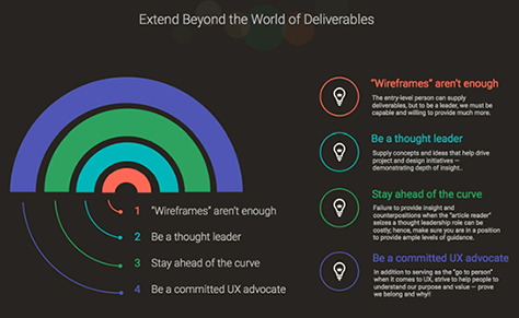
1. Extend beyond the world of deliverables.
“Being immersed in the world of deliverables is not enough,” cautioned Darren. “Wireframes and personas give some insights into what we’re trying to accomplish, but you have to go beyond that. You can’t be a leader if you’re focusing on deliverables. UX professionals should now function as business leaders and key functional assets.
“Wireframes aren’t enough. The entry-level person can supply deliverables, but to be a leader, we must be capable [of] and willing to provide much more.
“Be a thought leader. Supply concepts and ideas that help drive project and design initiatives, demonstrating depth of insight.
“Stay ahead of the curve. Failure to provide insights and counter-positions … can be costly. Make sure you are in a position to provide ample levels of guidance. If somebody brings up a new topic, you can be a leader if you already have some insights,” suggested Darren. “Don’t always be [reactive]. Lead. If a person brings in something out of context, you can put it into context.
“Be a committed UX advocate. In addition to serving as the go-to person when it comes to UX, strive to help people to understand [the] purpose and value [of UX]. Everybody doesn’t love UX. Prove we belong and why! We are thought leaders. Bring initiatives to the table. Explain why we should do something. Make sure you’re always selling people on the value of the function of UX.”
Figure 21 provides an overview of the level at which UX leaders should operate.
Figure 21—Going beyond deliverables
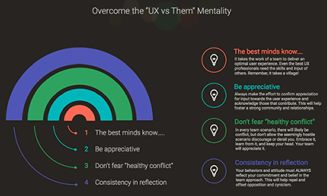
2. Overcome the UX-versus-them mentality.
“In a lot of creative agencies, the visual designers rule,” warned Darren.“ They run the show. Agencies are hostile environments. They see [UX professionals] as inhibitors of the creative process. There will be antagonism.
“The best minds know… It takes the work of a team to deliver an optimal user experience. Even the best UX professionals need the skills and input of others. Remember, it takes a village to make a good user experience. If everybody isn’t allowed to contribute, you’ll have a difficult time thriving. You’ll be butting heads with these other people.
“Be appreciative. Always make the effort to [express] appreciation for input toward the user experience and acknowledge those that contribute. This will help foster a strong community and relationships. Show appreciation for and acknowledge others’ contributions. Don’t condescend or be patronizing. If you have the data that supports someone else’s idea, share it.
“Don’t fear healthy conflict. In every team scenario, there will likely be conflict, but don’t allow the seemingly hostile scenario discourage or derail you. Embrace it, learn from it, and keep your head. You need to be courageous. Your team will appreciate it. [Where] there’s conflict, there’s a lot of passion. You’d rather have passionate people who are willing to listen, than passive people.”
Achieve “consistency in reflection. Your behaviors and attitude must always reflect your commitment and belief in the team approach. This will help repel and offset opposition and cynicism. We need consistency in the way we reflect.”
“As acceptance of UX continues to evolve, we must remain mindful of the need not only to provide our standard services, but to expand our teams’ comfort levels and foster partnership in our professional ranks by resisting the urge to work in the UX silo,” advised Darren. As Figure 22 shows, much of what it takes to be an effective UX leader is about working effectively with others and treating people well. Darren encouraged us to be at our best.
Figure 22—Working in unity
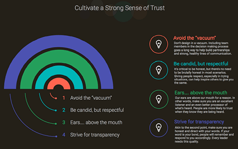
3. Cultivate a strong sense of trust.
“We need to earn and build trust. Not playing games builds a sense of trust,” counseled Darren.
“Avoid the vacuum. Don’t design in a vacuum. Don’t take the project brief into a cave. Don’t fall in love with your ideas. You need to get input and feedback from others. Including team members in the decision making process goes a long way to help build partnerships and strong, healthy lines of communication.
“Be candid, but respectful. It’s critical to be honest, but there’s no need to be brutally honest in most scenarios. Say how you feel, don’t pull punches, but show respect. Giving people respect, especially in trying situations, can help inspire others to give you the same.
“Ears.... above the mouth. Our ears are above our mouth for a reason. In other words, make sure you are an excellent listener and an even better processor of what’s heard. We have to process what we’ve heard. People are more likely to trust when they know they are being heard. So demonstrate an extremely high level of listening skills with your immediate team and customers.
“Strive for transparency. Akin to the second point, make sure you are honest and direct with your words. If your word is your bond, people will remember and respond to you accordingly. Every leader needs this quality. Don’t hide things. You’re all working to accomplish the same goals. Don’t be afraid to look stupid. Just get it out there. If you’re withholding, somebody else is, too, and that contributes to team dysfunction. There’s a lot of freedom that comes with [being open].”
Darren acknowledged, “Trust doesn’t come naturally, but must be earned. In addition, a trusting environment must be cultivated and managed.” Figure 23 provides good advice on building trust. Trust is essential to collaboration, which is an integral part of most of what we do as UX professionals.
Figure 23—Building trust
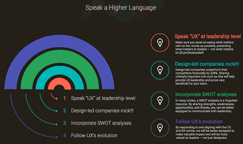
4. Speak a higher language.
“To help achieve UX excellence, we need to learn to speak a higher language. Executive speak. [Though maybe] not as fluently as executives do. If you can take what you’ve done and communicate it in a way that gets buy-in, you can get things done,” recommended Darren.
“Speak UX at the leadership level. Make sure you excel at saying what matters with as few words as possible, presenting what matters to leaders—not what matters to UX professionals!!! If you talk to executives the way you talk with UX professionals, you’ve lost. Use the words that matter to them. Communicate about all the things that matter to executives.
“Design-led companies rock!!! Design-led companies outperform their competitors financially by 228%. By such a whopping margin that you’re going to get people excited. Sharing critically important information such as this will help [you] provide UX leadership and prove very beneficial for your team.
“Incorporate SWOT analyses. In many circles, a SWOT analysis is a forgotten resource—a lost art. By sharing strengths, weaknesses, opportunities, and threats, you can be better equipped to communicate with leadership. You’ve left UX spectrum. They’re actually simple [and] fun to do. Enlightening. Present a SWOT analysis and see what kind of feedback you get. That will help you to speak executive.
“Follow UX’s evolution. UX is no longer what it used to be. We’ve had HCI since the ’30s—interaction design, information architecture, user experience. UX is now a holistic, critically important [function]. [Today,] you have to worry about CX (Customer Experience) and BX (Business Experience). Learn about CX and see where it fits in your own world. If you’re digitally oriented, your job is done once someone visits a Web site. We need to do everything with CX and BX in mind. Talk about things that affect these guys’ bonuses. By responding to and aligning with the CX and BX worlds, we will be better equipped to make valuable impact and will be more valued as leaders—not just designers.”
“The days of inundating people with UX speak are over. To foster optimal creativity and maximize buy-in from the executive team, we must speak their language. Learn it and get fluent!” counseled Darren. Figure 24 is about communicating value.
Figure 24—Communicating value
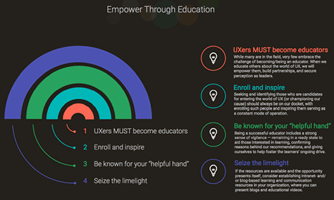
5. Empower through education.
It is essential that we empower other people through education, in all the ways that Figure 25 suggests. “Learn about educating. Learn how to present information so people can absorb it. Engage in the entire learning process,” advised Darren. He recommended the book Telling Ain’t Training.
“UX [professionals] must become educators. While many are in the field [of UX], very few embrace the challenge of becoming [and] being an educator. We must become educators. When we educate others about the world of UX, we will empower them, build partnerships, and secure [our] perception as leaders.
“Enroll and inspire. Seeking and identifying those who are candidates for entering the world of UX—or championing our cause—should always be on our docket. Enrolling such people and inspiring them [to serve the goals of UX should be our] constant mode of operation. They’re going to go to bat for you and become champions for UX in your organization. If only UX people fight [UX] battles, you’re going to lose those battles.” However, Darren railed against UX posers, saying, “I hate posers. There are companies in which all of the UX people are posers. Posers are doing our industry a gross disservice. They’re hurting salaries. The posers are hurting us bad.
“Be known for your helpful hand. Being a successful educator includes a strong sense of vigilance—remaining in a ready state to aid those interested in learning, confirming reasons behind our recommendations, and giving [of] ourselves to help foster the learners’ ongoing drive. Some people on a project will get excited about what you do and want to learn more. As you work, educate people—explain things—to the point people start giving you valuable UX input. You can find good people and help raise them up—grow talent from within.
“Seize the limelight. If the resources are available and the opportunity presents itself, consider establishing intranet- or blog-based learning and communication resources in your organization, where you can present blogs and educational videos. At work, when somebody needs input about UX, be ready to contribute in whatever way you can—brown bag lunches, blogs. Dive in!”
“By taking the time to commit to educating those on our teams, we provide them with a sense of belonging, pave the way for fruitful dialogue, help them understand our world, and give them the ability to provide genuinely valuable contributions to UX efforts,” explained Darren.
Figure 25—Empowering people through education
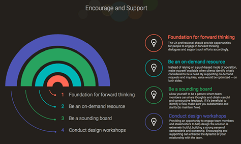
6. Encourage and support.
“Soliciting design input and encouraging people as they engage will go a long way in achieving leadership in UX and fostering a thriving design environment,” advised Darren. He shared many ways in which we can “encourage and support people,” as shown in Figure 26.
“Be a foundation for forward thinking. For innovation. UX professionals should provide opportunities for people to engage in forward-thinking dialogues and support such efforts.
“Be an on-demand resource. Instead of relying on a push-based mode of operation, make yourself available when clients identify what’s considered to be a need. Respond to the people who come to you. By supporting on-demand requests and inquiries, [you optimize] value—on both sides.
“Be a sounding board. Be a person [with] whom team members can share thoughts and obtain candid and constructive feedback, so they can get some input. Later they’ll come to you. If it’s beneficial to identify a flaw, make sure you substantiate and clarify—to maintain flow.
“Conduct design workshops. Have non-designers pretend to be designers for a day. Providing an opportunity to engage team members and stakeholders to help design the solution is extremely fruitful, building a strong sense of camaraderie and ownership. Encouraging and supporting [this] can enhance the dynamic of your relationship with the team.”
Figure 26—Providing encouragement and support
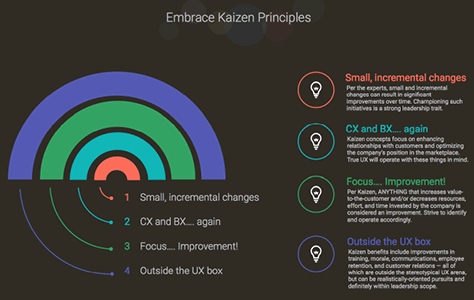
7. Embrace Kaizen principles.
Kaizen is the practice of continuous improvement as a long-term competitive strategy. Darren described how UX leaders can leverage Kaizen principles, as shown in Figure 27. Lean UX is one approach.
Make “small, incremental changes. [They] can result in significant improvements over time. Anytime you’re making incremental improvements, it helps the business. Championing such initiatives is a strong leadership trait.”
Work with “CX and BX…. Kaizen concepts focus on enhancing relationships with customers and optimizing the company’s position in the marketplace. True UX will operate with these things in mind.
“Focus on improvement. [According to] Kaizen, anything that increases value to the customer and/or decreases [the] resources, effort, and time invested by the company is considered an improvement. Strive to identify and operate accordingly. Making improvements—that’s what UX should be about.
“Think outside the UX box. Kaizen benefits include improvements in training, morale, communications, employee retention, and customer relations—all of which are outside the stereotypical UX arena, but can realistically [be UX-] oriented pursuits and [are] definitely within leadership scope. For example, especially in Lean environments, deliverables are frowned upon.”
“Akin to speaking exec, applying Kaizen-oriented methodologies and mindsets to UX efforts will help us to expand beyond stereotypical UX boundaries, broaden perception of how we’re valued, and make impact that wasn’t considered in yesteryear,” said Darren.
Figure 27—Practicing Kaizen
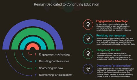
8. Remain dedicated to continuing education.
“Having a UX role isn’t enough. To achieve leadership excellence, we need to maintain constant engagement in learning about anything and everything that might be related to our operation,” Darren advised, in communicating the importance of continuing education, as shown in Figure 28.
“Engagement equals advantage. By committing to continued education—that is, always being ready to learn and advance—we can stay ahead of the curve and maintain sensitivity to trends in our respective industries.
“Revisiting our resources. Do you engage in continued education? If so, what are your resources? Whatever they are, it behooves us to continually evaluate and revise [them] to ensure we have optimal inroads and don’t get slack.
“Sharpening the saw. It is imperative that we are committed to continuing education—especially during times when our head is buried in various projects. It helps keep our minds fresh and our senses keen.
“Overcoming article readers.Article readers are the ones that indeed read, but only seem to grasp certain keywords. They later brandish their newfound words, but lack truly practical context. Be ready to provide the missing context to help maintain team health.”
Figure 28—Committing to continuing education
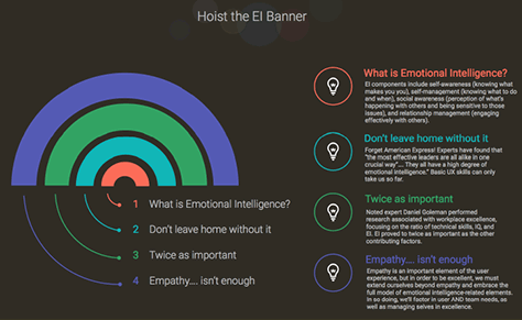
9. Hoist the EI (Emotional Intelligence) banner.
The final principle of Darren’s nine principles of UX leadership excellence is the most important of them all. Darren spoke about the value of emotional intelligence:
“What is emotional intelligence? EI components include self-awareness—knowing yourself, knowing what makes you you; self-management—knowing what to do and when; social awareness—perception of what’s happening with others and being sensitive to those issues; and relationship management—engaging effectively with others” and “having stronger relationships.” Having emotional intelligence makes you “a better decision maker.”
“Don’t leave home without it. Experts have found that ‘the most effective leaders are all alike in one crucial way.’ They all have a high degree of emotional intelligence.” Basic UX skills can only take us so far.
“Twice as important. Noted expert Daniel Goleman performed research associated with workplace excellence, focusing on the ratio of technical skills, IQ, and EI. EI proved to be twice as important as the other contributing factors. It’s two times as important as other skills.
“Empathy isn’t enough. Emotional intelligence is inclusive of empathy, but goes beyond it. Empathy is an important element of the user experience, but to be excellent, we must extend ourselves beyond empathy and embrace the full model of emotional intelligence-related elements. In so doing, we’ll factor in user and team needs, as well as [manage ourselves] in excellence.
“According to noted expert, Daniel Goleman, all successful leaders excel when it comes to emotional intelligence,” said Darren. “Therefore, UX professionals that seek to thrive as leaders must do likewise. It enhances the way we communicate, [and] it helps us make better decisions, optimize empathy, and manage challenges and our emotions.” Figure 29 conveys the importance of emotional intelligence.
Figure 29—Achieving emotional intelligence
Conclusion
Darren concluded his talk by saying, “The more you excel in these areas, the better aligned you will be with optimal levels of excellence in leadership, expanding perceptions of values regarding UX, building awesome team environments, and fostering creative hot beds.”
If, as a UX leader, you can embody all nine of these principles, you can attain leadership excellence. Darren’s talk was one of my favorites of the Summit. As you can see, he put a lot of thought into the design and structure his presentation, and he’s a dynamic and engaging speaker.
Surviving Implementation: How to Ship What You Design (And Design What You Ship)
Reviewer: Jim Nieters
Presenter: Cliff Williams
Cliff Williams, Principal UX Designer at NextDoor, who is shown in Figure 30, earned a degree in Computer Science. He assured us, “I love engineers. While I have an appreciation of computer science, my message is not: designers must code.”
Figure 30—Cliff Williams
Cliff briefly outlined the design process that he’s typically followed in the past: Creating mockups, red-lines, and specifications, then giving these deliverables to an engineering team. “The engineers have a surprising number of questions.” Getting busy with other projects, he sees a demo of the implementation just before launch. “It’s not great. Everything’s a little bit off. It’s sloppy. There are bugs. Stuff in the spec is missing. Microinteractions are overlooked. So we launch something that is not the UX I intended. It’s a mess.” This process needed an overhaul. Cliff encouraged us to: “Imagine how this could be different.”
Cliff believes that there is a mismatch between who UX designers think they are designing for and who they actually are designing for: “We define ourselves by our relationship with the users, but we don’t actually make things for users. Our work product is engineering documentation. The actual UX of the final product is affected by how it’s constructed at the end of the product lifecycle.”
Since UX designers are producing design artifacts for engineers, they need to make it as easy as possible for the engineers to implement their design ideas. Empathizing with engineers, Cliff acknowledged: “There is executive pressure to minimize time; pressure from designers to maximize quality and fidelity to their original intent. Engineers want to minimize risk.” Designers need to recognize the fact that their design choices impact implementation “time, quality, and risk.” Of course, the impact that UX designers have should not end when they hand off their designs to the engineering team.
Engineers Are Our Partners
“Great products are well designed and well built,” emphasized Cliff. “If you want users to have the experience you intend, it has to be well designed and well built. How do we achieve great design that gets built? We’re the driver of quality in most organizations. First, we have to realize that engineers are our allies, and if they’re not, we need to find a way to make that happen.” Next, Cliff identified three steps that UX designers can take to help ensure that their great designs get implemented.
1. Improve Your Deliverables
UX designers should improve the deliverables they give to engineers. “Engineers are the user,” stated Cliff. “Treat engineers like users. Understand their needs and workflows. Get feedback on how to organize your documentation. Tailor what you’re writing for them.” To successfully communicate with engineers, “develop a shared vocabulary and make sure everybody’s understanding things the same way. Work out early on what you’re going to call things.”
Make design documentation easy to read. “Write for reference, not reading. If you’re writing a spec, don’t assume it’s going to be read,” recommended Cliff. Mostly, engineers will refer to design documentation, “so try to make sections context free, and provide the complete information. Value tables and lists over paragraphs.
“Point out patterns. Engineers think about the reusability of code. If a widget is used in different places, call that out. When work is distributed across a team, engineers may not recognize patterns, so if one part is inspired by another part, call that out.”
You must keep design documentation up to date. UX design specs “are living documents. They’re never done,” explained Cliff. “Make sure you update these documents when you make new decisions. Add things that you missed. You’ll forget decisions you made, so these documents should be the single source of truth. The minute they become obsolete, they lose their value.”
2. Own Design Through Implementation
Cliff spoke about the importance of UX designers’ owning design all the way through implementation—staying involved in a project until launch. “Start by being available. Sit with the engineers.” By making yourself available for discussions, you’ll forestall engineers’ implementing a design that they don’t fully understand. The cost of fixing issues goes way up once something gets built. “If a spec is ambiguous, they’ll just throw it on the screen. Fit and finish can be death by a thousand cuts. … When they’re laying out a page for the first time, give them feedback.”
Actively seek out cross-team meetings to handle issues. “Schedule cross-team demos. Have engineers demo to one another,” suggested Cliff. “This is optimal for shaking things out.” You’ll recognize “divergent understandings and misinterpretations of your spec,” discover that “you need to make tweaks and compromises for different platforms,” identify “straight-up mistakes. One fun thing about client teams’ demoing to one another is that they’ll notice each other’s mistakes, and it will become competitive.”
To iteratively improve the implementation, designers and engineers should “schedule polish jam sessions,” said Cliff. “Don’t try to fix something in the meeting—that’s too time consuming. Document everything. Do this every week.”
Cliff encouraged UX designers to: “Manage risk. Your choices impact this. Listen when the engineers tell you something would result in hacks. Set aside your attachment to a design. Don’t cause a bug by forcing a solution. As soon as you have an idea of where things are going to go, start looping in the engineers responsible for implementing your design.”
Designers must be mindful of the hills they’re willing to die on. Is one design element or change that you want implemented important enough to warrant the time and effort it would take to implement it?
3. Work with the Medium, Not Against It
Cliff first defined what he meant by the medium in which a design is being implemented: “The medium is bigger than the front-end. It’s the complete stack of technologies behind a product—servers, databases, APIs, whole software ecosystems for products. These confer capabilities and limitations on what an app can do. They dictate what’s impossible. All of that is the medium.” UX designers should consider how they could tweak a design to take advantage of a medium. By demonstrating a deeper understanding of a medium, designers can more easily consider other design options.
According to Cliff, “Craftsmanship is the quality of the expression of a design in a medium. How we’re going to work with the medium. Well-crafted things deliver on the intention.” He suggested that each of us should endeavor be a craftsperson in some medium. We should design something, build it, and use it, then tear it down and do it again, but do it better. “Immerse yourself in a medium,” advised Cliff. “Be aware of how it’s influencing your design decisions.”
Cliff described four key factors that are integral to embracing a medium:
“Uncover hidden costs early. Run your designs by engineers early and often. Understand compromises early rather than later.” This will help you to discover and handle potential hidden costs before they arise.
“Fit and finish in the real medium. At design time, it’s best to solve the nitty gritty of the problem in the actual medium.” One good example of handling fit and finish in the final medium is animation. “Animations are tied to the medium itself.” This makes it unlikely that engineers would be able to replicate an animation that you had created in a design tool exactly. “So iron out the details during implementation.
“Be flexible.” Have compassion for the engineers and acknowledge the challenges that they face.
“Encode your style guide. Do it incrementally.” Once you encode design decisions in a living style guide, you’ll no longer have to make the same decisions over and over again. “Design systems evolve over time. Design and Engineering need to keep the style guide up to date.” Reusing designs that have been implemented in code decreases time and risk and increases quality.
Conclusion
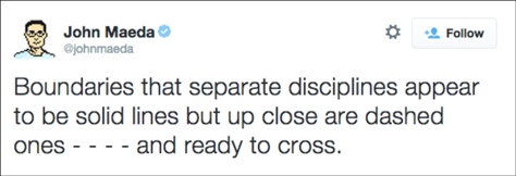
“How our products are built matters, and we play a part in that,” said Cliff. He suggested that UX designers, “Pull engineers into design. Rely on their knowledge to evaluate design choices. Push design into engineering. Own design all the way through implementation.” Cliff shared the apropos John Maeda quotation shown in Figure 31:
“Boundaries that separate disciplines appear to be solid lines, but up close are dashed ones - - - - and ready to cross.”—John Maeda
Figure 31—Removing boundaries between disciplines
Today, Cliff works closely with his engineers during both the design and implementation phases. In fact, he’s “a critical part of the team during implementation.” He creates design documentation for his engineers that is easy for them to consume. He leverages the engineers’ knowledge in making design decisions. He’s learned to understand and embrace the medium in which his designs get implemented, and he “knows every detail of the final product user experience.”
Building a UX Team: Strategies for Hiring & Retaining Good Designers
Reviewer: Pabini Gabriel-Petit
Presenter: John Athayde
John Athayde, who is shown in Figure 32, is VP of Design at CargoSense, a logistics product company. He began his talk by sharing some of the sorts of frustrating statements we’ve all heard from peers or stakeholders at one time or another in our work as UX professionals:
“I know it doesn’t look that great, but it works.”
“Just make it pretty.”
“Just give me whatever you did for the guys at Slack.”
“Things would be wonderful if we just had our own Jony Ive.”
Figure 32—John Athayde
During his career, John has been a UX team of one, has run agencies, and has built UX teams at large companies. He declared, “One unicorn cannot solve all of your problems.” He sees building a great UX team as “an epic voyage in three acts:
“Starting from zero: selling UX to a hostile manager
“Growing the team
“Keeping the team
“You have to get leadership’s “buy-in on big moves, so without #1, #2 and #3 don’t matter.” You have to “build, maintain, and evolve a culture.”
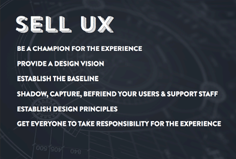
1. Starting from Zero: Selling UX to a Hostile Manager
John told us, as a UX leader, you need to answer these questions: “Why should we invest in UX? How does it benefit the company?” Designing the overall user experience comprehends a lot: user research, the brand experience, the call-center experience, and product UX and UI design.
“You need an experienced champion,” advised John. “Someone who has access [to executive leadership]. This works better in smaller companies. It’s more about facilitation. The Head of UX needs to be at same level as the Head of Product and the Head of Engineering. Often, product people over-promise and under-deliver. When you bring those people to same level, the CEO talks to those three people as a team.”
John segued briefly to the story of his work at livingsocial, where they created vision boards, which they thought of as “a new way to see. They’re a great communication tool.” But when the business responded, “You do realize that’s 18 months of work, right?” that became “the driver for our style guide. Developers didn’t have to call us for the basics. The product was built on top of Salesforce. All elements had same visual language. So we could focus on the big problems, and they could focus on the implementation. We hired a new UX leader who was equal, but got stonewalled.” But the ostriches said, “Everything is fine, wonderful.”
In situations like this, John recommended “bringing in a consultant to leverage your opinion. For some reason, people value the opinion of consultants over employees.
“Shadow your users, and get other people shadowing them,” advised John. “Become BFFs (Best Friends Forever) with the Support staff. They hear about problems first, so you can address them as quickly as possible. Research and testing are not optional. Otherwise, you’re just spitballing. Hire consultants to start you off. Everyone is responsible for the product experience.”
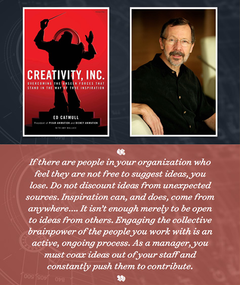
John recommended Ed Catmull’s book Creativity, Inc., which is shown in Figure 33, along with an inspiring quotation from the book. “He’s probably the person you can best attribute Steve Jobs learning creative management to,” said John.
“If there are people in your organization who feel they are not free to suggest ideas, you lose. Do not discount ideas from unexpected sources. Inspiration can, and does, come from anywhere…. It isn’t enough merely to be open to ideas from others. Engaging the collective brainpower of the people you work with is an active, ongoing process. As a manager, you must coax ideas out of your staff and constantly push them to contribute.”—Ed Catmull
Figure 33—A quotation from Ed Catmull’sCreativity, Inc.
“If you’re a UX team of one, draw in your Marcom designers,” suggested John. “Align marketing and the application branding. Define design principles—here’s what we want to do with design. Align with agreed-on principles. Create personas. Do crazy-eights sketches, and get ideas out of people who don’t know they can’t do things. Post designs on a wall” and ask a jury to review them. “Ask for Post-its comments.
“If that’s not all in place, the rest is irrelevant,” warned John.
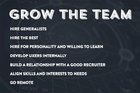
2. Growing the Team
“First, ask what your budget is,” advised John. “How are you going to apply that budget?” Find out about UX professionals’ median salaries from the annual UXPA Salary Survey. Use a 2.4 multiplier to determine the total cost of employment. “Get the need covered without an obscene amount of money,”
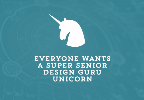
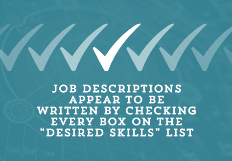
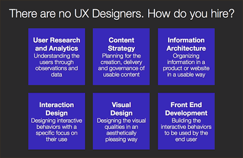
“Companies are having problems filling the seats with UX being so broad now,” noted John. As you can see in Figure 34, “Everyone wants a super senior design guru unicorn. You’re not going to build a team by hiring people [with big egos]. These people are doing startups. Job titles are confusing.” As Figure 35 indicates, “Job descriptions appear to be written by checking every box on the ‘desired skills’ list: Project Manager, Product Manager, Motion Designer, Prototype Engineer, Engineer, UX Researcher, Visual Designer, Information Architect, QA (Quality Assurance), Front-End Engineer. If you’re looking for a UX generalist, call it that.”
Figure 34—Wishing for a design guru unicorn Figure 35—Job descriptions
John suggested that we consider our team’s “speed of growth. The faster you grow, the faster your culture mutates. Hire generalists over specialists. If you hire a person who does only one thing well, they’re going to be twiddling their thumbs a lot. Only hire the best—with potential to grow. Don’t hire substandard people, they’ll take up your time.
“Designers should be learning like sponges. People from two different disciplines can learn from each other. As a manager, you should be the worst designer. Your job is to enable designers to do great work.” John commented that, when he receives a portfolio comprising only “screenshots, no stories, it goes in the trash can.”
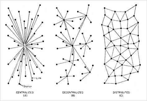
Next, John shared a diagram showing three possible organizational models for UX teams—Centralized, Decentralized, and Distributed—which is depicted in Figure 36.
Figure 36—Organizational models for UX teams
“Learn how to work with remote people,” advised John. “Quality of output is the main metric. Who cares if they’re doing it at two in the morning? There are lot of benefits if you can leverage remote people. You can hand off assets and implement rolling delivery. Every meeting is a virtual meeting. All conference rooms are closed. People are distributed.”
John recommended the book Remote: Office Not Required, by Jason Fried and David Heinemeier Hannson. “If you can’t trust the people you’re hiring to work remotely, you’re not hiring the right people. There’s no reason you can’t do remote work.”
“Look in your own backyard for existing, trainable talent,” suggested John. “Hire people from within. Work with good recruiter. (Many LinkedIn recruiters are lazy.) Give your recruiter an organization chart of what you want to fill. Some recruiters dump things on you. Find someone who fits, and bring them in. Pairing with a recruiter saves you time.
John concluded this section of his talk by making a very important point: “Balance the skills and interests of your people.”
3. Keeping the Team
Once you’ve built a great UX team, “How do you keep these people around?” asked John. He recommended Marcus Buckingham and Curt Coffman’s book First, Break All the Rules for good advice on how to lead people effectively. “What makes people stay or leave—even in same business? Your direct manager has more influence” than anything else. John shared this telling quotation from the book, as shown in Figure 37:
“Talented employees need great managers. The talented employee may join a company because of its charismatic leaders, its generous benefits, and its world-class training programs, but how long that employee stays and how productive he is while he is there is determined by his relationship with his immediate supervisor.”—Marcus Buckingham and Curt Coffman
Figure 37—A quotation from First, Break All the Rules
Also from First, Break All the Rules, here are some questions that team members might ask to assess the quality of their manager:
“Do I know what’s expected of me at work?
“Do I have the right materials and equipment I need to do my work right?
“At work, do I have the opportunity to do what I do best every day?
“In the last seven days, have I received recognition or praise for doing good work?
“Does my supervisor, or someone at work, seem to care about me as a person?
“Is there someone at work who encourages my development?”
”These are the foundational things,” said John. The more you get right, “the more likely people are to stay.”
The Challenges of Command
John again called upon great advice from Ed Catmull:
“If there is more truth in hallways than in meetings, you have a problem.
“It’s not the manager’s job to prevent risk. It’s the manager’s job to make it safe to take them.” “Otherwise, people make decisions that aren’t risky and aren’t going to move your company or product forward,” warned John.
“Our job as managers in creative environments is to protect new ideas from those who don’t understand that, in order for greatness to emerge, there must be phases of not-so-greatness. Protect the future, not the past.” “At Pixar, they rip scenes apart, asking: ‘How can this be the best ever? How can I make this an amazing experience?’” said John.
If someone quits, “find out why they’re quitting,” recommended John. “Hopefully, you can get them to be honest and open. This should not be an adversarial thing. Say, ‘Good luck. Maybe you’ll want to come back someday.’
Try to keep open channels of communication with people. At some point, you’re going to have to fire a friend. You’re going to go through the stages of grief. Do it on Friday, at end of day, not on Monday. Celebrate their contributions. But if you’re firing for cause, get them out immediately.
John shared some tips on effective leadership: “Traffic management saves lives. It can save your bacon. There needs to one person who sees where all the projects are—sees things that are taking too long. Plan to devote four hours per week to each direct report—in one-on-ones and other meetings. Emotion dies with data. But Doug Bowman, Creative Director at Google, now Twitter, quit over having to research colors of blue. Since Larry Page came back to Google in 2011, now design is important.
“When the challenge is lost, nothing excites anymore. Always think about what excites a person. Create a guru track. Not everyone should be a manager.” Figure 38 shows John’s idea of an ideal structure for a UX team, which comprises a
Team Manager—who focuses on people
Design Lead—who takes the guru route
Other team members—who focus on various aspects of design and research
Figure 38—An ideal structure for a UX team
Next, John identified some ways to defend against common problems that teams encounter: “Play defense. Crap rolls down hill. There should be ten positive interactions to one negative interaction at most. Meetings—cut this shit out!” If you’re invited to a “meeting without an agenda, don’t go to it. What are the outcomes?”
There are many things you can do to enrich your teams’ work experience. John suggested, “Create a university for your culture—brand and design culture. Do brown-bag lunches. Have a library—create a digital library on Dropbox. Subscribe to Treehouse. Everyone should have and be a mentor. Tell stories. Go back and teach what you learn at conferences. Bring in speakers on anything for one hour. Organize conference series in house, every Friday. Make all of this part of the culture.
“Open offices are awful!” John stated unequivocally. “There’s now proof of this. Create walls. Make spaces for designers. At Pixar, each designer gets a budget to decorate his or her office, showing personality—who they are. Celebrate your design staff. Have pet projects—sketching, painting, something that’s going to keep everyone creatively engaged.”
Action Items
John concluded his presentation with great summaries of his three acts—the action items that he hoped people would take away from his talk, which are shown in Figures 39–41.
Figure 39—Sell UX Figure 40—Grow the team Figure 41—Keep the team
During the Q&A, John recommended having a ratio of one senior mentor to two juniors—design studio style. The senior designers are responsible for the advancement of the junior designers. One person sets the design direction. The others are responsible for execution.
John’s talk was one of my Summit favorites. He’s a very effective speaker and put together an absolutely gorgeous slide deck.
Designing for Meaningful Experiences Across Devices and Touchpoints
Reviewer: Jim Nieters
Presenter: David M. Hogue
David Hogue, UX Design Manager, at Google, blitzed through a great, jam-packed presentation on designing across devices and touchpoints. He began his talk by stating that, today, there is “an illusion of simplicity. Experience and familiarity mislead us into thinking that our experiences are simpler than they really are.” The more we interact with something, the more we think it’s easy. Only when when we need to describe something, do we realize how complex it actually is.
Figure 42—David Hogue
To prove his point, David engaged the audience in a quick exercise. He asked us to “take out a pen and some paper to write down your answers to a few questions. Your memory may be blurry, and you may be uncertain, so please just record your best estimate. Accuracy is not essential.” First, he asked us to “select one of these activities you have done:
purchased a car or large appliance
planned a trip or vacation
managed a budget or retirement funds
designed a landscape or interior”
Then, he posed the following series of questions about the activity that each of us had chosen:
“How many people were involved from start to finish?
“How long did the process take from start to finish?
“How many resources did you use while gathering information to make a decision?
“How many devices did you use to look for, store, manage, and share information?
“Where did you conduct research, review information, and collaborate with others?
“How many documents did you create to help track and manage all of the information?
“How many times did you review and modify the information you were gathering?
“How many times did you share—send and receive—and collaborate on the information you were gathering?
“What actions were involved in deciding what to do?”
David then told us, “Look at your answers.
Did you do it alone?
Did it take just one session or visit?
Did you find all of the information needed?
Did you make a decision easily and quickly?
“It was not easy. There were many interconnected parts. In many cases, there was no clear path, choice, or decision.”
Extended Interactions
“Most of our experiences are not one-time events—they’re extended interactions that require time and thought. Our experiences often require multiple visits or sessions, resources, people, places, and tools or devices. They’re neither singular nor isolated. Some experiences happen infrequently, yet repeatedly, while others are ongoing. They’re never really finished.” Such extended interactions include doing our taxes, paying our monthly bills, managing our budget and finances, doing home maintenance, and shopping for groceries.
“Designing for extended interactions is much more than just designing a user interface. How can they be simple, connected, and clear?” How can we design such extended interactions when they have so much inherent complexity? “Designing for extended interactions requires understanding users, needs, context, steps, expectations, collaborations, tools, [and] devices. How can we integrate all of the parts?”
Mapping Experiences
UX professionals need to consider how to support a total user experience across complex interactions. To help us do this, we can rely on a process that is central to UX: mapping “how people already complete tasks.” As Figure 43 shows, David walked us through the journey of buying a new dishwasher, presenting a journey map that highlighted the different phases of the process.
He identifies a need.
He finds a product by searching, comparing, and winnowing.
He decides to buy the product, determines how to pay for it, completes his purchase, and takes delivery of the dishwasher. Can he install it himself, or does he need to hire a professional to do it?
Finally, he uses the dishwasher.
Figure 43—A dishwasher buying journey
What’s involved in this surprisingly complex journey?
David considered addressing the needs of appliance shoppers through the example of a hypothetical application for purchasing home appliances, called Appliancr. He asked, “Can one product to do it all? [Is it] technically feasible? Financially viable? Reasonably manageable? Desired by customers? What would that product really be like?”
David observed that things often sound better—and simpler—than they actually are. With our need to avoid “overcomplexification,” teams sometimes oversimplify and jump straight to designing. There are “many opportunities to get many things wrong:
Reacting, not planning.
Copying, not improving”—rather than creating a game-changing product
“Collecting parts, not connecting them” in a meaningful way
David explored some of the things that can go wrong in greater depth. A company may have a
“weak plan—Just keep trying, we’ll eventually find it!
following an unpredictable schedule
changing technologies
having vague goals—that change often
design for the business, not the customer
product by trial and error—reacting
“weak strategy—Just do what everyone else is doing!
no mission
no vision, or North Star
no guiding principles
no differentiators
product through parity—copying
“weak focus—“Just keep until adding until we have more!”
too much information
too many features
too many choices and paths
too many goals and use cases
product by aggregation—collecting”
Many product teams in industry lack crisp goals, clear strategy, and focus, so end up creating products that have a lot of features and are unnecessarily complex, but have no real differentiation.
Achieving Focus
“Extraordinary experiences are focused, simple, and meaningful,” said David. How do we find focus? By understanding what is essential, parity, or differentiated. “Be selective. First, focus on the essential. What do people actually need?”
To provide a successful solution for the journey map that David had presented earlier, the team creating Appliancr would need to select the core features that they could build better than anybody else—and determine what they should leave to others to build. They’d need to answer the questions “What can we do that other products cannot? What can we do better than other products?”
To demonstrate this focus, David provided an example of a journey map showing the core customer needs for an MVP for Appliancr, shown in Figure 44. Looking at how Appliancr could leverage other products and services, David shared several journey maps that demonstrated the strengths of Facebook, shown in Figure 45, Yelp, and Bing—potential partners that already have some of the information that Appliancr needs to present. He also showed a journey map presenting opportunities for Appliancr to differentiate. Finally, David showed a journey map that demonstrated the intent “not [to] compete on everything” and answered the question “How can we leverage what others do better?”
Figure 44—A journey map of core customer needs Figure 45—What are Facebook’s strengths?
David made the important point that, to achieve focus, a team needs to “craft a plan,” define a mission—“What are we doing? Why are we doing it?”—and set a vision—“Where are we going?”—define both “design and product principles—What guides us? Here, for example, are the mission, vision, and principles that David created for Appliancr:
“The Mission—Help people decide to repair or replace home appliances and find the best products and professionals to keep their homes running smoothly.”
“The Vision—We are the most reliable source of accurate information about home appliances and professional services where homeowners can shop with confidence.”
“Appliancr Principles:
Eliminate the customer’s stress
Earn their trust through quality.
Keep track of their options and choices.
Make paying effortless.
Never mislead them to make a sale.
Help them from problem to resolution.”
They were not going to compete in every area. They did not want to be in the appliance-delivery business. Someone else could do that better. They did not want to create an appliance retail storefront. Others have already done that. The need that they could serve best was to provide easier ways of making purchasing decisions.
Simplifying
A key point of David’s talk was that focusing and simplifying are critical to the success of a product. He presented a series of valuable techniques that teams can use to simplify:
“Subtraction—Remove the non-essential and and unnecessary. Nice to have is not necessary; it does not differentiate; it gets in the way. What do you need?
“Redistribution—Put things where they are needed, when they are needed.
Things that are in the wrong place or offered at the wrong time distract and mislead. Get the sequence right. When and where do you need it?
“Prioritization—Put the most important, relevant things first. Looking through irrelevant things makes it harder to find the relevant. The most important things go first. In what order do you need it?” Do you have the sequence right? Do you have the ranking right?
“Consolidation—Put things together that belong together. Completing a task in too many steps or with too many parts wastes time and effort. What do you need with it?” Combine things for efficiency, as shown in Figure 46.
“Presentation—Clean design guides attention to what is necessary.
Design can make the complicated look and feel simpler. Presentation can improve usability. Do you see what you need?”
Figure 46—Simplifying through consolidation
Making Meaning
David then reminded us that we need to make user experiences meaningful. “How do we make it meaningful?” asked David. In answer, he outlined a set of six principles to apply to make a product meaningful:
“Understandable—Help people process new information by making connections with what they already know.
Models, analogies, metaphors, and explanations facilitate understanding.” So does explicit context.
“Predictable—People are more confident in their predictions of outcomes or responses when experiences match their mental models. Ambiguity and ignorance decrease confidence.
“Relevant—Acknowledge and reflect context: place, time, constraints, opportunities, history, and expectation.
“Integrative—Bring the parts and steps together into a consistent, understandable whole. Make connections for people, because they do not always see them.” Integrative user experiences make a product’s meaning clear, as shown in Figure 47.
“Emotional—Products and interactions that appeal to people encourage deeper processing and deliver greater satisfaction. Delight and pleasure are necessary.
“Personal—Products and experiences that make the user believe they were made just for them increase confidence, relevance, and appeal. It’s mine; it works for me; it puts me first.”
Figure 47—Integrative user experiences make meaning clear
Conclusion
David delivered an inspiring, insightful presentation, but he covered so much content in such a short period of time that I found it difficult to follow at times. Ultimately, he presented an effective process for creating highly focused, simple, meaningful products that can differentiate in their market. I just wish David had provided an overview of his important message up front. It would have made his presentation much easier to follow. This was the only session that we reviewed from Track B: Research & Design.
A Web for Everyone: Accessibility as Innovation
Reviewers: Jim Nieters and Pabini Gabriel-Petit
Presenter: Whitney Quesenbery
Renowned accessibility expert Whitney Quesenbery, who is shown in Figure 48, consults through her company WQusability and is a Co-founder of the Center for Civic Design. She pointed out that we need to think of accessibility as design, not a legal checklist. “A wicked problem is incomplete, contradictory, or changing.” Creating accessibility for all is a wicked problem.
Figure 48—Whitney Quesenbery
“Usability and accessibility are like twins separated at birth,” suggested Whitney. User experience took a more cognitive and behavioral path, while accessibility took a legal path. While usability doesn’t have a lot of power, accessibility laws give power. We need to bring the UX and accessibility worlds back together again—getting the power of accessibility laws behind us—to create greater value for everyone. “Our true power comes from understanding people and how they work.”
Designing Technology for a Range of Abilities
“How do we include people with disabilities in our design considerations?” asked Whitney. Disabilities are often “hidden, invisible, and misunderstood. Real human experience is this range of abilities. How can we design for that broader range of people? That would help us to innovate, but also [to create] products that do good. How do we get accessibility into our work processes?” It’s good that accessibility laws are stable. We can build products based on them. “But team work processes get in our way. If we’re not doing user research with [people who are disabled], we’re not doing user-centered design.” The goal is really to understand a broader diversity of user needs and design solutions for them that are usable, useful, and delightful.
As Figure 49 shows, “We’re talking about accessibility now because technology is finally starting to catch up” with user needs, acknowledged Whitney. “There was a long gap when nothing changed, but now we are in this accelerated curve. People in the blind community have discovered that the iPhone is where it’s at.”
Figure 49—Technology is finally catching up with user needs
Whitney is a consummate storyteller. She told us about Glenda Watson Hyatt, author of the Do It Myself Blog, who orders coffee by typing what she wants on her iPad, which then says what she’s typed out loud. “Things we think are cool enable things to happen, enable societal change, affect people’s lives [because their designers thought] about accessibility,” said Whitney.
“There are things we can do that can help everyone,” advised Whitney. Take voting machines for example: “In voting standards, they banned scrolling because scroll bars are hard to use. A candidate might be off the bottom of the page. All of that changes with touchscreens. The ban needs to be rethought!”
Principles for Accessible UX
Whitney provided the following helpful “principles for accessible UX:
People first
Clear purpose
Solid structure
Easy interaction
Helpful wayfinding
Clean presentation
Plain language
Accessible media
Universal usability—We can all have the same product.”
Making a Difference
Whitney encouraged us to “take diverse participation seriously. Invite everyone in. Bring in design thinking.” Working with people who wouldn’t draw was a harder problem than people who couldn’t draw. “Sit down, work together, and make something powerful.” She shared the personas from “A Web for Everyone,” which are shown in Figure 50.
Figure 50—Personas from “A Web for Everyone”
Whitney told us about a voting-machine project that brought together cross-functional teams comprising designers and users—including people with disabilities—helping to ensure cross-functional engagement and ensuring they found a solution that worked for everyone. Similar to Luke Wroblewski’s idea to design for mobile first, they designed the simplest possible voting system, then layered navigation on top, ensuring that the system supported all users well, not just people with disabilities.
“Create better ways to innovate,” suggested Whitney. “Be flexible—for devices and people. Fit technology to the person. Reconsider everyday activities. Find new ways to use tools.?Use multiple methods. Find inspiration everywhere. Change your perspective.”
Just as we design for devices, why can’t we design for people as well? Moreover, why can’t we fit the technology to the person? For example, consider the problem of making it easy for people who cannot look at their phone to dial, regardless of whether they’re hindered by a disability. At Google, they created a no-look dialer. No matter where the user touches the screen, that’s the center, where the 5 key is. Then, if the user drags diagonally, up to the right, that’s where the 3 key is. Everyone can benefit from this clever design.
Whitney told a story about mail carriers: In the past, only men were allowed to carry mail. Mail carriers had to have the strength to carry bags filled with 50 pounds of mail, and it was thought that women couldn’t carry them. Later, they added wheels to the mail bags, creating mail carts, so mail carriers could wheel their mail bags around—and women could be mail carriers, too. It turned out that having a mail cart helped the men as well, by preventing injury and fatigue. The men no longer had to carry huge, heavy mail bags for eight to ten hours per day.
Whitney asked whether we could find new ways to use cool tools—for example, using all of our senses? Take Google Maps, for example. Today, we can read a map or text directions. A screen reader can read the text aloud for someone who can’t see it.
We can find inspiration everywhere. For example, Whitney worked with IDEO on their OpenIDEO voting project. In Iowa, people were able to institute the use of pop-up voting stations, shown in Figure 51. Any time they could get 100 or more people together, they could petition the state government to send a mobile voting station out. If we look at the creative things people are doing, we can learn a lot from them.
Figure 51—Making voting more accessible for everyone
Of course, the reality is that change is hard. Often, people don’t just jump up in excitement when someone else has a great idea. For example, many people resisted the curb-cut movement until activists pushed hard to make wheelchair accessible sidewalks a standard. Today, other people benefit from them, too—from rollerbladers to skateboarders to bicyclists.
How can we own the problem? Things evolve. Whitney pointed out, for example, that eyeglasses originally solved a major problem for people with poor eyesight, then evolved into a fashion statement. People with prosthetics such as Aimee Mullins have made fashion statements out of them. In Figure 52, Aimee has ornately carved wooden legs that look very cool. She is owning the problem and making a statement that demonstrates her power.
Figure 52—Turn a problem on its head by making bold statements
Ultimately, Whitney pointed out that reuniting usability and accessibility could be a fun, amazing experience, if only we let it. Her goal is to create great products that are available to everyone!
Whitney is a polished speaker and put together a meaningful presentation that inspired everyone to think about accessibility in a different way.
Enterprise UX: The Next Last Frontier
Reviewer: Jim Nieters
Presenter: Patrick Neeman
Patrick Neeman, Director of User Experience at Apptio, who is shown in Figure 53, began his talk by asking the question: “What is enterprise software?” He shared this definition from Wikipedia:
“Enterprise software is purpose-designed computer software used to satisfy the needs of an organization rather than individual users. Enterprise software is an integral part of an information system and, as such, includes Web site software production.”
Patrick gave some examples of enterprise-software companies, including SAP, Oracle, Workday, and Jobvite.
Figure 53—Patrick Neeman
Patrick then pointed out that designers tend to want to avoid designing enterprise software. “Why do designers avoid it?” He highlighted the following reasons:
“Incredibly tough domains—Most designers avoid enterprise because it’s really hard, and they can’t relate to it.
“Absolutely no user empathy
“Engineering cultures—Most enterprise companies have very tough engineering cultures, and they don’t necessarily want to bring designers along for the ride. They hire designers late. You have to learn how to sell to them, and this is going to mean a lot of painful conversations.
“Super political organizations—Most people in enterprise have been in it for a very long time and are good at working the system, managing the politics, and explaining away the lack of usability.
“Extreme UX and technical debt
“Super long user journeys”
As shown in Figure 54, Patrick contrasted the time it took Christopher Columbus to sail to the new world—only 70 days—with the average time it takes to implement a typical ERP (Enterprise Resource Planning) solution—560 days.
Figure 54—Enterprise software supports long user journeys
“Designers have attention deficit disorder,” said Patrick. “We are very liquid—always looking for the next opportunity. We are our own worst enemy. We have to stay at a place long enough to learn the domain so we can be effective.”
Should Designers Want to Work on Enterprise Software?
Patrick posed the important question: “Why should designers care about enterprise software? They should care about the money. There’s so much money in enterprise SaaS (Software as a Service) software”—an estimated $22.1 billion in 2015, as shown in Figure 55. “Custom built solutions within organizations are going away. They’re looking to applications they can implement and get value from faster. Companies are finding it easier to use SaaS applications that solve most of their needs and can realize business value quickly than building huge applications that take years to complete.”
Figure 55—The enterprise SaaS market is growing rapidly
“And enterprise companies are now getting it. Users—and customers—are expecting better experiences,” acknowledged Patrick.“ The iPhone changed everything. Users are expecting purpose-built applications and better holistic experiences.” Many users of enterprise software are Millennials, who demand a better experience. “Users ask, why is this software so bad? Eventually, they’re going to be customers. They’re expecting better experiences, not just better feature sets. There are changing attitudes—rent versus buy.”
Service-oriented architectures (SOAs) and the Internet of Things are changing things, too. “SOAs talk to each other through APIs, so they can be opened up to almost anything. Applications are opening up. This creates a super immersive environment.” As Jeff Bezos believes:
“All service interfaces, without exception, must be designed from the ground up to be externalizable. That is to say, the team must plan and design to be able to expose the interface to developers in the outside world. No exceptions.”—Jeff Bezos
How Can Companies Conquer Enterprise User Experience?
Patrick then asked, “How do companies conquer enterprise user experience? There’s got to be top-down decision to invest in design and a vision that can be put into action.” Like Steve Jobs, the C-level leadership must believe that UX design is an essential part of software development.
“Design is the fundamental soul of a man-made creation that ends up expressing itself in successive outer layers of the product or service.”—Steve Jobs
As shown in Figure 56, “Companies have to invest in design,” declared Patrick. But what if “there are no UX Designers? How do you hire them? Don’t hire an agency. Hire in-house designers. Hire UX generalists—interaction designers or product designers.” However, most companies don’t actually know what the UX roles are or what their definitions are. “People have to be educated about what these roles are. Hire design leaders that can come in and build a team, and know what the competencies are.” Figure 57 defines some common UX roles.
Figure 56—Enterprise software companies must invest in design Figure 57—Common UX roles
According to Patrick: “In the past, “the developer to designer ratio was about 50:1.” Today, the ratio of UX professionals to developers is more like 8.5:1 in many companies—and that includes both design and research. “Hire a design leader that can recruit and sell the idea, because they’re going to have to sell it hard,” advised Patrick.
However, Patrick suggested that enterprise companies need to change their target when hiring. Instead of hiring enterprise UX people, enterprise software companies, should “mix in researchers that are domain experts with designers that come from a consumer background, but have dealt with complex workflows”—designers who know how to design engaging software. “A lot of places have requirements like, ‘Must hire designers with financial software experience,’ so they get financial software looking stuff.”
“Bring designers along for the ride,” advised Patrick. Often, “within five minutes, they’re expected to know the domain. Create a culture where designers can learn, fail, and grow. For the first three to six months, designers need to be paired with subject-matter experts and developers who know the domain, [so they can] learn about the system. Pair them with developers [so they can] work collaboratively. [This] means designers have to be in house. It’s going to take about a year before … they really get it. Set your expectations appropriately.”
Patrick recommended that enterprise software companies “adopt a usage-based culture. Customers are not the users.” Enterprise companies typically define success by the sale. One of the big challenges is that most enterprise companies do not gather data on how users actually interact with their applications. “They’re not tracking metrics,” observed Patrick. Plus, many applications are on-premise solutions, which makes data harder to track. But designers need this sort of data to understand the users better. “How can we track metrics?” asked Patrick. “Add analytics to the right things [in] the application. Put analytics in the tool around Help topics users are looking at. Marry designers to the data.” Establishing the right metrics is an iterative process. “Establish goals.”
Enterprise companies need to “get away from the feature checklist,” cautioned Patrick—you know, when sales says, “If we do these things, we can bring in new customers.” “Avoid feature-based selling. [Instead], sell the experience and business value. Teach people about jobs and outcomes [rather than] going straight to the solution without understanding the problem. [When] you talk about problem you’re going solve, [make it] so compelling, they’re going to want to solve it.”
Too many enterprise companies produce software with so many features that no real person could actually use it. We need to bring a much greater degree of focus to our products, so they provide compelling experiences to our users. While a product may not have every feature, if it has the essential features and provides a great user experience, it will be a product that customers love.
“Be patient on the journey,” admonished Patrick. “It takes five years to build a design culture at most organizations. It’s a lot of small wins instead of a big win that builds trust,” explained Patrick. “What’s your five-year plan for the whole team? Designers start getting it after a year. The problem is: designers usually leave after two years, so you’re going to have to backfill when you lose team members, and you’ll have different designers at the end of the journey. Blaze trails. There’s a lot of opportunity in enterprise, considering the wicked problems we face. Partner with people in the community to talk about your successes and failures.”
How Can Designers Conquer Enterprise User Experience?
Finally, Patrick posed the questions: “How many designers want to get into enterprise user experience? How do designers conquer enterprise user experience?” He answered with the following advice:
“Listen. When you [join an enterprise company], you need to listen a lot. You’re going to be in a position of weakness and feeling stupid for a long time. Be humble and listen to everyone. Be flexible. Admit lack of knowledge. Say you don’t know anything.
“Learn the domain.” In fact, you need to “fall in love with the domain. Make a two-to-three-year commitment at a company and become a domain expert. You can’t do good enterprise experience design working as a consultant. Marry the problem and find something interesting about it.” As Figure 4 shows, you’ll find this rewarding.
“Go Fisher Price. You have to be able to explain in language they understand.” Make things very, very simple. Everyone can then understand what is going on.
“Bring the company along for the ride. We do a lot of education at Apptio. We can take design concepts that apply to the domain and educate other people in the company about them.” For example, instead of pointing product teams to Edward Tufte’s books on data visualization, Patrick and his team wrote a 40-page document on data visualization guidelines. He educated teams using tools that are very simple.
“Pick your spots. You’re not going to be able to design everything, because you’ll constantly be resource constrained. Turn the developers into designers. Develop a lot of patterns they can use.” Decide what you’re going to focus on—where you can have the most leverage—and, instead of trying to control everything, teach your product team about design. You can also use user researchers in innovative ways.
“Think small. Break out the problems in smaller chunks and even propose smaller applications. Chop up a project into a lot of smaller pieces and launch! Think configurable, not customizable.”
“Interview the users, then aim for a different one. You’ll learn more about the customer at a smarter scale, and the bottom up approach becomes very social.”
“Measure, measure, measure. Look at smaller flows and longer journeys. Develop metrics and outcomes you want achieve.”
Figure 57—Enterprise UX professionals must learn the domain
Remember, we’re all consumers! Patrick assumes that users don’t think, “I’m an enterprise user” or “I’m a consumer user.” They’re just the consumers of an enterprise application at work, then consumers of other apps at home. In both contexts, they’re just using apps. Why shouldn’t those applications be easy and delightful to use?
Conclusion
Despite a desire for more UX strategy content and the frustration of missing some sessions that we would have liked to attend because of the two-track format for much of Day 1 of the General Summit, this was, overall, the strongest day of the conference and offered a lot of valuable content.
Look for Part 3 of our UX Strategies Summit 2015 review, in which we’ll cover Day 2 of the General Summit, in an upcoming edition of UXmatters.
Founder, Publisher, and Editor in Chief of UXmatters
Silicon Valley, California, USA
With more than 20 years working in User Experience at companies such as Google, Cisco, WebEx, Apple, and many startups, Pabini now provides UX strategy and design consulting services through her Silicon Valley company, Strategic UX. Her past UX leadership roles include Head of UX for Sales & Marketing IT at Intel, Senior Director of UX and Design at Apttus, Principal UX Architect at BMC Software, VP of User Experience at scanR, and Manager of User Experience at WebEx. Pabini has led UX strategy, design, and user research for Web, mobile, and desktop applications for consumers, small businesses, and enterprises, in diverse product domains. Working collaboratively with business executives, multidisciplinary product teams, and UX teams, she has envisioned and realized holistic UX design solutions for innovative, award-winning products that delighted users, achieved success in the marketplace, and delivered business value. As a UX leader, she has facilitated conceptual modeling and ideation sessions; written user stories; prioritized product and usability requirements; established corporate design frameworks, standards, and guidelines; and integrated lean UX activities into agile development processes. Pabini is a strategic thinker, and the diversity of her experience enables her to synthesize innovative solutions for challenging strategy and design problems. She is passionate about creating great user experiences that meet users’ needs and get business results. A thought leader in the UX community, Pabini was a Founding Director of the Interaction Design Association (IxDA). Read More
Chief User Experience Strategist at Experience Outcomes
Los Altos, California, USA
A design leader for 17 years, Jim loves every minute of helping companies create competitive advantage by designing experiences that differentiate. He has worked with a range of companies—from startups to Fortune-500 companies—most recently as Senior VP of Customer Engagement at Monaker Group. He previously led User Experience at HP, Yahoo, and Cisco and has advised numerous startups. Jim chooses to work with brilliant clients, helping them unlock their unbounded potential by envisioning and designing end-to-end experiences that disrupt markets and engaging users emotionally. He often works with UX leaders to help them work through organizational challenges and ensure User Experience has the visibility it deserves and can design experiences that make the team proud. Jim also conducts design-value assessments for his clients, identifying gaps in their ability to differentiate on the experience, then helping them close those gaps and become extraordinary. Read More