Since I wrote my article “Mobile Inline Form Validation” for UXmatters back in 2012, I have very rarely used any of those patterns in my own work. Recently, when I created a pattern library for mobile applications for a big, multinational, corporate client, I didn’t include any of those tips. Since the publication of that article, I have identified and begun to follow a few principles that are I hope more user centric.
Don’t See Users As the Source of Errors
If you design systems, you are familiar with constraints. For example, it is hard to add new fields to a database; mobile networks sometimes provide poor connectivity or have slow performance or high latency. Typically, system design takes such constraints—and, of course, costs—into account in determining what a team can build.
Champion Advertisement
Continue Reading…
But, as UX professionals, it’s generally our goal to build products that people can use. At the core of user-centered design is the understanding that users are our biggest resource constraint—and the hardest thing to change.
We don’t train people to be part of a system, so we have to take them as they are. However, because we do control the rest of the system, we must do our best to take people into account. The following principles serve us well in designing systems for people:
Never ask users for data that any computer that is part of the broader system already knows.
Never require data input in formats for computers when it’s easy to parse data in formats that make data-entry easy for humans.
Avoid error conditions that are the result of bad user input. Instead, constrain data entry, parse erroneous data, or just live with it. Do not gripe at users for not being computers.
Assume Failures Occur and Design for Resilience
The way in which typical systems deal with failure is to perform a Failure Mode and Effects Analysis (FMEA). Nevertheless, the way in which systems typically avoid critical effects like a system’s crashing is to display an error message.
In engineering practice, or DevOps, resilience design is the practice that keeps services like Google, Facebook, Etsy, Flickr, Yahoo, and Amazon up and running—basically, all the time. This lets us build reliable systems on top of components or subsystems that are inherently unreliable. Big data centers experience dozens of hard-drive crashes a day, but by accepting that failure is inevitable, they can keep the whole system working without users noticing any problems.
For UX designers, this means we must accept that there is no happy path. At every level of a system, components, connections, and data can fail. More importantly, users will confound our expectations. No matter how we expect our customers to use products, at least some users will find different and unexpected ways to use them. So don’t force users down a single path. Instead, plan to handle the unexpected. User behaviors are not errors. Accept whatever users do with grace and charm.
When you focus primarily on avoiding errors, there are a few practical tactics you can use to make this work.
Avoid Data Entry
It is rare for me to design a traditional form into a Web site or app anymore. Instead, I follow the model of immediate helpfulness, as we all should.
Open up a few of your favorite apps and see what they do. The best immediately offer up the information you are most likely to use. Often, you can do that in your Web sites and apps, too. Use the data you’ve already gathered—whether from user profiles, data entry, tracking users’ previous behaviors, or based on your expectations of the type of user someone is or what other users generally choose.
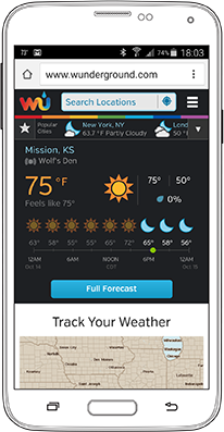
Mobile devices make this easier because they are usually with users wherever they go. So you can use sensors such as location awareness to determine things about users. When users are looking for weather data, you don’t need to ask where they are, but should instead offer up data for their current location, as shown in Figure 1.
Figure 1—Weather Underground Web site on a user’s first visit
Automatically Populate Data Fields
If you simply must require data entry, you can still frequently use the same principles I’ve just covered. Prepopulate data fields by guessing their values, then allow users to change them if they need to. For example, perhaps they’re planning a trip and want to know the weather for their destination instead.
Look at Figure 1 again, and you’ll note that, despite the prepopulated data for the user’s current location, there’s a nice big Search Locations box at the top of the page, as well as a list of Popular Cities, so users can easily change their location.
Even if the basis of a guess is not a specific user’s information, and you’re just making your best guess based on people’s behavior in general, a guess is often a better choice than an empty field. Some users won’t have to enter anything, and often, the data you display can provide useful context for users’ choices or suggest how a tool can help them, which is likely be more helpful than hint text.
Constrain Choices
In Web forms, the most common sort of error results from allowing entries that are out of bounds. As much as it’s annoying for your banking app to insist that you can make a particular transaction only in amounts between $20 and $200, how many times have you seen error messages that have gotten completely out of hand? For example, the message “Please enter a value that does not exceed $0.00.” may have resulted from good intentions, but in the end, it doesn’t make a lot of sense.
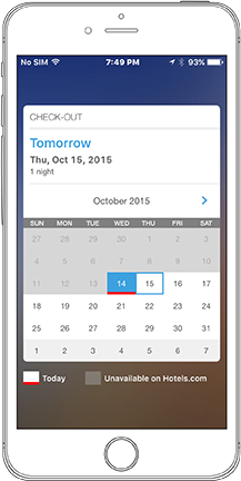
Instead, you should avoid making people type and let them select values from lists, step between choices, or use other constrained input methods. If you’re allowing people to schedule a reminder, why check for past dates and display an error if users select dates that are in the past? As shown in Figure 2, you can simply use a date selector that displays—and thus, allows users to select—only dates in the future.
Figure 2—Date picker for the Hotels.com mobile app
On Hotels.com, they use a custom picker that actually displays an entire monthly calendar, but grays out past dates so users can still orient themselves properly in the calendar.
Think carefully about what data your service or system actually needs, then work with data architects and developers to figure out what sorts of things might cause users problems and prevent them.
Use Mobile Inputs
Especially in apps, many fields with preset values that users can select also let users type values directly into them. This can be useful when a very large range of values is necessary and scrolling would take forever or be too imprecise. But this approach still prevents errors by rejecting out-of-bounds values and jumping either to the last value or the nearest valid value.
It’s important to think about your system and not assume that desktop Web interfaces are the ideal. Use mobile input methods on mobile devices. Pull-down menus and other selectors are different in mobile browsers than in desktop browsers, so familiarize yourself with all of the various ways in which your Web design would actually look and function in different browsers.
Native apps are very different from Web apps. Users rapidly become deeply familiar with their mobile OS and become confused if you use unfamiliar user-interface paradigms. For example, checkboxes simply aren’t an option on iOS. Therefore, you shouldn’t use them in your designs. Don’t use one of the hacked solutions to add checkboxes. Instead, respect the OS.
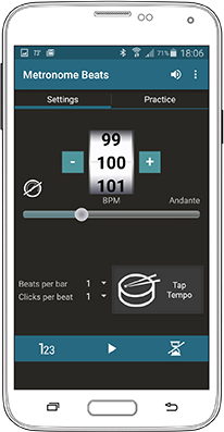
Figure 3 shows an app that has gone overboard with different types of input devices—offering a slider, a scrolling wheel, and stepper controls for the same input field. Still, it provides a good example of the range of input options you can use to avoid error-prone typing.
Figure 3—Several beats per minute selectors in the Metronome Beats app
Write Good Exception Messages
Okay, I actually do display messages occasionally to indicate that something has gone wrong. This is unavoidable because of system failures, disconnects from networks, and such. However, most of the messages I write aren’t for user-induced errors, but processing exceptions in some part of a system. So I call these exception messages. My rules for exception messages are as follows:
Make people notice the message.
Don’t put them in the way; instead, stay in context.
Make sure the message is clear.
Help users resolve the problem.
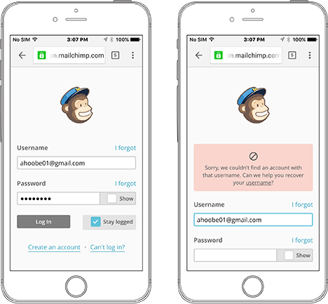
While some forms use inline messaging, most apps and Web sites still have terrible, terrible error messaging. However, MailChimp does a great job with error messaging, as shown in Figure 4.
Figure 4—MailChimp log-in screen, with and without an error
MailChimp follows the rules I’ve just outlined:
They display a prominent message, above the content, so it is noticeable whatever the user does.
The message is present on the screen at the same time as the form. Users can refer to it when they’re trying to fix the issue.
The message uses clear, unambiguous, human-readable terminology. The icon even makes it clear that the Web site won’t let the user do something, without implying actual danger.
They detect the problem—in this case, a bad username—and offer a link to let the user fix it.
Summary
Now, don’t let me leave you thinking that building better exception messages would solve all your problems. Try not to generalize these solutions too much. Avoid making them patterns for good error handling. Continuing to promulgate user interface–design and interaction-design solutions to address what are actually architectural issues just gives us permission to keep exposing our customers to bad user experiences.
Whenever you can, remember to plan your task flows and the overall structure of your products and services to ensure that the system works regardless of how people might use it. Plan for failure, imprecision, and the unexpected. Design your user interfaces and interactions to prevent errors and enable the user. Of course, we should always consider users—but be sure to consider users at every level of a system’s design. System constraints and common practices should never override the needs of people.
For his entire 15-year design career, Steven has been documenting design process. He started designing for mobile full time in 2007 when he joined Little Springs Design. Steven’s publications include Designing by Drawing: A Practical Guide to Creating Usable Interactive Design, the O’Reilly book Designing Mobile Interfaces, and an extensive Web site providing mobile design resources to support his book. Steven has led projects on security, account management, content distribution, and communications services for numerous products, in domains ranging from construction supplies to hospital record-keeping. His mobile work has included the design of browsers, ereaders, search, Near Field Communication (NFC), mobile banking, data communications, location services, and operating system overlays. Steven spent eight years with the US mobile operator Sprint and has also worked with AT&T, Qualcomm, Samsung, Skyfire, Bitstream, VivoTech, The Weather Channel, Bank Midwest, IGLTA, Lowe’s, and Hallmark Cards. He runs his own interactive design studio at 4ourth Mobile. Read More