Top

Session Expiry and Coke Machines

Mobile Matters

Designing for every screen

A column by Steven Hoober
March 7, 2016

The other day, I helped a friend of mine with some repairs on his new house, getting it ready for him to move in. Plenty of our friends are more than just moving-truck labor and have especially applicable skills. I am—among other things—the woodworking guy, so on this day, he consulted me on door refinishing. On the way over to his house, we stopped at the new Five Guys near my house to get food for friends and family and encountered a usability problem.

The Machine Always Wins

While waiting for seven burgers, we went to serve up the seven drinks we’d also purchased. They had one of the increasingly typical touchscreen Coke machines, with many hundreds of drinks options, as shown in Figure 1.

Champion Advertisement
Continue Reading…
Figure 1—A Coca Cola Freestyle touchscreen soda fountain
A Coca Cola Freestyle touchscreen soda fountain

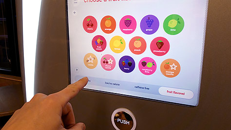
Some language and layout issues aside, the touchscreen actually works reliably, and the choice paradigm is generally effective. For an individual buying just one drink, it’s easier to use than when getting drinks for a group. In the latter case, fewer choices would make life easier.

When dispensing our drinks, my friend found that some of them were getting too much foam on top. So he’d wait for the foam to go down, then press the button again. Almost every time, nothing happened. The screen had returned to its idle state—the Home screen. While this befuddled and angered him, it was obvious to me what was happening. He’d run into the end of the session. Coca-Cola—or whoever made the machines for them—set an aggressive session expiry.

Average Good and Exceptional Unhappiness

The designers behind it say they did usability tests and understand in-store behaviors pretty well, so we can assume they even put some science behind it. The session time is presumably based on typical use or queue speed. They want to make sure the next person in line can make his or her own choice, so the machine returns to the Home screen each time. But I’ve encountered the other end of the spectrum as well: a person who’s in a hurry and gets to the machine in time to use the previous person’s selection.

Many user interfaces work only because of people’s behaviors and selections. Jumping into the middle of a process, as you would in this case, means you must first spend time orienting yourself to what screen the machine is on and finding the Back button. By then. the machine may well time out, jumping to a new page, causing you to have to start orienting yourself to the machine all over again.

“Don’t design for everyone. It’s impossible. All you end up doing is designing something that makes everyone unhappy.”—Leisa Reichelt

The argument that you cannot design for every user is a hard sell for kiosks in places like fast-food restaurants. But it’s still true—especially if you define your decisions narrowly. Designing for an average person or designing for everyone is a recipe for failure. One of my design principles is that, while it’s definitely good to satisfy or please some audiences, it’s critical that none of your users actually become frustrated or angry with you.

Sessions

The idea of user sessions arose from the needs of systems—and like all early system-design decisions, computing platforms imposed this model on users. Resource scarcity drove this decision—originally on shared-access mainframes and minicomputers, on which computing resources were extremely scarce. But the heyday we’re still experiencing results from the use of affinity-based load balancing on Web servers.

Servers hold sessions open, keeping an entire user context ready for the user to do something. They balance session times entirely according to resource management. If a session is too long, threads get wasted because no one is using them; too short and the overhead of loading the user’s profile and establishing the right context eats up resources.

Many connected products still use sessions despite there now being very different and better ways of handing server load. Many products use, over use, or even abuse sessions in the name of security.

When it comes to sessions, the needs of the people who use the system are secondary, at best. In my experience, users’ needs are usually discussed only in terms of how prominent to make the Sign Out button to ensure the system knows when to release the session. Short sessions that make people sign in again? There are no real worries about that. We’re slowly getting better at implementing sessions, but you’d better be prepared to offer alternatives—or at least to disguise a session expiry as something more useful to users.

I’ve often asked, why does a mostly disconnected mobile app—or a Coke machine—need session expiry at all? Because the device uses it for other things. In addition to being a multi-user system reset, it’s also a security mechanism—though not a very good one, for basically the same reasons I’ve already mentioned. If a session is too short, the system’s latency may not allow a user to complete the steps in a process. If it’s too long, the next person can jump on the system when the previous user leaves.

Sensors

We’re already using some better systems here and there. Many mobile phones now know whether you are looking at them—or at least they know whether you are moving them around a bit. They won’t go to sleep while you are holding and looking at them, even if it’s time to lock the screen for security purposes.

Pretty much every smartphone has camera-like sensors that discern whether you are holding your phone to your head during a phone call. The screen locks when put it to your head so your ear doesn’t push buttons, then unlocks when you take the phone away from your head, because you probably want to unlock, mute, or press other buttons.

Just as research is better than heuristics, using sensors is always better than assuming what the user will do. If I were designing a system like this Coke machine, I would not presume to understand what users want to do from average data. Instead, I’d try to sense what they’re doing. When users turn or step away from the machine, you can assume they’re finished. Machine vision is sophisticated enough that some machines could learn from user behaviors. There are specific ways in which people turn or move that are probably unique to either starting or ending a session and are perceptible by machines.

Sensing People or Sensing Behaviors

Or am I falling into the same trap of assuming, surmising, and using other data as proxies for actual behaviors? Let’s consider that Coke machine again. It has a touchscreen, but also a hardware button for dispensing drinks, a place to put a cup, an ice dispensing bar, and a spout out of which the liquid pours.

When users arrive at the machine with a cup, it’s the beginning of a session. When they leave, they remove the cup. This physical behavior—rather than some proxy for behavior—is all we need the machine to recognize. So we can use even cheaper sensors and simply detect cup presence. If a cup is present, assume the user is still filling it. Once the user removes the cup, the user is finished, and the machine can set up the screen for the next user. You could even disable the dispensing of beverages unless a cup is present to avoid waste and mess.

Sensors are cheap, but some of my requests to add LEDs, buttons, and sensors to products have been rejected by companies, even when they cost only 5c apiece and could save money over time. Perhaps there’s a target cost or a target design that cannot be changed at present. Very often, I work on version two of a product. Can we fix issues only with software changes?

Dialogs and Notices

If I were brought onto a project late and the assumption was that the session was wrong, the engineers would probably have a prototype in the corner of the office with some variation of a modal dialog box, asking the user whether he is finished.

Asking the user might seem like a great idea, but dialog boxes users didn’t request usually seem like intrusions that block their progress. Because users often perceive them as errors, I never use them for success messages. I don’t think there’s any such thing as a good way to design a dialog box for this case. Using status banners instead is fairly common now on many transactional Web sites. They work fine as success messages.

I’ve already mentioned the Back button, whose interface language is perceptible. But there is plenty of room on the screen. Could we add more navigation? How about a Last Selection button somewhere? Then you could not only jump back to your last session, if necessary, your friend could fill his cup with the same beverage.

There are no privacy concerns regarding your choice of a soft drink, so the machine could have a history, showing the last several selections. This would empower both easy refills and a shared experience among family members or groups of friends who are dining together. In fact, there’s no reason we cannot connect machines to the Internet and display things like trending popular drinks. While this wouldn’t be bad, I worry that people wouldn’t notice it much. (I didn’t even notice the tab bar being touched in Figure 1, until I started deliberately paying attention to the user interface for this evaluation.)

The design of the whole user interface follows a kiosk or mobile model, with key stuff in the middle, so anything at the edges is a bit suspect. Plus, each use is so brief that there’s little time for people to learn a navigation paradigm.

A Big, Shiny Button

Let’s look back at the Coke machine experience I had observed. My friend pushed the big, shiny Push button to dispense more of his drink, but nothing happened. Could we solve this problem directly? It’s good that there is no on-screen error or angry beep, but is no action at all the best choice in this situation? What if pressing the button had worked for him? It could have simply reactivated the last mode and dispensed the drink he’d asked for. The machine should also redisplay the last screen to show the right context and confirm to the user what drink is being dispensed.

Solving Problems, Not Improving Solutions

A common problem in nursing homes is patients’ dementia manifesting as a compulsion to leave. Patients may believe they must go to work, to school, or to their childhood home. The standard solution is to lock the exit doors, but there are always imperfections in such systems. So there have been increasingly technical solutions along the same lines. I have seen dozens of demonstrations and articles about tracking patients to better prevent their wandering.

But a nursing home in Düsseldorf, Germany, came up with a different solution. Most of their patients tried to take the bus to get to their perceived destination. So the facility didn’t add more locks or strap trackers to the patients, but instead built a convincing, but fake bus stop. The patients could still escape, but they’d always go to a safe location. Sometimes the staff used the bus stop as a therapeutic tool, allowing the patients to escape until they calmed down and returned to the present day.

In our work, we’re often saddled with preconceived notions—whether from our own experience, from frameworks or solutions that stakeholders impose on us, or from legacy systems or processes.

A couple of times a week, I have discussions almost exactly like those I’ve described. Users must enter complex passwords every time they launch a mobile app. Perhaps there's a legacy content server that uses sessions and thus requires a Sign Out button. Or a database has two text descriptions in one field, so we can’t format them individually.

When you’re transitioning to a new product, a new endpoint, or an all-new service design, it’s a great time to challenge your organization to think about the right way to solve technical problems, not just taking the easy way.

Use a simple PIN and biometric identity to actually improve security. It is also helpful to offer Lock and Switch controls so people actually want to use them. Parsing rules allow the detection of certain types of content and make the database display the information in the proper way.

Now, it’s your turn. What new solutions can you come up with to solve the problems people have with your product? 

References

Assmann, Baptiste. “Load Balancing, Affinity, Persistence, Sticky Sessions: What You Need to Know.” Haproxy, March 29, 2012. Retrieved February 16, 2016.

Feid, Allan. “Stop Buying Load Balancers and Start Controlling Your Traffic Flow with Software.” Shutterbits, May 22, 2014. Retrieved February 16, 2016.

Fridman, Emily. “Coca-Cola Freestyle.” Cargo, undated. Retrieved February 16, 2016.

Miller, Lulu. “The Bus Stop.” RadioLab, March 23, 2010. Retrieved February 16, 2016.

Reichelt, Leisa “The General Public Myth (or the Whole World Is Not Your User).” Disambiguity, July 22, 2008. Retrieved February 16, 2016.

Wikipedia. “Coca-Cola Freestyle.” Wikipedia. Retrieved February 16, 2016

President of 4ourth Mobile

Mission, Kansas, USA

Steven HooberFor his entire 15-year design career, Steven has been documenting design process. He started designing for mobile full time in 2007 when he joined Little Springs Design. Steven’s publications include Designing by Drawing: A Practical Guide to Creating Usable Interactive Design, the O’Reilly book Designing Mobile Interfaces, and an extensive Web site providing mobile design resources to support his book. Steven has led projects on security, account management, content distribution, and communications services for numerous products, in domains ranging from construction supplies to hospital record-keeping. His mobile work has included the design of browsers, ereaders, search, Near Field Communication (NFC), mobile banking, data communications, location services, and operating system overlays. Steven spent eight years with the US mobile operator Sprint and has also worked with AT&T, Qualcomm, Samsung, Skyfire, Bitstream, VivoTech, The Weather Channel, Bank Midwest, IGLTA, Lowe’s, and Hallmark Cards. He runs his own interactive design studio at 4ourth Mobile.  Read More

Other Columns by Steven Hoober

Other Articles on UX Design

New on UXmatters