Some of you may be reading this column while you’re seated at a woodgrain desk. Of course, you know it’s not really wood because wood might be too expensive, inconvenient, fragile, heavy, light, or simply impossible to use in the way we want to build a desk.
For centuries, there has been a tension between authenticity—which is often coupled with simplicity—and the decoration of surfaces or facades, which sometimes implies falseness. But there is no right or wrong in this. Often, a veneer is the best solution—in part because we are building for people, who might be happier sitting at a wood desk than one that is unabashedly plastic and made of MDF—that is, medium-density fiberboard or high-quality particle board.
Champion Advertisement
Continue Reading…
A History of Flat Design
Today’s digital world is full of open, airy, beautiful, tediously identical, unusable user-interface designs.
Applying simulated, real-world surface effects to digital interfaces can be helpful, but it’s easy to overdo this. And as we know, Apple—and many others—have taken this too far on occasion. Instead of creating a purely digital design, they simulated something else, finally taking skeuomorphism too far.
How does fine stitching or simulating specific types of leather or wood enhance any user interface, inform the user about anything an interface displays, or even help users feel good about gaming, reading, or finding their friends?
The backlash to excess skeuomorphism has resulted in a trend toward flat design, which is really based on a range of principles that tend to gravitate around Swiss Modernism as the ideal. But this design trend is not new. In fact, it goes back to at least the 1950s. Long before digital interfaces, simple, flat graphic-design approaches have resulted in some of the most long-lasting, impactful work. Road-sign systems, subway maps, and more have followed this style of design, which is pervasive, as well as effective.
When brand designers talk about logos, they still say “Will it FAX”—not because everyone has FAX machines these days, but as a shorthand way of expressing the need for a low-resolution version of a design. While your brand could be awesomely 3D and in color, while you could animate it for TV or paint it on the tail of a plane, there should always be the potential to fall back on a flat, black-and-white version of a logo for stenciling on crates or thermal printing on boarding passes.
These are well-understood design principles that can still serve us well.
Good Design in Digital
Microsoft was one of the first to apply a set of principles for a flat graphic-design style to digital interfaces. They’ve used and heavily promoted a Modern UI over the past few years. However, they haven’t talked enough about the roots of this style for everyone to understand why it’s important.
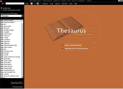
Despite versions of Windows before the Metro/Modern era having embraced the rounded, gradient style, with nearly realistic icons, Microsoft’s roots in flat graphic design go back to the 1990s. Figure 1 shows a screenshot of Encarta from fifteen years ago, and it’s not even the first version of such a design from Microsoft. Some groups within Microsoft recognized sooner than a lot of people that this design language works well for digital products.
Figure 1—Microsoft Encarta in 2001
However, Google’s Material Design is what has really made flat design take off lately. Partly by their simply supporting Material Design so robustly—not just by providing guides, but by offering whole sets of icons for designers to use and deep support for this style in their development platforms. In many ways, Material Design is key because Google has explained why it’s important and how effective digital experiences use layering.
Digital Isn’t Flat
Screens are flat, so there’s now a general belief that digital design is about a flat user interface between your eyes and fingers and the pixels. For starters, I’m not sure why people think this is unique. It’s not like paper was especially 3D.
When the Nielsen Norman Group describe the right way to do flat design, they say you can “make use of subtle shadows, highlights, and layers to create some depth in the UI.” Note that they say to “create depth.”
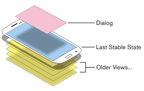
But look at your phone, your computer, your TV, or anything with a display. When these systems load a dialog box—whether to ask “Are you sure?” or allow a user to set the volume level—it appears on top of the screen. Literally on top. Software is not flat. It is built in layers. Dimensionality in digital interfaces is absolutely real. As shown in Figure 2, each new page in an app appears in a new view. Dialog boxes are just another type of view.
Figure 2—Views, including dialog boxes, stacked on top of other views
The same principle generally applies on the Web and other platforms—and it’s always true of dialog boxes. This is one reason they are so universally accepted and usable. The temporary condition that a dialog box represents explicitly appears on top of a page. Because new views appear on top—and the reduced size of dialog boxes indicates that they’re just temporary—the previous view is back there just waiting for the user.
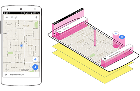
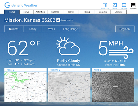
As you can see in the example of layering in Figure 3, which shows how user-interface (UI) elements are layered in Google Maps, layering extends to components of a single page as well.
Figure 3—UI elements layered in Google Maps
While this is a great example of flat design, it’s not actually flat. The fields and buttons on top of the map literally float on top of it. Everything behaves as though it has a position in a particular layer. UI elements on top block elements beneath them. Elements scroll behind other elements, based on this layering. UI elements even have little drop shadows—which are not affectations or ornaments or just pretending something is a real-world thing, but emphasize the actual layering that exists.
Being Authentically Digital
Instead of going for flat design or skeuomorphic design or anything else, when the next design trend comes along, we need to start by being authentically digital. Apply any design trend you want, but be sure to reflect the actual layers, use standard components, meet user expectations for the way they know systems work, and leverage human physiology and cognitive psychology to make sure users can see, read, and click.
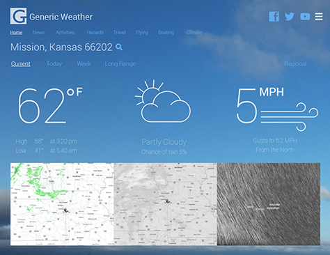
I’ve created an example of a bad user-interface design, shown in Figure 4, which uses many modern trends that make it hard to read, understand, and use. This example of bad design is bad, not because it’s flat, but because it’s inauthentic and unusable.
Figure 4—An example of bad, flat design
In other words, it’s bad not in new ways that are specific to flat design, but in well-established ways. It would have been bad years ago, and it would be bad in the distant future for all the same reasons. Those reasons would be pretty easy to enumerate, but instead, let’s take a positive approach and solve this design’s problems, one by one, by
attracting the eye
affording action
making text readable
inspiring confidence
Attracting the Eye
First, you must attract the user’s eyes to an app, which means it literally needs to be visible. Value contrast is the key way of making UI elements visible, but don’t forget the other design principles that provide contrast: differences in size and weight.
The AAA standard from the Web Content Accessibility Guidelines (WCAG) recommendations that I always follow defines two minimum contrast ratios: 7:1 for normal text and 4.5:1 for large text. Why? Because of something called the smallest perceptible difference. Without going into too much detail—and I know this is shocking—smaller things are harder to see. This rule extends not just to font size, but to component size as well. Thin type is harder to read than thicker type of the same size.
So we could improve the bad design shown in Figure 4 by doing the following:
increasing contrast by using only white text and icons
increasing the weight of the type and icons. Don’t use thin type unless it is in very large sizes.
using type weight to indicate prominence rather than underlines and symbols
Affording Action
Next, you must afford action. Affordance is the characteristic of objects that tells the user what they are and what they do. People mostly want to tap or click things. And the best way to provide affordance is to bound elements. That simply means using bordered boxes or placing interactive elements within strips, bars, rows with separators, table cells, and so forth.
Some believe that the move to flat design has “eliminated affordances altogether,” but there’s no need to go back to faking real-world buttons or even to adding gradients and rounded corners. Round or square, flat or clear with border, anything that bounds an icon works. When creating icon sets, I now always make two. One version has a circle or square around it as part of the icon itself, so I can use it without creating a separate, bounded shape to contain it.
It is critically important not to bound unclickable elements—or people will read them as interactive elements and keep tapping them to get more information.
Mastheads should usually be strips, which also gives you a chance to fix them to the edge of the viewport, so they’re always there.
Links on the Web get underlines. Not just color changes, not anything else. Underlines. However, apps should use underlines carefully and sparingly. Apps are not Web sites and users become familiar with such differences.
We could improve the design shown in Figure 4 by
indicating the row of labels comprises tabs by adding a tab shape around each label
making the masthead, or title bar, a distinct shape
boxing the icons for social media and the menu
boxing the search icon, so it’s clearly actionable, not just a label next to the location
Making Text Readable
Aside from merely being visible, content must be readable. That means users don’t just notice or discern it, but can tell what it says. You can make text readable by picking legible font faces and styles. For example, use italics minimally or not at all.
Base your choice of type sizes on the distance from the eye at which people use a device. As I have discussed in a previous column, “Type Sizes for Every Device,” use smaller type on smaller devices and larger type on larger devices—based on the angular resolution and the distance at which users tend to use such devices.
We could improve the design shown in Figure 4 by
making sure the type is in a useful size, so users can read it at normal viewing distances for a tablet
increasing the size of the icons. Icons are like type. They are readable glyphs so should follow the same weight and size guidelines.
adding text labels for all icons and icons to many labels
adding labels to the map images
Readability and affordance go hand in hand. Maybe your users knew images were clickable, but did they know what the images do? You may have to label them to make that clear.
Inspiring Confidence
Users are often leery of clicking anything they don’t understand in a system or a control they don’t think they can safely use.
Make sure clickable elements are
large enough to click or tap. Make click targets whole boxes, not just words and icons.
not too near other elements to avoid mistaken targets
large enough that, when users tap an element, they can see that it was tapped
visually distinct, so tappable labels next to images and charts are not actually part of the image or chart
interactively distinct, with tappable elements separate from gesture areas
Other types of user-interface elements have their own requirements that you must address as well. For example, make sure gestures have their own areas—for example, a blank space to the right of a list to allow swiping to scroll, which is separate from the list’s content.
We could improve the design shown in Figure 4 by
using semantic markup, with conventional elements working in conventional ways
spacing elements far enough apart, making them easy to tap
creating bounded elements such as tabs and buttons that are large enough to easily tap
ensuring that tappable elements are large enough that users can see their tapped state while tapping them, so they know they’ve tapped the right element
left-aligning lists and content, so there is at least a little empty room to the right for swiping to scroll
By applying these guidelines, we can improve the design shown in Figure 4, turning it into the design you can see in Figure 5.
Figure 5—An improved version of the original, poor design
While this is the same basic design, without any changes to its layout, functionality, or background, it demonstrates the following improvements:
Functions and key information attract the user’s eye.
Clickable elements clearly afford their action.
Content is visible, legible, and comfortably readable.
Users can be confident that they understand the information and the use of the user-interface elements they see.
Good Design
Edgar Kaufmann, Jr., Director of Industrial Design at MOMA in New York, spoke out against a “style follows sales” mentality by putting on a series of Good Design exhibitions at the museum in the 1950s. This exhibit included a set of principles for good design that are still much in use today—at least by furniture designers and decorators.
Fulfill the practical needs of modern life.
Express the spirit of our times.
Benefit by contemporary advances in the fine arts and pure sciences.
Take advantage of new materials and techniques and develop familiar ones.
Develop the forms, textures, and colors that spring from the direct fulfillment of requirements, in appropriate materials and techniques.
Express the purpose of an object, never making it seem to be what it is not.
Express the qualities and beauties of the materials used, never making the materials seem to be what they are not.
Express the methods used to make an object, not disguising mass production as handicraft or simulating a technique not used.
Blend the expression of utility, materials, and process into a visually satisfactory whole.
It should be simple—its structure evident.
Master the machine for the service of people.
Serve as wide a public as possible, considering modest needs and limited costs no less challenging than the requirements of pomp and luxury.
There are some lovely ideas in these principles that really do apply today. For example, it is hard to argue against the idea that we should “master the machine for the service of people.” But most relevant for this discussion is principle 7, which says to “express the qualities and beauties of the materials used, never making the materials seem to be what they are not.”
Let’s not merely follow trends or try to make our apps and Web sites something they are not. Let’s embrace today’s materials and build authentically digital products.
For his entire 15-year design career, Steven has been documenting design process. He started designing for mobile full time in 2007 when he joined Little Springs Design. Steven’s publications include Designing by Drawing: A Practical Guide to Creating Usable Interactive Design, the O’Reilly book Designing Mobile Interfaces, and an extensive Web site providing mobile design resources to support his book. Steven has led projects on security, account management, content distribution, and communications services for numerous products, in domains ranging from construction supplies to hospital record-keeping. His mobile work has included the design of browsers, ereaders, search, Near Field Communication (NFC), mobile banking, data communications, location services, and operating system overlays. Steven spent eight years with the US mobile operator Sprint and has also worked with AT&T, Qualcomm, Samsung, Skyfire, Bitstream, VivoTech, The Weather Channel, Bank Midwest, IGLTA, Lowe’s, and Hallmark Cards. He runs his own interactive design studio at 4ourth Mobile. Read More