The field of User Experience is increasingly under pressure to gather qualitative data in shorter amounts of time. As a UX professional, I’m on the hunt for novel methods and approaches that facilitate the collection of meaningful information about users’ emotions and engagement. A central tenet of User Experience is the importance of gathering revealing, informative, powerful data about the user experience by engaging with users. For example, during usability tests, users interact with Web sites, applications, products, and concepts and give us detailed feedback as they go. Whether you are a UX designer, developer, marketer, engineer, or in executive leadership, seeing users use your product first hand is invaluable.
After leading many formative and summative studies, including usability tests, I’ve become more and more interested in the reactions of users at the conclusion of an experience—when they reveal their feelings about the overall experience they’ve had. As we take a more holistic view of the user experience, there is growing interest and value in looking at what artifacts stick to the user’s memory. However, this is not easy information to access—especially within the context of a lab study where the moderator and the situation may make even the most confident participant feel inhibited. Developing rapport with participants and facilitating authentic sharing from them is challenging.
However, with companies today increasingly looking to improve the holistic experience they provide to their customers, it’s time to find a way to tap into users’ authentic feedback and engage with them in a way that allows them to share something real—beyond what we can usually capture within the lab.
Champion Advertisement
Continue Reading…
Gathering Authentic User Sentiment About Experiences
With the goal of collecting information relating to engagement, I took a closer look at our validated, best-practice techniques for understanding user sentiment. It quickly became clear that only a limited number of low-tech tools and techniques are currently available for assessing user sentiment.
There have been some interesting advances in biometric technology that have made it possible to gather many different data points, but this technology is expensive and complex. Using this type of technology for studies is impractical for most UX researchers.
So I began looking for a tool that could help me collect information about users’ reactions and emotional engagement as part of a usability test. My requirements for a viable tool included its having little or no cost and being easy to use and flexible. Through discussions with other UX professionals and extensive online searches, I determined that—other than the Microsoft Product Reaction Cards (MPRCs)—nothing exists that satisfies my specific requirements.
In examining the Product Reaction Cards, I read all of the literature I could dig up about them. As you may already know, for many years, the MPRCs have been widely used and accepted as a tool for gathering feedback regarding users’ emotions and reactions at the end of a usability study. In 2002, Microsoft employees Joey Benedek and Trish Miner published “Measuring Desirability: New Methods for Evaluating Desirability in a Usability Lab Setting,” (Word document) in which they first described this method. Their paper included a list of descriptive words—60% of which were positive and 40% negative to balance out human bias toward negativity. The Product Reaction Cards present 118 descriptive words that users often use at the end of a research session.
The MPRC approach does not rely on any advanced technology. Using this low-tech method is an effective way of facilitating a rich exchange between a UX researcher and a user. The conversation that begins with the use of the Product Reaction Cards often results in a user’s sharing additional valuable information that they had not previously mentioned during the session.
Despite the wide use of the Product Reaction Cards, little evidence has been collected about how researchers are actually using them. In fact, their use and the way researchers have adapted them have rarely been documented or shared publicly. In addition to what I have heard first hand when speaking with UX professionals, some limited evidence does exist online that UX researchers are using the MPRCs and adapting them in a variety of ways to make this approach better suit their needs to gather specific types of feedback from users.
Based on my research, I had made the assumption that UX researchers are making changes and adaptations with the intent of improving the effectiveness of the MPRCs in eliciting rich responses relating to user emotions and engagement. However, upon further review, it has become clear that some of these alterations to the MPRCs have also occurred because the Product Reaction Cards were not fully meeting the needs of UX researchers. Knowing that many are currently adapting the MPRCs for their needs, I was naturally inspired to design an alternative method of eliciting user feedback.
Exploring a New Method of Eliciting User Feedback
To start, there were several paths to consider. One obvious alternative was to revise the list of words used in the MPRC, validate the revised list, then use the new list. Since I already knew that UX researchers had been reporting on online forums that they were altering—most frequently shortening—the list of descriptive words, the next logical option was to find an alternative list of words that would elicit authentic exchanges between UX researchers and users. This is how I chose to proceed. With my background in teaching special-education courses, photography, and UX research and design, I was naturally drawn to the idea of using visuals to elicit user feedback.
A few years ago, when working with a special-education student who wasn’t easily able to identify facial expressions or their accompanying emotions, I drew a set of faces with exaggerated expressions that represented different moods to help him communicate how he was feeling. The visual representations of the faces helped this student become aware of his internal emotions, then express them externally.
My past experience sparked the idea that illustrations of expressive faces could also potentially help users to tap into their reactions and, as a result, offer authentic, meaningful feedback. When I began looking at the potential for using visuals in eliciting this kind of feedback, I reviewed people’s typical, every-day interactions and how they shared their reactions to them. Looking at social-media posts seemed a logical approach, so I observed how people provide feedback to each other via texts.
Since texting is a common shared experience and emojis are similar to the faces that helped my student, I decided to explore the use of emojis in eliciting user feedback. This approach satisfied my three requirements:
little or no cost
easy to use
flexible
Emojis are a widely used, common language that people use to express their emotions, so it made sense to look into whether emojis could potentially be a tool for unlocking the untapped sentiment of users that I wanted to gather. The first step was figuring out the most feasible way of gathering feedback on whether this method had potential.
Evaluating My New Method: Decision Points
Evaluating the potential of the emoji method presented several decision points. Here is a summary of the questions that arose and the decisions I made.
What/How many emojis to include?
I considered a number of options, including displaying the following:
all, 1000+ emojis
a subset of emojis
all categories of emojis
selected categories of emojis
only face emojis
I decided to display just the first screen of face emojis for a number of reasons, including the following:
to reduce the number of choices
to present the most common and familiar emojis
to reduce the potential for a biased or arbitrary selection of emojis
to reduce the number of variables
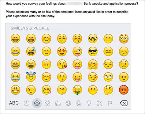
As shown in Figure 1, I ended up with a screen comprising five rows of eight emojis for a total of forty emojis from which users could select their responses.
Figure 1—Emoji home screen
Where to display the emojis?
I reviewed several options regarding the display of the emojis, including the following:
displaying emojis in context on a mobile device
displaying the emojis on a desktop screen
printing the emojis on a sheet of paper
I decided to display them on the desktop, embedding them in a Qualtrics survey so I could collect, record, and compare all participant responses in one place. I made this decision in part because the time for the pilot at the end of the study was limited, and it wasn’t efficient for users to spend time switching from the desktop to the phone.
Which style of emojis to use? Android, Google, or iOS?
I considered multiple styles of emojis, including Android, Google, and iOS, as well as using whatever emojis a participant was most familiar with. However, to minimize the variables and simplify things, I decided to use only the iOS emojis for the pilot session.
The Pilot Session Using the Emoji Method
The pilot using this new emoji method included twelve participants who were taking part in a 60-minute usability study of the loan-application microsite of a major banking institution. At the end of each hour-long session, the moderator asked participants to answer some questions in a Qualtrics Survey, instructing them not to submit the survey after making their selections. The moderator then left the room to ask observers for any additional questions. While the moderator was out of the room, the participants completed the System Usability Score (SUS) and Net Promoter Score (NPS) surveys. After the participants had completed the SUS and NPS surveys, the moderator asked them to answer the following question:
How would you convey your feelings about this bank Web site and application process? Please select as many or as few of the emotional icons as you’d like to describe your experience with the site today.
The screen of emojis shown in Figure 1 appeared below the question and participants could use the mouse to select as many emojis as they wanted.
Emoji Home Screen for Smileys & People
Once participants had selected their responses, the moderator returned to the room and asked them probing questions about the emojis they had selected—such as explaining their reasoning in selecting each emoji and what each emoji meant to them.
When we piloted this method, it was not clear to us at the outset how participants would respond to the use of the emojis. The responses participants shared included a variety of reactions and reflections. Neither the participants nor the banking client during whose study we ran this pilot questioned our use of the emojis. All participants were able to choose emojis, share their explanations of their choices, and tell us what the emojis meant to them.
A few initial observations from the pilot include that the feedback participants shared was slightly less formal than their previous feedback during the session, was authentic, and was sometimes less expected than the responses participants typically give to wrap-up questions at the end of a research session. A few examples of the unique feedback they shared using emojis include the following:
“I’m in the money. I got approved.”
“Do I want to do this? I learned something from this.”
“[The client is] an angel because they gave me money.”
“I’m proud to get a loan.”
When collecting and analyzing the data, we initially sorted the list of emojis into three categories: positive, neutral, and negative. We sorted 18 positive, 14 neutral, and 8 negative responses. One of the reasons emojis are potentially so useful lies in their interpretation. For each individual user experience, a single emoji may have many different meanings to different people. One of the challenges that sorting the emojis presents is potentially categorizing them in a way that may not reflect the experience a user had.
For example, one participant selected the smiley-face emoji shown in Figure 2, explaining that he had selected it “because it’s neutral.” Meanwhile, during data collection for the pilot, we had sorted this emoji as positive. After hearing this feedback, we realized that it may be important to consider the emojis exclusively on the user’s terms rather than assuming our own definitions for them. Allowing the participants to define the emojis and using them as a tool for eliciting an individual’s response rather than sorting the emojis somewhat arbitrarily as positive, neutral, or negative may hold more promise.
Figure 2—Smiley-face emoji
When using this method to gather overall feedback and sentiment, consider that participants may select more than one emoji to say the same thing. So it may be interesting to gather more data and explore the nuances they may communicate more subtly. For example, in the pilot study, half of the participants selected the wide smile with the round eyes, on the left in Figure 3. Another quarter of the participants selected the wide smile with the vertical-oval eyes, on the right in Figure 3. We understood that all of these participants were sharing overall positive feedback, but we didn’t probe to find out whether these expressions differed at all in the meanings participants assigned to them.
Reflections on the Future Potential of the Emojis Method
The use of the emoji method provided unique insights that hadn’t otherwise been revealed—either during the usability study or from other self-reported data in the SUS or NPS surveys. It provided a richness of detail about participants’ emotions, thoughts, and feelings about a company and its product that we would not otherwise have captured.
The emoji method also helped bridge the gap between the UX researcher and participant during sessions, which are often characterized by awkward exchanges that have a clear hierarchy. With the emoji method, participants became engaged in the process of providing feedback, offered authentic feedback that included their own personal explanations, and used their own language for telling their story. In future research sessions, we will further explore the possibility of using emojis to tap into users’ emotional responses and help them articulate them.
So great to see the Product Reaction Cards still getting used and tested. We had a lot of very similar findings about getting richer feedback than in surveys or during the study. The key point is that it was never about what word—or in your case emoji—the participant selected, but why they selected it.
Since you are clearly interested, have a look at Pieter Desmet’s Designing Emotion and his PrEmo tool. He also went after faces and went animated if I remember correctly to help more clearly elicit an emotion.
Thanks for taking the time to comment and for taking a look at the article. Words, faces, or emojis are different keys that can all unlock valuable user feedback and sentiment. Thanks for sharing the PrEmo tool, I will definitely take a look.
UX Consultant at the User Experience Center at Bentley University
Waltham, Massachusetts, USA
A UX designer and researcher, Heather is passionate about conducting formative and summative studies to help improve people’s interactions with technologies, services, and products. By conducting interviews, ethnographic studies, and usability studies of wireframes and prototypes, she has improved both products and services. She understands that, by looking at human behavior, we can understand people’s complex challenges and improve the user experience for them. She has worked with a wide range of stakeholders across industries that include financial services, ecommerce, education, transportation, retail, insurance, biotechnology, and technology to improve customer-facing as well as internal-facing systems. Heather holds a Master of Science in Human Factors in Information Design from Bentley University, a Master of Education in Curriculum and Instruction from the University of Massachusetts, and a Bachelor’s of Arts in Individualized Study from the Gallatin School at New York University. Read More