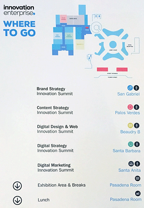
On September 10 and 11, 2015, Innovation Enterprise hosted the first Digital Design & Web Innovation Summit at the Westin Bonaventure Hotel & Suites in Los Angeles. This conference comprised the following five tracks, as shown in Figure 1:
Brand Strategy
Content Strategy
Digital Strategy
Digital Marketing
Digital Design & Web
I chose to attend and review the Digital Design & Web track.
Champion Advertisement
Continue Reading…
Figure 1—Signage to help attendees find the conference tracks
Overview of the Conference
Organization
Content
Presenters
Proceedings
Venue
Hospitality
Community
I’ll begin this review by providing an overview of the conference and critique it along the following dimensions:
organization
content
presenters
proceedings
venue
hospitality
community
Organization
Nathan Meyer, Head of Digital at Innovation Enterprise, did a great job of assembling an impressive roster of speakers for a day and a half of entertaining and informative presentations, from a diverse slate of industries, including media companies such as Disney, NBC News, the Washington Post, the Boston Globe, Wikimedia, and Activision; financial companies such as JP Morgan Chase, American Express, Visa, and Experian; and technology companies and service providers that included LinkedIn, Belkin, eBay, Yahoo!, Fandango, and Orbitz.
The Innovation Enterprise Summits app for iPhone was well designed and immensely helpful for keeping track of the conference schedule. The organizers made video recordings of most presentations and promptly made the videos available on the ieondemand.com Web site. However, to view the videos, even conference attendees must obtain one of the following:
Free, 7-day trial subscription—This requires that you provide your credit-card information and cancel your subscription before your free trial expires. You can get a trial of either the Specialist or Unlimited subscription.
Specialist subscription—This provides access to just one of nine different channels—Big Data, Analytics, Strategy, Innovation, Digital, Finance, Supply Chain, Sports, or CFO—plus, more than 4000 hours of case studies, most presenters’ slide decks, and some workshops and interviews, for $69 per month or $750 annually.
Unlimited subscription—This provides access to all nine channels and everything the Specialist subscription offers, plus, 2500 hours of business education and discounts to future Innovation Enterprise summits, for $89 per month or $950 annually.
The organizers were gracious and helpful. Overall, the conference was a pleasant and edifying experience for everyone.
Content
While every talk was enjoyable and some speakers shared inspiring stories about innovation at their companies, it would be a stretch to say that all of the talks were about innovation in the truest sense of the word. To be fair, that’s not surprising; real innovation is rare. Most companies want to be innovative, but in reality, make only incremental improvements. Google’s philosophy of making products that are 10X versus 10% better is exceptional. Few companies have the vision and the resources to take on that level of risk. In fact, several presenters shared stories about obstacles at their companies that prevented them from being as innovative as they would have liked.
Proceedings
All talks went well. Most presentations were a tight 30 minutes in length and transitioned smoothly to the next speaker’s talk. The organizers handled last-minute speaker cancellations and schedule changes gracefully.
Venue / Hospitality
The Westin Bonaventure Hotel & Suites is a 4-star hotel with the usual amenities. I did not stay at the hotel so can’t comment on the rooms.
The conference’s catered lunch was good, but not amazing. Outside the banquet hall, there were very few food choices for meals. Parking was underground and convenient, but a bit pricey.
There were a few hospitality gaps and some room for improvement: The conference rooms were overly warm and stuffy. Wireless access was almost nonexistent. The hotel staff seemed uninterested in helping the conference organizers or attendees with connectivity issues. I had been looking forward to live tweeting the conference, but that was almost impossible because of the lack of Internet access.
Community
Los Angeles is a great place for a conference because the confluence of technology and media attracts many intelligent, creative designers. Plus, LA is a great vacation spot. It was good to see old friends and colleagues from technology companies in San Francisco and LA and to network with new people from various places in the US and Europe.
The Presentations: Day 1
In this review, I’ll cover the presentations from Day 1 of the conference.
Bringing Emotion to the News
Presenter: Michael Workman, Design Director at Boston Globe
Under Michael Workman’s direction—and in collaboration with writers, illustrators, designers, and developers—The Boston Globe launched a redesign of their standard news template to make it more engaging, interactive, and immersive. They also created multimedia. Workman said, “We are hoping that by giving people these experiences that are really over the top and have this great emotional content, that will lead people back to our site … and [get them to] think about paying us.”
Key Points
Design Principles:
Maslow—Functional, Reliable, Usable, and Pleasurable
Norman—“The emotional side of design may be more critical to a product's success than its practical elements.”
The New York Times launched Snow Fall in 2012, a revolutionary breakthrough in Web content design.
The Boston Globe followed suit in 2014 with Chasing Bayla, their immersive presentation about right whales.
They tried text on the left and multimedia on the right. Users tended to stay on just one side of the page, but users who did switch back and forth liked the format.
They tracked user interactions using custom Google Analytics code.
Beautiful illustrations were key.
The feature was a finalist for the Pulitzer prize.
They were able to produce only one experience like this per year.
Michael Workman shared some inspiring examples of innovative, immersive content—which the New York Times pioneered and whose example other online publications have since followed and evolved. Such content has been hugely successful, but producing it demands significant resources and time. Breakthroughs like these, which completely change readers’ expectations, happen infrequently, but are a huge win for any company that leads the way. I predict that the next wow moment for journalism will involve VR cameras.
Personalized User Experiences
Presenter: Rodrigo Lopez, Co-Founder of Arrived
“Personalization equals essential experiences,” Rodrigo Lopez told us. “The idea behind personalization is to tailor the experience from the moment it begins. What you do to start your day; what helps you to be more you and better every time.” He emphasized how mobile creates unique and omnipresent opportunities for personalization.
Key Points
Rodrigo Lopez’s startup Arrived personalizes the traveler’s destination experience—how people find things to do once they’ve arrived.
With personalization, people expect devices to respond as if they know them and pay attention to their habits. Personalization needs to be like magic.
Mobile Personalization:
“By 2017, mobile users will provide personalized data streams to more than 100 apps and services every day.”
“In the next three to four years, apps will no longer be confined to smartphones and tablets, but will impact a wider set of devices, from home appliances to cars and wearable devices.”
We have evolved from customization, which the user must do, to personalization, which is based on “sensors” built into devices.
“Personalization goes a step beyond customization in that it doesn’t just affect the way things look to users, it also is the way things feel to users. It delivers the content users want, based on their past use, their preferences, or their location.
Users are willing to give up a certain amount of privacy if they see the value in what they receive in return.
Typical challenges include
gaining insights quickly enough—We need to collect data in an agile manner and respond quickly.
having enough or too much data—We must be careful not to collect too much data, then not use it, but get just enough data to act.
understanding context and learning—Key to personalization is knowing the user.
It can be challenging to move a desktop experience to mobile and apply personalization—for example, Yahoo Mail.
Arrived worked to customize user content across ten platforms, which was very challenging.
Transparent personalization relies on information that is passively relayed to your servers—for example, IP address, device type, or tie-outs to other systems such as a customer relationship management (CRM) system. There’s also an approach to personalization that allows users to participate in sharing their own information.
You can personalize data such as content, recommendations, notifications, and location.
Personalization requires learning from the data you’ve recorded in the past. You can only personalize if you know more about the user. Knowing a user very well requires a lot of historical data. To establish a good personalization pattern, you need to know a lot of your user’s past behaviors.
Focus on serving the customer. Instead of being channel- or device-focused, shape your business around customer desires. Apple is a master at creating customer-oriented experiences.
Return on investment (ROI) is more difficult to measure as the demand for more personalization grows.
Location is king. Location context has the most potential to drive significant revenue gains because it takes advantage of mobile devices’ greatest strength: personalization. In fact, 45% of consumers have chosen, recommended, or paid more for a brand that provides a personalized service or experience.
Personalization gives you room to lead. Consumers use their mobile devices for connectivity and content. People are looking for improvements in how they consume and experience mobile content, but many mobile experiences are still lagging far behind
Capture user-experience metrics, using tools such as Flurry and Google Analytics.
My Analysis
Data collection and personalization present huge opportunities. Designing to collect data and act on it appropriately and in a timely fashion differentiates products—especially mobile apps—creates positive brand experiences, and increases user trust.
Scaling the Digital-Payment Experience
Presenter: Kevin Lee, Vice President and Head of Design at Visa
Kevin Lee spoke about designing payment experiences across multiple platforms and products for Visa.
Key Points
Digital-payment tools are the ends, not the means. They must
manage and protect my financial life
protect financial privacy and safety
be available at the moment we need them
Kevin shared a user-experience flowchart that divided digital transactions into two stages with sub-steps:
Shop & consider context
Enroll and activate
Decide
Transact and manage context
Finish deciding
Authenticate and validate
Execute and record
Visa is developing many tools that go beyond simple payments. They have tools for managing spending and budgeting for purchases. They are always designing and testing new tools.
My Analysis
Kevin’s presentation made it clear that Visa is doing a good job of walking the fine line between security and convenience with their digital-payment experience. He alluded to new trends and big changes that are coming. His excellent slide deck is unfortunately missing from the ieOnDemand Web site.
Designing Experiences for Just Around the Corner
Presenter: Matt Glidden, Senior User Experience Designer at Belkin
Matt Glidden spoke about a sort of restrained futurism that allows innovation, but avoids being so cutting edge that there is no hope of mass adoption. Like several other presenters, he referred to Edison—both his successes and his failures. Matt shared images and information about the successful products he has worked on and a few favorite quotations, for example:
“My interest is in the future because I am going to spend the rest of my life there.”—Charles Kettering
Key Points
Design experiences that are not too far ahead of their time. Planning should aim for 18 months ahead.
Pay attention to real people. Avoid ivory-tower design. Do research to understand the past. Pay attention to context.
Influence your company culture to adopt agile processes and design thinking.
User research never stops. Insights are infinitely more valuable than observations.
Failing to address the inherent weaknesses in your technological infrastructure can kill an industry. Know your infrastructures.
Mind the gaps. Matt gave the example of the self-starting engine, which was developed before its time.
Don’t jump to the end. What does it look like in practice?
My Analysis
Like several other speakers, Matt emphasized designing for the near future—about 18 months away or “just around the corner.” Otherwise, you risk missing current opportunities or designing too far ahead of what the market will support. This may be true, but I think it’s an incomplete strategy. Thinking about the next 18 months is essential for any business, but without the freedom to explore long-term possibilities, there is no chance of leading the way with a groundbreaking new idea. Once you have a long-term vision, it can inform your short-term strategy and let you take small steps toward your lofty goals.
To do this, your company has to be in a position to invest its resources into projects that may not materialize for years or that may never pay off. Relatively few companies are. In the end, all companies need both a long-term and a short-term strategy for innovation.
Matt’s presentation stood out, with its inspiring examples of innovative products and projects in which he was instrumentally involved.
A Design Story: Agile, Service, & Semantics
Presenter: Miles Begin, VP of UX and Design at American Express
Miles Begin spoke about the importance of user-centered design. Among other benefits, it will help you avoid the your-org-chart-is-showing problem. The use of data and metrics is vital to good product design. In speaking about product, form, and intention, Miles shared details about the projects he’s been involved in that led to his philosophy of product innovation.
Key Points
Agile—What’s the material? We know that the material we’re working in is going to allow us to tweak it once it’s out there, so we want to get to 80% and get it live to start the conversation.
Service—What’s the context? We have a strong hypothesis for how to create high-impact moments to start our conversation, how to keep the conversation going, and what we want to measure.
Semantics—What’s the behavior? By considering the behavior we want to drive, we can take a focused view on high-impact moments in the conversation and set the stage for a good outcome.
“Product semantics is an attempt to convey what a product is or does through its form. Following this method, the designer uses shape, texture, materials, and color to convey meaning. A designer using product semantics in place of mere styling creates products that are understandable and engaging.”—John Milanski
My Analysis
Miles did a great job of distilling the most critical parts of the design process into an elegant set of principles that help designers and product managers keep on track and focused on the user.
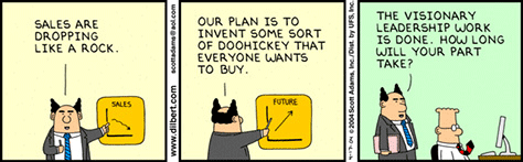
Mind the Gap
Presenter: Tom Wailes, Director, Product Management & UX, Social, at QVC Inc.
In his presentation about the gap between thinking and doing in the design process, Tom Wailes quoted Thomas Edison: “I never want to build something that nobody wants to buy.” Showing the familiar growth-curve chart that illustrates the chasm between early adopters and mass-market adoption, he talked about the challenges that arise during the design cycle. Tom shared examples of unsuccessful and successful product launches from history, as well as the Dilbert cartoon shown in Figure 2, which illustrates the need for more than vision in achieving success.
Figure 2—Dilbert on visionary leadership
Key Points
While whiteboards and Post-its are great for creative, innovative fun, it’s between brainstorming and execution that things go off the rails.
There is an “air sandwich” between the phases of strategic development and execution. This is the gap.
Everyone—in all roles—has to understand the customer, so there can be good collaboration and decision making. You need a complete team.
Create user stories, which follow this format:
As a _____ (role), I want to _____ (goal), so that _____ (benefit)
For example: We believe that _____ (capability) will result in _____ (outcome). We will know we have succeeded when _____ (measurable signal).
A good design process:
Research, test, and iterate.
Move quickly through the process of iteration.
Build many, many prototypes, test, and learn.
Build to think out; test to learn.
Define and measure success.
Tom also shared this Steve Jobs quotation:
“I’m actually as proud of the things we haven’t done as the things we have done.”
My Analysis
Tom is a seasoned professional who has seen all of the missteps that can arise during the product-development process and learned when to say no to half-baked ideas. He made some excellent points about how to close the gaps between strategy and execution. I wanted to hear more about his successful product launches, but I appreciated his insights into the universal challenges of the product-design process.
The Inconsistent Web
Presenter: Bill Hinderman, Lead UI Engineer at Orbitz Worldwide
Bill Hinderman, the Lead Engineer of the A:B Experimentation Team at Orbitz gave a practical, informative talk on how to design and implement multivariate testing for new product features and enhancements, sharing many examples of product designs.
Key Points
For data-driven UX design, use success metrics such as number of users, traffic, or hits. Don’t test just for data’s sake.
Define qualitative success.
What is the purpose of a site? It should be
measurable
visible
bold—Measure bold changes.
meaningful
realistic
cheap
Optimize and experiment.
Try branding new things rather than creating iterative change.
Sync up on verbs, not just nouns. The experience is what you are testing.
“A useful experiment should unlock value, not just mitigate loss.”
“Optimize, experiment, then optimize your experiments.”
“Endlessly validating success eliminates the chance of success.”
How to do A/B testing:
Define quantifiable success.
Optimize and experiment.
Over-communicate.
Fail cheaply.
Don’t test inevitabilities.
eBay slowly and incrementally changed their background color from yellow to white.
Google rolled outs their logo change seamlessly and explained why they made the change. “Everybody hates change, but that fades away.”
Bill Hinderman is an entertaining speaker who knows his subject matter backward and forward. He illustrated the value of data-driven decision making and presented many inspiring examples of how small improvements add up to innovative, effective product designs. I highly recommend your reviewing this presentation on the ieOnDemand site if you have the chance.
Developing a Mobile Product Strategy
Presenters: Shezad Morani, Creative Director, and Phil Zepeda, Director, Design, at NBC News
Shezad and Phil gave a presentation on their recent redesign of the NBC News Web site. Despite its improved usability, there was a drop in visits and other important metrics because of decreased performance and long page-load times. They discussed the importance of measuring and designing for performance—especially for mobile; using data to measure and improve performance in the user experience; and delivering an appropriate experience to users depending on what device they are using.
Increasing the time people spend on mobile sites does not mean decreased time spent on other screens such as notebook and desktop computers. Shezad and Phil shared examples and practical tips for instrumenting pages to detect platform and device and measure page-load time and other key metrics. They emphasized that fast performance means less frustration for users. We must always pay attention to how the user feels. This is a core requirement for content publishers.
Be careful about using external assets such as libraries and third-party tags.
Use responsive design, but be aware of its limitations. Load a minimal user interface on mobile.
What’s the value of performance?
More conversions, visits, return visits. Greater stickiness/habit.
A greater likelihood of increased engagement—more pageviews or video views.
Better search-engine optimization (SEO).
A less frustrating user experience. People’s patience threshold is dropping.
My Analysis
Shezad and Phil gave a great presentation about a product launch that was a mixed success, shared their learnings from that experience, and told us how they subsequently launched a significantly improved site. Their talk included lots of great takeaways and practical tips.
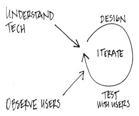
Designing Great Digital Experiences for Critical Business Functions
Presenter: Chris Kiley, Director of Digital Experience at Boeing Digital Aviation
Chris Kiley of Boeing Digital Aviation spoke about how consumer technology has been driving a digital transformation in the aviation industry—from a pre-mobile environment prior to 2010, with paper-based information and processes, digital information only on notebook computers, and highly regulated operations; to employees’ engaging with data on smartphones and tablets, achieving regulatory collaboration, cost savings, and greater workforce efficiency, and identifying new opportunities.
In more regulated industries such as aviation, making the shift toward consumer technology requires implementing new digital experiences that don’t conflict with established processes for critical job functions. Figure 3 shows Boeing’s customer-centered design process.
Figure 3—Customer-centered design
Key Points
Boeing’s digital vision encompasses app designs for pilots, flight attendants, and mechanics, running on smartphones, tablets—particularly, the iPad—wearables, and notebook computers.
Their customer-centered design process includes iterative cycles for understanding technology in light of human factors, visual and interaction design, and testing solutions by observing users.
Their continuous design cycle for enterprise digital experiences starts with technology innovation—for new devices or the Internet of Things—and comprehends product design, development, deployment, operational use—that is, beta testing in operational environments—and customer feedback.
What’s next for Boeing? New mobility capabilities, wearables in operations, better insights from big data, and the evolution of the Internet of Things.
My Analysis
In all product-development environments, an understanding of technological capabilities and limitations and user roles is vital, but this is particularly critical in aviation. Chris Kiley gave an exciting, concise presentation about recent innovations in aviation technologies, including the use of iPads for pilot navigation. Boeing had to address many obstacles, including regulatory and safety concerns, to successfully adopt new, consumer technologies. But doing so has enabled pilots to stop carrying around a 45-pound bag containing their navigation binder and charts and saving over 16 million pages of paper—as well as jet fuel—each year.
Panel: Designing for a World of Devices
Panelists:
Katie Acs, Creative Director at Experian Consumer Services
Josh Klenert, Head of UX & Design at JP Morgan Chase
Bill Hinderman, Lead UI Engineer at Orbitz Worldwide
Jeremy LaCroix, Vice President, Design, UX, & Brand, at Issuu
During an hour-long panel discussion, shown in Figure 4, these four digital leaders addressed the various challenges they face in their respective companies, most of which revolved around getting the right data and insights and designing for new platforms and devices.
Figure —Panel discussion
Key Points
Adaptive design versus responsive design. Which is right for your site?
Why add another platform like wearables?
Why don’t companies support mobile as their primary user experience? You could start small and create a mobile-only solution. With 30% of consumers having only a mobile device or mobile as their primary device, users are starting to expect that they can do everything on mobile, so they get frustrated if they can’t.
By using Bootstrap to define a design language, or style guide, across devices, you can achieve both efficiency and customization. It offers:
specific, context-appropriate functionality
innate features that matter—for example, camera, location, and accelerometer—not just screen size
roles and devices
lazy loading versus eager loading
Use multivariate testing to test the following:
wide versus narrow
different colors
pricing and offers
resource heavy user-interface changes—before committing to a design direction
iterations of data—Don’t lead with data; make it awesome with data.
qualitative versus quantitative research
Other approaches to testing include accessibility testing; in-home visits, or shadowing; focus groups, and usability testing.
Examples of testing:
The top-100 Web sites, stripped of all branding.
Apple’s removing the Store button in favor of storytelling and contextual Buy buttons.
Proper cloth versus custom shirts
Experian’s limited functionality for wearables:
Check your credit score.
Receive identity-theft alerts
Freeze or unfreeze your credit record.
View your annual credit reports.
Design principles to explore:
Rational / Emotional / Meaningful
Simple / Personal / Cohesive
My Analysis
A common mistake in UX design is taking content from an old user interface and jamming it into a new one—for example, from a desktop app to a mobile app or from a mobile app to a wearable app. These devices are different and can and should do different things. Katie Acs admitted that Experian does not have an extensive product strategy for wearables for the following reason: “You’re not going to read your credit report on a screen the size of the Apple Watch.”
However, this seems like a missed opportunity. Being innovative doesn’t mean doing what you’ve always done, just on a shiny new device. For Experian, this might mean using a combination of the data they already have—user’s credit scores—and new data—such as a user’s location and interests—enabling the user to opt in for notifications about timely, location-based offers such as a 0%-financing deal for the car they want to buy or 50% off all purchases for new, pre-approved store-card applicants.
Conclusion
In Part 2 of this review, I’ll cover Day-2 presentations from the Digital Design & Web track of the Digital Design & Web Innovation Summit.
The next Digital Design & Web Innovation Summit will take place on September 15 and 16, 2016, in Los Angeles.
Miria is a UX professional who has designed user interfaces for software, Web sites, and online advertising experiences at Yahoo, Symantec, and Digitas, and as a freelancer. She is currently doing user research and UX design at Spirent, a multinational, telecommunications-testing company. Miria is also pursuing a passion project, developing several Mars Kids! television series concepts to inspire children to learn about science and space exploration. She also writes songs, rescues Web sites, and creates art. Read More