The UX STRAT USA 2015 conference took place on September 9 and 10, at the Athens Classic Center in Athens, Georgia. The conference program promised two days of excellent content.
Now, in Part 3 of our UX STRAT USA 2015 review, we’ll cover some highlights from Day 1 of the main conference, on Wednesday, September 9.
Each day at the conference, Paul Bryan, UX STRAT organizer who is shown in Figure 1, delivered his opening and closing remarks, making sure everyone knew about the events of the day and evening.
Here are our session reviews from the first day of UX STRAT USA 2015.
My Journey with Experience Strategy
Reviewer: Krispian Emert
Presenter: Peter Merholz
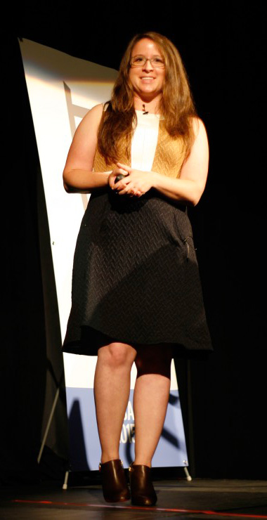
Peter Merholz’s keynote took us on his journey as an Experience Strategist over the past 17 years. Peter, who is Senior Director of Design at Jawbone and is shown in Figure 2, began by saying, “Let’s take this journey together, and we’ll see where it leads us.” An accidental strategist, Peter never set out to be a UX strategist. His education was in anthropology, and he taught himself everything he knows about design.
Figure 2—Peter Merholz
Strategy Through Research
Peter’s journey as a UX strategist began during the dot com Web boom, when he was working at Epinions.com—a Web site that helps people make product-purchase decisions by providing user reviews. He had completed a user-research project with Todd Wilkins, and they sat at a whiteboard, illustrating the journey people take when purchasing products—for example, a digital camera.
Traditionally, the purchase process was thought of as a funnel that let people filter and continue to weed out options until they had reached a choice. However, that's not at all what happens. “When people are researching a product, they have a vague notion of what they want,” then they dive deep to a specific product, and it’s not until they’re looking at the specific product that they realize they have a set of questions. For example, when shopping for a camera, they might ask: “How many megapixels do I want?” or “What am I willing to spend?” So they would bounce back up, then dive down again in making their decision. This process was not a logical or direct progression toward a choice.
This project ended up changing the way Peter thought about designing the experience. Rather than focusing on the funnel, it was about “quickly getting users to a product and architecting the space to help them understand what the other options are.” This experience showed Peter a new approach: “Instead of pushing forward with assumptions, step back, do research, rethink it, and figure out how to better it.”
Articulating Strategy
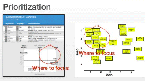
Peter was a Co-Founder of Adaptive Path, which was not a strategy company, but a Web design company. He told us, “We focused on specifications, on requirements.” He showed us his colleague Jesse James Garrett’s “Elements of UX” diagram, which they used to think about and talk about the work they did. Pointing to the bottom “User Needs” layer, Peter noted, “We didn’t even call it strategy or focus on the bottom layer back then.” But in their work, they asked stakeholders a lot of questions and found the stakeholders couldn’t provide answers to their questions. “So we had to go out and get answers to those questions, and those questions could only be answered through user research and prioritization exercises”—such as that shown in Figure 3. This thrust Peter into strategy work because he realized, “We couldn’t do good design without having a strategy articulated. Without having the strategy well-articulated, you’ll be throwing stuff and hoping it sticks. The goal was never to be a strategist, but to put things out in the world, you need to have somewhat of a strategic bent.”
Strategy Through Mental Models
Peter delved further into strategy when he began using mental models with his colleague Indi Young to understand users and developed task-driven information architectures. The purpose of mental-model activities was not to devise a strategy, but he quickly realized that mental models afford a strategic view of a problem. Peter told us that mental models let them “take a step back and see areas that are over supported or are opportunities for new value.”
Experience Strategy Favorites
Along the way, Peter stumbled into some additional tools that drive more fundamental, strategic business decisions. He shared his experience-strategy favorites, stating that they are still relevant today—even though some have been around for over 15 years.
Prioritization
According to Peter, “The most important thing you can do for an organization is prioritization. Companies are usually trying to do too many things with the resources they have. You need to prioritize if you don’t want to spread people too thin.” To inform prioritization, Peter uses a 2x2 grid like that shown in Figure 3. The Y axis displays low-to-high importance, while the X axis shows low-to-high feasibility. Using this grid, Peter realized that there were things he could not impact even though they were important to the business. He learned that, by focusing on the upper-right area of the grid, he could make a difference by focusing on things that were both of high importance and feasible; by focusing on the upper-left area, he could make cost-effective changes. He tried other types of grids, but realized the 2x2 grid worked well in helping clients to see where to focus.
Figure 3—Prioritization
Experience Principles
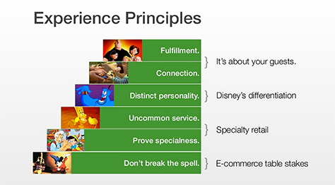
Peter defined experience principles as “statements to uphold as you execute on design.” As he stated, the benefits of experience principles are that they bring teams together and help orient disparate teams as a project goes from design to development. Peter then shared Disney’s Experience Principles, shown in Figure 4, which derived from research that showed guests do not buy because of the products themselves, but because of relationships. They realized that, usually, it’s a relative buying for child.
Figure 4—Disney’s Experience Principles
Peter went on to tell the story of the ideation that came out of using the Experience Principles—in the example, a grandmother buying for out-of-town grandkids. Even if they can’t be together at Christmas, the camera phone lets a grandma “be there” on Christmas morning via video and help the child celebrate. Peter and his team used technology to support this connection, and the Experience Principles were instrumental in understanding this.
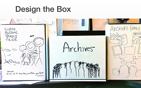
Design the Box
Peter described the Design the Box exercise, as follows: “If the thing you were designing were in a box on the shelf, what would it look like?” Different teams each make a box, then everyone brings the designs together to make one box. Peter told us that the benefit of this exercise is that it “brings stuff out of people’s minds.” He then shared a story about how using the Design the Box exercise on a family-tree Web site project, shown Figure 5, helped them to realize that the family tree is not the point of a family-tree site. Peter said, “You realize stories of coming over, of relationships. The exercise helped shift [their] perspective into telling stories, not family trees.”
Figure 5—Design the Box exercise
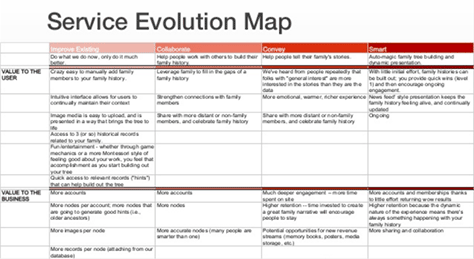
Service Evolution Map
“When you’re building a car, you don’t build piece by piece. No one wants just a tire or just a chassis,” remarked Peter. “The [purpose of a] Service Evolution Map [is to] build individual, delightful products such as a skateboard or a motorcycle until you get to the full car.” Figure 6 shows a Service Evolution Map. Peter explained, “The Service Evolution Map helps you stage experiences over time.” His team used the Service Evolution Map to evolve the experience over time, considering features last. “Focus on the things that afford the experience you want to model. Every client wants the last thing today,” continued Peter. “We’ll ideate, but recognize it’s a process to get there and ease the client toward this future.”
Figure 6—Service Evolution Map
Beyond User Research
“UX strategists get a little too caught up in user research as the primary means of [understanding problems],” cautioned Peter. He acknowledged that understanding and empathy are important, but advised us not to forget about secondary research such as trend forecasting, expert interviews, and fringe user interviews. By using trend forecasting, “You can figure out where things are going. You’ll be wrong, but it will help.”
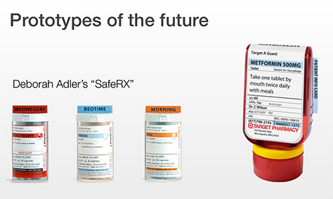
Prototypes of the Future
“We can build the future today. We can help make future ideas concrete. The future can sometimes manifest as actual objects,” said Peter. He used Deborah Adler’s SafeRX, shown in Figure 7, as an example. Adler realized that medication bottles have terrible a terrible user experience, so she mocked up a better solution. “With a vision of what could be, people get excited, and this serves to guide strategy,” stated Peter. According to Peter, devising a UX strategy without prototyping the future sells itself short. “You need to embody what it is you’re impressing. You can even use comics, storyboards, concept videos.” Although he cautioned that concept videos don’t leave much wiggle room between where you are and where you want to be. “Concept videos are problematic because they’re too perfect.”
Figure 7—SafeRX
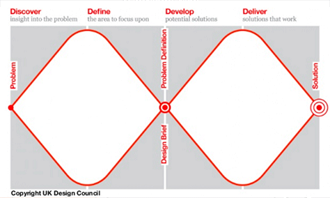
Double Diamond Model
When Peter left Adaptive Path and went in-house, he needed to create a means of communicating the way he designs to others, so he adapted the UK Design Council’s double diamond model, shown in Figure 8. Peter described the double diamond model, saying, “You start with a problem, go broad to discover, then narrow to refine. You then go broad to develop potential solutions and narrow to refine the solution.”
Figure 8—UK Design Council’s double diamond model
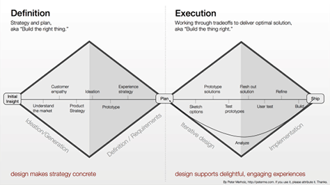
According to Peter’s double diamond model, shown in Figure 9, the first diamond, Definition, is where a lot of strategic work takes place—a whole series of strategic processes that occur before ideation. The second diamond, Execution, does what people expect: it’s about the doing the things that are necessary to deliver delightful experiences. Most companies focus on “execution, which is fairly linear.” The idea of divergence and convergence gets overlooked. Peter said, “My team wasn’t just going to do the things on the right; we were going to do the things on the left. Design makes strategy concrete. There’s a strategic component to design. The idea of divergence and convergence is crucial. Most product development is linear. The nature of this drawing has strategy inherent in it.”
Figure 9—Peter Merholz’s double diamond model
UX Strategy and Design Versus Product Management
Some years back, Peter gave a talk in which he tried to define the profession of UX Designer. The core of Peter’s definition was based on Dan Saffer’s diagram “The Overlapping Disciplines of Interaction Design,” from Dan’s book Designing for Interaction. As a UX Designer, “You could have started at a specific discipline, but now you’re overseeing many factors. UX is a leadership role, but it’s not necessarily a management role,” said Peter. “UX is a systems role. UX brings humanity into systems design and engineering. UX is a synthetic role,” bringing ideas together. “UX drives broader understanding, not just design outcomes.”
What does a UX designer do?
discovery of “user insights
facilitation
ideation
experience strategy and vision
experience planning
ongoing oversight and orchestration”
“Isn’t that just product management?” asked Peter.
After using his double diamond model to map out the various UX activities, Peter realized that it’s not a model of good design practice, but a model of good product-management practice. He has concluded: “The entire field of UX—and design thinking—emerged to accommodate insufficient product management practice.” This got a big reaction from the audience.
Peter told us that product-management practice was initially very business driven, but companies like Google have made product management more engineering driven, so the profession has become very technical. “But the problem is, if you’re only thinking of business and engineering, you’re missing out on the people.” This is the gap information architects, interaction designers, and interface designers have recognized. We have developed what we now call User Experience to fill that gap. This is why there’s tension between product management and strategic user experience.
Peter asserted that, while there’s UX strategy, there is no UX design. “UX—or just experience—strategy is a component of broader product and service definition. UX design is an awkward umbrella term for things that already have names: interaction design, information architecture, visual design, [usability] testing.”
7 Lessons Learned
Peter closed his talk by sharing some of his insights from over twenty years of UX strategy work:
UX strategy “often starts with good user research. When you do good user research, you unlock the vision. You realize it is different and stranger and more interesting and harder than when you thought you had the answer,” said Peter.
“Don’t get trapped within user centered.” Peter cautioned us against blindly following research results or rigidly adhering to a user-centered design (UCD) process. “Make sure you’re doing what you’re doing because it makes sense, not because it is our process or our methodology.”
“Pictures and words belong together. You have to be able to show, not just tell,” advised Peter. “When I started, I used to be very words oriented, but I became frustrated because clients didn’t read my reports. When my words were few and combined with powerful images such as mental models [and] prototypes, things began to stick.”
“It’s your job to make people uncomfortable. If you’re not making your colleagues uncomfortable, you’re probably doing it wrong.” Peter acknowledged that this can be hard for designers because we like to please people; we like to make people comfortable. But Peter believes his best work at Adaptive Path happened when people were uncomfortable. “If you’re doing the user research right and you’re coming up with interesting insights, they are going to call into question what it is that you are doing, and that’s okay. Ride out the uncomfortability and keep at it.”
“Not everyone can be, or should be, a strategist.” I’ve observed that there are a lot of really good designers who are not at all strategic. There’s a sense of a progression within our profession that assumes everyone needs to become a strategist. But some people are not wired for strategy. Accept that it’s okay if not everyone on your team is a strategist. Don’t try to push people into strategy.
“Strategy and execution are best when they’re connected. You don’t want one team doing one side of the diamond and a whole other team doing the other diamond. I think that is problematic,” advised Peter. “You want many people on your team doing both.” While leadership may go from strategy and definition to execution, “You want to keep it all together. If you have one team developing a strategy and throwing it over the wall to other teams, I find this lessens the impact. You want the designers working on the project to understand where the strategy comes from, to have taken part in the user research.”
“Don’t get caught up in identity battles based on job title. Just make sure the activities are getting done. Job titles are stupid,” asserted Peter. “They just get in the way of actually getting the work done. Focus on the activities. Don’t get caught up in labels; get caught up in activities and the value they provide, and make sure those activities are being done.”
In Conclusion
It is always a treat to hear Peter Merholz present. He is a fantastic speaker, and I found this a very enjoyable and informative talk. I learned some tenets and philosophies that have shifted the way I approach UX strategy—and project management. To peruse Peter’s excellent presentation in its entirely, see Figure 10.
Figure 10—Peter Merholz’s presentation on SlideShare
UX Strategy at Google Speed and Google Scale
Reviewer: Pabini Gabriel-Petit
Presenter: Molly Needelman
Molly Needelman, who is a newly minted UX Strategist at Google and is shown in Figure 11, presented a case study about how YouTube has built its UX strategy practice from the ground up—what they call their “visioning practice:
Try it.
Prove it.
Scale it.
Evolve it.”
Figure 11—Molly Needelman
After outlining the early history of UX strategy at YouTube, she spoke about her first UX-strategy project, whose goal was to discover how people become motivated to watch YouTube videos, using an untested framework. “No one was with us along the way. We were asking people to change their entire way of working. How could we ask anybody to believe in our ideas if they’re just our ideas?” asked Molly. The outcome of her early foray into UX strategy was disappointing.
So they went back to the drawing board to devise a new framework based on what they’d learned from their experience. Molly shared three key tenets:
“Meet people where they are. We needed to shift our way of thinking and working, with the team taking a risk with us. Everybody got out in the field—not just the strategists. We shifted … to talking with people.
“Design shared experiences.” Be guided by the process. “Sometimes you have to step completely outside culture.
We needed the space and time for people to think differently.
“Bring strategy to life. Make your strategy tangible through human stories instead of asking [people] to change how they were thinking. Google is about launch and iterate. We started by learning from users and identified key themes and use cases. We spent the time to understand the opportunity and meet users’ needs. It ended up being really beneficial for our business.”
Product Reviews
The team still had much to learn—for example, how to conduct product reviews. “The listing of component parts in a super-technical manner wasn’t human at all,” said Molly. “We wanted to focus products at human scale, but didn’t know how to do this in a product review—the impact it might have on people’s lives.” So they began using video for internal communications, including product reviews. This approach was both “aspirational and inspirational. It was like seeing an ad for a product before it was designed.” It took a handful of people two days to work on a video.
“What would the ideal user experience be?” asked Molly. “We knew why the product was important for the company; why it was beneficial for customers. Because the video was easy to share within the company and with partners, the team could share their dream for a product that did not yet exist. We prototyped the ideal experience, the product vision, [to understand] the impact we might have on real people. Only once we had designed end state could we look backward. This inspired us to create a unique user experience and a new business model for our company. We were able to bring strategy to life in a tangible way.”
Visioning Sprints
“In visioning sprints, people focus on the user and on developing concepts, not solutions. … When everything is collaboration, nothing is. …
“We take the sprints off campus and get out of the conference rooms people are so used to every day to help people think differently. We’ve rented photography studios for sprints. We inspire people through concepts. We try to learn from people at the very end of the bell curve.
“The sprints are inspiring—experiential. We avoid PowerPoints. To better internalize [concepts], we bring people together from across the organization as early as possible. If somebody might have something valuable [to contribute], we bring them into the room. … We get everyone on the same page. The beginner’s mind is super important. The process can be incredibly iterative. In a one-week workshop, we do two rounds of user research. Concept videos [completed] on Thursday are developed into a product on Friday.
“Everything we do is incredibly human. We work at human scale and think about behavior change. … Sometimes, even if you’re designing a brilliant workshop, you don’t come up with the right results. Focus on your user and all else will follow. We have to design for the people within the organization. It can be really hard to keep this focus on teammates, but it’s really important. [Previously, even though] we brought cross-functional people together in a room [for a concept sprint], but we didn’t take into account the constraints that people have.”
Conclusion
“To bring a successful UX strategy practice to Google, we needed to meet people where they live. We pride ourselves on learning from our mistakes. … We created unprecedented alignment across functional teams. We taught the visioning mindset to other people in the organization so other people can take on the role of strategy.
“The places where we work are human systems. Think about the users within your organization. Design for them with the same empathy you would for users. UX strategy is at the heart of product definition. Don’t try to own it. Feel good sharing it and watching it grow.”
Molly stepped up at the last minute to fill in for the scheduled speaker from YouTube, Catalina Naranjo-Bock, who was unable to attend to conference, and she did her best to fill the breach. Regrettably, Molly has not shared her slide deck on SlideShare.
Changing the Culture of Consumer and Enterprise Giants Through UX Strategy
Reviewer: Pabini Gabriel-Petit
Presenters: Mike Hubler and Tim Klauda
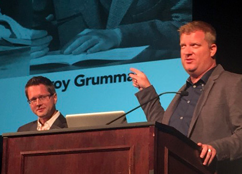
Mike Hubler, User Experience Program Manager at Northrop Grumman Corporation, and Tim Klauda, Vice President, Global Digital Creative, at Walt Disney Parks & Resorts, shown in Figure 12, began their presentation by posing the question: “Why in the world would we be onstage at the same time?” Northrop Grumman is a B2B enterprise, while Walt Disney Parks & Resorts is a consumer company, and the two companies apparently have little in common. In their introduction, they justified this pairing by saying, “We have some of the same digital-design constraints.” Tim said, “When you’re designing software for Disney, you’ve got to be connected with the people around you. You’ve got to be connected to the environment around you.” That’s true for Northrop Grumman, too, but I don’t think they ever answered that question satisfactorily.
Figure 12—Mike Hubler and Tim Klauda
Enterprise User Experience at Northrop Grumman
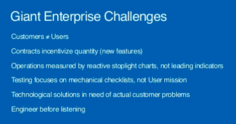
Mike started his talk by discussing some of the challenges that are inherent in a giant enterprise like Northrop Grumman, which are listed in Figure 13.
Figure 13—Challenges at Northrop Grumman
In exploring these challenges and more, Mike said:
“Customers who purchase [the products] do not equal the users who use the stuff. Users are vulnerable stakeholders, but have virtually no influence over [the products].
“Contracts incentivize quantity—[that is], new features. Government contracts are awarded by features [and contractors] earn value by producing features. There are dozens of features [users can’t find or use]. You need to incentivize up differently: award for features removed.
“Operations [are] measured by reactive stoplight charts, not leading indicators. We’re very reactive, not proactive.
“Testing focuses on mechanical checklists, not [the] user mission. Reductionists are contractually incentivized to do this. This is how we get paid. Things turn out not to be useful.
“Technological solutions [are] in need of actual customer problems.” They didn’t satisfy user scenarios.
“[They] engineer before listening. Engineers love to build things. We have lots of solutions in need of actual problems. Engineers are not trained to ask the why questions. We hire the census takers.… Engineers tend not to listen. We’ve got to listen more to make sure our solutions solve problems.
“Many of our projects don’t even know who our users are. They don’t know their user community.” They couldn’t answer simple questions about what users would do with a product. We may have a lot bigger problems than our clunky interface—deeply [embedded in] the strategy of the system. We’re talking to the wrong users: experts. We should talk to 18-year-old recruits with no training. They’re the ones you need to build for.
“Sampling projects yielded failing SUS [System Usability Scale] scores and project rejection. Engineers like to measure, … [but some of the] more interesting stories were things we couldn’t measure because [users] are not even using our product.
“Program stoplight charts [are] moving from green/blue to red. There are no leading indicators. They’re all reactive kinds of measures. User satisfaction [requires] better leading indicators.”
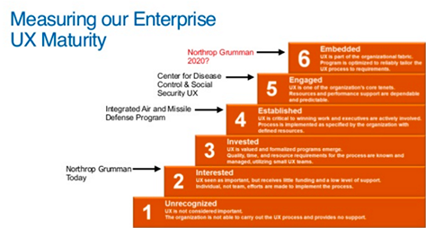
Mike touched on measuring Northrop Grumman’s enterprise UX maturity, which is today only at level 2, interested, as shown in Figure 14. He advocated for a capabilities maturity assessment—that is, a CMMI [Capability Maturity Model Integration] equivalent—for User Experience.
Figure 14—Enterprise UX maturity
User Experience should “shift from a support role to a leadership role,” said Mike. We need to “provide big vision that guides disparate engineering disciplines.”
Consumer User Experience at Walt Disney Parks & Resorts
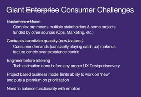
“Our users are everything we care about,” said Tim. He compared the challenges he encounters in the consumer entertainment and hospitality arena with those that Mike Hubler confronts in the enterprise space, which Figure 15 outlines.
Figure 15—Consumer challenges
In explaining these challenges, Tim told us:
“[The] complex [organization] means multiple stakeholders, and some projects [are] funded by other sources” such as Operations and Marketing.
“Consumer demands are always playing catchup. We’re being asked to add feature after feature. This makes us feature centric [rather than] experience centric.
“[Technical] estimation [is] done before any proper UX design discovery. We estimate features without bringing in UX or Design, when we
can’t build [the designs].
“[Our] project-based business model limits [our] ability to work on new [things] and puts a premium on prioritization. We’re hired to think about something only when it becomes a project. That’s too late.
“[We] need to balance functionality with emotion.”
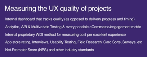
“The situation is partly due to UX being within a creative team, within a tech-centric organization, within a broader marketing organization,” said Tim. Next, he spoke about how his team measures “the UX quality of projects” at Disney, as shown in Figure 16.
Figure 16—Measuring UX quality
Tim’s team uses the following approaches to measure the UX quality of projects:
“[an] internal dashboard that tracks quality—as opposed to delivery progress and timing
“analytics, A/B & multivariate testing and every possible ecommerce/engagement metric
“[an] internal, proprietary, WDI [Walt Disney Imagineering] method for measuring cost per excellent experience
“Net-Promoter Score (NPS) and other industry standards”
To advance the practice of User Experience, Tim’s team has focused on:
education
redefining their roles and how they work
showing rather than telling
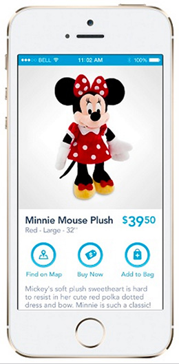
As a consequence of the work Tim’s team has done on the WDW (Walt Disney World) app, shown in Figure 17:
WDW app traffic has grown 260% year over year.
In-park consumption and utilization continue to be in the app.
There has been a continual decline in desktop traffic, as well as growth in mobile.
“The app breaks down barriers to purchase, capitalizes on the emotional connection to our merchandise, and empowers purchasing long after guests get home by grounding the mobile transaction in their vacation experience.”
Figure 17—WDW app
Tim shared a couple of his strategies for effective teamwork:
“Fight Club Strategy—Design time is safe time. Nobody knows we’re doing anything.
“Johnny Appleseed Strategy”—Tim suggested that we give away our expertise and be like a Johnny Appleseed, “spreading the good word of UX design everywhere we go.” To achieve this, his team integrates with other teams and does things together with them. They use “narratives, storyboards, and prototypes to sow” the seeds of User Experience.
Tim quoted John Wooden, saying: “When opportunity knocks, it’s too late to prepare.” Finally, he advised us to: “Stay ahead of the curve. Use data to inform, validate, and sell. Telling somebody there’s a better way doesn’t do anything. You need to show it.”
Conclusion
Since Mike went first and used up the great majority of the time allocated to this session—even though he skipped a bunch of slides—there wasn’t much time left for Tim’s part of the presentation. As a result, Tim had to rush through his content. I think it’s fair to say that most people in the audience had been looking forward to learning about how they do things at Disney, so were disappointed when the time for Tim’s presentation was so curtailed. While, for the most part, Mike and Tim delivered two discrete talks back to back, their talks followed similar outlines, and they combined their slides into a single deck, shown in Figure 18.
Phil Ohme, shown in Figure 19, is Design Strategist and Design Lead for TurboTax Mobile at Intuit. He leads the mobile product–design program for the entire TurboTax lineup. Phil’s talk covered his team’s rethinking of the mobile user experience for the TurboTax app, which allows anyone in the US to prepare and file their taxes on their phone—or switch, at any time, to their tablet or computer.
Figure 19—Phil Ohme
Phil first shared what the TurboTax team has learned about their mobile users:
Most TurboTax users are 20–40 year olds.
They file simple to complex tax returns.
These users have a short attention span.
They don’t like having to enter data.
They’re tech savvy, so they frequently navigate the mobile app store.
Mobile users “like the convenience of taking a picture to eliminate data entry.”
Intuit’s TurboTax mobile-app portfolio includes a range of tax-preparation and companion apps for iOS and Android, including SnapTax. In 2013, SnapTax growth had stalled and, while revenue and units sold remained unchanged, downloads were down. For TurboTax for iPad, downloads, revenue, and units sold were all down.
Mobile Market Trends
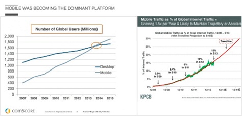
In 2012, responsive design had “led to massive, 4X growth on the mobile Web.” While, in general, 86% of mobile users chose mobile apps over Web applications; for TurboTax, 80% of mobile users chose the Web application over the mobile app. According to comScore and KPCB, “mobile was becoming the dominant platform,” as shown in Figure 20.
Figure 20—The dominance of mobile
Phil described some previously dominant online companies that made successful mobile transformations by doing the following:
eBay was “willing to embrace new form factors and their distinct advantages [and] optimized for distinct segments.”
USAA and Chase “figured out a way to eliminate bank [and] ATM visits [and saved] people time.”
Weight Watchers emphasized habit formation over calorie tracking.
In contrast, Phil told us that mobile laggards did the following:
Electronic Arts was “still mainly in the home-console market. So afraid of cannibalizing consoles, it pulled iOS apps like Rockband.”
Zynga had its “huge success in Facebook games to defend and extend, [so] could not translate to mobile games—even with [the] acquisition of DrawSomething.”
Microsoft “essentially ignored mobile for three key years. When they did get serious, it was too late to catch up on [the] app-store size [and] ecosystem.”
Dell “ignored feature phones, smartphones, [and] modern tablets, until recently, [and] focused only on efficiency, not innovation or trends.”
Mobile Snacking
One of the TurboTax team’s key tenets is the concept of mobile snacking. This term means “engaging with a mobile phone to accomplish a small task, sometimes as a part of a larger task; [or] consuming and/or creating small chunks of information on a smartphone.” The term originated in a publication from Great Britain’s House of Commons: “New Media and the Creative Industries: Fifth Report of Session 2006–2007, Volume II,” which stated: “To date consumers have chosen to snack on the mobile content offerings made to them, choosing content they need in bite-size chunks and downloading it to the handset. News bulletins, comedy sketches, [and] music [and] video downloads are all examples of mobile snacking.”
According to the TurboTax team’s analysis of their user research, some reasons for mobile snacking include the following:
People are busy.
“With a mobile device, they are able to do chunks of their taxes [in] their free time.
“They aren’t always home, so they don’t have access to a computer….”
Mobile snacking is common even when people are at home because:
“It can … be more comfortable to [snack] where there are no computers”—for example, on a couch, in bed, or just when in another room.
“New, tax-relevant information [doesn’t] always come to where they live, and they want to enter tax [information] the moment they get [it].”
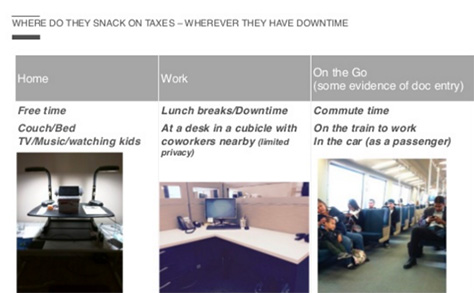
As shown in Figure 21, Phil and his team learned that people “snack on taxes wherever they have downtime”—at home, at work, or on the go and across devices.
Figure 21—Where do people snack on taxes?
Summing up his discussion of mobile snacking, Phil said, “[People] want to work on chunks of their taxes whenever there’s free time [or] they get new tax documents, and they will use whichever device they have access to at that moment.”
Conclusion
As a result of the TurboTax cross-device redesign, which met the user needs the team had identified through user research, the native iOS and Android apps have now achieved a 2.5X increase in conversions and a 2X unit growth.
In conclusion, Phil told us, if your app’s sales are not growing, there is no data portability across devices, or users are yelling at you, take inventory of the app’s current state. “Are you covering how users might want to use your app?” Consider poor coverage, usage—for example, snacking, and role models in industry. Figure out the solution. For TurboTax, they needed a solution in which:
“Data follows you to any device.
“Full tax scope means any taxpayer can use the app.”
There are “small chunks for snackability.”
The outcome was “happy users, exponential business growth, [and] engaged employees.”
Phil seemed almost painfully uncomfortable doing public speaking and rushed through his presentation. But he shared some really good information that would be useful to anyone crafting a mobile strategy. I found the segment of his talk about mobile snacking to be particularly edifying. Check out Phil’s full slide deck in Figure 22.
Scaling UX Strategy for Digital Interactions with Physical Spaces
Reviewers: Krispian Emert and Pabini Gabriel-Petit
Presenter: Shiloh Barnat
In her challenging role as VP of Strategy at Lokion Interactive, Shiloh Barnat, shown in Figure 23, leads groundbreaking, large-scale UX strategy to envision, define, and create scalable business processes and data automation for both user interfaces and physical spaces. In mapping Hilton Hotels, her team has created effective methods and tools for gathering property information from disparate sources, organizing it, and transforming it into useful, well-structured, spatial data that brings interactive experiences with physical spaces—buildings—to life. The tools her team creates support efficient property navigation, visual room selection, and interior wayfinding—on a huge scale—for over 650,000 Hilton hotel rooms across more than 4,000 hotels, 11 brands, and more than 80 countries.
Figure 23—Shiloh Barnat
Shiloh began by saying, “Being able to balance user [needs] and business priorities is really important.” The business context of her team’s work encompasses “evolving customer expectations, industry disruption, and executive mandates.” She reminded us that our work as UX professionals is becoming more physical. Increasingly, we are inventing interactions that move beyond the screen into the real world. Examples include the Internet of Things (IoT), sensors, beacons, and especially, geospatial data that facilitates human interactions with spaces and things within those spaces. “Suddenly, our UX strategies are filled with stories of humans moving through physical spaces like buildings, hallways, landscapes, and interacting with stuff in those spaces through the things we create,” remarked Shiloh.
The Business Context
In 2014, “Hilton became the first in the hospitality industry to offer visual maps for selecting your hotel room,” Shiloh told us.
“Hilton’s getting physical strategy needed context. It’s important to understand the business situation Hilton was facing when we got started,” said Shiloh. She presented the following business context:
“evolving customer expectations—Customers want more direct and visual control over their choices.” Consumers were already selecting airplane and concert seats visually, using interactive spatial maps. “We’ve been picking our airplane seats this way for a decade. An overwhelming 84% of business travelers want to be able to select their room visually.
“industry disruption—Inventive competitors were popping up to fill experience gaps.” When Shiloh’s team started their digital-mapping project, Hilton was under pressure from industry disrupters such as Google and Bing, with their interior maps of malls and airports, and Room 77, a startup using spatial data for the hospitality industry and creating virtual-reality views from hotel-room windows by averaging satellite views. “They really lit a fire under the hospitality market—and especially Hilton.
“executive mandate—Suddenly, executive management was paying attention and insisting it’s time to … do something new. Thus was born our mission, [and] it was a race to the starting gate—a race to map every Hilton property in a little over a year.”
The Method
Ideally, Shiloh and her team would have wanted to start with a more user-centered approach for “gathering and analyzing data to inform the strategy”—conducting contextual-inquiry hotel visits before, during, and after a guest’s stay to understand how visitors interact with hotel staff; mapping service-strategy possibilities; and creating proof-of-concept prototypes. But, because of the aggressive timeline, they quickly had to define a value proposition, ROI (return on investment), and future vision goals; relied on third-party, hospitality-industry market research; and “dove straight into the tactical work.” Shiloh told us her team
“catalogued business and IT goals and plans
“mapped business process workflows, requirements, and data structures
“scoped production labor based on projections of the numbers of hotels and floors and rooms and interaction points we’d be mapping and the varying levels of complexity involved”
“Even when we don’t do all the steps we’d like to do, we still play an important role,” said Shiloh.
The Solution
Thinking ahead to mapping all of the interaction points for the project, Shiloh and her team already had a decent starting place with the graphic floor plans they had created. They wanted to use these maps for bookings. They already knew the landscape and how to communicate with busy hotel staff.
Shiloh told us, “The immediate vision was clear: people want to makes choices visually—select, check in, or even upgrade their room visually.” Increasing such conversions meant everything because they would measure success in heads in beds. “That was our starting place and stated goal.”
Envisioning the Future
“We began figuring out exactly what needed to be mapped. We envisioned what users might want to see and interact with to make their decisions about what room to select and modeled various ways that users might navigate between buildings and floors,” said Shiloh. She and her team thought through many stories.
“Visual booking is not the end of the story. Maps would also know who you are and when you are, in combination with where you are,” envisioned Shiloh. Her team considered “what happens when these maps get hooked up with personalization [and] social, [and] integrating with external mapping services” and brainstormed social-networking mashups and 3D navigation. Shiloh asked, “What if the time of day and your location meant you could integrate with a larger map and find out what things are open to you, for example?”
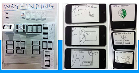
Shiloh showed us some sketches of a wayfinding scenario that they had envisioned, shown in Figure 24. “Imagine you have just landed, the app knows that it’s the day of your arrival and you’re at the airport. Imagine the app finds you transportation; knows that the hotel bar is open. The app sees a gap in your convention schedule and knows to book you a spa appointment,” posited Shiloh.
Figure 24—Wayfinding scenario
Tactical Reality: Gathering and Organizing Information
Shiloh told us that, because her team was unable to visit every property, the tactical reality of obtaining information about each hotel meant they needed to
organize humans to gather information—So they had to understand their roles, personalities, and motivations to keep communication flowing. “[They] mapped out an efficient system of information-gathering input points, file exchanges; motivational nudges, nags, and escalation cycles; smart, yet flexible automated status updates; and customized, role-based reporting [to] orchestrate [the] activities necessary to [gather] all of the [information they needed] to even get started. This need to manage human participation in spatial mapping likely translates to just about any situation or industry where we might be creating digital interactions with physical spaces on a large scale. No matter how much technology and automation you throw at [the problem of spatial mapping], you just can’t remove people from the process. Even if you automate it, it’s still about humans”
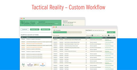
create a custom workflow—“We needed a way to keep the daily communication between literally thousands of humans all over the world organized—a sort of Basecamp for collecting details about hotels. [So] we customized our own proprietary workflow-management application to fit the way they worked,” shown in Figure 25.
Figure 25—Custom workflow-management application
Transformation Strategy
A cohesive strategy combined the following components:
“business-process mapping
“custom workflows
“production process
“mapping engine
“automation scripting
“data specifications”
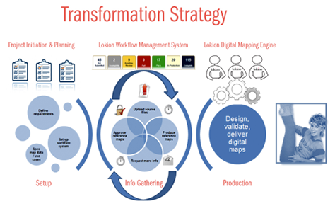
The team’s goal was to combine the human effort of creating maps with automation and transform flat, reference visuals into robust, well-structured geospatial data. “Along the way, … we learned a ton about what it takes to design strategically for huge-scale spatial interactions,” said Shiloh.
“Since these maps needed to support not just the immediate business goal, but also all sorts of potential, future human-spatial interactions, [we] needed … very structured, yet fluid data that can adapt to lots of disparate systems, [devices], and usage scenarios over time. We needed to figure out exactly what data and interaction points to include in the maps”; how to validate, review, and approve the information we’ve gathered [for] various usage contexts; and “build a mapping engine that would efficiently churn through all these of moving parts, enabling the human effort while automating as much as possible.” Figure 26 depicts Shiloh’s transformation strategy.
Figure 26—Transformation strategy
Tactical Reality: Choosing What to Map
“One of the greatest challenges in spatial mapping [is] reaching agreement on what to map. How much detail needs to be present to support immediate plans and future visions? … This critical step of understanding the details of what people might want to interact with [for a specific] property needs to inform the spatial data specification—no matter what kind of space is being mapped,” emphasized Shiloh.
To figure out what to map, they needed detailed information regarding what users cared about. The need to map some elements was obvious—for example, buildings, floors, guest rooms, lobbies, elevators and stairways, restaurants, bars, and swimming pools. But what about less common features such as a beach fire pit, water slide, lawn chess board, golf course, or dolphin lagoon? They realized they needed flexibility in defining key points of differentiation for properties.
Shiloh and her team realized that different properties present unique mapping challenges. Not all maps are created equal. There are more exceptions than rules. For example, some Hilton properties have interconnected skyways or curved walls, and the Mecca Hilton is “very much like an Escher painting.” There were even some properties for which there were no documented architectural details, so they had to map those from scratch.
Shiloh told us that their solution was to map “the structural specifications for a very specific list of standard elements, features, and amenities [with which] guests might want to interact, plus [some] interesting oddities, resulting in an architectural plan to organize … lots of physical-space interaction points.
“To scale our mapping engine, our automation scripting, our staffing, and schedule, we needed to categorize and quantify the complexity and [the exceptions] that translate into a level of effort for every single property.”
The Outcome
“Time shortage cultivates invention. We had to be very creative to infuse our mapping engine, human production processes, and workflow-management system with as much automation as possible [and] pull all these pieces together in the expected timeframe,” said Shiloh. She and her team created automation scripts to handle repetitive tasks—especially data generated by specifications. They also created ways to turn off automation when they were confronted with exceptions.
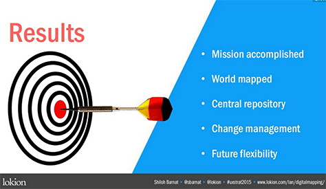
By the end of the project, they had mapped more than 1.5 million interaction points, more than 700K Hilton Hotel rooms, in 4,292 hotels and 93 countries. Getting there presented both strategy and human-effort challenges.
Mission accomplished! They delivered a mapping engine that would let Hilton manage change over time, as shown in Figure 27. The first use case, booking, was well received. There was a 183% increase in digital check-ins and, within four months, 1 million reservations. The system has enjoyed great success with users, with a 91% satisfaction rating and 93% saying they would use the system again. Shiloh told us, “This engine can support future stories of how humans interact with spaces.”
Figure 27—Results
Key Takeaways
Shiloh concluded her talk by sharing four key takeaways from this project:
“It’s all about the people—not just users, but information gatekeepers and business decision-makers and teams and partners who pull it all together. Efficient workflow organizing all those humans is essential to this kind of work.
“It’s only by planning for the future that we even begin to see clearly what needs to be on the map.
“The secret sauce to scaling this kind of mapping [is about] systematizing as much of the [mapping] work and validation as possible, so the humans can stay focused on the bits that just can’t be automated.
“Physical space just isn’t consistent. Variances from the anticipated structures are likely the norm rather than the exception. Plan for it.”
You can begin to think about what goes on a map only once you know the stories behind it. “Automation helps, but it only goes so far,” said Shiloh.
Shiloh gave an excellent talk on a fascinating topic that foreshadows what the future of our work as UX professionals might hold. Have a look at her complete slide deck in Figure 28.
Ben Judy is a Senior Interaction Designer at Intuit and appears in Figure 29. The title of his talk promised a focus on the strong connection between business and experience design strategy. Plus, Intuit is a great company for User Experience, so I was looking forward to hearing what Ben might have to say. He kicked off his talk by declaring that experience designers (XDs) “do not belong in silos.” During the remainder of his presentation, Ben told us his story about building a strategic capability into a newly formed experience design team within a large organization: the Pro Tax Group at Intuit. Ben promised to “talk about how we’re busting out of those dreaded silos.”
Figure 29—Ben Judy
Context: An Environment of Change
Intuit is a 32-year-old software company with about 8,000 employees that is currently experiencing a lot of change. While Phil Ohme works in the Consumer Tax Group at Intuit, Ben works in the Pro Tax Group that creates software for accounting firms and professional tax preparers. Ben described the ways in which Intuit is changing:
Going global—After more than 30 years as a US-based, US-centric software company, Intuit is going global.
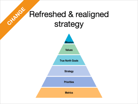
Refreshed and realigned strategy—Intuit is undergoing a major refresh and realignment of its business strategy, at all levels within the organization. Figure 30 shows the alignment triangle that represents a new strategy paradigm Intuit adopted a few years ago. The layers underneath Mission have been shifting over the past few years.
Brand strategy—Intuit’s “brand strategy is changing. We’re transitioning from a house of brands to a branded house.” Intuit’s product brands include TurboTax, QuickBooks, Mint, and Intuit Tax Online.
Products to platforms—They’re continuing their “transition from a company that sells boxed software products off the shelf to building open platforms and interconnected software ecosystems in the cloud.”
Design-led by 2020—Their CEO, Brad Smith, has said, “By 2020, Intuit will be considered one of the most design-driven companies in the world.” That sounds great and makes Ben do a little happy dance in his head. “But the reality is, we’re already a customer-first, design-led company. We serve small businesses, individual consumers, and the accounting professionals who serve both of those groups. The Pro Tax Group has historically focused on those
accountants who serve clients, but now we’re focusing a lot of attention on the relationships between our customers and their clients, the taxpayers.
Two-sided customer benefits—“Which means Pro Tax is learning how to design and deliver two-sided customer benefits.”
Working across business units—It also means they “have to work together with the rest of the company. To operate as One Intuit, all of our businesses and departments need to collaborate and coordinate more closely than they have in the past.”
Figure 30—Alignment Triangle
“In the midst of all of this strategic change, in February of 2014, I joined this [Pro Tax] business unit of about 800 employees—and, including myself, we had three experience designers.” But, in the last year and a half, the Pro Tax Group’s Experience Design team has grown to include seven interaction designers, including Ben, two visual designers, a customer research recruiter, a Senior Manager, and a Director.
Mission-Based Strategy
The Pro Tax Group’s Experience Design team is “developing an identity and a strategic approach aimed at helping us reach our full potential. Rather than being a loose group of individual designers who are isolated within software product teams, we’re a single, mission-based team that designs for the entire ecosystem of Pro Tax products. Our focus on three primary customer benefits is allowing us to break out of those silos.” Providing these benefits to customers is the Experience Design team’s mission:
“Help tax preparers save time. Tax preparers work insane hours during tax season. They can’t take on more work. If we can help them optimize their workflows, then we can help them grow.
“Help accountants grow their practice. Sometimes growth means adding more clients, but it could also mean growing the value they provide to existing clients or growing revenue from adjacent professional services.
“Help accountants make a difference to taxpayers.” The first “two missions help accountants do the thing that led them to their profession in the first place: [making] a difference in their clients’s lives. This is the heart, the most emotional of the three missions.”
“Experience Design didn’t come up with these missions ourselves. Veteran Pro Tax employees have known for a long time why these things are important customer benefits. In fact, our [Pro Tax] business unit vision statement incorporates all three of these ideas:
“Bring the power of time and money to accountants and their clients, so they may prosper.”
“This is very important: the missions are enduring strategic goals that XD shares with the business. … We’re all singing the same song. What could possibly go wrong?”
Mission-Based Challenges
There are some “challenges we’re facing as we organize our design strategy around our missions.”
“Working with multiple, agile product teams—Our mission-based strategy has helped us cope with some process and resourcing issues around product development and delivery. Initially, we aligned our designers individually to Scrum product teams, but without an overarching design strategy for our product ecosystem. We had no UX strategy.
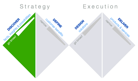
Define and Design in the “double-diamond model of experience design”—This model has “four phases: Discover, Define, Design, Deliver,” as shown in Figure 31. When Ben started working in Pro Tax, he noticed right away that they “have methods that provide for the beginning and the end of this process, but things were getting hazy in the middle. We have a strong focus on discovery. Just two of the ways we discover are:
“Unite—We do Unite events, where our employees get out of the office and spend the day with our customers to discover surprising insights and to build empathy.
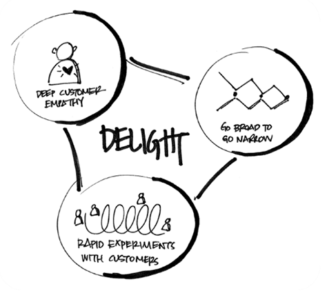
“Design for Delight (D4D)”—As shown in Figure 32, “there’s a heavy emphasis on going broad, brainstorming. Ideation. Discovery.”
Figure 31—Double diamond model Figure 32—Design for Delight
“Most of our product teams practice development methods like Scrum, which provide lots of rigor around [Delivery]. But, even though we talk a lot about measuring customer benefits, [we] don’t … always define them at the project level. There’s a lot of ambiguity about what the design process should be…. As a consequence, our approach to solution design … is also too fuzzy. Our XD strategy has to fix that problem.”
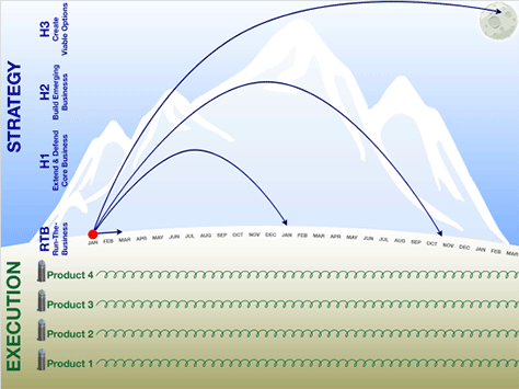
Ben uses the visualization shown in Figure 33 to represent the “placement of design work in a large software company.” Execution is at the bottom, with a “bunch of agile product teams iterating constantly. [The] loops [show] their headlights go out only about two weeks—maybe a month. They can’t see very far from ground level.” Strategy is at the top and uses the “concept of horizon planning—the H1, H2, and H3….” This visualization “really just asks the question: is your company innovating or stagnating? Horizon 3 at the top [is] taking moonshots. Big, bold, ambitious moves—[innovations] that can transform a company—and maybe transform an industry.”
Figure 33—Horizons
“75% of development resourcing goes to run the business (RTB))—In Pro Tax…, three quarters of our software development time as a business unit is spent running the business. Not even extending our core business, just maintaining and running what we already have. [If we overlay] our double diamond model [on] design projects [under Execution, the] diamonds, if they exist at all, get sucked down into executional, run-the-business, just-in-time, MVP, you name it. It’s anything but strategic.
“Altitude—We need to be operating on a higher level, but being a new team with minimal resources, we struggle to climb up out of those silos, where the developers and product management say they want us to be.
“Not enough designers—Our product managers outnumber designers roughly two to one,” and there are 54 project priorities. [Having] a mission-based strategy helps us deal with this.
Product Management “perspectives—The mindset of a product manager who wants to see designers stay fully dedicated only to his or her product [is]: Intuit sells products, not missions. And missions come to fruition in our products. … This perspective is too narrow. Last year, we added electronic signature capability in our Pro Tax products. The customer benefit is saving time. Clients get their returns filed faster; accountants get paid faster.” Therefore, this requirement was mission based. However, “We had three different agile product teams in the same building, delivering this set of features separately. Engineering built a common data service. Because we designers were trapped with each product team in their respective silos, we didn’t design strategically for a common experience. It was a lost opportunity for reuse of design patterns, for collaboration, sharing insights, ecosystem thinking, and efficiency in XD resourcing.”
“Ambiguity—We’re often told to embrace ambiguity. We [especially have] ambiguity around our design process” among people in other functions. When it comes to ambiguity, “timing is critically important. There is a time for embracing ambiguity”—when you’re going broad during discovery or design; “and a time for clarity”—when you’re narrowing during definition or delivery. “But at an organizational level, when the strategic purpose of experience design is ambiguous, the entire design process is unclear. … If I’m on the project, I make sure I know when we’re supposed to be narrowing, and that’s when I start driving conversations that eliminate ambiguity. … A focus on customer-benefit missions allows me to do this, because my role is no longer merely about sitting with the developers and delivering incremental product improvements rapidly. The whole end-to-end, experience-design process is how we deliver those customer benefits, and that’s my domain.”
“Customer insights in silos—While our employees go out in small teams to engage with customers” on ‘follow me home’ or ‘follow me to the office’ visits, “when they come back, they take the knowledge and empathy they gained back into their silos.
“Winning together—XD strategy can’t be XD versus … product management, development, marketing, whoever. We have to win together or we don’t win at all. Product Management and Experience Design need to jointly solve for Discover, Define, and Design. This is not an XD only job, is the job of all of our roles.”
Our Methods
Here are some methods the Pro Tax Experience Design team is using to work at a higher altitude and “organize our young team around what we know to be the greatest needs of our customers,” allowing them to design at a strategic level:
“Speak the language of business. We’re learning to talk about these missions the way the business does. Designers have to get comfortable with those alignment triangles. Pay attention to corporate strategy, be inquisitive, and contribute to it.
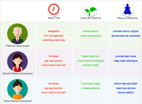
“Apply the missions to every customer. We’re making sure these missions are expressed in ways that are applicable to all of our customers.” As shown in Figure 34, “we do the research to figure out how the missions solve specific problems for each of our market segments such as: Premium, Growth Markets, and Value Market Accountants. …
“Learn the missions. We also had to learn how to think about the missions. We had to train our brains. I created a set of digital flash cards so we could drill ourselves on the missions and other points of business strategy. [Good] to pull out when you’re sitting in a meeting about the minutiae of running the business. Get your mind back on what really matters.
“Track progress against the missions. We started gathering as a team each morning in front of mission boards to review our projects and task status, in the context of fulfilling each of the three missions. …
“Plan projects in pursuit of missions. We’re experimenting with project-management software to help us plan and track our design work through a mission-based strategy lens.
“Commission Mission Captains. We assigned ourselves roles that we call Mission Captains. We act as accountability partners to make sure that we’re focused on customer benefits across all of the product design and discovery work that we’re doing.
Host a “Design Week. We hosted an event we called Design Week, [inviting] the entire business to come for five days of guest speakers, inspiration, design activities, and all throughout, we had a strong emphasis on those missions.
Figure 34—Research
Mission-Based Results
While Ben’s team is very much at the beginning of their journey, he shared some early results with us.
“XD driving clarity”—The team now has “greater clarity around our priorities as we drive a stronger commitment to the missions.
“[Doing] more with customer insights—Another result of mission-based design strategy is doing more with what we learn about our customers. … Intuit is a very customer-centric company. Even our CEO spends at least 60 hours each year doing ‘follow me home’ or ‘follow me to the office’ visits. But, even in such an environment, you need experience designers acting as champions of a customer-first approach. … Mission-based strategy [lets] XDs … categorize insights using the missions. That centralizes knowledge and customer empathy, informing our entire ecosystem of products and platforms.
“XD at all altitudes—[Our research] can help the company do better horizon planning—[whether we need to make an] incremental improvement [or solve] an impossibly big problem with a moonshot. [Doing] that kind of analysis is how experience designers can influence corporate strategy with customer insights.
“Happier, healthier designers—[With] mission-based strategy, designers are happier and more effective because we’re working together. We’re collaborative beings. We learn from each other and challenge each other. You can’t do that in product silos.
“Product Managers [advocating] for holistic XD—That’s how we start winning together: by recognizing that a holistic approach to XD work is all of our jobs.”
Principles for a Mission-Based Experience Design Strategy
Ben presented some broad principles for mission-based experience design, along with some more methods that would enable the audience to understand how they’re applying these principles.
“Every designer is a strategist. On a relatively [small] team, every designer needs to at least have some capability to think and operate strategically. … If we had 40 designers like the bigger business units do, we could have an XD strategy group.” Related method: “Train for strategic UX work. Train designers to think and work like strategists, even if that isn’t their greatest skill set or passion in life. …
“Every designer owns the missions. Communicate them consistently.” Otherwise, you’ll introduce ambiguity. “Get all the designers together, and sell it to yourselves first.
“Execute the design process like you’re on a mission.” It’s about attitude. Related method: “Embrace ambiguity, then murder it. … Strategy demands that you kill the ambiguity. Get everybody aligned on the process and where you are. Designers need to manage the design process for the organization.
“Empathy for all—even your coworkers. Practice empathy for other departments. For us in XD, moving to mission-based strategy has been freeing. But for others, it’s been unnerving. They’re worried that we’re going to abandon the product teams. We’ve had to do a lot of soft-skills work to build understanding and trust. XD has to model empathetic behavior so others reciprocate and try to see things from our perspective.” Related method: “Experiment with a unit of one. … In a political, corporate environment, proceed with caution.
“XD missions = business strategy. Connecting the missions with business strategy is critical. In our case, we drew our missions from the business strategy. We could do that because we’re in a customer-centric organization. This is why we draw pictures that put design process in the context of business strategy. This is also why we explain the missions in terms of the impact to our customer market segments. Business leaders think in these terms.
>
“Missions need metrics.” Business leaders “also like numbers. So we have KPIs. We’re figuring out exactly how to measure Saving Time, Grow My Practice, and Making a Difference. We conduct baseline measurements of user experiences and compare new designs to that data.
“Products and features exist to deliver customer benefits. Product managers and software developers are often incentivized to think product revenue first.” Related method: “Reframe design work requests. When we get requests for design work, we use Project Briefs to ensure that everything we do is mission based, and that we keep our eyes on the whole ecosystem at every step of the process.
“Designers are storytellers. The best stories we can tell are about the success we’re having accomplishing these missions on behalf of our customers.” Related method: “Publish case studies. We want to be the storytellers, not just for design, but for the whole organization—how we won together and delighted customers. …
“Silos suck! Break out! Strategically organizing our team around customer-benefit missions has allowed Experience Design to become a more effective partner with the business in innovating at all altitudes, always keeping our customers at the center of our designs.”
Conclusion
This was a great talk! Ben is a polished speaker, and he prepared what was, for the most part, a very well-organized presentation. His slide deck is well structured, highly visual, and beautifully conceived and executed, as you can see in Figure 35. I strongly recommend that you give it a look. It’s a model for a well-put-together slide deck.
Applying UX Strategy to Optimize the Support Experience
Reviewer: Pabini Gabriel-Petit
Presenter: Kirsten Mann
Kirsten Mann, who is shown in Figure 36, is Director of Customer / User Experience and Online Support at Aconex, the largest platform for the building and construction industry. In her talk, she related the story of how she’s optimized the Aconex support experience through UX strategy. She used one of my favorite metaphors for the key members of a product team: the three-legged stool, with the legs representing Product Management, User Experience, and Technology, or Engineering. (Read my UXmatters article from 2007, in which I employed this metaphor: “Sharing Ownership of UX.”)
Figure 36—Kirsten Mann
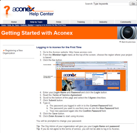
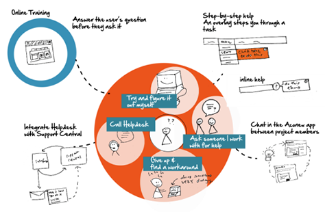
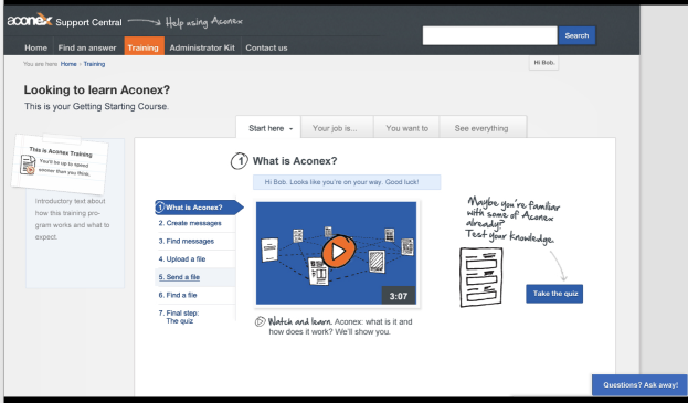
Kirsten inherited online support and thought it “sounded exciting and sexy. But online support was an HTML page with links to PDFs.” (Figure 37 shows the Aconex Help Center.) When Kirsten took over leadership of the Customer / User Experience and Online Support team, she just had “a writer who wanted to be a content strategist. A UX strategist knows when life gives you lemons, you go get tequila and salt,” quipped Kirsten. There were “4,000 support calls abandoned each month. The goal was to reduce call volume.”
Figure 37—Aconex Help Center
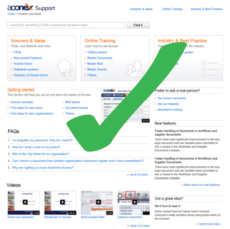
When her team delivered the first iteration of the Aconex Support site, shown in Figure 38, the company used it as a communications channel. “There was so much untapped potential with this channel. Face-to-face and online training was a money pit. Consultants were flying off and giving face-to-face training. We saw we could [invest in the support site and] eliminate face-to-face training entirely. Call abandonment [was] reduced.”
Figure 38—Aconex Support site
“Our support site wanted to be a broader ecosystem. We needed to create an end-to-end support experience,” as shown in Figure 39. “Suddenly I had the right strategy, people, and process ecosystem. I was a strong believer in approaching UX strategy by thinking and doing, not waiting for the ideal opportunity.” I decided to “create a showcase that demonstrated right way to do UX: to provide support where you need it and when you need it.”
Figure 39—End-to-end support experience
“The mission was to create an engaging training experience” like that shown in Figure 40. It’s engaging having somebody doing training. One of the key techniques we tried [to compensate for the lack of the human element] was humor. We weren’t actually as funny as we thought we were. We tried gamification—getting users engaged in their progress. People didn’t care about what they’d done. We were far more interested in people doing this training than they were.”
Figure 40—Training experience
“Within three months, we had removed the need for face-to-face training. We sent users to the Support site. This was a pivotal step in our journey. Support was an administrative cost; now it’s saving us money.
Kirsten’s team now covers User Experience, Content Strategy, Instructional Design, Development, and Videography. “We’ve done three major iterations of that site, including the information architecture and content strategy. This year started to feel like we’d hit all of these points.” Some attainments of Kirsten’s team:
In 2015, ASP judged Aconex to be one of the 10 best Web support sites.
“UX used to be about making shit shiny.
“UX moves up the food chain.”
UX and Support report to the CEO.
“UX has made a tangible difference.
“UX is working with stakeholders across the business to reimagine Support.”
“Lesson learnt: Never stop learning!”
Conclusion
Kirsten’s talk was a UX success story. She’s very personable, is an effective speaker with a good sense of humor, and I enjoyed her Aussie accent. You can view her entire slide deck in Figure 41.
Andrew Hinton is an Information Architect at The Understanding Group, is the author of the recent book Understanding Context: Environment, Language, and Information Architecture, and is shown in Figure 42. Andrew is a deep thinker and an articulate communicator. He told us he wrote his book “because, for years, I’ve been puzzling through what it means when we insert technology into people’s lives.” In his keynote address, which considered how context relates to UX strategy, Andrew looked at the following three themes from his book:
Environmental Complexity
Principles and Facts
Framing and Narrative
Figure 42—Andrew Hinton
“The context of an action you take isn’t the same in different environments. We’re giving our technology agency to run our world in many ways. Things are getting weird, and we need to know what to do about it,” said Andrew.
1. Environmental Complexity
Because there are now so many different technological contexts, Andrew said his “head exploded” when he was writing his book. “We used to rely on screens’ mediating all of this stuff. Not any more. How doesn’t the human body perceive stuff? When we do a thing, how is it going to be to get underneath all of this stuff?”
Ecological psychology is a school of psychology that has its basis in the work of James J. and Eleanor Gibson. “It is a radically empirical approach to understanding perception and behavior. Radical empiricism tries to strip away all the audiology,” said Andrew
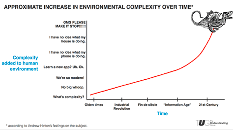
“We have to understand humans in an environment,” Andrew told us. There is the natural environment. “The things we’ve put into the world are the human environment,” which is represented in Figure 43. There is also the product environment. “Just because it’s pixels doesn’t mean it’s not part of the environment. The natural environment behaved differently. The human environment is changing faster than we can keep up with the changes. We’re making products. That’s awesome!” Figure 44 shows the increase in environmental complexity over time. “There’s a lot of complexity under there. It’s connected to everything else now. We cannot adequately address this complexity through interface design alone.”
Figure 43—The human environment Figure 44—Environmental complexity
“User Experience was basically a perspective that had to be added into work that already existed,” remarked Andrew. “You can’t do product work without thinking about environmental work. Complexity is at an extreme upward trend. It’s not even like the information age, which is so quaint right now. We don’t know what’s there. Dragons are going to eat you out at sea. Until we work out the implications, we don’t know what’s there. It’s territory [about which] ancient mapmakers would say, ‘There be dragons.’
“The antidote to UI (User Interface) fixation [is] models and maps. Maps and models look like a waste of time to a lot of people. But modeling is making, dammit. Resist premature instantiation—getting too concrete a solution too soon. Stay ambiguous for as long as you can. Years ago, I stopped doing boxes and arrows because it seemed to constrained to me.
“Just make up new stuff. Read and understand how things works. Rip out what you can use. Make up new stuff. Be okay with ambiguity. Give attribution. Where’s the solution? [When an organization] needs something for a developer to do, how to deal with that pressure? So much—at least half—of your work is pointed at the organization. The organization has to be situated in a way that allows you to do good things.”
2. Principles and Facts
“If you develop principles in an ivory tower based on some stuff you learned last year, stuff changes,” acknowledged Andrew. “The facts on the ground change. I’m just moving through an environment till I get to the thing I need. Even if I think I know what [people] are after, they’re recalibrating to the environment.
“Strategy versus actual work or theory versus practice? These things tend not to be very helpful or practical. You can’t understand the experience of people or organizations through artificial means. Get to the real facts. Strip away assumptions. Things are changing so fast. There are things in UX design that are wrong.”
Andrew used the One Laptop per Child (OLPC) project as an example of how far removed from reality people’s assumptions can be. It’s aims were based on Piaget’s progressive theories about how young people learn. “You can’t just throw that at the world and make it work,” said Andrew. About the OLPC project, Bruce Nussbaum wrote:
“It would have been far better to begin in the villages, spend time there, and build from the bottom up. [The OLPC project] might have discovered there was little need for this kind of machine.”
“There are a lot of reasons why this went sideways,” noted Andrew. “It was a really fascinating situation because it meant so well. It was informed strategy. If [a child is] using a computer online, it has to be same way everyone else is using it.
“[Ensuring we’ve got the real facts] is a discipline we have to build in, not something we do just periodically,” advised Andrew.
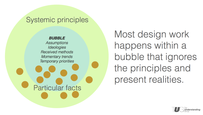
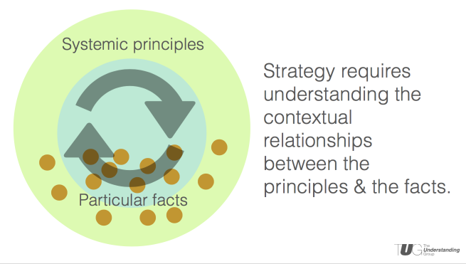
As shown in Figures 45 and 46, “Most design work happens within a bubble that ignores the principles and present realities,” Andrew pointed out. “We’re not going to the facts, then testing again. Strategy requires understanding the contextual relationships between the principles and the facts.”
Figure 45—The bubble Figure 46—Principles and facts
Personas must represent the “messy truth of real people, not tidy data,” stated Andrew. “I’m sorry to complicate your life, but things are going to change. You can’t trust them.”
3. Framing and Narrative
Andrew showed some examples of framing. For instance, you can look at the S&P 500 from a short-term, tactical frame or a long-term, strategic frame. A broker can put this in context for you, “Historically, that’s done really well.”
“As designers, our job is to understand [users’] pain,” said Andrew. “We have to make everything easy for the user. A strategic frame of reference is a better context for decisions they’re making. I’m a very anxious, reactive person. The strategic view gives me a lot more to work with.”
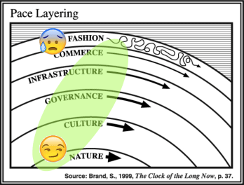
Stuart Brand’s pace layering, shown in Figure 47, is another frame of reference. “Most of the work we do is Infrastructure or up. Governance is more strategic,” commented Andrew. You should ask, “What’s the actual principle beneath. Otherwise, you get stuck in a story that’s wrong.”
Figure 47—Pace layering
Andrew shared a quotation from James McGaugh, of the Center for the Neurobiology of Learning, at UC Irvine:
“We all have narratives. We’re all creating stories. Our lives are stories in that sense.”
“Context controls conduct. … Narrative framing changes what our environment means to us. Being strategic means escaping narrative debt”—the difference between actual behavior and the collective narrative or the complexity of real facts and “the mistaken principle, ‘It’s simple.’ The answer to complexity is clarity, not simplicity. Asking supposedly dumb questions is essential. The things we thought we knew are changing. If I’d asked you five years ago if you wanted a device that tracked you, [you’ have said, ‘No!’ But we’re doing it now.”
Conclusion
Wrapping up his talk, Andrew summarized his key points, as follows:
Consider the complexity of the full environment.
Understand the context between principles and facts.
Regularly question and reframe contextual narratives.
We’re all environmental designers. We’ve got to at least navigate to the part of the ocean where the dragon could get us.”
Andrew is a great speaker and presented some very interesting perspectives on the relationship between context and UX strategy. You can peruse his entire slide deck in Figure 48.
Founder, Publisher, and Editor in Chief of UXmatters
Silicon Valley, California, USA
With more than 20 years working in User Experience at companies such as Google, Cisco, WebEx, Apple, and many startups, Pabini now provides UX strategy and design consulting services through her Silicon Valley company, Strategic UX. Her past UX leadership roles include Head of UX for Sales & Marketing IT at Intel, Senior Director of UX and Design at Apttus, Principal UX Architect at BMC Software, VP of User Experience at scanR, and Manager of User Experience at WebEx. Pabini has led UX strategy, design, and user research for Web, mobile, and desktop applications for consumers, small businesses, and enterprises, in diverse product domains. Working collaboratively with business executives, multidisciplinary product teams, and UX teams, she has envisioned and realized holistic UX design solutions for innovative, award-winning products that delighted users, achieved success in the marketplace, and delivered business value. As a UX leader, she has facilitated conceptual modeling and ideation sessions; written user stories; prioritized product and usability requirements; established corporate design frameworks, standards, and guidelines; and integrated lean UX activities into agile development processes. Pabini is a strategic thinker, and the diversity of her experience enables her to synthesize innovative solutions for challenging strategy and design problems. She is passionate about creating great user experiences that meet users’ needs and get business results. A thought leader in the UX community, Pabini was a Founding Director of the Interaction Design Association (IxDA). Read More
Information Architecture Instructor at Vancouver Film School
Vancouver, British Columbia, Canada
Krispian has over 10 years’ experience, working at all stages of the User Experience process—from strategy and conception through production and implementation. She has worked at award-winning agencies and for some of the world’s top brands, including Microsoft, Thompson Reuters, ING, and Toyota. Keen to improve the discipline of User Experience, Krispian is the Information Architecture Instructor at VFS and speaks about UX Strategy at conferences, universities, and within Vancouver’s UX community. Read More