There are many different types of interaction models, relating to all sorts of domains of human endeavor. General classes of interaction models that have significant impact on user experience include models for
business interactions—Such models represent the ways in which organizations conduct their business—internally, working in partnership with other businesses, or serving their end customers. Business interaction models may be specific to a particular business or represent standard practices in particular industry domains. They define the business context for design solutions and, thus, help ensure that they create business value.
social interactions—These models represent the ways in which people interact with one another in specific social contexts—whether in real-world, virtual, or digital environments or on social networks. Social interaction models may either represent common patterns of human interaction or define patterns for specific products or services.
user interactions—Such interaction models represent the ways in which people interact with technologies of various kinds, which are often specific to particular platforms or types of devices. However, in today’s cross-channel / omni-channel world, it is becoming evermore desirable to design solutions that are consistent across all relevant channels.
In this column, I’ll focus on interaction models for software and the impact of consistency—or the lack thereof—on users’ ability to learn and interact with software user interfaces.
Champion Advertisement
Continue Reading…
In interaction design, an interaction model consists of a set of principles, patterns, relationships, and behaviors that are characteristic of the objects and actions that make up a holistic software user experience. As designers, we define interaction models to establish standards and guidelines that enable us to design consistent user interfaces that optimally serve the needs of particular users, in particular contexts. Application designs may employ both standard interaction models and innovative interaction models, as appropriate to a specific part of a design solution, and may use the same interaction model in different contexts within an application.
To make an application easy to learn and prevent user error, it is essential that an interaction model be completely consistent—both internally, with other similar parts of the user interface; and externally, with other user interfaces that either run on the same platform or belong to the same software domain.
Fundamental Interaction Models for Software User Interfaces
There are a few fundamental interaction models with which we’re all familiar:
point and click—The introduction of desktop user interfaces and mouse devices gave rise to what Apple, ironically, called direct-manipulation interfaces, which let users point to an object on a screen using a mouse or trackpad, then click the object to select it. Desktop and Web applications and Web sites have point-and-click user interfaces. While computers’ desktop interfaces also support more complex manipulations such as drag and drop, the links that provide the foundation of Web interfaces are a perfect example of a point-and-click user interface. Common types of point-and-click user interfaces include Web forms and wizards.
touch—Now, with touch interactions—on our mobile phones, phablets, tablets, music players, wearables, automobiles with touch screens such as the Tesla and Toyota Prius, Microsoft’s Surface, and some Wacom pen computers and pen displays—we have true direct-manipulation interfaces. Most mobile devices and tablets use the iOS and Android touch operating systems.
stylus—Microsoft’s Surface supports stylus interactions; as do Wacom pen computers such as the Mobile Studio Pro, Cintiq pen displays, and graphics tablets such as the Wacom Intuos Pro for Macs and PCs. A few mobile phones—such as the LG Stylus and Samsung Galaxy Note—come with a stylus, and a variety of stylus pens are available for iOS and Android devices. While users employ the stylus primarily to draw and write on a screen, they can also use them for other interactions.
menu navigation and selection—These interactions employ directional arrows that let users navigate menus and a Select or OK button with which they can select menu items. Devices that support this interaction model include remote controls for DVRs (Digital Video Recorders), cable boxes, audio systems, and televisions; controls for automobile settings and navigation systems; and phones that don’t support touch interactions. The menu-driven interfaces of early computers supported similar interactions.
command line—While typing commands on a command line—for example, in UNIX or the Terminal application on the Mac—is a very powerful means of interacting with a computer, few users other than software developers or systems administrators use command-line interfaces today. Command-line interfaces rely on recall rather than recognition, which makes them more challenging to use.
voice—Most of our devices now support voice control, including computers, mobile phones, tablets, wearables, and Internet of Things (IoT) devices—using natural-language and voice-command technologies such as Google Voice Interactions, Google Now, Siri, Alexa, and Cortana—as does the Xfinity X1 Voice Remote. Popular IoT applications include smart homes, wearables, smart cities and grids, the industrial Internet, connected cars, connected health, and smart retail.
gesture—Gestural interfaces range from touchscreens that support 2D and 3D gestures—for example, gestures on iOS and Android devices—to using hand gestures in 3D spaces to interact with virtual-reality spaces, gaming consoles, and IoT devices that let us control the spaces we inhabit.
3D—In real-world, augmented-reality (AR), and virtual-reality (VR) environments and digital games, users interact with objects in 3D spaces. Video-game controllers such as those for Nintendo’s Wii U, Xbox, and Sony PlayStation provide a diverse array of input controls, as well as haptic feedback.
A key benefit of implementing the standard interaction models of common operating systems for particular types of devices is consistency. In the absence of an existing standard, consider stealing the best design solution that already exists, so you can leverage the behaviors that users already know—unless you can come up with a solution that’s much better.
How Kinesthetic Memory Impacts the Need for Consistency
Kinesthetic memory—remembering with our body—is a powerful factor in learning to use a software user interface. We learn by doing—through repetitive actions. We remember the sensations of our body’s positions and muscular movements in relation to ourselves and our spatial environment.
“Kinesthetic cues, or the awareness of parts of our body’s position with respect to itself or to the environment, are useful for recalling the positions of objects in space.”
While information about the prevalence of different learning styles differs, the University of Illinois reports that 50% are kinesthetic learners who learn best through movement and manipulation, 40% are visual learners who learn by watching, and only 10% are auditory learners who learn by listening. Research by Asselin and Mooney found that kinesthetic learners retain best; and people remember 90% of what they say and do, but just 30% of what they see and hear. Of course, the majority of people are multimodal learners.
Because of the power of kinesthetic learning, once users learn the position of an affordance on a screen, they reach for it without even looking. Interactions become habits, and habits are powerful and hard to break. Thus, inconsistencies in interaction models wreak havoc on our ability to learn new user interfaces that differ from those we already know. Which interaction models will stick in our mind, causing us to make the same mistakes over and over again when using software that deviates from the standards in our mind?
Good and Bad Disruption
As UX professionals, we all want to create great user experiences. But opportunities to design something new from scratch that will disrupt a market are rare, so most of our design work involves iteratively improving the designs of existing user interfaces.
Innovating Interaction Models
If you have the opportunity to design a new operating system, a brand-new application, software for a new business domain, or even a feature that no company has ever implemented before, that’s the time to think outside the box and innovate. Don't rush the process. Create something great!
If you can innovate an interaction model that is leagues better than what already exists or is current best practice and will differentiate a product in the marketplace, go for it!
Breaking Interaction Models
But what you really shouldn’t do is make little, incremental changes to interaction models that disrupt users’ established behaviors. If you’re thinking about tweaking anything that would impact a user interface’s interaction models, don’t!
Making users change their long-established behaviors drives them crazy. Nobody likes making mistakes, and tweaking interaction models is guaranteed to result in user errors or, at the very least, irritate users.
Unfortunately, we see these sorts of design changes all the time. For example, designers move controls from the top to the bottom of a screen or vice versa for no good reason. They change the way affordances behave. They change interactions in small ways that don’t add value, but disrupt user behaviors. Companies release applications that have similar functionality, but implement them using inconsistent interaction models.
Recently, I’ve experienced what were to me some irritating design changes to interaction models that have disrupted my behaviors when interacting with some of my favorite products. That’s what prompted me to write this article. These are the changes that bothered me:
Apple added widgets to iOS 10 and disrupted the behavior of the iPhone lock and home screens and the Camera.
Apple overloaded the Control Center in iOS 10 and changed its behavior.
Apple hid the message toolbar in Mail for Mac OS X.
Amazon changed the behavior of toolbars in Kindle for iPad.
I’ll tell you stories about my experiences from the standpoint of a user to convey how users might feel when we make them change their behaviors.
Widgets and the iOS 10 Lock and Home Screens and Camera on iPhone
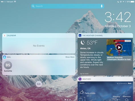
This is the change that annoyed me the most. I discovered this change when using my iPhone for the first time after a software update. I had grabbed my locked iPhone to take what would have been an incredible photo of a huge flock of birds flying swiftly over my top-floor balcony at very close range and wasn’t able to get to the Camera app in time to take the shot. I had only seconds!
Notifications were completely covering the lock screen, as shown in Figure 1, and there was no longer a Camera icon, shown in Figure 2, in the lower-right corner. My habitual behavior was to tap, not swipe to get to the Camera app. There was nothing to tap. Once Notifications were out of the way, I did not notice that the dot at the right in the page control was actually a tiny image of a camera, shown in Figure 3, because of the background image on my phone.
Figure 1—iOS 10 lock screen on iPhone, covered by notifications Figure 2—Old Camera icon Figure 3—iOS 10 page control on iPhone, with a tiny Camera icon
Apparently, Apple changed this long-standing interaction model for taking photos on a locked phone to accommodate its new widgets user interface, shown in Figure 4, which is a copycat feature that I have absolutely no use for.
Figure 4—iOS 10 widgets on iPad
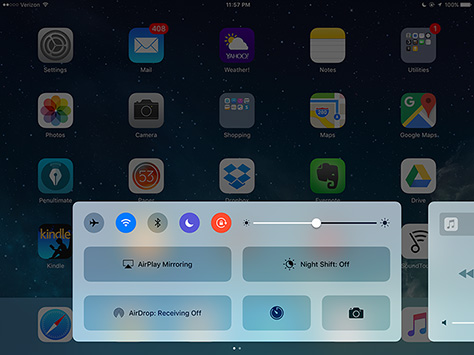
iOS 10 Control Center on iPad
This is just a minor annoyance, but I used to have easy access to all of the settings I needed on the Control Center. Now, they’re inconveniently spread across two pages, as shown in Figure 5, so I have to swipe back and forth to get to all of them. The controls for playing music or videos are buried on the second page of the Control Center, and those are the ones I use the most. If the Control Center extended the full width of the screen and all of the touch targets were of a reasonable size—many are huge—the designers could easily have fit all of the controls on one page.
Figure 5—iOS 10 Control Center on iPad
Message Toolbar in Mail for Mac OS X
In Mail windows that display messages in my Inbox, there’s no reason at all why there should be two toolbars with the same controls on them, one of which is visible only on hover. But, in addition to that, the designers have now removed the controls for viewing and saving attachments from the visible interface—Figure 6 shows the old user interface with a visible toolbar—and placed them only on a hidden toolbar, as shown in Figures 7 and 8, making them very inconvenient to use. I’m really not a fan of having to move the mouse pointer around to discover whether there are any hidden features and where they might be. Plus, Quick Look is buried at the bottom of a menu listing all of the attachments, so instead of it’s being a click away, I have to click, move the pointer to the bottom of the menu, then click again. It takes longer to acquire hidden click targets.
Figure 6—Mail’s old attachments user interface Figure 7—OS X El Capitan Mail message user interface Figure 8—OS X El Capitan Mail attachments user interface
Toolbars in Kindle for iPad
Over the years, Kindle’s designers have moved the toolbar from beneath a book’s pages to the top of the screen—with the exception of the page slider, which is still at the bottom. And now they’ve hidden all of the controls, so I have to tap a page to display them. That means I have to tap twice instead of once to do anything with them, and I use some of the controls often.
The new behavior of the app when I tap a page to view the toolbar is very disconcerting. The page zooms out, as shown in Figure 9, then once I tap an icon on the toolbar, in most, but not all cases, I have to tap the page again to get it to zoom back in. Amazon did realize it’s not possible to adjust the size of the type when one can’t see the content at its actual size, so automatically zoom the page back out again when I tap the View Options icon. I don’t find the zoomed out view at all useful.
The most aggravating thing is that I have to wait through this slow zoom animation anytime I want to do anything using the toolbar, then wait again before I can go back to reading. The zoom animations make doing both of these things take several times as long as they otherwise would. Animations that are part of interactions should never obstruct the progress of the user’s tasks.
Figure 9—Kindle controls with book page zoomed out
Conclusion
To keep users happy, design interaction models that are consistent with those that have gone before—except on those relatively rare occasions when you can create a truly disruptive innovation that will improve users’ lives. Don’t needlessly—or inadvertently—tweak interaction models in ways that would make users change their behaviors. If changes to interaction models disrupt habitual user behaviors, they must add significant value to the user experience. So, when deciding whether to change an interaction model, carefully balance the value of that design change against the effort it will take for users to learn a new behavior.
Many seek to innovate for the sake of innovation, failing to realize or consider that such a mindset comes at a cost—and nobody can really afford it. This is a wonderful argument for simplifying design approaches and being courageous enough to build on common convention. Everybody wins! Awesome breakdowns and presentation! Very, very thorough, Pabini!
Founder, Publisher, and Editor in Chief of UXmatters
Silicon Valley, California, USA
With more than 20 years working in User Experience at companies such as Google, Cisco, WebEx, Apple, and many startups, Pabini now provides UX strategy and design consulting services through her Silicon Valley company, Strategic UX. Her past UX leadership roles include Head of UX for Sales & Marketing IT at Intel, Senior Director of UX and Design at Apttus, Principal UX Architect at BMC Software, VP of User Experience at scanR, and Manager of User Experience at WebEx. Pabini has led UX strategy, design, and user research for Web, mobile, and desktop applications for consumers, small businesses, and enterprises, in diverse product domains. Working collaboratively with business executives, multidisciplinary product teams, and UX teams, she has envisioned and realized holistic UX design solutions for innovative, award-winning products that delighted users, achieved success in the marketplace, and delivered business value. As a UX leader, she has facilitated conceptual modeling and ideation sessions; written user stories; prioritized product and usability requirements; established corporate design frameworks, standards, and guidelines; and integrated lean UX activities into agile development processes. Pabini is a strategic thinker, and the diversity of her experience enables her to synthesize innovative solutions for challenging strategy and design problems. She is passionate about creating great user experiences that meet users’ needs and get business results. A thought leader in the UX community, Pabini was a Founding Director of the Interaction Design Association (IxDA). Read More


