In my last column, Part 1 of this series, I reviewed my research and analyzed on how people hold, touch, and view mobile phones and tablets. I even provided some guidelines on how to design for touchscreen mobile devices. Now, I’m going to explain how I arrived at those guidelines, going into more detail about everything I’ve learned. Looking beyond simple design tactics, this column describes what people actually do and will help you to understand why they interact with their phones and tablets the way they do.
Design Guidelines for Fingers, Touch, and People
For many years, I have performed foundational research, as well as research that was incidental to my design work. From this research, I have learned a great many things about how people hold, touch, and view smartphones. In fact, because I had gathered data on many different things, it had actually started to get confusing.
Champion Advertisement
Continue Reading…
So, a few years ago, I started organizing that knowledge by categories. As a result, I’ve ended up with ten basic user behaviors or technical truths. For each of these, there is a set of principles and guidelines for their use. These are becoming my heuristics for mobile touchscreen design for real people, in the real world, on any device. In this column, I’ll cover the first five of these heuristics:
Device diversity is human diversity.
People touch the center of the screen.
People look at the center of the screen.
Fingers get in the way.
People use different devices in different ways.
1. Device Diversity Is Human Diversity
It’s all too easy to make assumptions and confuse your own point of view with having empathy for your users. But, remember, users probably are not like you or your friends. They use different phones, in different ways, and there is nothing wrong in their doing so.
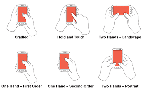
So how do people hold their mobile phone? One of my most quoted data points is that 75% of users touch the screen with only one thumb. However, that data can be misleading because fewer than half of all users also hold their phone with one hand. About 36% of users cradle their device, using a second hand for reach or stability. Plus, fully 10% of users hold their device in one hand and tap the screen with a finger. Thus, users interact with their phone in three totally different ways. Figure 1 shows various hold and touch methods.
Figure 1—The many ways people hold and touch their mobile phones
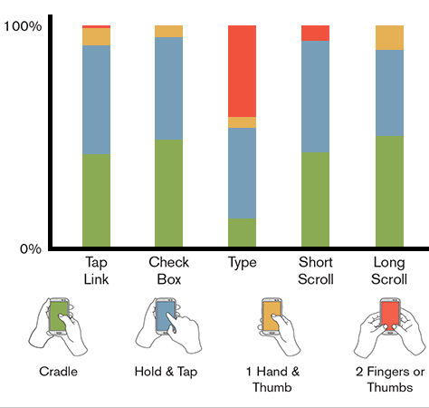
People hold their phone in multiple ways that change all the time. They don’t have just a single favorite way, but frequently shift their grip. The more I watch people, the more I am amazed at how variable people’s interactions are and how comfortable they are with changing their hand positions. Figure 2 is a chart showing how people change their grip for specific types of interactions, depending on their task and context.
Figure 2—How people change their grip for specific interactions
Few people hold their phone with two hands and two thumbs on the screen. At least, they don’t usually hold their phone that way. But people shift their grip when typing, and 41% of users hold their phone with both hands and tap using their thumbs when typing.
Summary
Design for every user and every type and size of phone.
Design for the variable ways in which people work with their devices, not just one way.
Set aside your biases. Don’t assume everyone has your phone or uses it in the same way you do.
2. People Touch the Center of the Screen
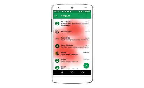
Regardless of the type of touchscreen device, people prefer to touch the center of the screen. Figure 3 shows a heatmap of users’ actual tap positions when selecting items on a full-screen scrolling list.
Figure 3—Positions where people prefer to tap
I set up a study that let users move the content to the position on the screen where they naturally wanted it to be. Once they had moved the content to the center of the screen, they would tap to select it. This study proved something I had observed for a long time during product research.
Therefore, key clickable items should not be along the edges, but in the center of the screen. Accounting for the position of the content and the various sizes and shapes of different devices, I found that most taps were in about the center half of a page. This was true for all hand-held devices, even large tablets.
This explains both why list designs work so well, as well as why Google’s Material Design—which brings function buttons away from the edge of the screen—is a good design solution.
Summary
Users prefer to touch the center of the screen and will do so whenever you give them that choice.
Place key actions in the middle half to two-thirds of the screen. Then, place secondary options and buttons that provide paths to secondary screens along the top and bottom of the screen.
3. People Look at the Center of the Screen
Users focusing on the center of the screen extends to viewing as well. People prefer to view content in the center of the screen. Plus, they notice content in the middle of the screen more quickly and read it more accurately. So follow the existing, reliable mobile patterns of list views and grid views, putting your main content and primary interactions at the center of the screen.
When designing content that scrolls or takes up the whole viewport, be sure to pad the bottom of article pages and forms, so users can bring the very last line of text or the last field to the middle of the screen.
If you don’t, users will still try to move the content to the middle of the screen, wasting their time, increasing their frustration, and making them feel that little-bit-more dissatisfied. Avoid the trendy approach of displaying pages that fit the viewport, then snap to the next page when users swipe. We now know people that don’t enjoy reading like that.
Summary
Make sure key content is in the middle of the page, whether for tapping or just viewing.
Sometimes, this means simply allowing content to scroll to the middle. So provide extra space at the bottom of a page to let users scroll the last content to the middle of the viewport.
4. Fingers Get in the Way
In my last column, I talked a lot about how finger size doesn’t really matter. That’s true, but only in relation to touch-target size and touch accuracy. However, fingers are opaque, so they do get in the way.
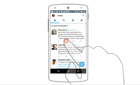
When tapping, people’s finger or thumb completely covers very small icons—such as the Twitter Retweet icon shown in Figure 4.
Figure 4—A user’s finger completely obscuring a touch target in Twitter
When users cannot see targets, it is impossible to target them well. Users cannot tell whether they’ve successfully tapped a too-small target until they’ve moved their finger or thumb away from it. Thus, you should leave plenty of room around each touch target to ensure users can see the target and its state changes.
During the tests I conducted in which I allowed users to scroll, then tap a list, another key thing I learned from the way they touched their screen was their method of gesturing. Some users gestured in the middle of the screen, but as Figure 5 shows, there were many cases in which people gestured at the far right side of the screen, but almost none at the left side.
Figure 5—Scrolling positions vary depending on the length of content
Why? Well, look at the content. When the content extends across the full width of the screen, more people gesture at the side to scroll. So, even though they tap content such as text labels and icons, they scroll by tapping to the side of the content. When you completely fill a page—for example, with a grid of images—people generally scroll at the far right, trying to get away from the content as much as possible.
This is quite universally true. Even people using their left hand reach across the screen to scroll in the blank space at the right side of the screen. However, when reading right-to-left languages such as Arabic or Hebrew—where the left side has empty space instead of the right—people scroll in the blank space at the left.
You might think that users would stick to the edges of the screen on tablets because their screens are larger. But apply the principles we know: people prefer the center and scroll at the side of the content. Because tablets are larger, the content in scrolling lists is less likely to occupy the full width of the viewport. So, when using tablets, people more often scroll nearer to the center of the screen rather than at the edges.
Summary
Make sure people’s fingers and thumbs don’t obscure content, so they can see what they’re tapping.
Make sure selectable items are large enough that they can clearly indicate a successful tap. Try to place functions or any content that changes state to allow users to see the result. Place functions in such a way as to invite users to perform the actions you think are important.
Ensure there is plenty of whitespace within the content, as well as reasonable margins, so users can feel confident about scrolling or gesturing in an area that’s separate from any selectable content.
5. People Use Different Devices in Different Ways
Stop talking about fragmentation as though it’s a bad thing. Instead, respect the different choices people make. There are so many different devices because people’s needs differ. The way people use their devices also demonstrates this diversity.
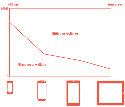
We think of people holding the typical smartphone around 12 inches—or 30 centimeters—from the eyes, even when walking around. But the larger the device, the further people hold them away from the eyes, as shown in Figure 6.
Figure 6—Distance from the eyes varies by device class
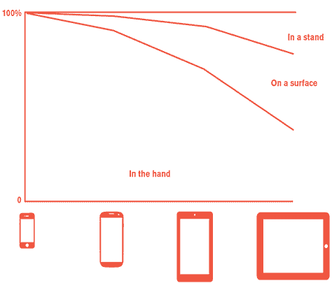
People also use larger devices sitting down more, so almost two-thirds of the time, they use tablets on a stand or resting on a table or in their lap. Figure 7 shows a summary of these behaviors.
Figure 7—Summary of how people use various mobile devices
In general, the smaller a device is, the more people use it on the move. But on the move doesn’t necessarily mean on a bus or train or walking down a street. It often means simply walking around the house or office. People can work as they go about their lives instead of stopping to use a tablet on a table or sitting down to type on a computer at their desk.
As mobile devices have gotten larger, people use these larger devices less and less as hand-held devices. About a quarter of the time, people use larger tablets such as the original iPad with a physical keyboard and the screen at almost an arm’s reach away—just like a desktop PC. Plus, almost 10% of people use pen styluses as their pointing device instead of fingers.
For specific device classes, we can use our knowledge of angular resolution to determine the minimum type size and minimal differences in the sizes of type we use for hierarchies such as subheadings. You’ll find a full discussion of this topic—including an explanation of conversion formulas and everything else you’ll need—in my column “Type Sizes for Every Device.” However, I’ll repeat my final summary of suggested sizes in Table 1.
Table 1—Type sizes for content and subheadings, in points
Device Class
Minimum Size
Basic Content
Enhanced Content
H3
H2
H1
Small Phone
4
5.5
7.2
8.5
10.8
14.4
Large Phone
6
8.5
10.8
12.6
16.2
21.6
Phablet
7
9.8
12.6
14.7
18.9
25.2
Small Tablet
8
11.2
14.4
16.8
21.6
28.8
Large Tablet / Desktop
10
14
18
21
27
36
Summary
Support all input types—especially if you are building responsive Web sites or expect to create an app for tablets and mobile phones.
If you can, gather data on how your users work in their actual environment. However, for most users, the patterns I’ve outlined here are pretty safe for you to follow. You can predict the right type size based on usage and device class.
For optimal legibility, adjust the sizes of type, icons, text boxes, checkboxes, and buttons to accommodate the typical distance of the screen from the user’s eyes for a particular device class.
What’s Coming in Part 3?
In my next column, I’ll wrap up this discussion of how people hold, touch, and view their phone, covering in detail my final five findings:
Touch is imprecise.
One, two, three for better mobile design.
People tap only what they see.
Phones are not flat.
Work at human scale.
Then, I’ll summarize everything we know now and what else we need to look into and learn about.
References
Apple. “Layout.” Apple iOS Human Interface Guidelines. Retrieved March 28, 2017. Apple gives very short shrift to touch, still sticking to their 44-pixel touch-target size from their very first guidelines. In addition to this always having been too small and their not updating their guidelines with additional information for new devices, Apple doesn’t seem to care that they now have devices with different pixel densities, making targets even smaller on many phones.
Carey, John. “Getting in Touch with Capacitance Sensor Algorithms.” Embedded, September 9, 2009. Retrieved March 28, 2017. A good overview of how capacitive touchscreens work and how to make them work even better. This comprehensive article gets pretty technical, so you might want to skim past any parts you don’t understand.
Diaz, Jesus. “This Is Why the iPhone’s Screen Will Always Be 3.5 Inches.” Gizmodo, October 8, 2011. Retrieved March 28, 2017. This is laughable now, but still provides an excellent example of how people hang on to their old biases for way too long. We see the remnants of this thinking all over the place even now—for example, in biases against “overly large” phones and the belief that the only smartphone that matters is the iPhone.
Dave Syverson Auto Center. “Flashback Friday: The First Car Equipped with a Touchscreen in 1989.” Dave Syverson Auto Center, September 26, 2014. Retrieved March 28, 2017. An example of a consumer touchscreen from the 1980s, with photos and everything. Still worth a look because it’s less out of date than you might expect.
Ganapati, Priya. “Finger Fail: Why Most Touchscreens Miss the Point.” Wired, March 4, 2010. Retrieved March 28, 2017. A good, general overview of the issues of technical accuracy on capacitive touchscreens, which may be another good reason to use larger touch targets. Tolerance stacking means adding device inaccuracy to user inaccuracy. While I used to suggest that, with bezels, edge targets could be even smaller, I no longer recommend this because accuracy is poor at the edges of the screen.
Google. “Metrics and Keylines.” Material Design. Retrieved March 28, 2017. Google suggests 48 dp, which is even worse than the iOS standards because there is almost always a mismatch between the assumed pixel density and the actual pixel density of the screen. Actual sizes can be 30% smaller or larger than expected. Google now also suggests 8 dp or more of space between targets. While 8 dp is really small, it’s a start.
Hoober, Steven, and Eric Berkman. Designing Mobile Interfaces. Sebastopol, California: O’Reilly Media, 2011. See the section “Size of the Stimulus: Visual Angle,” in Appendix D: Human Factors, which includes a formula for calculating visual angle, or angular resolution. Also, see the section “Provide Constraints”—around page 317—which discusses how scrolling should typically lock to one axis once scrolling starts.
Human Factors & Ergonomics Society. ANSI/HFES 100-2007 Human Factors Engineering of Computer Workstations. Santa Monica, CA: Human Factors and Ergonomics Society, 2007. This standard suggests a button size of at least 9.5 millimeters, but these recommendations are for the design of computer workstations, or desktop computers.
International Organization for Standardization. “Requirements for Non-keyboard Input Devices.” Ergonomic Requirements for Office Work with Visual Display Terminals (VDTs). Geneva, Switzerland: International Organization for Standardization, 2000. This standard recommends a button size that is equal to the breadth of the distal finger joint of a 95th percentile male—that is, approximately 22 to 23 millimeters. This is extremely large. Plus, contact patches are not the full width of a finger on most devices. This standard derives from the use of interference touchscreens, which sense the entire finger size, using a field in front of the screen. The screen technology matters, so apply standards with caution.
Microsoft. “Interactions and Usability with Windows Phone.” Windows Dev Center. Retrieved March 28, 2017. Microsoft suggests 7-millimeter targets for most uses; 9 millimeters for more important targets; but allows 5-millimeter targets “when it just won’t fit.” More important, they also advise putting 2 millimeters between targets. This gets their recommendation much closer to a proven usable size.
Nielsen, Jakob, and Raluca Budiu. Mobile Usability. Berkeley, California: The Nielsen Norman Group, 2013. Making feedback large enough so it’s visible around the user’s finger is a basic usability guideline for visual design on mobile devices and tablets, from some of those who brought us all our Web heuristics.
Oremus, Will. “The One Big Problem with the Enormous New iPhone.” Slate, September 19, 2014. Retrieved March 28, 2017. Typical, anecdotal, personal opinion on how any particular form factor is a bad idea. Don’t let your personal opinions make you design for people you like better instead of all your actual users.
Sears, Andrew. “Improving Touchscreen Keyboards: Design Issues and a Comparison with Other Devices.” (PDF) Interacting with Computers, April 1991. Retrieved March 28, 2017. This is fairly early research on mounted touchscreens. While many refer to it, I’d be wary of almost any specifications for mobile devices that rely on this too strongly.
Wikipedia. “HP-150.” Wikipedia. Retrieved March 28, 2017. Probably the first commercially available touchscreen, the IR-grid style, all-in-one HP-150 desktop PC sold from 1983 onward, followed by an unbroken series of touchscreens for all sorts of devices and settings.
Wikipedia. “Touchscreen.” Wikipedia. Retrieved March 28, 2017.
Thanks again for your thoughts and shared knowledge. Always inspiring to me. Would you then say that mobile users would usually prefer longer lists of scrolling content rather than pagination on a mobile phone ? Or else, is scrolling not an issue at all on a mobile phone?
In general, I always say scrolling over pagination. Scrolling is natural, easy, and done by just everyone on [touchscreen smartphone] mobiles. Not even slightly an issue. Even false bottoms are rarely an issue; if it’s a list, people will try to scroll.
The preference to scroll is almost the opposite of the old days of desktop worries about implying scroll and false-bottom fears. I mean, it can happen, but it’s almost automatic for people to scroll, and while I see issues of not knowing the form keeps going, more often people wonder why they cannot see more of a list. See the padded-bottom bits in #3 in the column. That tells them they are at the end of the list.
If performance worries pop up, make it a fake infinite-scrolling list. Simple thought exercises will make it clear that pagination doesn’t have to be a traditional interaction, and Show More is just pagination that looks like a cheap infinite scroll. I’ve discussed this a bit on my site.
If anyone worries about things like Back not working on infinite scroll, tell them to make it work! You can absolutely anchor the position on the history for Web, and for apps, you can simply:
Make sure that the linked page is a new view so the list view is just waiting in the stack.
Make sure the list view doesn’t redraw. (It probably doesn’t need to, but we have moved to this world of everything executing on focus for some reason, and need to stop doing it by default.)
There are special cases. Google has famously got some insane number of all clicks on search in about the top three first-page results. Tiny numbers go to page 2 and so on, so they paginate on purpose for both performance and analysis paralysis. They don’t want most users to scroll easily, but to focus on the results. You may have such a situation, so think carefully.
Thank you for sharing your insights here, Stephen. Very helpful. I shared these with my colleagues, and one response we got back was referring to the data illustrated in Figure 2:
“I can’t believe those 1-hand-and-thumb numbers. That’s the only way I see people IRL using their phone, and 0% using that for a short scroll? I think either I’m misunderstanding that chart, or the data is way off here.”
For his entire 15-year design career, Steven has been documenting design process. He started designing for mobile full time in 2007 when he joined Little Springs Design. Steven’s publications include Designing by Drawing: A Practical Guide to Creating Usable Interactive Design, the O’Reilly book Designing Mobile Interfaces, and an extensive Web site providing mobile design resources to support his book. Steven has led projects on security, account management, content distribution, and communications services for numerous products, in domains ranging from construction supplies to hospital record-keeping. His mobile work has included the design of browsers, ereaders, search, Near Field Communication (NFC), mobile banking, data communications, location services, and operating system overlays. Steven spent eight years with the US mobile operator Sprint and has also worked with AT&T, Qualcomm, Samsung, Skyfire, Bitstream, VivoTech, The Weather Channel, Bank Midwest, IGLTA, Lowe’s, and Hallmark Cards. He runs his own interactive design studio at 4ourth Mobile. Read More
