Designing for usability and maximizing value delivery are UX design best practices. Building a useful, data-heavy user experience demands even more. Software engineers have achieved a remarkable feat in recent years: leveraging Big Data and data analytics to predict and prescribe users’ behavior. With the help of artificial intelligence (AI) and machine-learning tools, we can gather huge amounts of data from various sources, enrich and analyze that data, then share the results visually on dashboards and in reports.
But visualizing data isn’t helpful if that data doesn’t make sense. So UX designers have traditionally used bar graphs, line graphs, and pie charts to present data to users visually. Nevertheless, keeping user interfaces simple, focusing on clarity over style, and emphasizing what the user would consider important insights are timeless UX design best practices that can make data-heavy user experiences successful. In this article, I’ll highlight some UX design trends that are transforming data-heavy user interfaces into more insightful and less overwhelming user experiences.
Champion Advertisement
Continue Reading…
Building Scalability into a UX Design
As UX designers, we need to contemplate the possibility of both business and product changes when making our initial design proposals—right from the beginning of a project. Both user needs and product features are likely to grow continuously. So designing a successful data-heavy solution requires its being adaptable to meet the needs of the future.
How can we achieve this goal? Design the user interface (UI) on a platform that supports scalability, whose UI elements—rather than being blockers—enable continuous growth and development by virtue of being dynamic and extensible—through the use of APIs, add-ons, and extensions. You might even leverage open-source code to enable others to help you build and continuously integrate new capabilities over time.
Your clients’ being able to scale up a design solution themselves—on a phase-by-phase basis and using in-house talent—is beneficial to them. Google’s Material Design Guidelines are a good source of wisdom on which you can model your product. Using these guidelines, you can simplify and draw attention to the key data points that you want to prioritize on a dashboard.
Clarity-Promoting Responsiveness
Many people associate responsiveness with mobile-app design trends. But when you target larger screens, which are 1280 pixels in width or more, your data-intensive designs should take advantage of that extra space.
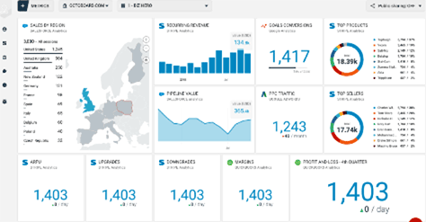
Of course, you could just display more information, but the current UX design trend is to present key, relevant data in the clearest, most detailed manner that makes full use of the larger viewport. In addition to reducing clutter, these designs also help users find more information with less clicking and browsing. Figure 1 provides an example of this approach.
Figure 1—An effective dashboard
This ChartMogul dashboard for Chief Financial Officers (CFOs) and other professionals working in finance manages to walk the narrow line between providing rich resources and trying to communicate too much information. The sidebar hides additional information, so the dashboard prioritizes the most vital metrics that finance professionals want to see right away when they log into the system.
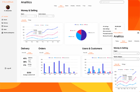
Figure 2 shows the FloralSun online-store dashboard, as it appears both on a mobile device and on a larger screen.
The designs for both of these dashboards have sufficient whitespace, which prevents their feeling overwhelming, and they deliver value from the first glance.
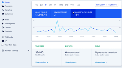
Figure 3 provides another example of a clean dashboard, with line graphs, tiles, and a tabular display that manages to keep things clean on different screen sizes while providing enough insights at a glance.
Stripe combines simplicity with answers to the most common questions that account owners typing ask when they log in.
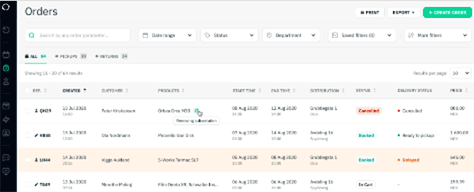
Well-Prioritized Tables That Show More Data
Data tables are a great way of organizing and presenting lots of data, showing both the correlations and the variables that they comprehend. However, the issues with tables can be a bit like the dilemma of niche versus multitopic Web sites: the more data you need to tabulate, the more challenging it can be to optimize a table’s user experience.
UX designers often use color coding to draw attention to key information. For instance, in Figure 5, Payfit’s color-coded dashboard highlights high-priority data that requires the user’s immediate attention in red, while green highlights indicate a complete or successful process.
Figure 5—Highlighting urgent information
Image source: Payfit
There are various uses for color coding in your design language. For instance, organizing tasks by color-coding their deadlines—for example, using red for overdue tasks, orange for upcoming deadlines, and green for completed tasks. This approach is quite intuitive and can help users find the answers they need quickly.
Other user-interface design elements that enable you to structure and clean up tabulated data include the following:
cell padding—whose height and width you can adjust
fixed rows or headers
zebra striping
alignment tips
linked data
pagination
sorting
filtering
searching
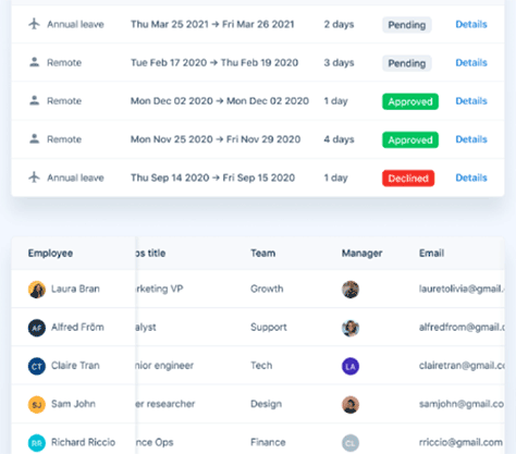
In Figure 6, Sharefox’s booking-management system combines a number of these UX design techniques to help users more easily capture key data from among a large amount of information.
Figure 6—Tabular data in Sharefox
Drop-down menus and progressive disclosure are other options for UX designers who are creating data-heavy user experiences. On click, a drop-down menu expands to display more actions or options, while progressive disclosure can reveal more data or task details.
Tapping, swiping, and rollovers are ideal user interactions for revealing more information, as is zoom-in-to-reveal.
Usability Testing with Video
As users continue to interact with your UX design solutions, they’ll often suggest improvements that you could make to improve their user experience. However, an even smarter, more actionable practice is to watch videos of your actual users interacting with your design so you can tell what features to optimize and what bottlenecks to eliminate.
Some top usability-testing tools let you record video and audio of your users interacting with a design, which can help you understand their actual experience of your UX design solution or product. You can then leverage these insights and implement your UI designs in code to improve the user experience.
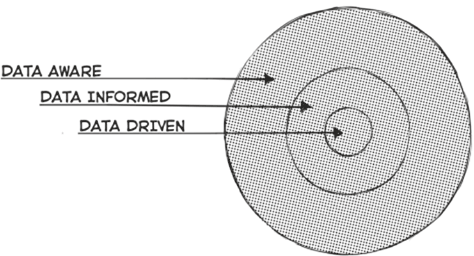
Data Aware, Data Informed, or Data Driven?
Your operational approach can help you determine how much data you should collect, analyze, and display on your dashboard. The trend is to use a data-driven, data-informed, or data-aware UX design from an early stage when creating a data-heavy user experience, as Figure 7 depicts.
Figure 7—Approaches to leveraging data
Image source: Designing with Data
A data-driven user experience involves simply leveraging analytics-driven decisions, which can help improve performance and conversion rates.
A data-informed user experience incorporates statistics, feedback from users, and intuitive thinking. Structured A/B testing is an example of data-informed design.
A data-aware user experience takes a bigger picture view of the data. It is most useful when you’re tackling specific design challenges rather than when undertaking extensive design changes. You can choose which data collection, evaluation, and reporting processes to use to ensure you make UX design improvements that matter.
The best approach to use depends on the specific need that is driving your building a data-heavy user experience.
Some UX Design FAQs
Here are answers to some common UX design questions:
What is a good UX design? Ideally, this is a design that helps the target users do their job or make decisions more efficiently.
When is UX design necessary? For UX design projects for data-heavy Web, desktop, or mobile applications.
What is a bad UX design? A design that is cluttered, overwhelms the user, or fails to prioritize information for your actual target user, so is less useful than you intended.
What is the difference between UX and UI when designing for data-heavy applications? UX design and UI design are not the same. UX design provides a holistic design solution that comprehends all aspects of design and delivers an optimal user experience. UI design focuses more on layout and appearance and attempts to establish an emotional connection with users. However, UX and UI design go hand-in-hand and complement each other.
This is a great article! Having worked in enterprise applications with data-heavy tools, this clearly illustrates the importance of UX and the important aspects to look out for when designing for enterprise applications.
Jon is a digital-marketing consultant, keynote speaker, SEO specialist, and business coach. The founder of Jon Torres, he has a deep understanding of all the highs and lows of online business. When he’s not absorbed in digital marketing, Jon loves raising mental-health awareness through the adoption of emotional-support animals (ESA). Read More