Top

Beware of Feature Overload: A Case Study

March 25, 2014

Many popular applications from the 90s are not available on the market anymore. New Internet users will never hear about RealPlayer or ICQ—products that millions were using just ten years ago. One reason they’re gone is that a plethora of new features turned those simple, usable applications into hulking space stations, resulting in a bad user experience.

The Paradox of Choice

According to an interesting psychological concept called the paradox of choice, the more choices we have, the less happy we are with the choices that we make. If we were to apply this concept to an application user experience, it just might be that the more options a product offers, the less satisfied users will be. Some companies have never understood this.

Champion Advertisement
Continue Reading…

ICQ used to be the most popular online communications tool in the world. Released in 1996, it succeeded in the marketplace, registering 100 million users by 2001. Year after year, ICQ’s feature set grew—to the point where the company had to offer a second product?, ?ICQ Lite, which included “only the most popular features of ICQ.” Their original instant messaging application had gotten so bloated with features that they had to release a simplified version of the product.

RealPlayer is another example of a product that had too many features. Initially, it was just a simple media player, but it ended up offering CD burning, audio recording, RealPlayer Music Store, and more. In 2006, PCWorld magazine included RealPlayer on its list of “The 25 Worst Tech Products of All Time.”

On the market since 2002, LiveChat, my company’s communications tool for Web site owners, had become bloated with too many features by 2006.

Figure 1—LiveChat in 2006, a case of feature overload
LiveChat in 2006, a case of feature overload

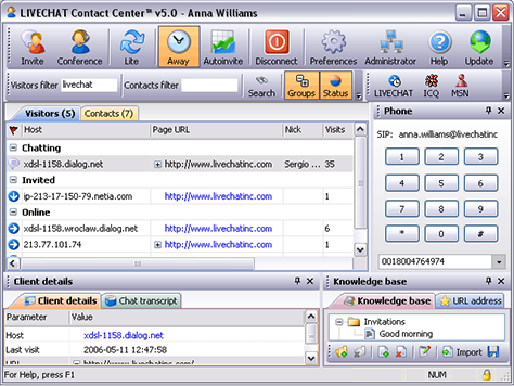
LiveChat let companies monitor traffic on their Web site, chat with site visitors, manage their business contacts list, integrate with ICQ/MSN instant messengers, and even make phone calls.

In the beginning, adding new features felt good. We loved employing new technologies, and our customers loved getting what they asked for. It seemed to be a classic win-win situation. We thought this was a good way to develop the product. This approach seemed logical to us: if we solve all the problems our customers have, we’ll finally create the perfect application.?

However, we reached a point where there was just no more room for new features. Adding another feature was no longer a 1-hour job. Where to place that new button? How to explain a new feature to customers? Our overloaded product was also much harder to maintain. A small change in one place could easily cause a bug somewhere else.

Along with the product’s new features, its number of use cases grew exponentially. We were surprised by some of the ways in which people used our product. For example, we provided agent-to-agent chats, so agents could help each other while serving challenging customers. As it turned out, some of our clients were using that feature to collect pizza orders in their company. These customers didn’t really need to use our product for that. They might easily have used Skype instead.

Escaping from the Trap

In 2009, we took a step back and finally understood that feature overload is not a good way to go. We made a decision to simplify the product as much as possible.

At first, we had planned just to cut features from our existing product, but came to feel that this would amount to simply painting the grass green. Making small, iterative changes would change only the product’s appearance. Instead, we wanted to improve the whole user experience of our product, so we decided to create a new version of our application from scratch.

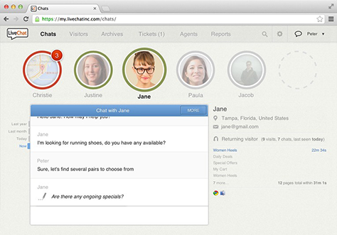
After eleven months of hard work, we released our new application and a new product Web site. We also provided our customers with lots of high-quality materials that helped them to better understand the product. The results were satisfying. After just six months on the market, our new product was getting 20% more customers a month. After a year, 70% of our customers had decided to migrate to the new product.

Our new customers were spreading the word about our application’s great user experience. One said, “I’m loving everything about #livechat. You guys have a beautiful user experience.”

Figure 2—Simplified, easy-to-use LiveChat in 2014
Simplified, easy-to-use LiveChat in 2014

Lesson Learned: Product Teams Should Learn to Say No

During our product redesign process, I learned how important it is to manage feature requests from customers properly. Customers really wanted to be helpful and bring value to the product. Even though customers’ specific use cases biased their requests, it’s natural that others would have the same problems. This might seem to be definitive proof that making the decision “Let’s build that!” was the right way to go. However, this would have been a short-sighted perspective. Do not rush to build something new just because of a single tweet or email message.

Having a clear vision that steers the design process brings value in the long run. It keeps your product clean, easy-to-use, and worth recommending. The problem is: people are more comfortable with making short-term decisions. A good product manager must always keep a product’s long-term vision in mind.

Being this disciplined is especially hard for developers. Blindly following the path of building more new features is the way they’ve typically worked. Getting a task, completing it, and moving forward feels good. By nature, developers love building things, so the idea of removing features feels like a step backward.

How to Keep Your Product Clean?

I recommend doing the following to prevent your team from building unnecessary features in your Web application and keep your product clean.

1. Build universal features whenever possible.

Learning how customers use a product can be an eye-opener. You may discover interesting use cases that your product can support. For example, Gmail not only lets users send email messages, but also maintain a sort of to-do list. When an email message lands in a user’s inbox, he can keep it there until he’s completed the task that is associated with it. This is an effective technique for people who receive tasks via email. No other tool is necessary for writing down to-do’s.

2. Consider enabling features only for customers who really need them.

A corporate customer has different requirements in comparison to a freelancer, but you can still build a single product for both audiences. Using Gmail as an example once again: both small and large enterprises rely on Gmail for their online communications.

Plans offering different features are the way to go. A customer has to make only one choice?—?to pick a plan. All subsequent interactions with the product are tailored to the customer’s needs. That’s way better than confronting users with unnecessary product features over and over again.

3. Display features at the appropriate moment.

Users don’t need to see all available features, all of the time. Facebook provides a good example of displaying features contextually. When you sign out of Facebook, they suggest that you use their mobile app. They present this pitch at the best possible moment: right when users may need it.

Figure 3—When a user signs out of Facebook, a suggestion to use their mobile app appears
When a user signs out of Facebook, a suggestion to use their mobile app appears

4. Have a strong product vision and follow it whatever you do.

Many product teams have no clear sense of the direction in which they’re going. Subversion, a dominant player in the version-control systems industry of the 90s, is a good example.

Subversion solves the problem of allowing many people to work on the same source code. Many software projects rely on Subversion, but they also use other tools in their everyday work to manage bugs and feature requests and collaborate on open-source projects. This is what the people behind GitHub.com understood when, a few years ago, they created a product to fulfill this vision: Build software better, together.

It turned out that developers like the idea of working on a project using a single tool. The team behind GitHub didn’t focus on features. They focused on the profits that  their customers would earn thanks to their product. Subversion was just one of the necessary components. GitHub includes all of the tools that developers need and, from a developer’s perspective, that’s how it should be.

Subversion pursued the wrong direction. Their fuzzy vision statement provides good proof of that:

Subversion exists to be universally recognized and adopted as an open-source, centralized version-control system characterized by its reliability as a safe haven for valuable data; the simplicity of its model and usage; and its ability to support the needs of a wide variety of users and projects, from individuals to large-scale enterprise operations.

5. Rethink your whole product user experience from time to time.

To keep your vision clear and your products clean, you must perpetually question the usefulness of your products’ available features. The Internet is a young medium. What is useful today may not be tomorrow.

MySpace.com is a prominent example of failing to make good decisions about what features to add. The team behind it was building lots of features, but could not decide which ones were most important. This place for friends offered its users photos, videos, emails, blogs, forums, groups, games, apps, a friends list, page themes, and more. Even worse, they displayed all of this on a single page. Eventually, people started using other applications that offered similar features in a cleaner, better designed user interface—for example, Facebook. MySpace missed the opportunity to rethink why their product existed. They didn’t realize that they should focus on the most important things to bring a truly valuable product to the marketplace.

Conclusions

You should avoid making new-feature development your highest priority. Keeping a product easy-to-use requires that you constantly question its available features. When there’s no clear reason for something to exist, bite the bullet and remove it from your product. This will help you to focus on only essential features in the future.

People who develop products are comfortable building new things. But with every new feature that a team releases, there’s the risk that another part of the product may suffer. Never forget the fundamental value that your product provides. Remember to stick to your product vision in everything that you do.

Don’t compete in the features rat race. This would move your product development efforts in the wrong direction. 

CTO at LiveChat

Wroclaw, Poland

Bartosz OlchówkaBartosz is passionate about building simple yet powerful products. Since 2009, he has been working on LiveChat, a customer-service tool for businesses, and took part in redesigning a product that was already in use by 6000 companies. Following an effective migration process, LiveChat’s introduction to the public was successful. Bartosz received his Master’s Degree in Computer Science from Wroclaw University of Technology.  Read More

Other Articles on UX Design

New on UXmatters