We’ve probably all had the experience of opening an HTML email message on a smartphone only to find that it hasn’t been optimized for mobile. The text is too small to read easily, and it’s difficult to interact with calls to action because of their size and spacing. However, there are ways in which email creators can solve these problems, including using responsive design techniques and taking a mobile-first approach to designing HTML email messages.
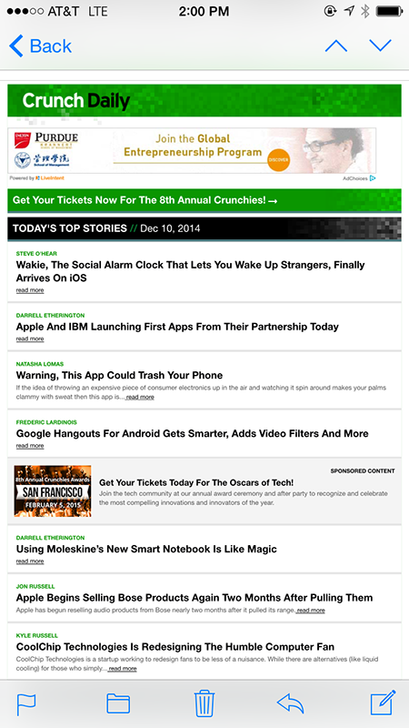
The example shown in Figure 1 is a TechCrunch daily-update email message, which is not optimized for smartphone users. The first problem is that the headline text is too small to read easily without zooming in, so it requires horizontal scrolling. Some headlines have additional text beneath them, but that text is even smaller. And the read more call to action feels almost microscopic. To be fair, the headlines also link to the articles, but people may not know that at first, because there is a separate, more explicit call to action.
Champion Advertisement
Continue Reading…
Figure 1—Crunch Daily email message on a smartphone
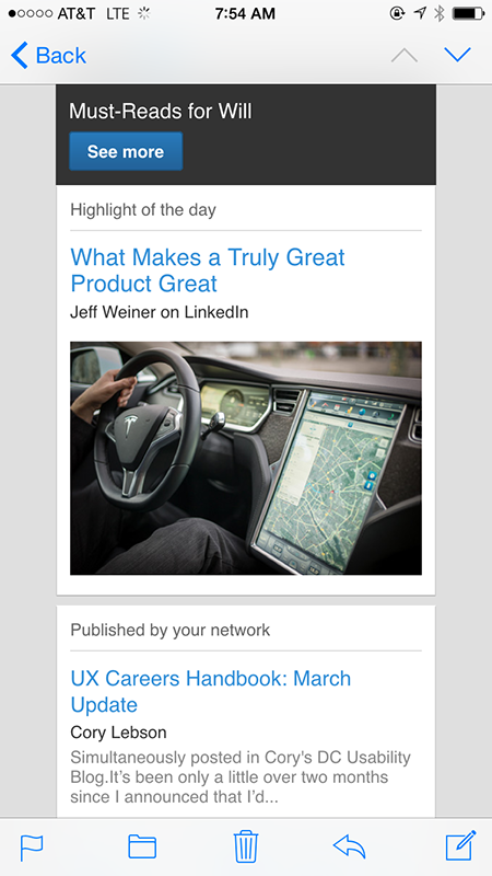
Compare the TechCrunch message to the LinkedIn Pulse message shown in Figure 2, which is optimized for mobile. It also presents articles in an email-newsletter format, but the copy is much easier to read, the tappable objects are larger, and the design even includes images. In this LinkedIn Pulse message, both the headline and the snippet of text from the article link to the article on the Web site.
Figure 2—LinkedIn Pulse email message
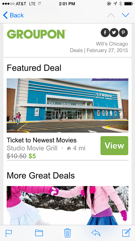
Another example of a mobile-optimized email message, which comes from the daily deals site Groupon, is shown in Figure 3. In this message, the photo, the View button, and the text Tickets to Newest Movies are all linked to the Groupon site, which serves up a mobile-optimized page. But Groupon still has a problem with the social media icons being placed so closely together that it is easy to tap the wrong one.
Figure 3—Groupon daily deals email message
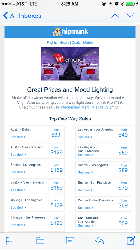
The Groupon email message is much easier for mobile users to process than the example from Hipmunk, shown in Figure 4, in which the copy is too small to read easily.
Figure 4—Hipmunk discount airfare email message
All of these examples help to illustrate several things that designers should consider when they are creating HTML email messages, as follows:
readability of all text
size and spacing of tap targets
use of media queries for email clients that support them
use of fluid layouts for email clients that don’t support media queries
testing on actual mobile devices
Before we look at each of these topics, let’s look at some changes that are happening in the way people are consuming email messages.
The Growth of Mobile Email
When designing HTML email messages, designers need to consider mobile, because a growing number of people are reading more of their email messages on smartphones rather than on any other device. According to a report from Movable Ink about messages that were sent from its platform in the first quarter of 2014, recipients opened 47% of them on smartphones. Other studies in the last few years have shown similar patterns, as in some of the statistics that Luke Wroblewski compiled.
Despite this, a 2014 survey of emarketers by Folio and Lyris showed that about 35% of the 182 respondents had not yet optimized their HTML email messages for mobile, and 18% of respondents said they didn’t even know where to start. A shift has occurred in people’s habits, and for many people, mobile is becoming their primary means of reading their email messages. However, some email creators still need to catch up with this trend.
HTML Email Coding Challenges
One of the long-standing challenges in designing HTML email messages has been the wide variability of support for standards-complaint HTML and CSS across both the many Web-based email services such as Gmail and Yahoo! Mail and desktop clients such as Microsoft Outlook and Apple Mail. Because of this lack of consistency in HTML/CSS support, organizations typically code email messages using HTML tables and other techniques that people designing Web pages or applications for desktop browsers have long ago abandoned. If you add to the list of clients you’re trying to support the email clients for mobile platforms such as iOS and Android, as well as third-party email apps such as Gmail and Google Inbox for iOS, things start to get really complicated.
Fortunately, many mobile email clients support media queries and other responsive techniques. Campaign Monitor maintains a list of email clients and their support for CSS—although they haven’t updated it since May 2014—and has published a free guide that you can use to learn about designing responsive email messages. MailChimp has also published a free guide to creating responsive email messages, and ZURB has created a free set of responsive email templates called Ink.
Design Considerations for Mobile Email Messages
You can address many of the considerations I mentioned earlier by using media queries and responsive design. If you have not yet worked with responsive design, a good place to start learning is Ethan Marcotte’s article from 2010, which introduced the idea to the Web design world.
By using media queries to present different layouts and styles to screens of different sizes, you can prevent some problems like those in the TechCrunch example. In that example, they could have applied a larger font size to both the headlines and the text call to action on mobile devices—and even styled them to look completely different from those elements on the desktop.
If you have to design for mobile email clients that don’t support media queries, you should experiment with fluid email, an approach that Nicole Merlin wrote about in 2013.
Designing Email Messages for Mobile First
One way to ensure that your email messages will look more appealing and be more usable on smartphones is to design for small screens first. This lets you focus on designing for smartphones, which is a much better approach than designing for traditional desktop Web browser email clients, then having to retrofit your design for mobile devices. With the growing use of smartphones as many people’s primary way of reading email messages, it makes sense to start with mobile-focused designs.
Testing on Real Devices
You can’t underestimate the importance of testing on real mobile devices. If you are tracking your email campaigns, you should be able to determine which devices your customers use most commonly. If you have limited resources, you should at least test on those devices. One common way to test responsive designs is simply to make the width of a desktop browser viewport narrower, but this does not let you see how an email message would actually appear in the mobile apps your audience uses. Testing on real devices is also the only way to get a true understanding of the touch experience.
Tap-Target Sizes
The two main things to consider when thinking about tap targets are the size of the targets and the spacing between different tap targets. Tap targets that are too close together can cause people to make mistakes and become frustrated with your design. A good rule of thumb is to make tap targets between 8 and 10 millimeters wide, with 8 millimeters of space between them. For more insights on designing tap targets and other touchscreen considerations, see Steven Hoober’s UXmatters article, “Common Misconceptions About Touch.”
Responsive Images
When creating email messages, designers also need to pay attention to images. Images are critical to the success of marketing email messages from businesses selling products or services such as clothing or travel, so make sure your images render correctly on your expected target devices. Jason Rodriguez included examples of using images in mobile email messages in his 2014 article on A List Apart, “Can Email Be Responsive?”
Linking to Mobile-Optimized Pages
Once you’ve optimized your email messages for smartphones, you need to ensure that people tapping links in those messages go to a mobile-optimized Web site. The examples I’ve used in this article did link to mobile-friendly Web sites, but that isn’t always the case. You can ensure that what your audience sees is mobile friendly in a couple of ways, including
using a responsive design for your Web site or
detecting the device, then routing the user to a mobile-specific site, if you haven’t yet created a responsive design for your site
Conclusion
Despite the fact that responsive Web site design has been around for several years, some of its best practices are not yet in common use for HTML email messages. But as mobile email clients become more advanced, designers will have greater control over how their email messages look on mobile devices. By using some of the coding techniques that I’ve described and applying a mobile-first philosophy to your email message designs, you’ll have a better chance of delivering a compelling experience to people’s mobile inboxes.
Thanks so much for a really practical guide. Lots of great links, as well as the tactical approach. Many thanks! :-) I would add one more resource: a great email coding newsletter.
At GE Capital, Will works on multi-device designs for commercial lending software. He holds a Master’s in Human-Computer Interaction from DePaul University. Will is the author of Mobile Prototyping With Axure 7, and his writings have appeared in Boxes and Arrows, Smashing Magazine, UX Booth, and UX Magazine. He is a frequent speaker at design events in Chicago. Read More