Young children communicate well visually. When they want to articulate something for which they simply don’t have words, they point to objects in their environment. When they want more food and their plate is empty, they point to their empty plate or slam their plate down onto the table to signal hunger. They are prompting their parents to visualize what they are asking for. Their parents see the empty plate and know they’ve just finished eating their food. Their child must be asking for more food.
Visuals are effective ways in which to communicate. Sometimes sketching is the fastest way to convey a need or ask a question. According to education professor John Hattie and cognitive psychologist Gregory Yates, people are not all just better visual learners or auditory learners. Lab studies show that people learn best when the stimuli they receive are from different types of media. Our brains are wired to integrate information in different modalities. When we want people to understand something that we are explaining to them, we can reinforce our meaning not just through words, but also through pictures and sounds.
Champion Advertisement
Continue Reading…
When I am doing early-phase UX research—when the seeds of ideas require refinement through conversations with research participants who are representative of users—complex ideas are difficult to articulate through words alone. Often, I become tongue tied in trying to ask a complex question clearly enough so participants will understand it. However, by using images, words, and sounds, I can untangle the complexity of my questions and enable participants to provide more accurate responses. If I underinvest in my effort to craft effective questions, either I’ll end up with responses asking for clarification, I’ll receive looks of confusion from participants, or participants might feel intimidated and simply tell me what they think I want to hear—just so they can get through the session. Sometimes, all of these outcomes occur simultaneously. Leveraging multiple modalities of communication when asking research questions is worth the time and effort—especially when the questions are complex and understanding them requires examples.
Using multiple modalities in crafting UX research questions has helped me to achieve better results. I’ve gotten more detailed responses as a result of participants’ clearer understanding of what I am asking. Some of the insights I’ve gained include the following:
Using both words and pictures to frame questions allows us to better understand user expectations and preferences.
Combining pictures with verbal communication lets participants more easily mentally deconstruct complex ideas.
Engaging participants through visual stimuli can break them out of a disinterested, defensive position and improve their engagement in a session, yielding more meaningful feedback and insights.
Framing Questions with Words and Pictures
Framing questions using both words and pictures allows us to better understand users’ expectations and preferences.
For example, let’s say you’re researching possible designs for a content-management system (CMS). The plan is provide a certain level of configurability to CMS administrators. Your product stakeholders want to understand how much configurability administrators would want. They might also want to understand how administrators would manage the communication settings for their readers—such as what communication channels they should be able to make available to readers—as well as what the default settings should be. Suddenly, what seemed like a very simple question about what types of communication preferences CMS administrators would want to set for their readers could potentially turn into a myriad of questions about controlling the default states of options. There has to be a better way to frame such questions to participants without either making them feel stupid or like I was the one losing my marbles.
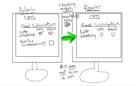
So I drew two quick-and-dirty sketches to help frame the question and enable me to better discern what CMS administrators expected. Each sketch represented a potential expectation that participants might have relating to how the control panel should work. Figure 1 illustrates my first sketch framing the question, which allowed participants to better understand the necessary actions and their consequences than if I had simply asked the question without the illustration.
Figure 1—Using a sketch to frame a question about a design option
This sketch illustrates a design idea for a control panel within a CMS console that lets an administrator control the availability of features, without turning them on. The sketch shows both actions and their consequences, so participants must use visual perception to understand it. As humans, we are wired to detect differences within and between objects. The sketch in Figure 1 demonstrates the concept of making incremental changes that are easy for humans to detect. On the left side, the CMS administrator selects the communication channels. Then, on the right, the reader views the channels the CMS administrator originally selected. In the middle of the sketch, redundant cues reinforce the concept of making channel preferences available, as well as communicate what the user interface is not doing.
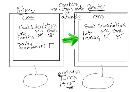
The second sketch, shown in Figure 2, incrementally increases the complexity of the options that I presented to participants.
Figure 2—A sketch of an incrementally more complex design option
This sketch is virtually identical to the first one except that the action of selecting check boxes for communication preferences now does two things:
It makes the options available for selection on CMS readers’ screens.
It turns those options on by default.
The middle of the sketch again provides redundant cues through verbal descriptions that indicate how the action differs from that in Figure 1.
Since I had initially shown participants the first sketch as an anchor, they were more easily able to understand the second sketch, then compare the two experiences to better answer the question.
Once I had presented each option to the participants, I ensured that they understood what the sketches were trying to convey and answered any questions they had.
The small amount of time I invested in creating these sketches and ensuring participants’ understanding provided a great segue to asking the burning question: What expectations do CMS administrators have regarding what check boxes should be available to control the user interface. The sketches and their sequence minimized participants’ confusion, making data collection faster, more fluid, and more concrete.
Combining Pictures with Verbal Communication
When you combine pictures with verbal communication, participants can more easily mentally deconstruct complex ideas. A Wharton study showed a 400-percent improvement in efficiency—that is, memory retention—when participants experienced both visual and verbal presentations than with only a verbal presentation. The use of multiple modalities of communication—specifically, visual and verbal communication—should improve participants’ understanding, especially when you provide redundant cues such as color and labels.
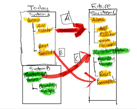
For example, if you were researching how a company should organize access to its CMS, you might interview administrators who are currently in the process of migrating from multiple CMS platforms to just one. Product stakeholders would be keenly interested in hearing from CMS administrators about how they would want to manage administrative access in the new system, as well as how they would prefer to provide access to the marketing team that is responsible for publishing their own content and managing some low-level security activities such as resetting passwords. To help you articulate questions about how administrators would want to organize access to the future CMS, you could create a diagram that illustrates the current and future states of the system architecture, as shown in Figure 3. The future state—System C in Figure 3—integrates access into one system, but can also either keep current administrative groups as is in the future—System A in Figure 3—or rebundle specific security-related features into other groups—for example, Reset Passwords, as in System B in Figure 3.
Figure 3—Visualization comparing Systems A, B, and C
Using only words to ask this question—with no visuals—would present a significant challenge to participants’ who were trying overcome the complexity of the questions. A verbal question that you might pose could be something like this:
Imagine two different system architectures: the current architecture and a future architecture. The current architecture comprises two systems: one for just administrative groups and another for business groups. The future architecture comprises only one system, comprehending both types of groups. This future system would let you port over existing administrative groups as is and also allow you to unbundle features from the administrative groups and reuse them for business groups. Which system configuration would you prefer to have in the new system: keeping the administrative groups as is, gaining the ability to reuse the security features for administrative groups for business groups, or both?
Try to understand this question without looking at Figure 3! Is your head spinning yet? Explaining this question to participants through only verbal means would require them to rely on their own imagination. And people’s imaginations can run wild! But using the visual method of articulating this question takes advantage of a quality that human beings have perfected over hundreds of thousands of years of evolution: the ability to easily discern sufficiently contrasting differences among the objects around us. This is how we are able to detect enemies and hunt for food. Our brains are hardwired to look for differences within our visual field, then fill in the rest of a pattern—as explained by Gestalt psychology.
The exercise I’ve described takes advantage of the efficiencies of utilizing the visual part of our brain. The addition of color to the same groupings provides a redundant cue that helps participants to easily understand the relationships between the current system’s setup and that of the future system. The branches that connect groups to features allow participants to quickly discern the parent-child relationship between them. Combining the green and yellow features into a single group in the new system architecture suggests the reuse of features from the current system. The red arrows highlight the visual sequence of the combined elements, helping to draw participants’ attention to the changes.
Using both visuals and words to depict complex concepts and frame questions during UX research satisfies people’s innate desire to understand complex ideas and decompose them into something digestible for human comprehension.
Engaging Participants Through Visual Stimuli
By engaging participants through visual stimuli, you can break them out of a disinterested, defensive mindset, improve their engagement in a research session, and yield more meaningful feedback and insights.
Body language can influence participants’ behavior. Studies show that, when you place someone in a more positive posture, it alters their attitude, making it more positive. During a research session, if a participant is in a pose that conveys disinterest, a defensive pose with his arms folded, or slouched in a chair with his feet pointing toward the door as if he wants to leave, get that participant to look at a picture. He’ll be forced to ease up in his chair, point his feet toward the table on which the stimulus rests, and undo his arms, making him more submissive and willing to engage in the research.
On a recent project I was running, a participant was twiddling his thumbs. His fingers were linked together while his thumbs were doing somersaults around one another. He was sitting in a partially reclined posture, with his legs crossed and pointing slightly away from the computer in front of him. Was he bored, as his twiddling thumbs would suggest, or was something else going on with him?
In their book The Definitive Book of Body Language, body-language experts Allan and Barbara Pease call these various body-language stances gesture clusters. By considering a participant’s particular combination of gestures, we can assess their congruence and draw a conclusion about the participant’s level of engagement, attitude, and whether they might be deceiving the moderator.
The twiddling of that participant’s thumbs suggests boredom, as well as that he might potentially be holding back information during the discussion. According to the Peases, the exposure of thumbs demonstrates a sense of superiority or assertiveness and is typically associated with a gesture cluster. The participant’s crossed legs suggest a closed, defensive position. He’ll probably give short answers to questions and possibly invest less thought and reflection in his answers. The legs pointing away from the stimulus on the table suggest a lack of interest in the study’s topic. According to the Peases, our legs are under less conscious control than the other parts of our body—often just doing what the mind wants them to do. The participant’s gesture cluster spells danger for the research session’s outcome. Feedback will likely come in short spurts. Insights will be scarce. But adding a visual stimulus such as using a sketch to frame a question—and letting the participant hold it while viewing and trying to understand it—forces the participant to disengage his crossed legs, slide his chair up to the table, lean forward, and abandon his defensive posture. Hopefully, this will open up his flow of thought, and he’ll provide more in-depth feedback.
Conclusion
Whenever possible during early-phase UX research, get your participants not only to speak but also to look at ideas that you’ve expressed visually. Maybe you can show them a video demonstration of a concept or a storyboard that describes a situation involving the product you are testing with prospects. Allowing participants to see what you are asking them about can help your research effort. Getting a reaction out of participants, whether good or bad, is ultimately your job. Doing this with visuals such as sketches can help you understand where the shortcomings of your product idea might lie and move you another step closer to a more well-defined product strategy.
References
Hattie, J., and G. Yates. Visible Learning and the Science of How We Learn. New York: Routledge, 2014.
Pease, A., and B. Pease, B. The Definitive Book of Body Language. New York: Bantam Dell Publishing Group, 2006.
Michael has worked in the field of IT (Information Technology) for more than 20 years—as an engineer, business analyst, and, for the last ten years, as a UX researcher. He has written on UX topics such as research methodology, UX strategy, and innovation for industry publications that include UXmatters, UX Mastery, Boxes and Arrows, UX Planet, and UX Collective. In Discovery, his quarterly column on UXmatters, Michael writes about the insights that derive from formative UX-research studies. He has a B.A. in Creative Writing from Binghamton University, an M.B.A. in Finance and Strategy from NYU Stern, and an M.S. in Human-Computer Interaction from Iowa State University. Read More