One of the best ways to make your mobile app or Web site pretty—but also inconsistent and unusable—is to begin by drawing the user interface (UI).
However, starting with problems, user needs, and audience definitions, then defining the data structure and information architecture is a pretty well-defined approach that many UX designers and product teams believe in and try to follow. Still, too many go from there straight to user-interface designs. That’s still too big a jump and leaves too much to chance, gut instinct, default framework behaviors, and nitpicking reviews.
Instead, to understand and define an app or Web site’s information design, we first need to create a box diagram, or box model.
Champion Advertisement
Continue Reading…
Information Design
The term information design predates digital-design philosophies by several decades. At first, this term usually applied to library-science fields of study—such as codifying the information placards that accompany museum exhibits. My favorite classic definition of information design is that it’s about sense making—that is, making sense of a bunch of information by ordering, presenting, and designing it so people can easily and accurately understand it. In the digital era, I and some others, use this term to refer to defining the structure of information presentation within a single view. You can think of this as the information architecture of a single page.
Of course, we don’t want to design each page individually, so it’s best to use information-design methods to understand the structure of your product design, then create templates that you can use consistently throughout an app or Web site.
Box Diagrams and Models
In everyday conversation, I often use the term box model to refer to the way I structure the information design of a page. I know this is might be a problem for those who think in very Web-centric ways, because this term can be confused with the CSS box model, which defines the rendering of every intrinsically rectangular element on a Web page.
While I usually try to say box diagram instead, I don’t really mind the overlap in these definitions because I like to think of modeling the system, not just diagramming it. Plus, I still live by some of the tenets of the 1950s Good Design movement. Several of these tenets encourage designers to embrace the true nature of materials.
Digital design is all about rectangles full of content and functionality. Therefore, it is never wrong to think about designing and implementing content in a series of boxes. Nor does this model apply just to digital experiences. Back in the old days of print design, before we used computers for everything, we’d type or print out content, then cut it into rectangles, gluing or waxing them and placing them on boards to lay out a page design—just as we do today digitally.
Which Boxes?
If you really think about the process of designing pages, you might note that there’s still a bit of a leap from information architecture to these box diagrams. Where do all the features come from, and how do you know what goes into each page or view? Good question. Early on in the design process as I pursue answers to it, I run workshops with all the stakeholders and other knowledgeable parties from a product team. Lists of requirements or features aren’t that helpful on their own. So I try to get everyone in a room and put each requirement on a card, then run exercises—perhaps using the KJ-technique, also known as affinity diagramming—to get consensus on grouping and priority, as shown in Figure 1.
Figure 1—Results of a requirements-sorting exercise
Once your team understands the requirements for an entire project, you can sort the same requirements cards within a single view to understand how best to implement them. An example of the output of this exercise is shown in Figure 2.
Figure 2—Requirements in a view-sorting grid
Optionally, my design team might start working on the design ourselves—not just to create a pretty user interface, but representing it at as high a level as is practical—as a box diagram if possible—and explaining our approach and assumptions. If we find these are mistaken, we can correct them early on.
Tools for Box Diagramming
Fundamentally, box diagramming is exactly what it sounds like. You are going to diagram, using boxes. These boxes are
just boxes—Create only rectangles and squares.
any size you need—However, decide early on whether size should be purely representational or have some other meaning such as importance or expected usage rate.
labeled, not designed—Use simple titles, perhaps a few bullet points, or iconic representations of content such as arrows or cartoonish images. Do not draw or write anything to be like real content.
coded—Use boxes of different colors, stickers on the corner of each box, or other methods to categorize each box type—even such simple categories as items on every page or items only on this page—so users can perceive and understand the coding at a glance.
There are several ways to do this, but none is universally better than the others. In fact, I use all of them at different times, on different projects. Let’s consider each of these.
Drawing and Whiteboards
Use a whiteboard or any surface you can draw on. Or just sit at your favorite coffee shop, drawing on your notepad. Some benefits of box diagramming are that it’s simple, fast, and understandable at a glance, so it’s great for collaborative exercises. Get a team together and draw big, so you can get everyone’s input. You don’t need to prepare for this. If you’ve left all of your design supplies at home, just clear some space on a whiteboard or get some chart paper and markers. Start drawing simple boxes.
Post-it Notes
My favorite mode of collaboration by far is using sticky notes. Practically, you’ll probably end up mixing methods. Place notes on a whiteboard or piece of chart paper, then you’ll end up bounding, labeling, or adding some items by drawing directly on it, as shown in Figure 3.
Figure 3—A box diagram comprising sticky notes and drawn elements
As you can see, the sticky notes are not only positioned to represent the content and its relationships, but have different colors and sizes. This is important because box diagramming is all about organizing the boxes of content according to the first two aspects of the hierarchy of visibility: Position > Size > Shape > Contrast > Color. You’ll address shape, contrast, and color in the next step, when you actually create a detailed user-interface design based on this information-design work.
However, since we’re now most concerned with position and size, the sticky-note method works great. You can move, remove, or replace notes. Because they are paper and cheap, you can fold, cut, tear, tape up, and scribble on them. For this reason, I strongly prefer using Post-it Notes to simply drawing boxes on paper or a whiteboard. Of course, you’ll need a piece of chart paper or a whiteboard to put the Post-it Notes on. You should feel free to draw with markers to define the outer box, label the page, or draw arrows to show process. Include some tape in your design supply kit. You’ll eventually find a surface to which the notes won’t stick—or perhaps you’ll move them around so much that you’ll need to add more stickiness to them.
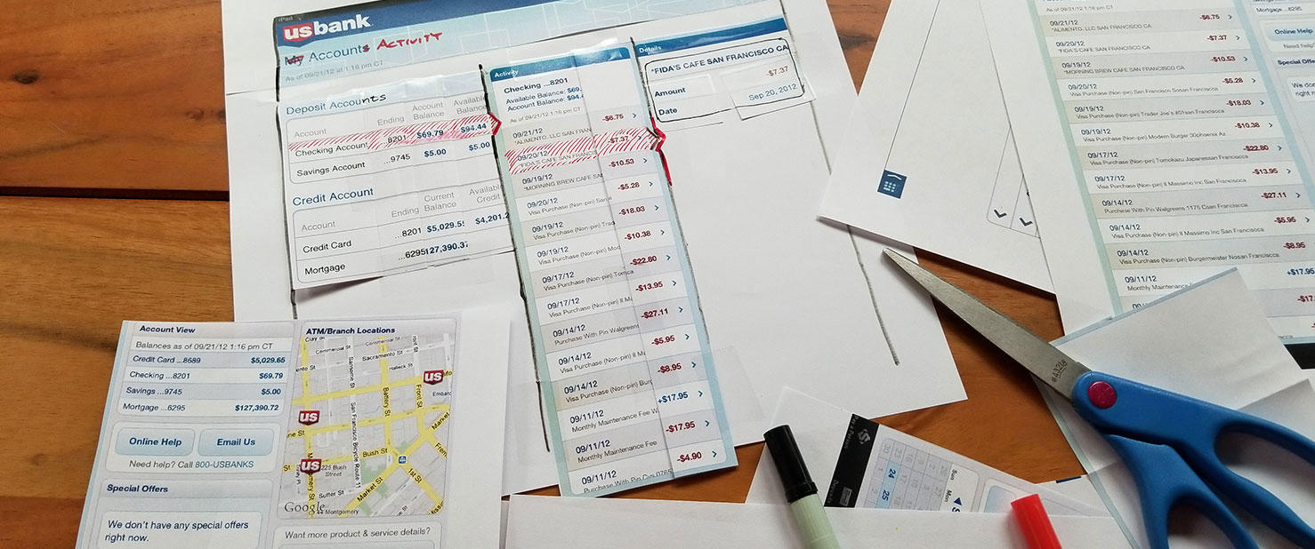
Scissors and Tape
You can use this same basic scissors-and-tape method for existing products or revisions to first designs. Print out the designs, then cut out their components with a pair of scissors or an X-acto knife. Choose a work area such as a whiteboard, move components around, then tape up each box of content where it is needed, as with the Post-it Notes. Figure 4 shows an example of this work in progress.
Figure 4—Revising a mobile / tablet design using scissors and tape
Often, it’s best to print out two or more copies of a design, enlarging the design so it’s easy to see and handle. Don’t hesitate to modify the cut-out shapes, folding or cutting them to make them smaller. Draw on the whiteboard or chart paper if you need to indicate that an element is bigger or otherwise different. Feel free to use other methods of representing new or very different components—such as supplementing the design by adding Post-it Notes.
Using scissors and tape is great method for any number of complex, organizational tasks, not just page design. My team once needed to revise a document that included 10,000 requirements. This went poorly almost immediately when we tried using spreadsheets, and it was impossible for us to collaborate, so I instead had the team print everything out, cut out each requirement, and group them on a wall. Your workshop and design kit should always include scissors and tape as well as Sharpies and Post-it Notes.
Digital Drawings
Digital renderings don’t lose their stickiness. Plus, you don’t have to go to the store to get more sizes and colors. Otherwise, drawing box diagrams in digital spaces is much the same as the previous methods.
While creating drawings by hand on a pen tablet or touchscreen is possible, they may not very readable, nor is this method efficient. I try to make sure everything is legible, so draw simple boxes and type inside them using an application’s drawing tools, as shown in Figure 5.
Figure 5—A box diagram in a high-fidelity mobile-phone design frame
Of course, this isn’t very demanding graphic-design work, so you can use any application you like. I use Adobe InDesign as my default drawing tool, but you can do this in pretty much any application. PowerPoint is a pretty good choice if you have limited resources or need to share an editable version of the work with nondesigners.
Digital tools also work well for cutting up existing designs—especially when you don’t have access to the original design documents or they’ve become irrelevant because of changes in production over time. Simply use the cropping tools—and even PowerPoint has these—to create a box for each element. Then, rearrange the boxes in whatever way you want. Stretch or compress them or scale them to fit, just as you would with a Post-it Note design.
Using a similar style throughout can be helpful in communicating that an information-design level exists and in explaining the structure of high-fidelity designs to the team. All of this helps communicate the modularity, reusability, and data-driven nature of your design.
My favorite method is to create boxes—just as I would for a normal box model—but make them translucent so the team can see the high-fidelity drawing behind them. It’s usually best to place labels off to the side for readability, as shown in Figure 6.
Figure 6—Box model overlaid on top of a mobile app’s final design
Design-Studio Methods
One way I use this whole concept of cutting and pasting boxes is in the context of design-studio methods. I think studio methods result in a sort of competitive / collaborative process of design. A number of individuals or small teams come up with concepts for a new product or a specific page, problem, or widget. Then, everyone gets back together to discuss and review the ideas.
But here’s where the overlap with box diagramming comes up. Because no design is so perfect that you should adopt or reject it as a whole, as the creative director, working collaboratively with the whole team, I’ll pick and choose which elements are best, then mix and match them in new designs.
Often, it’s best to do this live, using scissors and tape. Then, I’ll give the new pasted-up diagram to a new designer or team to work on. Ideally, I’ll give the new design to people who haven’t worked on any of the components to encourage the cross-pollination of ideas and get us out of the rut of a specific style.
Even when doing so much remote work these days, I still use the same basic method, but over Skype, using digital tools to crop, copy, paste, box, and scribble over whatever the team submits.
This approach works great, gets everyone involved in the actual work, and ensures detailed design oversight instead of requiring a boring presentation of a design to the team to get theoretical feedback.
Adaptive Box Diagramming
I’ve left out one important thing to consider before you start: is the model to scale?
When first starting on a project, I’ll use these methods without a bounding box. On a whiteboard or other drawing surface, I’ll just lay out the boxes wherever they go. You can place the content as needed, transparently evolving your understanding of the relationships between the elements.
However, these diagrams are deliberately not yet exactly representative of the page designs. You are just establishing the relationships between elements. What is most important is what items are next to each other.
As you go deeper into the process—or when making revisions to existing products—start by drawing a box around an area to denote a page. Sometimes, it can be convenient to simply use a sheet of chart paper to define the page boundaries. Plus, you can move a sheet of chart paper around or carry it away with you.
I define what a page is and, ideally, create layouts for several viewport sizes, actually drawing them right next to each other. Information is rarely tied to a single set of pixel dimensions.
As for the final user-interface design, you should not create a box diagram to a specific scale, but only a class of device. Define what is critical—relative positions, relative sizes, spaces, and what is adjacent or not adjacent to each other. Over time, you may evolve this rendering, clearly specifying how the elements move, appear, or change at each breakpoint, or for each device class. Figure 7 shows an example of same page template for two device classes.
Figure 7—Side-by-side box diagrams for desktop and mobile phone
Diagramming Templates, Not Pages
Even as I move to more detailed box diagrams, I rarely use the same template for every page in a product that I am designing. Ideally, I don’t need to design every page because the templates, components, and cooperation with the rest of the product team mean we can build pages systematically and programmatically.
It’s critical to understand that it’s best to use this method when you’re considering doing or want to reinforce the practice of
component-based design
consistency in interfaces and interactions
making it easier to follow basic rules—such as the 1, 2, 3 placement I’ve discussed in a previous column
Template design is intrinsically different from page design. It cannot be pixel perfect, but must be rules based. It involves conditionality, modularity, and fluidity. These must be explained or specified, not just drawn. Most people get this once it’s explained to them, but fluid or flexible design is one of the harder concepts, so let’s expand on this.
I never specify the widths of page components using any fixed system such as pixels. While margins and padding do get hard dimensions, areas between the margins are in percentages or have conditions. For example, a table is 100% of the available width and the first column is wide enough to display a date in full, but all others are a uniform width. Thus, a design works at any viewport width. Responsive changes or different adaptive templates are fine on top of this, but between breakpoints, the user interface is a perfect fit, in design and code.
Vertical fluidity is also important. What happens if there’s more text? Does your two-column layout get messed up by a very tall right column that leaves a lot of whitespace in the left column? If so, you may need to reconsider the whole design to avoid that being an issue.
What about infinite scroll? As I discussed in my last column, a key solution is to create floating headers and footers. But designing templates and considering the full range of ways in which the data could display led me to understand that this might be an issue and propose a solution before ever seeing the problem in a coded user interface.
Closing the Loop
Often, when I bring a new or additional step into the design process, I get a lot of pushback on how designers’ old-school, slow, nonagile methods are always holding up the train. While I have many objections to the whole idea of diminishing design time, in case you get that sort of pushback, let me tell you more about how information-design methods help streamline the rest of your process.
First, information design is another solid link between the defined requirements and their execution. Working off good requirements and measuring your results helps close the loop and proves that you are responsive to the project team, user feedback, and other data sources.
Second, information design can help eliminate almost all UI-design work—as long as you have some sort of design system. I always do—even if for only one project. The concept phase always includes creating a style guide and reusable components. The boxes for pages or templates then simply become placeholders for the default text, list, table, or form. If your design work is well integrated with that of the front-end development team, you can go so far as letting them create a first cut of the final user interface without any detailed drawings or comps of individual pages at all.
Lastly, information design—and box diagramming specifically—can be very easy for nondesigners to understand. The diagramming process lets you involve everyone with parts of the design, helps get the team to buy into the design process, and possibly even avoids their nitpicking about the user interface later on—because they’ve become invested in the higher-level design choices.
For his entire 15-year design career, Steven has been documenting design process. He started designing for mobile full time in 2007 when he joined Little Springs Design. Steven’s publications include Designing by Drawing: A Practical Guide to Creating Usable Interactive Design, the O’Reilly book Designing Mobile Interfaces, and an extensive Web site providing mobile design resources to support his book. Steven has led projects on security, account management, content distribution, and communications services for numerous products, in domains ranging from construction supplies to hospital record-keeping. His mobile work has included the design of browsers, ereaders, search, Near Field Communication (NFC), mobile banking, data communications, location services, and operating system overlays. Steven spent eight years with the US mobile operator Sprint and has also worked with AT&T, Qualcomm, Samsung, Skyfire, Bitstream, VivoTech, The Weather Channel, Bank Midwest, IGLTA, Lowe’s, and Hallmark Cards. He runs his own interactive design studio at 4ourth Mobile. Read More


