Prototyping is a form of digital sketching. Whenever you need to develop, depict, or demonstrate motion, gestures, scrolling, or other interactions, you need to prototype.
But people can’t look at a prototype and determine at a glance how it works. Many prototyping tools have no useful inspection mode, so people can’t take apart an existing prototype to find out how it works or emulate it—unlike the bad, old method of measuring and slicing Photoshop comps to create a static user interface (UI).
To make sure a product gets built right, you need to write everything down and draw it out. You need to create design specifications.
Champion Advertisement
Continue Reading…
Design Specifications Matter
Why agonize over a design, argue with the product team, iterate, and test, just to have something random get built because no one took good notes during discussions or people misunderstood your prototype?
Getting scrolling, gestures, and animations right is especially critical because very small mismatches can change the nature of a good UI for the worse. For example, I have worked on projects on which changing the delay for an animation from three to ten seconds was critical to making users trust what a Web application was doing.
Motion design is especially tricky—both expressing your original intent and ensuring universal access. Vestibular disorders cause a lot of people—including me—to become dizzy or disoriented when motion isn’t implemented properly. (No, out-of-the-box solutions are not necessarily safe.) If you’ve spent the time figuring out how to create good, universal motion design, why leave implementation to chance?
Now that we have more types of connected devices, design specifications are becoming even more important. You can no longer assume you’re designing for a touchscreen. You need to specify when the user must use buttons to click, scroll, or take other actions.
Representing Use by Humans
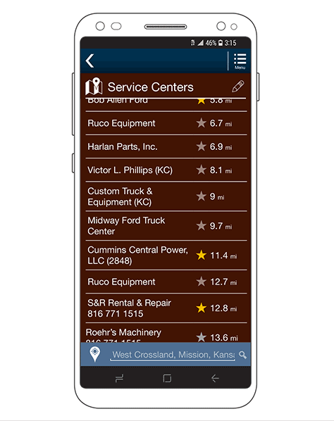
A key job of a design specification is to remind everyone that a product is for use by humans. One key way of doing this is always to start every diagram of a mobile app or Web site by placing the design in a mobile-phone frame, as shown in Figure 1.
Figure 1—App design in a representative mobile-phone frame
This frame is simply a line drawing of a slightly simplified, generic, modern mobile phone. Even when you’re looking at the design on your computer or in a projected image, the frame helps orient the viewer to the proper scale. Things such as fixed headers and chyrons make more sense within the frame.
The frame also helps you to limit the amount of content and the complexity of a page. Because the project team sees what is visible within a representative viewport, they can easily understand that everything else is off screen when the page first loads.
For user interfaces that are not fully visible within the viewport—such as that shown in Figure 1—always draw a complete, full-height view of a page next to the framed view, so no one has to guess what the rest of the page looks like.
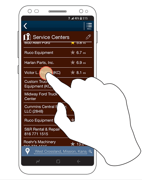
Sometimes, orienting the project team requires some additional context—whether to communicate an unusual user interface or because the client is not used to thinking in terms of mobility or touch. The best way of providing context is simply to show a human hand interacting with the system, as shown in Figure 2.
Figure 2—Representing touch by showing a finger touching the screen
As for the device frame, this hand is a simplified line drawing that represents a hand, not a photo of a hand. While the hand need not appear with every screen drawing, it provides helpful context at the beginning of a design document or at the beginning of a project.
I sometimes use these hands with early prototypes or for more public demos to remind everyone that the app is for use by humans and demonstrate how people would use it. Just as the frame cuts off parts of a page, showing fingers and thumbs reminds everyone that they take up space and are opaque.
Sometimes showing how people interact with an app is very important. People might not touch a screen when interacting with many control panels, IoT (Internet of Things) devices, remote-control units, or other devices. Often, it’s necessary to remind product teams that a screen is for display, so show what users click or twist.
Showing Areas of Interaction
Communicating what areas users must click can often be problematic. For some reason, many developers default to making only words or icons clickable rather than entire buttons, boxes, or rows. Tap targets always need all the space they can get, so the best way to make sure they get coded properly is to specify them visually.
Yes, my written specifications also say things such as, “Tapping anywhere on a row loads a details page…,” but developers often don’t read or follow those instructions. Box diagram overlays are clear, but interfere with viewing a visual design, so I often add brackets to the side of or below an element to indicate a whole area is clickable, as Figure 3 shows.
Figure 3—Brackets indicating two different clickable areas
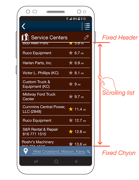
Often, it’s necessary to explain a function because only part of a user interface scrolls or moves. In fact, almost everything I design now has a fixed header and footer or chyron.
The old-school, Web-design viewpoint of pages scrolling within a viewport is so prevalent that I must often very carefully indicate what part of a page scrolls and how. At least once in every product-design system or project style guide, it’s important to provide a diagram similar to that shown in Figure 4 to make scrolling clear.
Figure 4—Indicating only part of a screen scrolls
Indicating Gestural Interactions
Did you notice the little, orange dot under the fingertip in Figure 2? It is necessary because the finger isn’t the only thing that diagram represents. It also indicates what the interaction is.
Over time, I’ve developed a visual language for gestural interactions in specifications. For example, these might indicate the difference between a tap and a press or the direction of a drag or rotation. The chart in Figure 5 shows the key components of this visual language.
Figure 5—Design language for gestures
For this gestural language, the hand is the key orienting element. Dots represent a touch, ringed dots a press or touch-and-hold interactions. Arrows show the direction of movement—or the available directions of movement—for scrolling, dragging, rotating, or whatever other action is occurring.
Depicting Motion
Another key thing whose motions you need to depict are elements within the user interface. If there are elements that move on their own in any way, you must specify where they move and how.
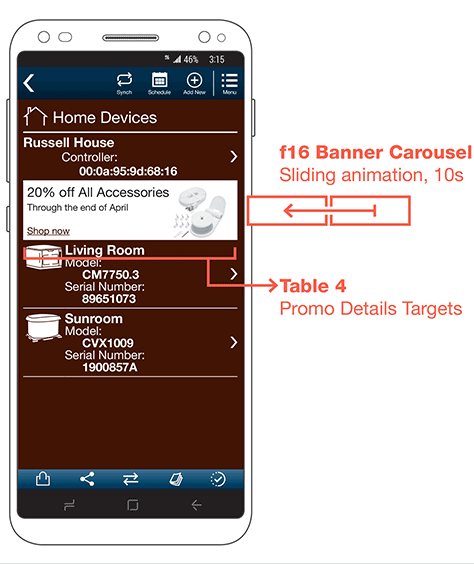
For example, while carousels are annoying and ineffective, they are very common. Figure 6 shows an example of interactions with a carousel.
Figure 6—Annotations for selection and animation
Simply showing that an element animates by providing an annotation outside the design, as shown in Figure 7, is usually enough detail. But to ensure that nobody interprets the direction arrow as an action path, enclose it in a box, diagrammatically illustrating that one banner moves to display another.
Figure 7—Diagram detailing a banner’s animated movement
Note that Figure 7 also shows a selection diagram, with a bracketed area indicating that the user can click or tap the banner to take an action. If the user also has manual control of a carousel, you should show those tappable areas or swipe interactions as well.
Communicating additional details can sometime be important. For example, you might need to detail the animation movement in both a diagram and in your written specifications, as Figure 7 shows. You can expand on the diagram by showing movement and label each phase of movement. The separate line in green indicates animation speed as a function of the vertical axis.
While this diagram shows time on the horizontal axis, it is rare to represent time at scale because this would be hard to indicate properly. The most critical phases of an interaction often have very short timeframes, so could be lost.
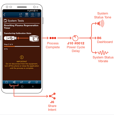
Showing Off-Screen Interactions
I leverage the principle of off-screen design elements for all of my specifications documents. The UI layer—the screen design—is only part of the overall product design. It must function as part of an integrated, well-considered system.
A few of the iconic representations of elements outside an app or Web UI that I commonly use include the following:
share intents
email or SMS
cross link to another platform—for example, for an app, the Web
camera
settings
delay
process complete
sound
haptics, or vibration
LED annunciator
Figure 8 shows a few examples of these iconic representations.
Figure 8—Diagram showing off-screen behaviors
Employ best practices for the use of icons, reinforcing all icons with text labels. It’s necessary to design specifications documents as much as actual user interfaces.
Designing for Hardware
Hardware is even harder to prototype than software—especially when integrating software prototypes with hardware. Therefore, design specifications are critical to joining the two sides of a product.
Because hardware can take so many different forms and perform so many functions, there is an almost infinite number of possible specifications for interactions with hardware. Let’s look at three interesting examples of specifications that I create regularly.
Buttons
Early in my career, I wrote a lot of specifications detailing what off-screen button pushes do to on-screen behaviors. However, after years of doing touchscreen work, I’ve observed that certain devices are now making a comeback and with better designs, so buttons on hardware matter again.
Showing a device with a finger on a button is helpful in orienting the project team, but specifying the actions that hardware buttons initiate on a screen is hard. Figure 9 shows an example of a button-driven process flow.
Figure 9—Snippet from a diagram of a button-driven process
Note how, instead of showing the user interacting directly with the device, the diagram shows the button itself as initiating a process function. In the case shown in Figure 9, there were relatively few, very clear buttons, so I could show them individually and depict their direct interactions. But for some five-way pads that don’t have such clear labeling, I instead provide different representative diagrams of the entire direction pad, with the relevant portion highlighted.
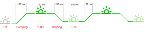
Blinking
In many industries, blinking is a very common signaling technique for warning and annunciator lights. However, the logic that drives the fundamental nature of blinking lights as a warning is flawed because of a change in technology.
Back when basically all annunciator lights were incandescent, they had significant start and stop times. The filament took a visible amount of time to power on, then to go dark after power was removed. For a simple blink circuit, applying and cutting power would not make the light turn on and off, but instead, make it slowly build to full power, then gradually drop off. So the light would pulse between off and on.
LEDs, on the other hand, turn on and off almost instantly. When the blink cycle is off, the light is completely off. A problem I have encountered many times is that people happen to glance at a panel or the top of their phone between blink cycles. So they can miss seeing a bright, blinking light entirely or just see a blink out of the corner of their eye, then quickly look at it only to see that it is off. To avoid this problem, you should specify blink behavior, as shown in Figure 10.
Figure 10—Diagram specifying the blink-rate behavior for an LED
Because the power applies slowly, the light is never off during a blink, so users can see it no matter when in the cycle they observe the light. This is so complex to explain that simple written specifications never work, so a diagram similar to this is necessary to orient everyone to the proper behavior.
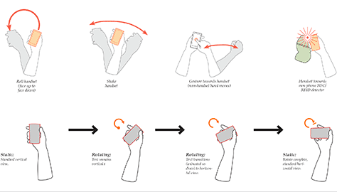
Kinesthetics
So far, I’ve assumed that a mobile device is relatively fixed in space or any movement is irrelevant, but this is often not the case. In fact, movement can sometimes be critical to understanding what the user is doing because the system performs actions based on that movement. Figure 11 shows a series of device-movement behaviors and how I depict them by extending the hand-and-arrows gestural language that I use for on-screen interactions.
Figure 11—Gestural design language for mobile-device movements
Conclusion
The creation of design artifacts such as prototypes and specifications should encompass common, easily understood methods that go beyond the traditional wireframe. Our design documents must communicate not just the look, but also the feel of the entire designed system. You can easily accomplish this by designing arrows, labels, lines, and icons that represent behaviors and placing them adjacent to the UI design layer.
Doing this makes creating design artifacts less about drawing user-interface comps or wireframes and places greater emphasis on written specifications that describe the user experience of the entire product or system.
For his entire 15-year design career, Steven has been documenting design process. He started designing for mobile full time in 2007 when he joined Little Springs Design. Steven’s publications include Designing by Drawing: A Practical Guide to Creating Usable Interactive Design, the O’Reilly book Designing Mobile Interfaces, and an extensive Web site providing mobile design resources to support his book. Steven has led projects on security, account management, content distribution, and communications services for numerous products, in domains ranging from construction supplies to hospital record-keeping. His mobile work has included the design of browsers, ereaders, search, Near Field Communication (NFC), mobile banking, data communications, location services, and operating system overlays. Steven spent eight years with the US mobile operator Sprint and has also worked with AT&T, Qualcomm, Samsung, Skyfire, Bitstream, VivoTech, The Weather Channel, Bank Midwest, IGLTA, Lowe’s, and Hallmark Cards. He runs his own interactive design studio at 4ourth Mobile. Read More


