One of the most prevalent user interactions is scrolling. For mobile devices, with their small screens and direct, gestural interactions, scrolling is even more important than for desktop applications. But we don’t generally even refer to vertical scrolling because pages in apps and Web sites typically default to vertical scrolling. Today, most of us have grown up reading content—whether in print or online—so scrolling vertically is simply what works best for people.
When designing for content, it is important to remember that people do not always do things the same way. They consume text, grids, or lists not just by reading each item, but very often by scanning. People’s eyes jump from one section to the next, often reading just the first few characters of each line. If you organize content oddly or incorrectly, users might miss a huge amount of what you’re trying to show them.
Champion Advertisement
Continue Reading…
Horizontal Scrolling
Horizontal scrolling is fraught with issues when it is the primary method of revealing content, but it can be useful for a subset of the information on a page.
However, the user must be able to control scrolling directly. Few things are more disconcerting to users than seeing other movement that is unrelated to scrolling—for example, elements moving horizontally as well as vertically. Users with vestibular disorders might become ill, so they won’t be able to use your site at all if it acts this way.
Nevertheless, as individually controlled elements, horizontal scrolling areas can work great. There are two common methods of scrolling—one of which is rather bad and another that can be great. However, each of these methods works well only if they’re designed and implemented correctly.
Carousel Banners
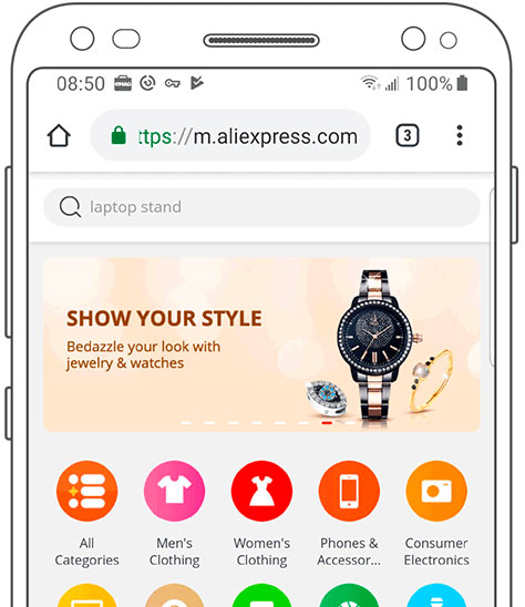
Pretty much every home page and marketing landing page these days has a large banner at the top that rotates on a timer. This is a carousel banner, but is sometimes called other things such as an image slider or rotating offer. Figure 1 shows an example.
Figure 1—A typical carousel banner
These banners are usually terrible and a result of design by committee. Web sites use carousel banners to get more content onto a page, so the Sales and Marketing teams don’t have to decide which items to push and can have it all.
The prevalence of such banners is weird because it is well known—even in marketing circles—that they simply do not work. Almost no one clicks them. The few clicks they do get are usually on the first item in the stack. Plus, the constant movement detracts from any messaging on the rest of the page.
All of this has been well known for several years, but there’s been no slowdown in demand that we create carousel banners. Even in the details of user-interface, interaction, and motion design, they are not very good. Just look again at the Aliexpress Web site example in Figure 1 and you’ll see numerous issues of contrast and control.
However, since your clients are likely to force you to create carousel banners, here are some simple tips to make them work as well as possible:
Consider employing no automatically timed behavior at all. Just give users control of horizontal scrolling. If they are interested enough in the concept of offers, they’ll see what else is there.
Automatic rotation must be slow enough for users to read and understand, then act on the banner. Almost all of the carousel banners you’ll see in the wild rotate far too quickly. Ten seconds is about the fastest rate at which I’d allow a banner to rotate.
Make sure the banner’s content is brief and to the point, so users can read and comprehend it before the banner rotates.
Provide manual controls—in the form of prominent arrows at either side of the banner. Try to place the arrows beside the banner instead of on top of it. Otherwise, users might think they should click the right arrow to see more about the content on the banner—just as they would with normal rows of items.
Indicate the current position in the carousel. Using dots—similar to those that indicate which home page a user is viewing on a smartphone—works well and are very familiar to most users. On mobile devices, these dots are too small to tap, so they’re just indicators.
Animate the transition between banners with horizontal scrolling. Do not just replace the banner—and certainly do not use methods such as a cross-fade or vertical scroll. Do not allow the entire page to blink or reload. The transition time should be about two seconds—or enough time to make it clear that it is a carousel of offers—so users understand the paradigm.
Carousels should go around and around. Do not get to the end and stop or rapidly go back to the start.
Provide a clear call to action. Don’t overreach and prompt users to buy now when they’re only trying to go to a product-details page. Instead, use calls to action such as Learn more, Shop now, or other simple, truthful messages.
A call to action should generally be a button. Normally, I suggest using links to display new pages, while actions—such as submitting a form or adding an item to a cart—should be buttons. But, in practice, buttons work far better than links on graphic banners, and their actions do not seem to confuse users.
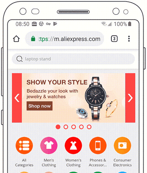
I have redesigned the Aliexpress banners using these methods, as shown in Figure 2.
Figure 2—A carousel banner that has optimal mobile usability
Responsive Banners
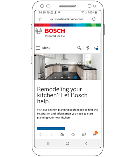
Banner ads are an excellent poster child for why responsive Web design is risky and very often terrible. Far too often, desktop banners end up displaying on mobile devices with poor or no modifications to make them fit well. One example of such a banner is shown in Figure 3.
Figure 3—A carousel banner for the desktop on a mobile device
In this case, the banner is far too large—so not all of it even fits in the viewport—and it obscures key information on the rest of the Web page.
In other cases, the banner is scaled to fit the screen and too small, so the user cannot read the content or interact with the banner properly.
The best way to create banners that work on all platforms is to stop thinking of them as graphics. They can include text, links, buttons, and more. Therefore, you should design and build banners just as you would any other interactive component, using either native technologies for a mobile platform or HTML for the Web. Then ensure banners adapt or respond to the viewport size and platform.
At the least, use responsive or adaptive images, loading different or flexibly cropped banner images that work well on all platforms.
Category Carousels
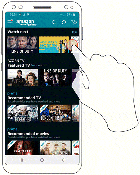
A lot of media companies—including Netflix and the Google Play store—use a pattern I like to call a category carousel. Figure 4 shows how Amazon Prime Video uses this pattern.
Figure 4—A series of category carousels
In a category carousel, each of the items depicted as a thumbnail represents a title, app, or other product. Each row of product images represents a category.
This is one of my favorite methods of exposing content and allowing users to drill down to it at the same time. This method is useful in resolving the problem of making users aware of content, as well as explaining categories on home pages and landing pages.
This pattern works well because it organizes the information organically. While there are usually titles that apply to each row, they are often unnecessary. Product thumbnails show at a glance what the category actually is—which is often better than a text title.
However, it is all too easy to create bad category carousels. These are just starting to gain traction in ecommerce, so Web sites and apps often misuse them—just because companies don’t know better. Here are some guidelines for creating good horizontal-scroll components for content categories:
In most cases, at least on mobile devices, assume gestural control only. Don’t take up room with pagination controls—especially not with the complexity of both next, next-five, and start/end buttons.
The list must imply scrolling by having items at the right not fit fully on the page. This is important, so despite your visual designers’ getting a headache over it, they must not lock everything to a grid. Otherwise, users would assume it’s a display list, not a scrollable carousel.
Make sure that both the first and last items at the left and right are always only partially visible—even as the user scrolls. Make sure the widths of items adjust to different sizes of phones. Consider adding some automatic snapping, so the system scrolls after the user stops, ensuring there’s no chance of false-end alignment.
Make sure individual items are readable and understandable. Don’t use screenshots or photos that look too much like others when at icon size. Books and streaming-video services often assume the cover art is readable, but frequently it is not. Don’t rely just on a thumbnail. Always use a text label below each graphic.
Provide a function to let users immediately view an entire category with a single click. The category title can serve this purpose.
The title for the category can be either above the carousel or to its left, but should not scroll. If you use icons for categories anywhere, use them here.
The link to a category page provides a fallback for those who do not want to or cannot use the carousel. Make sure you list the products on that page in a simple, easy to use, universally accessible manner.
While there must be a way to link to a whole category, remember that the content is what labels the category best. Category titles do not have to be prominent or take much space.
Position in the carousel is not usually important. No scroll bars, dots, or labels such as 4–8 of 26 is necessary because the user has complete control of scrolling.
Do not automatically scroll for any reason. If you design and code the carousel well, users will understand it.
Ideally, the carousel should use infinite-scroll functionality to load chunks of content and allow users to see an entire category. Developers are likely to complain about this, so if they insist you must limit the number, make it a large one and avoid having the list just end. Never rotate back to the start. Otherwise, users might think you sell only ten products in a category! Instead, provide a link at the end of the list to view the whole category.
Don’t be repetitive. Remove Buy now sorts of buttons from each item because users will become blind to the repetition. Look closely at what other content might be like in reality. For example, if your list is always ordered by top rated, all the ratings users see will be 5 stars. This can also become a repetitive blind spot and is simply not worth doing.
Adaptive Content
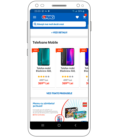
The labels underneath each thumbnail image must be readable in the space provided. This is a good excuse for dipping your toes into the world of adaptive content. Instead of writing a single product title, provide many of them—one for desktop, one for mobile Web, one for the mobile app, and others for specific uses of the carousel. For a counter-example, see the titles in the carousel from the Eastern European ecommerce site eMag, shown in Figure 5.
Figure 5—Truncated titles in a category carousel
The descriptions here use a canned format that follows a type + brand + model + variations format. Presumably, they use these for some heavy-handed SEO purposes on the landing pages, but they reuse these titles everywhere.
In this case, it is not especially helpful to list every item as a Mobile Phone, Blackview A60. Especially when showing products in the category mobile phones, leave that information out and instead provide useful color, size, or capacity information, allowing the user to make a good selection.
When titles might be longer than the available space, do not simply truncate them, but instead append an ellipsis to them, ending the title content with the ellipsis character. This lets users know there’s more information and invites them to click to find out more. Note that an ellipsis is not three periods, nor any other number of dots, but a character, U+2026 or the HTML entity …. Always use the proper character, and do not allow it to break or become separated from the preceding characters.
Conclusion
While animated banners and horizontal-scrolling elements are definitely not the best answer to every problem, just as with every other pattern, they must be well designed and well implemented to work properly for you and your users.
Just because we flip an interaction on its side doesn’t mean everything we know about human behavior changes as well. Use your heuristics, and avoid choosing trends and style over functionality.
For his entire 15-year design career, Steven has been documenting design process. He started designing for mobile full time in 2007 when he joined Little Springs Design. Steven’s publications include Designing by Drawing: A Practical Guide to Creating Usable Interactive Design, the O’Reilly book Designing Mobile Interfaces, and an extensive Web site providing mobile design resources to support his book. Steven has led projects on security, account management, content distribution, and communications services for numerous products, in domains ranging from construction supplies to hospital record-keeping. His mobile work has included the design of browsers, ereaders, search, Near Field Communication (NFC), mobile banking, data communications, location services, and operating system overlays. Steven spent eight years with the US mobile operator Sprint and has also worked with AT&T, Qualcomm, Samsung, Skyfire, Bitstream, VivoTech, The Weather Channel, Bank Midwest, IGLTA, Lowe’s, and Hallmark Cards. He runs his own interactive design studio at 4ourth Mobile. Read More
