As ever-increasing quantities of information confront us, critical thinking is a tool that we’ll need to apply with greater frequency. Information sometimes takes the form of memes, or information that appears out of context. We’re encountering a higher level of political disinformation than we’ve ever seen before, which has the potential to destabilize our societies. Disinformation relating to COVID-19 is costing people’s lives. Social media is responsible for the proliferation of much of this disinformation.
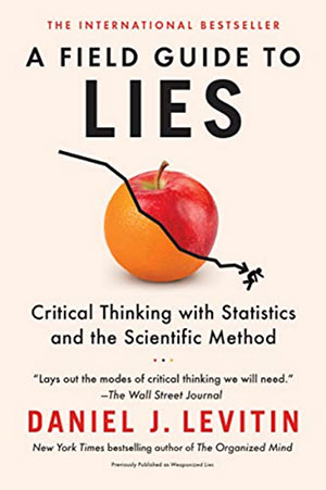
Daniel J. Levitin’s book A Field Guide to Lies: Critical Thinking with Statistics and the Scientific Method, is the perfect book for this time. I hope this book encourages people to apply critical thinking—both as they consume other’s arguments and communicate their own.
Champion Advertisement
Continue Reading…
Book Specifications
Title:A Field Guide to Lies: Critical Thinking with Statistics and the Scientific Method
Author: Daniel J. Levitin
Formats: Paperback, Kindle
Publisher: Dutton
Published: November 19, 2019
Pages: 336
ISBN-10: 0593182510
ISBN-13: 978-0593182512
Using Charts to Deceive
In Levitin’s book, a chapter titled “Axis Shenanigans” shows how it’s possible to use split axes to create a false comparison —or at a minimum, a deceiving comparison.
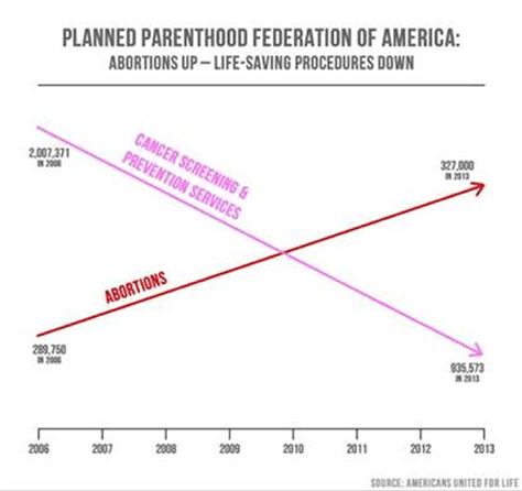
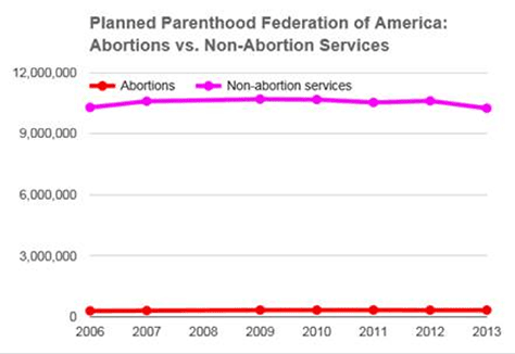
Abortion is a controversial topic in the United States. Without taking a position on the matter, Levitin’s book shows that there are honest and less than honest ways of presenting information on the subject. In his book, Levitin shows—as is verifiable—that US Congressman Jesse Chaffetz presented a deceptive chart concerning the activities of Planned Parenthood. Interestingly, the chart, shown in Figure 1, makes it falsely appear that the organization was increasing abortion services, at the expense of every other service, including cancer screenings.
Figure 1—A misleading chart from US Congressman Jesse Chaffetz
Note—I am not taking a position on abortion. I’m taking a position on clearly presenting accurate information.
For an investor, it could be beneficial to recognize when a company is providing information about cumulative sales, profits, or revenues, as opposed to period-over-period data. It is very easy to paint a rosy picture of a business’s outlook by smoothing out the data. I won’t give specific examples here—but Levitin’s book provides them. But I suspect that you might find examples of these techniques in the quarterly presentations of some of your favorite technology companies.
One obvious, deceptive technique is changing the scale of a chart’s axis so it doesn’t begin with zero. Organizations can and do employ this method to provide favorable or unfavorable contrasts relating to a variety of subjects.
Extrapolating Observations: Things Don’t Go on Forever
One of the largest errors we see in forecasting is the expectation that we live in a steady state—that the conditions we live with today will continue in a linear fashion ad infinitum. Levitin uses an example to explain this phenomena: the cooling of a hot cup of coffee in a room-temperature space simply cannot continue forever; there are natural stop points. Think about it. If a cup of coffee were at 140 degrees Fahrenheit and lost 5 degrees every minute, within 30 minutes the coffee would be frozen.
As Levitin describes, this flaw in people’s thinking results from mixing up interpolation and extrapolation. Simply put, interpolation relies on taking two observations, then estimating what has happened between those two points. Extrapolation also relies taking on two observations, but then extends those observations beyond the observed phenomena, which is much riskier.
A Case Study—or What I Learned
The current COVID-19 pandemic has brought many human failings to the surface—from people’s unwillingness to take basic precautions such as the wearing of masks to their tendency to overreact to necessary restrictions on their lives. I’ve observed two primary trends in the human response to COVID-19: First, many people have shown a willingness to create, spread, and accept obvious misinformation or even disinformation. Second, there is an apparent inability among many to apply critical thinking to information from intentionally or inadvertently dishonest actors.
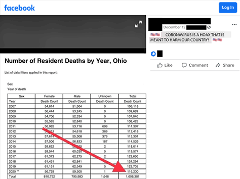
For example, I encountered the table in Figure 3 on Facebook, in the first half of December 2020, which ostensibly shows deaths in Ohio, but lacks any citations or appropriate context.
Figure 3—Deaths in Ohio?
Note—I have modified or removed the information that identified the original poster—even though the poster’s privacy settings made that information public.
The example in Figure 3 exhibits many problems, starting with the obvious: this person has a bias against accepting that COVID-19 poses a real threat to the lives of our families, friends, and colleagues and our economy. The poster begins with a conclusion and applies this bias to cherry-pick information that supports this position. Moving on to the table itself:
There is no citation. From where did the poster gather this information?
In the second-to-last row, what do the two asterisks adjacent to 2020 mean?
When did the poster collect this data? We could perhaps conclude: in the prior years. But, as of this writing, we are now only halfway through December 2020.
Death is a lagging indicator. There could be many people in ICU units, a percentage of whom will die. They might spend days, weeks, or months in an ICU prior to their death. If a person is diagnosed with a fatal disease after they’re in the grave, the information in the diagnosis is useless.
Back to the question of where this information comes from: the source I check, the CDC, has a known lag in their information because the CDC tabulates death certificates, which could take weeks to process.
There is an obvious data-quality problem: why are the unknown genders inflated from 2011 through 2014?
There is a lack of context. A crude number of deaths is almost meaningless if you do not account for population growth or decline.
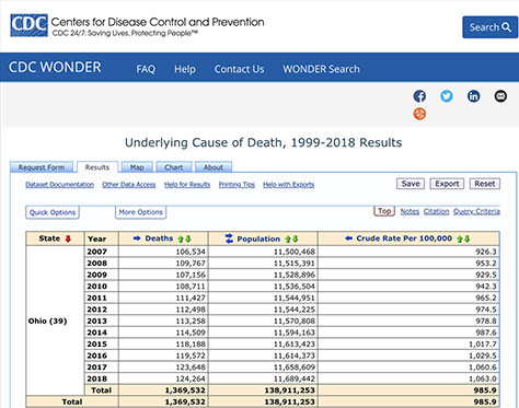
In response to this out-of-context post, I’ll provide data collated from the CDC’s public records in Figure 4.
Figure 4—Actual CDC data on deaths in Ohio
The data in Figure 4 provides more context for death rates and offers more than crude numbers. We can see that the death rate in Ohio has been rising since 2007. It is worth mentioning that this data gains some semblance of credibility vis-à-vis the Web site’s user interface.
While the example I’ve provided may not be meme-worthy, it could provide more clarity and accuracy and inspire our asking some more important questions such as the following:
Why does the data end in 2018? This is a fair question, but I assume that it is because of delays in reporting.
What are the underlying causes of death? I have previously hypothesized that, because of the changes in people’s behaviors due to stay-at-home orders, we might see a decline in certain causes of death such as automobile accidents, violence, and workplace accidents and rises in others such as suicide and complications from substance abuse. However, this does not mean COVID infections would not make up the difference. What it might mean is that, without these measures, COVID would have added to an already-rising death rate. But I do not have this data, so I cannot present it here.
Conclusion
We enjoy tremendous benefits because of the World Wide Web and social media. The World Wide Web has made information and knowledge easier than ever to produce and access. Social media provides tools that let us communicate quickly and over tremendous distances, and thus maintain relationships that might otherwise have withered with age.
The downside to this avalanche of information is that a larger share of it is low quality—even harmful. When everyone with one or more email addresses has access to communications and publishing tools, information of poor quality and even harmful information can scale exponentially. Just as the proliferation of telephones enabled harassment, prank calls, and our current plague of unsolicited robocalls, new innovations in communications have their downsides. No information technology is inherently bad, but every technology can be exploited in negative ways.
As UX professionals, who have intimate knowledge of how information works and of people’s biases, it is our responsibility to ensure that we are clear eyed about the world in which we live. It is only by providing accurate information—and, perhaps more importantly, by truthfully presenting that information—that we can inspire health and prosperity for ourselves and our communities.
If you are concerned about the truthfulness of the information you share and the accuracy of people’s fundamental beliefs, Levitin’s book A Field Guide to Lies provides excellent tools that let you evaluate the assumptions you and others hold.
Ben’s global design and technology firm specializes in software design and development for the Web, mobile, and ecommerce. The company serves clients ranging from small startups to some of the largest companies in the world, including General Electric, Rio Tinto, and Fidelity. His career in User Experience began in the late 1990s. Ben has held diverse roles, including UX management at a global B2B firm, full-time and part-time academia, and executive roles. He enjoys solving complex business problems and coaching talent to be competitive UX design professionals. Ben earned his MS in Information Architecture and Knowledge Management at Kent State University and is a graduate of the Executive MBA program at Case Western Reserve University’s Weatherhead School of Management. He has presented long-format talks, speed presentations, and posters at many conferences and events and has conducted training and workshops for organizations throughout the United States, Europe, and Asia. Read More
 As ever-increasing quantities of information confront us, critical thinking is a tool that we’ll need to apply with greater frequency. Information sometimes takes the form of memes, or information that appears out of context. We’re encountering a higher level of political disinformation than we’ve ever seen before, which has the potential to destabilize our societies. Disinformation relating to COVID-19 is costing people’s lives. Social media is responsible for the proliferation of much of this disinformation.