When Google announced last year that its Core Web Vitals (CWV) update was set to become a ranking factor in June 2021, SEOs, developers, and designers around the world emitted a collective shudder.
After all, any new, major tweak to Google’s algorithm would typically tend to cause tectonic shifts in how Web sites rank. Generally, such updates require adaptation, optimization, and, often, equally seismic changes to the ways in which your site displays content. All of that adds up to a lot of work.
But CWV is a special case. Google has designed and is implementing these new criteria specifically to improve the speed, interactivity, and layout of your Web site’s pages. This algorithm update is neither arbitrary nor capricious. In building it, Google has actually prioritized the user experience across the online community.
Champion Advertisement
Continue Reading…
As you’re aware, UX matters! That’s why, in this article, I’ll unpack the key ways in which CWV is enabling the Web user experience and the design of a multitude of sites across the Web to function better for users. In addition to walking you through some key insights into Core Web Vitals that you need to know about, I’ll also offer my best advice to help ensure that you optimize your site for CWV success.
What Are the Core Web Vitals?
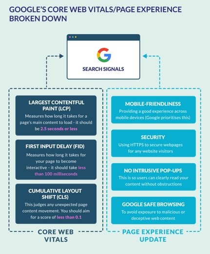
There are three Core Web Vitals, each governing a slightly different element of a page’s user experience:
Largest Contentful Paint (LCP)—This measure looks at the time it takes for a page’s main content to load—whether that’s text, images, or a video. Aim to have your main content load within 2.5 seconds.
First Input Delay (FID)—This measure takes into account the amount of time it takes your page to become interactive—for instance, enabling a visitor to click a link or a button. This should take no longer than 100 milliseconds.
Cumulative Layout Shift (CLS)—This measure of visual stability looks at how often a user experiences jarring, unexpected shifts in a page’s content. The metric you can use to measure this is Google’s layout-shift score, from the Google Search Console Core Web Vitals Report. Your pages should target a cumulative layout shift of less than 0.1, with a score of zero being ideal.
What Is Page Experience?
Google completed its rollout of Core Web Vitals in August 2021, so they’ve now become a ranking factor—something that search engines consider when calculating where a site should place in its rankings. In the case of CWV, this ranking factor has a name. It’s called Page Experience.
Page Experience consists of the three Core Web Vitals, in addition to three other UX metrics that have been around for a while, as follows:
Security—This requires equipping your site with an SSL (Secure Sockets Layer) certificate.
Mobile friendliness—This means providing a good user experience across all smartphones and tablets, as well as on desktop computers.
No intrusive interstitials—Avoid including annoying popups or any other page elements that would disrupt the user’s interactions with the content.
With all this in mind, it’s clear how Google’s most recent updates can help you improve the user experience and accessibility of your site. Faster load times, fewer frustrating popups, and guaranteed security for users when browsing—whatever device they’re viewing your site on! Take a look at the diagram shown in Figure 1, for a visual explanation of how CWV and Page Experience break down.
So how can you start optimizing your Web site to fit Google’s new UX criteria? Let’s take a look in more detail.
How to Optimize Your Web Site for Google’s New UX Criteria
Before getting to my top tips for making your site CWV compliant, I should note that much of the following advice depends on how you’ve built your Web site.
If you’ve created your online presence using a Web site builder such as Squarespace, Wix, GoDaddy, or Strikingly, to name just a few, the advice that’s coming up next will suit your needs to a tee. Similarly, there’s plenty of advice for you here if your site relies on a content-management system (CMS) such as WordPress, Drupal, Django, Joomla, or Magento, which are all popular options.
1. Implement Lazy Loading
Don’t get busy—get lazy. With lazy loading, images further down the page—which could be dubbed nonessential content—don’t load until the user has scrolled down. After all, the user doesn’t need this content until later so why load it all at once?
Implementing lazy loading on your site decreases the user’s perception of the amount of time it takes for your page to load. This drives down your bounce rate and helps raise your site’s LCP score. It’s also great for the user experience because you’re not overburdening your users with as-yet-unnecessary content such as images they don’t need to see until later—images that wouldn’t yet make sense contextually.
To apply lazy loading to your images, you can jump directly into the HTML code and insert a relatively straightforward loading="lazy" into the image tags. Alternatively, most Web-site builders and CMSs offer plugins that can do this for you.
2. Compress and Optimize Your Images
Image optimization should be a no-brainer. If you’re not compressing and optimizing the images you’re uploading to your site, you’re not providing a good user experience.
First, that’s because images with bloated dimensions can have an adverse effect on how fast your site loads. Plus, not only can images fail to load but—depending on how gargantuan the images are—they can cause your page to fail to load, too.
To optimize your images, first resize them to the correct pixel width and height for their placement on the page. Then simply run them through a free online tool that compresses them—such as tinypng.com, which is excellent, or iloveimg.com, which is superb. These tools reduce an image’s file size, without compromising its quality—and compression takes just moments!
Once you’ve optimized and compressed your images, and they’re loading lazily, your site’s pages load more quickly, helping you hit that less than 2.5-second sweet spot to satisfy Google’s LCP criteria. However, there’s one more thing you can do with images to drive down page-load times and boost your site’s user experience. Don’t use them!
Yep, wherever possible, avoid including banal, outdated stock images just for the sake of adhering to a page-layout template. Your users appreciate the scrolling time this saves them and are quite happy without some grinning, generic businessman flashing them a thumbs-up. The fewer images you include, the faster your page loads. You do the math!
3. Switch to a Simpler Design Theme
If you set up your site using a Web-site builder or CMS, chances are that you began with a theme. This is a kind of template—often, one they’ve tailored to a specific industry or niche—upon which you can base your Web site, customizing elements to your liking along the way.
Naturally, themes are very handy, but not all templates are created equal. Particularly not, as it turns out, in the eyes of Google’s CWV. Because, while some themes rely on relatively simple layouts and basic fonts—and, thus, require less code—others are more elaborate implementations, so come with more back-end baggage.
Essentially, the more bloated your site’s template is with code, the more time it will take for your pages to load—and the greater impact this has on your site’s page-load speeds. So I recommend your going back to basics and switching to a cleaner, more stripped-down design template.
Not only will you tick the box of Google’s LCP requirements but your users will thank you for your site’s refreshingly simple, easy-to-navigate new user experience.
4. Get to Know Your Largest on-Page Element
Remember that Google’s CWV guidelines relating to the Largest Contentful Paint look at how long a page’s main content takes to load. That content—a page’s LCP—could be a chunk of text, an image, or a video. It’s important to become familiar with this metric because, while you might think you have the identification of your page’s LCP down pat, Google may have other ideas.
That’s why I recommend a quick experiment: simply run your site through a tool called PageSpeedInsights. It takes moments to find out which on-page element Google has singled out as your page’s MVP—that is, its LCP.
But why go to the trouble? Well, the greater your understanding of which element is your LCP, the better able you’ll be to optimize it. This could mean compressing or resizing an image or, when it comes to video, repositioning it or removing it from the page entirely.
5. Keep Testing Your Site on Mobile
A key part of Google’s Page Experience ranking signal is mobile friendliness, and this makes sense. When people have trains to catch, schedules to follow, and nothing but a smartphone for company, mobile devices are fast becoming their main source of Internet content.
The last thing you want to do is to fail your smartphone audience by offering a poor user experience for mobile devices. To get a strong idea of how your site is rendering on mobile, your backend should be your first port of call. After all, most Web-site builders and CMSs let you toggle between desktop and smartphone views, so you can view your site as a mobile user would and play around with the visual formatting for each of them.
As Jon Buchan, Director of the B2B (business-to-business) email-template company Charm Offensive, states:
“We’re laying an active emphasis on enhancing the mobile experience for users. In recent years, mobile friendliness has emerged as a major ranking factor for Google. With the latest update, the search-engine giant is laser focused on the mobile usability of Web sites.
“Considering this, we’re working on enhancing the key aspects of our Web site to make it relevant for mobile devices. We’ve tested our Web site using Google’s Mobile-Friendly Test Tool and used the analysis to anchor some key changes in upcoming days.
“Plus, we’re working on multiple aspects, which include enabling Accelerated Mobile Pages (AMP), redesigning popups and CTAs, and using a more responsive theme tailored for mobile devices.”
Once you’ve set your site up for mobile success, you’ll want to test it on various mobile devices, to see how it’s getting on. Doing this not only gives you the full experience of your site’s user experience from the user’s perspective, it also helps you get a sense of how mobile friendly it is. Better still, you can figure out firsthand how well your site is meeting Google’s criteria for FID—whether it’s interactive straight away—and CLS—whether the content is jumping around.
Again, PageSpeeds Insights is your friend. When you run your site through this tool—as you did earlier to find out what your LCP was—you can separate your page’s performance across both mobile and desktop, toggling between them using a simple button in the upper-right corner of the screen.
Being able to get such a granular breakdown of the user experience across both mobile devices and the desktop is ideal because it gives you an idea of any issues that may be native to mobile. Plus, identifying and fixing such problems not only enables your site to shine in the eyes of CWV but also in those of the billion-strong population of users who are glued to the 5.5-inch screens of their smartphones—so it’s well worth doing!
Rob is passionate about empowering your online brand with the tools, skills, and knowledge you need to drive a better user experience—and boost your bottom line. He has been writing Web content for more than seven years. Rob graduated with a BA (Hons) from Victoria University of Wellington, New Zealand. When he’s not reading, writing, and editing, you can find him curled up in a sunny spot or watching football in the company of close friends while enjoying cold beer. Read More