Top

Reviewing User Interfaces

February 23, 2009

Has your boss or a client ever asked you to review a user interface for a Web or desktop application? Perhaps the request went something like this: Can you just look over these new screens for us? Oh, and can you check the error messages, too? It won’t take long! And, by the way, we ship next month. Whether you are an interaction designer, usability professional, technical communicator, quality assurance engineer, or developer, reviewing a user interface typically means identifying

  • usability problems related to the layout, logical flow, and structure of the interface and inconsistencies in the design
  • non-compliance with standards
  • ambiguous wording in labels, dialog boxes, error messages, and onscreen user assistance
  • functional errors

Champion Advertisement
Continue Reading…

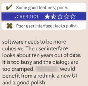
While user interface (UI) reviews often occur at the end of the development cycle, I recommend that you get involved early in the process, preferably when the designers create the initial wireframes or paper prototypes. Why? Making changes early in the process reduces development costs. Plus, if you identify usability issues early, it’s much more likely the team can remedy them before launch, preventing bad reviews like that shown in Figure 1, negative word-of-mouth, and the lost sales that result from them.

Figure 1—A bad review of an application in Australian Personal Computer
Bad review

Before reviewing an application’s user interface, make sure you know who the users will be, have clear goals in mind, and remember, it’s all about improving the user experience.

What Does a Comprehensive UI Review Involve?

Based on my experience working with desktop, enterprise, and Web applications over the past decade, I’ve identified five general areas you should consider when reviewing a user interface:

  • design elements
  • text elements
  • link elements
  • visual elements
  • user interactions

Reviewing Design Elements

“Design is not about decoration. It’s about communication and problem solving.”—Garret Dimon, in “Improving Interface DesignPDF from Web Visions, 2007

When assessing the design elements of a user interface, you need to consider their overall aesthetics—Do they look good?—and functionality—Do they work well?

In many ways, what makes a user interface look good is entirely subjective. What looks good to me might not look good to you. But reviewing certain elements in the overall design of a window or Web page removes much of this subjectivity—for example, the labels; the size, placement, and alignment of user interface elements; and the way a user interface communicates its workflows.

Your company or product user interface guidelines should cover all of these design characteristics. Then, you can objectively judge whether a product’s UI design follows the guidelines, and your review has nothing to do with your personal opinion. Consistency is an important design element of user interfaces. Developing UI guidelines helps ensure consistency.

Tip—If your company does not have user interface guidelines or a style guide, create them. Creating guidelines or style guides is a big undertaking. To save a lot of effort, base them on the standards from Microsoft, Apple, or Sun, and document only the exceptions that are specific to your organization. Whether you’re working on desktop or Web applications, a wide variety of style guides is available online.

Guidelines for Design Elements

When reviewing design elements, consider the following:

  • Are all user interface elements labeled?
  • Are related features or functions grouped together and labeled appropriately?
  • Are there visual cues that separate elements from one another and from other groups of elements—for example, group boxes, tabs, expandable sections, or areas with different background colors?
  • Are all labels correctly aligned with their user interface elements? Check the horizontal alignment of labels with boxes, check boxes, and option buttons. Use a screen ruler like Screen Ruler from Micro Fox Software to confirm alignment if you aren’t sure.
  • If most of your users are from Western cultures, does the placement of user interface elements follow the reading pattern from upper left to lower right?
  • Does the user interface accommodate users from other cultures who read from right to left?
  • Is the vertical spacing between individual elements the same for similar elements? Use a screen ruler to measure the spacing if you’re not sure.
  • Is there sufficient space in windows, on Web pages, on tabs, or in boxes to accommodate labels and other text in all required languages? For example, labels in German can take up to 30% more space than English labels. Have the developers allowed for the possibility of other languages, or have they hard-coded fixed-length values and labels? To test whether a text box has a fixed length, try typing more characters than it appears it can contain.

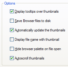
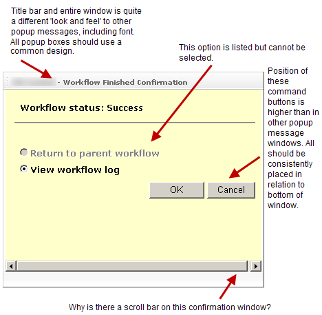
Here are some examples of the kinds of problems you might find when assessing design elements. The tabbed page shown in Figure 2 contains misaligned labels, check boxes, and text boxes, as the dashed lines show.

Figure 2—Misaligned design elements
Misaligned labels

Figure 3 shows examples of command buttons that are too small for their labels and buttons for which there isn’t sufficient space.

Figure 3—Poorly rendered command buttons
Poor command buttons

The form in Figure 4 is a jumble. Text boxes and combo boxes have different heights, descenders are cut off, arrow buttons aren’t the same size, and labels are in title case, are overly long, and aren’t parallel. (See “Reviewing Text Elements” for more information about text issues.)

Figure 4—Inconsistent sizes, misaligned interface controls, and inconsistent labels
Inconsistencies

Assessing Logical Flow

When reviewing a user interface, you must assess its logical flow. By logical flow, I mean whether the user interface is logical to your audience. Ask these questions:

  • When a user presses the Tab key, where does the focus jump? Does it jump all over the user interface, or does it follow your audience’s expectations based on their reading patterns—for example, left to right, top to bottom?
  • Which element has the focus when a page, window, or tab first appears? Is it on the first element, the OK or Cancel button, or some other element? Is the focus sufficiently visible, so users can easily see where any insertion point is by default?
  • Can users access all elements in the user interface using the Tab key or other keys? Are there elements users can select only using a mouse or other pointing device?
  • Can a screen reader such as JAWS read the user interface?
  • Can users control the user interface using voice commands?
  • Do users have to scroll horizontally or vertically to see the entire user interface, even on a screen of the target resolution and size? (Vertical scrolling is usually acceptable, but generally, horizontal scrolling is not.)

Reviewing Text Elements

When reviewing text user interface elements, consider these three Cs of communication:

  • clarity—The textual messages a user receives from an application must be clear.
  • consistency—Use terms and labels for user interface controls that are familiar to users.
  • conciseness—Be as brief as possible, but don’t sacrifice meaning for brevity.

Getting each of these aspects right for every text element in a user interface helps reduce that other C—confusion.

When reviewing a user interface, be sure to review these textual elements:

  • title bars
  • status bars
  • sidebars
  • navigation and menu items—all levels
  • items in list boxes and drop-down lists
  • group box labels
  • headings
  • text box labels
  • column headers
  • icon labels
  • button labels
  • ToolTips
  • link text—usually in Web applications
  • graphic elements containing text
  • user assistance text
  • Help text
  • confirmation messages
  • error messages

Consistency in Terminology and Spelling

When reviewing a user interface, look for:

  • misspellings and typos
  • consistent spelling of product names and terms
  • appropriate use of case and capitalization, as specified by your style guide

Many languages have distinct regional variations in spelling to which a user interface might need to conform. For example, if your user interface is in English, should the spelling conform to US English or British English?

Remember that correctness means the user interface complies with your company or product style guide.

Correct Punctuation

Review the punctuation of text elements for correctness and consistency. In particular, look for the following:

  • inconsistencies in word hyphenation
  • appropriate use of closing punctuation for text elements

For example, your style guide probably specifies a closing colon following a text box or list label. Make sure all labels conform to the guidelines.

Appropriate Use of Fonts

When reviewing user interface text, check the following:

  • Is the font family appropriate to the application and familiar to the audience? For example, Times New Roman rarely, if ever, appears in a desktop application, and Comic Sans never appears in an enterprise Web application.
  • Are bold, italics, and underlining used consistently, in compliance with your style guide? For example, Web style guides specify that no text in a user interface should be underlined unless it is a link.
  • In Web applications, can a user increase or decrease the font size, or is the size hard-coded?

Appropriate Use of Language

Check the use of language in a user interface:

  • Ensure the user interface uses simple language.
  • Ensure the use of language is appropriate for the expected audience.
  • Watch out for abbreviations and acronyms. Avoid using them unless you are absolutely sure your audience understands them.
  • Look for parallel structure in text elements such as headings, lists, and the labels of text boxes, check boxes, and option buttons. For example, do they consistently use the gerund form, ending in -ing, or the imperative form of verbs? See Figure 5 for an example of parallel labels.
Figure 5—Ensure that labels are parallel in structure
Parallel labels

Assessing Internationalization and Localization Issues

When reviewing text elements, consider what impact other languages and alphabets might have on how the interface text displays.

  • Is the space for titles, labels, and values in fields flexible enough to allow for other languages? Or might labels wrap badly, overlap, and be obscured by other labels or other user interface elements or be truncated so they are unreadable?
  • What happens to text when it’s translated to a right-to-left or double-byte language?
  • Is the user interface text hard-coded into the application, or is it stored in linked resource files? When developing a new application, make sure developers use linked resource files—even if they aren’t currently considering future support for other languages. In the long-term, maintaining text in resource files is much easier for everyone—particularly developers, technical writers, and technical editors—even if the application never gets translated.
  • Is there anything culturally specific about the user interface text? For example, the United States uses ZIP code when referring to a postal code, but other countries use other terms for postal codes. In the finance industry, many terms, abbreviations, and acronyms apply only in specific regions, even when countries use the same language. For example, the United States has the IRS, while Australia has the ATO; the United States refers to IRAs and retirement funds, while Australia refers to superannuation.
  • Are there any regional language differences within a single country you need to consider? For example, does a drop-down list of beverages use soda or pop or another other word for a carbonated drink?

Reviewing Error Messages

Error messages must be clear and useful. We’ve all seen plenty of error messages that are neither. Good error messages tell users what went wrong—and possibly why—provide one or more solutions for fixing the error, and offer a set of buttons that relate directly to the next action a user should take. Options like OK, Continue, and Cancel are not appropriate when an error message is a question. The possible responses to a question should be Yes and No. Too many options in an error message can confuse users, so they have no idea what will happen when they click a button. When reviewing error message text, your aim is to reduce confusion.

Tip—Ask the developers on your team for your application’s resource file, which contains all of the error messages and other UI text, so you don’t have to try to create every error condition to review the message text. Without a resource file, you’re likely to miss some error messages, because you may never create the error condition that displays them.

Reviewing Link Elements

There are links in all Web applications and in some desktop applications, but not all of them are blue underlined text. Links help users navigate—both within an application and to external locations.

Navigational links include menus of all types, breadcrumb trails, links to other pages, links to Help, and even email addresses. Often links in applications display something on the same page—such as a popup dialog box, an expandable panel, or user assistance—or clickable image maps with multiple hotspots display related information. When reviewing a user interface:

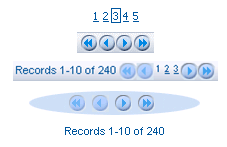
  • Ensure it uses similar link elements consistently. For example, if an application has a page browser, do the link elements always look the same? Or are they different like those in Figure 6?
  • Review the font, color, and style of active and visited links.
  • Check the behavior when users hover over links.
  • Make sure the text matches the link’s action.
  • Verify that links take users where they would expect to go.
Figure 6—Inconsistent page browsers within a single application
Inconsistent page browsers

Reviewing Visual Elements

Visual elements include graphics, color, and display mechanisms. You don’t have to be a graphic designer to review the visual elements of a user interface. As with text and links, you’re looking for usefulness and consistency. You’ll notice consistency by its absence.

Graphics Must Add Value

As a general rule, if a graphic image is not necessary, don’t use it. Such an image just becomes noise and uses up bandwidth. However, some graphics can help guide users through a process or provide visual cues showing progress along a sequence of steps. When reviewing a user interface’s visual elements, consider the following:

  • Are any graphics or graphic elements unnecessary?
  • Are any graphic elements too big or too small?
  • If images don’t display, what happens to the user interface? Does it display alternate or title text, or do you get a placeholder box?
  • Did your developers use consistent, familiar, and recognizable images for common functions? For example, although we no longer use floppy disks, that icon is instantly recognizable as a Save icon. If you use a different image for save, such as a lifesaver, your users may not understand that it means save and might assume it means help.
  • Are any of the graphic elements blurred or jagged?
  • Do the graphic elements use transparency appropriately?
  • Do hotspots on image maps cover the relevant parts of the image—for example, the countries on a map?

Use Color Carefully

Color is often a matter of personal preference. Be aware that people will interpret color names differently. For example, if I recommend using purple in a user interface, which purple do I mean—violet, mauve, lilac, burgundy, maroon, or just plain purple? Figure 7 shows many shades of the color purple.

Figure 7—Many shades of the color purple
Purples

Color also has different meanings in different cultures. In Western societies, white means purity, while in some Asian cultures, white means death. Depending on where you live, red might represent danger or good luck.

Most importantly, though, colors render differently on a screen than they do on paper. Different monitors, resolutions, flicker rates, brightness and contrast settings, gamma settings, and angles of view affect how color appears on a screen. And ambient light conditions from overhead lights, sunlight, and fluorescent lights can drastically change a color’s appearance.

Finally, a small percentage of the population has some form of color-deficient vision or other visual impairment. This also contributes to the different ways in which users perceive color. On the Vischeck Web site, you can see how those with various types of color-deficient vision see Web pages.

Some things to consider when reviewing the color in a user interface include the following:

  • If there is information in an application that users are likely to print, try printing it on various color and black-and-white printers and on different paper stocks. See how the color renders when printed. Set the print options to gray scale and test that printout, too.
  • Check the color palette your developers used. Is it a limited range of colors, or does it use all 16 million colors? Older monitors might not display the full range of colors, although this is far less likely today than it was five years ago.
  • What happens if a user or administrator changes the color scheme? For example, savvy users can change their Windows color scheme and display fonts or the colors, fonts, and cascading style sheets (CSS) their browser uses by default. If graphic user interface elements—for example, the background color for buttons—are hard-coded to the classic gray of older Windows interfaces, they’ll look completely out of place if users customize their Windows colors. See Figures 8 and 9 for examples of elements whose color did not change to match user settings.
  • Has the designer used colors to identify standard or required elements—for example, a required field? Some Web applications indicate required fields with a red asterisk or some other symbol, color, or font weight. Other Web applications shade required text boxes with a background color. Are all required fields treated in the same way?
Figure 8—Before: A skinnable Web application’s default colors and graphics
Default colors
Figure 9—After: Changing colors in the CSS did not change the hard-coded colors and graphics
User-modified colors

Consider Resolutions, Screen Sizes, and Displays

When reviewing the visual elements of a user interface, you must also consider various aspects of the computer display—resolutions, screen sizes, window sizes, and so on.

  • Test how pages display at various resolutions. Change the computer settings to reflect an 800x600 screen, a 1024x768 screen, a 1440x1920 screen, and any other screen sizes your users might use. Also, resize the fonts—make them very large and very small—and see what happens. You’ll readily notice what visual elements have potential readability problems and accessibility issues for users with visual impairments.
  • Test how the pages display on various devices. Web applications now must consider multiple browsers and multiple devices, including those that have small screens—such as PDAs, mobile phones, iPods, and BlackBerry devices—and those that have large screens—such as wide-screen monitors or large LCD television screens. If you do not have access to all of these different types of devices, try resizing your browser window to the dimensions of their screens. Even if the application was not designed for such screens, test them anyway, just in case a user tries to use the application on another device.
  • For Web applications:
    • Test how the pages display in the most popular browsers. Microsoft Internet Explorer and Mozilla Firefox make up around 90% of the market, so at least test in those browsers. If Mac users are likely to use a Web application, test using the Safari browser. You can test how Web pages display in all major browsers using Browsershots.
    • Turn off CSS, JavaScript, cookies, and frames in your Web browser. Is the page still usable? It might look ugly, but users should still be able to use it. Can you see the navigation links and the content? If your browser doesn’t let you turn off these elements, try one of these free browser add-ons:
    • Validate all Web pages. Use some of the markup validation tools that validate a page’s DOCTYPE, HTML, and CSS, such as the W3C Markup Validation Service and CSS Validator, or an all-in-one validator like the one from AI Internet Solutions.
  • Resize all resizable windows. Do the elements in the window resize appropriately? For example, if the window contains a list box, do the dimensions of this box resize when you make the window smaller or larger? Does the application save the size and position of a window once a user has resized or moved it?
  • If a user is likely to print a page or window, print it. While most browsers have a print preview option or your application might have one, actually print it on paper to see how it really looks. What happens to the headers, footers, sidebars, and navigation elements? Is any content missing or cut off—such as large images or wide tables? A well-designed user interface needs to print readable content.

Reviewing User Interactions

User interactions are the dynamic aspects of a user interface—such as clicking a button, performing a search, or saving a record. What happens when you perform such actions? What results or feedback do you get? Do you get logical and appropriate results? Look out for results that don’t behave as you expect them to.

Test All Buttons, Links, and Keys

When reviewing a user interface, test these user interactions:

  • Click every menu item, button, and toolbar button. Do they do what you expect them to do? Do they take you where you expect them to go? For example, is there a clear difference between what happens when you click Apply, OK, or Cancel?
  • Click all other controls, including tabs, spin boxes, drop-down list boxes, and other user interface elements.
  • Try to access all functionality using the keyboard. For example, Alt+<Character> should display the relevant menu, Tab should move the insertion point to the next field, Enter should execute a command if the focus is on a button, and Esc should close a dialog box.
  • Check what happens when you press the function keys. For example, on a PC, F1 should display Help and F5 should refresh the browser window or a directory.

Check System Response Times

Before measuring system response times, make sure your system configuration matches the design specifications for the application. Otherwise, the developers might reject or ignore your comments about performance.

System response times determine how long it takes to complete specific actions. Are the times within acceptable ranges—that is, do they meet your expectations based on your experience performing similar tasks using other software? Some interactions whose performance you should check include the following:

  • opening and closing an application
  • loading new pages, dialog boxes, and tabs
  • loading new and existing records
  • responses to user interactions such as clicking a button
  • running processes such as saving a record or displaying a report

Test Any Search Facility

If the application includes a search facility, perform several searches to check what search functions are available and what results they produce.

  • Search for single words—both whole and partial words. Try any wildcard characters—such as ? and *—that let you match just part of a word.
  • Search for phrases and multiple terms, with and without using quotation marks. Do the search results differ? Can you use either single or double quotation marks, and do the results differ if you do?
  • Search for multiple terms using Boolean operators such as +, -, !, |, =, AND, OR, and NOT. What works? What doesn’t?

Reporting Issues

As you review each Web page or screen of an application, record your findings. No matter how you report issues, always provide constructive criticism and minimize personal opinion. Certainly avoid comments such as I don’t like that. Back up your assertions and any suggestions you make for improving the application’s user interface with objective reasons relating to the following:

  • usability
  • readability
  • accessibility
  • familiarity
  • consistency
  • conformance with accepted industry standards—for example, the Checklist of Checkpoints for Web Content Accessibility Guidelines 1.0
  • legislative compliance—for example, Section 508 of the Rehabilitation Act (USA), the British Disability Discrimination Act (UK), or the Disability Discrimination Act (Australia)

Using a Bug Tracking System

If possible, record both the issues you’ve found and your suggestions for making improvements in the development team’s bug tracking system, so the developers will be more likely to review and address your comments and recommendations. Avoid labeling your bug reports as cosmetic bugs, because developers rarely review or fix cosmetic issues, especially if there’s a strong push to get the product released as soon as possible.

Creating a Formal Report

If you document your findings in a formal report to the development team or to management, clearly illustrate the issues and the changes you’re recommending. To illustrate issues and document your suggested changes, do the following:

  • Take screen shots, using tools such as SnagIt from TechSmith.
  • Capture an entire Web page that requires scrolling using SnagIt or Paparazzi!
  • Add callouts to screen shots, as shown in Figure 10.
  • Create a PDF document and add comments to the file, then either refer to it or incorporate it in your report.
Figure 10—A screen shot with callouts
Screen shot with callouts

Once you’ve created a formal report of your findings, don’t let the product team ignore it. Set up times to talk directly with the developers, team leads, or project managers who can help you get your feedback addressed. Present your findings as an advocate for users, and let the team see your passion for meeting users’ needs.

Reporting Issues Less Formally

Sometimes you just want to report an issue to the one person who can fix the problem. In such instances, consider one of these less formal reporting methods:

  • Sit with the developer, show him the problems on your computer, and confirm the fixes as he makes them.
  • If you cannot sit down with a developer to show him the problems, capture screen videos that show the issues. A video is also very useful when a developer says he can’t replicate a problem. Capture them using tools such as Captivate, Camtasia, or ViewletBuilder. Refer to any videos in your formal report.
  • Complete a checklist showing the items you’ve checked as you reviewed each part of an application—one checklist per screen. Developers can reuse your checklist as they continue developing the application. Here is a link to a comprehensive checklistPDF that covers all of the guidelines I’ve discussed in this article.

Why Tackle a User Interface Review?

Reviewing an application’s user interface is not about your opinions. Your aim is to improve a user experience to reduce potential user confusion and meet users’ needs. By thoroughly reviewing design elements, text elements, link elements, visual elements, and user interactions, you can ensure users have a positive experience with your application.

Although you can use some software tools to help you with this task, ultimately, your knowledge and understanding of user interface guidelines, standards, and interactions are your best tools for reviewing a user interface. 

Managing Director at CyberText Consulting

Western Australia, Australia

Rhonda BraceyRhonda runs a technical communication consultancy from her home in the lush southwest corner of Western Australia. Since 1992, Rhonda has worked for numerous software companies, mostly as a technical writer. She is pedantic about unfriendly user interfaces and passionate about improving them. In the past few years, that passion has led her to take on the mantle of user interface expert within the small software companies in which she has been the lone technical writer and often the only user advocate. In 2008, she presented a session on “Techniques for Reviewing a User Interface” at the WritersUA Conference and will do so again in 2009.  Read More

Other Articles on Usability Testing

New on UXmatters