As more and more UX professionals, consultants, agencies, and other businesses embrace the future that is UX strategy, it was inevitable that there would be more conferences focusing on UX strategy, including some from companies whose primary business is organizing conferences. One such conference is the UX Strategies Summit, which is presented by the Global Strategic Management Institute (GSMI). Their goal is to provide conferences and workshops “covering topics that today’s leaders find most challenging and inspiring.” The inaugural UX Strategies Summit took place in San Francisco, California, at the Marines’ Memorial Club & Hotel, spanning three days—June 10–12, 2014—including one day of workshops and two days for the “General Summit.”
Champion Advertisement
Continue Reading…
Organization
Overall, this was a well-organized conference. Since GSMI are professional conference organizers, they did a excellent job on planning, hosting, and running the conference. Following a full day of workshops, the main conference comprised three tracks:
Research & Design, Day 1
UX & Business Strategy, Day 1
Practical Application of UX, Day 2
Each day of the main conference opened with a welcome and introduction from Summit Producer Breanna Jacobs and an opening keynote address. On Day 1 of the conference, one other talk followed the morning keynote. After the morning break, the conference split into two tracks. Then, after the afternoon break, all attendees came together again for a panel on “UX Team Collaboration: Best Practices in Communication and Productivity” and another talk.
The first two conference tracks ran concurrently, which was sometimes frustrating. Because the rooms in which the conference occurred were relatively small and fairly crowded, despite the rooms’ proximity, it was not easy to move from room to room to attend particular sessions. Plus, the UX & Business Strategy track took place in the smaller Crystal Lounge, so I missed a number of the sessions that I would have liked to attend.
On Day 2, opening and closing keynotes bookended a single track of conference sessions. This was a small conference, with about 150 attendees. In my opinion, small conferences provide a much better experience when everyone shares a common experience—in a single-track conference. Thus, although there were many great talks on both Day 1 and Day 2, Day 2 provided a better overall experience to attendees.
All keynotes were allotted an hour and a quarter; all other sessions, 45 minutes. Therefore, all speakers had sufficient time in which to develop their topics.
Content & Presenters
In her welcome letter to attendees, Summit Producer Breanna Jacobs wrote, “The Summit will feature case studies and talks covering the challenging topics most relevant to helping you build and execute your team’s UX strategy.” Speakers did, indeed, present many interesting case studies during the conference. If there was fault in the conference’s content, it was an overemphasis on execution—that is, the tactical aspects of User Experience—and being rather light on talks about UX strategy. Nevertheless, the content was generally good to great.
The Pre-Summit Workshops
There were three pre-Summit workshops—one in the morning and two in the afternoon—as follows:
“The Ins and Outs of UX Research,” by Alison Meier, Senior UX Strategist and Research Lead at gotomedia—This was the only morning workshop and was full by the time I registered.
“Adaptable Product Roadmaps,” by Lis Hubert, Independent Information Architecture and UX Consultant, and Donna Lichaw, Product Management and UX Consultant
I’ve linked the workshop titles to the PDF presentations on the UX Strategies Summit site.
Workshop: Adaptable Product Roadmaps
Facilitators: Lis Hubert and Donna Lichaw
Because I’m already very well-versed in Lean UX and I’m interested in product strategy, I chose to attend Lis and Donna’s workshop. Plus, Lis was already a UXmatters author. Lis and Donna started by defining what a product roadmap is: “a plan or strategy intended to achieve a particular goal.” Donna told us that it’s important to “get a consensus of what a roadmap is. Otherwise, it becomes a pot of gold at the end of a rainbow. You have to know who your audience is.”
They showed diverse examples of how people have depicted product roadmaps, then discussed some of the problems that product teams—comprising UX designers, product managers, and developers—encounter in devising product roadmaps:
Great ideas can fall by the wayside.
Roadmaps just sort of happen—or can fall by the wayside.
Business goals can change.
Donna related a story about her experience creating a product roadmap for a new mobile app at a startup: “We figured out a three-month roadmap for what we were going to build and how it was going to work, and we had the goals solidified. … It was all going to be about acquiring new users. They were in this growth mode, and they just wanted to get new users. That was all their investors cared about. … It doesn’t matter if they use the app, we just need to sign them up. We’ll worry about that next year, next quarter. So we had this all planned out. Then, one day, the founders came to talk to me. … We have a new business goal. We don’t care about growth right now. … Our investors now want us to focus on revenue. We have to figure out how to make money within the next quarter or that’s it. … This story has an interesting thread throughout our workshop.”
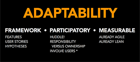
The workshop comprised brief lectures on key concepts, with activities following each lecture. Lis explained that the key characteristic of a good product roadmap is adaptability. “It’s malleable, and that’s okay.” And adaptability requires that the process of creating a product roadmap be
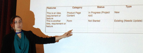
based on a framework—A framework provides “a solid foundation on which to build,” said Lis. The product roadmap framework shown in Figure 1 is the one we used for the workshop activities, but Lis shared a variety of other worksheets that product teams have used in creating product roadmaps. Donna mentioned that a product roadmap must be actionable and extensible, stating that, “A framework is not just a deliverable. Understanding the building blocks is key to a great roadmap. What is the goal?”
participatory—The full participation of the product team members is necessary in identifying stakeholders, establishing the big goals and a timeline for achieving them, creating a feature list—defining the level of effort that they’ll require and ranking and prioritizing them—and mapping out their themes.
measurable—It’s essential to define a KPI (Key Progress Indicator)—such as acquisition, activation, retention, revenue, or growth—then adjust and adapt.
Figure 1—Lis Hubert, showing their product roadmap framework
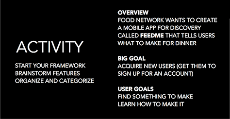
Figure 2 shows Donna’s first instructions to us for the workshop’s activity. She asked us to start a framework and brainstorm features for a mobile app called FeedMe, with the goal of acquiring new users, then “organize, categorize, and tag the requirements in a simple spreadsheet.” We broke up into teams of three or four people to work through the activity.
Figure 2—Instructions for the workshop activity
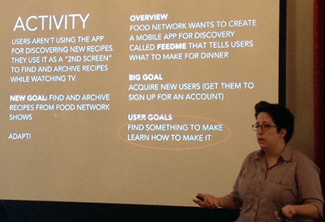
During the next stage of this activity, we prioritized, reordered, and mapped the requirements. Next, we defined a guiding KPI and other useful metrics. When we learned that users actually had a different goal for using the app, shown in Figure 3, we adapted our product roadmaps.
Figure 3—Donna describing the evolution of the activity for a new user goal
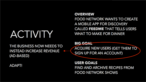
When we then learned that there was also a different business goal for the app, shown in Figure 4, we again adapted our product roadmaps.
Figure 4—Adapting to a new business goal
The activity demonstrated the significance of adaptability when defining a product roadmap—especially in an agile or Lean context—as Figure 5 shows.
Figure 5—Adaptability
After each stage of the activity, the various teams shared the product roadmaps that they had created. It was clear that workshop participants had become very engaged in this well thought–out activity. This was an excellent workshop. Lis and Donna presented a very pragmatic and adaptable approach to defining a product roadmap.
Day 1 of the Conference: Highlights
As I described earlier, the audience spent much of Day 1 split into two separate tracks, as follows:
Panel: “UX Team Collaboration: Best Practices in Communication and Productivity,” moderated by Mathew Varghese, with panelists Amy Chenault, Catalina Naranjo-Bock, and Michelle Haag
I’ve linked the session titles to the PDF presentations on the UX Strategies Summit site.
Opening Keynote: Beyond Usable: Mapping Emotion to Experience
Presenter: Kelly Goto
“I want to talk to you about something that has really been … close to the work that I’ve been doing over the years,” Kelly told us. “It’s really understanding how to get beyond usable. Everything was usability, usability, usability. … It’s time that we get beyond usable. So if you’re not already doing usability testing and making sure that things work at the highest level, you really need to get there. But it’s time to go past that. We want to start mapping this next level to our product strategy. Getting to the meaning of the work that we do is really hard because we’re kind of engrossed, day to day, in getting the buttons right and making sure the layout’s clean. But we’re really getting past that, into a new level….
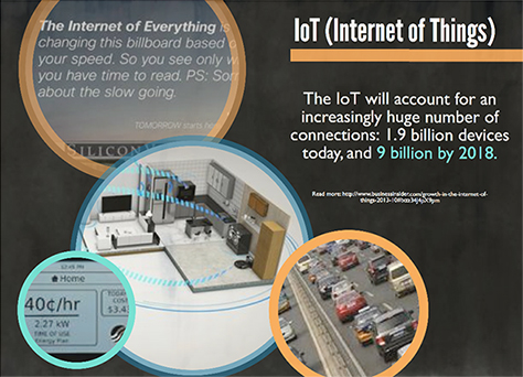
“The Internet of Things is kind of quickly taking over—smart homes and smart freeways and crowd sensing,” as Figure 6 shows. “People are starting to say it’s just the Internet of everything. … There’s also a movement into freehand gestures. … This affects us as UI designers and as product strategists. What else do we have to think of besides pixels and devices now? … It’s become … a digital renaissance. … We’re at an amazing time. It’s exciting. But at the same time, I think, with everything getting smarter, what’s happening to our society?”
Figure 6—Internet of Things
Kelly shared a great Nicholas Carr quote from “The Web Shatters Focus, Rewires Brains.”
“When we go online, we enter an environment that promotes cursory reading, hurried and distracted thinking, and superficial learning. Even as the Internet grants us easy access to vast amounts of information, it is turning us into shallower thinkers, literally changing the structure of our brain.”
“I have this thing about this checking habit that happens, and you just compulsively pick up your phone and look at it and see if someone’s messaged you.” Research has “found that people were picking up their phone an average of eight to ten times an hour. I think, for me, it’s like 30 times an hour,” confessed Kelly. “Why are we compulsively checking our phones and checking our devices and looking at our Fitbits?” Studies have shown that “our brains are literally being rewired” to have short attention spans. “Our attention span is at zero. Our brains are literally being trained to act this way. So it’s a little bit scary. … Walking around, you see people that are looking at their phones. At SXSW, fewer people are interacting. More people are just sitting there, staring at their devices between sessions.”
“[South] Korea always sets the pace. … The first telecoms that really got mobile going” were in Asia. “We were always behind Japan. We were always behind South Korea. Everything was super advanced there. We looked to them for all our steps to see when could American catch up and be totally ready to be on smartphones … They’re supposedly getting rid of all paper textbooks by next year. … They’re also starting treatment for digital addiction at age three.”
Kelly called upon us to move from the mindless—stimulation, pleasure, zero output—to the meaningful—habitual, integrated, lifestyle integration: “We’re really at a point where we have to think about how to make meaningful experiences. And we’re responsible for this as product strategists because we are designing for the future. So, starting off with this mindless thing that’s going on…. A lot of companies want mindless. It’s predictable. There’s like an algorithm for it. If there’s an algorithm for it, if it’s predictable, it’s going to be revenue generating. … What does it take to create an actual meaningful experience that is going to integrate with someone’s life and is going to be here for the long haul? How much work do we need to do? Quite a bit of work.” The remainder of this presentation provided answers to these questions.”
“To get to this level of meaningful interaction with people,” we can tap into the automatic through research—into the preconscious or inter-conscious thought or semi-awareness “that’s right between what people are aware of and their deep subconscious”—through asking questions, through deep-dive interviews.”
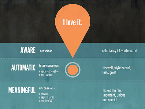
Figure 7 shows people’s levels of emotional response to products: aware, automatic, and meaningful.
Figure 7—Levels of emotional response to products
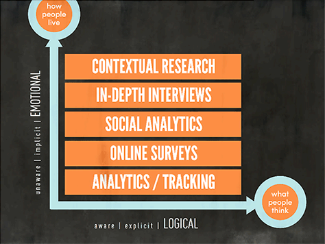
“We look at a lot of different research methods. I’m just totally into any kind of research—any kind of data,” Kelly told us. “I’m not a die-hard contextual researcher only. … I am absolutely into any kind of data that you can actually gather. And I love having numbers to look at. I love having stats. I love having patterns. But once you have those patterns, you really have to dive into the why people are feeling that way. And it really takes moving [from] both the emotional and logical statements that people make into watching them to see what they actually do. … It’s kind of interesting looking at what the differences are between what people say they would do and what they would actually do. … It’s not that people mean to be untruthful,” but they are often unaware of what they actually do every day. “We want to make sure that we understand what the emotional values are, and really the only way to understand emotional values is by looking at people’s actual lifestyles,” as Figure 8 shows.
Figure 8—The emotional—how people live—versus the logical—what people think
“We really believe in telling stories,” said Kelly.“ And those stories help product decision makers understand their audience better—understand a bit more what they’re trying to accomplish. And the storytelling helps build the case to make changes happen in your organization.”
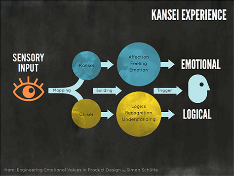
Next, Kelly introduced the concept of Kansei, or sensory engineering, which originated in Japan in the 1970s. (According to Wikipedia, Kansei’s aim is to improve the development of products and services by translating customer’s feelings and psychological needs into requirements for product design.) “We’ve translated this … into what we call why-finding,” said Kelly. A brochure that gotomedia provided to all attendees explains this concept in greater depth.
“There’s sensory input that we can track and understand. And it could be memories. It could be smells. It could be the feeling of something as you touch it. It could be a tactile experience of a button. And that sensory experience translates both into emotional and logical attributes. And what we’re trying to capture as best we can are: What are the logical things that you already are aware of? … But the emotional aspects you’re trying to gather are: Why is it important? Why is it meaningful? How does it fit into my life? Does it frustrate me? Does it make me happy? The combination of this is really understanding that whole Kansei experience. And then we move into more of a product mindset. … You need to instill emotional value into products,” as in Kansei, or sensory engineering, which Figure 9 depicts. The creators of this methodology went “beyond usability a long time ago.”
Figure 9—Kansei experience
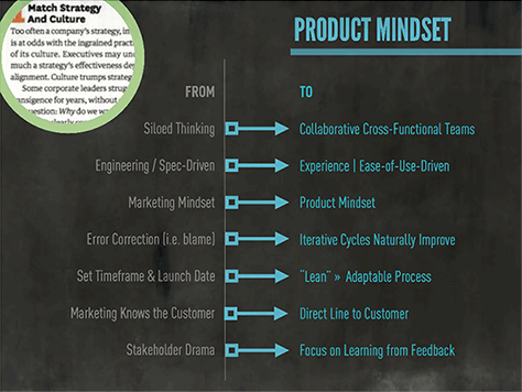
Kelly talked about having a product mindset—first describing some typical types of product companies:
traditional, top-down structure—“The CEO has no clue really on the digital side…, but mandates a lot … from the top down. Companies are marketing focused. The Internet is a solid marketing tool. User experience is still a relatively new, top-down structure. The field of human factors is emerging.”
transitional, Web 2.0 movement—“A functional Web movement started by developers. A lot of frameworks came in. This is where we started moving to responsive design. Also frameworks for quick building and prototyping—getting it out there. C-level–[driven] and traditional companies fall behind. Hybrid designers + coders begin to emerge. Usability testing, mostly in the lab, starts to take hold.”
progressive, dynamic, adaptable—“Where we are right now. Collaborative, cross-functional teams. An experience and ease of use–driven product mindset. Iterative cycles naturally improve [products]. A Lean, adaptable process. A direct line to the customer. A focus on learning from feedback.”
“Progressive … teams are dynamic and adaptable,” said Kelly. “I’m not really into agile or Lean, as much as iteration. … Iteration works for everybody. … Methodologies may work, but it depends on the culture, … the discipline, and the rigor.”
“If you look at the shift that’s happening, you can see … that a product mindset is a really different mindset,” as shown in Figure 10. “And one that we need to instill in our teams, and then within our organization.”
Figure 10—Product mindset
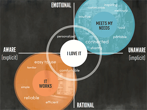
“Why-finding reveals key connectors that map experience to emotion. These connectors lie between what people are aware of and deeper meaning. Identifying these key connectors is an essential part of product strategy,” explained Kelly. These connectors resonate deeply with the people who are using your product or service. “Identifying what these connectors are for your company and your product is essential to developing a product strategy in the future. The key connectors that are the main key connectors—there may be dozens of key connectors, and these may represent a few— … map nicely to Maslow’s hierarchy of needs.”
Meaning derives from “aspiration, connection, identity, trust, and ease of use,” which range from the emotional to the rational. “You need to get that ease of use right. Otherwise, you’re never going to be able to go up the ladder. So moving beyond usable would be your first step.” As Figure 11 shows, people are more aware of their rational responses than their emotional responses. Kelly showed some examples of the types of emotional responses that particular products evoke—as well as people’s emotional responses to brands.
Figure 11—Emotional and rational responses and the corresponding levels of awareness
“Most of the information we get is actually from interviewing—IDIs, or in-depth interviews,” said Kelly. “We have short, targeted interviews. We don’t go on and on and on. We’re focusing our questions on laddering—why, why, why—getting deeper into why people might say something. And there are different cues—‘Oh, I love it!’ … ‘Oh, I just love the way [a product works or feels].’ So you really want to understand” how a product works for someone, “moving up Maslow’s hierarchy of needs to it really meets my needs. And not every product or service needs to be at the meets-my-needs level. You could have a really straightforward product that works, and you will hit that emotional value.”
Once we “get the words … that people are saying, we actually do a cluster analysis. … You need to take it all into context. We have all of our interviews transcribed. … It does take some rigor and discipline to take it to that next level. Then we take the word clusters and really start to understand: What are the areas of value that this product or service has? What are the things that aren’t working, and where can we fix that? Where do we need to concentrate our efforts? So, in the end, here’s Maslow’s hierarchy of needs again. We have ease of use building into trust. Be sure that you have that trust piece. And it’s really … about understanding how it fits into … your business, and which ones are the focus areas for you. When you start gathering this sensory information, it can be overwhelming because there [is so much], and it’s all processed in a single second. … I don’t expect you to … capture all of that. But if you move into this other side of asking questions and understanding what the output is, you can start to [understand].”
“We have a lot of interfaces we’re going to have to create in the next several decades. Just moving into gesture-based, touchable, sensory [products], understanding the number of sensors that are in each of the products that we’re actually creating and understanding how that relates back to UI, it’s a very complicated process and one that we’re just beginning to understand. … Understanding these emotional values … should be your drivers. … So just like you have brand value, these are user experience values that you need to instill into the product team, into the marketing team, and into the actual product experience itself.”
“When we do contextual interviews, we try and go to at least two places with that person. … Start at their home or at a cafe, if they’re not comfortable. … Follow them through one transition that they go through in a day that’s a regular transition—be it going to school, maybe going to another cafe, or going to work.” They capture video, using a GoPro or other inexpensive camera. “Contextual research is inspired by ethnography and anthropology, but really, it’s deep hanging out, … where you hang out with people long enough to understand, at a deeper level, what their needs and desires are.”
“I encourage you to go out at least once a quarter and meet with your customers. Try to meet with them where they’re actually using your products or services, and understand what else is on their desktop. … It’s really interesting to see what offline things people are using and what alternate types of services people are really looking for.
“When you’re looking at the future of devices’ not being in one place, at one time, and people using everything, everywhere, people moving, and everything being quantified, you want to also look at these elements. This gets into what we call a contextual persona. And it’s a little bit more than just looking at one situation and one time. You want to look at device, place, task” and ask questions like the following:
“Were you able to complete your task?—Most likely, people start in one place and finish someplace else. They start on one device. They finish on another device.
What limitations were there? Did your wireless go out? Were you commuting? Were you driving and you couldn’t look at your phone?
How, in the end, did it make you feel?
What state were you at? Were you exploring? Making a purchase? What were you doing at the time?”
“As we look back and forth between device, place, task, … it leads to a better understanding,” said Kelly. At gotomedia, they use the mobile app Dscout in their research. “It works pretty well. They have what they call missions, and you’re able to set up digital diaries, send out short surveys, and also get people to respond to missions. We’ve found that we need to keep encouraging people, along a several- week path or even a several-month path. … Even with digital diaries and interviews, remotely, we were able to put all the information together into … areas that really needed improvement from a product perspective. We divided it into technology, business, and design for our client, but then we found that the biggest changes—the most important changes that needed to happen—were really with ongoing use, which normally wouldn’t get captured with usability testing. So, you have the beginning of the process, the ongoing use, … the decision to use it or not. Would you recommend it to a friend? That sort of thing. The ongoing-use phase can really only be captured with something like ongoing diaries….
“This is an example of a process we actually went through. We did two bigs rounds of usability testing that were focused on prototype and release. … Then, we added digital diary studies with families, both remotely and in person. And weekly we would check in with them on Skype and do kind of an interview. We combined all of these things, so mixed-method research is really important for product strategy.”
In discussing getting beyond usable, Kelly told us, “Remember, people don’t advance as quickly as technology. You may have an assumption about how something’s used, but in the end, find that it’s used completely differently than you’d intended. … Looking at ethos, or ethical appeal; pathos, or emotional appeal; and logos, appeal to logic: Understanding the brand story, the trust that you create first, then getting into both the logical and emotional side of the experience, this has been around 2000 years. So, it is not new. It’s just that we’re finally beyond usable, so we’re able to embrace it.”
This was one of the best keynotes I’ve ever heard. Kelly is a wonderful speaker who engenders emotional engagement in her audience through storytelling and interacts with her audience. (Check out the recording of her presentation to hear her stories.) She gave a great talk on a very important topic and, as you can see from Figures 6–11, the information design for her slide deck was superb. Many slides succinctly conveyed great meaning.
Starting from Scratch: Best Practices for Creating a Great UX Team
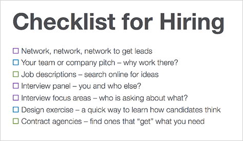
Presenter: Julie Baher
Julie talked at length about the evolution of the UX team at Citrix, their hiring practices, and their workspaces. In describing their hiring process, she told us, “You need to think about designing the candidate experience. … Assign different topics to different interviewers. … Do some kind of design exercise.” Here’s her list of things to think about when you’re hiring, in Figure 12.
Figure 12—Hiring checklist
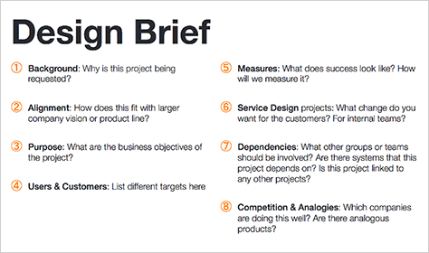
Once Julie got to the parts of her presentation covering planning and process, her talk held more interest for me. The most interesting segment was about preparing design briefs, which define the scope, timeline, stakeholders, and why you’re doing a project. “This is really common in … design agencies, not so much inside [product] companies,” said Julie. “We tend to just jump into projects. … The key thing, in the beginning, is to put together some kind of design brief, … and think about and ask: What’s the scope of the project? What’s the timeline? Who are the stakeholders? And the big, money question: Why are we doing this project? What’s the point for the business, the team, or the group? What do we want to get out of it?
“A lot of how we developed the specific questions we used was by doing a lot of lessons learned from projects afterward. … What should we have asked in the first place that, had we known that, we wouldn’t have ended up in this pickle on this project?” Figure 13 shows Julie’s outline for a design brief.
Figure 13—Outline for a design brief
“Understanding the background: Why is this project being requested? Who’s it for? … How’s it fitting in with other things going on at the company? … Is this going work with some of the other products? … Is there something it’s going to be dependent on? In terms of the purpose: What are the business objectives? What are the success metrics? … What is the target market? … What’s going to be different after we change how we interact with them? … There are things that we do that—it’s not going to change just the product, but it’s going to change how we work as a company. So thinking through some of the other things that are going to have to change if you’re releasing a new kind of product.
“The dependencies… What we found was that, by really probing people about who else needs to be a part of this, … that was really helpful because they hadn’t always thought those people should really be included in the beginning. … Knowing who the competition is and what the analogous spaces are: … Who else does this well? … What is anybody else doing that could be vaguely related or has some best practices around that? So this is what goes into a design brief.
“We tended to have a kick-off meeting. I would often send these questions to people beforehand and say, ‘these are the things we’re going to talk through.’ … In some cases, … people would actually write five-page documents. … We weren’t hardcore about this [being] something that has to be written down. This was meant to be a tool to make sure we had the discussion. Then, sometimes, [after the kick-off meeting], we would type [the revised brief] up and send it back to them and say, we just want to reflect back what we heard. … They would sometimes have a vice president or a more senior person look at it. … Sometimes there had been a little miscommunication over why we’re doing it or what the purpose was or the business reason, so it became a really good tool to get everyone on the same page before we ran into projects.
“The other thing we did, right from the beginning, … was to come up with some user experience principles…:
Make it simple.
Exhibit craftsmanship.
Inspire delight.
Deliver unique value.
Focus on human goals.”
“Make it simple, which is sort of obvious, but, especially in an enterprise company, really isn’t because they will just tend toward the complex. They’ll say, ‘[Users] like it that way. IT admins, they want to feel they’re really smart, so they like the software to be really hard to use.’ … I’ve been arguing [that] … the software could get out of their way. … Principles… [don’t] solve everything, but they’re a good language for folks who are really not in UX teams to have a conversation. And we do find some people will take these and analyze their own project. … We could educate people around: What does it mean to have a good experience? … These [are] things that would be part of a good experience.”
In showing diagrams of linear and agile processes, Julie said, “Some teams … still have these really linear processes. … You just need a way to communicate what’s going on in the design team as other folks are moving along. … [Communicating that agile is] more layered and being clear that there’s going to be some up-front work that the design team wants to do. We can’t just be brought in the minute they’re ready to start a sprint and crank out designs in an hour.”
Julie talked about the importance of Iteration 0 in an agile development process. That’s when a team defines a project’s scope, prepares a design brief, comes up with design concepts, and creates an information architecture. She said, “On some of the projects I’ve been on recently, we did take this long Sprint 0—or even before the project really got going—to say, ‘Here’s the design brief. Here’s some information we got about users. Here’s the sort of concept / vision.’ And we did a lot of … information architecture up front…. You need to communicate that you need to do your design work and get that going before the engineers get a start on those particular things, because you’re just never going to build a good product if you’re making up as fast as they’re coding it. You’re just not going to create a whole that makes any sense. Really, it’s about just communicating, in some way, where you’re fitting into some of these processes.”
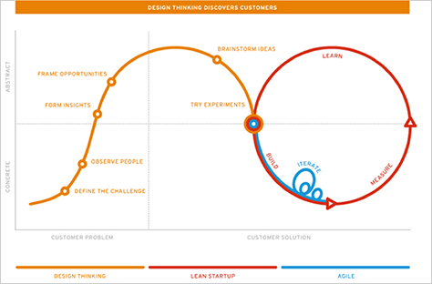
“Citrix has this group called the Startup Accelerator. So we’ve been funding different … microstartups. We give them under $250,000, but there’s a space they can use. There are people who coach them. So we’ve been talking a lot more about Lean Startup, trying to understand: How does that fit with design thinking? How does that fit with agile? How does it all go together?”
Figure 14, from Nordstrom’s Innovation Lab, is a great depiction of a synthesis of design thinking, agile development, and Lean Startup. “What they tried to do in this diagram is fit these together—these ideas around Lean Startup and agile and design thinking,” said Julie. “The way it works here: Design thinking is … more the up-front understanding [of] the users, needs finding. … That’s what we found at Citrix, too. The stuff we were doing around design thinking, teaching people how to do it, was really helping them go out, talk to users, think about empathy. Then, they [asked], what do we do now? …
“Lean Startup is about [quickly] testing and iterating an idea. … It’s not just about testing and iterating a product, but a whole business model, too. … Startups pivot and change their whole business as they get feedback. And once you become this big, lumbering company, you just assume that stuff is fixed, and you’re just iterating your product, but you’re not thinking maybe there are other problems with it.”
Figure 14—Synthesis of design thinking, agile development, and Lean Startup
“Design thinking is great when you’re trying to figure out: What should we build? We’re not sure. We’ve talked to users. We found this problem. You start to build that and prototype it. Then you can bring that into the Lean Startup process, where you’re quickly putting stuff out there, whether you’re A/B testing it or just getting feedback and iterating. … Agile. That’s really just a development process. … Agile is not always iterative, but in theory, it’s this very iterative, user-focused process of building. … Where do the design and research fit into these processes?”
“We did a lot of baseline studies … because it’s good to show where you started from—especially if … you’ve inherited things. So you can say, this is where we’re starting from, and this is where we’re going.”
Julie put together a beautiful, clean-looking presentation, but overall, I thought her talk focused too much on promoting Citrix rather than providing broadly useful information. (If you’re interested in Citrix, check out the recording of her presentation.) While the first half of her talk skimmed the surface, after the midpoint, she delved into some bigger ideas in greater depth.
How Does UX Research Impact Product-Design Strategy?
Presenter: Catalina Naranjo-Bock
Catalina presented a case study on how UX research works at YouTube, which has “millions of users around the world.” They keep a “laser focus on the user … [by] integrating UX research and design into strategy.” “Google>’s mantra: Focus on the user and all else will follow.”
At Google, “Engineers + Product Management + UX (Research + Design) = Successful Products.” This includes UX Writers and UX Producers. “The role of UX at Google has changed in past five to seven years. Before, UX was about making things pretty. Now, it’s shifted to what do we build next? Focus on the user in 2000 was about making [the software] faster, more powerful, with more features. Now, in addition to all of the above, it’s make it delightful, make it simple, solve real problems, and take the context of use into account.”
“User experience research is not the same as usability testing.
“User experience research
drives change and product direction
opens new horizons for innovation
provides context and understanding
challenges assumptions
supplies solutions for product disagreements and
tests the usability of a product.”
“When you already have a product in place, user research [should occur] throughout a project.” UX research “builds opportunities for innovation in products.”
At the exploration and discovery stage: “UX research can help us understand:
Why are we doing this?
Who is this for?
What is the problem we are solving?
How are people addressing this problem today?
[What] is the space we are entering?
What are current painpoints or needs that are not addressed?”
Certain methods of UX research are most effective in particular types of situations, as follows:
“studying users [in the] real world—ethnography, contextual inquiry, shadowing, diary studies, field trips. In field research, we try to bring the whole product team with us.
innovation and discovery—participatory design, co-creation, community crowdsourcing, innovation games, trend research. We do a lot of expert panels and do co-design with them. Many use YouTube to make a living, and they’re more expert on YouTube than we are.”
At the design stage: “UX research can help us understand:
How will [a product] behave?
What will it look like?
How will people use it?
What is the development plan?
How will it be different from competitors?
How does it fit into the overall product ecosystem of the product—if [one] exists?”
As UX researchers, we strive to answer these questions. At the design stage, the following forms of UX research are helpful: “cognitive walkthroughs, paper prototyping, card sorting, concept evaluations, group sketching, heuristic evaluations. For us, design is an iterative process, from Lo-Fi to Hi-Fi. User research supports design throughout the process. We’re always evolving the design—starting broad and getting to the specifics of a product or feature. Fleshing out the details of what we’re designing. For complex interactions, we build Hi-Fi prototypes. Design moves into specs, giving very specific requirements to engineers.”
At the refinement stage: “UX research can help us understand:
Is the designed user flow optimal?
Does the product effectively support the use cases it was designed for?
Are the UI patterns and interactions in accordance with … mental models when using the product?
Most importantly, can users accomplish their goals using the product we’ve designed?”
At the refinement stage, highly tactical UX research methods are useful—including “task-based usability testing, A/B testing, instrumentation, and experiments”—as well as“ ‘dogfooding,’ beta testing with [the user] community, white-listed, live [usability] testing, log analysis, and bug reports. Users have a goal is mind. Can they do it or not? We always try to do a combination of methods of research.”
The product development cycle at Google first focuses on innovation, starting with exploration, discovery, and understanding; then design—iterative design, from Lo-Fi to Hi-Fi. Then, the focus shifts to optimization through refinement—initial coding, Hi-Fi design specs, and testing—then building the final code and doing final testing.
“How do we make it happen? Collaboration, collaboration, collaboration.
“Collaboration is very important at Google. None of this could happen if the teams at Google weren’t collaborative. For user research to be impactful, it needs to be deeply embedded in the product development process. This is achieved only if every member of the team believes in a user-centered design process and is willing to make changes or take decisions based on user research findings. Everyone has to have this mentality for UX to succeed in driving strategy.”
YouTube’s cultural values are as follows:
“Avoiding unconscious bias
All team members working together, without any hierarchy
Open communication
Involving all teams from the beginning
And most importantly, deep respect for all members of the team. Each person is an expert in their craft, and they’re very good at it. That’s why they’re here.”
“Functional bias on a team is not funny. It introduces pollution. Working without hierarchy is very difficult. Be respectful of other people’s points of view. If there are disagreements, it’s important to talk those through.”
“In the end, who is responsible for creating a great user experience? Everyone is responsible for creating a good user experience—Product, Engineering, Marketing, Design, Research, and more. We’re all in this together. Otherwise, none of this would happen.”
“Remember, you are not the user. And, most importantly, your CEO is not the user.
“The product decision makers are important, but the most important thing is the user. Commitment to a UX-centric culture has to come from the top to be widespread across the organization. Having that commitment from the top is very important. When a leader has that kind of mentality, UX can thrive. If not, it’s harder to evangelize UX. With that commitment from the top, you can try so much. This is where UX research will thrive the most and will be most impactful on strategy and the design process. It’s more difficult to make an impact on the strategy, especially where things are more nebulous.
“YouTube creators are very different kinds of people. UX researchers help the team understand this population. UX Researchers work with the team throughout the development process. I am part of the discussions with the team; part of shaping the product; and recommend particular approaches. We do foundational, discovery research because we don’t know the users. We do iterative research. All of that is driven by me.
“Product Management role is still the same; they drive the process; make sure things are on track. We make sure the Product Managers have a UX-centric mentality. Since everyone has a UX-centric mentality, they’re willing to reconsider the roadmap and work with you.”
I really enjoyed Catalina’s excellent, well-structured talk on UX research. Her delivery was very engaging, and she did a good job of demonstrating how UX research can impact UX strategy.
Psychology of UX Design: Decoding Emotions and Discovering Delight
Presenter: Anna Bhatia and Tammy Snow
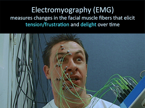
According to Anna and Tammy of Expedia, “There’s a way you can reliably see what users are feeling during a usability study: sensors on users’ faces. Electromyography (EMG) measures changes in the facial muscle fibers that elicit tension / frustration and delight over time,” as shown in Figure 15. “We ask users not to think aloud because that would move the facial muscles.”
Figure 15—Electromyography
“Just positive language and happy words elicited a positive reaction. We no longer had to rely on self-reporting or interpreting facial expressions. We can use EMG to discover delight. Delight is addictive and can motivate users to keep working through difficult tasks.”
Using an eyetracker, “we knew we were getting delight, but we didn’t know why. So we kicked off an ethnographic study with EMG. We visited ten participants in their homes. We wanted to see their process shopping for a hotel for a trip.”
Anna and Tammy took us through some use cases:
“Use Case #1: Creating hooks in hotel shopping—Photos equal delight. There was something transformative about what photos can do. [People] notice a photo and say, ‘That’s it!>’
Use Case #2: Providing insights to empower shoppers—Give shoppers insight to supply and demand. Sold-out hotels are an emotionally frustrating experience for users. We started to expose availability information in search results … to prevent frustrating experiences. some users didn’t like these messages; some found them helpful. There’s a difference between tension and frustration; focus versus frustration. Not all tension is bad! Sometimes it’s a call to action.
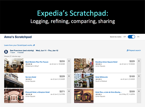
Use Case #3: Creating delight by satisfying unmet needs—Photos, prices, rooms, location. ‘This is the hardest part—trying to find a good one.’ Shopping is time consuming. Customers do 48 searches before booking on average—across many weeks, maybe months. Customers have a hard time keeping track of all the details and take tons of notes, jotted down details. We studied note taking in hotel shopping. The main purpose of the notes is logging hotel names, prices, room types, and amenities. The Web site was not accommodating that need. From that was born a feature: the Scratchpad,” shown in Figure 16, “where prices are up to date and available across devices, [unlike] on your notepad at home.”
Figure 16—Expedia’s Scratchpad
“We’re introducing delight more deliberately into our product.” For example, when users recognize a product they want that engenders delight; as does being able to delete products they don’t want.
“EMG tells you the what, but not the why, so it works best when paired with a qualitative method like ethnography or feedback in a usability lab. Designing for delight requires early primary research. Not everyone has the money to do that. It’s a science and an art—there are lots of gray areas in the analysis. Emotions are complex, and we can’t assume that all tension is bad. Delighters can become expected experiences. With EMG and ethnography, we don’t have to guess anymore.”
“Sometimes we see spikes when there’s no expression on a user’s face. Without EMG, you can get false reads. Maybe they’re just squinting to read the text. Every user’s amplitude is different, so you need to calibrate the high points for tension and delight. People kind of forget that the EMG is on them pretty quickly.”
This approach to research creeped me out a bit when I saw that image of a person with sensors all over his face, but it clearly generates useful findings about users’ emotions that might not be discoverable in any other way.
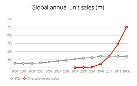
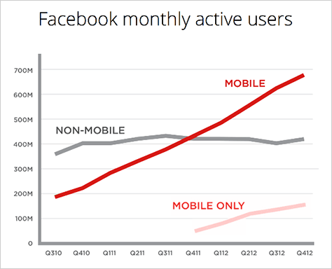
A Mobile Product Designer at Yelp, Yoni first shared some interesting data on mobile usage. “Mobile is more important than desktop for a lot of apps,” as Figures 17 and 18 show. “[Considering] the mobile-only group—people who won’t interact with your product in any way but mobile, a desktop application transitioning into mobile should be a fully featured app. The problem you’re solving on desktop you should be completely solving on mobile. We have to enable content creation and other things users wouldn’t have traditionally done on mobile.”
Figure 17—Global annual sales for smartphones and tablets versus PCs
Source: Luke W.
Figure 18—Facebook month active users, including mobile-only users
Source: Luke W.
“Yelp has 61 million monthly mobile unique visitors, and 45% of Yelp users are on mobile; 60% of searches are on mobile. Mobile users are more engaged users—70% of the photo [uploads] are on mobile.”
“The mobile user experience was originally thought of as being supplementary to the desktop experience, but now many are end-to-end mobile users.” According to a 2010 Harris Study, “73% of mobile app users expect a company’s mobile app to be easier to use than its Web site. But small devices are not inherently user friendly. Mobile first relies on simplifying, but that doesn’t always work—especially for complex products.”
“We needed to rethink for mobile. Yelp’s business page assumed users had a deep understanding of Yelp. The two main goals were for it to be intuitive and scalable to boost contributions and bring them more to the forefront. We took inventory of all content—and [reconsidered] business actions such as getting directions to a business and contributions actions. The surface is 3x5, so the page relies on scrolling.”
“Yelp has so many different personas. Some people are photo centric; some search for keywords. They’re different for different types of businesses.”
“The page was oriented toward scrolling. Labeling each type of contribution was not obvious. Posting too many contributions was a problem.”
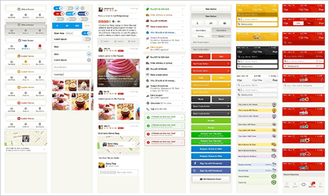
“We created a pattern library,” shown in Figure 19. “New pages start with patterns. Everyone is already invested in patterns. They let us very quickly align pages across devices. … But navigation … is very platform specific. As we evolve patterns, all of that’s measurable. [We implement them] across platforms and slowly roll them out.”
Figure 19—Yelp pattern library
“Navigation started out very basic. Mobile users could not use Yelp without desktop experience. The bottom tabs and springboard design were really good for power users, but new or mobile-only users could not figure it out. So, we went back to our main goals—reduce complexity and boost contributions—and focused on the Yelp experience for discovery, search, and contributions. Taking advantage of Android-specific patterns set the same, right expectations with users.”
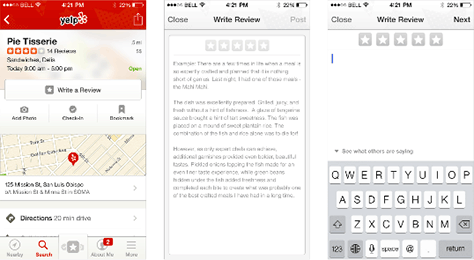
When redesigning “reviews on mobile, we were afraid that contributions would turn into SMS texts. Review quality correlates with review length. We optimized the design for quick entry of content, using an industry-established pattern,” shown in Figure 20. “We used longer ghost text.”
Figure 20—Design for Yelp reviews on mobile
“With review quality as a core goal, we launched and would iterate whether the design succeeded or failed. Now, 35% of new reviews are coming through the mobile flow. The mobile review flow looks nothing like the desktop review flow, but it definitely works.”
“Capture the heart and mind of users to truly delight [through] creativity, interactivity, ingenuity, transparency, and humor. Users have certain expectations of a product; do what they need. See if there are any ways you can put some fun in. One of our biggest successes was pull to refresh. Apple called it the snot. Build things the right way—to standards you set. Not everything has to be about design. We got a lot of love through social media on a privacy change.”
“When we redesigned our business page on the desktop, the aesthetics of mobile influenced the desktop Web. [While] 45% of users are on mobile, 35% of reviews] come from mobile users.
“Stakeholders understand that there are space constraints on mobile. We prototype flows so information is only one screen away. If there are conflicting interests, they can try to work it out among themselves. Now we have a really good track record. The product has gotten so much better. You make some sacrifices [on mobile], but they’re not really sacrifices if they make the app awesome. We wanted to build the app right in a fun way, and the results were overwhelming.”
This was one of my favorite talks of the conference. Yoni designed a gorgeous presentation whose hallmark was simplicity and delivered an excellent talk on a popular topic.
Maximizing UX Across Touchpoints: Creating Brand Perception + Value
Presenter: Alexander Muir
Senior Design Researcher for Internet of Things at Microsoft, Alexander Muir, has worked on projects such as the Connected Car—“which is an infotainment system, not self-driving cars”—and the Microsoft Partner Program. He started his talk on maximizing UX across touchpoints by saying, “The underlying problem we need to solve is often other people in the organization. Their part of the Web site or their part of the ecosystem is just not working with ours. We need to influence them. We need to work with them together. That’s a hard person problem. … Budget your time and energy to get really strong at … organizational agility, stakeholder management, how to get people to do stuff, or influence without authority. Because a lot of the underlying problems can be solved that way rather than just redesigning a button or moving a label or something like that.
“For UX across touchpoints, … how do you even think about what touchpoints you have when your car is connected to the Internet, your phone’s connected to the Internet, your house, your life, your desktop; if you’ve got wearables, your wrist is connected to the Internet. Where we’re going in the long term, … the larger picture of where we’re heading is, soon, the idea of touchpoints is almost going to be defunct, because everything is going to be connected…. That’s still years off, … so back to the practical world of reality of now….”
“When you have a broken thing, it doesn’t matter what your brand values are. The thing is broken. … I’m a big skeptic when it comes to the idea of branding. …”
“One of the big points I’d like to get across with this talk is how important it is to understand how your users are actually trying to get their tasks done. … Delivering brand values, for this talk, is about making it easy for people to do what they want to get done. … So, I’d like to suggest that we look at the problem of touchpoints from how do we get to the place of seamlessness. … The user journeys through your ecosystem to complete their tasks, but when it comes to crossing from one site / app / device to the next, the trail is lost. [When] your users … come to your ecosystem as part of a journey and want to get somewhere, you want to make it so they don’t fall through the cracks. So frequently that happens.”
“So often we shoot ourselves in the foot by not having some of the basic tasks be easy to use. We could have an amazing product, an amazing service; we could be a wonderful team, but we’re only as good as the weakest link in that entire chain.”
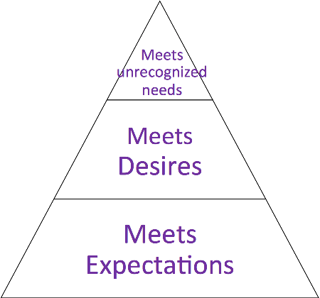
In the “wonderful book Peak, … Chip Conley has this very simplified but effective way of describing user needs,” shown in Figure 21. “The most basic things people just need to get done—you need to meet their expectations. You need to deliver the basics before delivering higher brand values. Most of the problems, I find when getting to seamlessness, are problems in getting basic stuff done. So why try to move up the pyramid and deliver some sort of aesthetic, amazing brand experience if the lower levels of the pyramid are really broken?”
Figure 21—Chip Conley’s pyramid in Peak
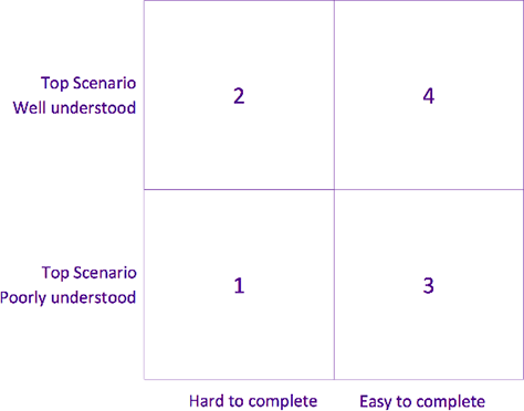
“Think about the problems … where you’re trying to make things seamless, where you’re trying to make all the touchpoints join up and make sense to people, so … when they come to your place it feels all competent—it feels like you and your brand know what you’re doing and you’re trying to help.” Figure 22 shows “a simple map you can use” to assess how well you’re doing.
Figure 22—Mapping scenarios
“Firstly, let’s focus on the top scenarios. Forget all the marginal stuff you do. Just the main tasks that people are trying to get done—the main journeys people have…. Do you actually know what your top scenarios are and can you describe how your user thinks of them? … Frequently…, in the company you work at, the top scenarios may be a little unclear. There may be different versions of what the top scenarios are, depending on who you ask, and people may be saying one thing is a scenario, but they both mean something completely different. So just understanding what you’re even doing online is a good start. And it’s often our job, as the UX people, to make sure that the other team members, our stakeholders, have got a clear vision, too, and that they’re elucidating it clearly.
“Are your scenarios understood? That’s the first one and, secondly, are they basically hard to do or are they basically easy to do? … How do you know? How hard is it? How easy is it? How big are your biggest problems? Where are they, and how many are there? Knowing this is just the rigor that we need to get to that sense of seamlessness.
“So, if we were to take the worst case and, let’s say, you do an honest assessment of most of your top scenarios, you’re not exactly sure how people are doing it or exactly what they’re doing, and you’re not sure that they’re very easy. Worst-case scenario, but unfortunately, very common. Then, to understand how they’re doing it, … you can do field visits, … follow them on ClickTrack, you can do search … term mining….
“Let’s say you do understand your top scenarios, but you also know that some of them are hard to use. Probably, most of us fall into this category. Because, frankly, if we’re working on any product which is in the least bit complicated or pushing the edge, we’re going to be on the bleeding edge. There are going to be some usability issues. …
“What if you don’t your scenarios that well, but somehow you know they’re easy to complete? I can’t think I’ve seen that very much. … If you know that your scenarios are great and easy, congratulations. … But also, you should go work on something more ambitious, because frankly, the stuff we’re working on nowadays is complicated. Gone are the days when a company just had a Web site. Now, it’s a set of Web sites, maybe some devices, maybe some bricks and mortar, maybe some retail, maybe some face-to-face time with people. These are complicated business models we’re trying to generate user experiences to match. And it’s hard. The hardest thing, I think, is stakeholder management, not UI. When it comes to understanding the top scenarios, you can think of this in a very practical way. …
“What do I mean by scenario? … Are scenario and task the same? No. What do you think a scenario has that a task doesn’t? A scenario will typically be a number of tasks, and it will have extra elements like motivation, the particular actor, the goal, and so forth. Today, I’m using actual scenarios and tasks fairly interchangeably. … That’s fine. …
“Who are the users? What are their needs? What are their painpoints? What knowledge do they have or don’t they have coming in? What are they actually trying to accomplish? What feeling state are they trying to get to? … We need that nuanced understanding of where people are on their journeys. … Feeling how the user journey shifts, moment by moment. … We need to be able to capture and describe those important differences and explain it to people.
“Another thing we need to understand: How are they currently going about their task? This can be quite hard to figure out and, typically, there’s a lot we don’t know. … It’s very surprising to find out where people go to get tasks done? Have you had that moment when you’ve been gobsmacked by how people are actually going through your Web site? How people are putting pieces together in a way which would never have expected? The other things people are drawing in? We tend to think of our own Web site in a little box. But, of course, people have a whole network of resources … that [they’re] creating a journey with. Do you understand those resources? Can you honestly say you understand how people are putting together the resources and information and the capabilities? We tend to be rather myopic and focus in just on our own Web site and just … test our own product. But, of course, people work in this network. …
“There should be some way of modeling the network of tools and resources and people that are involved in these core journeys and how you fit into it. We tend to think the world revolves around us. That’s not true.
Alexander then considered appropriate methods of UX research for touchpoints: “ClickTrack to see where people go. Diary studies or field studies to see what they actually do. … Search-term mining is a handy way of understanding what people are trying to do on your site. … Jerry McGovern … has an appealingly simple way of ranking the effectiveness of your search engine. Firstly, go in and look for the top 100 or so search terms which people frequently use on your Web site. That will be illuminating. What’s on people’s minds when they come there. So that’s going to be groundbreaking, probably, for you already, if you haven’t done it. Secondly, for each of those terms, think of which Web page should they go to if they type that in. Then, for each of those terms, actually type it in and see what Web page you actually get to. If you’re taken to the right one, score 1; if not, score 0. Then you just add up all your points, and the closer to 100 that you get, the more clearly you’re matching your users’ intent. The further away from 100, the closer to zero, the more out of touch you are with your users.
“It’s nice to have ways of analyzing things that are rigorous enough, without overdoing it. … A lot of the craft in being a researcher is figuring out how much rigor you do and don’t need. … The trick, in an agile world, is figuring out what’s just enough analysis. …
What are some examples of hard problems across touchpoints? “Different organizations who are responsible for the different touchpoints—to be honest, I think this is the hardest problem you’ll face.” … “A lot of different Web sites. One of the things that’s very hard is that different groups were responsible [them]. A system which had evolved. It had grown into what it was. These, I think, are probably the knottiest, hardest ways of getting a consistent user experience, because different terminology is being used, different types of tasks are being offered. … How would you get the different groups to align on the same terminology? That’s where you need serious … organizational agility.
“One good book on that … is Robert Cialdini’s Influence. Influence and politics are natural. You’re going to get that if you want to make big things happen in UX. You have to bite the bullet and learn about influence and politics. Politics is not necessarily a bad thing. It’s how things get done. What role does UX play in that? … To stay on topic, I can’t go much further into stakeholder management, other than to urge you to look there for your solutions.
“What if [there are] extremely diverse users? They’re going to be similar on some dimensions. They’re not going to be different on every dimension. Where are the similarities and where are the differences? … How does that change how people use the site? … Can we still boil it down to three or four or five, without losing too much fidelity? Maybe, maybe not. …
“Healthcare [for a patient] to have a smooth experience where it feels like everyone who’s helping them is on the same team and is competent and helpful. Not easy.”
“We’re always trying to … make it better, but rarely do we actually solve these things once and for all.”
“When we design software, we often think about just the states we’re going to. We don’t think about the journey itself. … Design for the transition, not just your … A and B states. The interesting, hard challenge of things like … the Internet of Things is it’s very much an embodied computing problem. It’s computing in the real world. It’s on our person. It’s part of our day-to-day flow. The same with smartphones. … We need answers that can help us be safe and make sense of our real-world environment. … We’re in these in between moments. … These are complicated moments when a lot of stuff is happening. … There are these interruptions we have to design for—that we have to understand. … What can we say about maximizing user experience when people are so distracted, when they have all these limitations on them, when they’re right in the middle of something else?”
“Measuring where you are today and where you’ve got to is very important for making the changes, because we need to bring data that … helps our executive stakeholders to understand the size of a problem. If we just turn up to an executive and say, We need to do this because it’s a problem—and it’s a big problem, and users’ hate it; if they’re a competent person, they’re going to ask some probing questions: How bad is it? What exactly do they hate? How many of them hate it? When do they hate it? And if we’re not able to answer that, we’re going to look like amateurs. And frankly, I think one of the weak spots often in the UX discipline is sometimes we’re not good at answering these kinds of precise, probing questions, which our executives and senior stakeholders are very likely to throw at us. So measuring of UX is really important. Unfortunately, it’s a wicked problem.”
“Design consistency, I think, is often overrated. … If people get it, that’s fine. If it confuses people, that’s not fine. We don’t have to make everything look the same. Harmony and familiarity are more important than consistency. Things should generally be harmonious, so there’s clear recognizability. But not everything has to be exactly the same. What would be an example of an important thing that should be consistent? Important terminology … or where key things are on the screen.”
“Touchpoint mapping can, of course, be done. … All the important points in the process—of our different flows—where people touch the system. … On top of your map, you should put your measurements. You should mark your painpoints. So, when you are trying to influence your stakeholders, you can say, look, these are the most broken spots, here’s how we know, and here’s how broken they are. We have data to show it. Most of the time I’ve seen touchpoint mapping, it’s more been driven by Marketing, and it’s more an aspirational thing than a reality thing. So distinguish between your mapping as is or your mapping the aspirational.”
“Cross-group collaboration … needs to happen to get to this place of seamlessness. You need evidence. You need an executive sponsor normally, because, frankly, UX people often don’t have a seat at the table. Occasionally, we get it if we work hard—if we develop good relationships. But you need an executive sponsor if you’re going to bring other teams together. How you get an executive sponsor or how you manage up to your executive sponsor are really important skills. …
“Have a Plan B in case the collaboration doesn’t appear, because often a hallmark of a slightly naive UX practitioner is to hope that people are just going to get together and play nicely. Because users are having a problem, we’re all going to rally round and solve that problem together. Rarely happens. So have a Plan B in case you don’t get the collaboration. What short-term fixes can you do to help usability?”
“What are some of the typical seams—the crevasses—which people fall through and jeopardize the sense of a nice, consistent touchpoint experience?
going to another site for your full catalog
having to log in multiple times versus a single sign-on
when you switch from the app to the mobile Web site …
going to sections which have been built by other teams can be shocking
here’s one that is very hard and I’ve struggled with quite a lot: your cloud collection versus your streaming collection versus your local collection …
“How do you even explain to people that some of your songs are available in the cloud, others are on one of your computers, and others are just in the store? Not easy.”
“Nowadays, we’re not pushing our brand at people. We deliver brand value by delivering the important things that people come to our sites to do. We focus on the top scenarios.”
This was really an excellent talk. In addition to providing practical advice on maximizing user experience across touchpoints, Alexander explored many philosophical points that are key to the success of UX professionals and teams within organizations.
If you love British accents as much as I do, listen to the recording of Alexander’s talk.
Read Part 2 of my UX Strategies Summit 2014 review on UXmatters. And check out the lineup for UXSS 2015.
Founder, Publisher, and Editor in Chief of UXmatters
Silicon Valley, California, USA
With more than 20 years working in User Experience at companies such as Google, Cisco, WebEx, Apple, and many startups, Pabini now provides UX strategy and design consulting services through her Silicon Valley company, Strategic UX. Her past UX leadership roles include Head of UX for Sales & Marketing IT at Intel, Senior Director of UX and Design at Apttus, Principal UX Architect at BMC Software, VP of User Experience at scanR, and Manager of User Experience at WebEx. Pabini has led UX strategy, design, and user research for Web, mobile, and desktop applications for consumers, small businesses, and enterprises, in diverse product domains. Working collaboratively with business executives, multidisciplinary product teams, and UX teams, she has envisioned and realized holistic UX design solutions for innovative, award-winning products that delighted users, achieved success in the marketplace, and delivered business value. As a UX leader, she has facilitated conceptual modeling and ideation sessions; written user stories; prioritized product and usability requirements; established corporate design frameworks, standards, and guidelines; and integrated lean UX activities into agile development processes. Pabini is a strategic thinker, and the diversity of her experience enables her to synthesize innovative solutions for challenging strategy and design problems. She is passionate about creating great user experiences that meet users’ needs and get business results. A thought leader in the UX community, Pabini was a Founding Director of the Interaction Design Association (IxDA). Read More