Before graphic user interfaces, text was the primary means of both input and output defining human-computer interactions. Even today, much of the information user interfaces present is textual. Therefore, we should not underestimate how the right text treatment can measurably improve user productivity and increase user satisfaction. As new technologies become available—for example, larger monitors with higher resolutions—a good foundation of knowledge about effective text treatment can help designers create usable user interfaces for them more quickly.
Font Type
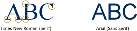
Content developers have hundreds of serif and sans serif fonts at their disposal. Serifs are small lines at the ends of the main strokes of characters. Serif fonts improve readability in continuous text, because the serifs help readers to structure and discriminate characters [1]. Times New Roman, for example, is a serif font, as Figure 1 shows. Typically, newspapers, magazines, and books use serif fonts.
Champion Advertisement
Continue Reading…
Figure 1—Examples of serif and sans serif fonts
Sans serif fonts like Arial do not feature these little strokes, as you can see Figure 1. On computer screens, sans serif fonts are preferable, because relatively low screen resolutions—typically around 100 pixels per inch rather than the 800 dots per inch of print—make serif fonts look fuzzier, especially in small sizes.
The new generation of e-books such as the Kindle from Amazon have much higher pixel densities than current PC monitors—around 170 ppi. This makes it possible to use serif fonts—as in a real paper book—improving the overall user experience. So the choice between serif and sans serif fonts depends on the capabilities of the target output technology.
Letter Cases
In the mechanical printing process of the past, printers manually assembled individual letters into words and sentences. Miniscule letters—a, b, c, and so forth—were stored in cases that were placed below those that held majuscule letters—A, B, C, and so on. Hence, we now call them lowercase and uppercase letters.
There are three major ways of using letter cases in text, as shown in Figure 2: lowercase, mixed case, and uppercase. We see all three in our daily lives. Ergonomists have consistently recommended using mixed case letters and shy away from using all uppercase letters, especially for continuous text.
Figure 2—Examples of different letter cases
Their reason for recommending mixed case is that the ascenders—extensions toward the top, as in b, d, f, h, k, l, and t—and descenders—extensions toward the bottom, as in g, j, p, q, and y—create the typical shape for a specific word [2]. It is, therefore, easier to recognize words in mixed case while reading. Mixed case also allows better comprehension of the sentence structure, since uppercase applies only to the first letter of the first word at the beginning of a sentence or to proper names.
Interestingly, recent research yields opposing findings. Experiments show that, because of its sheer size, all uppercase is more legible, in terms of reading speed, than the other letter cases, especially for visually impaired persons. [3]
Now try reading the previous paragraph in all uppercase.
INTERESTINGLY, RECENT RESEARCH YIELDS OPPOSING FINDINGS. EXPERIMENTS SHOW THAT DUE TO THE SHEER SIZE, UPPERCASE IS MORE LEGIBLE IN TERMS OF READING SPEED THAN THE OTHER LETTER CASES, ESPECIALLY FOR VISUAL IMPAIRED PERSONS.
You can judge for yourself what letter case style is easier and faster to read. I personally believe that mixed case is superior, at least for users without vision impairments.
Text Alignment
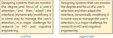
When displaying continuous text on informational Web sites or in online Help, there are two common ways of aligning the text, as shown in Figure 3:
justified—The text body has clean edges at both the left and right.
ragged right—The text body is left aligned.
Although justifying continuous text provides a nice block of text, the extra spaces that appear between individual words often create continuous vertical spaces that can appear meaningful—like vertical rivers of white. This can be distracting to readers [4]. It is, therefore, recommended to use ragged-right text alignment.
Figure 3—Examples of justified versus ragged-right text alignment
Text Orientation
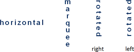
Different layouts may require different text orientations. Figure 4 shows standard horizontal text; marquee style text, in which each individual letter is horizontal, yet the letters are vertically aligned; and text that is rotated by 90° to the right or left.
Figure 4—Different text orientations
Obviously, in the western world, it is best to use horizontal text. After all, our books are not printed in marquee or rotated text. Though this may not be the case for other cultures.
Research confirms that people can read text with a horizontal orientation the fastest [5]. It has also shown, from a usability standpoint, that it does not matter whether text is rotated to the right or the left—for example, on vertical tabs. Reading speed is a function of where the items appear on the screen. However, for aesthetic reasons, the font should be directed inward. Of all text orientations, marquee is the hardest to read and yields the poorest reading performance.
Font Size
Font size is a crucial factor in determining character legibility. Software developers often simply use the common font sizes countless Web sites recommend—for example, 10-pixel Verdana or Arial. While it makes sense to recommend standard font sizes for software or Web sites, keep this in mind: Font size is just one determinant of the physical size of a character on a computer screen. Thus, it is more appropriate to base our recommendations for character size on physiological measures. In other words, what matters is what a user actually sees on the screen, not what a product team has designed and developed. Explaining why this is so is going to get a bit technical, but please bear with me.
Different guidelines recommend slightly different character sizes. ISO standard 9241-3 [6] states:
“Character heights from 20 to 22 minutes of arc are preferred for most tasks. The minimum character height shall be 16 minutes of arc.”
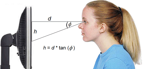
One minute of arc is equal to 1/60 (0.0167) degree. Therefore, as Figure 5 shows, the respective line-of-sight angles are as follows:
16 minutes of arc = 0.267 degree
20 minutes of arc = 0.333 degree
22 minutes of arc = 0.367 degree
Figure 5—Relationship between line-of-sight angle, viewing distance, and character height
Recommendations for the minimum viewing distance (d) between user and monitor screen range from 400 to 600 mm. ISO 9241-3 indicates a minimum viewing distance of 400 mm for normal office work. Given the fact that the near point of accommodation at the age of 50 is typically already 500 mm [7], a minimum viewing distance of 500 mm is more appropriate and is often recommended in ergonomic literature [8].
Assuming a character is viewed orthogonally—that is, so, as in Figure 5, the viewing distance (d) is at a right angle to the screen—if d is 500 mm, the result of the trigonometric formula shown in Figure 5 gives the following character heights:
minimum character height—2.3mm
preferred character height range—from 2.9 to 3.2mm
Usually character height relates to uppercase letters, so an E has to be at least 2.3mm in height.
The challenge is to understand the various parameters that determine physical character height—that is, the absolute height one could measure on the screen by using a ruler. In other words, now that we know the target character height, how can we ensure the characters on a screen really are this height? In addition to font size, the following parameters determine the physical character height:
an operating system’s font size setting—for example, in Microsoft Windows, small or large
for Web applications, a Web browser’s text size setting—for example, in Microsoft Internet Explorer, smallest, small, medium, large, largest
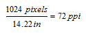
pixel density—expressed in pixels per inch (ppi), this unit of measurement depends on
screen resolution—for example, 1024 x 768 pixels
the physical size of the screen
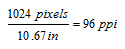
While we can control the effects of font and text size settings, there is not a definite pixel density, because each user’s monitor size and resolution settings can vary. To give an example, consider two people who both use the same software, the recommended 500mm viewing distance, and the same system settings. However, one person uses a 14-inch notebook, with a visible width of 10.67 inches, while the other uses a 17-inch LCD monitor, with a visible width of 14.22 inches. The definition of pixel density is as follows:
Therefore, as Table 1 shows, we obtain the following pixel densities for an assumed screen resolution of 1024 x 768 pixels for these two people.
Table 1—Calculating pixel density
Person A
Person B
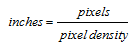
To measure this pixel density in inches, use this formula:
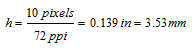
The physical height of an uppercase character that is 10 pixels in height would consequently be as shown in Table 2.
Table 2—Calculating actual character height
Person A
Person B
So, for Person A, the physical character height conforms only to the required minimum character height stated in ISO 9241-3 for a viewing distance of 500 mm, while that for Person B exceeds the preferred value range.
Conclusion
The appropriate treatment of text is only one of many building blocks that determine the usability and the user experience of a user interface—yet, it is a fundamental component. Unfortunately, as countless Web sites demonstrate, our knowledge about the do’s and don’t’s of text treatment is still underdeveloped. In this article, I hope I have contributed a solid overview that you can apply directly when designing user interfaces.
References
[1] Wheeler, Susan G., and Gary S. Wheeler. TypeSense: Making Sense of Type on the Computer. Boston: International Thompson Computer Press, 1996.
[2] Dul, Jan, and Bernard Weerdmeester. Ergonomics for Beginners. Oxford: Taylor & Francis, 1993.
[3] Arditi, Aries, and Jianna Cho. “Letter case and text legibility in normal and low vision.” Vision Research: September, 2007.
[4] Watzmann, Suzanne. “Visual Design Principles for Usable Interfaces,” in The Human-Computer Interaction Handbook, ed. Andrew Sears and Julie A. Jacko. New York: Lawrence Erlbaum Associates, 2008.
[5] Byrne, Michael D. “Reading Vertical Text: Rotated vs. Marquee,” in Proceedings of the Human Factors and Ergonomics Society 46th Annual Meeting. Santa Monica, CA: Human Factors and Ergonomics Society, 2002.
[6] ISO 9241-3. Ergonomic requirements for office work with visual display terminals (VDTs)—Part 3: Visual display requirements. Geneva: International Organization for Standardization, 1992.
[6] Grandjean, Etienne. Ergonomics in Computerized Offices. New York: Taylor & Francis, 1986.
[8] Kroemer, Karl H.E., and Anne D. Kroemer. Office Ergonomics. New York: Taylor & Francis, 2001.
Tobias, I haven’t read the references you cite for legibility of mixed case versus uppercase text, and I’m curious about the length of the text set in uppercase.
I can see that uppercase might be more effective for headlines or ad copy, but in my own experience and in the anecdotal information I’ve seen, large blocks of uppercase text are harder to read.
Did the study address that issue? I’m very curious about that point.
I’ve tried before to determine the impact of font size and font type, but was thwarted in my efforts. I seemed to always end up at the conclusion that having the right words were more important than having the words formatted properly and stopped there.
So thanks for putting this together. It’s going on my reference list.
They used both rapid serial visual presentation and continuous text, which was composed of four text passages of ninth-grade-level reading difficulty—that is, about 400 words in length.
At Infragistics, Tobias leads data analytics, artificial intelligence, and machine-learning initiatives. An evangelist for user- and customer-centered design strategy, methods, and processes, he has worked in User Experience for over 20 years, leading teams, projects, and programs with the goal of creating user experiences that are meaningful, usable, and differentiated. Prior to joining Infragistics, he served as Global Director of User Experience for Corporate IT at Honeywell and held several senior R&D positions at Siemens. Tobias holds a Master’s in Psychology from the University of Regensburg in Germany and earned his PhD in the field of Usability Engineering from the University of Kassel, also in Germany. He has published more than 50 technical papers, has presented at international conferences, and teaches UX courses as an Adjunct Professor in the Master’s in Business & Science program at Rutgers University.
Read More
